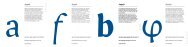
Intone - MA Typeface Design
Intone - MA Typeface Design
Intone - MA Typeface Design

You also want an ePaper? Increase the reach of your titles
YUMPU automatically turns print PDFs into web optimized ePapers that Google loves.
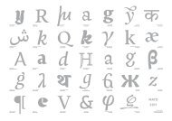
Negative Remarks:<br />
1. Very accentuated serifs.<br />
2. “N” and “h” too pointy compared<br />
to “d” and “o” which are<br />
too round.<br />
3. Restart.<br />
4. “E” looks weird but I don’t<br />
know why yet.<br />
5. “G” is interesting but doesn’t<br />
really fit the rest.<br />
6. It is a bit too bold and I would<br />
like something slightly more<br />
refined.<br />
Positive remarks:<br />
1. I like the top serif on the “d” and<br />
the “n”; they have a strong deep<br />
cut. I like also the right part of the<br />
ascender of the “d” that leans to<br />
the right translating the movement<br />
of the pen.<br />
2. The serif on the “h” has<br />
something but maybe it is a bit<br />
excessive for the regular. I will try<br />
to imply it on the italic.<br />
Negative Remarks:<br />
1. What happened to the top serif<br />
of the “h”?<br />
2. Contrast is better on the sketch.<br />
3. The outstrokes look better on<br />
the sketch.<br />
4. The serifs don’t fit. They seem<br />
as if someone forced them.<br />
5. The form of the stem doesn’t fit<br />
the ascenders.<br />
Positive remarks:<br />
1. The sketch is better.<br />
2. The stem has something<br />
interesting.<br />
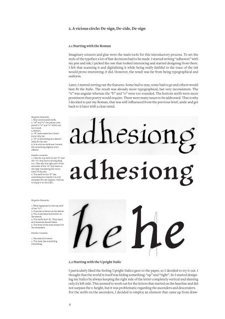
2. A vicious circle: De-sign, De-cide, De-sign<br />
2.1 Starting with the Roman<br />
Imaginary scissors and glue were the main tools for this introductory process. To set the<br />
style of the typeface a lot of fast decisions had to be made. I started writing “adhesion” with<br />
my pen and ink; I picked the one that looked interesting and started designing from there.<br />
I felt that scanning it and digitalizing it while being really faithful to the trace of the ink<br />
would prove interesting; it did. However, the result was far from being typographical and<br />
uniform.<br />
Later, I started sorting out the features. Some had to stay, some had to go and others would<br />
best fit the Italic. The result was already more typographical, but very inconsistent. The<br />
“n” was angular whereas the “b” and “o” were too rounded. The bottom serifs were more<br />
prominent than poetry would require. There were many issues to be addressed. That is why<br />
I decided to put my Roman, that was still influenced from the previous brief, aside and get<br />
back to it later with a clear mind.<br />
adhesiong<br />
2.2 Starting with the Upright Italic<br />
2.2 Starting with the Upright Italic<br />
I particularly liked the feeling Upright Italics gave to the paper, so I decided to try it out. I<br />
thought that the world in itself was hiding something; “up” and “right”. So I started designing<br />
my Italics by always keeping the right side of the letter completely vertical and slanting<br />
only its left side. This seemed to work out for the letters that started on the baseline and did<br />
not surpass the x-height, but it was problematic regarding the ascenders and descenders.<br />
For the serifs on the ascenders, I decided to employ an element that came up from draw-<br />
6<br />
he