Intone - MA Typeface Design
Intone - MA Typeface Design
Intone - MA Typeface Design
You also want an ePaper? Increase the reach of your titles
YUMPU automatically turns print PDFs into web optimized ePapers that Google loves.
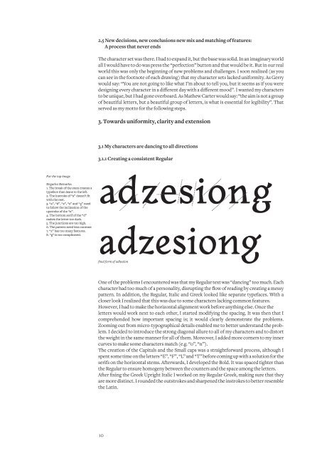
For the top image<br />
Negative Remarks:<br />
1. The break of the stem creates a<br />
typeface than leans to the left.<br />
2. The instroke of “a” doesn’t fit<br />
with the rest.<br />
3. “a”, “d”, “e”, “s” and “g” need<br />
to follow the inclination of the<br />
upstroke of the “n”.<br />
4. The bottom serif of the “d”<br />
makes the letter too dark.<br />
5. The junctions are too high.<br />
6. The pattern need less contrast<br />
7. “z” has too many features.<br />
8. “g” is too complicated.<br />
2.5 New decisions, new conclusions new mix and matching of features:<br />
A process that never ends<br />
The character set was there. I had to expand it, but the base was solid. In an imaginary world<br />
all I would have to do was press the “perfection” button and that would be it. But in our real<br />
world this was only the beginning of new problems and challenges. I soon realized (as you<br />
can see in the footnote of each drawing) that my character sets lacked uniformity. As Gerry<br />
would say: “You are not going to like what I’m about to tell you, but it seems as if you were<br />
designing every character in a different day with a different mood”. I wanted my characters<br />
to be unique, but I had gone overboard. As Mathew Carter would say: “the aim is not a group<br />
of beautiful letters, but a beautiful group of letters, is what is essential for legibility”. That<br />
served as my motto for the following steps.<br />
3. Towards uniformity, clarity and extension<br />
3.1 My characters are dancing to all directions<br />
3.1.1 Creating a consistent Regular<br />
adzesiong<br />
adzesiong<br />
final form of adhesion<br />
One of the problems I encountered was that my Regular text was “dancing” too much. Each<br />
character had too much of a personality, disrupting the flow of reading by creating a messy<br />
pattern. In addition, the Regular, Italic and Greek looked like separate typefaces. With a<br />
closer look I realized that this was due to some characters lacking common features.<br />
However, I had to make the horizontal alignment work before anything else. Once the<br />
letters would work next to each other, I started modifying the spacing. It was then that I<br />
comprehended how important spacing is; it would clearly demonstrate the problems.<br />
Zooming out from micro-typographical details enabled me to better understand the problem.<br />
I decided to introduce the strong diagonal allure to all of my characters and to distort<br />
the weight in the same manner for all of them. Moreover, I added more corners to my inner<br />
curves to make some characters match (e.g. “o”, “n”).<br />
The creation of the Capitals and the Small caps was a straightforward process, although I<br />
spent some time on the letters “E”, “F”, “L” and “T” before coming up with a solution for the<br />
serifs on the horizontal stems. Afterwards, I developed the Bold. It was spaced tighter than<br />
the Regular to ensure homogeny between the counters and the space among the letters.<br />
After fixing the Greek Upright Italic I worked on my Regular Greek, making sure that they<br />
are more distinct. I rounded the outstrokes and sharpened the instrokes to better resemble<br />
the Latin.<br />
10


