Intone - MA Typeface Design
Intone - MA Typeface Design
Intone - MA Typeface Design

Create successful ePaper yourself
Turn your PDF publications into a flip-book with our unique Google optimized e-Paper software.
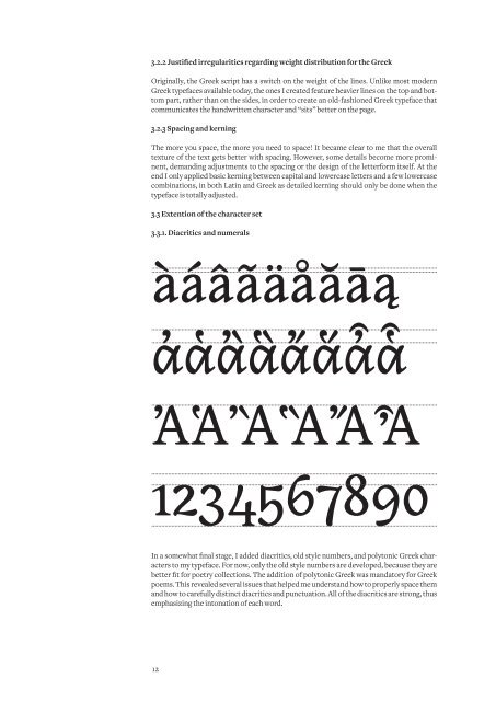
3.2.2 Justified irregularities regarding weight distribution for the Greek<br />
Originally, the Greek script has a switch on the weight of the lines. Unlike most modern<br />
Greek typefaces available today, the ones I created feature heavier lines on the top and bottom<br />
part, rather than on the sides, in order to create an old-fashioned Greek typeface that<br />
communicates the handwritten character and “sits” better on the page.<br />
3.2.3 Spacing and kerning<br />
The more you space, the more you need to space! It became clear to me that the overall<br />
texture of the text gets better with spacing. However, some details become more prominent,<br />
demanding adjustments to the spacing or the design of the letterform itself. At the<br />
end I only applied basic kerning between capital and lowercase letters and a few lowercase<br />
combinations, in both Latin and Greek as detailed kerning should only be done when the<br />
typeface is totally adjusted.<br />
3.3 Extention of the character set<br />
3.3.1. Diacritics and numerals<br />
àáâãäåăāą<br />
ἀἁἂἃἄἅἆἇ<br />
ἈἉἊἋἌἎ<br />
1234567890<br />
In a somewhat final stage, I added diacritics, old style numbers, and polytonic Greek characters<br />
to my typeface. For now, only the old style numbers are developed, because they are<br />
better fit for poetry collections. The addition of polytonic Greek was mandatory for Greek<br />
poems. This revealed several issues that helped me understand how to properly space them<br />
and how to carefully distinct diacritics and punctuation. All of the diacritics are strong, thus<br />
emphasizing the intonation of each word.<br />
12