Intone - MA Typeface Design
Intone - MA Typeface Design
Intone - MA Typeface Design

Create successful ePaper yourself
Turn your PDF publications into a flip-book with our unique Google optimized e-Paper software.
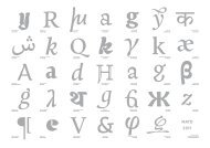
From top to bottom and right<br />
to left:<br />
1. Hendrik de Roo’s typeface<br />
Egmont cursive in Jan Visser<br />
Fluitekruid, Verzen<br />
2. Hendrik de Roo’s typeface<br />
Erasmus in Margot Vos (1923),<br />
De nieuwe lent’, Em Qyerido,<br />
Amsterdam<br />
3. Greek matrices from the Plantin<br />
Moretus museum<br />
4. Pierre Didot typeface Didot<br />
Elder (1819) redeveloped by<br />
Francois Rappo<br />
1. <strong>Intone</strong>, a collage of inspiration and knowledge<br />
1.1 Reading: A source of knowledge<br />
This past year in Reading has been a constant exploration of different ideas and points of<br />
view regarding type. Being exposed to different people, different historical resources and<br />
different imagery, I managed to create a solid baggage that helped me understand what type<br />
is all about. The interesting part about this baggage is that everyone has it, but it is not the<br />
same for any of us. It is even built from the same pieces, but each one of us has<br />
assembled a different puzzle, depending on his personal background and expectations<br />
from the course.<br />
1.2 Several sources of inspiration for my typeface<br />
At the beginning of the year, I formulated a brief stating that the process of typedesign<br />
could not escape conventional methods. This has been a great struggle for me, due to the<br />
excitement I felt from acquiring so much knowledge here, in Reading. Trying to be exciting<br />
within convention was a process that I could not follow. After reading Gerard Unger’s book,<br />
“While we are reading”, it became clear to me that my situation was not a personal failure<br />
but merely the consequence of a conventional typeface.<br />
When it comes to typedesign, convention is the enemy of creativity. Therefore, I decided<br />
to put this project temporarily in a drawer and start anew, with a more creative one. Four<br />
items that drew my attention were the crucial elements that led me to this decision. The<br />
first two are two poetry books that came into my possession. Both were typeset with Sjoerk<br />
Hendrik de Roos’s typefaces, Egmont cursive and Erasmus. I found the small details (like<br />
the serifs on the ascenders of the l, h, k, b and d in Egmont) of each letter to be very fascinating.<br />
They made each character unique while, simultaneously, they created an interesting<br />
pattern on the paper.<br />
The third element was discovered during our trip to the Plantin Moretus museum. A “g”<br />
that looked different from all the others caught my attention immediately. It was the “g”<br />
from the Didot typefamily. Was it a mistake? It was almost standing out of the text but, at<br />
the same time, was blending in a very harmonious way with the rest of the letters.<br />
The last decisive detail was the discovery of some Greek punches that did not look like<br />
Greek at all. Being Greek, my fellow students were asking me what these letters were. I felt<br />
incapable of giving an accurate answer because these ligatures where completely different<br />
from the commonly known modern letterforms.<br />
After these discoveries I had enough food for thought and the design process that will be<br />
analyzed in this essay was happily starting once again.<br />
4