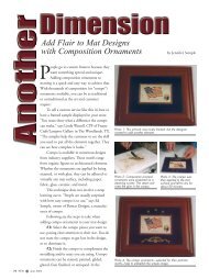
Close-framed Photographs - Picture Framing Magazine
Close-framed Photographs - Picture Framing Magazine
Close-framed Photographs - Picture Framing Magazine

You also want an ePaper? Increase the reach of your titles
YUMPU automatically turns print PDFs into web optimized ePapers that Google loves.
<strong>Close</strong>-<strong>framed</strong><br />
<strong>Photographs</strong><br />
By Timothy Holton<br />
Several years ago I found myself<br />
becoming enchanted by a framing<br />
approach typical of the early twentieth<br />
century, an approach that went<br />
completely against the standards I'd<br />
learned when I began framing in the<br />
seventies and eighties. The frames were<br />
beautiful in themselves: broad, quartersawn<br />
oak moldings, fairly plain but<br />
often with very interesting elements like<br />
beads, reeding, ovolos, and coves, which<br />
were sometimes combined in very<br />
thoughtful, artistic ways.<br />
It wasn't uncommon to see such<br />
frames on oil paintings, but most often<br />
and notably I'd see them on prints and<br />
photographs. On the original pieces,<br />
they were frequently used close to the<br />
photograph just as they were on paintings.<br />
That is, no mat separated the frame<br />
from the art. The effect was pleasingly<br />
simple, yet substantial. <strong>Framing</strong> photographs<br />
and prints close in wide dark<br />
wood moldings went against the modern<br />
habit of matting nearly every work<br />
on paper, often for perfectly good conservation<br />
reasons. And yet whenever I<br />
saw it done on the right picture and<br />
with everything about the frame in harmony<br />
with the picture, I found the<br />
effect absolutely unbeatable. I began to<br />
explore this approach, especially for photos,<br />
and how it might be revived using<br />
today's archival standards.<br />
62 PFM _ October 2007<br />
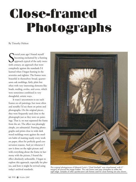
This original photogravure of Edward Curtis's “Chief Garfield” was close-<strong>framed</strong>, with 3”<br />
margins all around the image hidden. This oak frame used stop champfers to soften the<br />
sight edge. Samples of other quarter-sawn oak frames used for close framing are also shown.
Lessons from the<br />
Arts and Crafts<br />
Movement<br />
Period Guidance<br />
A 1906 manual for professional picture framers instructed<br />
that “Frames for…photographs…are now principally<br />
made of [black and brown stained] oaks all finished in the<br />
dead [flat], and used in most cases close up to the picture<br />
without mats. The frames are used broad, yet very thin<br />
through, and the ornaments, if any, consist of delicate<br />
tracery of small classical designs, the same color as the<br />
frame.”<br />
House Beautiful advised in 1902, “Large photographs…may<br />
be <strong>framed</strong> in broad flat oak or gold moldings,<br />
without any mat or margin. The width of the frame<br />
makes up for the mat.”<br />
A 1912 article in The School Arts<br />
<strong>Magazine</strong> suggested that framing close was<br />
so popular as to be in danger of overuse:<br />
“Some decorators go so far as to say, 'Mat<br />
no picture,' but it is to a certain extent a<br />
matter of taste, and there are cases where<br />
an exception seems wise.” The writer<br />
offered some exceptions, such as “a small<br />
picture which is like a jewel and requires a<br />
setting. A picture with a great deal of<br />
action seems sometimes to require a mat.” The framers'<br />
manual adds, “Every framer knows that close framing is<br />
only effective where the subject is large enough and bold<br />
enough in outline to bear such severe treatment.”<br />
The Arts and Crafts Movement Unity Ideal<br />
The basis for this approach is the Arts and Crafts Movement's<br />
overriding concern for the unity of the arts. The<br />
leading reformers, such as John Ruskin and William Morris,<br />
held that throughout time, where allowed to thrive<br />
without tyrannical conditions—including the miserable<br />
industrialized conditions of their own day—all the arts,<br />
An original Curtis photo, “Canyon de Chelly,” was <strong>framed</strong> by the<br />
photographer around 1910 without matting in the Arts and Crafts<br />
style of the time.<br />
A recent photogravure of “Canyon de<br />
Chelly” by Mountain Hawk was close<strong>framed</strong><br />
using a compound or stacked frame.<br />
A flat frame with beading on the sight edge<br />
was used with ovolo cap moulding.<br />
from the most utilitarian handcrafts to the most refined<br />
and purely spiritual paintings and sculptures, had been<br />
practiced together and had worked in harmony. With<br />
architecture as the mother of the arts, everything from<br />
metalsmithing to pictures—the first pictures being<br />
murals—had been in service, and subordinate to buildings.<br />
Unity, it was argued, is absolutely critical to the vitality<br />
of the arts. Furthermore, the unity of the arts was<br />
inseparable from the unity of art and life, the arts being<br />
practiced by the whole people in every aspect of their<br />
lives. As Gustav Stickley, the leading promoter of Arts and<br />
Crafts ideas in America, put it, art is not “something apart<br />
October 2007_ PFM 63
<strong>Close</strong> framing also works on small photographs. This smaller portrait<br />
of a Judge Hammond from the 1920s was <strong>framed</strong> with a 2” cushion<br />
moulding with a bead at the outside edge and a fine bead on the<br />
sight edge.<br />
from common and everyday existence, but rather…the<br />
very means of realizing life.”<br />
Unity, <strong>Picture</strong>s, and the Architecture<br />
of the Frame<br />
Frames held a fascinating—and today, a greatly underappreciated—place<br />
in the Arts and Crafts mission to restore<br />
unity to the arts. They are, in fact, truly emblematic of<br />
Arts and Crafts beliefs regarding both the connectedness<br />
of the arts—no two arts are more intimately related than<br />
pictures and their frames—and the place of art. That is,<br />
when framing pictures we address in the most concrete<br />
and immediate ways our ideas about the position and role<br />
of art in relation to life.<br />
Neo-classical nineteenth-century frames projected an<br />
understanding that art was largely for show. Their designs<br />
were often carried to absurdity, with great masses of<br />
debased ornament intended as nothing more than signifiers<br />
of status and prestige or as packaging to seduce a<br />
prospective buyer. Such a “vault of gold,” as Ruskin called<br />
it, was covered with overblown and showy ornament and<br />
projected the idea of art as a trophy to be shown off, not<br />
as a natural and edifying light enhancing daily life. And<br />
yet, as Walter Crane put it, “The frame, which separates a<br />
64 PFM _ October 2007<br />
This original photogravure is another image that is believed to have<br />
been <strong>framed</strong> by Curtis.<br />
picture from its surroundings, also helps to unite it again<br />
to its original home.” Judiciously displayed, a picture<br />
could restore the original place of paintings in concert<br />
with architecture. It was an accent and focal point, certainly,<br />
but not to be decoratively unrelated and demanding all<br />
the attention.<br />
Lessons of the Movement<br />
By the early twentieth century the movement's ideals had<br />
become widely accepted, and humbler, more self-effacing<br />
frame styles had taken over. “With the figured wall paper,<br />
gaudy carpets, festooned curtains, and fussy upholstered<br />
furniture have gone the ornate frames with diagonal crosspieces<br />
at the corner, whips and horseshoes, dog's heads,<br />
and mariner's compass decorating a portion of the frame<br />
and presumably giving the keynote to the picture” began<br />
the 1913 School Arts article. “In all cases it is essential…to<br />
aim for unity of design in the complete object.”<br />
Today, while every designer at least gives a nod to<br />
unity as key to good design, an attitude remains that pictures<br />
are something apart and untouchable, and that influences<br />
framing design. Often through sheer intimidation,<br />
framers play it safe and unnecessarily separate picture and<br />
frame with a wide liner or mat.<br />
The Arts and Crafts Movement returns today's<br />
framers to an essential understanding about pictures,<br />
which is crucial to good framing. Among its lessons are:<br />
• <strong>Picture</strong>s don't depend on isolation for our enjoyment<br />
and edification but can be made more enjoyable by the<br />
adjacent art of frames used to seamlessly to sustain the<br />
spirit of the art.<br />
• <strong>Framing</strong> can be used either to isolate a picture from a
oom and the life in it or can be used to connect the<br />
picture to that life, allowing it to contribute to the<br />
scheme of a room and giving it a meaningful role in the<br />
everyday activities of the home.<br />
• The unity of pictures with architecture, represented by<br />
the frame, is not only possible but also natural.<br />
• <strong>Framing</strong> for the home, for pictures to be lived with, is<br />
very different from framing for galleries and museums.<br />
<strong>Framing</strong> <strong>Photographs</strong> <strong>Close</strong>:<br />
Some Examples<br />
I don't know of more striking period examples of photographs<br />
<strong>framed</strong> close than those of Edward Curtis. Both<br />
period examples shown here are believed to have been<br />
<strong>framed</strong> by Curtis himself in the type of wide quartersawn<br />
oak profile he preferred. When customers bring us Curtis<br />
photogravures (actual photographs by him are much<br />
rarer), the pieces typically have margins too wide to allow<br />
close framing. In these cases we create the effect of framing<br />
close by using a wide, lap-joined flat over the glass<br />
and mat (the hidden mat is used just to separate glass and<br />
print) to hide the margin, surrounding that with a suitable<br />
mitered frame in a profile 1 1 /2" or so wide.<br />
When we discovered the beautiful new Curtis photogravures<br />
being produced by Paul Unks of Mountain<br />
Hawk Prints, who gave us permission to trim the margins,<br />
we saw an opportunity to revive Curtis's preferred<br />
method of framing close. The broad profiles we mill<br />
allow room to cut the rabbet an inch or more wide to<br />
accommodate a hidden, slightly narrower “gasket” mat.<br />
Because the frame is still fairly close to the paper, we seal<br />
the rabbet with aluminum frame sealing tape.<br />
The two Mountain Hawk examples, “Vanishing<br />
Race” and “Canyon de Chelly,” show the contrast<br />
between framing all the way to the image versus revealing<br />
a narrow strip of the margin, including the text just outside<br />
and below the image. Even when we frame all the<br />
way to the image, the paper is trimmed outside the plate<br />
mark to preserve the text. This margin is hidden under<br />
the rabbet. Especially if an artist has signed the paper in<br />
the margin, the choice of showing the margin and text is,<br />
of course, questionable. But I feel strongly that the disadvantage<br />
of hiding any text has to be weighed against that<br />
of leaving a stark white margin (especially jarring if the<br />
image is dark) and breaking the unified effect of the picture<br />
comfortably nestled into a pleasing frame.<br />
The question of revealing text forced us to confront<br />
the intriguing difference between how people view pic-<br />
This Mountain Hawk photogravure of Curtis's “Vanishing Race” was<br />
<strong>framed</strong> with some of the margin showing to display text in the bottom<br />
margin. The visible margin, however, creates a much different<br />
effect from close framing, and makes the image stand apart from the<br />
frame.<br />
To buffer the print from the glass, a hidden or "gasket" mat was<br />
used, with the bevel reversed. The rabbet is cut wide to accommodate<br />
a slightly narrower mat and is sealed with frame sealing tape.<br />
tures today compared to 100 years ago. Today we're much<br />
more inclined to treat photos as documentary objects<br />
enhanced by the information provided by the text. They<br />
become Art with a capital A or art in the abstract (“an<br />
Edward Curtis!”) instead of being particular images of<br />
Native American life and experiencing them for their<br />
inherent beauty and interest.<br />
The tendency of this period, with its concern for<br />
unity, was to not show the text and margin. As the 1906<br />
framers' manual noted, “This not showing the printed title<br />
of a picture has become so universal of late, because (to<br />
October 2007_ PFM 65
use the customer's way of expressing it) 'it's not the style to<br />
label any more.'” I like this idea, where appropriate, not<br />
because it represents the period but because it allows a more<br />
direct experience of the picture itself while preserving the<br />
unity of picture and frame. Showing even a narrow margin<br />
would create a break in the unity of a well-<strong>framed</strong> piece.<br />
<strong>Framing</strong> close is usually used to achieve a “mural feeling,”<br />
so it is most successful on pieces that are substantial<br />
enough that they approach the kind of architectural presence<br />
of an actual mural. But if displayed appropriately,<br />
smaller photographs such as a portrait can be suitably<br />
<strong>framed</strong> close.<br />
Since the principles behind framing close are timeless,<br />
contemporary photographs can also be <strong>framed</strong> close, as is<br />
the image by Joseph Holmes. In this case we used lightly<br />
stained walnut. While the tight grain of the wood suits the<br />
smooth finish of the picture, the complementary carved<br />
recess panel echoes the rough texture of the tree bark.<br />
The key to success here is the design and crafting of the<br />
frame itself. Because it's right on the picture, the frame will<br />
be scrutinized much more closely. So it must be a real piece<br />
of craftsmanship. The profile should have a wide expanse<br />
uninterrupted by beading or other elements to give the picture<br />
“breathing space” (without the isolating effect of a<br />
mat). It should be made of beautiful wood (my first choice<br />
is usually oak), shaped in a profile sympathetic to the picture,<br />
soundly joined, finished to a harmonious color and<br />
shade, and given a low luster. All of this is done while preserving<br />
a tactile sense of the wood. With all these aspects<br />
done right, the frame quietly celebrates the picture and<br />
reflects the frame maker's care for it.<br />
66 PFM _ October 2007<br />
<strong>Close</strong> framing isn't limited to vintage photography. This contemporary<br />
image by Joseph Holmes was surrounded by a light walnut<br />
frame with a carved, recessed panel that echoes the tree bark in<br />
the image. The margin was left showing because it contains the<br />
photographer's signature.<br />
Above all, a photo <strong>framed</strong> close should be part of a<br />
larger scheme shaped by an eye for unity, nothing made<br />
to compete for attention, but all working (to borrow<br />
William Morris's phrase) “for Beauty's sake, and not for<br />
show.” ■<br />
Timothy Holton, owner of Holton Studio<br />
Frame-Makers in Emeryville, CA, has<br />
been a framer for more than 30 years. His<br />
shop designs and makes all the frames it sells.<br />
He can be contacted at info@<br />
holtonframes.com.