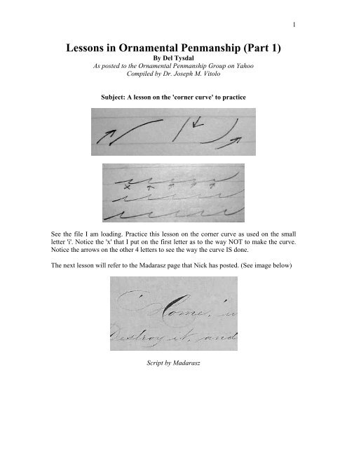
Lessons in Ornamental Penmanship (Part 1) - IAMPETH
Lessons in Ornamental Penmanship (Part 1) - IAMPETH
Lessons in Ornamental Penmanship (Part 1) - IAMPETH

Create successful ePaper yourself
Turn your PDF publications into a flip-book with our unique Google optimized e-Paper software.
<strong>Lessons</strong> <strong>in</strong> <strong>Ornamental</strong> <strong>Penmanship</strong> (<strong>Part</strong> 1)<br />
By Del Tysdal<br />
As posted to the <strong>Ornamental</strong> <strong>Penmanship</strong> Group on Yahoo<br />
Compiled by Dr. Joseph M. Vitolo<br />
Subject: A lesson on the 'corner curve' to practice<br />
See the file I am load<strong>in</strong>g. Practice this lesson on the corner curve as used on the small<br />
letter 'i'. Notice the 'x' that I put on the first letter as to the way NOT to make the curve.<br />
Notice the arrows on the other 4 letters to see the way the curve IS done.<br />
The next lesson will refer to the Madarasz page that Nick has posted. (See image below)<br />
Script by Madarasz<br />
1
Refer to Nick's post<strong>in</strong>g of Madarasz page, 'ome'<br />
I am post<strong>in</strong>g my analysis of the way that Madarasz wrote the word 'ome'. He probably did<br />
the 'o' <strong>in</strong> one stroke. The shade is somewhat darker than as used <strong>in</strong> other shaded letters<br />
(see the third down stoke <strong>in</strong> the small 'm'). This was an effect the penmen liked to used to<br />
even out the dark shade of the capital letter preced<strong>in</strong>g and tie the first letter after that<br />
shaded letter for better visual effect. The down shade on the 'o' is wonderful. Look at it<br />
with the magnify<strong>in</strong>g glass. It was slowly drawn with his foref<strong>in</strong>ger, no arm movement.<br />
After the 'o' Maddy probably lifted the pen and slid the paper to the left to get <strong>in</strong> the right<br />
position to f<strong>in</strong>ish the 'm’ and ‘e'. Penmen lifted their pen and slid their paper often (every<br />
3rd letter) so they would ma<strong>in</strong>ta<strong>in</strong> the same slant of all the letters on a s<strong>in</strong>gle l<strong>in</strong>e. (If the<br />
paper is not moved to the left, the arm will cause a significant change <strong>in</strong> slant from the<br />
beg<strong>in</strong>n<strong>in</strong>g of a l<strong>in</strong>e to its end).<br />
Madarasz wrote the 'm’ and ‘e' with no additional lifts. Notice the lighter shade on the<br />
third stroke of the 'm', the equal distance between the two portions of the 'm'.<br />
However, he blew it on the low cross<strong>in</strong>g of the small 'e'. He did not get enough lift from<br />
the third stroke of the 'm' to get a good corner curve. The cross<strong>in</strong>g of the 'e' at its bottom<br />
is too congested.<br />
My attempt at this 'ome' is posted with comments. I had to write the letters 22 times<br />
before I got it right. Practice these letters and really get to know the feel<strong>in</strong>g of how<br />
Madarasz wrote.<br />
The next lesson will be the word 'what', aga<strong>in</strong> <strong>in</strong> detail.<br />
2
The small 's' <strong>in</strong> sublime of L Madarasz<br />
Study this letter carefully <strong>in</strong> the Maddy letter as it is such a unique form. Maddy came up<br />
with this form much like an artistic designer would create someth<strong>in</strong>g new. No one before<br />
him had used this lovely style of letter and most viewers would not even notice how it<br />
was made. The arm moved the pen to the top of the 's' (a bit higher than a small 'i'). He<br />
used f<strong>in</strong>ger motion to br<strong>in</strong>g the pen down slowly and cause the down l<strong>in</strong>e to disappear<br />
<strong>in</strong>to the base l<strong>in</strong>e. NOTE: he did not connect the bottom to the upstroke. The 1/2 oval is<br />
put on with the pen without a lot of heav<strong>in</strong>ess, just enough to cause the illusion of a<br />
closed letter. It is a marvelous letter form.<br />
'sublime' from Madarasz page<br />
On this word Madarasz lifted his pen 3 times: after the 's', after the second part of the 'b'<br />
and also above the cross l<strong>in</strong>e of the 'l'. The pen lifts were to preserve slant and accuracy.<br />
He used a lot of arm movement between letters but <strong>in</strong> letters there was precise f<strong>in</strong>ger<br />
motion.<br />
3
Madarasz way of adjust<strong>in</strong>g the flange of an oblique<br />
Put the holder <strong>in</strong> your hand with the right thumb on top. With the left f<strong>in</strong>gers as shown,<br />
push up with the lower <strong>in</strong>dex f<strong>in</strong>ger and down with thumb to br<strong>in</strong>g the oblique up. This<br />
will help the nib 'skate' on the surface of the paper rather than dig <strong>in</strong>. Photo shown <strong>in</strong><br />
files.<br />
<strong>Ornamental</strong> <strong>Penmanship</strong> exercise ala Madarasz<br />
4
Just made a post for practice: sublimity<br />
The small 's' is higher than the 'i' form; each time Maddy lifted his pen he also slid the<br />
paper to the left. Notice the 7 to make the shade on the 't'. He used the curved end on the<br />
'y' as it was easier than mak<strong>in</strong>g a precise loop which had to cross exactly on the base l<strong>in</strong>e.<br />
And the curved end 'y' is just a bit of eye candy.<br />
The top of the 't' is just fun.<br />
5
3 Madarasz post<strong>in</strong>gs<br />
I have made 3 files for Madarasz writ<strong>in</strong>g as to how he f<strong>in</strong>ished the first l<strong>in</strong>e of the full<br />
page. Notice the 'x' I used to show where he lifted the pen and also slid the paper to the<br />
left. Notice the small 't' and 'd': he often would write to the height of the 'i' <strong>in</strong> each of<br />
those letters, lift the pen, and come down from the top. Note the right side of a figure '7'<br />
which is the way he would shade the top: fill<strong>in</strong>g the form.<br />
6