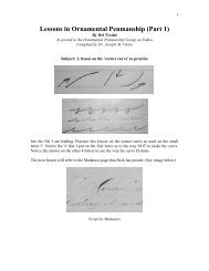
Brown, E.L - Lessons in Engrossing - IAMPETH
Brown, E.L - Lessons in Engrossing - IAMPETH
Brown, E.L - Lessons in Engrossing - IAMPETH

Create successful ePaper yourself
Turn your PDF publications into a flip-book with our unique Google optimized e-Paper software.
*Please refer to image posted <strong>in</strong> the follow<strong>in</strong>g message………Joe Vitolo<br />
Image 15<br />
Taken for The Educator, December 1953<br />
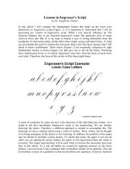
Lesson <strong>in</strong> Engross<strong>in</strong>g<br />
By EL <strong>Brown</strong><br />
The letter<strong>in</strong>g was adapted from several styles, <strong>in</strong>clud<strong>in</strong>g Church Text, Old English, and German Text.<br />
Study balance, proportion and masses, then lay off <strong>in</strong> pencil with special attention to uniform size and<br />
spac<strong>in</strong>g, The t<strong>in</strong>ted <strong>in</strong>itials add greatly to the effect of the design. Outl<strong>in</strong>e <strong>in</strong>itials very carefully. The t<strong>in</strong>t<strong>in</strong>g<br />
on the capital "H" is called simple, and that on "L" and "C" l<strong>in</strong>e t<strong>in</strong>t, done with the aid of a ruler<br />
Use Nos. 3 and 31/2 letter<strong>in</strong>g pens for the smaller letter<strong>in</strong>g. "Trim up" the letters and correct <strong>in</strong>accuracies<br />
here and there with a Gillott No. 170 pen, Add relief l<strong>in</strong>e,<br />
last, freehand except<strong>in</strong>g of course, the straight vertical l<strong>in</strong>es for which a ruler should be used.<br />
The flourish<strong>in</strong>g should be executed with the whole arm movement. Study the l<strong>in</strong>es <strong>in</strong> the flourish very<br />
carefully. Haphazard methods of practice will lead to failure every time.<br />
In some specimens we have see, the flourished part is devoid of merit. At the present time, penmen devote<br />
more time to letter<strong>in</strong>g and engross<strong>in</strong>g and less time to flourish<strong>in</strong>g. Skill and design<strong>in</strong>g acquired <strong>in</strong><br />
flourish<strong>in</strong>g can be used to advantage by engrossers.<br />
Remember that the light and shaded strokes must be properly arranged to atta<strong>in</strong> the desired effect. Suggest<br />
<strong>in</strong> pencil the general effect of the flourish by outl<strong>in</strong><strong>in</strong>g the bird and some of the pr<strong>in</strong>cipal strokes. Do not try<br />
to follow the pencil l<strong>in</strong>es exactly, but strive to have your pen work cover approximately the same space of<br />
pencil sketch, Us, a quick, offhand movement, but do not throw <strong>in</strong> a lot of l<strong>in</strong>es which mean little or<br />
noth<strong>in</strong>g <strong>in</strong> the effect of the design. Study, study, study-practice, practice, practice. Work hard, and criticize<br />
your work unmercifully. Accept criticism from others <strong>in</strong> a grateful manner.<br />
-------<br />
*Please refer to image posted <strong>in</strong> the follow<strong>in</strong>g message………Joe Vitolo<br />
Image 16<br />
Taken for The Educator, December 1953<br />
Lesson <strong>in</strong> Engross<strong>in</strong>g 'Display Letter<strong>in</strong>g'<br />
By EL <strong>Brown</strong><br />
Text letter<strong>in</strong>g is often embellished with flourished strokes, and, when well done, enhances the beauty of the<br />
letter<strong>in</strong>g. It is one matter to letter well and quite another to flourish well, hence it is ,of unusual to see the<br />
two I elmd<strong>in</strong>ed with a very displeas<strong>in</strong>g effect. The art of flourish<strong>in</strong>g should be an important part of an<br />
engrosser's tra<strong>in</strong><strong>in</strong>g. We have seen an engrosser work two hours on the flourish<strong>in</strong>g of a head<strong>in</strong>g, and we<br />
contend that the work could have been done <strong>in</strong> as many m<strong>in</strong>utes, and far better, by a skillful, offhand<br />
penman This statement will bear repeat<strong>in</strong>g. Learn to flourish well, and you will be able to save much time,<br />
<strong>in</strong>crease your earn<strong>in</strong>g power, and improve your work as a whole. It will put more symmetry <strong>in</strong> your curves,<br />
better harmony <strong>in</strong> color values, and more taste <strong>in</strong> ornamentation.
The compound head and base l<strong>in</strong>e curves for the word "Engross<strong>in</strong>g" were mad, freehand. It will be noticed<br />
that the l<strong>in</strong>es converge near end of the word. After mak<strong>in</strong>g the compound curved l<strong>in</strong>es to govern height of<br />
the letters and perpendicular l<strong>in</strong>es to keep letters from slant<strong>in</strong>g, roughly suggest the size and spac<strong>in</strong>g of the<br />
letters. Fellow same plan for the next l<strong>in</strong>e "Memorial Resolutions."<br />
Add the flourish<strong>in</strong>g last, and if this part of the work does not were out satisfactorily, not much labor will<br />
have been lost on the letter<strong>in</strong>g, and you can try aga<strong>in</strong> on the reverse side of the sheet.<br />
Study the arrangement of the light shaded strokes with care With a flexible, smooth runn<strong>in</strong>g pen <strong>in</strong> a<br />
straight holder, you are ready to beg<strong>in</strong>. Start to the right of <strong>in</strong>itial "E" and work toward the right, add<strong>in</strong>g the<br />
ma<strong>in</strong> shaded strokes first, mov<strong>in</strong>g the pen from left to right. A few ornaments may be used wherever they<br />
will add to the general effect. I do not, however, spoil the effect of boldness and symmetry of l<strong>in</strong>e by an<br />
overload<strong>in</strong>g of mean<strong>in</strong>gless l<strong>in</strong>es and dots.<br />
Use a No. 1 letter<strong>in</strong>g pen for the letter<strong>in</strong>g and observe uniform size and spac<strong>in</strong>g. Note carefully the f<strong>in</strong>ish of<br />
<strong>in</strong>itials "M" and "It". It will be necessary to pencil these letter, very accurately and they must be <strong>in</strong>ked <strong>in</strong><br />
the same manner. Rule the edges of the letters <strong>in</strong> word "Engross<strong>in</strong>g" and f<strong>in</strong>ish with a common pen.<br />
*Please refer to image posted <strong>in</strong> the follow<strong>in</strong>g message………Joe Vitolo<br />
Image <strong>Brown</strong>0018.jpg<br />
Taken from The Educator, December 1953<br />
Lesson <strong>in</strong> Engross<strong>in</strong>g<br />
By EL <strong>Brown</strong><br />
Rustic Letter<strong>in</strong>g & Flourish<strong>in</strong>g<br />
Rustic letter<strong>in</strong>g is quite effective and not difficult. It must be uniform <strong>in</strong> size and spac<strong>in</strong>g. Outl<strong>in</strong>es should<br />
be irregular and broken.<br />
The orig<strong>in</strong>al design measured 12 x 20 <strong>in</strong>ches, Pen work for reproduction should be made on a scale from<br />
1/3 to 1/2 larger than the desired pr<strong>in</strong>t<strong>in</strong>g plate.<br />
The flourish<strong>in</strong>g is given as am exercise to atta<strong>in</strong> command of the pen <strong>in</strong> offhand work, and it will serve, we<br />
believe, as art <strong>in</strong>terest<strong>in</strong>g study <strong>in</strong> l<strong>in</strong>e and color.<br />
Good flourish<strong>in</strong>g comprises skill, good design<strong>in</strong>g, balance, grace and beauty. To the engrosser of today, it<br />
has value for develop<strong>in</strong>g proficiency <strong>in</strong> offhand pen work and resolutions.<br />
First make a rough sketch of rustic letter<strong>in</strong>g giv<strong>in</strong>g special attention to the spac<strong>in</strong>g. This is a simple and<br />
effective style <strong>in</strong> l<strong>in</strong>e and stipple, and can be used with good effect for prom<strong>in</strong>ent words.<br />
Use India Ink. Outl<strong>in</strong>e with a No. 21/2 letter<strong>in</strong>g pen and f<strong>in</strong>ish with a Gillott No. 170 pen. Make the outl<strong>in</strong>e<br />
heavy, branches irregular and broken. Rule l<strong>in</strong>es to govern height of letters, and "block <strong>in</strong>" the l<strong>in</strong>es very<br />
roughly to f<strong>in</strong>d approximate space the letter<strong>in</strong>g will occupy. Letter freehand with a No. 2 and 1/2 pen,<br />
aim<strong>in</strong>g for regularity of size and spac<strong>in</strong>g. F<strong>in</strong>ish with a common pen.
*Please refer to image posted <strong>in</strong> the follow<strong>in</strong>g message………Joe Vitolo<br />
Image <strong>Brown</strong>0019.jpg<br />
Taken from The Educator, December 1953<br />
Lesson <strong>in</strong> Engross<strong>in</strong>g<br />
By EL <strong>Brown</strong><br />
Harmonious Pen Flourish<strong>in</strong>g<br />
This nest of birds is a typical <strong>Brown</strong> production and places him up <strong>in</strong> the ranks of the most artistic<br />
flourishes of all times.<br />
What charm and grace <strong>in</strong> a flourish when made by a master penman. While flourishes are some. what<br />
conventional, yet a good flourish will take one out among nature, <strong>in</strong>to the Held, trees and shrubbery. The<br />
little birds <strong>in</strong> our back yard hopp<strong>in</strong>g about <strong>in</strong> the v<strong>in</strong>es and limbs, Yes, to many of us there is as much art <strong>in</strong><br />
a well executed flourish as there is <strong>in</strong> an oil pa<strong>in</strong>t<strong>in</strong>g. There is skill and beauty <strong>in</strong> a flourish which is more<br />
than you can say of some modernistic oil pa<strong>in</strong>t<strong>in</strong>gs.<br />
Aside from the pleasure derived from flourish<strong>in</strong>g, it does <strong>in</strong>crease our skill <strong>in</strong> handl<strong>in</strong>g a pen and helps one<br />
<strong>in</strong> creat<strong>in</strong>g harmonious designs. Flourish<strong>in</strong>g works <strong>in</strong> well with engross<strong>in</strong>g and pen work and the engrosser<br />
is constantly us<strong>in</strong>g it.<br />
Have you noticed how the advertisers and commercial artists <strong>in</strong> the large popular magaz<strong>in</strong>es and<br />
advertis<strong>in</strong>g circulars, etc., are copy<strong>in</strong>g flourish<strong>in</strong>g as practiced by penmen? No, they are not produc<strong>in</strong>g a<br />
new type of design, just copy<strong>in</strong>g and mak<strong>in</strong>g slight changes- We are pleased to see so much flourish<strong>in</strong>g<br />
used, and the favorable way it is be<strong>in</strong>g accepted by the public. No doubt the user of the art of flourish<strong>in</strong>g<br />
will po<strong>in</strong>t out to penmen many new uses for flourish<strong>in</strong>g and many new ideas. More power to them if they<br />
help the art.<br />
*Please refer to image posted to the FILES section <strong>in</strong> the Arcangel folder referred to <strong>in</strong> the follow<strong>in</strong>g<br />
message………Joe Vitolo<br />
Image <strong>Brown</strong>22.jpg<br />
Taken from The Educator, December 1953<br />
Lesson <strong>in</strong> Engross<strong>in</strong>g<br />
By EL <strong>Brown</strong><br />
Decorative Scroll Work<br />
This simple decorative scroll shows how to get a beautiful effect with a m<strong>in</strong>imum of effort and time, On the<br />
less expensive jobs, you can use designs Patterned after this one and produce them at a profit. In place of<br />
the crosshatch and l<strong>in</strong>e offact, you can vary it considerably by us<strong>in</strong>g brush and color. Many borders or<br />
designs are beautiful but so complicated and elaborate requir<strong>in</strong>g so much labor and time that they can be<br />
used only <strong>in</strong> very high priced jobs.<br />
Use Paper or cardboard about BX13 <strong>in</strong>ch,, <strong>in</strong> size. Draw the border l<strong>in</strong>e 6 x 11 <strong>in</strong>ches. Divide the page <strong>in</strong>to<br />
three even vertical sections, us<strong>in</strong>g the first one for the <strong>in</strong>itial I and the scroll.
Divide this space <strong>in</strong>to four spaces, allow<strong>in</strong>g 3/4 <strong>in</strong>ches for top marg<strong>in</strong>, 3 <strong>in</strong>ches for <strong>in</strong>itial "1," 2 <strong>in</strong>ches each<br />
for the three spaces form<strong>in</strong>g the scroll, and 1 1/4 <strong>in</strong>ches for bottom marg<strong>in</strong>.<br />
Draw an oval for the Initial "I" and ovals <strong>in</strong> the three spaces for the scrolls, To l<strong>in</strong>e up the ovals, get balance<br />
and a gradual taper, draw a pencil center l<strong>in</strong>e and l<strong>in</strong>es on both sides of the scroll.<br />
Sketch the <strong>in</strong>itial "I" carefully, giv<strong>in</strong>g the form and f<strong>in</strong>ish of the scroll work critical attention. The color<br />
values are obta<strong>in</strong>ed with l<strong>in</strong>es, and a very few l<strong>in</strong>es. Crosshatch the background and use short parallel l<strong>in</strong>es<br />
for the scroll. Use a No. 2 letter<strong>in</strong>g pen for the Old English. Rule up word "Idleness," mak<strong>in</strong>g it larger than<br />
the rest of the letter<strong>in</strong>g. Aim for uniform size and spac<strong>in</strong>g.<br />
*Please refer to image posted to the FILES section <strong>in</strong> the Arcangel folder referred to <strong>in</strong> the follow<strong>in</strong>g<br />
message………Joe Vitolo<br />
Image <strong>Brown</strong>0023.jpg<br />
Taken from The Educator, December 1953<br />
Lesson <strong>in</strong> Engross<strong>in</strong>g<br />
By EL <strong>Brown</strong><br />
Roses Adapted to Engross<strong>in</strong>g<br />
Sprays of roses and leaves are very decorative and can be used with pleas<strong>in</strong>g effect on memorial<br />
resolutions, and also on many commercial designs.<br />
Make a pencil draw<strong>in</strong>g cry roughly at first, giv<strong>in</strong>g special attention to balance and arrangement of masses,<br />
these be<strong>in</strong>g two important features of any de, sign. Follow with detail suggest<strong>in</strong>g the color values. Criticize<br />
your pencil draw<strong>in</strong>g before add<strong>in</strong>g the <strong>in</strong>k. Use India <strong>in</strong>k, which is easy flow<strong>in</strong>g and waterproof. Gillott No.<br />
170 Pen should be used for the very f<strong>in</strong>e l<strong>in</strong>es and a stub pen for the coarse strokes. Study the arrangement<br />
and thickness of l<strong>in</strong>es used to produce the various color values, and note that the deepest shadows occur<br />
near the roses Work carefully and avoid carelessness, which is a sure road to failure. Use Ch<strong>in</strong>ese white I, a<br />
clean pen <strong>in</strong> stippl<strong>in</strong>g and l<strong>in</strong><strong>in</strong>g the solid black.<br />
The letter<strong>in</strong>g was executed freehand, except<strong>in</strong>g the words "Commercial Design<strong>in</strong>g," which were ruled and<br />
po<strong>in</strong>ted up with a common pen. Uniform size adds spac<strong>in</strong>g must be observed <strong>in</strong> all styles of letter<strong>in</strong>g. Pen<br />
technique must be mastered by every ambitious designer or engrosser.<br />
This load of a design is beautiful when skillfully rendered <strong>in</strong> black and white and still more beautiful <strong>in</strong><br />
colors. Study some of the beautiful draw<strong>in</strong>gs of roses for color values and design<strong>in</strong>g and ideas.<br />
*Please refer to image posted to the FILES section <strong>in</strong> the Arcangel folder referred to <strong>in</strong> the follow<strong>in</strong>g<br />
message………Joe Vitolo<br />
Images <strong>Brown</strong>0024.jpg and <strong>Brown</strong>0025.jpg<br />
Taken from The Educator, December 1953<br />
Lesson <strong>in</strong> Engross<strong>in</strong>g
By EL <strong>Brown</strong><br />
Illum<strong>in</strong>ation and Color<br />
ILLUMINATION<br />
This lesson is given as a study <strong>in</strong> pen technique and design<strong>in</strong>g. A very carefully executed pencil draw<strong>in</strong>g is<br />
the first step, and we would urge the importance of grace and symmetry <strong>in</strong> the curves, and proper<br />
arrangement of color values. Make your design larger than the engraved copy.<br />
Outl<strong>in</strong>e scroll work with a No. 5 broad pen, and a No. 170 Gillott pen will be satisfactory for the tone<br />
values. Very little crosshatch<strong>in</strong>g will be necessary as all the various tones of light and shade may be<br />
obta<strong>in</strong>ed by us<strong>in</strong>g th<strong>in</strong> or thick l<strong>in</strong>es either openly or closely spaced, accord<strong>in</strong>g to the ton, value desired.<br />
The <strong>in</strong>itial "It" should be darker <strong>in</strong> tone than the rest of the design. Use short thick, parallel l<strong>in</strong>es for scroll<br />
work on <strong>in</strong>itial, leav<strong>in</strong>g the high lights properly placed. Rema<strong>in</strong>der of "R." solid black Ch<strong>in</strong>ese white may<br />
be used for reitouch<strong>in</strong>g.<br />
Illum<strong>in</strong>ated letter<strong>in</strong>g is used for the more expensive jobs of engross<strong>in</strong>g and is most effective and pleas<strong>in</strong>g <strong>in</strong><br />
color harmony.<br />
You need an outfit consist<strong>in</strong>g of a draw<strong>in</strong>g board, T-square, letter<strong>in</strong>g pens, rul<strong>in</strong>g pen, bristol board or<br />
Whatman's paper, pencils 3H and 4H, brushes numbered from 7 down to 1 or 0 for f<strong>in</strong>e tracery, colors<br />
alizarian crimson, ,,halt blue and aurora yellow, or similar colors of the primary group and India <strong>in</strong>k.<br />
Great care and study will be necessary <strong>in</strong> plac<strong>in</strong>g the parts of the design to obta<strong>in</strong> correct forms and<br />
proportions. Symmetrical curve, and balance of masses will produce harmony and beauty. A pencil<br />
draw<strong>in</strong>g <strong>in</strong> detail is necessary for satisfactory result,. Lay off design about 13 x 15 <strong>in</strong>ches everall. Initial<br />
"It" stands 3 1/2, <strong>in</strong>ches high, rema<strong>in</strong><strong>in</strong>g letters 1 1/2 <strong>in</strong>ches, Rest of letter<strong>in</strong>g <strong>in</strong> relative proportions. Make<br />
a carefully executed<br />
draw<strong>in</strong>g of pr<strong>in</strong>ciple l<strong>in</strong>es of letter<strong>in</strong>g. The lower-case or small letters are roughly penciled for spac<strong>in</strong>g<br />
only. All letter<strong>in</strong>g was done <strong>in</strong> waterproof <strong>in</strong>k with <strong>in</strong>itials "C" and "P" and word "Rotary" outfired with a<br />
thick l<strong>in</strong>e<br />
COLOR<br />
This is the most <strong>in</strong>terest<strong>in</strong>g also the most particular part of the work on the design.<br />
First outl<strong>in</strong>e scroll work <strong>in</strong> pale blue obta<strong>in</strong>ed by mix<strong>in</strong>g a small quantity of blue with considerable water.<br />
Follow pencil outl<strong>in</strong>es very carefully, then erase all pencil l<strong>in</strong>es before add<strong>in</strong>g color. The various colors and<br />
t<strong>in</strong>ts used are as follows: Deep red, p<strong>in</strong>k, orange and green. The stalk to which the conventional flowers are<br />
attached is a yellowish green. The scrolls alternate <strong>in</strong> red and yellow: for <strong>in</strong>stance, the scroll at left at word<br />
"deal<strong>in</strong>g", <strong>in</strong> fifth l<strong>in</strong>e of text, is yellow with shades of deep red and p<strong>in</strong>k; next one below <strong>in</strong> deep red and<br />
p<strong>in</strong>k and so on to the end at the lower righthand cancer. If the red when applied seems crude add a touch of<br />
blue or white, but not enough to dead,, its brilliancy. A touch of red <strong>in</strong> your yellow will sometimes add<br />
ref<strong>in</strong>ement to the color effect, but remember <strong>in</strong> all ... as the color must be brilliant and "snappy." Note the<br />
tone values critically and aim for Variety.<br />
After apply<strong>in</strong>g the different washes add the deeper tones here and there especially where the scroll work<br />
entw<strong>in</strong>es the stalk. Now your work will beg<strong>in</strong> to show character and strength. The tracery was made with a<br />
f<strong>in</strong>e brush, and <strong>in</strong> same <strong>in</strong>stances a f<strong>in</strong>e pen. Outl<strong>in</strong>e scroll work with a heavy black l<strong>in</strong>e. There are other<br />
f<strong>in</strong>e l<strong>in</strong>e, <strong>in</strong> orange t<strong>in</strong>t which do not show up well <strong>in</strong> the engraved plate. Initials "C" and "P" and top <strong>in</strong>
shades of blue outl<strong>in</strong>ed <strong>in</strong> black. Initial "R" <strong>in</strong> shades of blue, with white dots added with a common Pen<br />
and Ch<strong>in</strong>ese white. Other letters of word <strong>in</strong> shades of p<strong>in</strong>k and deep blue also dotted with Ch<strong>in</strong>ese white.<br />
Use India <strong>in</strong>k and never common writ<strong>in</strong>g fluids for per draw<strong>in</strong>g.<br />
Background of <strong>in</strong>itial "R" <strong>in</strong> gold leaf, also the Rotary wheel. Any sign po<strong>in</strong>ter can tell you how to apply<br />
gold leaf and can do it for you. The surface is first sized, then leaves of gold added. Be very careful <strong>in</strong><br />
add<strong>in</strong>g the siz<strong>in</strong>g to cover the exact space the gold is to occupy. You can also use water color gold, shell<br />
gold is best, but of course gold leaf is much richer <strong>in</strong> effect and not subject to change <strong>in</strong> color.<br />
*Please refer to image posted to the FILES section <strong>in</strong> the Arcangel folder referred to <strong>in</strong> the follow<strong>in</strong>g<br />
message………Joe Vitolo<br />
Images <strong>Brown</strong>0026.jpg<br />
Taken from The Educator, December 1953<br />
Letter<strong>in</strong>g and Pen Draw<strong>in</strong>g<br />
By EL <strong>Brown</strong><br />
Send<strong>in</strong>g holiday greet<strong>in</strong>gs to friends has become a most popular custom, and it is rather an effective and<br />
<strong>in</strong>expensive way of express<strong>in</strong>g friendship and remembrance.<br />
The sentiment expressed is most important and it often is difficult to f<strong>in</strong>d stock cards with word<strong>in</strong>g suitable<br />
for special occasions or circumstances.<br />
The word<strong>in</strong>g of this card and design make it appropriate for Christmas. The decorative <strong>in</strong>itial "B" is<br />
<strong>in</strong>terest<strong>in</strong>g <strong>in</strong> effect and must be drawn carefully with a pencil, Study the color values produced by thick<br />
and th<strong>in</strong> l<strong>in</strong>es and solid black. Use a f<strong>in</strong>e pen for the leaves and a coarser one for background of <strong>in</strong>itial.<br />
Avoid common writ<strong>in</strong>g <strong>in</strong>ks for pen draw<strong>in</strong>g-use India <strong>in</strong>k for satisfactory results. Do not outl<strong>in</strong>e letters <strong>in</strong><br />
pencil, but roughly suggest the form for the spac<strong>in</strong>g. Use a number 2 1/2 and 1 1/2 pen for larger letter<strong>in</strong>g.<br />
The relief l<strong>in</strong>e adds to the f<strong>in</strong>ish and general effect.<br />
*Please refer to image posted to the FILES section <strong>in</strong> the Arcangel folder referred to <strong>in</strong> the follow<strong>in</strong>g<br />
message………Joe Vitolo<br />
Images <strong>Brown</strong>0027.jpg<br />
Taken from The Educator, December 1953<br />
Illum<strong>in</strong>ation<br />
By EL <strong>Brown</strong><br />
You will need good material and tools. Aside from the draw<strong>in</strong>g board, T-square, rul<strong>in</strong>g pens, pencils,<br />
trac<strong>in</strong>g paper, etc., the gold grounds, three or four red sable brushes, which have a pencil po<strong>in</strong>t when filled<br />
with color.
Color: Gamboge, cadmium yellow, lemon yellow, crimson lake, rose madder, Indian red, vermilion, cobalt,<br />
Prussian blue, Hooker's green No. 2, burnt sienna, Vandyck brown, yellow core, lamp black and Ch<strong>in</strong>ese<br />
white.<br />
Gold which is the most convenient to use is called "shell gold" as it can be applied with brush like ord<strong>in</strong>ary<br />
color, and will sh<strong>in</strong>e when burnished.<br />
Alum<strong>in</strong>um is used <strong>in</strong> preference to silver, as it never changes its luster and silver turns black after a time.<br />
Parchment or sheepsk<strong>in</strong>, is used for the best illum<strong>in</strong>ated work, but beg<strong>in</strong>ners should not attempt to work on<br />
parchment until they have had considerable experience <strong>in</strong> illum<strong>in</strong>at<strong>in</strong>g on paper. Sheepsk<strong>in</strong> must be treated<br />
to remove the oil before attempt<strong>in</strong>g to work on it with <strong>in</strong>k, otherwise the <strong>in</strong>k will run and not stay <strong>in</strong> place.<br />
Magnesium, when rubbed once or twice over the ski, like a, eraser, will remove the oil and not spoil the<br />
surface.<br />
The student must bear <strong>in</strong> m<strong>in</strong>d that the beauty of illum<strong>in</strong>ated work is lost <strong>in</strong> reproduction, even the relative<br />
color values cannot always be shown <strong>in</strong> the black and white reproductions.<br />
First, lay off the <strong>in</strong>itial R <strong>in</strong> pencil, and aim to obta<strong>in</strong> good draw<strong>in</strong>g and proportions. When the sketch is<br />
f<strong>in</strong>ished, transfer to the draw<strong>in</strong>g paper by the usual trac<strong>in</strong>g process. Mix the colors as follows: For the<br />
purple, use Prussian blue and rose madder, and add Ch<strong>in</strong>ese white to give that raised velvety effect. Red,<br />
vermilion, and rose madder toned with Ch<strong>in</strong>ese white. The green should be of the pale olive shade,<br />
obta<strong>in</strong>ed by mix<strong>in</strong>g yellow ocre and Prussian blue. Shell gold was used on this <strong>in</strong>itial, applied with a brush<br />
as previously expla<strong>in</strong>ed.<br />
In apply<strong>in</strong>g the color it is necessary to obta<strong>in</strong> evenness of tone, and <strong>in</strong> order to acquire this result, it is<br />
necessary to handle the color quickly. Do not let the edges dry before the color is carried to its proper place.<br />
The color should dry with a flat, velvety surface, and be free from streaks and spots. Cut the colors <strong>in</strong> with<br />
clear black l<strong>in</strong>e,. Use rul<strong>in</strong>g pen and square for all straight l<strong>in</strong>es. A letter<strong>in</strong>g pen, Number 5, can also be<br />
used <strong>in</strong> the place of the rul<strong>in</strong>g pen. Add the white l<strong>in</strong>es last.<br />
We trust that these few suggestions will at least <strong>in</strong>terest you <strong>in</strong> this fasc<strong>in</strong>at<strong>in</strong>g art, and we will add that<br />
actual practice will do more for you than anyth<strong>in</strong>g else. No matter how many essays you may read on the<br />
subject, you absolutely need the actual experience.<br />
*Please refer to image posted to the FILES section <strong>in</strong> the Arcangel folder referred to <strong>in</strong> the follow<strong>in</strong>g<br />
message………Joe Vitolo<br />
Image <strong>Brown</strong>0028.jpg<br />
Taken from The Educator, December 1953<br />
Rapid Practical Letter<strong>in</strong>g<br />
By EL <strong>Brown</strong><br />
This style is based on the Roman alphabet and is recommended as a most practical style for purpose, where<br />
speed and legibility count for more than accuracy or artistic f<strong>in</strong>ish.<br />
Rule l<strong>in</strong>es for height about one <strong>in</strong>ch apart and also vertical l<strong>in</strong>es to prevent slop<strong>in</strong>g letters. Use pencil only<br />
to <strong>in</strong>dicate general size and spac<strong>in</strong>g of letters. A letter<strong>in</strong>g pen No. 2 was used for alphabet. The th<strong>in</strong> stroke
of the letter represents the width of pen, two strokes be<strong>in</strong>g required for thick part of letters. This letter<br />
requires no touch<strong>in</strong>g, and its accuracy must depend entirely upon your skill <strong>in</strong>stead of any mechanical<br />
devices whatever. Good spac<strong>in</strong>g and good form are, of course, highly essential for best results. A No. 5<br />
broad po<strong>in</strong>ted pen was used for the smaller letter<strong>in</strong>g.<br />
S<strong>in</strong>ce the Roman alphabet is the foundation of most letterforms, it is highly important that engrossers make<br />
a careful study of it. This can be done by pencil<strong>in</strong>g a standard Roman alphabet large and carefully.<br />
Use a tough good piece of cardboard that will stand plenty of eras<strong>in</strong>g. Mark off <strong>in</strong> pencil the marg<strong>in</strong>al l<strong>in</strong>es<br />
ad head and base l<strong>in</strong>es. Lightly suggest the position and size of the entire alphabet. You can then spend<br />
considerable time <strong>in</strong> perfect<strong>in</strong>g each letter. This will mean a lot of <strong>in</strong>telligent study and much eras<strong>in</strong>g and<br />
redraw<strong>in</strong>g, but it will be worth it.<br />
The <strong>in</strong>itial "A" is highly decorative and will afford considerable careful study. First, sketch <strong>in</strong> pencil,<br />
aim<strong>in</strong>g for balance and action, then follow with a detail draw<strong>in</strong>g, suggest<strong>in</strong>g color values.<br />
Aim for strong, vigorous l<strong>in</strong>es <strong>in</strong> your color tones, vary<strong>in</strong>g the thickness of spac<strong>in</strong>g of l<strong>in</strong>es to produce the<br />
different gradations of light and shade. Observe how effectively the leaves melt <strong>in</strong>to the solid background.<br />
Try your hand on a similar design, mak<strong>in</strong>g changes here and there to suit the purpose required. Aim for<br />
strength and contrast <strong>in</strong> render<strong>in</strong>g color values. Balance and action are important requisites <strong>in</strong> any design.<br />
*Please refer to image posted to the FILES section <strong>in</strong> the Arcangel folder referred to <strong>in</strong> the follow<strong>in</strong>g<br />
message………Joe Vitolo<br />
Image <strong>Brown</strong>0029.jpg<br />
Taken from The Educator, December 1953<br />
Pla<strong>in</strong> Letters<br />
By EL <strong>Brown</strong><br />
The spray of wild roses was first carefully sketched <strong>in</strong> pencil, with special attention given to the<br />
arrangement of the masses, balsam, and color values. Aim for an easy, natural effect. Next, lay off the<br />
alphabet, mak<strong>in</strong>g letters about lit <strong>in</strong>ches high. Study the form and character of the letters with card, aim<strong>in</strong>g<br />
for uniform size and spac<strong>in</strong>g.<br />
Use India <strong>in</strong>k and Gillott 170 pen for the f<strong>in</strong>e l<strong>in</strong>es on the roses, and coarser pens for the darkest tones <strong>in</strong><br />
the leaves and background, lower part of panel, obta<strong>in</strong>ed by mak<strong>in</strong>g short parallel l<strong>in</strong>es varied <strong>in</strong> direction<br />
and thickness. Study quality of l<strong>in</strong>es used <strong>in</strong> treat<strong>in</strong>g the various color values. Thicken and crosshatch the<br />
l<strong>in</strong>es for the darker tones, leav<strong>in</strong>g the white paper for the high lights. The background around <strong>in</strong>itial "A"<br />
was po<strong>in</strong>ted <strong>in</strong> with a brush, and when perfectly dry the l<strong>in</strong>es added were added with Ch<strong>in</strong>ese white and a<br />
common pen.<br />
The alphabet was written with a No. 2 broad pen, and the ma<strong>in</strong> strokes built up and slight <strong>in</strong>accuracies here<br />
and there corrected with a common pen. Add the relief l<strong>in</strong>es after the letters are otherwise completed. The<br />
smaller letter<strong>in</strong>g was written with a No. 3 pen and f<strong>in</strong>ished with a common pen. Uniform size and spac<strong>in</strong>g<br />
must be observed.<br />
We believe you will derive much profit by giv<strong>in</strong>g this design careful attention.
We are glad to see dur<strong>in</strong>g the past few years that commercial artists, magaz<strong>in</strong>e editors, and advertis<strong>in</strong>g men<br />
have found new uses for flourish<strong>in</strong>g for decorative purposes. Their designs have been borrowed from the<br />
work of penmen.<br />
Flourish<strong>in</strong>g is, therefore, practical enough to attract the attention of these practical men of the advertis<strong>in</strong>g<br />
and art world. A well-designed and skillfully executed flourish will always attract persons of artistic<br />
<strong>in</strong>cl<strong>in</strong>ations.<br />
*Please refer to image posted to the FILES section <strong>in</strong> the Arcangel folder referred to <strong>in</strong> the follow<strong>in</strong>g<br />
message………Joe Vitolo<br />
Image <strong>Brown</strong>30.jpg<br />
Taken from The Educator, December 1953<br />
Wash Draw<strong>in</strong>g and Engross<strong>in</strong>g<br />
By EL <strong>Brown</strong><br />
A specimen of moderately priced engross<strong>in</strong>g. Lay off the entire word<strong>in</strong>g on a sheet 18 x 23 <strong>in</strong>ches, or<br />
smaller. It may bother you some to make word<strong>in</strong>g "come out right" and you must not become discouraged<br />
if you f<strong>in</strong>d it necessary to make several trials before you f<strong>in</strong>ally succeed.<br />
Exercise care to have rul<strong>in</strong>g for script uniform. Pencil the head<strong>in</strong>g Salt Spr<strong>in</strong>gs Solar Coarse Salt Co., and<br />
Jonathan Gosman, Wynkoop very carefully before add<strong>in</strong>g the <strong>in</strong>k; also <strong>in</strong>itial W and ornaments.<br />
Watercolor shades are <strong>in</strong> purple.<br />
The strength and general effect of the piece is lost <strong>in</strong> engrav<strong>in</strong>g.<br />
Good script can be used quite extensively by most engrossers for fill<strong>in</strong>g <strong>in</strong> dates and for the body of many<br />
pieces of work. The use to which you can put it will depend upon how well you can write it.<br />
*Please refer to image posted to the FILES section <strong>in</strong> the Arcangel folder referred to <strong>in</strong> the follow<strong>in</strong>g<br />
message………Joe Vitolo<br />
Image <strong>Brown</strong>32.jpg<br />
Taken from The Educator, December 1953<br />
Advertis<strong>in</strong>g Design<br />
By EL <strong>Brown</strong><br />
There is an ever <strong>in</strong>creas<strong>in</strong>g demand for pen and <strong>in</strong>k designs for commercial advertis<strong>in</strong>g. The design shown<br />
on follow<strong>in</strong>g page is suitable for a circular and speaks for itself as a specimen of decorative pen work The
color effect, were obta<strong>in</strong>ed by a comb<strong>in</strong>ation of l<strong>in</strong>e and stipple and the result is rather pleas<strong>in</strong>g. The scroll<br />
work is made up of conventionalized natural forms <strong>in</strong>clud<strong>in</strong>g the lion rampant, and grace harmony and<br />
balance are important factors for consideration. Offhand flourish<strong>in</strong>g has helped us greatly <strong>in</strong> our decorative<br />
pen draw<strong>in</strong>g.<br />
Lay off the design on a piece of th<strong>in</strong> paper, mak<strong>in</strong>g changes here and there until the picture "hangs<br />
together," then trace it on a piece of cardboard, and after a ref<strong>in</strong>ed pencil draw<strong>in</strong>g is obta<strong>in</strong>ed you will be<br />
ready for the pen work. Outl<strong>in</strong>e scroll work with a rather coarse pen, us<strong>in</strong>g a f<strong>in</strong>e pen for shade l<strong>in</strong>es. Study<br />
effects very closely and work <strong>in</strong> a most careful and pa<strong>in</strong>stak<strong>in</strong>g way. Use small uniformly spaced dots for<br />
background, deepen<strong>in</strong>g the tone here and there by us<strong>in</strong>g small irregularly spaced stipple. The head of<br />
M<strong>in</strong>erva is quite effectively and simply done <strong>in</strong> shaded and f<strong>in</strong>e l<strong>in</strong>es.<br />
Aside from the two words, Diplomas and Certificates, the letter<strong>in</strong>g is a freehand style recommended for its<br />
neatness and legibility.<br />
*Please refer to image posted to the FILES section <strong>in</strong> the Arcangel folder referred to <strong>in</strong> the follow<strong>in</strong>g<br />
message………Joe Vitolo<br />
Image <strong>Brown</strong>34.jpg<br />
Taken from The Educator, December 1953<br />
Cover Pages<br />
By EL <strong>Brown</strong><br />
The most prom<strong>in</strong>ent l<strong>in</strong>e, "The Educator," <strong>in</strong> bold script, with white letter, shaded heavily, gives both relief<br />
and contrast to the t<strong>in</strong>ted background. The oak branch cuts through the design diagonally and was mad,<br />
after a water color sketch of a twig plucked from an oak rise. The character of the leaves must be studied<br />
very carefully.<br />
First, make a pencil draw<strong>in</strong>g with color values suggested. On all draw<strong>in</strong>gs to be reproduced by z<strong>in</strong>c etched<br />
process, a jet black <strong>in</strong>k must be used.<br />
Note carefully, thickness and direction of l<strong>in</strong>es used for values and follow the rule of light on dark or the<br />
reverse for effective results. You will observe that the graduation of tone <strong>in</strong> background was handled <strong>in</strong> a<br />
way <strong>in</strong> prevent "spott<strong>in</strong>ess" which is no disastrous to an effective picture.<br />
The background of word "Educator" is deeper <strong>in</strong> tone to give desired relief to the letters. Thicken l<strong>in</strong>es or<br />
crosshatch them where deeper tones are required, either on the oak leave, , background. Aim for correct<br />
color values and note quality, spac<strong>in</strong>g, and direction of l<strong>in</strong>e, used <strong>in</strong> atta<strong>in</strong><strong>in</strong>g desired effect.<br />
The solid black letters were made with a No. 2 broad pen and retouched with a f<strong>in</strong>e pen. Decorative white<br />
was also used.<br />
Pen technique is more difficult to mister than brush and color, but young pen workers will f<strong>in</strong>d it to their<br />
advantage to handle skillfully all the various medium, of expression.<br />
The design shown was made for a front cover and is appropriate for any of the w<strong>in</strong>ter months ow<strong>in</strong>g to its<br />
effect of snow and ice.
Lay off the design larger than the space it occupies on the cover. The proportions must be correct, however.<br />
Size of orig<strong>in</strong>al design on the cover is 11 x 15.<br />
A good pencil sketch is the first step, aim<strong>in</strong>g for proportion and balance and suggest<strong>in</strong>g color values.<br />
Use India Ink - never writ<strong>in</strong>g fluid for tak<strong>in</strong>g <strong>in</strong> pen draw<strong>in</strong>gs. All draw<strong>in</strong>gs for me etch<strong>in</strong>g must be<br />
executed <strong>in</strong> jet black <strong>in</strong>k, as weak, bluish l<strong>in</strong>es will not reproduce satisfactorily.<br />
Deepest shadows are at the disappear<strong>in</strong>g po<strong>in</strong>t <strong>in</strong> the river and at the water's edge. Use a l<strong>in</strong>e po<strong>in</strong>ted pen <strong>in</strong><br />
treat<strong>in</strong>g light and shade, except<strong>in</strong>g for deepest shadows, where a coarser po<strong>in</strong>t will be better. The<br />
foreground trees are birch, the snow-covered trees, p<strong>in</strong>e or spruce, Try to represent snow by f<strong>in</strong>e pen<br />
strokes leav<strong>in</strong>g white cardboard for highest lights. It is permissible to so Ch<strong>in</strong>ese White spar<strong>in</strong>gly if<br />
necessary.<br />
The letter<strong>in</strong>g <strong>in</strong> lower left-hand corner serve, as a balance for river at the right. Uniform size and spac<strong>in</strong>g<br />
must be observed. The stippled background gives an <strong>in</strong>terest<strong>in</strong>g tonal value and relieves the "papery"<br />
effect, so called by artists.<br />
*Please refer to image posted to the FILES section <strong>in</strong> the Arcangel folder referred to <strong>in</strong> the follow<strong>in</strong>g<br />
message………Joe Vitolo<br />
Image <strong>Brown</strong>11.jpg<br />
Taken from The Educator, December 1953<br />
Album Page<br />
By EL <strong>Brown</strong><br />
The <strong>in</strong>itial "A" "America's Greatest Man" is quite decorative and a good no to study and imitate, It ,, be<br />
treated <strong>in</strong> many different techniques of pen and brush, By us<strong>in</strong>g flat washes or color, pleas<strong>in</strong>g effects can be<br />
secured with little effort.<br />
There are many ways of slightly chang<strong>in</strong>g the design to produce a variety of similar designs.<br />
In us<strong>in</strong>g a design as a model, learn to copy the general idea rather than copy<strong>in</strong>g it <strong>in</strong> detail. Your f<strong>in</strong>ished<br />
design should be so different that it looks like an entirely new creation.<br />
Be careful to get symmetry, color values, and good graceful form. The various leaves, stems, and<br />
ornaments must be properly located for spac<strong>in</strong>g and balance. Study the general direction and movement of<br />
each scroll.<br />
Use constructional l<strong>in</strong>es and ovals <strong>in</strong> lay<strong>in</strong>g out the foundation of your design. You can divide the "A"<br />
scroll <strong>in</strong>to about four parts or square, to locate the ma<strong>in</strong> ovals and curves.<br />
Use waterproof Indian <strong>in</strong>k for scroll work especially where color or washes are used. Avoid <strong>in</strong>ks that smear<br />
and are not permanent.
Add background of <strong>in</strong>itial "A" first, us<strong>in</strong>g a rul<strong>in</strong>g pen, and T-square. Aim for uniform spac<strong>in</strong>g of l<strong>in</strong>es,<br />
giv<strong>in</strong>g special attention to color values. Thicken the l<strong>in</strong>es for the darker tones. Outl<strong>in</strong>e scroll work and<br />
<strong>in</strong>itial with a heavy l<strong>in</strong>e.<br />
The smaller letter<strong>in</strong>g was executed with a broad pen and f<strong>in</strong>ished with a f<strong>in</strong>e po<strong>in</strong>ted pen. Dip <strong>in</strong>k<br />
spar<strong>in</strong>gly. Use an open mouthed <strong>in</strong>kwell to see amount of <strong>in</strong>k dipped, thus avoid<strong>in</strong>g an overflow of <strong>in</strong>k<br />
from the pen.<br />
Pencil the <strong>in</strong>itial "A" and the l<strong>in</strong>e "America's Greatest Man", aim<strong>in</strong>g for accuracy of form, size, and<br />
spac<strong>in</strong>g.<br />
The <strong>in</strong>itial letter and the word "Whereas," from a page from a, album, were carefully penciled and then<br />
outl<strong>in</strong>ed with waterproof <strong>in</strong>k. The brush work was done <strong>in</strong> green by a mixture of Payne's gray and Hooker's<br />
Green No. 2 with but very little of the former. The letter<strong>in</strong>g was done with a broad po<strong>in</strong>ted pen without<br />
outl<strong>in</strong><strong>in</strong>g, and even without first suggest<strong>in</strong>g spac<strong>in</strong>g with a pencil. In work of this sort exactness of detail is<br />
of less importance than uniform space between letters and words. Aim for a good general effect <strong>in</strong> color,<br />
and right proportions so that the design will look solid and balanced.