

IntegralUI TreeListView User Guide - Lidor Systems
IntegralUI TreeListView User Guide - Lidor Systems
IntegralUI TreeListView User Guide - Lidor Systems

Create successful ePaper yourself
Turn your PDF publications into a flip-book with our unique Google optimized e-Paper software.
[C#]<br />
// Set the StyleFromParent to False, so that<br />
// a specific style changes be applied<br />
node.StyleFromParent = false;<br />
// Change the look of the node, when it is in normal state<br />
node.NormalStyle.BackColor = Color.LightGreen;<br />
node.NormalStyle.BorderColor = Color.LimeGreen;<br />
// Change the look of the node, when it is in hovered state<br />
node.HoverStyle.BackColor = Color.LightSalmon;<br />
node.HoverStyle.BorderColor = Color.Salmon;<br />
node.HoverStyle.FillStyle = FillStyle.Vertical;<br />
// Repaing the control<br />
this.treeListView1.Invalidate();<br />
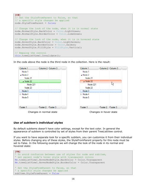
In the code above the node is the third node in the collection. Here is the result:<br />
Changes in normal state Changes in hover state<br />
Use of subitem’s individual styles<br />
By default subitems doesn’t have color settings, except for the text color. In general the<br />
appearance of subitem is controlled by set of styles from their parent <strong>TreeListView</strong> control.<br />
If you want to have separate look for a specific subitem, you can customize it from their individual<br />
styles. Before changing any of these styles, the StyleFromParent property for this node must be<br />
set to False. In the following example we will change the look of the node in its normal and<br />
hovered state:<br />
[VB]<br />
' To avoid confusion between use of styles for node and subitem,<br />
' set parent node's hover style with transparent colors<br />
Me.treeListView1.HoverNodeStyle.BackColor = Color.Transparent<br />
Me.treeListView1.HoverNodeStyle.BorderColor = Color.Transparent<br />
' Set the StyleFromParent to False, so that<br />
' a specific style changes be applied<br />
subItem.StyleFromParent = False<br />
18
 Change language