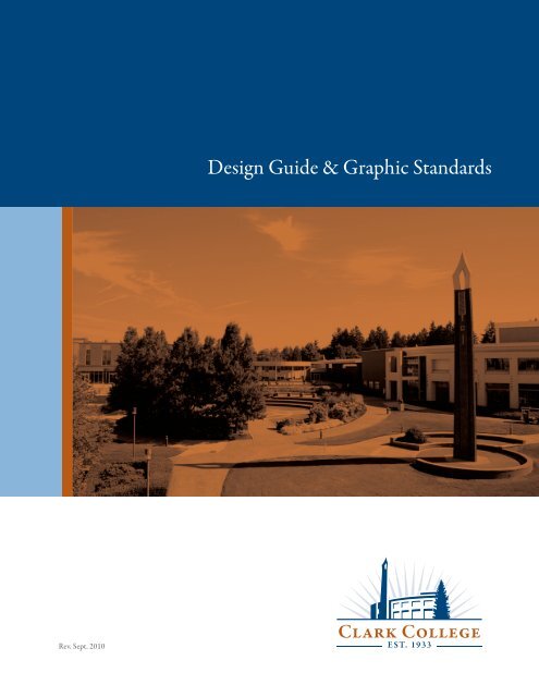
Design Guide & Graphic Standards - Clark College
Design Guide & Graphic Standards - Clark College
Design Guide & Graphic Standards - Clark College

You also want an ePaper? Increase the reach of your titles
YUMPU automatically turns print PDFs into web optimized ePapers that Google loves.
Rev. Sept. 2010<br />
<strong>Design</strong> <strong>Guide</strong> & <strong>Graphic</strong> <strong>Standards</strong>
<strong>Clark</strong> <strong>College</strong> Style <strong>Guide</strong><br />
This guide is a general reference tool for applying a consistent look, feel and tone<br />
for all of <strong>Clark</strong> <strong>College</strong>’s communication needs involving the usage of the “Bright<br />
Future” logo.<br />
Consistent application of the college logo assists to convey a look that is uniquely<br />
<strong>Clark</strong> and helps to build brand equity, as well as increase brand recognition. You<br />
will find guidance for color, typefaces, sizing and layouts.<br />
Any questions relating to <strong>Clark</strong> <strong>College</strong>’s graphic identity program and the<br />
production of publications or Website should be addressed to:<br />
Office of Communications and Marketing<br />
360-992-2219<br />
To download the logos in various formats, publication templates, as well as a copy<br />
of this style guide, please go to: www.clark.edu/brightfuturelogo.
The <strong>Clark</strong> <strong>College</strong> Bright Future Logo<br />
Logomark<br />
Logotype
Preferred Usage<br />
The sun ray should be set at 10% screen if placing on white or light background.<br />
One color<br />
Black and white<br />
Two color<br />
Reverse Logos<br />
Should be used on a black or dark-color background (black or blue preferred). The sun<br />
ray should be set at 90% screen of background color.
Minimum Size<br />
Except some special applications, to ensure that the logo is always legible and accurately<br />
reproduced, do not reproduce the logo at sizes less than the size shown.<br />
Logo width = 1”<br />
Clear Space<br />
Clear space around the logo ensures that it has maximum visibility and impact on every<br />
communication. Avoid crowding the logo with other graphic elements such as typography and<br />
imagery. As illustrated, the height and width of the “C” (x) has been chosen as the standard unit of<br />
measurement for calculating the logo clear space.<br />
X = C width<br />
X X<br />
X X
Departmental Usage<br />
Space department name one “C-width” below the logo.<br />
Return Address Format<br />
X X<br />
Department Name<br />
Department Name/MS #<br />
1933 Fort Vancouver Way<br />
Vancouver, WA 98663-3598
Common Mistakes<br />
Always use original <strong>Clark</strong> <strong>College</strong> logo artwork. It should never be edited, recreated,<br />
or combined with other graphic or typographic elements. Below are some common<br />
mistakes to avoid.<br />
1. DO NOT skew or change proportion.<br />
2. DO NOT place the logo and the next step slogan in a close proximity.<br />
3. DO NOT remove or add any element.
Common Mistakes, cont.<br />
4. DO NOT add any effects such as drop shadows or glow.<br />
5. DO NOT use a different font for the logotype.<br />
<strong>Clark</strong> <strong>College</strong><br />
6. DO NOT place on any busy background that renders the logo unreadable.
Blue (PMS 295) should<br />
be used as primary color,<br />
secondary color maybe used<br />
for differentiation<br />
Publication <strong>Guide</strong>lines<br />
Brochure – 8.5x11” trifold<br />
<strong>College</strong> Conference<br />
and Event Services<br />
Helping you plan the perfect event<br />
One/two/four color logo<br />
maybe used, logo width = 2”<br />
Primary photographic<br />
image depicting the<br />
purpose of brochure<br />
Secondary, decorative image<br />
Adobe Garamond Small Caps, 14 pt<br />
Adobe Garamond Italic, 12pt<br />
“Next Step” slogan<br />
Width = 1.625”
Adobe Garamond<br />
Small Caps, 24pt.<br />
Helvetica Medium,<br />
22 pt.<br />
Adobe Garamond<br />
Regular, 11 pt.<br />
Helvetica Medium,<br />
16 pt.<br />
Publication <strong>Guide</strong>lines<br />
Flyer – 8.5x11”<br />
<strong>College</strong> Conference<br />
and Event Services<br />
Join Us for an Information Session<br />
Et am, vulputpatet nibh eum quissim iure ming eniat volestrud<br />
dunt nostie ming eum zzriust ionsequat. Na feugait irit<br />
lam, sequis numsan ullaorp erostrud endre duisl ipsustinim<br />
velis duipsustrud tatet prat lummy nos estrud tem velit ullaortinit,<br />
quat. Em iusto exero dio duis eniam, vulla facincil<br />
incilit, quis nulputp atumsan dreet, conse commy nim quam<br />
adipsummolor sim augait lutpat luptat.<br />
Molore tionse te facil doloborem ad dunt alit dolore er<br />
amconsectet dolum dolortio con ut er susci bla con ea faci<br />
bla feuis acidunt lore modipit wis ex endre do odignit et dolutatis<br />
delenibh elenim iureraestrud magna consectet nisl ut<br />
lan henis accum iriliquam, senibh ex ex enim iustin vel utatio<br />
eu facilit, qui tet ulla augait prat. Ore dolorero eu facilit in<br />
ut pratie dolumsan volenim nummolenim eugiat. Gait nim<br />
iriustie commodo dolore veros ad ting eu faccum iustinis exercinit inis do doloree tuerosting ercipis cillamet laortin iscincilit la conullan<br />
euguercip ex estincidunt lortion henim iustio od tat. Em deliquisl etue doloreet numsandit ut enisl utpat vercincil et la ad minim vel<br />
dolore vel iliqui blaortio conse modiam vullum il doloborem quam digna feuisci blandre rcinibh ero commoluptat lore magnismodit<br />
utem diat eum volorpero et ing etue diametuer accummy nos ea core et niscipi ssequat ut aciduiscil eliquat, sit lummolum ing eu feu<br />
faciduisit volestie ex ex eum ent accumsan ute dunt am iure feugiatum irillaor seniatum volor si eugiat wisim nos nulla faccum quamcor<br />
percidunt nis aut la facincipsum illa feuiscipisit dolut wissequ ipsummo loreet irilit alit lum do commy nisis am quis autpat. Boreet la<br />
con ut nullutpat vullaor<br />
Monday, August 13, 2007<br />
Penguin Union Building<br />
<strong>Clark</strong> <strong>College</strong><br />
Contact Information<br />
Logo width = 1.75”
Logo width = 1.375”<br />
Logo width = 1.25”<br />
Publication <strong>Guide</strong>lines<br />
Postcard – 6x4.25”<br />
Department Name/MS #<br />
1933 Fort Vancouver Way<br />
Vancouver, WA 98663-3598<br />
Join Us for an<br />
Information Session<br />
Ustis num diatio delisis numsan hent alit nosto od<br />
eu feugiatuer ing endreet, quamcon sequipismod<br />
et etum dolor adipisim zzriureril doloreet vulla<br />
consectem duissectem vullum iure molesequat.<br />
Monday, August 13, 2007<br />
Penguin Union Building<br />
<strong>Clark</strong> <strong>College</strong><br />
Contact Information<br />
Helvetica Medium, 22 pt.<br />
Note: The templates shown here are for to be used as a general guidelines, please consult with<br />
Communications and Marketing if you need further assistance. The templates are available for<br />
download at www.clark.edu/brand.<br />
Helvetica<br />
Medium,<br />
12 pt.
Color Palettes<br />
Primary Colors<br />
The primary colors can be used for print materials. Tints of the primary colors<br />
may be used but should not exceed 50%.<br />
PMS 295<br />
100C/57M/0Y/40K<br />
Supporting Colors<br />
The supporting colors can be used along with the primary palette, but should not overwhelm primary<br />
palette. Refrain from using more than four colors in a single publication. Tints of the accent colors may be<br />
used but should not exceed 50%.<br />
PMS 188<br />
0C/97M/100Y/50K<br />
PMS 446<br />
21C/0M/23Y/75K<br />
PMS 1675<br />
0C/67M/100Y/28K<br />
PMS 262<br />
45C/100M/0Y/55K<br />
PMS 498<br />
0C/64M/100Y/60K<br />
PMS 3015<br />
100C/30M/0Y/20K<br />
PMS 384<br />
18C/0M/100Y/31vK
<strong>Clark</strong> <strong>College</strong> Typefaces<br />
Typography plays an important role in communicating overall tone and quality. New Baskerville will be our<br />
primary typeface. In addition to New Baskerville, Adobe Garamond Pro and Helvetica typefaces can be used to<br />
further express our brand personality and to signal our brand transformation.<br />
For example:<br />
• Use New Baskerville Regular, Bold for headlines, subheads, captions or body copy.<br />
• Use Adobe Garamond Pro Semi Bold, Bold or Italic for subheads, captions, or body copy.<br />
• Garamond may be used if both Baskerville and Adobe Garamond are not present on your computer.<br />
• The Helvetica typeface may be used for readability when copy is extensive or a sans serif typeface is needed.<br />
New Baskerville Bold<br />
ABCDEFGHIJKLMNOPQRSTUVWXYZ<br />
abcdefghijklmnopqrstuvwxyz<br />
123456789<br />
New Baskerville Bold<br />
ABCDEFGHIJKLMNOPQRSTUVWXYZ<br />
abcdefghijklmnopqrstuvwxyz<br />
123456789<br />
New Baskerville Bold<br />
ABCDEFGHIJKLMNOPQRSTUVWXYZ<br />
abcdefghijklmnopqrstuvwxyz<br />
123456789<br />
Abobe Garamond Pro Bold<br />
ABCDEFGHIJKLMNOPQRSTUVWXYZ<br />
abcdefghijklmnopqrstuvwxyz<br />
123456789<br />
Abobe Garamond Pro Bold<br />
ABCDEFGHIJKLMNOPQRSTUVWXYZ<br />
abcdefghijklmnopqrstuvwxyz<br />
123456789<br />
Abobe Garamond Pro Bold<br />
ABCDEFGHIJKLMNOPQRSTUVWXYZ<br />
abcdefghijklmnopqrstuvwxyz<br />
123456789
1933 Fort Vancouver Way<br />
Vancouver, WA 98663-3598