type styles of the IBM Selectric Composer - Luc Devroye
type styles of the IBM Selectric Composer - Luc Devroye
type styles of the IBM Selectric Composer - Luc Devroye

Create successful ePaper yourself
Turn your PDF publications into a flip-book with our unique Google optimized e-Paper software.
ABCDEFGHIJKLMNOPQRSTUVWXYZ<br />
ABCDEFGIII]KLMNOPQRS TU VJ1!X 'z<br />
ABCDEFGHIJ KLMNOPORSTUVWXYZ<br />
ABCDEFGHIJKLMNOPORSTUV\\'. YZ<br />
ABCDEFGHIJKLMNOPQRSTUVW. YZ<br />
ABCDEFGHIJKLMNOPQRSTL 'VlrXYZ<br />
A BCDE FGH I JKLMNOPQRS TV l' W X YZ<br />
ABeD EFGHIJ KLM NOPQ RSTU VW XY Z<br />
ABCDEFGHIJKLMNOPORSTUVWXYZ<br />
ABCDEFGHIJKLMNOPQRSTUVWXY2<br />
ABCDEFGHIJKLMNOPQRSTUVWXY.<br />
ABCDEFGHIJKLMNOPQRSTUVWXY<br />
ABCDEFGHIJK LMNOPQRSTUVWXY<br />
A BC DEFGHIJ KLMNOPQRSTUVWXY<br />
ABCDEFGHljKLMNOPQRSTUVWXY<br />
ABCDEFGHIJKLMNOPQRSTUVWXY<br />
ABC DEFGHIJ KL NOPOR TUVWXY<br />
ABCDEFGHIJKLMNOPQRSTUVWXY;<br />
ABeDEFGHIJ KLMNOPQRSTUVWXY,<br />
ABCDEFGHIJKLMNOPQRSTUVWXYZ<br />
ABCDEFGH IJ KLMNOPQRSTUVWXYZ<br />
ABCDEFGHljKLMNOPQRSTUVWXYZ<br />
ABCDEFGHIJKLMNOPQRSTUVWXYZ<br />
ABCDE F GH IJ KLMNOPORSTUVWXYZ<br />
ABCDEFGHIJ LMNOPQRSTUVWXYZ<br />
A BCDEFGHIJKLMNOPQRSTUVWXYZ<br />
ABCDEFGHljKLMNOPQRSTUVWXYZ<br />
ABCDEFGHIJKLMNOPQRSTUVWXYZ<br />
..{ P C-1ll1 '1 I lV()PIlJl..\' TJ1 1 lX Y 7.
2<br />
-<br />
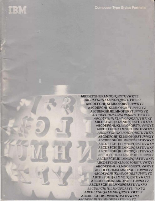
I BM Electronic "<strong>Selectric</strong>" <strong>Composer</strong><br />
This desktop composer features a working memory<br />
and keyboard contro ls that makes quality <strong>type</strong>setting<br />
almost as easy as typing. It is ideal for any work or<br />
applicat ion. The operator ca n produce justified, flush<br />
and centered material in one typing. And eli m inate<br />
many <strong>type</strong>sett ing steps. Depending on <strong>the</strong> requirements,<br />
<strong>the</strong> <strong>IBM</strong> Electronic "<strong>Selectric</strong>" <strong>Composer</strong> can<br />
be used as a single composing sy stem, as part <strong>of</strong> an<br />
existing system or integrated in a word processi ng<br />
environment. It provides new flexibility and productivity<br />
and <strong>of</strong>fers a rea l opportunity for you to enjoy<br />
improved pri ce performance.<br />
I BM Mag Card <strong>Composer</strong><br />
The I BM Mag Card <strong>Composer</strong>- w ith magnetic ca rd <strong>type</strong>setting-<strong>of</strong>fers<br />
<strong>the</strong> one-time way to prepare pr<strong>of</strong>essional <br />
quality copy . Time is saved because justifying, formatting<br />
and composing are automatic. Resetting time is saved,<br />
too, as ca mera-ready pro<strong>of</strong>s can be played out automatically.<br />
Whenever t hey 're needed. Since t he composer<br />
features a powerful worki ng memory, and everything<br />
recorded in memory ca n be stored on magnetic ca rd s,<br />
copy revisio ns are simply keyed in. Magnetic cards also<br />
<strong>of</strong>fer multi-page composing convenience. Because any<br />
length text can be stored on cards, t he composer can be<br />
freed for o<strong>the</strong>r jobs wh ile copy is awaiting approval or<br />
being pro<strong>of</strong>read . The I BM Mag Card <strong>Composer</strong> gives your<br />
copy a highly pr<strong>of</strong>essional appearance. Helping t o<br />
upgrade <strong>the</strong> quality <strong>of</strong> all YOUI' work .
Sample Type Style Showing<br />
T h is informatio n w ill enabl e To adjust y our Compose r These sample parag raphs w ill se rve<br />
you to make ind ividual<br />
letterform compariso ns.<br />
for optim um resul ts use<br />
this informat ion.<br />
(<br />
as a gu ide in determ i n i ng y ou r<br />
se lection <strong>of</strong> t he proper lead ing.<br />
8 Pt. Press Roman Medium<br />
ABCDEFGHIJKLMNOPQRSTUVWXYZ<br />
abcdefghijklmnopqrstuvwxyz<br />
1234567890$ .,·": ;!?*Y,Y.'I.-O [1 =t /+%&@<br />
tR ecommended Impressi on Setting: 1 Capital Height :<br />
Average N umber Of Ch aracters Per Pica: ' 3 .3<br />
Ch aracter Count Scale: See page 5.<br />
Solid<br />
Press Roman is a practical <strong>type</strong> face, which is characterized<br />
both by its distinctive appearance as well as by its legibility.<br />
An analysis <strong>of</strong> Press Roman reveals that it has no pronounced<br />
thick and thin strokes as are found frequenUy in o<strong>the</strong>r <strong>type</strong><br />
faces. It has an overall symmetry that is pleasing. The short<br />
ascenders and descenders, also characteristic <strong>of</strong> <strong>the</strong> <strong>type</strong> face,<br />
create a large lower case letter. It is a sturdily constructed,<br />
dignified face, which can be utilized for varied applications.<br />
Character Count Scales<br />
Ther·e are only three al phabet w idths in <strong>the</strong> <strong>IBM</strong><br />
<strong>Composer</strong> fam ily <strong>of</strong> <strong>type</strong>. Sh own below are three<br />
st andard reference tabl es wh ich are color coded for<br />
each <strong>of</strong> t he three basi c alphabet vvicJths. Within each<br />
t ab le are showings <strong>of</strong> <strong>the</strong> typica l al phabet width for<br />
1 Poi nt Leaded<br />
Alphabet Width in Yellow Code ABCDEFGHJJKDL\fOPQRSTUVWXYZ<br />
which includes 9 and 10 Pt. Sizestt abcderghijkJmnopqm uywxyz<br />
Column Widt h In PIcas·<br />
Average No. Of Charon; els<br />
Average No Of Unrts<br />
Press Roman is a practical <strong>type</strong> face, which is characterized<br />
both by its distinctive appearance as well as by its legibility.<br />
An analysis <strong>of</strong> Press Roman reveals that it has no pronounced<br />
thick and thin strokes as are found frequently in o<strong>the</strong>r <strong>type</strong><br />
faces. It has an overall symmetry that is pleasing. The short<br />
ascenders and descenders, also characteristic <strong>of</strong> <strong>the</strong> <strong>type</strong> face,<br />
create a large lower case letter. It is a sturdily constructed,<br />
dignified face, which can be utilized for varied applications.<br />
2 Point Leaded<br />
Press Roman is a practical <strong>type</strong> face, which is characterized<br />
both by its distinctive appearance as well as by its legibility.<br />
An analysis <strong>of</strong> Press Roman reveals that it has no pronou nced<br />
thick and thin strokes as are found frequently in o<strong>the</strong>r <strong>type</strong><br />
faces. It has an overall symmetry that is pleasing. The short<br />
ascenders and descenders, also characteristic <strong>of</strong> <strong>the</strong> <strong>type</strong> face,<br />
create a large lower case letter. It is a sturdily constructed,<br />
dignified face, which can be utilized for varied applications.<br />
that co lor. Also shown are pica sca les w ith <strong>the</strong>ir correspo<br />
nd ing average number <strong>of</strong> charact ers and averag e<br />
number <strong>of</strong> letter unit w idths per pica. T hese referen ce<br />
tab les can be used to estimat e how much area <strong>the</strong><br />
<strong>type</strong>set copy w ill occupy w hen it is co mposed .<br />
10 11 12 13 14 16 16 17 18 19 20 21 22 23 24 25 26 27 28 29 30<br />
29.0 31.9 34.8 37 .7 40.6 43.5 46.4 49.3 52.2 55.1 58.0 60.9 63.8 66.7 69.6 72 .5 76.4 78.3 812 84.1 87 .0<br />
140 154 168 182 196 210 224 238 252 266 280 294 308 322 336 350 364 378 392 406 420<br />
'The pica referred to here is ex actly 1/ 6th o f an inch o r .16666 inch. The trad it iona l pica is . 16604 inch.<br />
t Recommended Impression Sett ing: The rec ommend ed impressi o n settings are not ex act. Prec ise setti ngs w ill depend on<br />
va riations <strong>of</strong> ind ividual machines and t he suppli es being used. 5<br />
t t Ex ceptions w ill be f ou nd withi n <strong>the</strong> Century , Classified News. Unive rs . and Copperp lat e Gothic t ype families. Always refer<br />
t o t he co lored triangle on <strong>the</strong> ca p <strong>of</strong> each t ype font to deter m ine <strong>the</strong> correc t Charac ter Count Sca le to use.
6<br />
8 Pt. Aldine Roman Medium AR-8-M "<br />
ABeDEFGHIJ KLMNOPQRSTUVWXYZ<br />
abcde fghijklmno pqrstuvwxyz<br />
1234567890S.. -":;! ?'Y2Y..%- () [l =t /+%&@<br />
Recommended Impression Setting: 1 Capital Height: 5 Points<br />
Average Number Of Characters Per Pica:' 3.3<br />
Character Count Scale: See page 5.<br />
Solid<br />
Aldine Roman has a delicate beauty <strong>of</strong> letter which makes it<br />
an outstanding <strong>type</strong> face. Throughout its overall design. <strong>the</strong>re<br />
is a harmonious balance between thin and thick lines. Aldine<br />
Roman is characterized by ascending and descending strokes<br />
which are perfectly proportioned. This has <strong>the</strong> added effect<br />
<strong>of</strong> intensifying <strong>the</strong> balanced design <strong>of</strong> each letter. Because <strong>of</strong><br />
Aldine Roman's outstanding visual appeal, it is particularly<br />
suited as a text <strong>type</strong> face for a wide variety <strong>of</strong> applications.<br />
8 Pt. Aldine Roman Italic AR-8-1 "<br />
A BCDEFGHI]KUv[NOPQRSTUVWX YZ<br />
abc de fgh ijklmnopqrst« v wxyz<br />
123456 7890S.,-": ;II*'/;,v.,x,- (){ J=tl+%&@<br />
Recommended Impression Setting: 1 Capital Height: 5 Points<br />
Average Number Of Characters Per Pica ' 3.3<br />
Character Count Scale: See page 5.<br />
Solid<br />
Aldine Roman has a delicate bea«ty <strong>of</strong> letter which makes it<br />
an outstanding <strong>type</strong> face. Throughout its overall design, <strong>the</strong>re<br />
is a harmonious balance between thin and thick lines. Aldine<br />
Roman is characterized by ascending and descending strokes<br />
which are perfectly proportioned. This has <strong>the</strong> added effect<br />
<strong>of</strong> intensifying <strong>the</strong> balQllced design <strong>of</strong> each letter. BecQlHe <strong>of</strong><br />
Aldine Roman's outstanding "isHal appeal, it is partiwlarly<br />
suited as a text <strong>type</strong> face for a wide variety <strong>of</strong> applications.<br />
8 Pt. Aldine Roman Bold AR-8-B •<br />
ABCDEFGHIJKLMNOPQRSTUVWXYZ<br />
abcdefghijklmnopqrstuvwxyz<br />
1234567890S.,-":;!?· Y2y"3/,1_() [ 1=t /+o/o&@<br />
Recommended Impression Setting: 3 Capital Height: 5 Points<br />
Average Number Of Characters Per Pica: ' 3.3<br />
Character Count Scale: See page 5.<br />
Solid<br />
Aldine Roman has a delicate beauty <strong>of</strong> letter which makes it<br />
an outstanding <strong>type</strong> face. Throughout its overall design, <strong>the</strong>re<br />
is a harmonious balance between thin and thick lines. Aldine<br />
Roman is characterized by ascending and descending strokes<br />
which are perfectly proportioned. This has <strong>the</strong> added effect<br />
<strong>of</strong> intensifying <strong>the</strong> balanced design <strong>of</strong> each letter. Because <strong>of</strong><br />
Aldine Roman's outstanding visual appeal, it is particularly<br />
suited as a text <strong>type</strong> face for a wide variety <strong>of</strong> applications.<br />
1 POint Leaded<br />
Order No. 1194023<br />
1 Point Leaded<br />
Aldil1e Roman has a delicate beauty <strong>of</strong> letter which makes it<br />
an outstanding <strong>type</strong> face. Throughout its overall design, <strong>the</strong>re<br />
is a harmonio«s balance between thin and thick lines. Aldine<br />
Roman is characterized by asc en.ding and descending strokes<br />
which are perfectly proportioned. This has <strong>the</strong> added effect<br />
<strong>of</strong> intensifying <strong>the</strong> balanced design <strong>of</strong> each letter. Because <strong>of</strong><br />
Aldille Roman's outstanding visual appeal, it is partiwlarly<br />
s«ited as a text <strong>type</strong> face for a wide variety <strong>of</strong> applications.<br />
2 Point Leaded<br />
Order No. 1194022<br />
Aldine Roman ha.s a delicate beauty <strong>of</strong> letter which makes it<br />
an outstanding <strong>type</strong> face. Throughout its overall design. <strong>the</strong>re<br />
is a harmonious balance between thin and rhick lines. Aldine<br />
Roman is characterized by ascending and descending strokes<br />
which are perfectly proportioned. This has <strong>the</strong> added effect<br />
<strong>of</strong> intensifying <strong>the</strong> balanced design <strong>of</strong> each letter. Because <strong>of</strong><br />
Aldine Roman's outstanding visual appeal. it is particularly<br />
suited as a text <strong>type</strong> face for a wide variety <strong>of</strong> appl.ications.<br />
2 Point Leaded<br />
Aldine Roman has a delicate beauty <strong>of</strong> letter which makes it<br />
an outstanding <strong>type</strong> face. Throughout its overall design. <strong>the</strong>re<br />
is a harmonious balance between thin and thick lines. Aldine<br />
Roman is characterized by ascending and descending strokes<br />
which are perfectly proportioned. This has <strong>the</strong> added effect<br />
<strong>of</strong> intensifying <strong>the</strong> balanced design <strong>of</strong> each letter. Because <strong>of</strong><br />
Aldine Roman's outstanding visual appeal, it is particularly<br />
suited as a text <strong>type</strong> face for a wide variety <strong>of</strong> applications.<br />
Aldine Roman has a delicate beauty <strong>of</strong> letter which makes it<br />
an outstanding <strong>type</strong> face. Throughout its ovcrall design, <strong>the</strong>re<br />
is a harmol1ious balal1ce betweel1 thin and thick lines. Aldil1e<br />
Roman is characterized by ascendi>lg and descending strokes<br />
which are perfectly proportiol1ed. This has <strong>the</strong> added effect<br />
<strong>of</strong> irztensifying <strong>the</strong> balanced design <strong>of</strong> each letter. Because <strong>of</strong><br />
Aldine Roman's outstanding "isHal appeal, it is particularly<br />
suited as a text <strong>type</strong> face for a wide "ariety <strong>of</strong> applications.<br />
1 Point Leaded<br />
Order No. 1194055<br />
Aldine Roman has a delicate beauty <strong>of</strong> letter which makes it<br />
an outstanding <strong>type</strong> face. Throughout its overall design, <strong>the</strong>re<br />
is a harmonious balance between thin and thick lines. Aldine<br />
Roman is characterized by ascending and descending strokes<br />
which are perfectly proportioned. This has <strong>the</strong> added effect<br />
<strong>of</strong> intensifying <strong>the</strong> balanced design <strong>of</strong> each letter. Because <strong>of</strong><br />
Aldine Roman's outstanding visual appeal, it is particularly<br />
suited as a text <strong>type</strong> face for a wide variety <strong>of</strong> applications.<br />
2 Point Leaded<br />
Aldine Roman has a delicate beauty <strong>of</strong> letter which makes it<br />
an outstanding <strong>type</strong> face. Throughout its overall design, <strong>the</strong>re<br />
is a harmonious balance between thin and thick lines. Aldine<br />
Roman is characterized by ascending and descending strokes<br />
which are perfectly proportioned. This has <strong>the</strong> added effect<br />
<strong>of</strong> intensifying <strong>the</strong> balanced design <strong>of</strong> each letter. Because <strong>of</strong><br />
Aldine Roman's outstanding visual appeal, it is particularly<br />
suited as a text <strong>type</strong> face for a wide variety <strong>of</strong> applications.
A<br />
8 Pt. Baskerville Medium BA-8-M<br />
ABCDEFGHIJKLMNOPQRSTUVWXYZ<br />
abcdefghijklmnopqrstuvwxyz<br />
12 34567890$.,,": ;!?*WA%- ()[ 1=t/+%&@<br />
Recommended Impression Setting: 1 Capital Height: 5 Points<br />
Average Number Of Characters Per Pica: . 3.3<br />
Character Count Scale: See page 5.<br />
So lid<br />
Baskervill e has a distinguishable style that is characterized by<br />
its bold contrasting weights and well· proportioned, rounded<br />
letter· forms. T h e strong definition <strong>of</strong> <strong>the</strong> vertical accents in<br />
combination with <strong>the</strong> delicate connecting strokes create its<br />
individuality. Because <strong>of</strong> its excell ent readability, Basken'ille<br />
is widely used for a great variety <strong>of</strong> advertising material and<br />
in addition, it is adaptable for tex t composition. Textbooks<br />
and manuals re present practical a pplication <strong>of</strong> this <strong>type</strong> face .<br />
8 Pt. Baskerville Italic BA-8-1 •<br />
ABCDEFCHIJKLMNOPQRSTUVWx YZ<br />
abcdefgh z}"klmnopqrstuvwxyz<br />
1234567890$.,-":;/Y*'M,,3),-()[ j=t/+%&@<br />
Rec ommended Impression Se tting: 1 Capito l Height: 5 Points<br />
Average Number Of Charac ters Per Pica: 3.3<br />
Ch arilcter Count Sca le: See page 5.<br />
Sol ,d<br />
Baskerville has a distinguishable style that is characterized by<br />
its bold contrasting weights and well-proportioned, rounded<br />
letter-forms. Th e strong definition <strong>of</strong> <strong>the</strong> vertical accents in<br />
combination with <strong>the</strong> delicate connecting strokes create its<br />
individuality. Because <strong>of</strong> its excellent readability, Baskerville<br />
is widely used for a great variety <strong>of</strong> advertising material and<br />
in addition, it is adaptable for text composition. Textbooks<br />
and manuals represent practical application <strong>of</strong> this <strong>type</strong> face.<br />
8 Pt. Baskerville Bold BA-8-B •<br />
ABCDEFGHIJKLMNOPQRSTUVWXYZ<br />
abcdefghijklmnopqrstuvwxyz<br />
123456 i890$.,.": ;!?*I/z',4%-()[ 1=t/+%&@<br />
Recommended I mpress ion Setting: 3 Capital Height: 5 Points<br />
Average Number Of Charac ters Per Pica:' 3.3<br />
Character Cou nt Sca le: See page 5.<br />
Solid<br />
Baskerville has a distinguishable style that is characterized by<br />
its bold contrasting weights and well-proportioned, rounded<br />
letter·forms. The strong definition <strong>of</strong> <strong>the</strong> vertical accents in<br />
combination with <strong>the</strong> delicate connecting strokes create its<br />
individuality. Because <strong>of</strong> its excellent readability, Baskerville<br />
is widely used for a great variety <strong>of</strong> advertising material and<br />
in addition, it is adaptable for text composition. Textbooks<br />
and manuals reprcscnt practical application <strong>of</strong> this <strong>type</strong> face.<br />
1 Point Leaded<br />
Order No. 1194098<br />
Baskerville has a distinguishable style that is charac terized by<br />
its bold contrasting weights and well· proportioned, rounded<br />
Jetter-forms. The strong definition <strong>of</strong> <strong>the</strong> vertical accents in<br />
combination with <strong>the</strong> delicate connecting strokes create its<br />
individuality. Because <strong>of</strong> its excellent readability, Baskerville<br />
is widely used for a great variety <strong>of</strong> advertising material and<br />
in addition, it is adaptable for text composition. Textbooks<br />
and manuals represent prac tical application <strong>of</strong> this <strong>type</strong> face.<br />
2 Point Leaded<br />
Basken 'ille has a distinguishable style that is characterized by<br />
its bold contrasting w eights and well-proportioned, rounded<br />
letter-forms. The strong definition <strong>of</strong> <strong>the</strong> vertical accents in<br />
combination with <strong>the</strong> delicate connecting strokes create its<br />
individuality. Because <strong>of</strong> its excellent readability, Baskerville<br />
is widely used for a great variety <strong>of</strong> advertising ma terial and<br />
in addition, it is adaptable for text composition. Textbooks<br />
and manuals represent practical application <strong>of</strong> this <strong>type</strong> face.<br />
Order No. 1194099<br />
1 Pai n' Leilded<br />
Baskerville has a distinguishable style that is characterized by<br />
its bold contrasting weights and well-proportioned.. rounded<br />
letter-forms. Th e s-trong definition <strong>of</strong> <strong>the</strong> vertical accents in<br />
combination with <strong>the</strong> delicate connec ting strokes crea te its<br />
individuality. Because <strong>of</strong> its excellent readability, Baskerville<br />
is widely used for a great variety <strong>of</strong> advertising material and<br />
in addition, it is adaptable for text composition. Textboolis<br />
and manllals represent practical application <strong>of</strong> this <strong>type</strong> face.<br />
2 Poi nt Leuded<br />
Baskerville hilS a distinguishable style that is characterized by<br />
its bold contrasting weights and well-proportioned.. rounded<br />
letter-forms. The strong definition <strong>of</strong> <strong>the</strong> vertical accents in<br />
combinat·ion with <strong>the</strong> delicate connecting strokes create its<br />
individuality. Because <strong>of</strong> its excellent readability, Baskerville<br />
is widely used for a great variety <strong>of</strong> advertising material and<br />
in addition, it is adaptable for t ex t composition. Textbooks<br />
and manuaiI represent practical application <strong>of</strong> this <strong>type</strong> face .<br />
1 Point Leaded<br />
Order No. 1194100<br />
Baskerville has a distinguishable style that is characterized by<br />
its bold contrasting weights and well·proportioned, rounded<br />
letter-fonns. The strong definition <strong>of</strong> <strong>the</strong> vertical accents in<br />
combination with <strong>the</strong> delicate connecting strokes create its<br />
individuality. Because <strong>of</strong> its excellent readability, Baskerville<br />
is widely used for a great variety <strong>of</strong> advertising material and<br />
in addition, it is adaptable for text composition. Textbooks<br />
and manuals represent practical application <strong>of</strong> this ty pe face.<br />
2 Point Leaded<br />
Baskerville has a distinguishable style that is characterized by<br />
its bold contrasting weights and well·proportioned.. rounded<br />
Jetter-forms. The strong definition <strong>of</strong> <strong>the</strong> vertical accents in<br />
combination with <strong>the</strong> delicate connecting strokes create its<br />
individuality. Because <strong>of</strong> its excellent readability, Baskerville<br />
is widely used for a great variety <strong>of</strong> advertising material and<br />
in addition, it is adaptable for text composition. Textbooks<br />
and manuals represent practical application <strong>of</strong> this <strong>type</strong> face. 9
10<br />
9 Pt. Baskerville Medium BA-9-M Order No. 1194095<br />
ABCDEFGHijKLMNOPQRSTUVWXYZ<br />
abcdefghijklmnopqrstuvwxyz<br />
1234567890$.,''':;!?*'i2'A%-O [] =t /+%&@<br />
Recommended Impression Setting: 2 Capital Heigh t: 6 Points<br />
Average Number Of Characters Per Pica:' 2.9<br />
Character Count Stale: See page 5.<br />
Solid<br />
Basknville has a distinguishable graphic style that is<br />
characterized by its contrasting weights and graceful,<br />
rounded construction. The strong, crisp ddinition <strong>of</strong><br />
<strong>the</strong> vertical accents in combination with <strong>the</strong> delicate<br />
connecting strokes create its individuality. This <strong>type</strong><br />
face, with its easily read characters, is widely used for<br />
advertising material as well as fine text composition.<br />
9 Pt. Ba kerville Italic BA-9-1<br />
ABCDEFGHljKLMNOPQRSTUVWXYZ<br />
abcdefghijklmnopqrstuvwxyz<br />
1234567890$.,-":;f?*WkJj,-()[J=t/+%&@<br />
Recommended Impression Setting: 2 Capital Height : 6 Po ints<br />
Average Number Of Characters Per Picd:· 2.9<br />
Character Count Scale: See page 5.<br />
Solid<br />
Baskerville has a distinguishable graphic style that is<br />
characterized by its contrasting weights and graceful,<br />
rounded construction. The strong, crisp definition <strong>of</strong><br />
<strong>the</strong> vertical accen ts in combination with <strong>the</strong> delicate<br />
connecting strokes create its individuality. This <strong>type</strong><br />
face, with its easily read characters, is widely used for<br />
advertising material as well as fine text composition.<br />
9 Pt. Baskerville Bold BA-9-B<br />
ABCDEFGHIJKLMNOPQRSTUVWXYZ<br />
abcdefghijklmnopqrstuvwxyz<br />
1234567890$.,·":;!?*W:4%- O [] =t /+%&@<br />
Recommended Impress ion Setting: 3 Capital Height : 6 Po ints<br />
Average Number Of Characters Per Pica:' 2.9<br />
Character Count Scale: See page 5.<br />
Solid<br />
Baskerville has a distinguishable graphic style that is<br />
characterized by its contrasting weights and graceful,<br />
rounded construction. The strong, crisp definition <strong>of</strong><br />
<strong>the</strong> vertical accents in combination with <strong>the</strong> delicate<br />
connecting strokes create its individuality. This <strong>type</strong><br />
face, with its easily read characters, is widely used for<br />
advertising material as well as fine text composition.<br />
1 Point Leaded<br />
Baskerville has a distinguishable 6'Taphic style that is<br />
characterized by its contrasting weights and graceful,<br />
rounded construction. The strong, crisp definition <strong>of</strong><br />
<strong>the</strong> vertical accents in combination with <strong>the</strong> delicate<br />
connecting strokes create its individuality. This <strong>type</strong><br />
face, with its easily read characters, is widely used for<br />
advertising material as well as fine text composition.<br />
2 Point Leaded<br />
Baskerville has a distinguishable graphic style that is<br />
characterized by its contrasting weights and graceful,<br />
rounded construction. The strong, crisp definition <strong>of</strong><br />
<strong>the</strong> vertical accents in combination with <strong>the</strong> delicate<br />
connecting strokes create its individuality. This <strong>type</strong><br />
face, with its easily read characters, is widely used for<br />
advertising material as well as fine text composition.<br />
Order No. 1194096<br />
1 Point Leaded<br />
Baskerville has a distingw'shable graphic style that is<br />
characterized by its contrasting weights and graceful,<br />
rounded construction. The strong, crisp definition <strong>of</strong><br />
<strong>the</strong> vertical accents in combination with <strong>the</strong> delicate<br />
connecting strokes create its individuality. This <strong>type</strong><br />
face, with its easily read characters, is widely used for<br />
advertising material as well as fine text composition.<br />
2 Point Leaded<br />
Baskervz:tle has a distinguishable graphic style that is<br />
characterized by its contrasting weights and graceful,<br />
rounded construction. The strong, crisp definition <strong>of</strong><br />
<strong>the</strong> vertical accents in combination with <strong>the</strong> delicate<br />
connecting strokes create its individuality. This <strong>type</strong><br />
face, with its easily read characters, is widely used for<br />
advertising material as well as fine text co mposition.<br />
Order No. 1194097<br />
1 Point Leaded<br />
Baskerville has a distinguishable graphic style that is<br />
characterized by its contrasting weights and graceful,<br />
rounded construction. The strong, crisp definition <strong>of</strong><br />
<strong>the</strong> vertical accents in combination with <strong>the</strong> delicate<br />
connecting strokes create its individuality. This <strong>type</strong><br />
face, with its easily read characters, is widely used for<br />
advertising material as well as fine text composition.<br />
2 Point Leaded<br />
Baskerville has a distinguishable graphic style that is<br />
characterized by its contrasting weights and graceful,<br />
rounded construction. The strong, crisp definition <strong>of</strong><br />
<strong>the</strong> vertical accents in combination with <strong>the</strong> delicate<br />
connecting strokes create its individuality. This <strong>type</strong><br />
face, with its easily read characters, is widely used for<br />
advertising material as well as fine text compositions.
..<br />
6 Pt. Century Medium C-6-M<br />
ABCDEFGHlJKLMNOPQRSTUVWXYZ<br />
abc defghijklmnopqrstuv wx yz<br />
1234567890$.,-":;!"?"12W4-0[] ;t/+%&@<br />
Recommended Im pression Setting: 2 Capital Height: 5 Points<br />
Average Number Of Characters Per Pic a: 3.3<br />
Character Count Sca le: See page 5.<br />
Solid<br />
Century is a well-delineated face characterized b y its strong<br />
harmonious balance, which helps to produce clear, clean <strong>type</strong><br />
impressions. Becau se <strong>of</strong> its visual appeal and legibility, this<br />
ty pe face h as been widely used for advertising matter as well<br />
as textbooks and m anuals. Periodicals and newspapers, which<br />
report news in great detail, very <strong>of</strong>ten specify Century for<br />
body <strong>type</strong>. The strength and clarity <strong>of</strong> Century has succeeded<br />
in making it one <strong>of</strong> th e outstanding <strong>type</strong> faces in u se today.<br />
6 Pt. Century Italic C-6-1 •<br />
ABCDEFGHIJKLMNOPQRSTUVIVXYZ<br />
a bcde(ghijIII m rl a pqrsI u vwx yz<br />
1234567890$." " :;! ?*'h'f,'I4-()[J=t /+%&@<br />
Recommended Impress ion Setting: 1 Capital Height : 5 Points<br />
Average Nu mber Of Characters Per PiCd : ' 3.3<br />
Character Count Scale: See page 5.<br />
Solid<br />
Century is a welt·detineated face characterized by its strong<br />
harmonious balance, which h elps to produce c l ear, c lean Iype<br />
impressions. Because <strong>of</strong> its visual appeal and legibilit y, this<br />
Iype {ace has beerl widety " sed {or advertising malter as well<br />
as le;.." t boo /?s and lnanuals. Pe l"lodicols and newspapers. which<br />
report rlews in great d etail, very o {ten speci{y Cenlury {or<br />
body t y p e. The strerlgth and clarilY ol Cen U"y ha., succeeded<br />
in ma/lirlg il Orle <strong>of</strong> <strong>the</strong> outstanding t ype laces in use 10da y.<br />
..<br />
6 Pt. Century Bold C-6-B<br />
ABCDEFGHIJKLMNOPQRSTUVWXYZ<br />
abcdefghijklmnopqrstuvwxyz<br />
1234567890$.,-":;!?*'12W4-()[ 1;t/+%&@<br />
Recommended Impression Sell ing: 2 Capital Height: 5 Poin ts<br />
Average Number Of Characters Per Pic,,: . 3.3<br />
Cha racter Count Scale: See page 5.<br />
So lid<br />
Century is a well-delineated face characterized by its strong<br />
harmonious balance, which helps to produce clear, clean <strong>type</strong><br />
impressions. Because <strong>of</strong> its visual appeal and legibility, this<br />
<strong>type</strong> face has been widely used for advertising malter as well<br />
as textbooks and manuals. Periodicals and newspapers, which<br />
report news in great detail, very <strong>of</strong>ten specify Century for<br />
body <strong>type</strong>. The strength and clarity <strong>of</strong> Century has succeeded<br />
in making it one <strong>of</strong> <strong>the</strong> outstanding <strong>type</strong> faces in use today.<br />
1 Point Leaded<br />
1 Point Leaded<br />
Order No. 1194072<br />
Cerllury is a well·delin ea l ed {ace characterized by its strong<br />
harmonious balance, which helps to produce c lear, clean <strong>type</strong><br />
impress ions. B ecause <strong>of</strong> its visual appeal and l egibility, lhi:;<br />
t y p e face has been widely used {or advertising malter as well<br />
(LS tex tbooks and manuals. Periodicals and newspapers, whic h<br />
report news irl great detail, very o{l en speci{y Cerltury {or<br />
body l ype. The slrength and c larit y o{ Century has "",cceeded<br />
irl mallirlg il o n c <strong>of</strong> <strong>the</strong> olUstanding I ype {aces in use loda y.<br />
2 Point Leaded<br />
Order No. 1194068<br />
Century is a well-delineated face characterized by its strong<br />
harmonious halance, which helps to produce clear, clean ty pe<br />
impressions. Becau se <strong>of</strong> its visual appeal and legibility, this<br />
<strong>type</strong> face has h een widely u sed for advertising matter as well<br />
as tex tbooks and manuals. Periodicals and n e wspa pers, which<br />
report news in great d etail, very <strong>of</strong>ten specify Century for<br />
body t ype. The strength and clarity <strong>of</strong> Century has succeeded<br />
in making it one <strong>of</strong> <strong>the</strong> outstanding <strong>type</strong> faces in use today.<br />
2 Point Leaded<br />
Century is a well-delineated face characterized by its strong<br />
harmonious balance, which helps to produce clear, clean <strong>type</strong><br />
impressions. Because <strong>of</strong> its visual appeal and legibility, this<br />
<strong>type</strong> face has been widely used for advertising matter as well<br />
as tex thooks and manuals. Pe riodicals and newspapers, which<br />
report news in great deta il, very <strong>of</strong>ten specify Century for<br />
body <strong>type</strong>. The strength and clarity <strong>of</strong> Century has succeeded<br />
in making it one <strong>of</strong> th e outstanding <strong>type</strong> faces in use today.<br />
Century is a well·delirleated {ace c h arac l erized by its strong<br />
harmoniolu balance, which h elp s t o produce c lear, clearl Iype<br />
impre:js ions. Because o f its visual appeal and legibility, this<br />
<strong>type</strong> fac e has been w idely used (or advertising matler as well<br />
U') lex lboohs and manuals. Periodica ls and newspapers, which<br />
report news in great detail, very <strong>of</strong>l en specilY Cen lury (or<br />
body t y p e. The strenglh and claril Y o{ Cerltllry has succeeded<br />
in making it one <strong>of</strong> th e oLltslanding t y pe faces in use today,<br />
Order No. 1194076<br />
1 Point Leaded<br />
Century is a well-delineated face characterized by its strong<br />
harmo nious balance, which helps to produce clear, clean <strong>type</strong><br />
impressions. Because <strong>of</strong> its visual appeal and legibility, this<br />
<strong>type</strong> face has been widely used for advertising malter as well<br />
as textbooks and manuals. Periodicals and newspapers, which<br />
report n ews in great detail, very <strong>of</strong>ten specify Century for<br />
body <strong>type</strong>. The strength and clarity <strong>of</strong> Century has succeeded<br />
in making it one <strong>of</strong> <strong>the</strong> outstanding <strong>type</strong> faces in use today.<br />
2 Point Leaded<br />
Century is a well-delineated face characterized by its strong<br />
harmonious balance, which helps to produce clear, clean <strong>type</strong><br />
impressions. Because o f its visual appeal and legibility, this<br />
t y pe face has been widely used for advertising malter as well<br />
as textbooks and manuals. Periodicals and newspapers, which<br />
report news in great detail, very <strong>of</strong>ten specify Century fo r<br />
body <strong>type</strong>. The strength and clarity <strong>of</strong> Century has succeeded<br />
in making it o ne <strong>of</strong> <strong>the</strong> outstanding <strong>type</strong> faces in use today. 15
18<br />
..<br />
10 Pt. Century Medium C-l0-M<br />
ABCDEFGHIJKLMNOPQRS1'UVWXYZ<br />
abcdefghijklmnopqrstuvwxyz<br />
1234567890$.,-":;!?*lh%%-O [] =tj+%&@<br />
Recommended Impression Setting: 2 Capital Height: 7 Points<br />
Average Number Of Characters Per Pica:' 2.5<br />
Character Count Scale: See page 5.<br />
Solid<br />
Century is a fine, legible face characterized by<br />
its harmonious balance, which helps produce<br />
a dear, clean <strong>type</strong> impression. Because <strong>of</strong> its<br />
graphic appeal, this <strong>type</strong> face has been widely<br />
used for advertising matter as well as manuals<br />
and textbooks. Century is very <strong>of</strong>ten specified<br />
by periodicals which print <strong>the</strong> news in detail.<br />
...<br />
10 Pt. Century Italic C-1D-1<br />
ABCDEFGHIJKLMNOPQRSTUVWXYZ<br />
abcdefghijklmnopqrstuvwxyz<br />
1234567890$.,-":;!?*WI4 3 14-()[J=t/+%&@<br />
Recommended Impression Setting: 2 Capital Height: 7 Points<br />
Average Number Of Characters Per Pica:' 2.5<br />
Character Count Scale: See page 5.<br />
Solid<br />
Century is a fine, legible face characterized by<br />
its harmonious balance, which helps produce<br />
a clear, clean <strong>type</strong> impression. Because <strong>of</strong> its<br />
graphic appeal, this <strong>type</strong> face has been widely<br />
used for advertising matter as well as manuals<br />
and textbooks. Century is very <strong>of</strong>ten specified<br />
by periodicals which print <strong>the</strong> news in detail.<br />
...<br />
10 Pt. Century Bold C-l0-B<br />
ABCDEFGHIJKLMNOPQRSTUVWXYZ<br />
abcdefghijklmnopqrstuvwxyz<br />
1234567890$.,-": ;!?*W14%-() [] =t/+%&@<br />
Recommended I mpression Setting: 4 Capital Height: 7 Points<br />
Average Number Of Characters Per Pica:' 2.5<br />
Character Count Scale: See page 5.<br />
Solid<br />
Century is a fine, legible face characterized by<br />
its harmonious balance, which helps produce<br />
a clear, clean <strong>type</strong> impression. Because <strong>of</strong> its<br />
graphic appeal, this <strong>type</strong> face has been widely<br />
used for advertising matter as well as manuals<br />
and textbooks. Century is very <strong>of</strong>ten specified<br />
by periodicals which print <strong>the</strong> news in detail.<br />
Order No. 1194065<br />
1 Poi nt L eaded<br />
Century is a fine, legible face characterized by<br />
its harmonious balance, which helps produce<br />
a clear, clean <strong>type</strong> impression. Because <strong>of</strong> its<br />
graphic appeal, this <strong>type</strong> face has been widely<br />
used for advertising matter as well as manuals<br />
and textbooks. Century is very <strong>of</strong>ten specified<br />
by periodicals which print <strong>the</strong> news in detail.<br />
2 Point Leaded<br />
Century is a fine, legible face characterized by<br />
its harmonious balance, which helps produce<br />
a clear, clean <strong>type</strong> impression. Because <strong>of</strong> its<br />
graphic appeal, this <strong>type</strong> face has been widely<br />
used for advertising matter as well as manuals<br />
and textbooks. Century is very <strong>of</strong>ten specified<br />
by periodicals which print <strong>the</strong> news in detail.<br />
Order No. 1194069<br />
1: Poi nt Leaded<br />
Century is a fine, legible face characterized by<br />
its harmonious balance, which helps produce<br />
a clear, clean <strong>type</strong> impression. Because <strong>of</strong> its<br />
graphic appeal, this <strong>type</strong> face has been widely<br />
used for advertising matter as well as manuals<br />
and textbooks. Century is very <strong>of</strong>ten specified<br />
by periodicals which print <strong>the</strong> news in detail.<br />
2 Point Leaded<br />
Century is a fine, legible face characterized by<br />
its harmonious balance, which helps produce<br />
a clear, clean <strong>type</strong> impression. Because <strong>of</strong> its<br />
graphic appeal, this <strong>type</strong> face has been widely<br />
used for advertising matter as well as manuals<br />
and textbooks. Century is very <strong>of</strong>ten specified<br />
by periodicals which print <strong>the</strong> news in detail.<br />
Order No. 1194073<br />
1 Point Leaded<br />
Century is a fine, legible face characterized by<br />
its harmonious balance, which helps produce<br />
a clear, clean <strong>type</strong> impression. Because <strong>of</strong> its<br />
graphic appeal, this <strong>type</strong> face has been widely<br />
used for advertising matter as well as manuals<br />
and textbooks. Century is very <strong>of</strong>ten specified<br />
by periodicals which print <strong>the</strong> news in detail.<br />
2 Point Leaded<br />
Century is a fine, legible face characterized by<br />
its harmonious balance, which helps produce<br />
a clear, clean <strong>type</strong> impression. Because <strong>of</strong> its<br />
graphic appeal, this <strong>type</strong> face has been widely<br />
used for advertising matter as well as manuals<br />
and textbooks. Century is very <strong>of</strong>ten specified<br />
by periodicals which print <strong>the</strong> news in detail.
20<br />
A<br />
6 Pt. Classified News Medium CN-6-M<br />
ABCDEFGHIJKLMNOPQRSTUVWXYZ<br />
abcdefgh ijkl m nopqrst uvwxy z<br />
1234567890$.,-":;!? *1f2 1/,1/4-() [1 =t/+%& @<br />
Recommended Impression Setting: 1 Capital Height: 4.5 Points<br />
Average Number Of Characters Per Pica:' 3.3<br />
Character Count Scale: See page 5.<br />
Solid<br />
Classified News is a sans-serif, clearly delineated <strong>type</strong> face. It<br />
is valued for its efficiency-<strong>the</strong> ability to place a maximum<br />
number <strong>of</strong> characters in a given space while maintaining<br />
readability. I t <strong>the</strong>refore is widely used by newspapers for<br />
classified advertising, an application which inspired its name.<br />
Space-saving economy makes Classified News a popular<br />
choice for statistical copy, forms, footnotes, and letterheads.<br />
The strong vertical accent <strong>of</strong> each letter contributes to a<br />
distinctly modern appearance. The abil,ity <strong>of</strong> this <strong>type</strong> face to<br />
compress without crowding is a mark <strong>of</strong> its modernity.<br />
.&<br />
6 Pt. Classified News Bold CN-6-B<br />
ABCDEFGHIJKLMNOPQRSTUVWXYZ<br />
abcdefghijkl m nopqrstuvwxyz<br />
1 234S6 7890$.,·":;!? *if"/43/4-[) [1 =t/+%&@<br />
Recommended Impression Setting: 2 Capital Height: 4 .5 Points<br />
Average Number a f Characters Per Pica: ' 3.3<br />
Character Count Scale: See page 5.<br />
Solid<br />
Classified News is a sans-serif, clearly delineated <strong>type</strong> face. It<br />
is valued for its efficiency-<strong>the</strong> ability to place a maximum<br />
number <strong>of</strong> characters in a given space while maintaining<br />
readability. It <strong>the</strong>refore is widely used by newspapers for<br />
Classified advertising, an application which inspired its name.<br />
Space·saving economy makes Classified News a popular<br />
choice for statistical copy, forms, footnotes, and letterheads.<br />
The strong vertical accent <strong>of</strong> each letter contributes to a<br />
distinctly modern appearance. The ability <strong>of</strong> this <strong>type</strong> face to<br />
compress without crowding is a mark <strong>of</strong> its modernity.<br />
If' d News Medium CN-8-M<br />
ABCDEFGHIJKLMNOPQRSTUVWXYZ<br />
abcdefgh ij kl mnopqrstuvwx yz<br />
1234567890$.,-": ;I? * 1/2 1 /4 3 /4-() [1 =tj+%&@<br />
Recommended Impression Setting: 1 Capital Height: 6 Points<br />
Average Number Of Characters Per Pica:' 2.9<br />
Character Count Scale: See page 5.<br />
Solid<br />
Classified News is a clearly delineated sans·serif <strong>type</strong><br />
face. The strong vertical accent <strong>of</strong> each letter denotes<br />
a sharp modern appearance. Its distinctive, clean look<br />
attracts attention, making it a popular <strong>type</strong> style<br />
selection for subheads and captions. Because <strong>of</strong> its<br />
superb readability, Classified News can be used with<br />
good effect as text <strong>type</strong>. Its use by newspapers for<br />
classified advertising inspired <strong>the</strong> choice <strong>of</strong> its name.<br />
1 Point Leaded<br />
Order No. 1194056<br />
Classified News is a sans·serif, clearly delineated <strong>type</strong> face. It<br />
is valued for its effiCiency-<strong>the</strong> ability to place a maximum<br />
number <strong>of</strong> characters in a given space while maintaining<br />
readability. It <strong>the</strong>refore is widely used by newspapers for<br />
classified advertiSing, an application which inspired its name.<br />
Space-saving economy makes Classified News a popular<br />
choice for statistical copy, forms, footnotes, and letterheads.<br />
The strong vertical accent <strong>of</strong> each letter contributes to a<br />
distinctly modern appearance. The ability <strong>of</strong> this <strong>type</strong> face to<br />
compress without crowding is a mark <strong>of</strong> its modernity.<br />
2 Point Leaded<br />
Classified News is a sans·serif, clearly delineated <strong>type</strong> face. It<br />
is valued for its efficiency-<strong>the</strong> ability to place a maxi mum<br />
number <strong>of</strong> characters in a given space while maintaining<br />
readability. It <strong>the</strong>refore is widely used by newspapers for<br />
classified advertising, an application which inspired its name.<br />
Space-saving economy makes Classified News a popular<br />
choice for statistical copy, forms, footnotes, and letterheads.<br />
The strong vertical accent <strong>of</strong> each letter contributes to a<br />
distinctly modern appearance. The ability <strong>of</strong> this <strong>type</strong> face to<br />
compress without crowding is a mark <strong>of</strong> its modernity.<br />
1 Point Leaded<br />
Order No. 1194064<br />
Classified News is a sans·serif, clearly delineated <strong>type</strong> face. It<br />
is valued for its effiCiency-<strong>the</strong> ability to place a maximum<br />
number <strong>of</strong> characters in a given space while maintaining<br />
readability. It <strong>the</strong>refore is widely used by newspapers for<br />
classified advertising, an application which inspired its name.<br />
Space·saving economy makes Classified News a popular<br />
choice for statistical copy. forms, footnotes, and letterheads.<br />
The strong vertical accent <strong>of</strong> each letter contributes to a<br />
distinctly modern appearance. The ability <strong>of</strong> this <strong>type</strong> face to<br />
compress without crowding is a mark <strong>of</strong> its modernity.<br />
2 Point Leaded<br />
Classified News is a sans·serif, clearly delineated <strong>type</strong> face. It<br />
is valued for its effiCiency-<strong>the</strong> ability to place a maximum<br />
number <strong>of</strong> characters in a given space while maintaining<br />
readability. It <strong>the</strong>refore is widely used by newspapers for<br />
classified advertising, an application which inspired its name.<br />
Space-saving economy makes Classified News a popular<br />
choice for statistical copy, forms, footnotes, and letterheads.<br />
The strong vertical accent <strong>of</strong> each letter contributes to a<br />
distinctly modern appearance. The ability <strong>of</strong> this <strong>type</strong> face to<br />
compress without crowding is a mark <strong>of</strong> its modernity.<br />
1 Po int Leaded<br />
Order No. 1194060<br />
Classified News is a clearly delineated sans·serif <strong>type</strong><br />
face. The strong vertical accent <strong>of</strong> each letter denotes<br />
a sharp modern appearance. Its distinctive, clean look<br />
attracts attention, making it a popular <strong>type</strong> style<br />
selection for subheads and captions. Because <strong>of</strong> its<br />
superb readability, Classified News can be used with<br />
good effect as text <strong>type</strong>. Its use by newspapers for<br />
classified advertising inspired <strong>the</strong> choice <strong>of</strong> its name.<br />
2 Poi nt Leaded<br />
Classified News is a clearly delineated sans·serif <strong>type</strong><br />
face. The strong vertical accent <strong>of</strong> each letter denotes<br />
a sharp modern appearance. Its distinctive, clean look<br />
attracts attention, making it a popular <strong>type</strong> style<br />
selection for subheads and captions. Because <strong>of</strong> its<br />
superb readability, Classified News can be used with<br />
good effect as text <strong>type</strong>. Its use by newspapers for<br />
classified advertising i'nspired <strong>the</strong> choice <strong>of</strong> its name.
8 Pt. CI Bold CN-8-B<br />
ABCDEFGHIJKLMNOPQRSTUVWXYZ<br />
abcd efgh ijkl mnopqrstuvwxyz<br />
1234567890$.,-":;! ?*1/zl/4J/4-O [1 =t/+%&@<br />
Recommended Impression Setting: 3 Capital Height : 6 Points<br />
A'Je';;ge Number Of Characters Per Pica : · 2.9<br />
Cnareete' Cou nt Scale: See page 5.<br />
Solid<br />
Classified News is a clearly delineated sans-serif <strong>type</strong><br />
face. The strong vertical accent <strong>of</strong> each letter denotes<br />
a sharp modern appearance. Its distinctive, clean look<br />
attracts attention, making it a popular <strong>type</strong> style<br />
selection for subheads and captions. Because <strong>of</strong> its<br />
superb readability, Classified News can be used with<br />
good effect as text <strong>type</strong>. Its use by newspapers for<br />
classified advertising inspired <strong>the</strong> choice <strong>of</strong> its name.<br />
..<br />
10 Pt. Classified News Medium CN-10-M<br />
ABCDEFGHIJKLMNOPQRSTUVWXYZ<br />
abcdefghijklmnopqrstuvwxyz<br />
1234567890$.,-" :;! ?*lh 1 /4 3 /4-0 [ 1=t/+%&@<br />
Recommended Impress io n Setting: 2 Capital Height : 7 Points<br />
Average Number Of Characters Per Pica:· 2 .5<br />
Character Count Scale: See page 5.<br />
Solid<br />
Classified News is a clearly defined sans-serif<br />
<strong>type</strong> face. The strong vertical accent <strong>of</strong> each<br />
letter gives it a distinctly modern appearance.<br />
Its sharp, clean look stands out, making it a<br />
popular <strong>type</strong> style for subheads and captions.<br />
Because <strong>of</strong> its readability, Classified News can<br />
be used with equally good effect as text <strong>type</strong>.<br />
..<br />
10 Pt. Classified News Bold CN-10-8<br />
ABCDEFGHIJKLMNOPQRSTUVWXYZ<br />
abcdefghijklmnopqrstuvwxyz<br />
1234567890$.,-":;! ?*1f21f4 3/4-0 [1 =t/+%&@<br />
Recommended Impression Setting: 4 Capital Height: 7 Points<br />
Average Number Of Characters Per Pica:· 2.5<br />
Character Count Scale: See page 5.<br />
Solid<br />
Classified News is a clearly defined sans-serif<br />
<strong>type</strong> face. The strong vertical accent <strong>of</strong> each<br />
letter gives it a distinctly modern appearance.<br />
Its sharp, clean look stands out, making it a<br />
popular <strong>type</strong> style for subheads and captions.<br />
Because <strong>of</strong> its readability, Classified News can<br />
be used with equally good effect as text <strong>type</strong>.<br />
Order No. 1194063<br />
1 Point Leaded<br />
Classified News is a clearly delineated sans-serif <strong>type</strong><br />
face. The strong vertical accent <strong>of</strong> each letter denotes<br />
a sharp modern appearance. Its distinctive, clean look<br />
attracts attention, making it a popu lar <strong>type</strong> style<br />
selection for subheads and captions. Because <strong>of</strong> its<br />
superb readability, Classified News can be used with<br />
good effect as text <strong>type</strong>. Its use by newspapers for<br />
classified advertising inspired <strong>the</strong> choice <strong>of</strong> its name.<br />
2 Point Leaded<br />
Classified News is a clearly delineated sans-serif <strong>type</strong><br />
face. The strong vertical accent <strong>of</strong> each letter denotes<br />
a sharp modern appearance. Its distinctive, clean look<br />
attracts attention, making it a popular <strong>type</strong> style<br />
selection for subheads and captions. Because <strong>of</strong> its<br />
su perb readability, Classified News can be used with<br />
good effect as text <strong>type</strong>. Its use by newspapers for<br />
classified advertising inspired <strong>the</strong> choice <strong>of</strong> its name.<br />
Order No. 1194059<br />
1 Point Leaded<br />
Classified News is a clearly defined sans-serif<br />
<strong>type</strong> face. The strong vertical accent <strong>of</strong> each<br />
letter gives it a distinctly modern appearance.<br />
Its sharp, clean look stands out, making it a<br />
popular <strong>type</strong> style for subheads and captions.<br />
Because <strong>of</strong> its readability, Classified News can<br />
be used with equally good effect as text <strong>type</strong>.<br />
2 Point Leaded<br />
Classified News is a clearly defined sans-serif<br />
<strong>type</strong> face. The strong vertical accent <strong>of</strong> each<br />
letter gives it a distinctly modern appearance.<br />
Its sharp, clean look stands out, making it a<br />
popular <strong>type</strong> style for subheads and captions.<br />
Because <strong>of</strong> its readability, Classified News can<br />
be used with equally good effect as text <strong>type</strong>.<br />
Order No. 1194062<br />
1 Point Leaded<br />
Classified News is a clearly defined sans-serif<br />
<strong>type</strong> face. The strong vertical accent <strong>of</strong> each<br />
letter gives it a distinctly modern appearance_<br />
Its sharp, clean look stands out, making it a<br />
popular <strong>type</strong> style for subheads and captions.<br />
Because <strong>of</strong> its readability, Classified News can<br />
be used with equally good effect as text <strong>type</strong>.<br />
2 Point Leaded<br />
Classified News is a clearly defined sans-serif<br />
<strong>type</strong> face. The strong vertical accent <strong>of</strong> each<br />
letter gives it a distinctly modern appearance.<br />
Its sharp, clean look stands out, making it a<br />
popular <strong>type</strong> style for subheads and captions.<br />
Because <strong>of</strong> its readability, Classified News can<br />
be used with equai ly good effect as text <strong>type</strong>. 21
24<br />
&<br />
8 Pt. Journal Roman Medium J-8-M<br />
ABCDEFGHIJKLMNOPQRSTUVWXYZ<br />
abcdefghijklmnopqrstuvwxyz<br />
1234567890$.,-": :!? y,IH4- 0 [] =t/+%&@<br />
Recommended Impression Setting: 1 Capital Height: 5 Points<br />
Average Number Of Characters Per Pica:' 3.3<br />
Character Count Scale: See page 5.<br />
Solid<br />
Journal Roman derives its characteristic style from <strong>the</strong> fine<br />
proportions <strong>of</strong> this well-designed classic face. This distinctive<br />
font, with its uniform weights, and easily read characters, is<br />
particularly well adapted for journal and book composition.<br />
Its letter-forms, and eccentric calligraphic portrayal <strong>of</strong> its<br />
italic face, serve to create an impression <strong>of</strong> enduring appeal.<br />
Journal Roman's practicality and refined quality make it an<br />
excellent choice for use in many forms <strong>of</strong> educational matter.<br />
&<br />
8 Pt. Journal Roman Italic J-8-1<br />
ABCDEFGHIjKLMNOPQRSTUVWXYZ<br />
abcdefghijklmnopqrstuvwxyz<br />
1234567890$., -": ;'? 'h14J4-() [J =tl+%&@<br />
Recommended Impression Setting: 1 Capital Height : 5 Points<br />
Average Number Of Characters Per Pica: • 3.3<br />
Character Count Scale: See page 5.<br />
Solid<br />
journal Roman derives its characteristic style from <strong>the</strong> fine<br />
proportions <strong>of</strong> this well-designed classic face. This distinctive<br />
fonl, with its uniform weichts, and easily read cbaracters, is<br />
particularly well adapted Jor journal and book composition.<br />
Its letter-[orms, and eccentric calligraphic portrayal <strong>of</strong> its<br />
italic face, serve to create an impression <strong>of</strong> enduring appeal.<br />
journal Roman's practicality and refined quality make it an<br />
excellent choice for use in many forms <strong>of</strong> educational malter.<br />
..<br />
8 Pt. Journal Roman Bold J-8-B<br />
ABCDEFGHIjKLMNOPQRSTUVWXYZ<br />
abcdefghijklmnopqrstuvwxyz<br />
1234567890$.,-":;!? ·'h'.4%-O [] =t/+%&@<br />
Recommended Impression Setting: 3 Capital Height: 5 Points<br />
Average Number Of Characters Per Pica:' 3.3<br />
Character Count Scale: See page 5.<br />
Solid<br />
Journal Roman derives its characteristic style from <strong>the</strong> fine<br />
proportions <strong>of</strong> this well-designed classic face. This distinctive<br />
font, with its uniform weights, and easily read characters, is<br />
particularly wcll adapted for journal and book composition.<br />
Its letter-forms, and eccentric calligraphic portrayal <strong>of</strong> its<br />
italic face, serve to crcate an impression <strong>of</strong> enduring appeal.<br />
Journal Roman's practicality and refined quality make it an<br />
excellent choice for use in many forms <strong>of</strong> educational matter.<br />
1 Point Leaded<br />
Order No. 1194087<br />
Journal Roman derives its characteristic style from <strong>the</strong> fine<br />
proportions <strong>of</strong> this well-designed classic face. This distinctive<br />
font, with its uniform weights, and easily read characters, is<br />
particularly well adapted for journal and book composition.<br />
Its letter-forms, and eccentric calligraphic portrayal <strong>of</strong> its<br />
italic face, serve to creat" an impression <strong>of</strong> enduring appeal.<br />
Journal Roman's practicality and refined quality make it an<br />
excellent choice for usc in many forms <strong>of</strong> educational matter.<br />
2 Point Leaded<br />
Journal Roman derives its characteristic style from <strong>the</strong> fine<br />
proportions <strong>of</strong> this well-designed classic face. This distinctive<br />
font, with its uniform weights, and easily read characters, is<br />
particularly well adapted for journal and book composition.<br />
Its letter-forms, and eccentric calligraphic portrayal <strong>of</strong> its<br />
italic face, serve to create an impression <strong>of</strong> enduring appeal.<br />
Journal Roman's practicality and refined quality make it an<br />
excellent choice for use in many forms <strong>of</strong> educational matter.<br />
Order No. 1194088<br />
1 Point Leaded<br />
journal Roman derives its characteristic style from <strong>the</strong> fine<br />
proportions <strong>of</strong> this weI/-designed classic face. This distinctive<br />
font, with its uniform weights, and easily read characters, is<br />
particularly well adapted for journal and book composition.<br />
Its letter·forms, and eccentric calligraphic portrayal <strong>of</strong> its<br />
italic face, serve to create an impression <strong>of</strong> enduring appeal.<br />
journal Roman 's praclicality and refined quality make it an<br />
excellent choice for use ill many forms <strong>of</strong> educational matter.<br />
2 Poi nt Leaded<br />
journal R oman derives its characteristic style from tbe fine<br />
proportions <strong>of</strong> this well-designed classic face. This distinctive<br />
font, with its uniform weights, and easily read characters, is<br />
particularly well adapted for journal and book composition.<br />
Its letter-forms, and eccelltric calligraphic portrayal <strong>of</strong> its<br />
italic face, serve to create an impression <strong>of</strong> enduring appeal.<br />
journal Roman's practicality and refined quality make it an<br />
excellent choice for use in many forms <strong>of</strong> educational matter.<br />
Order No. 1194089<br />
1 Point Leaded<br />
journal Roman derives its characteristic style from <strong>the</strong> fine<br />
proportions <strong>of</strong> this well-designed classic face. This distinctive<br />
font, with its uniform weights, and easily read characters, is<br />
particularly well adapted for journal and book composition.<br />
Its letter·forms, and eccentric calligraphic portrayal <strong>of</strong> its<br />
italic face, serve to create an impression <strong>of</strong> enduring appeal.<br />
Journal Roman's practicality and refjned quality make it an<br />
excellent choice for usc in many forms <strong>of</strong> educational matter.<br />
2 Point Leaded<br />
Journal Roman derives its characteristic style from <strong>the</strong> fine<br />
proportions <strong>of</strong> this well·designed classic face. This distinctive<br />
font, with its uniform weights, and easily read characters, is<br />
particularly well adapted for journal and book composition.<br />
Its letter-forms, and eccentric calligraphic portrayal <strong>of</strong> its<br />
italic face, serve to create an impression <strong>of</strong> enduring appea\.<br />
journal Roman's practicality and refined quality make it an<br />
excellent choice for use in many forms <strong>of</strong> educational matter.
8 Pt. Journal Roman Bold Italic J-8-BI •<br />
Order No. 1194135<br />
ABCDEFGHljKLMNOPQRSTUVWXYZ<br />
abcdefghijklmllopqrstuvwxyz<br />
1234567890$.,-"; ;!?*'lzl4 '4 - 0{J=t/ +%&@<br />
Recommended Impression Setting : 3 Capital Height: 5 Points<br />
Average Number Of Ch arac ters Per Pica: ' 3.3<br />
Character Count Scale: See page 5.<br />
Solid<br />
journal Roman derives its characteristic style from <strong>the</strong> fille<br />
proportions <strong>of</strong> this well-desigl1ed classic face. This distinctive<br />
font, with its uniform weichts, and easily read characters, is<br />
particularly well adapted J'or journal MId book composition.<br />
Its letter-forms, and eccelltric calligraphic portrayal <strong>of</strong> its<br />
italic face, serve to create an impression <strong>of</strong> enduring appeal.<br />
j01l17lal Roman's practicality and refined quality make it an<br />
excellent choice for lise in many forms <strong>of</strong>edllcational matter.<br />
10 Pt. Journal Roman Medium J-10-M<br />
ABCDEFGHIJKLMNOPQRSTUVWXYZ<br />
abcdefghijklmnopqrstuvwxyz<br />
1234567890$.,-" :;!? * '12',4% - 0 [1 =tI+ %&@<br />
Recommended Impression Setting: 2 Capital Height: 6 Points<br />
Average Number Of Ch aracters Per Pica:' 2.9<br />
Character Count Scale : See page 5.<br />
Solid<br />
Journal Roman derives its characteristic style from<br />
<strong>the</strong> fine proportions <strong>of</strong> this well-designed classic face.<br />
This distinctive font, with its uniform weights, and<br />
easily read characters, is particularly well adapted for<br />
journal and book composition. Its letter-forms, and<br />
eccentric calligraphic portrayal <strong>of</strong> its ita.1ic face, serve<br />
to create an impression <strong>of</strong> enduring attractiveness.<br />
10 Pt. Journal Roman Italic J-10-1<br />
A BCDEFGHIjKLMNOPQRS TUVWXYZ<br />
abcdefghijklm nopq-rstuvwxyz<br />
1234567890$., -"; ;!1* 'h!4 ¥, - ()fJ= t / +%& @<br />
Recommended Impression Setting : 2 Cap ital Height : 6 Points<br />
Average Nu mber Of Ch aracters Per Pica: ' 2.9<br />
Character Count Scale : See page 5 .<br />
Solid<br />
journal Roman derives its characteristic style from<br />
<strong>the</strong> fine proportions <strong>of</strong> this well-designed classic face.<br />
This distinctive font, with its uniform weights, and<br />
easily read cbaracters, is particularly well adapted for<br />
journal and book composition. Its letterJorms, and<br />
eccentric calligrapbic portrayal <strong>of</strong> its italic face, serve<br />
to create an impression <strong>of</strong> enduring attractiveness.<br />
1 Point Leaded<br />
jOllrnal Roman derives its characteristic style from <strong>the</strong> fine<br />
proportions <strong>of</strong> this well-designed classic face. This distinctive<br />
font, with its uniform weights, and easily read characters, is<br />
particularly well adapted for journal and book composition.<br />
Its letter-[ornls, and eccemric calligraphic portrayal <strong>of</strong> its<br />
italic face, serve to create an impressioll <strong>of</strong> enduril1g appeal.<br />
journal Roman's practicality and refined quality make it an<br />
excellem choice for lise in many fornls <strong>of</strong>educational matter.<br />
2 Point Leaded<br />
journal Roman derives its characteristic style from <strong>the</strong> fine<br />
proportions <strong>of</strong> this well-designed classic face. This distinctive<br />
font, witl> its uniform weights, and easily read characters, is<br />
particularly well adapted for JOIln/al and book composition.<br />
fts letter-[orms, and eccentric calligraphic portrayal <strong>of</strong> its<br />
italic face, serve to create an impression <strong>of</strong> enduring appeal.<br />
journal Roman's practicality and refined quality make it all<br />
excellent choice for lise in trnlny forms <strong>of</strong>educational matter.<br />
Order No. 1194084<br />
1 Poin t Leaded<br />
Journal Roman derives its characteristic style from<br />
<strong>the</strong> fine proportions <strong>of</strong> this well-designed classic face.<br />
This distinctive font, with its uniform weights, and<br />
easily read characters, is particularly well adapted for<br />
journal and book composition. Its letter-forms, and<br />
eccentric calligraphic portrayal o f its italic face, serve<br />
to create an ImpreSSIOn <strong>of</strong> enduring attractiveness.<br />
2 Point Leaded<br />
Journal Roman derives its characteristic style from<br />
<strong>the</strong> finc proportions <strong>of</strong> this well-designed classic face.<br />
This distinctive font, with its uniform weights, and<br />
easily read characters, is particularly well adapted for<br />
journal and book compositio n. Its letter-forms, and<br />
eccentric calligraphic portraY,ll <strong>of</strong> its italic face, serve<br />
to create an impression <strong>of</strong> enduring attractiveness.<br />
Order No. 1194085<br />
1 Poi n t Leaded<br />
journal Roman derives its characteristic style from<br />
<strong>the</strong> fine proportions <strong>of</strong>this w ell-designed classic fac e.<br />
This distinctive font, with its uniform weights, and<br />
easily read characters, is particularly well adapted for<br />
journal and book composition. Its letter-forms, and<br />
eccentric calligraphic portrayal <strong>of</strong> its italic fac e, serv e<br />
to create an impression <strong>of</strong> enduring attractiveness.<br />
2 Point Leaded<br />
journal Roman derives its characteristic style from<br />
tbe fine proportions <strong>of</strong> tbis well-designed classic fac e.<br />
Tbis distinctive font, with its uniform weights, and<br />
easily read cbaracters, is particularly well adapted for<br />
journal and book composition. Its Ie tter-forms, and<br />
eccentric calligrapbic portrayal <strong>of</strong> its italic fac e, serve<br />
to create an impression <strong>of</strong> enduring attractiveness. 25
A<br />
11 Pt. Journal Roman Italic J-11-1 Order No. 1194082<br />
ABCDEFGHljKLMNOPQRSTUVWXYZ<br />
abcdefghijklmnopqrstuvwxyz<br />
1234567890$.,-";;! ?*0 I4Y4- ()[} =t l +%&@<br />
Reco mmended Impressiol) Setl ing : 3 Cap it a l Height. 7 Points<br />
Average Number Of Characters Per Pica: . 2.5<br />
Character Count Scale: See page 5 .<br />
Sol id<br />
Journal Roman derives its character from <strong>the</strong><br />
finely designed proportions <strong>of</strong>this classic face.<br />
This distinctive font is well adapted for book<br />
composition. Its letter-forms, and eccentric<br />
calligraphic portrayal <strong>of</strong>its italic face, serve to<br />
create an impresslOn <strong>of</strong> lasting attractiveness.<br />
A<br />
11 Pt. Journal Roman Bold J-11-B<br />
ABCDEFGHIJKLMNOPQRSTUVWXYZ<br />
abcdefghijklmnopqrstuvwxyz<br />
1234567890$.,-":;!? * Yl 1,4 %-0 [) =tI+%&®<br />
Recommended Impression Selling: 5 Cap ital Height : 7 Points<br />
Average Number Of Characters Per Pica:' 2.5<br />
Character Count Scale: See page 5.<br />
Solid<br />
Journal Roman derives its character from <strong>the</strong><br />
finely designed proportions <strong>of</strong> this classic face.<br />
This distinctive font is well adapted for book<br />
composition. Its letter-forms, and eccentric<br />
calligraphic portrayal <strong>of</strong> its italic face, serve to<br />
create an impression <strong>of</strong> lasting attractiveness.<br />
A<br />
11 Pt. Journal Roman Bold Italic J-11-BI<br />
ABCDEFGHljKLMNOPQRSTUVWXYZ<br />
abcdefghijklmnopqrstuvwxyz<br />
1234567890$.,-";;!? *1JzI4J4-() [] =tl+%&@<br />
Recommended Impression Setling: 5 Capit al Height: 7 Points<br />
Average Number Of Characters Per Pica: ' 2 .5<br />
Character Count Scale: See page 5.<br />
Solid<br />
journal Roman derives its character from <strong>the</strong><br />
finely designed proportions <strong>of</strong>this classic face.<br />
This distinctive font is well adapted for book<br />
composition. Its letter-forms, and eccentric<br />
calligraphic portrayal <strong>of</strong>its italic face, serve to<br />
create an impresslOll <strong>of</strong> lasting attractiveness.<br />
1 Point Leaded<br />
Journal Roman derives its character from <strong>the</strong><br />
finely designed proportions <strong>of</strong>this classic face.<br />
This distinctive font is well adapted for book<br />
composition. Its letter-forms, and eccentric<br />
calligraphic portrayal <strong>of</strong>its italic face, serve to<br />
create an impression <strong>of</strong> lasting attractiveness.<br />
2 Point Leaded<br />
Journal Roman derives its character from <strong>the</strong><br />
finely designed proportions <strong>of</strong>this classic face.<br />
This distinctive font is well adapted for book<br />
composition. Its letter-forms, and eccentric<br />
calligraphic portrayal <strong>of</strong>its italic face, serve to<br />
create an impression <strong>of</strong> lasting attractiveness.<br />
Order No. 1194083<br />
1 Poi n t Leaded<br />
Journal Roman derives its character from <strong>the</strong><br />
finely designed proportions <strong>of</strong> this classic face.<br />
This distinctive font is well adapted for book<br />
composition. Its letter-forms, and eccentric<br />
calligraphic portrayal <strong>of</strong> its italic face, serve to<br />
create an impression <strong>of</strong> lasting attractiveness.<br />
2 Point Leaded<br />
Journal Roman derives its character from <strong>the</strong><br />
finely designed proportions <strong>of</strong> this classic face.<br />
This distinctive font is well adapted for book<br />
composition. Its letter-forms, and eccentric<br />
calligraphic portrayal <strong>of</strong> its italic face, serve to<br />
create an impression <strong>of</strong> lasting attractiveness.<br />
Order No. 1194090<br />
1 Point Leaded<br />
journal Roman derives its cbaracter from tbe<br />
finely designed proportions <strong>of</strong>this classic face.<br />
This distinctive font is well adapted for book<br />
composition. Its letter-forms, and eccentric<br />
calligraphic portrayal <strong>of</strong>its italic face, serve to<br />
create an impression <strong>of</strong> lasting attractiveness.<br />
2 Point Leaded<br />
journal Roman derives its character from <strong>the</strong><br />
finely designed proportions <strong>of</strong>this classic face.<br />
This distinctive font is well adapted for book<br />
composition. Its letter-forms, and eccentric<br />
calligraphic portrayal <strong>of</strong>its italic face, serve to<br />
create an impression <strong>of</strong> lasting attractiveness. 27
•<br />
7 Pt. Press Roman Bold Italic PR-7-BI Order No·. 1194' 50<br />
ABCDEFGHUKLMNOPQRSTUVWXYZ<br />
abcdefghijklmnopqrstuvwxy z<br />
1234567890$.,·":;!?"1,i'4.J1.- () [1=t 1+% * @<br />
Recommended Impression Setting: 1 Capital Height: 5 Points<br />
Average Number O f Characters Per Pica: ' 3 .3<br />
Ch aracter Count Scale: See page 5 .<br />
So li d<br />
Press Roman is a practical <strong>type</strong> face, which is characterized<br />
both by its distinctive appearance as well as by its legibility.<br />
An analysis <strong>of</strong> Press Roman reveals that it has no pronounced<br />
thick and thin strokes as are found frequently in o<strong>the</strong>r <strong>type</strong><br />
faces. It has an overall symmetry that is pleasing. The short<br />
ascenders and descenders, also characteristic <strong>of</strong> <strong>the</strong> <strong>type</strong> face,<br />
create a large lower case letter. It is a sturdily constructed,<br />
upright face, rich in feeling and quality, which can be used<br />
for varied applications, including newsletters and brochures .<br />
8 Pt. Press Roman Medium PR-8-M •<br />
ABCDEFGHIJKLMNOPQRSTUVWXYZ<br />
abcdefghijk.lmno pqrstuvwxyz<br />
1234567890$. ,," :;!?*V,Y.%-O[ 1 =t /+%&@<br />
Recommended Impression Se tting : 1 Capital Height : 6 Po ints<br />
A verage Num ber O f Characters Per Pi ca : " 3.3<br />
Cha ract er Count Scale: See page 5 .<br />
Solid<br />
Press Roman is a practical ty pe face, which is characterized<br />
both by its distinctive appearance as well as by its legib ility.<br />
An analysis <strong>of</strong> Press R o man reveals that it has no pronounced<br />
thick and thin stro kes as are fou nd frequently in o<strong>the</strong>r <strong>type</strong><br />
faces. I t has an overall sy mmetry that is pleasing. T he short<br />
ascenders and descenders, also characteristic <strong>of</strong> <strong>the</strong> ty pe fac e,<br />
create a large lower case letter. I t is a sturdily constructed,<br />
dignified [ace, which can be utilized for varied applications.<br />
A<br />
8 Pt. Press Roman Italic PR-8-1<br />
ABCDEFGHIJKLMNOPQRSTUVWX YZ<br />
abcdefghijklmno pqrstulill'xyz<br />
1234567890$.,· ":,I? * Y,y.,'J{,_()/J =t/+%&@<br />
Recommended Impression Se tting : 1 Cap itol Height: 6 Points<br />
Average Number O f Characters Per Pic,,: ' 3 .3<br />
Cha racter Count Sca le: See page 5 .<br />
So li d<br />
Press Roman is a practical <strong>type</strong> fa ce, which is characterized<br />
both by its distinctiJle appearance as well as by its legibility.<br />
A n analysis <strong>of</strong>Press Ro ma n reveals that it has no pronounced<br />
thick and thin strok es as are found frequently in o<strong>the</strong>r <strong>type</strong><br />
fac es. It has an overall sy mmetry that is pleasing. Th e short<br />
ascenders and descenders, also characteristic <strong>of</strong><strong>the</strong> ty pe face,<br />
create a large lower case letter. It is a sturdily constructed ,<br />
dignified face, which can be utilized jor l'ilried applications.<br />
1 Point Leaded<br />
Press Roman is a practical <strong>type</strong> face, which is characterized<br />
both by its distinctive appearance as well as by its legibility.<br />
An analysis <strong>of</strong> Press Roman reveals that it has no pronounced<br />
thick and thin strokes as are found frequently in o<strong>the</strong>r <strong>type</strong><br />
faces. It has an overall symmetry that is pleasing. The short<br />
ascenders and descenders, also characteristic <strong>of</strong> <strong>the</strong> <strong>type</strong> face,<br />
create a large lower case letter. It is a Sfllrdily constructed,<br />
upright face, rich in feeling and quality , which can be used<br />
for varied applications, including newsletters and brochures.<br />
2 Point Leaded<br />
Press Roman is a practical <strong>type</strong> face, which is characterized<br />
both by its distinctive appearance as well as by its legibility.<br />
An analysis <strong>of</strong> Press Roman reveals that it has no pronounced<br />
thick and thin strokes as are found frequently in o<strong>the</strong>r <strong>type</strong><br />
faces. It has an overall symmetry that is pleasing. The short<br />
ascenders and descenders, also characteristic <strong>of</strong> <strong>the</strong> <strong>type</strong> face,<br />
create a large lower case letter. It is a sturdily constructed,<br />
upright face. rich in feeling and quality, which can be used<br />
for varied applications, including newsletters and brochures.<br />
, Po int Leaded<br />
Order No. '1 94006<br />
Press Roman is a practi cal <strong>type</strong> face, which is characterized<br />
both b y its distinctive appearance as well as by its legibility.<br />
An analysis <strong>of</strong> Press R o man reveals that it has no pronounced<br />
thick and thin stro kes as are found frequ ently in o<strong>the</strong>r ty pe<br />
faces. I t has an overall symmetry that is pleasing. The short<br />
ascenders and descenders, also characteristic <strong>of</strong> <strong>the</strong> <strong>type</strong> face,<br />
create a large lower
30<br />
A<br />
8 Pt. Press Roman Bold PR-8-B<br />
ABCDEFGHIJKLMNOPQRSTUVWXYZ<br />
abcdefghijklmnopqrstuvwxyz<br />
1234567890$.,·": ;!?*Y2\\.%-O[1=t /+o/o&@<br />
Recommended Impression Setting: 3 Capital Heigh !: 6 Points<br />
Average Number Of Characters Per Pica :' 3.3<br />
Character Count Scale: See page 5.<br />
Solid<br />
Press Roman is a practical <strong>type</strong> face, which is characterized<br />
both by its distinctive appearance as well as by its legibility.<br />
An analysis <strong>of</strong> Press Roman reveals that it has no pronounced<br />
thick and thin strokes as are found frequently in o<strong>the</strong>r <strong>type</strong><br />
faces. I t has an overall symmetry that is pleasing. The short<br />
ascenders and descenders, also characteristic <strong>of</strong> <strong>the</strong> <strong>type</strong> face,<br />
create a large lower case letter. It is a sturdily constructed,<br />
dignified face, which can be utilized for varied applications.<br />
A<br />
8 Pt. Press Roman Bold Italic PR-8-BI<br />
A BCD£FGHJJKLMNOPQRSTUVWXYZ<br />
abcdefghijklml/opqrstuvwxyz<br />
1234567890$." ":;/?*Uy.,X-()I/=tl+'JIO&@<br />
Recommended Impression Setting: 3 Capital Hei gh !: 6 Points<br />
Average Number Of Characters Per Pica:' 3.3<br />
Character Count Scale: See page 5.<br />
SolicJ<br />
Press Roman is a practical <strong>type</strong> face, which is characterized<br />
both by its distinctive appearance as well as by its legibility.<br />
An analysis <strong>of</strong> Press Roman reveals that it has I/O pronounced<br />
thick and thin strokes as are found frequently in o<strong>the</strong>r <strong>type</strong><br />
faces. It has an overall symmetry that is pleasing. The short<br />
ascenders and descel/ders. also characteristic <strong>of</strong> <strong>the</strong> <strong>type</strong> face.<br />
create a large lower case letter. It is a sturdily constmcted.<br />
dignified face. which call be utilized for I'aried applications.<br />
9 Pt. Press Roman Medium PR-9-M<br />
ABCDEFGHIJKLMNOPQRSTUVWXYZ<br />
abcdefghij kim nopq rs tuvwxyz<br />
1234567890$.,-°: ;!? *Y2'1. 3 1.- () [ 1=t j+%&@<br />
Recommended Impression Selling: 2 Cap i!al Heigh!: 6 Points<br />
Average Number Of Characters Per Pi ca" 2.9<br />
Charac ter Count Scale: See page 5 .<br />
Solid<br />
Press Roman is a unique <strong>type</strong> face highlighting both<br />
appearance and fine legibility. Characteristically, Press<br />
Roman has no pronounced thick and thin strokes as<br />
are found frequently in o<strong>the</strong>r <strong>type</strong> fa ces. The short<br />
ascenders and descenders help to create a large lower<br />
case letter. It is a dignified, sturdily constructed <strong>type</strong><br />
face which can be used for a variety <strong>of</strong> applications.<br />
Order No. 1194008<br />
1 Point Leaded<br />
Press Roman is a practical <strong>type</strong> face, which is characterized<br />
both by its distinctive appearance as well as by its legibility.<br />
An analysis <strong>of</strong> Press Roman reveals that it has no pronounced<br />
thick and thin strokes as are found frequently in o<strong>the</strong>r <strong>type</strong><br />
faces. It has an overall symmetry that is pleasing. The short<br />
ascenders and descenders, also characteristic <strong>of</strong> <strong>the</strong> <strong>type</strong> face,<br />
create a large lower case letter. It is a sturdily constructed,<br />
dignified face, which can be utilized for varied applications.<br />
2 Point Leaded<br />
Press Roman is a practical <strong>type</strong> face, which is characterized<br />
both by its distinctive appearance as well as by its legibility.<br />
An analysis <strong>of</strong> Press Roman reveals that it has no pronounced<br />
thick and thin strokes as are found frequently in o<strong>the</strong>r <strong>type</strong><br />
faces. It has an overall symmetry that is pleasing. The short<br />
ascenders and descenders, also characteristic <strong>of</strong> <strong>the</strong> <strong>type</strong> face,<br />
create a large lower case letter. It is a sturdily constructed,<br />
dignified face, which can be utilized for varied applications.<br />
Order No. 1194132<br />
1 Poin! Leaded<br />
Press Roman is a practical <strong>type</strong> face, which is characterized<br />
both by its distinc/iJle appearance as well as by its legibility.<br />
An analysis <strong>of</strong>Press Roman reveals that it has I/O pronounced<br />
thick and thill strokes as are found frequently ill o<strong>the</strong>r <strong>type</strong><br />
faces. It has an overall symmetry that is pleasing. The short<br />
ascenders and descenders, also characteristic <strong>of</strong> <strong>the</strong> <strong>type</strong> face ,<br />
create a large lower case letter. It is a sturdily constmcted,<br />
dignified face, which can be utilized for varied applica tions.<br />
2 Point Leaded<br />
Press Roman is a practical <strong>type</strong> face, which is characterized<br />
both by its distinctive appearance as well as by its legibility.<br />
An analysis <strong>of</strong> Press Roman reveals that it has 110 pronounced<br />
thick and thin strokes as are foulld frequently in o<strong>the</strong>r <strong>type</strong><br />
faces. It has an ol'erall symmetry that is pleasillg. The short<br />
ascenders and descenders. also characteristic <strong>of</strong> <strong>the</strong> <strong>type</strong> face,<br />
create a large lower case letter. It is a sturdily constmcted.<br />
dignified face, which can be utilized for Ilaried applications.<br />
Order No. 1194077<br />
1 Point Leaded<br />
Press Roman is a unique <strong>type</strong> face highlighting both<br />
appearance and fine legibility. Characteristically, Press<br />
Roman has no pronounced thick and thin strokes as<br />
are found frequently in o<strong>the</strong>r <strong>type</strong> faces . The short<br />
ascenders and descenders help to create a large lower<br />
case letter. I t is a dignified, sturdily constructed <strong>type</strong><br />
face whic h ca n be used for a variety <strong>of</strong> applications.<br />
2 Point Leaded<br />
Press Roma n is a unique <strong>type</strong> face highlighting both<br />
appearance and fine legibility. Characteristically, Press<br />
Roman has no pronounced thick and thin strokes as<br />
are found frequently in o<strong>the</strong>r <strong>type</strong> faces. The short<br />
ascenders and descenders help to create a large lower<br />
case letter. I t is a dignified, sturdily constructed <strong>type</strong><br />
face which can be used for a variety <strong>of</strong> applications.
9 PR-9-1<br />
A BCDEFGHIJKLMNOPQRSTUVWX YZ<br />
abcdefghijklmnopqrstuvwxyz<br />
1234567890$., -":;! ?*Y:JY
34<br />
A<br />
11 Pt. Press Roman Bold PR-11-B Order No. 1194002<br />
ABCDEFGHIJKLMNOPQRSTUVWXYZ<br />
abcdefghijkJmnopqrstuvwxyz<br />
1234567890$.,-" : ;!?*W.4%-()[] =,j+%&@<br />
Recommended Impression Setting: 5 Cap ital Heigh t : 8 Po ints<br />
Average Number Of Characters Per Pi ca: ' 2.5<br />
Character Count Sca le: See page 5.<br />
So li d<br />
Press Roman is a practical <strong>type</strong> face fea turing<br />
excellent form and clarity. Characteristically,<br />
Press Roman has no pronounced thick or thin<br />
lines as found frequently in o<strong>the</strong>r <strong>type</strong> faces.<br />
It is a sturdily constructed face, rich in feeling,<br />
that can be employed for numerous purposes.<br />
A<br />
11 Pt. Press Roman Bold Italic PR- l 1-BI<br />
ABCDEFGHIJKLMNOPQRSTUVWXYZ<br />
abcdefghijklmnopqrstuvwxyz<br />
1234567890$.,-":;!?*W4%-{}/ J=t/+%&@<br />
Recommended Impression Se tting : 5 Cap ital Height : 8 Points<br />
Average Number Of Charac ters Per Pica: ' 2.5<br />
Character Count Scale: See page 5.<br />
Solid<br />
Press Roman is a practical <strong>type</strong> face featuring<br />
excellent form and clarity. Characteristically.<br />
Press Roman has no pronounced thick or thin<br />
lines as found frequently in o<strong>the</strong>r <strong>type</strong> faces.<br />
It is a sturdily constmcted face, rich in feeling,<br />
that can be employed for numerous purposes.<br />
1 Point Leaded<br />
Press Roman is a practical <strong>type</strong> face featuring<br />
excellent form and clarity. Characteristically,<br />
Press Roman has no pronounced thick or thin<br />
lines as found frequently in o<strong>the</strong>r <strong>type</strong> faces.<br />
It is a sturdily constructed face, rich in feeling,<br />
that can be employed for numerous purposes.<br />
2 Point Leaded<br />
Press Roman is a practical <strong>type</strong> face featuring<br />
excellent form and clarity. Character,istically,<br />
Press Roman has no pronounced thick or thin<br />
lines as found frequently in o<strong>the</strong>r <strong>type</strong> faces.<br />
It is a sturdily constructed face, rich in feeling,<br />
that can be employed for numerous purposes.<br />
Order No. 11941 16<br />
1 Point Leaded<br />
Press Roman is a practical <strong>type</strong> face featuring<br />
excellent form and clarity. Characteristically ,<br />
Press Roman has no prollounced thick or thin<br />
lines as found frequently ill o<strong>the</strong>r <strong>type</strong> faces.<br />
It is a sturdily constructed face, rich in feeling,<br />
that can be employed for numerous purposes.<br />
2 Poin t Leaded<br />
Press Roman is a practical <strong>type</strong> face featuring<br />
excellent form and clarity. Characteristically ,<br />
Press Romall has 110 pronounced thick or thin<br />
lines as foulld frequently in o<strong>the</strong>r <strong>type</strong> faces.<br />
It is a sturdily constructed face, rich in feeling,<br />
that can be employed for numerous purposes.
8 Pt. Pyramid Medium P-8-M •<br />
Order No. 1194034<br />
ABCDEFGHIJKLMNOPQRSTUVWXYZ<br />
abcdefghijklmnopqrstuvwxyz<br />
1234567890$.,-" :;' ?*1/2WI.-() [1 =tI +%&@<br />
Recommended Impression Setting: 1 Capital Height: 5 Points<br />
A verage Number Of Charac ters Per Pica: • 3.3<br />
Charac ter Count Scal e: See page 5.<br />
Solid<br />
Pyramid is a uniquely designed face featuring a square serif.<br />
Because <strong>of</strong> its excellent ability to hold <strong>the</strong> reader's attention,<br />
it lends itself particularly well to material requiring special<br />
emphasis. Although it <strong>of</strong>ten is used for subheads in printed<br />
material, it can also be used with equally good effect as a<br />
text <strong>type</strong> face. A prime example <strong>of</strong> Pyramid's application as<br />
a text face is its frequent use for catalog copy. O<strong>the</strong>r areas<br />
where it can be used are in advertising and promotion pieces.<br />
8 Pt. Pyramid Italic P-8-1 •<br />
ABCDEFGHIJKLMNOPQRSTUVWXYZ<br />
abcdefghijklmnopqrstuvwxyz<br />
1234567890$.,-":;'?*'iHr.%-()[ J=tl+"IO&@<br />
Recommended I mpression Setting: 1 Capital Height: 5 Points<br />
Average Number Of Characters Per Pica: ' 3.3<br />
Character Count Scale: See page 5.<br />
Solid<br />
Pyramid is a uniquely designed face featuring a square ser if.<br />
Because <strong>of</strong> its excellent a bility to hold <strong>the</strong> reader's attention,<br />
it lends itself particularly well to material requiring special<br />
emphasis. Although it <strong>of</strong>ten is used for subheads in printed<br />
material, it can also be used with equally good effect as a<br />
text <strong>type</strong> face. A prime example <strong>of</strong> Pyramid's application as<br />
a text fac e is its frequent use for catalog copy. O<strong>the</strong>r areas<br />
where it can be used are in advertising and promo tion pieces.<br />
10 Pt P mid M diurn P-10-M<br />
ABCDEFGHIJKLMNOPQRSTUVWXYZ<br />
abcdefghijklmnopqrstuvwxyz<br />
1234567890$.,-" : ;!?*YzV-!1il- ()[] =t/+%&@<br />
Recommended Impression Setting : 2 Capita l Height : 7 Points<br />
Average Number Of Ch arac ters Per Pica:' 2.9<br />
Ch aracter Count Scale: See page 5 .<br />
So lid<br />
Pyramid is a uniquely designed face featuring a square<br />
serif. Because <strong>of</strong> its outstanding ability to hold <strong>the</strong><br />
reader's attention, it lends itself particularly well to<br />
material requiring special emphasis. Although it <strong>of</strong>ten<br />
is used for subheads in printed material, it can also be<br />
used with especially good effect as a text <strong>type</strong> face_<br />
An example <strong>of</strong> this is Pyramid's use for catalog copy_<br />
1 Poi nt L eaded<br />
Pyramid is a uniquely designed face featuring a square serif.<br />
Because <strong>of</strong> its excellent ability to hold <strong>the</strong> reader's attention,<br />
it lends itself particularly well to material requiring special<br />
emphasis_ Although it <strong>of</strong>ten is used for subheads in printed<br />
material, it can also be used with equally good effect as a<br />
text <strong>type</strong> face. A prime example <strong>of</strong> Pyramid's application as<br />
a text face is its frequent use for catalog copy. O<strong>the</strong>r areas<br />
where it can be used are in advertising and promotion pieces.<br />
2 Point Leaded<br />
Pyramid is a uniquely designed face featuring a square serif.<br />
Because <strong>of</strong> its excellent ability to hold <strong>the</strong> reader's attention,<br />
it lends itself particularly well to material requiring special<br />
emphasis. Although it <strong>of</strong>ten is used for subheads in printed<br />
material, it can also be used with equally good effect as a<br />
text <strong>type</strong> face_ A prime example <strong>of</strong> Pyramid's application as<br />
a text face is its frequent use for catalog copy. O<strong>the</strong>r areas<br />
where it can be used are in advertising and promotion pieces_<br />
Order No. 1194035<br />
1 Po in t Leaded<br />
Pyramid is a uniquely designed face featuring a square serif.<br />
Because <strong>of</strong> its excellent ability to hold <strong>the</strong> reader's attention,<br />
it lends itself particularly well to material requiring special<br />
emphasis. Although it <strong>of</strong>ten is used for subheads in printed<br />
material, it can also be used with equally good effect as a<br />
text <strong>type</strong> face. A prime example <strong>of</strong> Pyramid's application as<br />
a text face is its frequent use for catalog copy. O<strong>the</strong>r areas<br />
where it can be used are in advertising and promotion pieces.<br />
2 Poi nt L eaded<br />
Pyramid is a uniquely design ed face featuring a square serif.<br />
Because <strong>of</strong> its excellent ability to hold <strong>the</strong> reader's attention,<br />
it lends itself particularly well to material requiring special<br />
emphasis. Although it <strong>of</strong>ten is used for subheads in printed<br />
material, it can also be used with equally good effect as a<br />
text <strong>type</strong> face. A prime example <strong>of</strong> Pyramid's application as<br />
a text face is its frequent use for catalog copy. O<strong>the</strong>r areas<br />
where it can be used are in advertising and promotion pieces<br />
Order No. 1194032<br />
1 Point Le"decl<br />
Pyramid is a uniquely designed face featuring a square<br />
serif. Because <strong>of</strong> its outstanding ability to hold <strong>the</strong><br />
reader's attention, it lends itself particularly well to<br />
material requiring special emphasis_ Although it <strong>of</strong>ten<br />
is used for subheads in printed material, it can also be<br />
used with especially good effect as a text <strong>type</strong> face.<br />
An example <strong>of</strong> this is Pyramid's use for catalog copy.<br />
2 Po int Leaded<br />
Pyramid is a uniquely designed face featuring a square<br />
serif Because <strong>of</strong> its outstanding ability to hold <strong>the</strong><br />
reader's attention, it lends itself particularly well to<br />
material requiring special emphasis_ Although it <strong>of</strong>ten<br />
is used for subheads in printed material, it can also be<br />
used with especially good effect as a text <strong>type</strong> face.<br />
An example <strong>of</strong> this is Pyramid's use for catalog copy. 35
36<br />
10 Pt Pyramid Italic P-10-1<br />
ABCDEFGHIJKLMNOPQRSTUVWXYZ<br />
abcdefghijklmnopqrstuvwxyz<br />
1234567890$.,·":;!?*Y:z14%- ()[ j=tl+%&@<br />
Recommended Impression Setting: 2 Capital Height : 7 Points<br />
Average Number Of Characters Per Pica:· 2.9<br />
Character Count Scale: See page 5.<br />
Solid<br />
Pyramid is a uniquely designed face featuring a square<br />
serif. Because <strong>of</strong> its outstanding ability to hold <strong>the</strong><br />
reader's attention, it lends itself particularly well to<br />
material requiring special emphasis. Although it <strong>of</strong>ten<br />
is used for subheads in printed material, it can also be<br />
used with especially good effect as a text <strong>type</strong> face.<br />
An example <strong>of</strong> this is Pyramid's use for catalog copy.<br />
.l<br />
12 Pt. Pyramid Medium P-12-M<br />
ABCDEFGHIJKLMNOPQRSTUVWXYZ<br />
abcdefghijklmnopqrstuvwxyz<br />
1234567890$.,-": ;!?*Y2'14*-O[] =t/+%&@<br />
Recommended Impression Setting: 3 Capital Height : 8 Points<br />
Average Number Of Characters Per Pica:· 2.5<br />
Character Count Scale: See P"ge 5.<br />
Solid<br />
Pyramid is a uniquely designed <strong>type</strong> face with<br />
a square serif. Because <strong>of</strong> its ability to hold<br />
<strong>the</strong> reader's attention, it lends itself especially<br />
well to material requiring emphasis. Although<br />
it is <strong>of</strong>ten used to designate subheads, it can<br />
be used with equally good effect as text <strong>type</strong>.<br />
A<br />
12 Pt. Pyramid Italic P-12-1<br />
ABCDEFGHIJKLMNOPQRSTUVWXYZ<br />
abcdefghijk1mnopqrstuvwxyz<br />
1234567890$.,-":;!?*y?4%- ()[]=t/+%&@<br />
Recommended Impression Setting: 3 Capital Height : 8 Points<br />
Average Number Of Characters Per Pica:· 2.5<br />
Character Count Scale: See page 5.<br />
Solid<br />
Pyramid is a uniquely designed <strong>type</strong> face with<br />
a square serif. Because <strong>of</strong> its ability to hold<br />
<strong>the</strong> reader's attention, it lends itself especially<br />
well to material requiring emphasis. Although<br />
it is <strong>of</strong>ten used to designate subheads, it can<br />
be used with equally good effect as text <strong>type</strong>.<br />
Order No. 1194033<br />
1 Point Leaded<br />
Pyramid is a uniquely designed face featuring a square<br />
serif. Because <strong>of</strong> its outstanding ability to hold <strong>the</strong><br />
reader's attention, it lends itself particularly well to<br />
material requiring special emphasis. Although it <strong>of</strong>ten<br />
is used for subheads in printed material, it can also be<br />
used with especially good effect as a text <strong>type</strong> face.<br />
An example <strong>of</strong> this is Pyramid's use for catalog copy.<br />
2 Point Leaded<br />
Pyramid is a uniquely designed face featuring a square<br />
serif. Because <strong>of</strong> its outstanding ability to hold <strong>the</strong><br />
reader's attention, it lends itself particularly well to<br />
material requiring special emphasis. Although it <strong>of</strong>ten<br />
is used for subheads in printed material, it can also be<br />
used with especially good effect as a text <strong>type</strong> face.<br />
An example <strong>of</strong> this is Pyramid's use for catalog copy.<br />
Order No. 1194030<br />
1 Poi nt Leaded<br />
Pyramid is a uniquely designed <strong>type</strong> face with<br />
a square serif. Because <strong>of</strong> its ability to hold<br />
<strong>the</strong> reader's attention, it lends itself especially<br />
well to material requiring emphasis. Although<br />
it is <strong>of</strong>ten used to designate subheads, it can<br />
be used with equally good effect as text <strong>type</strong>.<br />
2 Point Leaded<br />
Pyramid is a uniquely designed <strong>type</strong> face with<br />
a square serif. Because <strong>of</strong> its ability to hold<br />
<strong>the</strong> reader's attention, it lends itself especially<br />
well to material requiring emphasis. Although<br />
it is <strong>of</strong>ten used to designate subheads, it can<br />
be used with equally good effect as text <strong>type</strong>.<br />
Order No. 1194031<br />
1 Point Leaded<br />
Pyramid is a uniquely designed <strong>type</strong> face with<br />
a square serif. Because <strong>of</strong> its ability to hold<br />
<strong>the</strong> reader's attention, it lends itself especially<br />
well to material requiring emphasis. Although<br />
it is <strong>of</strong>ten used to designate subheads, it can<br />
be used with equally good effect as text <strong>type</strong>.<br />
2 Point Leaded<br />
Pyramid is a uniquely designed <strong>type</strong> face with<br />
a square serif. Because <strong>of</strong> its ability to hold<br />
<strong>the</strong> reader's attention, it lends itself especially<br />
well to material requiring emphasis. Although<br />
it is <strong>of</strong>ten used to designate subheads, it can<br />
be used with equally good effect as text <strong>type</strong>.
A<br />
S Pt. Theme Medium T·S-M<br />
ABCDEFGHI JKLMNOPQRSTUVWXYZ<br />
abcdefghijklm nopqrstuvwxy l<br />
1234567890$.,-":;!HY2'4 'l4_() [ I=t/+%&@<br />
Recommended Impression Setting: 1 Capital Height: 6 Points<br />
Average Number Of Characters Per Pica : . 3.3<br />
Character Count Scale: See page 5.<br />
Solid<br />
Theme is a distinctive <strong>type</strong> face which occupies a special<br />
place between <strong>the</strong> roman and sans-serif <strong>type</strong> designs. I t is<br />
highly contemporary in appearance, having a crispness and<br />
clarity much sought after by tod ay's designers. In having<br />
<strong>the</strong> simplicity <strong>of</strong> a sa ns-serif combined with <strong>the</strong> legibility<br />
<strong>of</strong> <strong>the</strong> roman letter-form, Theme is ideally suited for book<br />
and catalog composition. Using this beautifully formed <strong>type</strong><br />
face will extend <strong>the</strong> scope <strong>of</strong> your graphics immeasurably.<br />
A<br />
S Pt. Theme Italic T-S-I<br />
A BCDEFGHljKLMNOPQRSTUVWXYZ<br />
abcdefghiiklmnopqrstuvwxyz<br />
7234567890$.,- ":;/?'0i4f$-()! j=t/+%&@<br />
Recommended Impression Setting: 1 Capital Height: 6 Points<br />
Average Number Of Characters Per Pica:' 3.3<br />
Cha racter Count Scale: See page 5.<br />
Solid<br />
Theme is a distinctive <strong>type</strong> face IVhich occupies a special<br />
place between <strong>the</strong> roman and sans-serif <strong>type</strong> designs. It is<br />
highly contemporary in appearance, having a crispness and<br />
clarity much 50ught after by today's designers. In hOl'ing<br />
<strong>the</strong> simplicity <strong>of</strong> a sans-serif combined with <strong>the</strong> legibility<br />
<strong>of</strong> <strong>the</strong> roman letter-form, Theme is ideally suited for book<br />
and catalog composition. Using this beautifully formed <strong>type</strong><br />
face will extend <strong>the</strong> scope <strong>of</strong> your graphics immeasurably .<br />
A<br />
S Pt. Theme Bold T-S-B<br />
ABCDEFGHIJ KLMNOPQRSTUVWXYZ<br />
abcdefghi jkl m no pqrstuvwx yz<br />
1234567890$.,-": ;!? V, '4'l4- () [I =t /+%&@<br />
Recommended Impression Setting: 3 Capital Height: 6 Points<br />
Average Number Of Characters Per Pica:' 3.3<br />
Character Count Scale: See page 5.<br />
Solid<br />
Theme is a distinctive <strong>type</strong> face which occupies a special<br />
place between <strong>the</strong> roman and sans-serif <strong>type</strong> designs. It is<br />
highly contemporary in appearance, having a crispness and<br />
clarity much sought after by today's designers. In having<br />
<strong>the</strong> simplicity <strong>of</strong> a sans-serif combined with <strong>the</strong> legibility<br />
<strong>of</strong> <strong>the</strong> roman letter-form, Theme is ideally suited for book<br />
and catalog composition. Using this beautifully formed <strong>type</strong><br />
face will extend <strong>the</strong> scope <strong>of</strong> your graphics immeasurably.<br />
1 Point Leaded<br />
Order No. 1194123<br />
Theme is a distinctive <strong>type</strong> face which occupies a special<br />
place between <strong>the</strong> roman and sans-serif <strong>type</strong> designs. I t is<br />
highly contemporary in appearance, having a crispness and<br />
clarity much sought after b y today's designers. In having<br />
<strong>the</strong> sim plicity <strong>of</strong> a sans-serif combined with <strong>the</strong> legibility<br />
<strong>of</strong> <strong>the</strong> ro man letter-form, Theme is ideally suited for book<br />
and catalog composition. Using this beautifully formed ty pe<br />
face will extend <strong>the</strong> scope <strong>of</strong> your graphics immeasurabl y.<br />
2 Point Leaded<br />
Theme is a distinctive <strong>type</strong> face which occupies a special<br />
place between <strong>the</strong> roman and sans-serif <strong>type</strong> designs. It is<br />
highly contem porary in a ppearance, having a crispness and<br />
clarity much sought after by today's designers. I n having<br />
<strong>the</strong> simplicity <strong>of</strong> a sans-serif combined with <strong>the</strong> legibility<br />
<strong>of</strong> <strong>the</strong> rom an letter-form, Theme is ideally suited for book<br />
and catalog com position. Using this beautifully formed <strong>type</strong><br />
face will extend th e scope <strong>of</strong> your graphics immeasurably.<br />
1 Po int Leaded<br />
Order No. 1194128<br />
Theme is a distinctive <strong>type</strong> face which occupies a special<br />
place between <strong>the</strong> roman and sans-serif <strong>type</strong> desigllS. It is<br />
highly contemporary in appearance, having a crispness and<br />
clarity much sought after by today's designers. In hOl'ing<br />
<strong>the</strong> simplicity <strong>of</strong> a sans-serif combined with <strong>the</strong> legibility<br />
<strong>of</strong> <strong>the</strong> roman letter-form, Theme is ideally suited for book<br />
and catalog composition. Using this beautifully formed <strong>type</strong><br />
face will extend <strong>the</strong> scope <strong>of</strong> your graphics immeasurably.<br />
2 Point 'Leaded<br />
Theme is a distinctive <strong>type</strong> face which occupies a special<br />
place between <strong>the</strong> roman and sans-serif <strong>type</strong> designs. It is<br />
highly contemporary in appearance, having a crispness and<br />
clarity much sought after by today's designers. In having<br />
<strong>the</strong> simplicity <strong>of</strong> a sans-serif combined with <strong>the</strong> legibility<br />
<strong>of</strong> <strong>the</strong> roman letter-form, Theme is ideally suited for book<br />
and catalog composition. Using this beautifully formed <strong>type</strong><br />
face will extend <strong>the</strong> scope <strong>of</strong> your graphics immeasurably.<br />
1 Point Leaded<br />
Order No. 11941 3 1<br />
Theme is a distinctive <strong>type</strong> face which occupies a special<br />
place between <strong>the</strong> roman and sans-serif <strong>type</strong> designs. lit is<br />
highly contemporary in appearance, having a crispness and<br />
clarity much so ught after by today's designers. In having<br />
<strong>the</strong> simplicity <strong>of</strong> a sans-serif combined with <strong>the</strong> legibility<br />
<strong>of</strong> <strong>the</strong> roman letter-form, Theme is ideally suited for book<br />
and catalog composition. Usi ng this beautifully formed <strong>type</strong><br />
face will extend <strong>the</strong> scope <strong>of</strong> your graphics immeasurably.<br />
2 Point Leaded<br />
Theme is a distinctive <strong>type</strong> face which occupies a special<br />
place between <strong>the</strong> roman and sans-serif <strong>type</strong> designs. I t is<br />
highly contemporary in appearance, having a crispness and<br />
clarity much sought after by today's designers. In having<br />
<strong>the</strong> simplicit y <strong>of</strong> a sa ns-serif combined with <strong>the</strong> legibility<br />
<strong>of</strong> <strong>the</strong> roman letter-form, Theme is ideally suited for book<br />
and catalog composition. Using this beautifully formed <strong>type</strong><br />
face will extend <strong>the</strong> scope <strong>of</strong> your graphics immeasurably. 37
44<br />
..<br />
11 Pt. Univers Light UN-11-L<br />
ABCDEFGHIJKLMNOPORSTU VWXYZ<br />
abcdefghijkl mnopqrstuvwxyz<br />
1234567890$.,-":;! ?'*%%:y,.- () [ ] =t /+%&@<br />
Recommended Impression Setting: 3 Capital Height: 8 Points<br />
Average Number Of Characters Per Pica : ' 2.5<br />
Character Count Scale: See page 5 .<br />
Solid<br />
This example <strong>of</strong> Univers, a prec ise ly defined<br />
sans-serif face, wa s creat ed by Adrian Frutiger<br />
for <strong>the</strong> I BM "Select ric" Co mpose r. Univers is<br />
a versatile face, w ell suited for advertising and<br />
technical Iliterature. lt is effectively used for<br />
direct mail pi eces, statistica l copy and fold ers .<br />
..<br />
11 Pt. Univers Medium UN-11-M<br />
ABCDEFGHIJKLMNOPORSTUVWXYZ<br />
abcdefghijklmnopqrstuvwxyz<br />
1234567890$.,-":;!?*%%%-O [] =t/+%&@<br />
Recommended Impression Setting : 3 Capital Height: 8 Points<br />
Average Number Of Characters Per Pica:' 2.5<br />
Character Count Scale: See page 5.<br />
Solid<br />
This example <strong>of</strong> Univers, a precisely defined<br />
sans-serif face, was created by Adrian Frutiger<br />
for <strong>the</strong> I BM "<strong>Selectric</strong>" <strong>Composer</strong>. Univers is<br />
a versatile face, well suited for advertising and<br />
technical literature. It is effectively used for<br />
direct mail pieces, statistical copy and folders .<br />
..<br />
11 Pt. Univers Medium Italic UN-11-MI<br />
A BCDEFGHIJKLMNOPQRSTU VWX YZ<br />
abcdefghijklmnopqrstuvwxyz<br />
1234567890$.,- ":;!? * %% %-()[]=t/+%&@<br />
Recommended Impression Setting : 3 Capital Height: 8 Points<br />
Average Number Of Characters Per Pica : ' 2.5<br />
Character Count Scale: See page 5.<br />
Solid<br />
This example <strong>of</strong> Univers, a precisely defined<br />
sans-serif face, was created by Adrian Frutiger<br />
for <strong>the</strong> <strong>IBM</strong> "<strong>Selectric</strong>" <strong>Composer</strong>. Univers is<br />
a versatile face, well suited for advertising and<br />
technical literature. It is effectively used for<br />
direct mail pieces, statistical copy and folders.<br />
Order No. 1194036<br />
1 Point Leaded<br />
This exam pl e <strong>of</strong> Univers, a prec ise ly defined<br />
sa ns-serif face, was created by Adrian Frutiger<br />
for <strong>the</strong> I BM " <strong>Selectric</strong>" <strong>Composer</strong>. Unive rs is<br />
a versatil e face, wel l suited for advertising an d<br />
tech nical literature. It is effectively used for<br />
direct mail pi eces, statistica l co py and fo lders<br />
2 Poi nt Leaded<br />
This exampl e <strong>of</strong> Univers, a preci se ly defi ned<br />
sans-serif face, wa s created bV Adrian Frutiger<br />
for <strong>the</strong> I BM "<strong>Selectric</strong>" Com pose r, Univers is<br />
a versatile face, wel l suited for advertisi ng and<br />
techllical literat ure. It is effect ivel y used for<br />
direct mail pieces, stat ist ical co pv and fol ders.<br />
Order No. 1194037<br />
1 Point Leaded<br />
This example <strong>of</strong> Univers, a precisely defined<br />
sans-serif face, was created by Adrian Frutiger<br />
for <strong>the</strong> I BM "<strong>Selectric</strong>" <strong>Composer</strong>. Univers is<br />
a versatile face, well suited for advertising and<br />
technical literature. It is effectively used for<br />
direct mail pieces, statistical copy and folders.<br />
2 Poi nt Leaded<br />
This example <strong>of</strong> Univers, a precisely defined<br />
sans-serif face, was created by Adrian Frutiger<br />
for <strong>the</strong> <strong>IBM</strong> "<strong>Selectric</strong>" <strong>Composer</strong>. Univers is<br />
a versatile face, well suited for advertising and<br />
technical literature. It is effectively used for<br />
direct mail pieces, statistical copy and folders.<br />
1 Point Leaded<br />
Order No. 1194039<br />
This example <strong>of</strong> Un ivers, a precisely defined<br />
sans-serif face, was created by Adrian Frutiger<br />
for <strong>the</strong> <strong>IBM</strong> "<strong>Selectric</strong>" <strong>Composer</strong>. Univers is<br />
a versatile face, well suited for advertising and<br />
technical literature. It is effectively used for<br />
direct mail pieces, statistical copy and folders.<br />
2 Point Leaded<br />
This example <strong>of</strong> Univers, a precisely defined<br />
sans-serif face, was created by Adrian Frutiger<br />
for <strong>the</strong> <strong>IBM</strong> "<strong>Selectric</strong>" <strong>Composer</strong>. Univers is<br />
a versatile face, well suited for advertising and<br />
technical literature. It is effectively used for<br />
direct mail pieces, statistical copy and folders.<br />
'1
11 Pt. Umve Light Conden ad UN-ll-LC<br />
ABCD EFG HIJ KLMNOPQRSTUVWXYZ<br />
abcdefghi ikl mnop qrstuvwxyz<br />
1234567890$.,-": ;!?*%/4%-O [] =t/+%&@<br />
Recommended Impression Setting: 3 Capital Height: 8 Points<br />
Average Number Of Characters Per Pica:' 2.9<br />
Character Count Scale: See page 5.<br />
Solid<br />
This example <strong>of</strong> Univers, a crisply defined sans-serif<br />
<strong>type</strong> face, was created by Adrian Frutiger for <strong>the</strong> <strong>IBM</strong><br />
"<strong>Selectric</strong>" <strong>Composer</strong>. It has an elegant simplicity,<br />
making for a clean, clear <strong>type</strong> impression. Univers is<br />
a strong <strong>type</strong> face, minus typographical eccentricities.<br />
It is a practical face for both sales and technical copy.<br />
11 Pt Unlvers Medium Con dens UN-11-MC<br />
ABCD EFGH IJKLMNOPQRSTUVWXYZ<br />
abcdefgh ijkl m nopqrstuvwxyz<br />
1234567890$.,-":;!?*%%%-() l] =t/+%&@<br />
Recommended Impression Selting: 3 Capital Height: 8 Points<br />
Average Number Of Characters Per Pica: - 2.9<br />
Character Count Scale: See page 5.<br />
Solid<br />
This example <strong>of</strong> Univers, a crisply defined sans-serif<br />
<strong>type</strong> face, was created by Adrian Frutiger for <strong>the</strong> <strong>IBM</strong><br />
"<strong>Selectric</strong>" <strong>Composer</strong>. It has an elegant simplicity,<br />
making for a clean, clear <strong>type</strong> impression. Univers is<br />
a strong <strong>type</strong> face, minus typographical eccentricities.<br />
It is a practical face for both sales and technical copy.<br />
11 Pt. Untve Med. I tal. Condo UN-l1-MIC<br />
ABCDEFGHIJKLMNOPQRSTUVWXYZ<br />
abcdefghijklmnopqrstuvwxyz<br />
1234567890$.,- ":)?*%%%-()[]=t/+%&@<br />
Recommended Impression Selting: 3 Capital Height: 8 Points<br />
Average Number Of Characters Per Pica:' 2.9<br />
Character Counl Scale: See page 5.<br />
Solid<br />
This example <strong>of</strong> Univers, a crisply defined sans-serif<br />
<strong>type</strong> face, was created by Adrian Frutiger for <strong>the</strong> <strong>IBM</strong><br />
"<strong>Selectric</strong>" <strong>Composer</strong>. It has an elegant simplicity,<br />
making for a clean, clear <strong>type</strong> impression. Univers is<br />
a strong <strong>type</strong> face, minus typographical eccentricities.<br />
It is a practical face for both sales and technical copy.<br />
Order No. 1194040<br />
1 Point Leaded<br />
This example <strong>of</strong> Univers, a crisply defined sans-serif<br />
<strong>type</strong> face, was created by Adrian Frutiger for <strong>the</strong> <strong>IBM</strong><br />
"<strong>Selectric</strong>" <strong>Composer</strong>. It has an elegant simplicity,<br />
making for a clean, clear <strong>type</strong> impression. Univers is<br />
a strong <strong>type</strong> face, minus typographical eccentricities.<br />
It is a practical face for both sales and technical copy.<br />
2 Point Leaded<br />
This example <strong>of</strong> Univers, a crisply defined sans-serif<br />
<strong>type</strong> face, was created by Adrian Frutiger for <strong>the</strong> <strong>IBM</strong><br />
"<strong>Selectric</strong>" <strong>Composer</strong>. It has an elegant simplicity,<br />
making for a clean, cl1ear <strong>type</strong> impression. Univers is<br />
a strong <strong>type</strong> face, minus typographical eccentricities.<br />
It is a practical face for both sales and technical copy.<br />
Order No. 1194041<br />
1 Poi nt Leaded<br />
This example <strong>of</strong> Univers, a crisply defined sans-serif<br />
<strong>type</strong> face, was created by Adrian Frutiger for <strong>the</strong> <strong>IBM</strong><br />
"<strong>Selectric</strong>" <strong>Composer</strong>. It has an elegant simplicity,<br />
making for a clean, clear <strong>type</strong> impression. Univers is<br />
a strong <strong>type</strong> face, minus typographical eccentricities.<br />
It is a practical face for both sales and technical copy.<br />
2 Point Leaded<br />
This example <strong>of</strong> Univers, a crisply defined sans-serif<br />
<strong>type</strong> face, was created by Adrian Frutiger for <strong>the</strong> <strong>IBM</strong><br />
"<strong>Selectric</strong>" <strong>Composer</strong>. It has an elegant simplicity,<br />
making for a clean, clear <strong>type</strong> impression. Univers is<br />
a strong <strong>type</strong> face, minus typographical eccentricities.<br />
It is a practical face for both sales and technical copy.<br />
Order No. 1194043<br />
1 POlill Leaded<br />
This example <strong>of</strong> Univers, a crisply defined sans-serif<br />
<strong>type</strong> face, was created by Adrian Frutiger for <strong>the</strong> <strong>IBM</strong><br />
"<strong>Selectric</strong>" <strong>Composer</strong>. It has an elegant simplicity,<br />
making for a clean, clear <strong>type</strong> impression. Univers is<br />
a strong <strong>type</strong> face, minus typographical eccentricities.<br />
It is a practical face for both sales and technical copy.<br />
2 Poinl Leaded<br />
This example <strong>of</strong> Univers, a crisply defined sans-serif<br />
<strong>type</strong> face, was created by Adrian Frutiger for <strong>the</strong> <strong>IBM</strong><br />
"<strong>Selectric</strong>" <strong>Composer</strong>. It has an elegant simplicity,<br />
making for a clean, clear <strong>type</strong> impression. Univers is<br />
a strong <strong>type</strong> face, minus typographical eccentricities.<br />
It is a practical face for both sales and technical copy. 45
Specialized Fonts<br />
The growth and advancement <strong>of</strong> science and technology<br />
has resulted in an increased volume <strong>of</strong> technical<br />
composition . To meet this need, <strong>the</strong>re is a wide<br />
variety <strong>of</strong> <strong>Composer</strong> fonts for techni ca l, scientific, and<br />
ma<strong>the</strong>matical composition. This section includes<br />
showings for <strong>the</strong> following classifications <strong>of</strong><br />
special ized fonts:<br />
Presswire Fonts<br />
Presswire Fonts were designed specifi ca lly for <strong>the</strong><br />
presswire paper tapes with numbers designed for <strong>the</strong><br />
4-unit escapement (en space) req uired for numeric<br />
tables in items sent over <strong>the</strong> presswire system.<br />
Because <strong>the</strong> Pressw ire Fonts are normally used to set<br />
<strong>the</strong> narrower newspaper col umn widths, <strong>the</strong> <strong>type</strong> style<br />
samples are set on a narrower measure.<br />
Symbol Fonts<br />
Symbol Fonts are available in <strong>the</strong> Press Roman <strong>type</strong><br />
style only. The Symbol Greek Fonts co ntain <strong>the</strong> cap ital<br />
and lowercase letters <strong>of</strong> <strong>the</strong> Greek alphabet, Greek<br />
accent marks, tariff symbols, and o<strong>the</strong>r miscellaneous<br />
symbols. The Ma<strong>the</strong>matical Fonts contain symbols<br />
used in ma<strong>the</strong>matical expressi ons. The Technical<br />
Fonts contain symbols used mainly in composing<br />
technical ex pressions for chemistry and physics.<br />
Custom Fonts<br />
For increased flexibility certa in fonts can be customized<br />
to include as many as 11 symbols. This saves<br />
<strong>type</strong>setting time and improves accuracy by eliminating<br />
<strong>the</strong> need to change fonts or to <strong>type</strong> in sym bols<br />
after <strong>the</strong> text is completed.<br />
Ruling Font<br />
The Ru ling Font produces <strong>the</strong> rules used in forms and<br />
tabular composition. It can be used in conjunction<br />
with any <strong>of</strong> <strong>the</strong> <strong>type</strong> fonts shown throughout this book.<br />
Copperplate Gothic/Fraction, Bold/Light, Technical<br />
Feature Fonts*<br />
<strong>IBM</strong> " Se lectric" <strong>Composer</strong>s equipped with <strong>the</strong><br />
Copperplate Gothic/Fraction Feature may be used for<br />
simple fast forms preparation.<br />
The new Bold/Light Feature adds <strong>the</strong> capabil ity to<br />
produce catalog and directory work more easily.<br />
The Technical Feature provides a new variety <strong>of</strong><br />
technica l symbols and superscripts to aid in <strong>the</strong><br />
preparation <strong>of</strong> specification sheets, technical manuals,<br />
and materials using formula and ma<strong>the</strong>matical data.<br />
'For use on <strong>IBM</strong> "<strong>Selectric</strong>" <strong>Composer</strong>s equipped with t he Copperplate Gothic/Fraction Feature. <strong>the</strong> Bold/Light Feature, or<br />
<strong>the</strong> Technical Fea ture. These features are available at addit ional charge. Consult your <strong>IBM</strong> Representat ive for details. 47
48<br />
6 Pt. Century Medium Presswire<br />
ABCDEFGHIJKLMNOPQRSTUVWXYZ<br />
abcdefghijklmnopqrstuvwxyz<br />
1234567890$ .,-": ;!? *'3 57;';,1.-0I + %&@<br />
Recommended Impression Setting: 1 Capital Height: 5 Points<br />
Average Number Of Characters Per Pica: ' 3.3<br />
Character Count Scale: See page 5.<br />
Solid<br />
Century Presswire has <strong>the</strong> advantages<br />
<strong>of</strong> regular Century <strong>type</strong> plus <strong>the</strong> spacesaving<br />
Presswire numerals. The upper<br />
and lower case letters in this face are<br />
<strong>the</strong> same balanced letters one finds in<br />
standard Century. But <strong>the</strong> Presswire<br />
figures are designed for work requiring<br />
greater use <strong>of</strong> numerals. Statistical<br />
tables and stock quotations are just a<br />
few <strong>of</strong> <strong>the</strong> uses for this specialized face.<br />
,<br />
C-6-M<br />
PW Order No. 1194214<br />
1 Point Leaded<br />
Century Presswire has <strong>the</strong> advantages<strong>of</strong><br />
regular Century <strong>type</strong> plus <strong>the</strong> spacesaving<br />
Presswire numerals. The upper<br />
and lower case letters in this face are<br />
<strong>the</strong> same balanced letters one finds in<br />
standard Century. But <strong>the</strong> Presswire<br />
figures are designed for work requiring<br />
greater use <strong>of</strong> numerals. Statistical<br />
tables and stock quotations are just a<br />
few <strong>of</strong> <strong>the</strong> uses for this specialized face.<br />
2 Point Leaded<br />
Century Presswire has <strong>the</strong> advantages<br />
<strong>of</strong> regular Century <strong>type</strong> plus <strong>the</strong> spacesaving<br />
Presswire numerals. The upper<br />
and lower case letters in this fae e are<br />
<strong>the</strong> same balanced letters one finds in<br />
standard Century. But <strong>the</strong> Presswire<br />
figures are designed for work requiring<br />
greater use <strong>of</strong> numerals. Statistical<br />
tables and stock quotations are just a<br />
few <strong>of</strong> <strong>the</strong> uses for this specialized face.<br />
C-8-M<br />
8 Pt. Century Medium Presswlre PW Order No. 1194213<br />
1 Poi nt Leaded<br />
ABCDEFGHIJKLMNOPQRSTUVWXYZ Century Presswire has all <strong>the</strong> fine<br />
abcdefghijklmnopqrstuvwxyz features <strong>of</strong> Century <strong>type</strong> with <strong>the</strong><br />
1234567890$ .,-": ;'? *1357 /";'/,,-()j +?t&@ added advantage <strong>of</strong> space-saving<br />
Presswire numerals. It is a very<br />
outstanding face, that highlights<br />
numbers which are compressed<br />
Recommended Impression Setting: 1 Capital Height: 6 Points<br />
for copy using extensive figures<br />
Average Number Of Characters Per Pica:' 2.9<br />
such as stock market quotations.<br />
Character Count Scale: See page 5.<br />
2 Point Leaded<br />
Century Presswire has all <strong>the</strong> fine<br />
Solid<br />
features <strong>of</strong> Century <strong>type</strong> with <strong>the</strong><br />
Century Presswire has all <strong>the</strong> fine<br />
features <strong>of</strong> Century <strong>type</strong> with <strong>the</strong><br />
added advantage <strong>of</strong> space-saving<br />
added advantage <strong>of</strong> space-saving Presswire numerals. It is a very<br />
Presswire numerals. It is a very outstanding face, that highlights<br />
outstanding face, that highlights<br />
numbers which are compressed<br />
numbers which are compressed<br />
for copy using extensive figures<br />
for copy using extensive figures<br />
such as stock market quotations. such as stock market quotations.<br />
8 Pt. Century Bold Presswire<br />
ABCDEFGHIJKLMNOPQRSTUVWXYZ<br />
abcdefghijklmnopqrstuvwxyz<br />
1234567890$ .,-' , : ;!?*13 5 7/2/.0/,,-( ) / +%&@<br />
Recommended Impression Setting: 3 Capital Height: 6 Points<br />
Average Number Of Characters Per Pica: . 2.9<br />
Character Count Scale: See page 5.<br />
Solid<br />
Century Presswire has all <strong>the</strong> fine<br />
features <strong>of</strong> Century <strong>type</strong> with <strong>the</strong><br />
added advantage <strong>of</strong> space-saving<br />
Presswire numerals. It is a very<br />
outstanding face, that highlights<br />
numbers which are compressed<br />
for copy using extensive figures<br />
such as stock market quotations.<br />
C-8-B<br />
PW Order No. 1194216<br />
1 Point Leaded<br />
Century Presswire has all <strong>the</strong> fine<br />
features <strong>of</strong> Century <strong>type</strong> with <strong>the</strong><br />
added advantage <strong>of</strong> space-saving<br />
Presswire numerals. It is a very<br />
outstanding face, that highlights<br />
numbers which are compressed<br />
for copy using extensive figures<br />
such as stock market quotations.<br />
2 Point Leaded<br />
Century Presswire has all <strong>the</strong> fine<br />
features <strong>of</strong> Century <strong>type</strong> with <strong>the</strong><br />
added advantage <strong>of</strong> space-saving<br />
Presswire numerals. I t is a very<br />
outstanding face, that highlights<br />
numbers which are compressed<br />
for copy using extensive figures<br />
such as stock market quotations.
54<br />
<strong>Composer</strong> Type Style Abbreviations<br />
A ldine Roman. A R<br />
Baskel'vi lie .BA<br />
Bodon i..... . .B<br />
Century .. . . . .C<br />
Class ified News · CN<br />
Copperplate Goth ic · CG<br />
Journal Roman .. . .J<br />
Press Roman . ... . · PR<br />
Press Roman Symbols. .PRX<br />
Pyramid . .P<br />
Ruling. .RX<br />
Theme . .T<br />
Univers · UN<br />
<strong>Composer</strong> Type Styles Avai'lable by Language<br />
AR BA B C CN CG J PR PRX P RX T UN<br />
Brazilian • • 0 • • • • •<br />
English 0<br />
UK • • • • • • • • • • • • •<br />
US • • • • • • • • • • • • •<br />
• • • • • • • • • • • •<br />
• • • • • • • • • • • •<br />
• • • •<br />
• • • • • • • • • • • •<br />
• • • • • • • • • • • •<br />
• • •<br />
• • • •<br />
• •<br />
• • •<br />
French 0<br />
Ge rmanic 0<br />
Hungarian 0<br />
Latin & French Latin 0<br />
Nordic 0<br />
Po li sh 0<br />
Portuguese 0<br />
Romanian 0<br />
Russian Cyrillic 0 • • • •<br />
Turk ish 0<br />
Yugoslavian Cyrillic 0<br />
Yugoslavian Lati n CJ<br />
•<br />
•<br />
• • • •<br />
• • •<br />
• • • •<br />
o The symbols in lowercase on Copperplate Gothic and <strong>the</strong> fractions in uppercase on Copperplate Gothic Fract ion<br />
fon ts can be used in al l languages.<br />
For additional in formation. consult your I BM Representative for deta ils.
56<br />
Order<br />
Description Number<br />
Press Roman<br />
8 pt. Medium ...... ... .. . ..... ... 1194006<br />
8 pt. Italic . .... ...... . .......... 1194007<br />
8 pt. Bold ........ ..... ... . . . . . . 11 94008<br />
8pt. Bold Itali c .. ..... . .. . . .. . . .. 11 94132<br />
9 pt. Medium ... .. .... . . ..... .. . . 11 94077<br />
9 pt Ita li c ....... . ...... . ... ... . 1194078<br />
9 pt. Bo ld ... . .. . ....... . . . .. ... 1194079<br />
9 pt. Bold Italic .. .. . ............. 1194127<br />
10 pt. Medium .. . ....... ... ....... 1194003<br />
10 pt. Italic ... .. .......... .. ..... 1194004<br />
10 pt. Bold .... . .. . ... .. . . . ...... 1194005<br />
10 pt. Bold Italic . ... .. . ..... . ... .. 1194121<br />
11 pt. Medium . . . . ..... .. ... ... ... 1194000<br />
11 pt. Ita li c ...................... 1194001<br />
11 pt. Bold ... . .... . .. ... ... . . ... 11 94002<br />
11 pt. Bo ld Italic . . ... .......... . .. 1194116<br />
Pyramid<br />
8 pt. Medium ...... . . ............ 1194034<br />
8pt. ltalic .......... .. .. .. ... . .. 11 94035<br />
10 pt. Medium .. .... . . ............ 11 94032<br />
10 pt. Italic .................... .. 11 94033<br />
12 pt. Medium .. ... . . . .......... . . 11 94030<br />
12 pt. Ital ic .... ..... ... .......... 11 94031<br />
Ruling Font<br />
12pt. Ru ling Font .. .. . . . ... ... . ... 11 94413<br />
Theme<br />
8pt. Med ium ... . ......... . ...... 1194123<br />
8 pt. Itali c ............... . ...... 1194128<br />
8 pt Bold . . .............. . .. ... 11941 31<br />
10 pt. Med ium ... . ... .. ........ . . . 1194126<br />
10 pt. Italic ........ .. .. .. .. ...... 1194130<br />
10 pt. Bold .... ... . .. ......... ... 1194134<br />
11 pt. Medium . .. . .. .. . . .... . .. . .. 119411 7<br />
11 p t Itali c . . . . . . . . . . . . . . . . . . . . . . 11 941 1 9<br />
11 pt Bold ... .. . ...... . .... .. . . . 1194122<br />
Univers<br />
7 pt. Medium ...... . ...... . . . . . .. 1194052<br />
8Pt. Light. ... ... . ..... . .... .... 11 94048<br />
8 Pt . Medium .. . .. .. . . . . .. ... . .. . 1194049<br />
8 pt. Medium Itali c ..... . .. .... ... . 11 94051<br />
8 pt. Bold .......... ......... ... 1194050<br />
10 pt Light.. .................. . . 1194044<br />
10 pt. Medium ...... . ... ........ . . 11 94045<br />
10 pt. Medium Italic .. .. ..... ..... . . 11 94047<br />
10 pt. Med iu m Itali c Condensed ........ 1194125<br />
10 Pt. Med iu m Condensed ....... . . . .. 11 94080<br />
10 Pt. Bold . ....... .. . .. . . .. . .... 11 94046<br />
10 pt. Bo ld Condensed .... .. ........ 11 94120<br />
11 pt. Light .. .. ... ...... ..... .... 11 94036<br />
11 pt. Light Conden sed ......... . .... 1194040<br />
11 pt. Medium .. .. . . .. ... . ...... .. 1194037<br />
11 pt. Medium Italic . .......... . . ... 1194039<br />
11 pt. Medium Condensed . ... . .. . .... 1194041<br />
11 pt. Medium Italic Condensed . .. . .. . . 1194043<br />
11 pt. Bold . .. . ... . ...... . ....... 1194038<br />
11 pt. Bo Id Condensed .............. 1194042<br />
Order<br />
Description Number<br />
Univers Bold/Light Feature<br />
10 pt. Bold/ Light. . . .......... 1194139<br />
11 pt. Bold/Light .............. . ... 1194138<br />
Technical Feature<br />
10 pt. Press Roman Technical . ... ...... 1194106<br />
11 pt. Press Roman Technica l... ..... .. 1194105<br />
10 pt. Univers Technical .... .. . ...... 11 94108<br />
11 pt. Univers Technica l .... . .... .... 1194107<br />
Technical<br />
7 pt. Greek ........ ... ... . . .. ... 1194013<br />
10 pt. Greek . ..... . .... .... . . ... . 1194012<br />
11 pt. Greek . ... ...... .. . . .. . .... 1194011<br />
7 pt. Ma<strong>the</strong>matical ... ... " ........ 1194109<br />
10 pt. Ma<strong>the</strong>mat ica l .. . ...... .. . .... 11 94017<br />
11 pt. Ma<strong>the</strong>ma ti cal .. .. . ... . ....... 1194015<br />
7 pt. Technical .. . .. . . . . . ....... . 1194110<br />
10 pt. Techn ical ...... ......... . .. 1194016<br />
11 pt. Technical . .... .. ........... 1194014
---- --- - - --- - --- - - - ---<br />
----- ---<br />
--_.<br />
International Business Machines Corporation<br />
Office Products Division<br />
For additional information, consult <strong>the</strong> nearest <strong>IBM</strong> Branch Office.<br />
OPD Adv. Form No. G549-0206-4 Printed in USA 770/578