Unicode 4.1 and Slavic Philology - Kodeks
Unicode 4.1 and Slavic Philology - Kodeks
Unicode 4.1 and Slavic Philology - Kodeks

Create successful ePaper yourself
Turn your PDF publications into a flip-book with our unique Google optimized e-Paper software.
<strong>Unicode</strong> <strong>4.1</strong> <strong>and</strong> <strong>Slavic</strong> <strong>Philology</strong><br />
Problems <strong>and</strong> Perspectives (I)<br />
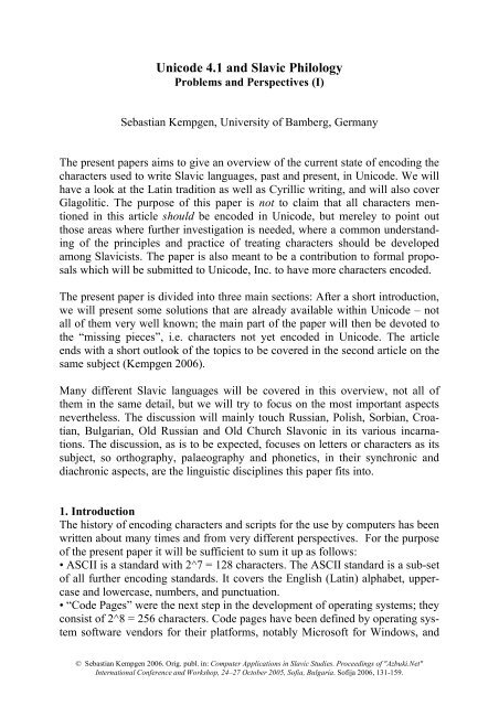
Sebastian Kempgen, University of Bamberg, Germany<br />
The present papers aims to give an overview of the current state of encoding the<br />
characters used to write <strong>Slavic</strong> languages, past <strong>and</strong> present, in <strong>Unicode</strong>. We will<br />
have a look at the Latin tradition as well as Cyrillic writing, <strong>and</strong> will also cover<br />
Glagolitic. The purpose of this paper is not to claim that all characters mentioned<br />
in this article should be encoded in <strong>Unicode</strong>, but mereley to point out<br />
those areas where further investigation is needed, where a common underst<strong>and</strong>ing<br />
of the principles <strong>and</strong> practice of treating characters should be developed<br />
among <strong>Slavic</strong>ists. The paper is also meant to be a contribution to formal proposals<br />
which will be submitted to <strong>Unicode</strong>, Inc. to have more characters encoded.<br />
The present paper is divided into three main sections: After a short introduction,<br />
we will present some solutions that are already available within <strong>Unicode</strong> – not<br />
all of them very well known; the main part of the paper will then be devoted to<br />
the “missing pieces”, i.e. characters not yet encoded in <strong>Unicode</strong>. The article<br />
ends with a short outlook of the topics to be covered in the second article on the<br />
same subject (Kempgen 2006).<br />
Many different <strong>Slavic</strong> languages will be covered in this overview, not all of<br />
them in the same detail, but we will try to focus on the most important aspects<br />
nevertheless. The discussion will mainly touch Russian, Polish, Sorbian, Croatian,<br />
Bulgarian, Old Russian <strong>and</strong> Old Church Slavonic in its various incarnations.<br />
The discussion, as is to be expected, focuses on letters or characters as its<br />
subject, so orthography, palaeography <strong>and</strong> phonetics, in their synchronic <strong>and</strong><br />
diachronic aspects, are the linguistic disciplines this paper fits into.<br />
1. Introduction<br />
The history of encoding characters <strong>and</strong> scripts for the use by computers has been<br />
written about many times <strong>and</strong> from very different perspectives. For the purpose<br />
of the present paper it will be sufficient to sum it up as follows:<br />
• ASCII is a st<strong>and</strong>ard with 2^7 = 128 characters. The ASCII st<strong>and</strong>ard is a sub-set<br />
of all further encoding st<strong>and</strong>ards. It covers the English (Latin) alphabet, uppercase<br />
<strong>and</strong> lowercase, numbers, <strong>and</strong> punctuation.<br />
• “Code Pages” were the next step in the development of operating systems; they<br />
consist of 2^8 = 256 characters. Code pages have been defined by operating system<br />
software vendors for their platforms, notably Microsoft for Windows, <strong>and</strong><br />
© Sebastian Kempgen 2006. Orig. publ. in: Computer Applications in <strong>Slavic</strong> Studies. Proceedings of "Azbuki.Net"<br />
International Conference <strong>and</strong> Workshop, 24–27 October 2005, Sofia, Bulgaria. Sofija 2006, 131-159.
2<br />
Apple for the Macintosh. Code Pages are tables which have the 128 ASCII<br />
characters in their first (upper) half, <strong>and</strong> additional 128 characters in their second<br />
(lower) half. These additional characters can, for example, comprise a set of<br />
accented Latin characters as required by a certain language or by a group of languages,<br />
but can also contain the Cyrillic alphabet, for example. However, one<br />
cannot have both accented Latin <strong>and</strong> Cyrillic in a single code page.<br />
Code pages differ from computing platform to computing platform, so tools<br />
were necessary to translate characters in a text file from one platform to another,<br />
say a text containing East European characters from a PC for use on a Macintosh.<br />
Not all <strong>Slavic</strong> characters, languages or scripts were ever covered by code<br />
pages: Cassubian is an example of a Latin-writing language, <strong>and</strong> Old Church<br />
Slavonic in its Cyrillic <strong>and</strong> Glagolitic tradition are also examples of scripts that<br />
were never defined as code pages, so only ad hoc or custom solutions were possible<br />
here, with some becoming more widespread than others. Code pages characterize<br />
the computing situation during the ’90s.<br />
• In 1991, several hard- <strong>and</strong> software vendors founded <strong>Unicode</strong>, Inc. to define a<br />
common encoding st<strong>and</strong>ard that would eventually cover all languages of the<br />
world with all their characters. This st<strong>and</strong>ard came to be known simply as<br />
‘<strong>Unicode</strong>’. It has 2^16 = 65.536 slots for characters which were thought to present<br />
ample space to fit each <strong>and</strong> every character of all the world’s scripts into.<br />
The <strong>Unicode</strong> st<strong>and</strong>ard gradually evolved over the next years, <strong>and</strong> operating system<br />
software vendors implemented more <strong>and</strong> more support for <strong>Unicode</strong> in their<br />
software. The code pages which were in existence before the conception of<br />
<strong>Unicode</strong> were all integrated into the new st<strong>and</strong>ard to guarantee compatibility<br />
with legacy data.<br />
• Version <strong>4.1</strong> of the <strong>Unicode</strong> st<strong>and</strong>ard was finalized <strong>and</strong> published in 2005, <strong>and</strong><br />
it featured an important addition for <strong>Slavic</strong>ists, namely the inclusion of the Glagolitic<br />
script. Thus, it seems appropriate today to present an overview of the current<br />
state of encoding the <strong>Slavic</strong> languages <strong>and</strong> scripts in <strong>Unicode</strong> <strong>4.1</strong>. As we<br />
said before, <strong>Unicode</strong> is an evolving st<strong>and</strong>ard, <strong>and</strong> hints of an upcoming version<br />
5.0 are already to be found. 1<br />
<strong>Unicode</strong> as an encoding st<strong>and</strong>ard can be thought of as a gigantic table with<br />
65.536 cells; each cell has a numerical value <strong>and</strong> contains a specific character.<br />
In addition, this character can also have its own unique name, for example “Tsecyrillic”.<br />
Character are defined by their internal numbers, not by their names,<br />
<strong>and</strong> in principle this should indeed allow for every defined character to be transported<br />
from platform to another unaltered. What should be kept in mind, how-<br />
1 The website for <strong>Unicode</strong>, Inc. is at http://www.unicode.org. It covers all aspects of the<br />
<strong>Unicode</strong> st<strong>and</strong>ard <strong>and</strong> of its evolution. While in the beginning printed editions served as the<br />
st<strong>and</strong>ard reference, downloadable pdf files serve the same purpose today. When the present<br />
article refers to ‘<strong>Unicode</strong> docs’, we refer to these pdf files (together about 50 smaller files that<br />
cover a specific section of the st<strong>and</strong>ard or one global file that contains everything).<br />
© Sebastian Kempgen 2006. Orig. publ. in: Computer Applications in <strong>Slavic</strong> Studies. Proceedings of "Azbuki.Net"<br />
International Conference <strong>and</strong> Workshop, 24–27 October 2005, Sofia, Bulgaria. Sofija 2006, 131-159.
3<br />
ever, is that characters are represented on-screen by using fonts, <strong>and</strong> fonts may<br />
cover only certain subsets of <strong>Unicode</strong>. Also, one should be aware that the basic<br />
fonts used on PCs <strong>and</strong> Macs fonts evolve over time to incorporate more characters,<br />
which means, that as a piece of software they carry version numbers. If one<br />
refers to a font having or not having a certain feature, one should carefully note<br />
the version of the font that serves as a reference. The Appendix to the present<br />
article contains a list of features from <strong>Unicode</strong> that are important to <strong>Slavic</strong> philology,<br />
<strong>and</strong> it notes the availability of that feature in current versions of st<strong>and</strong>ard<br />
fonts like Times <strong>and</strong> Times New Roman. As can be seen from that table, these<br />
fonts differ markedly in what they – currently – have to offer to a slavicist, <strong>and</strong><br />
especially a medievalist.<br />
For practical purposes, the aforementioned gigantic <strong>Unicode</strong> table can be<br />
thought of as consisting of “blocks”. The most common blocks are various<br />
blocks containing Latin characters, one block contains phonetics characters, another<br />
Cyrillic characters for the <strong>Slavic</strong> languages, <strong>and</strong> the next one those for the<br />
non-<strong>Slavic</strong> additions, another block various accents <strong>and</strong> diacritics <strong>and</strong> so on. For<br />
common Western languages, these blocks are not unlike the former code pages<br />
in scope, while they do differ in size – some may be small, others may be large.<br />
<strong>Unicode</strong> terminology differs a bit from linguistic usage: linguists usually talk<br />
about characters, graphemes, allographs <strong>and</strong> letters, whereas <strong>Unicode</strong> knows<br />
characters, glyphs, <strong>and</strong> character codes. These different terminologies can<br />
largely be neglected for the purpose of the present paper.<br />
Apart from the blocks touched upon above, <strong>Unicode</strong> also provides a so-called<br />
‘private area’ consisting of 6.400 slots. Seeing that there might be the need to<br />
use non-st<strong>and</strong>ard characters, company logos etc. in texts, this private area was<br />
meant to house such elements. The ‘risk’, so to speak, of using it lies in the fact<br />
that compatibility between fonts <strong>and</strong> documents cannot be guaranteed any<br />
longer. This may be not be problem for texts which are used by a small user<br />
community. For example, a company may decide to put its logo into a slot of the<br />
private area so all workers can produce texts using that logo. However, it is easy<br />
to foresee a situation where several groups of users (say the medievalists of<br />
various philologies, like Germanic, Romance, <strong>Slavic</strong>) start to use the same slots<br />
for their different needs. This can easily lead to problems in publishing papers,<br />
in printing etc. At present, this private area is already in use, <strong>and</strong> its use is not<br />
yet coordinated between philologies. 2<br />
2 Philologies seem to differ in their efforts to coordinate the use of this private area within<br />
their discipline or between them. There seem to be more efforts for coordination in Germanic,<br />
English <strong>and</strong> Romance philologies, as evidenced by MUFI, the Medieval <strong>Unicode</strong> Font Initiative<br />
(http://g<strong>and</strong>alf.aksis.uib.no/mufi/).<br />
© Sebastian Kempgen 2006. Orig. publ. in: Computer Applications in <strong>Slavic</strong> Studies. Proceedings of "Azbuki.Net"<br />
International Conference <strong>and</strong> Workshop, 24–27 October 2005, Sofia, Bulgaria. Sofija 2006, 131-159.
4<br />
The process of evolving the <strong>Unicode</strong> st<strong>and</strong>ard further is through written submissions<br />
<strong>and</strong> proposals. These proposals need to follow a given structure, <strong>and</strong> they<br />
have technical <strong>and</strong> philological aspects. It is the burden of the persons submitting<br />
proposals to clearly demonstrate why a character is needed, how <strong>and</strong> when<br />
it was used, what its relevance for today’s computing needs is etc. <strong>Unicode</strong>.org<br />
publishes a ‘pipeline’ of characters <strong>and</strong> scripts that will eventually be included<br />
into the next revision of the st<strong>and</strong>ard so double submissions <strong>and</strong> the work connected<br />
with putting together such a proposal can be avoided. This is very important<br />
because the process of getting a proposal accepted is lenghty <strong>and</strong> includes<br />
several steps – it can in principle take anything from months to years as evidenced<br />
by the efforts of having Glagolitic being accepted as part of <strong>Unicode</strong>.<br />
<strong>Unicode</strong>.org also publishes a lists of rejected scripts <strong>and</strong> characters so interested<br />
parties are spared the work of proposing them again. The Klingon language/<br />
script may serve as an example of a rejected script. Lastly, the documentation of<br />
the <strong>Unicode</strong> st<strong>and</strong>ard will naturally contain some errors, mistakes, though every<br />
effort is being made to minimize them. All known errata are also published on<br />
the <strong>Unicode</strong> web-site. All material that will be presented in the third section of<br />
this paper has, of course, been checked against the already published errata <strong>and</strong><br />
the pipeline of forthcoming characters.<br />
2. The Status Quo – A Few Appetizers<br />
In this section we will have a look at what is already available to <strong>Slavic</strong> philology,<br />
what has already been accomplished, what is already covered by st<strong>and</strong>ard<br />
solutions. This section will of course not exp<strong>and</strong> on trivial accomplishments.<br />
Modern Cyrillic, for example, has been a part of the <strong>Unicode</strong> st<strong>and</strong>ard from version<br />
1 on. But nevertheless, <strong>Unicode</strong> presents some solutions for <strong>Slavic</strong>ists not<br />
everybody will be aware of. Thus, it is certainly worth to have a look at some of<br />
them, the more so because some of these solutions will serve later as basis to<br />
outline deficiencies in the <strong>Unicode</strong> <strong>4.1</strong>.<br />
One important thing that is worth repeating here is that if a character, may it be a<br />
letter, an accent or some other sign is defined in <strong>Unicode</strong>, that does not mean<br />
that a certain font contains an image of that character. Thus, it would be a misconception<br />
to think that because font X does not have character Y, it is not available<br />
in <strong>Unicode</strong>. Most people today will, for example, use Times New Roman<br />
(from Monotype) on the PC (<strong>and</strong> now on the Macintosh, too), <strong>and</strong> Times (from<br />
Linotype) on the Macintosh. A comparison of these two common fonts (see Appendix)<br />
will show that, unfortunately, Times New Roman has much less to offer<br />
to a <strong>Slavic</strong>ist than Times, but Times is not as widespread on the PC whereas on<br />
© Sebastian Kempgen 2006. Orig. publ. in: Computer Applications in <strong>Slavic</strong> Studies. Proceedings of "Azbuki.Net"<br />
International Conference <strong>and</strong> Workshop, 24–27 October 2005, Sofia, Bulgaria. Sofija 2006, 131-159.
5<br />
the Macintosh it is a st<strong>and</strong>ard since the invention of desktop publishing in the<br />
80’s. 3<br />
As an appetizer may also serve the fact that the autor of the present article has<br />
produced a font named Kliment Std that is available for free. This font is aimed<br />
especially at <strong>Slavic</strong> medievalists, <strong>and</strong> it features a lot of those characters not present<br />
in either Times or Times New Roman. The font is available for download<br />
from http://kodeks.uni-bamberg.de/AKSL/Schrift/KlimentStd.htm <strong>and</strong> also from<br />
the ‘Repertorium’ website. It is being used in the present paper where the st<strong>and</strong>ard<br />
fonts do not offer support for a character in question.<br />
2.1. Transliteration of pre-revolutionary Russian orthography<br />
Ѳѳ: Ḟḟ <strong>Unicode</strong>: 1E1E, 1E1F (Latin Extended Additional)<br />
Ѵѵ: Ẏẏ <strong>Unicode</strong>: 1E8E, 1E8F (Latin Extended Additional)<br />
For F with overdot, the <strong>Unicode</strong> documentation mentions “Irish Gaelic (Old Orthography)”<br />
as an example for the use of this character; for Y with overdot, no<br />
such information is given. It is not important whether the documentation for<br />
<strong>Unicode</strong> has any reference to Russian here or not; it is not even important if<br />
<strong>Unicode</strong>, Inc. is aware of this specific use of these two character pairs – what’s<br />
important to the user is only that these characters do exist <strong>and</strong> can be used.<br />
As for the presence in st<strong>and</strong>ard fonts, it should be noted that Times New Roman<br />
does not have these characters at present, whereas Times has both (see Appendix).<br />
2.2. Transliteration of Soft Sign <strong>and</strong> Hard Sign<br />
ЬЪ: ʹ ʺ <strong>Unicode</strong>: 02B9, 02BA (Spacing Modifiers)<br />
“Modifier Letter Prime”, “Modifier Letter Double Prime”<br />
A bit unexpected to many Slavists might be the fact that <strong>Unicode</strong> has special<br />
characters that should be used for the transliteration of the soft <strong>and</strong> hard sign. In<br />
other words: the curly quote (i.e. ’ ) which is so common today in printed material<br />
regarding <strong>Slavic</strong> is, strictly speaking, incorrect from a <strong>Unicode</strong> perspective. 4<br />
3 It might be worth pointing out that version 3.05 of both Times New Roman <strong>and</strong> Arial for the<br />
Macintosh have the same character set as their PC counterparts. Thus, any data <strong>and</strong> file exchange<br />
that is based on these fonts will be completely without problems. This is true for the<br />
Latin accented characters used by today’s <strong>Slavic</strong> languages, <strong>and</strong> for the contemporary orthography<br />
of Cyrillic. The differences – <strong>and</strong> problems – however begin to start immediately beyond<br />
that point.<br />
4 This brings up another interesting point: Even if a specific <strong>Unicode</strong> character is available for<br />
a given purpose, nobody forces a user to use it – one can use an incorrect character accidentally<br />
or if one prefers it to the right one or if the right one is not available in the basic font.<br />
Therefore the requirement, often heard today, to “use only <strong>Unicode</strong> fonts” does not guarantee<br />
© Sebastian Kempgen 2006. Orig. publ. in: Computer Applications in <strong>Slavic</strong> Studies. Proceedings of "Azbuki.Net"<br />
International Conference <strong>and</strong> Workshop, 24–27 October 2005, Sofia, Bulgaria. Sofija 2006, 131-159.
6<br />
That <strong>Unicode</strong> should have separate characters for the transliteration of the soft<br />
<strong>and</strong> the hard sign is underst<strong>and</strong>able, though: for purposes such as sorting,<br />
searching etc., one will want to be able to distinguish between punctuation <strong>and</strong><br />
characters. In this case, the <strong>Unicode</strong> docs explicitly mention the use of these two<br />
symbols, which also denote “primary stress” <strong>and</strong> “exaggerated stress” in a phonetic<br />
context. The shape of these two glyphs may be acceptable in phonetics, but<br />
it seems questionable if they are the best solution aesthetically for the soft <strong>and</strong><br />
hard sign, <strong>and</strong> it remains to be seen if these two characters will really become<br />
widespread for this use.<br />
In any case, neither Times nor Times New Roman has these two symbols at present.<br />
2.3. Transliteration of Macedonian<br />
Ѓѓ Ǵǵ <strong>Unicode</strong>: 01F4, 01F5 (Latin Extended-B)<br />
Ќќ Ḱḱ <strong>Unicode</strong>: 1E30, 1E31 (Latin Extended Additional)<br />
The <strong>Unicode</strong> documentation correctly mentions that these two character pairs<br />
are needed for the transliteration of Macedonian; however, it also mentions Serbian<br />
for the first character pair, which is not correct. Interesting in this case is<br />
also the fact that these two character pairs are distributed between two blocks<br />
which are, so to speak, “miles apart”. This is clear evidence of the fact that<br />
proper support for the transliteration of Macedonian has not originally been a<br />
systematic consideration when these characters were introduced, or otherwise<br />
one would expect to see both character pairs close together in one block.<br />
As for support of these character by our reference fonts, Times has both pairs,<br />
Times New Roman has neither of the two.<br />
2.4. Support for the Cassubian alphabet<br />
Cassubian, a minority language in Pol<strong>and</strong> with a very lively Internet-using<br />
community, never had its own code-page on any computing platform, so users<br />
had to switch between the st<strong>and</strong>ard Western character set <strong>and</strong> the CE (Central<br />
European) code page if they wanted to write their language; however, all characters<br />
were in principle available. Now with <strong>Unicode</strong>, the disctinctions between<br />
code pages are largely irrelevant <strong>and</strong> it is now possible to have one keyboard<br />
driver to allow input of all Cassubian characters.<br />
Cassubian characters from the Western character set: Ãã Òò Ùù Ôô Éé Ëë<br />
Cassubian characters from the CE code page: Łł Óó Éé Ńń Ôô Żż<br />
full <strong>Unicode</strong>-compatibility in encoding the text – users may be more interested in in the presentation<br />
form of their text: if the output matches their intentions, they don’t care whether<br />
they have used the correct character or not.<br />
© Sebastian Kempgen 2006. Orig. publ. in: Computer Applications in <strong>Slavic</strong> Studies. Proceedings of "Azbuki.Net"<br />
International Conference <strong>and</strong> Workshop, 24–27 October 2005, Sofia, Bulgaria. Sofija 2006, 131-159.
7<br />
Only those characters with diacritics are given here, <strong>and</strong> one can see that Cassubian<br />
uses quite a few characters not used by Polish (all pairs from the Western<br />
character set listed here).<br />
2.5. Nasal vowels<br />
In the area of slavic phonetics <strong>and</strong> phonology, it may be worth noting that <strong>Unicode</strong><br />
has nasal variants of all five basic vowels a, e, i, o, u. Of these, four, namely<br />
Ąą Ęę Įį Ųų, are needed for Polish <strong>and</strong> Lithuanian orthography <strong>and</strong> therefore<br />
are part of the <strong>Unicode</strong> st<strong>and</strong>ard, but not Ǫǫ. So it is a very welcome addition<br />
to find Ǫǫ, which <strong>Unicode</strong> documentation says is needed for Sami <strong>and</strong> Old<br />
Icel<strong>and</strong>ic. Of course, it is also possible to put a breve or macron over these nasal<br />
vowels to indicate ‘short’ or ‘long’ duration. 5<br />
From our two reference fonts, Times has a glyph for nasal o, Times New Roman<br />
doesn’t. Codepoints are [01EA] <strong>and</strong> [01EB], respectively.<br />
2.6. Long <strong>and</strong> short vowels<br />
For <strong>Slavic</strong> phonetics, long <strong>and</strong> short vowels are very important. Here, the situation<br />
is as follows (only lowercase letters are given):<br />
Basic vowels: long <strong>and</strong> short: ā ă ē ĕ ī ĭ ō ŏ ū ŭ<br />
Additional vowels: only long: ȳ<br />
Of course, y with breve above can be composed from its parts: y̆. 6 Thus, for<br />
Latin writing, all essential glyphs are there. For Cyrillic, one will have to resort<br />
to composing anything besides st<strong>and</strong>ard orthography by using the base character<br />
<strong>and</strong> then putting a diacritic on top.<br />
2.7. Vowels with underdot (indicating accent)<br />
Sometimes, especially in typesetting poetry, vowels with underdots are used to<br />
indicate stress position. Among Latin precomposed characters, six vowels are<br />
available with such a diacritic below:<br />
5 ‘macron’ is the name of the symbol used to denote long duration. – In addition, it might be<br />
noted that a long nasal o is available as a precomposed character (01EC: Ǭ, 01ED: ǭ), because<br />
it is also needed for Old Icel<strong>and</strong>ic. However, no other nasal vowel is available as a precomposed<br />
character in its long or short variant so we won’t stress the presence of this single<br />
one too much here. As for our reference fonts, Times has this character, but not Times New<br />
Roman.<br />
6 Actually, the Times font has a bug in the “Combining Diacritical Marks” block: its diacritics<br />
do not really combine but have their own positive width, just as the corresponding diacritics<br />
in the “Spacing Modifiers” block. Other fonts, like Lucida Gr<strong>and</strong>e or my own Kliment Std.<br />
have combining diacritics which do in fact allow composition. Times New Roman does not<br />
have the breve or the macron in this block.<br />
© Sebastian Kempgen 2006. Orig. publ. in: Computer Applications in <strong>Slavic</strong> Studies. Proceedings of "Azbuki.Net"<br />
International Conference <strong>and</strong> Workshop, 24–27 October 2005, Sofia, Bulgaria. Sofija 2006, 131-159.
Latin precomposed: ạ ẹ ị ọ ụ ỵ<br />
For Cyrillic, no such precomposed characters are available, so here one has to<br />
use combining diacritics to achieve the same effect:<br />
8<br />
Cyrillic composed: а̣ е̣ и̣ о̣ у̣ ы̣ э̣ ю̣ я̣<br />
The Cyrillic sample uses the medieval characters shapes of the Kliment Std font.<br />
2.8. Croatian Digraphs matching Serbian<br />
An unusual feature of the <strong>Unicode</strong> st<strong>and</strong>ard is that it contains (in the Latin Extended-B<br />
block) three groups of three characters each, the so-called “Croatian<br />
digraphs matching Serbian Cyrillic letters”:<br />
LJ Lj lj - NJ Nj nj - DŽ Dž dž ≈ Љљ Њњ Џџ<br />
Nearby in the same <strong>Unicode</strong> block, there is another similar group:<br />
DZ Dz dz ≈ Ѕѕ<br />
See the following on-screen representation of the corresponding section from<br />
the Latin Extended-B block, with the characters in question highlighted: 7<br />
Fig. 1: Croatian digraphs matching Serbian <strong>and</strong> Macedonian Cyrillic letters<br />
For the last group, the <strong>Unicode</strong> documentation does not give a specific use, but<br />
is clear that these are “Croatian digraphs matching Macedonian Cyrillic letters”.<br />
7 The table also shows several characters we have already talked about – the nasal o, the g<br />
with acute for Macedonian transliteration, <strong>and</strong> many of the characters important for the discussion<br />
in section 3.1 (see below).<br />
© Sebastian Kempgen 2006. Orig. publ. in: Computer Applications in <strong>Slavic</strong> Studies. Proceedings of "Azbuki.Net"<br />
International Conference <strong>and</strong> Workshop, 24–27 October 2005, Sofia, Bulgaria. Sofija 2006, 131-159.
9<br />
Of course, it could also be indicated that we need DŽ Dž dž ≈ Џџ for Macedonian,<br />
too. The reasoning behind the introduction of these characters was that<br />
‘Serbocroatian is one language which can be written with two alphabets, <strong>and</strong><br />
therefore it should be possible to convert any text written in one alphabet into its<br />
counterpart from the other – <strong>and</strong> back again’.<br />
As one can see from the samples above, each group consists of three digraphs:<br />
one uppercase only, one mixed uppercase (first character) <strong>and</strong> lowercase (second<br />
character), <strong>and</strong> one lowercase only. Although a normal user might not be<br />
aware of this, the typical uses would be a headline in all capitals (DŽAS - JAZZ),<br />
the beginning of a sentence, where only the first letter is capitalized (as in Džas,<br />
for example), <strong>and</strong> never the first two (*DŽas, for example, looks horrible, even<br />
if it sounds the same), <strong>and</strong> a ‘normal’ form (like džas).<br />
As for our reference fonts, Times has all these digraphs, Times New Roman<br />
doesn’t have any of them.<br />
These observations may conclude the discoveries that can be made among the<br />
already available characters in the current <strong>Unicode</strong> st<strong>and</strong>ard, either with or<br />
without support from st<strong>and</strong>ard fonts.<br />
3. A Case of Blues – Missing Pieces in <strong>Unicode</strong> <strong>4.1</strong><br />
This next section will be devoted to problems <strong>and</strong> missing features of the current<br />
<strong>Unicode</strong> st<strong>and</strong>ard from a <strong>Slavic</strong>ists point of view. Available space does not permit<br />
us to touch upon everything that would be worth mentioning, so only a selection<br />
from various <strong>Slavic</strong> languages, language areas <strong>and</strong> times will be presented<br />
here (our second article on the same subject will present additional material).<br />
8<br />
3.1. Štokavian Accents – the missing ‘r grave accent’<br />
Serbian <strong>and</strong> Croatian use four accent marks to denote the four possible<br />
combinations of long vs. short duration with rising vs. falling tone. The accepted<br />
norm uses acute ( ´ ) for long-rising, grave ( ` ) for short-rising, an inverted bow<br />
( ̑ ) for long-falling <strong>and</strong> a double grave accent ( ˵ ) for short-falling. 9 These four<br />
diacritics go over any of the following six vowels: a e i o u r, totalling 6 x 4 = 24<br />
different character combinations.<br />
One of the pleasant surprises of <strong>Unicode</strong> is that it contains “Additions for<br />
Slovenian <strong>and</strong> Croatian” in its Latin Extended-B block – see the last line of Fig.<br />
8 Also, it should be duely noted that others, notably Birnbaum (1996 & 2002), have already<br />
covered several of the topics that will follow in the next section, although sometimes from a<br />
different perspective <strong>and</strong> in a different context. See also Berdnikov/Lapko (1999).<br />
9 The inverted bow is sometimes misinterpreted by people writing about Serbocroatian without<br />
being really familiar with the language: the circumflex ( ˆ ) can sometimes be found instead,<br />
or the macron ( ¯ ). Both are not correct here.<br />
© Sebastian Kempgen 2006. Orig. publ. in: Computer Applications in <strong>Slavic</strong> Studies. Proceedings of "Azbuki.Net"<br />
International Conference <strong>and</strong> Workshop, 24–27 October 2005, Sofia, Bulgaria. Sofija 2006, 131-159.
10<br />
1 above. However, a closer look reveals a strange omission. Here is an overview<br />
of available characters (only lowercase characters are given here):<br />
á é í ó ú ŕ – Latin 1<br />
à è ì ò ù _ – Latin 1<br />
ȁ ȅ ȉ ȍ ȕ ȑ – Latin Extended-B<br />
ȃ ȇ ȋ ȏ ȗ ȓ – Latin Extended-B<br />
Fig. 2: Štokavian accents in <strong>Unicode</strong> – one is missing<br />
Strange as it may seem, one character has obviously been forgotten, namely r<br />
with grave accent: r̀. Now the fact itself that all of these vowel-diacritic combinations<br />
have been added to <strong>Unicode</strong> may be astonishing by itself, but there is<br />
some logic to it: The letters in the first two rows (Latin 1) are part of st<strong>and</strong>ard<br />
orthographies, so they were already present in <strong>Unicode</strong>, which means half of the<br />
whole system was already implemented. The remaining characters were added<br />
to the Latin Extended-B block to complete the Štokavian accent system.<br />
However, it was overlooked that r with grave accent ( r̀ ) isn’t part of any alphabet<br />
<strong>and</strong> not present in the Latin 1 block. Thus, we have 23 of 24 characters that<br />
are available as preaccented characters, <strong>and</strong> one has to made up from its parts. A<br />
strange omission indeed, <strong>and</strong> one which should surely be corrected from a user’s<br />
perspective. However, <strong>Unicode</strong>, Inc. has changed its attitude in recent years with<br />
respect to precomposed characters: they won’t be accepted if they can equally<br />
well be composed from available parts. The omission is especially strange if we<br />
look at some – not completely r<strong>and</strong>om – sample words that need the missing<br />
glyph: Sr̀bija, <strong>and</strong> hr̀vatski.<br />
As for our reference fonts – Times has the Štokavian accents while Times New<br />
Roman doesn’t. The r with grave accent cannot be composed using the current<br />
version of the Times font, however, because of the bug mentioned above (the<br />
combining grave accent behaves as a spacing character, not as a combining character),<br />
so the sample again uses the Kliment Std font.<br />
The <strong>Unicode</strong> documentation may mention both Slovenian <strong>and</strong> Croatian, but it’s<br />
really the Croatian system that was implemented here. One the one h<strong>and</strong>, Slovenenian<br />
does not use all of the 24 characters mentioned above, <strong>and</strong>, on the other<br />
h<strong>and</strong>, requires additional characters (cf. Comrie/Corbett 1993: 390ff.) in a<br />
phonological transcription: 10 ə̀ (Schwa with grave accent), ə̏ (Schwa with double<br />
grave accent), <strong>and</strong> ẹ́ (e with dot below <strong>and</strong> acute above). These samples again<br />
use the Kliment Std font, as neither Times nor Times New Roman support these<br />
character combinations.<br />
10 For Croatian, there is no distinction here between orthography with added accents <strong>and</strong> tones<br />
<strong>and</strong> a phonological transcription – they are identical. For Slovenian, this is not true.<br />
© Sebastian Kempgen 2006. Orig. publ. in: Computer Applications in <strong>Slavic</strong> Studies. Proceedings of "Azbuki.Net"<br />
International Conference <strong>and</strong> Workshop, 24–27 October 2005, Sofia, Bulgaria. Sofija 2006, 131-159.
11<br />
It should also be mentioned that Serbian uses the same four accents in its Cyrillic<br />
writing, as can be seen from the following sample (from Tolstoj 1970):<br />
Fig. 3: Serbian Cyrillic use of accents<br />
The scan – which is interesting insofar as it shows all four accents in a row over<br />
r – also shows the use of the macron ( ¯ ) denoting a long non-accented vowel.<br />
It is worth pointing out here that the Cyrillic portion of <strong>Unicode</strong> does not have<br />
its own diacritics, not even speaking of precomposed Štokavian accents.<br />
3.2. Cyrillic Uk<br />
The Cyrillic block presents a problem which can be treated with the same arguments<br />
that led to the inclusion of three variants each for the Croatian digraphs<br />
(see above, section 2.8.):<br />
Fig. 4: Two slots for ‘Uk’ – mixed implementation<br />
It is well known that the horizontal digraphs Оу – оу are variants of the vertical<br />
ligatures Ȣ ȣ. However, to represent the two vertical ligatures with two separate<br />
letters, we really need three pairs: ОУ - Оу – оу, not two, as the <strong>Unicode</strong> table<br />
shows. Further, it is not completely clear which character pair should go into the<br />
first slot (i.e. 0478). Some fonts realize this position with uppercase-only letters,<br />
others with the mixed variant (see sample). Clearly, some action is required here<br />
to introduce the third pair into <strong>Unicode</strong> <strong>and</strong> to clarify which slot to assign the<br />
uppercase-only variant to.<br />
© Sebastian Kempgen 2006. Orig. publ. in: Computer Applications in <strong>Slavic</strong> Studies. Proceedings of "Azbuki.Net"<br />
International Conference <strong>and</strong> Workshop, 24–27 October 2005, Sofia, Bulgaria. Sofija 2006, 131-159.
12<br />
Fig. 5: Uppercase-only <strong>and</strong> lowercase-only implementation<br />
It could be argued that as long as the solution is not clear, it is better to have the<br />
uppercase-only variant in [0478], because word-processors usually have a<br />
function to capitalize words written in lowercase letters <strong>and</strong> vice versa. But a<br />
lowercase word-form like оугодити would look like ОуГОДИТИ after applying<br />
this function if we were to have the mixed uppercase-lowercase variant in<br />
[0478] – not to everyone’s typographical taste, one would assume.<br />
3.3. <strong>Slavic</strong> Phonetics<br />
Just added to <strong>Unicode</strong> version <strong>4.1</strong>. have been two characters that are supposed to<br />
be useful for Russian phonetics:<br />
Fig. 6: Latin small capital ɪ with stroke <strong>and</strong> iota with stroke in UC<br />
Having consulted all phonetic manuals on Russian that were available to me, I<br />
have not seen a single instance where the small iota with stroke has been used.<br />
However, there are many instances, where another, similar letter is being used:<br />
Fig. 7: Dotless ı with stroke (Gabka 1975: 34)<br />
It is a dotless ı with stroke, <strong>and</strong> it is commonly used to denote the unaccented<br />
realization of ы. It is not the lowercase capital ɪ that is being used here in the<br />
first row of this table, it is indeed a dotless i!<br />
© Sebastian Kempgen 2006. Orig. publ. in: Computer Applications in <strong>Slavic</strong> Studies. Proceedings of "Azbuki.Net"<br />
International Conference <strong>and</strong> Workshop, 24–27 October 2005, Sofia, Bulgaria. Sofija 2006, 131-159.
13<br />
If we take a closer look at the transcription system used by Avanesov in his<br />
various books on Russian phonetics, we see that he mixes Cyrillic with some<br />
Latin <strong>and</strong>/or IPA characters (h j ʌ ə), throwing in some Greek characters (γ α),<br />
<strong>and</strong> making extensive use of accents, too.<br />
However, he also introduces a new phonetic symbol, essentially an “S” turned<br />
sideways, to denote “nasality as such”:<br />
Fig. 8: Phonetic symbol introduced by Avanesov (1974: 50)<br />
The symbol is available as a technical or mathematical symbol in <strong>Unicode</strong><br />
[223D], but not as a phonetic symbol.<br />
In Bulgarian phonetics, we have another interesting phenomenon: the revival of<br />
an Old Church Slavonic character, used to denote the affricate [dž]:<br />
Fig. 9: OCS ч used in Bulgarian phonetics (Gramatika 1982, T. 1: 29)<br />
While the transcription is in principle Cyrillic, it also makes use of the Latin ‘l’<br />
to write the ‘middle’ or ‘European’ l-sound (not as soft as the <strong>Slavic</strong> soft l, <strong>and</strong><br />
not as hard as the hard <strong>Slavic</strong> l).<br />
The two phonetic symbols mentioned in this section may, however, be regarded<br />
as individual, non-st<strong>and</strong>ard uses, which do not merit an expansion of the <strong>Unicode</strong><br />
st<strong>and</strong>ard.<br />
3.4. Polish <strong>and</strong> Sorbian Orthography<br />
The history of Polish orthography exhibits many interesting developments, not<br />
all of which can be discussed here at equal length.<br />
Jakub Parkosz (or Parkoszowicz) in his work on Polish orthography (written ca.<br />
1440) was looking for a way to distinguish between hard <strong>and</strong> soft consonants.<br />
The solution he arrived at was to draw characters like ‘b’ <strong>and</strong> ‘p’ with a round<br />
belly to denote soft consonants, <strong>and</strong> with a square part to denote a hard consonant.<br />
His suggestions never really caught on with is contemporaries <strong>and</strong> actually<br />
© Sebastian Kempgen 2006. Orig. publ. in: Computer Applications in <strong>Slavic</strong> Studies. Proceedings of "Azbuki.Net"<br />
International Conference <strong>and</strong> Workshop, 24–27 October 2005, Sofia, Bulgaria. Sofija 2006, 131-159.
14<br />
were never used in the then-emerging typesetting. However, he is a prominent<br />
figure in the history of Polish orthography, <strong>and</strong> modern editions of his work try<br />
to mimic his h<strong>and</strong>written original by using character forms created especially for<br />
this purpose (cf. 1985, 78). The square vs. round distinction is more a stylistic<br />
variation comparable to modern type vs. broken script, but the need to reproduce<br />
these letters today is one of the criteria that <strong>Unicode</strong>, Inc. has formulated for any<br />
successful submissions.<br />
More successful proved the distinctions used by St. Murzynowski in his “Orthographia<br />
Polska” (Königsberg 1551). Among the characters not present in<br />
<strong>Unicode</strong> today are a soft b ( b’ ), the m with a combining overline, <strong>and</strong> the socalled<br />
“r rotunda”, which is also well-known from Germanic philology.<br />
Fig. 10: Alphabet by St. Murzynowski (1551)<br />
While the “r rotunda” was only a stylistic variation in medieval German (it was<br />
used when the neighbouring letter was round), Murzynowski proposed another<br />
use: he wanted to distinguish those cases where the combination rz denotes one<br />
sound, i.e. [ž] from those where it denotes two sounds, i.e. [r-z]. Thus, the difference<br />
for him was functional, not only aesthetic.<br />
Being linguistically closely related to Polish (<strong>and</strong> Czech), Sorbian is in need of<br />
very similar additions as those just mentioned. While several Sorbian characters<br />
are included in <strong>Unicode</strong> (in blocks Latin Extended-A <strong>and</strong> Latin Extended Additional),<br />
others still await a solution (see Fig. 11). They include a soft b ( b’ ) <strong>and</strong><br />
a soft f ( f ’ ) which can in principle be composed from their parts. These two<br />
characters were removed from the official orthography of Sorbian only in 1948<br />
(Upper Sorbian) resp. 1952 (Lower Sorbian; see Comrie/Corbett 1993: 601,<br />
606). A completely new character, however, is the “stroked S”. Because Sorbian<br />
has always been printed using German broken script, the lowercase counterpart<br />
to the “S with stroke” is not the st<strong>and</strong>ard s but the “long s” ( ſ ) already available<br />
in <strong>Unicode</strong> (without stroke) in slot [017F], block Latin Extended-A.<br />
Fig. 11: Additional characters required for Sorbian<br />
© Sebastian Kempgen 2006. Orig. publ. in: Computer Applications in <strong>Slavic</strong> Studies. Proceedings of "Azbuki.Net"<br />
International Conference <strong>and</strong> Workshop, 24–27 October 2005, Sofia, Bulgaria. Sofija 2006, 131-159.
15<br />
The s with stroke seems to have been introduced for the printing of a bible in<br />
1868; it was limited (?) to the trigraph sch which denotes the sound [ š ] in German.<br />
This corresponds to its funtion: sch with stroked long s denotes [ š ], while<br />
sch with a normal long s denotes [ ś ]. See the following table from Mucke<br />
(1965: 18) which also includes the “r rotunda”:<br />
Fig. 12: Distribution <strong>and</strong> use of normal vs. stroked long s<br />
The stroked s <strong>and</strong> the r rotunda are very interesting challenges typographically<br />
because they have never been designed for modern printing types, only for historic<br />
broken scripts. In a modern serifed font, they would look like this:<br />
Fig. 13: Design of stroked S/long s <strong>and</strong> r rotunda<br />
3.5. Czech Orthography<br />
It is well-known from Roman writing onwards that ‘v’ stood for the sound [u];<br />
this was also true for medieval German, <strong>and</strong> from there it migrated to Czech. In<br />
his edition of Johannes’ Hus “Orthographia Bohemica”, Schröpfer (1968: 82,<br />
Fn. 25) says that until 1849 initial [u] was written v in Czech, <strong>and</strong> [v] was written<br />
w. As this initial vowel could also be long, the combination v́ is required for<br />
the historical orthography of Czech, for example, for the word v́dolj ‘valley’.<br />
Similarly, historical German needs v̈, i.e. a v with a dieresis above. Old tombstones,<br />
by the way, are a good source for samples for this specific character.<br />
© Sebastian Kempgen 2006. Orig. publ. in: Computer Applications in <strong>Slavic</strong> Studies. Proceedings of "Azbuki.Net"<br />
International Conference <strong>and</strong> Workshop, 24–27 October 2005, Sofia, Bulgaria. Sofija 2006, 131-159.
16<br />
3.6. Historical Cyrillic letters<br />
The basic principle that governs the first editions of the <strong>Unicode</strong> st<strong>and</strong>ard as far<br />
as Cyrillic is concerned, has been clearly stated in the printed edition of <strong>Unicode</strong><br />
v. 1:<br />
“The early form of the Cyrillic alphabet is regarded as a font change from modern<br />
Cyrillic, because the early Cyrillic forms are relatively close to the modern appearance”<br />
(The <strong>Unicode</strong> St<strong>and</strong>ard 1991: vol. 1, 44).<br />
The application of this principle, however, creates as many problems as it solves,<br />
as we’ll see below. However, there is a glimmer of hope:<br />
“If, at some future date, the old letterforms are adequately documented <strong>and</strong> the<br />
need for them demonstrated, then they can be added to this [the Cyrillic-<br />
Extended] block” (The <strong>Unicode</strong> St<strong>and</strong>ard 1991: vol. 1, 45).<br />
That’s exactly the status quo today, where several slavists join forces to do exactly<br />
this: to demonstrate the use <strong>and</strong> importance of older letters missing so far<br />
from the <strong>Unicode</strong> st<strong>and</strong>ard, with the aim to finalize a submission to <strong>Unicode</strong>,<br />
Inc. The present paper fulfills its purpose if it lines out some of the deficiencies<br />
in <strong>Unicode</strong> <strong>4.1</strong> <strong>and</strong> proposes some good arguments for the inclusion into<br />
<strong>Unicode</strong> of some of them.<br />
The application of the principle cited above is more or less trivial in some cases,<br />
for example А ~ А, Б ~ Б, Щ ~ Щ. In other cases, we have a functional<br />
identity, if not an identity in the history of the glyphs themselves: Љ ~ Љ, Њ ~<br />
Њ vs. Ѓ ~ Ѓ, Ќ ~ Ќ. However, Sobolevskij (1908: 52) also lists a soft d, <strong>and</strong><br />
Ščepkin (1967: 111) shows a soft m, too:<br />
Fig. 14: Old Russian soft consonants (with tail)<br />
The soft d, i.e. Ђ, could be said to correspond funtionally to a Ђ, although both<br />
forms are completely unrelated historically, <strong>and</strong> no such correspondence exists<br />
for the soft m. So, while for some characters it would be possible to think of a<br />
solution consisting of creating a separate font containing old or alternate charac-<br />
© Sebastian Kempgen 2006. Orig. publ. in: Computer Applications in <strong>Slavic</strong> Studies. Proceedings of "Azbuki.Net"<br />
International Conference <strong>and</strong> Workshop, 24–27 October 2005, Sofia, Bulgaria. Sofija 2006, 131-159.
17<br />
ter shapes with identical function, no uniform solution is possible for all of these<br />
soft consonants. 11<br />
The yotated jat ( ѣ ) is also missing from <strong>Unicode</strong> so far. It seems to occur in<br />
Old Russian only, <strong>and</strong> not very frequently. However, it is important for the history<br />
of the Russian form of the Cyrillic script because it evolved into the cursive<br />
form of the jat that looks like a ligature of an n with a soft sign, ь. Because in<br />
<strong>Slavic</strong> we have the well-known correspondence of yotated <strong>and</strong> non-yotated<br />
vowel letters (а – я, є – ѥ, ѧ – ѩ, ѫ – ѭ, o – ю), the yotated jat would fit into<br />
this row rather nicely, too.<br />
The best-known problem is surely the case of the Old-Russian Я where we<br />
have two competing correspondences, Я <strong>and</strong> Ѧ. <strong>Unicode</strong> <strong>4.1</strong> doesn’t have a<br />
separate entry for Я, but it is very much needed to faithfully transcribe old<br />
texts. Therefore, it is one of the characters that are being added to the private<br />
area, but while this is certainly a stop-gap solution, this character is really much<br />
too important <strong>and</strong> too regular for the private area. It absolutely should be a<br />
regular citizen of the <strong>Unicode</strong> st<strong>and</strong>ard.<br />
It is common knowledge that Peter the Great replaced Я with Я. Less attention<br />
is usually given, however, to another replacement that occurred in Early Modern<br />
Russian. In the 18 th century, the [jo] sound was written, very logically, with the<br />
digraph ıô. To faithfully reproduce this character, the circumflex should sit between<br />
the two characters, but we will limit ourselves here to this approximation.<br />
12 We find this ıô in the Academic Dictionary of 1783-94, <strong>and</strong> although Karamzin<br />
came up with ë as a replacement in 1797, the Academic Grammar of<br />
1802 still uses the old form.<br />
3.7. Accents <strong>and</strong> numbers, Paerok<br />
A separate, but closely related subject is the encoding of Old Russian accents,<br />
breathing marks, numbers etc. Of the two dozen or so elements (not counting<br />
superscript letters), only a few can be considered to be encoded in <strong>Unicode</strong> <strong>4.1</strong>.<br />
Further, it is well-known that the system of these accents – if it even can be<br />
called a system at all – underwent some changes over time, <strong>and</strong> not all scribes<br />
knew the rules when <strong>and</strong> where to write these diacritics. From the overview that<br />
Čerepnin gives (1956: 374-376), we will limit ourselves here to the erok, ertica,<br />
or paerok, as the no. 26 from Fig. 15 was called. The st<strong>and</strong>ard Russian name<br />
today is paerok.<br />
11 We will not touch upon another set of soft consonants here, those written with the corresponding<br />
OCS diacritic, an inverted bow at the right side of the character.<br />
12 Actually, the ıo was printed in several ways: the first part could be a Latin or a Cyrillic i,<br />
<strong>and</strong> the Latin i could be with dot or dotless.<br />
© Sebastian Kempgen 2006. Orig. publ. in: Computer Applications in <strong>Slavic</strong> Studies. Proceedings of "Azbuki.Net"<br />
International Conference <strong>and</strong> Workshop, 24–27 October 2005, Sofia, Bulgaria. Sofija 2006, 131-159.
18<br />
Fig. 15: Old Russian accents <strong>and</strong> breathing marks (Čerepnin 1956: 375)<br />
Manuscripts actually know two different basic forms of this glyph: one is very<br />
similar or identical to a single quote or apostrophe ( ’ ), the other, older, form is<br />
a distinctive ‘S’-like shape:<br />
Fig. 16: The basic form of the Paerok (Samsonov 1973: 57)<br />
The paerok st<strong>and</strong>s mostly between characters, but can also appear above characters.<br />
However, it is not a diacritic in the sense that it modifies the preceding character.<br />
Rather, it is a special glyph that appears instead of a character, namely<br />
the jer. 13<br />
The first form of the paerok can be considered to be available in <strong>Unicode</strong>: at position<br />
[02BC] there is a “modifier letter apostrophe”, <strong>and</strong> the documentation<br />
says that “many languages use this as a letter of their alphabets”. This is also<br />
true for some contemporary <strong>Slavic</strong> languages (for example, Macedonian, <strong>and</strong>,<br />
for a short period after the revolution of 1917, Russian), <strong>and</strong> it correctly describes<br />
the use of the paerok, too. Actually, Leskien calls the paerok an ‘apostrophe’.<br />
Not so clear, however, is the second form of the paerok. In <strong>Unicode</strong>, there is a<br />
“combining vertical tilde” [033E], which looks similar to the paerok, so some<br />
font designers or authors have identified both, a solution we wouldn’t think is<br />
correct. So the paerok is a character that needs to be encoded separately.<br />
As for number signs, Vostokov (1863: 9) describes the following system:<br />
13 And because the paerok appears instead of a normal character, its superscript, diacritic-like<br />
use has to be solved in the same way all other superscript letters are treated: either all of them<br />
have to be encoded separately in <strong>Unicode</strong> or they all have to be treated as presentation forms<br />
(using mark-up to denote their position).<br />
© Sebastian Kempgen 2006. Orig. publ. in: Computer Applications in <strong>Slavic</strong> Studies. Proceedings of "Azbuki.Net"<br />
International Conference <strong>and</strong> Workshop, 24–27 October 2005, Sofia, Bulgaria. Sofija 2006, 131-159.
19<br />
Fig. 17: Old Russian number signs according to Vostokov<br />
From the six signs, only two are encoded in the Cyrillic block (legion <strong>and</strong><br />
leodr), <strong>and</strong> the first one, a combining circle, could possibly be identified with<br />
slot no. [20DD], block “combining diacritical marks for symbols”, but that<br />
doesn’t appear to be the ideal solution.<br />
It should be noted, however, that the glyphs that mark large numbers are, to a<br />
large extend, theoretical entities – there was hardly any actual need to count to<br />
such large numbers in early Rus’.<br />
3.8. Transliteration of Glagolitic<br />
Now that the Glagolitic script has been accepted by the <strong>Unicode</strong> consortium as<br />
being a separate script, it is only natural to check if all the necessary characters<br />
are available which are commonly used for the transliteration of Glagolitic into<br />
Cyrillic (just as Latin counterparts to certain Serbian / Macedonian characters<br />
have been added to have a 1:1–correspondence). In fact, the common usage by<br />
librarians to transliterate Glagolitic into Cyrillic served as an argument not to<br />
encode certain Glagolitic variants separately.<br />
If we take, for example, the Glagolitic i, we’ll see that there is certain problem<br />
here. The Glagolica has three different forms for the i (see Fig. 18), <strong>and</strong> these<br />
three characters – all encoded in <strong>Unicode</strong> <strong>4.1</strong> – are usually transliterated with<br />
the four Cyrillic characters in the second row.<br />
Fig. 18: Transliteration of Glagolitic ‘i’<br />
© Sebastian Kempgen 2006. Orig. publ. in: Computer Applications in <strong>Slavic</strong> Studies. Proceedings of "Azbuki.Net"<br />
International Conference <strong>and</strong> Workshop, 24–27 October 2005, Sofia, Bulgaria. Sofija 2006, 131-159.
20<br />
The first <strong>and</strong> the third Glagolitic i are consistently transliterated using the indicated<br />
characters, but for the middle Glagolitic i, the transliteration differs between<br />
authors, with the Iota being more common (see below).<br />
Of the four Cyrillic characters in Fig. 18, only two are present in <strong>Unicode</strong>, <strong>and</strong><br />
two are missing: the Cyrillic Iota <strong>and</strong> the Cyrillic dotless lowercase ɪ.<br />
The Cyrillic Iota was introduced by Jagić expressly for the purpose of transliterating<br />
Glagolitic. Samples of both an uppercase <strong>and</strong> a lowercase variant are present<br />
in the following scan (Jagić 1911: 232) <strong>and</strong> also frequent in his edition of<br />
the Codex Marianus:<br />
Fig. 19: Jagićs use of Cyrillic Iota (uppercase <strong>and</strong> lowercase)<br />
Of the two characters, Cyrillic Iota <strong>and</strong> Cyrillic I with dieresis, the former is<br />
clearly the st<strong>and</strong>ard most editions use for the transliteration of the middle Glagolitic<br />
character from Fig. 18. The second one can be considered a minority use,<br />
<strong>and</strong> quite rightly so: the use of diacritics leads, in this case, to a confusion as to<br />
which diacritics are present in the original, <strong>and</strong> which ones are only part of the<br />
transliteration.<br />
With every proposal that is submitted to <strong>Unicode</strong>, Inc., one has to include a font<br />
that shows the character in question. This requirement poses an interesting typographical<br />
challenge: Until now, a Cyrillic Iota has only existed in the blackletter<br />
designs used in printing OCS texts, but not in modern typefaces. Therefore<br />
the question arises what a Cyrillic Iota should look like in serifed typefaces like<br />
Times (or Times New Roman). Fig. 20 presents the answer.<br />
Fig. 20: Design of the Greek Iota (left) <strong>and</strong> Cyrillic Iota (Roman <strong>and</strong> Sans)<br />
If we first take a look at the lowercase <strong>and</strong> uppercase Greek Iota (left), we see<br />
that it has an individual character shape for the lowercase letter, while the uppercase<br />
letter is identical to the Latin uppercase I. Consequently, the Cyrillic<br />
© Sebastian Kempgen 2006. Orig. publ. in: Computer Applications in <strong>Slavic</strong> Studies. Proceedings of "Azbuki.Net"<br />
International Conference <strong>and</strong> Workshop, 24–27 October 2005, Sofia, Bulgaria. Sofija 2006, 131-159.
21<br />
uppercase Iota cannot be identical to the Greek uppercase Iota, because we need<br />
distinct lowercase <strong>and</strong> uppercase forms: the uppercase I is needed for the third<br />
Glagolitic letter from Fig. 18. The lowercase Cyrillic iota can be borrowed from<br />
<strong>and</strong> be identical to the Greek lowercase iota, but the uppercase Cyrillic Iota has<br />
to be designed differently. Following the design principles of a serifed typeface,<br />
the uppercase Cyrilic Iota must look like a flipped Latin J. Thus, Fig. 20 shows a<br />
serifed Cyrillic Iota in the middle, <strong>and</strong> a sans-serif Cyrillic Iota at the right<br />
side. 14<br />
Such a serifed Cyrillic Iota has been, as it turned out after the author arrived at<br />
his own solution, actually been used before. It may be a black-letter design, but<br />
the design principles are the same, <strong>and</strong> it serves as a confirmation of the solution<br />
demonstrated in Fig. 20:<br />
Fig. 21: Serifed (black-letter) uppercase Cyrillic Iota (Kurz 1955: 3)<br />
The transliteration of the three Glagolitic I’s actually show that we need another<br />
Cyrillic character, namey a lowercase only addition: a dotless small variant of<br />
the uppercase I with the same design: ɪ. In the Cyrillic block, we have two pairs<br />
of I’s so far that look like Latin characters: I – i <strong>and</strong> Ï – ï. As is usual with Latin<br />
alphabets, in the first pair the lowercase i has an overdot, but the uppercase<br />
doesn’t have one. In contrast to Turkish, the dot is not a distinctive element. For<br />
the transliteration of Glagolitic, however, we need a third lowercase letter: ɪ.<br />
This is the same glyph that survived in the digraph (ligature) ы, <strong>and</strong> as the first<br />
part of ю, ѥ, ѩ, ѭ. Аs can be seen from Fig. 18, <strong>and</strong> as every edition of a OCS<br />
text will prove, it is impossible to use a st<strong>and</strong>ard i with overdot in the transliteration<br />
of a Glagolitic text. This must be a dotless i. However, it cannot be the Latin<br />
dotless i which is already available in <strong>Unicode</strong>, i.e. ı, because that is a Latin<br />
character, <strong>and</strong> it is not the smaller variant of the capital letter I that we need for<br />
the Cyrillic transliteration. The Cyrillic lowercase dotless ɪ must be the same<br />
glyph that is available as [026A] in the ‘IPA Extensions’ block, only as a Cyrillic<br />
character in the Cyrillic block. Further, the Cyrillic lowercase dotless ɪ cannot<br />
be said to be an earlier variant of the modern character i: The modern i could<br />
be said to be a dotless ı with a dot above (<strong>and</strong> the modern dotless ı could be said<br />
14 With the sans-serif uppercase Iota, the design actually isn’t simply a flipped J as that does<br />
not produce an optimal optical effect. The design of the uppercase variant is more ‘a long<br />
version’ of the lowercase letter, just as in traditional OCS printing types (see Fig. 19).<br />
© Sebastian Kempgen 2006. Orig. publ. in: Computer Applications in <strong>Slavic</strong> Studies. Proceedings of "Azbuki.Net"<br />
International Conference <strong>and</strong> Workshop, 24–27 October 2005, Sofia, Bulgaria. Sofija 2006, 131-159.
22<br />
to have a precursor looking like ɪ ), but once an i with a dot has been encoded as<br />
a Cyrillic character, the dotless form ɪ must be a separate entry. Lastly, there is<br />
ample evidence from Old Russian texts that an ɪ <strong>and</strong> <strong>and</strong> an ɪ with an overdot<br />
exist side by side in the same text, from the h<strong>and</strong>s of the same scribe.<br />
4. To be continued…<br />
Within the space of the present article, only a h<strong>and</strong>ful of missing characters <strong>and</strong><br />
areas could be presented <strong>and</strong> covered. Therefore, a second article will cover additional<br />
topics such as the Cyrillic transliteration of Glagolitic nasals, the transliteration<br />
of Glagolitic into Croatian Latin, Croatian Glagoljica characters,<br />
Bosančica, Cyrillic superscripts <strong>and</strong> ligatures, additional considerations from a<br />
broader perspective of Balkan philology (OCS-Cyrillic for Romanian, Greek for<br />
Albanian <strong>and</strong> Macedonian), <strong>and</strong> General Phonology to name the most important<br />
areas.<br />
References<br />
Berdnikov, A., Lapko, O. 1999. Old Slavonic <strong>and</strong> Church Slavonic in TEX <strong>and</strong> <strong>Unicode</strong>. pdf<br />
file available for download from:<br />
http://www.uni-giessen.de/partosch/eurotex99/berdnikov2.pdf<br />
Birnbaum, D. 1996. St<strong>and</strong>ardizing characters, glyphs, <strong>and</strong> SGML entities for encoding early<br />
Cyrillic writing. Computer St<strong>and</strong>ards <strong>and</strong> Interfaces 18, 201-252.<br />
Birnbaum, D. 2002. <strong>Unicode</strong> for <strong>Slavic</strong> Medievalists. Presentation for Sofia conference.<br />
Available at http://clover.slavic.pitt.edu/~repertorium/resources/<br />
unicode_sofia_1_post.pdf<br />
Comrie, B., Corbett, G.G. (eds.) 1993. The Slavonic Languages. London—New York.<br />
Dobreva, M. 2003. Mediæval Slavonic Written Cultural Heritage in the E-World: The Bulgarian<br />
Expertise. pdf paper, publication forthcoming.<br />
Gabka, K. (ed.) 1975. Einführung in das Studium der russischen Sprache. Phonetik und Phonologie.<br />
Düsseldorf.<br />
Kempgen, S. 2005. Kliment Std – A Free Font for <strong>Slavic</strong> Medievalists.<br />
http://kodeks.uni-bamberg.de/AKSL/Schrift/KlimentStd.htm<br />
Kempgen, S. 2006. <strong>Unicode</strong> <strong>4.1</strong> <strong>and</strong> <strong>Slavic</strong> <strong>Philology</strong> – Problems <strong>and</strong> Perspectives (II). In: T.<br />
Berger, J. Raecke, T. Reuther (eds.), Slavistische Linguistik 2004/2005, München, 223–<br />
248.<br />
Kurz, J. (ed.) 1955. Evangeliarum Assemani. Codex Assemani 3. slavicus glagoliticus. Ediderunt<br />
Josef Vajs & Josef Kurz. Tomus II. Edidit Josef Kurz. Pragae.<br />
Mucke, K.E. 1891. Historische und vergleichende Laut- und Formenlehre der niedersorbischen<br />
(niederlausitzisch-wendischen) Sprache. Leipzig (Reprint 1965).<br />
Parkosz, J. 1985. Traktat o ortografii Polskiej Jakuba Parkosza. Opracował Marian Kucała.<br />
Warszawa: PAN.<br />
Schröpfer, J. 1968. Hussens Traktat „Orthographia Bohemica“ […]. Wiesbaden.<br />
<strong>Unicode</strong> 1991. The <strong>Unicode</strong> Consortium (ed.), The <strong>Unicode</strong> St<strong>and</strong>ard. Worldwide Character<br />
Encoding. Version 1.0. Vols. 1-2. Reading, Mass.: Addison-Wesley Publ. Co.<br />
© Sebastian Kempgen 2006. Orig. publ. in: Computer Applications in <strong>Slavic</strong> Studies. Proceedings of "Azbuki.Net"<br />
International Conference <strong>and</strong> Workshop, 24–27 October 2005, Sofia, Bulgaria. Sofija 2006, 131-159.
23<br />
<strong>Unicode</strong> v. <strong>4.1</strong> 2005. Complete code tables are available in a single pdf file for download:<br />
http://www.unicode.org/Public/<strong>4.1</strong>.0/charts/Codecharts.pdf<br />
Urbańczyk. S., Olesch, R. (eds.) 1983. Die altpolnischen Orthographien des 16. Jahrhunderts.<br />
Stanisław Zaborowski, Jan Seklucjan, Stanisław Murzynowski, Jan Januszowski<br />
(Slavistische Forschungen, Bd. 37). Köln–Wien: Böhlau.<br />
Аванесов, Р. И. 1974. Русская литературная и диалектная фонетика. Москва.<br />
Востоков, А. Х. 1863. Грамматика церковно-словенскаго языка изложенная по<br />
дрейвнейшимъ онаго письменнымъ памятникамъ. СПб. (Reprint Köln 1980).<br />
Граматика 1982. Граматика на съвремения български книжовен език. Том І. Фонетика.<br />
София.<br />
Самсонов, Н. Г. 1973. Древнерусский язык. Москва: Высшая школа.<br />
Соболевский, А. И. 1908. Славяно-русская палеография. Изд. 2-е. СПб.<br />
Толстой, И. И. (сост.) 1970. Сербскохорватско-русский словарь. Изд. 3-е, исправл. и<br />
доп. Москва.<br />
Черепнин, Л. В. 1956. Русская палеография. Москва.<br />
Щепкин, В. Н. 1967. Русская палеография. Москва.<br />
Ягичъ, И. В. 1911. “Глаголическое письмо.” В: Энциклопедія славянской филологіи,<br />
вып. 3, “Графика у славян”, СПб, 51–230.<br />
Abstract<br />
The paper presents an overview of <strong>Slavic</strong> philology with respect to version <strong>4.1</strong> of the <strong>Unicode</strong><br />
st<strong>and</strong>ard. A review of East, West <strong>and</strong> South Slavonic languages, their alphabets <strong>and</strong> writing<br />
systems reveals at least a dozen characters that need to be encoded in <strong>Unicode</strong>, among them a<br />
Latin S with stroke, the ‘r rotunda’, several (soft) Cyrillic charactes with tail, the Cyrillic oldstyle<br />
Я, a Cyrillic Iota (uppercase <strong>and</strong> lowercase), a Cyrillic dotless lowercase ɪ, the Cyrillic<br />
Paerok (no distinction between uppercase <strong>and</strong> lowercase), number signs, accents etc.<br />
A second article (to appear) on the same subject will present more areas which need attention<br />
<strong>and</strong> careful consideration, <strong>and</strong> will feature more material in support of the missing characters<br />
covered in this first article<br />
© Sebastian Kempgen 2006. Orig. publ. in: Computer Applications in <strong>Slavic</strong> Studies. Proceedings of "Azbuki.Net"<br />
International Conference <strong>and</strong> Workshop, 24–27 October 2005, Sofia, Bulgaria. Sofija 2006, 131-159.
Appendix: St<strong>and</strong>ard fonts <strong>and</strong> their features for Slavists<br />
24<br />
Lucida<br />
Gr<strong>and</strong>e<br />
v. 5.0d8e1<br />
Times /<br />
Helvetica<br />
v. 5.0d10e1<br />
Times New<br />
Roman /<br />
Arial v. 3.05<br />
(OS X) (OS X) (Win/OS X)<br />
Basic Latin <br />
Latin-1 Supplement<br />
(= Western Europe)<br />
<br />
Latin Extended-A<br />
(= Eastern Europe & more)<br />
<br />
Latin Extended-B most some<br />
Croatian Digraphs – –<br />
Maced. Translit. (ǵ) – –<br />
Štokavian Accents – –<br />
Nasal o – –<br />
Latin Extended Additional (256) ca. 1/3<br />
Maced. Translit. (ḱ) – –<br />
Russ. Hist. Translit. (ḟ, ẏ) – –<br />
Sorbian (ḿ, ṕ) – –<br />
IPA – Phonetic 2/96 1/96<br />
Spacing Modifiers 11/80 9/80<br />
Translit. of Jers – – – –<br />
Combining Diacritics<br />
(= „Flying Accents“)<br />
Greek<br />
40/112 5/112<br />
Modern Greek <br />
Archaic Letters (Koppa, Stigma,<br />
Sampi…)<br />
– – – –<br />
Classical Greek<br />
Cyrillic<br />
– –<br />
Std. Russian & <strong>Slavic</strong> <br />
Macedonian Add. ( è, ѝ ) – –<br />
Historical Add. ( ѣ ѧ ѫ …) – – – –<br />
Ukrainian Ghe ( Ґ ґ ) <br />
Non-<strong>Slavic</strong> Cyrillic<br />
(ex GUS-Countries)<br />
ca 1/2 ca. 1/10<br />
© Sebastian Kempgen 2006. Orig. publ. in: Computer Applications in <strong>Slavic</strong> Studies. Proceedings of "Azbuki.Net"<br />
International Conference <strong>and</strong> Workshop, 24–27 October 2005, Sofia, Bulgaria. Sofija 2006, 131-159.
25<br />
Lucida<br />
Gr<strong>and</strong>e<br />
v. 5.0d8e1<br />
(Mac OS X)<br />
Times/<br />
Helvetica<br />
v. 5.0d10e1<br />
(OS X)<br />
Times NR/<br />
Arial<br />
v. 3.05<br />
(Win/OS X)<br />
Hebrew,<br />
Arabic<br />
Armenian, Georgian, Hebrew, Hebrew – – (supported<br />
Arabic, Ethiopian<br />
by other fonts)<br />
General Punctuation 18/112 27/112<br />
Superscripts/Subscripts (0…9) – – – –<br />
Currency (Euro…) 3/48 6/48<br />
Comb. Diacr. for Symbols (O) – – – –<br />
Number Forms <br />
Add. Fractions (2/3…) – – 6/13<br />
Roman Numerals – –<br />
Arrows 20/112 – –<br />
7/112<br />
(complete in (complete in<br />
Apple Symbols) Wingdings)<br />
Mathematical Operators<br />
18/256 12/256 15/256<br />
(∏, ∫, ≠ …)<br />
(complete in (complete in<br />
Apple Symbols<br />
font)<br />
other fonts)<br />
Prof. Dr. Sebastian Kempgen<br />
University of Bamberg<br />
<strong>Slavic</strong> Linguistics<br />
D-96045 Bamberg, Germany<br />
Email: sebastian.kempgen@uni-bamberg.de<br />
© Sebastian Kempgen 2006. Orig. publ. in: Computer Applications in <strong>Slavic</strong> Studies. Proceedings of "Azbuki.Net"<br />
International Conference <strong>and</strong> Workshop, 24–27 October 2005, Sofia, Bulgaria. Sofija 2006, 131-159.

![30 Nezhit-Amulett [96] - Kodeks](https://img.yumpu.com/17746071/1/184x260/30-nezhit-amulett-96-kodeks.jpg?quality=85)