The PC is Not a Typewriter (finished)
The PC is Not a Typewriter (finished)
The PC is Not a Typewriter (finished)

You also want an ePaper? Increase the reach of your titles
YUMPU automatically turns print PDFs into web optimized ePapers that Google loves.
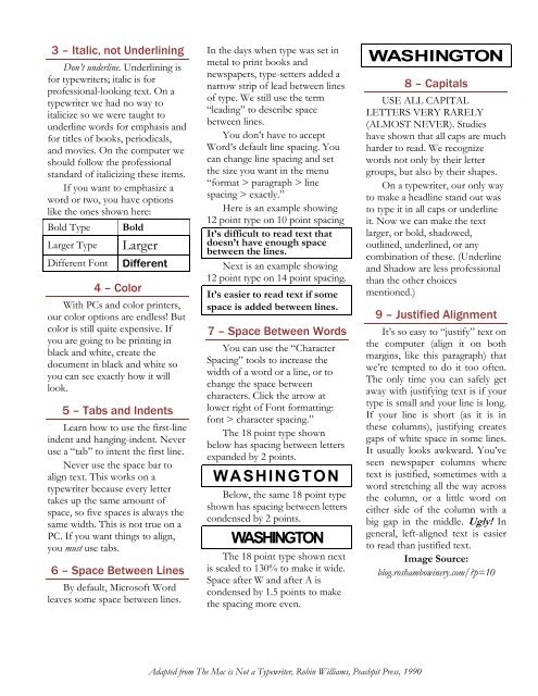
3 – Italic, not Underlining<br />
Don’t underline. Underlining <strong>is</strong><br />
for typewriters; italic <strong>is</strong> for<br />
professional-looking text. On a<br />
typewriter we had no way to<br />
italicize so we were taught to<br />
underline words for emphas<strong>is</strong> and<br />
for titles of books, periodicals,<br />
and movies. On the computer we<br />
should follow the professional<br />
standard of italicizing these items.<br />
If you want to emphasize a<br />
word or two, you have options<br />
like the ones shown here:<br />
Bold Type Bold<br />
Larger Type Larger<br />
Different Font Different<br />
4 – Color<br />
With <strong>PC</strong>s and color printers,<br />
our color options are endless! But<br />
color <strong>is</strong> still quite expensive. If<br />
you are going to be printing in<br />
black and white, create the<br />
document in black and white so<br />
you can see exactly how it will<br />
look.<br />
5 – Tabs and Indents<br />
Learn how to use the first-line<br />
indent and hanging-indent. Never<br />
use a “tab” to intent the first line.<br />
Never use the space bar to<br />
align text. Th<strong>is</strong> works on a<br />
typewriter because every letter<br />
takes up the same amount of<br />
space, so five spaces <strong>is</strong> always the<br />
same width. Th<strong>is</strong> <strong>is</strong> not true on a<br />
<strong>PC</strong>. If you want things to align,<br />
you must use tabs.<br />
6 – Space Between Lines<br />
By default, Microsoft Word<br />
leaves some space between lines.<br />
In the days when type was set in<br />
metal to print books and<br />
newspapers, type-setters added a<br />
narrow strip of lead between lines<br />
of type. We still use the term<br />
“leading” to describe space<br />
between lines.<br />
You don’t have to accept<br />
Word’s default line spacing. You<br />
can change line spacing and set<br />
the size you want in the menu<br />
“format > paragraph > line<br />
spacing > exactly.”<br />
Here <strong>is</strong> an example showing<br />
12 point type on 10 point spacing<br />
It’s difficult to read text that<br />
doesn’t have enough space<br />
between the lines.<br />
Next <strong>is</strong> an example showing<br />
12 point type on 14 point spacing.<br />
It’s easier to read text if some<br />
space <strong>is</strong> added between lines.<br />
7 – Space Between Words<br />
You can use the “Character<br />
Spacing” tools to increase the<br />
width of a word or a line, or to<br />
change the space between<br />
characters. Click the arrow at<br />
lower right of Font formatting:<br />
font > character spacing.”<br />
<strong>The</strong> 18 point type shown<br />
below has spacing between letters<br />
expanded by 2 points.<br />
WASHINGTON<br />
Below, the same 18 point type<br />
shown has spacing between letters<br />
condensed by 2 points.<br />
WASHINGTON<br />
<strong>The</strong> 18 point type shown next<br />
<strong>is</strong> scaled to 130% to make it wide.<br />
Space after W and after A <strong>is</strong><br />
condensed by 1.5 points to make<br />
the spacing more even.<br />
Adapted from <strong>The</strong> Mac <strong>is</strong> <strong>Not</strong> a <strong>Typewriter</strong>, Robin Williams, Peachpit Press, 1990<br />
WASHINGTON<br />
8 – Capitals<br />
USE ALL CAPITAL<br />
LETTERS VERY RARELY<br />
(ALMOST NEVER). Studies<br />
have shown that all caps are much<br />
harder to read. We recognize<br />
words not only by their letter<br />
groups, but also by their shapes.<br />
On a typewriter, our only way<br />
to make a headline stand out was<br />
to type it in all caps or underline<br />
it. Now we can make the text<br />
larger, or bold, shadowed,<br />
outlined, underlined, or any<br />
combination of these. (Underline<br />
and Shadow are less professional<br />
than the other choices<br />
mentioned.)<br />
9 – Justified Alignment<br />
It’s so easy to “justify” text on<br />
the computer (align it on both<br />
margins, like th<strong>is</strong> paragraph) that<br />
we’re tempted to do it too often.<br />
<strong>The</strong> only time you can safely get<br />
away with justifying text <strong>is</strong> if your<br />
type <strong>is</strong> small and your line <strong>is</strong> long.<br />
If your line <strong>is</strong> short (as it <strong>is</strong> in<br />
these columns), justifying creates<br />
gaps of white space in some lines.<br />
It usually looks awkward. You’ve<br />
seen newspaper columns where<br />
text <strong>is</strong> justified, sometimes with a<br />
word stretching all the way across<br />
the column, or a little word on<br />
either side of the column with a<br />
big gap in the middle. Ugly! In<br />
general, left-aligned text <strong>is</strong> easier<br />
to read than justified text.<br />
Image Source:<br />
blog.roshambowinery.com/?p=10