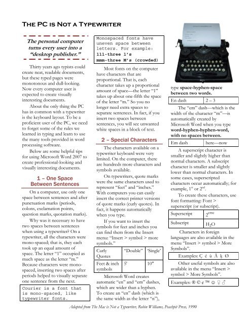
The PC is Not a Typewriter (finished)
The PC is Not a Typewriter (finished)
The PC is Not a Typewriter (finished)

You also want an ePaper? Increase the reach of your titles
YUMPU automatically turns print PDFs into web optimized ePapers that Google loves.
<strong>The</strong> <strong>PC</strong> <strong>is</strong> <strong>Not</strong> a <strong>Typewriter</strong><br />
<strong>The</strong> personal computer<br />
turns every user into a<br />
“desktop publ<strong>is</strong>her.”<br />
Thirty years ago typ<strong>is</strong>ts could<br />
create neat, readable documents,<br />
but these typed pages were<br />
monotonous and dull-looking.<br />
Now every computer user <strong>is</strong><br />
expected to create v<strong>is</strong>ually<br />
interesting documents.<br />
About the only thing the <strong>PC</strong><br />
has in common with a typewriter<br />
<strong>is</strong> the keyboard layout. To be a<br />
proficient user of the <strong>PC</strong>, we need<br />
to forget some of the rules we<br />
learned in typing and learn to use<br />
the many tools provided in word<br />
processing software.<br />
Below are some helpful tips<br />
for using Microsoft Word 2007 to<br />
create professional-looking and<br />
v<strong>is</strong>ually interesting documents.<br />
1 – One Space<br />
Between Sentences<br />
On a computer, use only one<br />
space between sentences and after<br />
punctuation marks (periods,<br />
colons, exclamation points,<br />
question marks, quotation marks).<br />
Why was it necessary to have<br />
two spaces between sentences<br />
when using a typewriter? On a<br />
typewriter, all the characters were<br />
mono-spaced; that <strong>is</strong>, they each<br />
took up an equal amount of<br />
space. <strong>The</strong> letter “1” occupied as<br />
much space as the letter “m.”<br />
Because characters were monospaced,<br />
inserting two spaces after<br />
periods helped to v<strong>is</strong>ually separate<br />
one sentence from the next.<br />
Courier <strong>is</strong> a font that<br />
<strong>is</strong> mono-spaced, like<br />
typewriter fonts.<br />
Monospaced fonts have<br />
uneven space between<br />
letters. For example:<br />
111-three 1’s<br />
mmm-three M’s (crowded)<br />
Most fonts on the computer<br />
have characters that are<br />
proportional. That <strong>is</strong>, each<br />
character takes up a proportional<br />
amount of space—the letter “1”<br />
takes up about one-fifth the space<br />
of the letter “m.” So you no<br />
longer need extra spaces to<br />
separate sentences. In fact, if you<br />
insert two spaces between<br />
sentences, you will see unwanted<br />
white spaces in a block of text.<br />
2 – Special Characters<br />
<strong>The</strong> characters available on a<br />
typewriter keyboard were very<br />
limited. On the computer, there<br />
are hundreds more characters and<br />
symbols available.<br />
On typewriters, quote marks<br />
were the same characters used to<br />
represent “feet” and “inches.”<br />
With computers you can easily<br />
insert the correct printer versions<br />
of quote marks (curly quotes). In<br />
fact, it happens automatically<br />
when you type.<br />
If you want to insert the<br />
symbols for feet and inches you<br />
can find them from the Insert<br />
menu: “Insert > symbol > more<br />
symbols.”<br />
Curly “Double” ‘Single’<br />
Quotes<br />
Feet & inch<br />
symbols<br />
5' 10"<br />
Microsoft Word creates<br />
automatic “en” and “em” dashes,<br />
which are wider than a hyphen.<br />
To create an “en” dash (which <strong>is</strong><br />
the same width as the letter “n”),<br />
Adapted from <strong>The</strong> Mac <strong>is</strong> <strong>Not</strong> a <strong>Typewriter</strong>, Robin Williams, Peachpit Press, 1990<br />
type space-hyphen-space<br />
between two words.<br />
En dash 2 – 3<br />
<strong>The</strong> “em” dash—which <strong>is</strong> the<br />
width of the character “m”—<strong>is</strong><br />
automatically created by<br />
Microsoft Word when you type<br />
word-hyphen-hyphen-word,<br />
with no spaces between.<br />
Em dash here—now<br />
A superscript character <strong>is</strong><br />
smaller and slightly higher than<br />
normal characters. A subscript<br />
character <strong>is</strong> smaller and slightly<br />
lower than normal characters. In<br />
some cases, superscripted<br />
characters occur automatically; for<br />
example, 1 st or 2 nd .<br />
To create these characters, use<br />
font formatting: Font ><br />
superscript (or subscript).<br />
Superscript 2 eme<br />
Subscript H 2 O<br />
Characters in foreign<br />
languages are also available in the<br />
menu “Insert > symbol > More<br />
Symbols”.<br />
Examples: Ç é ù Ă ķ Ø<br />
Other useful symbols are also<br />
available in the menu “Insert ><br />
symbol > More Symbols”.<br />
Examples: ® © ¢ ☺ ♀ ♂
3 – Italic, not Underlining<br />
Don’t underline. Underlining <strong>is</strong><br />
for typewriters; italic <strong>is</strong> for<br />
professional-looking text. On a<br />
typewriter we had no way to<br />
italicize so we were taught to<br />
underline words for emphas<strong>is</strong> and<br />
for titles of books, periodicals,<br />
and movies. On the computer we<br />
should follow the professional<br />
standard of italicizing these items.<br />
If you want to emphasize a<br />
word or two, you have options<br />
like the ones shown here:<br />
Bold Type Bold<br />
Larger Type Larger<br />
Different Font Different<br />
4 – Color<br />
With <strong>PC</strong>s and color printers,<br />
our color options are endless! But<br />
color <strong>is</strong> still quite expensive. If<br />
you are going to be printing in<br />
black and white, create the<br />
document in black and white so<br />
you can see exactly how it will<br />
look.<br />
5 – Tabs and Indents<br />
Learn how to use the first-line<br />
indent and hanging-indent. Never<br />
use a “tab” to intent the first line.<br />
Never use the space bar to<br />
align text. Th<strong>is</strong> works on a<br />
typewriter because every letter<br />
takes up the same amount of<br />
space, so five spaces <strong>is</strong> always the<br />
same width. Th<strong>is</strong> <strong>is</strong> not true on a<br />
<strong>PC</strong>. If you want things to align,<br />
you must use tabs.<br />
6 – Space Between Lines<br />
By default, Microsoft Word<br />
leaves some space between lines.<br />
In the days when type was set in<br />
metal to print books and<br />
newspapers, type-setters added a<br />
narrow strip of lead between lines<br />
of type. We still use the term<br />
“leading” to describe space<br />
between lines.<br />
You don’t have to accept<br />
Word’s default line spacing. You<br />
can change line spacing and set<br />
the size you want in the menu<br />
“format > paragraph > line<br />
spacing > exactly.”<br />
Here <strong>is</strong> an example showing<br />
12 point type on 10 point spacing<br />
It’s difficult to read text that<br />
doesn’t have enough space<br />
between the lines.<br />
Next <strong>is</strong> an example showing<br />
12 point type on 14 point spacing.<br />
It’s easier to read text if some<br />
space <strong>is</strong> added between lines.<br />
7 – Space Between Words<br />
You can use the “Character<br />
Spacing” tools to increase the<br />
width of a word or a line, or to<br />
change the space between<br />
characters. Click the arrow at<br />
lower right of Font formatting:<br />
font > character spacing.”<br />
<strong>The</strong> 18 point type shown<br />
below has spacing between letters<br />
expanded by 2 points.<br />
WASHINGTON<br />
Below, the same 18 point type<br />
shown has spacing between letters<br />
condensed by 2 points.<br />
WASHINGTON<br />
<strong>The</strong> 18 point type shown next<br />
<strong>is</strong> scaled to 130% to make it wide.<br />
Space after W and after A <strong>is</strong><br />
condensed by 1.5 points to make<br />
the spacing more even.<br />
Adapted from <strong>The</strong> Mac <strong>is</strong> <strong>Not</strong> a <strong>Typewriter</strong>, Robin Williams, Peachpit Press, 1990<br />
WASHINGTON<br />
8 – Capitals<br />
USE ALL CAPITAL<br />
LETTERS VERY RARELY<br />
(ALMOST NEVER). Studies<br />
have shown that all caps are much<br />
harder to read. We recognize<br />
words not only by their letter<br />
groups, but also by their shapes.<br />
On a typewriter, our only way<br />
to make a headline stand out was<br />
to type it in all caps or underline<br />
it. Now we can make the text<br />
larger, or bold, shadowed,<br />
outlined, underlined, or any<br />
combination of these. (Underline<br />
and Shadow are less professional<br />
than the other choices<br />
mentioned.)<br />
9 – Justified Alignment<br />
It’s so easy to “justify” text on<br />
the computer (align it on both<br />
margins, like th<strong>is</strong> paragraph) that<br />
we’re tempted to do it too often.<br />
<strong>The</strong> only time you can safely get<br />
away with justifying text <strong>is</strong> if your<br />
type <strong>is</strong> small and your line <strong>is</strong> long.<br />
If your line <strong>is</strong> short (as it <strong>is</strong> in<br />
these columns), justifying creates<br />
gaps of white space in some lines.<br />
It usually looks awkward. You’ve<br />
seen newspaper columns where<br />
text <strong>is</strong> justified, sometimes with a<br />
word stretching all the way across<br />
the column, or a little word on<br />
either side of the column with a<br />
big gap in the middle. Ugly! In<br />
general, left-aligned text <strong>is</strong> easier<br />
to read than justified text.<br />
Image Source:<br />
blog.roshambowinery.com/?p=10