Fine Typesetting with TjjX Using Native Autologic Fonts - TUG
Fine Typesetting with TjjX Using Native Autologic Fonts - TUG
Fine Typesetting with TjjX Using Native Autologic Fonts - TUG
You also want an ePaper? Increase the reach of your titles
YUMPU automatically turns print PDFs into web optimized ePapers that Google loves.
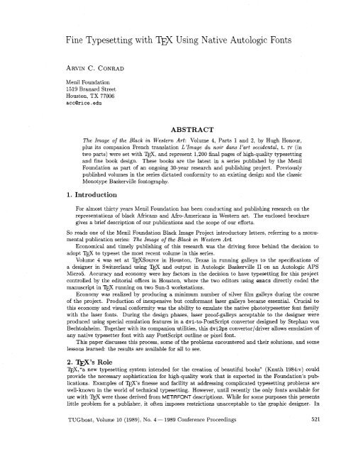
<strong>Fine</strong> <strong>Typesetting</strong> <strong>with</strong> <strong>TjjX</strong> <strong>Using</strong> <strong>Native</strong> <strong>Autologic</strong> <strong>Fonts</strong><br />
Menil Foundation<br />
1519 Branard Street<br />
Houston, TX 77006<br />
accQrice.edu<br />
ABSTRACT<br />
The Image of the Black in Western Art: Volume 4, Parts 1 and 2, by Hugh Honour,<br />
plus its companion French translation L'lmage du noir duns l'art occidental, t. IV (in<br />
two parts) were set <strong>with</strong> TJ$, and represent 1,200 final pages of high-quality typesetting<br />
and fine book design. These books are the latest in a series published by the Menil<br />
Foundation as part of an ongoing 30-year research and publishing project. Previously<br />
published volumes in the series dictated conformity to an existing design and the classic<br />
Monotype Baskerville fontography.<br />
1. Introduction<br />
For almost thirty years Menil Foundation has been conducting and publishing research on the<br />
representations of black Africans and Afro-Americans in Western art. The enclosed brochure<br />
gives a brief description of our publications and the scope of our efforts.<br />
So reads one of the Menil Foundation Black Image Project introductory letters, referring to a monu-<br />
mental publication series: The Image of the Black in Western Art.<br />
Economical and timely publishing of this research was the driving force behind the decision to<br />
adopt to typeset the most recent volume in this series.<br />
Volume 4 was set at TJ$Source in Houston. Texas in running galleys to the specifications of<br />
a designer in Switzerland using TJ$ and output in <strong>Autologic</strong> Baskerville I1 on an <strong>Autologic</strong> APS<br />
Micro5. Accuracy and economy were key factors in the decision to have typesetting for this project<br />
controlled by the editorial offices in Houston, where the two editors using emacs directly coded the<br />
manuscript in TEX running on two Sun-3 workstations.<br />
Economy was realized by producing a minimum number of silver film galleys during the course<br />
of the project. Production of inexpensive but conformant laser galleys became essential. Crucial to<br />
this economy and visual conformity was the ability to emulate the native phototypesetter font family<br />
<strong>with</strong> the laser fonts. During the design phases, laser proof-galleys acceptable to the designer were<br />
produced using special emulation features in a dvi-to-Postscript convertor designed by Stephan von<br />
Bechtolsheim. Toget her <strong>with</strong> its companion utilities, this dvi2ps convertor /driver allows emulation of<br />
any native typesetter font <strong>with</strong> any Postscript outline or pixel font.<br />
This paper discusses this process, some of the problems encountered and their solutions, and some<br />
lessons learned: the results are available for all to see.<br />
2. W's Role<br />
w,"a new typesetting system intended for the creation of beautiful books" (Knuth 1984:~) could<br />
provide the necessary sophistication for high-quality work that is expected in the Foundation's publications.<br />
Examples of W's finesse and facility at addressing complicated typesetting problems are<br />
well-known in the world of technical typesetting. However, until recently the only fonts available for<br />
use <strong>with</strong> TJ$ were those derived from METRFONT descriptions. While for some purposes this presents<br />
little problem for a publisher, it often imposes restrictions unacceptable to the graphic designer. In<br />
<strong>TUG</strong>boat, Volume 10 (1989), No. 4- 1989 Conference Proceedings 521
classical typesetting environments, there are literally thousands of fonts available. A general solution<br />
to fine typesetting using rn must rationally address the requirements of all designers. Locally, except<br />
for documentation, it is unlikely that we would ever use Computer Modern for any publication.<br />
3. <strong>Fine</strong> Fontography, '&X, and the Graphic Designer<br />
A fine book is more than type, graphics, and photos; it is a pleasing, coherent combination of these<br />
elements. The graphic designer is responsible for this coherency and beauty. The graphic designer has<br />
been around longer than the typesetting process and it sometimes seems that his main objective is to<br />
make a job less profitable for the typesetter by demanding what is often called quality typography. It<br />
is the designer's job to "direct" the typesetter to produce his typeset output in a way that will make<br />
the finished product, usually in print, fulfill its purpose. The ultimate purpose of the work may be<br />
visual attractiveness and readability, or it may have other, multiple goals.<br />
4. Image of the Black in Western Art: A Case Study<br />
4.1 Production Environment<br />
The first books in The Image of the Black series were prepared and printed in Europe on second-<br />
generation (50 lines-per-minute) phototypesetting equipment (Monotype). The most recent volumes<br />
were prepared in 'TEX on Sun workstations and proofed on Apple Laserwriter Plus and Apple Laser-<br />
Writer I1 NTX laser printers. The final galleys were output on an <strong>Autologic</strong> Micro5 CRT (1,000 lpm)<br />
output device located at WSource's plant a few miles from the Foundation's facilities. The dvi<br />
files were transferred to PC diskettes or tele-communicated to a PC running the TextSet (ArborText)<br />
DVIAPS driver.<br />
4.2 Font Matching<br />
The overall design parameters were driven by the previous volumes in the series. The new typography<br />
needed to be consistent <strong>with</strong> the preexisting type. Volumes 1 and 2 had been set in Europe using<br />
a Monotype Baskerville face. To achieve the closest match many samples were required. Having an<br />
output device that is capable of producing type output in tenths of a point (10.1, 10.2, etc.) made<br />
it possible to find a "look," or appearance, that visually matched the weight and size of the previous<br />
volumes.<br />
One of the fist problems encountered was the classic difference between manufacturers: the up-<br />
percase alphabet and its dimensional relationship to the lowercase alphabet. If the paragraph was set<br />
to match capital height, then the text ran too long and if it was reset to match the lowercase alphabet,<br />
the "color" of the paragraph (the visual appearance of a page or paragraph) was undesirable. "Good<br />
color" means there is nothing about the preparation of the page that detracts from one's original ob-<br />
jective: to read and retain the information on the page. "Bad color" results in a lower comprehension<br />
and retention. Words too close together or too far apart (especially a combination of both in the same<br />
paragraph), too much or too little leading, the presence of "rivers" (wordspaces that make vertical,<br />
white gullies through a page of print), all produce "bad color."<br />
The ultimate solution was to define the range of point sizes for the copy to be set in (10.8 through<br />
11.4), then set the paragraph in all possible point sizes (tenths of a point increments) and <strong>with</strong> different<br />
leading values. The results were then compared, on an individual basis, <strong>with</strong> the paragraph from<br />
the published books. The result was a choice that allowed the new volumes to match as closely as<br />
possible the previous volumes. The magnification function available in 'QjX lent itself well to solving<br />
a problem which arose late in the design phase. The original manuscript was in English, then the<br />
French translation was produced from it. French tends to run longer for the same thought. Since<br />
both language versions were to use the same mechanicals, the equivalent running length of the typeset<br />
sections became a critical factor. Through more laser type and photo galley tests it was determined<br />
that if a global magnification of 985 (i.e., a 1.5% reduction) was applied to the French chapter text,<br />
the overall effect would not be annoying and it would, on average, act to resynchronize the English and<br />
French mechanicals. After numerous tests and conversations the production staff agreed upon some<br />
basic font calls for the structural elements of the book.<br />
522 <strong>TUG</strong>boat, Volume 10 (1989), No. 4- 1989 Conference Proceedings
4.3 Laser Proofing: Font Emulation<br />
The cost of typesetting a book depends on the number of galleys to be produced and on the number of<br />
changes required before the final mechanical boards are pasted up. If preliminary silver galleys can be<br />
kept to a minimum and laser proof galleys utilized for the design and editorial stages, then significant<br />
cost savings are possible. Typically laser proofs cost a tenth to a twentieth of equivalent film galleys.<br />
If this approach was to be successful, the laser proofs would need to mimic the final galleys as closely<br />
as possible. These laser galleys would be all that the author, editors, and designer would have to work<br />
<strong>with</strong> until the final stages of paste-up. Acceptable representation of the <strong>Autologic</strong> font face at the laser<br />
stage would be critical.<br />
4.4 Laser Resolution Pixel Representation of <strong>Autologic</strong> <strong>Fonts</strong><br />
One solution to laser proof galleys is to produce pixel representations of the typesetter proprietary<br />
font outlines in .pxl format for downloading to the Laserwriter. For many reasons, not all related<br />
to technical considerations, this was not possible <strong>with</strong>in the cost and time constraints imposed by the<br />
production schedule.<br />
4.5 PostScript Laser <strong>Fonts</strong><br />
A more interesting and general solution was to substitute PostScript outline fonts for the proprietary<br />
fonts during laser proofing. In brief, this process derives width information from the proprietary font<br />
to produce a set of standard . tfm files for the font. This facility is included in the ArborText dviaps<br />
software package. The resultant . tfm files are loaded into the local font path environment. Next<br />
in the installation procedure, these . tfms are used to produce a corresponding .pdr file which includes<br />
the font mapping information and width values. At the time of dvi-to-Postscript conversion this .pdr<br />
file is referenced by the convertor to produce the font width vector which acts to impose the <strong>Autologic</strong><br />
native widths on the Postscript outlines.1 A major practical advantage of this method over that of<br />
pixel representation is the freedom offered by the scalable nature of Postscript outline fonts. During<br />
the "color" trial galley stages this greatly facilitates the easy changes of font sizes which would not be<br />
possible <strong>with</strong> pixel representation where each new trial size would need to be generated and stored.<br />
5. Proof of the Pudding<br />
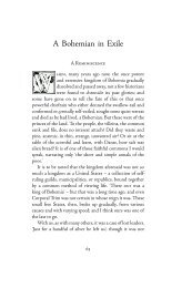
Examples of both laser proofs and tear sheets are included in the Appendix. Sample 1 and Sample 2<br />
are equivalent chapter pages (in both laser proof and tear sheet form) from the English and fiench<br />
publicatons. The endnotes shown in sample 3 and sample 4 illustrate the extremely tight setting which<br />
had to be achieved.<br />
6. Acknowledgements<br />
These are all books which are success stories partly because of the facilities developed over the last<br />
three years <strong>with</strong>in the Menil Foundation publications arm. Much of this success is due to the talents<br />
and patience of highly skilled professionals in the fields of book design, fine typography, and computer<br />
science.<br />
Specifically, the designer of record for The Image of the Black series, Hanspeter Schmidt, oversaw<br />
the production of a truly beautiful set of volumes. Steve Bencze, proprietor of WSource, provided<br />
much more than the output of the final galleys. His knowledge of fontography and classical typesetting,<br />
as well as his exemplary patience during the type-matching trials, were the technical basis for the<br />
success.<br />
None of this would have been possible <strong>with</strong>out the talents and generosity of Donald Knuth and<br />
the TEX community. Finally, the publications program owes much of its success to the talents and<br />
efforts of Stephan von Bechtolsheim for the development of the dvi-to-Postscript convertor software.<br />
Without the font emulation facilities incorporated into this convertor, utilization of arbitrary fonts<br />
would not have been possible.<br />
For full appreciation of the font emulation processes one needs to refer to Bechtolsheim's WPS manual and<br />
installation document, which is a very complete description of the system and currently runs to more than a hundred<br />
pages <strong>with</strong> examples.<br />
<strong>TUG</strong>boat, Volume 10 (1989), No. 4 - 1989 Conference Proceedings 523
Ultimately responsibility for quality publications rests <strong>with</strong> management decisions. In the case<br />
of the Menil Foundation and Black Image Project, many far-reaching decisions had to be formulated<br />
before actual results could be demonstrated. It is to their credit that this project took the direction<br />
that it did and that the final books represent high levels of quality in all aspects.<br />
Bibliography<br />
1. Technical reference titles used in the process described in the paper:<br />
Bechtolsheim, Stephan v. Another Look at m, West Lafayette, IN (self-published), 1986, 1987,<br />
1988.<br />
-. in Practice. Heidelberg: Springer-Verlag. Forthcoming.<br />
---. Documentation for the ~V~-~O-POSTSCRIPT Convertor, 1986, 1987, 1988. Final version included<br />
in the current WPS distribution, available from Stephan von Bechtolsheim.<br />
Knuth, Donald E. The mbook. Reading, MA: Addison-Wesley, 1984.<br />
2. Titles produced using the process and techniques described in the paper [technical colophon infor-<br />
mation pertaining to volume in square brackets]:<br />
Barnes, Susan J. The Rothko Chapel, An Act of Faith. Houston: Rotbko Chapel, 1989, 128pp.<br />
[Designer: Don Quaintance; font: <strong>Autologic</strong> Galliard.]<br />
Camfield, William. Marcel Duchamp Fountain. Houston: The Menil Collection and Houston <strong>Fine</strong> Art<br />
Press, 1989, 184pp.<br />
[Editor, W compositor: John Kaiser; Designer, hands-on m er: Don Quaintance; font: Auto-<br />
logic Caslon.]<br />
Davezac, Bertrand. Spirituality in the Christian East, Greek, Slavic, and Russian Icons from The<br />
Menil Collection. Houston: The Menil Collection, 1989, 134pp.<br />
[Designer, editor, m compositor, John Kaiser; font, Adobe Palatino and Greek pixel fonts de-<br />
rived from Silvio Levy's Greek METAFONT descriptions.]<br />
Guidieri, Remo, F. Pellizzi, and S.J. Tambiah. Ethnicities and Nations: Processes of Interethnic Relations<br />
in Latzn America, Southeast Asia, and the Pacific. Houston: The Rothko Chapel, 1988,<br />
408pp.<br />
[Designer: Harris Rosenstein; 'I)$ compositor, Geraldine Aramanda; font: <strong>Autologic</strong> Times New<br />
Roman.]<br />
Honour, Hugh. The Image of the Black in Western Art, Volume 4, Parts 1 and 2. Cambridge, MA:<br />
Harvard University Press, 1989.<br />
[Designer: Hanspeter Schmidt; font: <strong>Autologic</strong> Baskerville 11.1<br />
Honour, Hugh. L71mage du noir dans l'art occidental, t. IV [two parts]. Paris: Gallimard, 1989<br />
[Designer: Hanspeter Schmidt; font: <strong>Autologic</strong> Baskerville 11.1<br />
. Karageorghis, Vassos. Blacks in Ancient Cypriot Art. Houston: The Menil Collection, 1988, 63pp.<br />
[Designer: Don Quaintance; font: <strong>Autologic</strong> Times New Roman.]<br />
Printz, Neil and Remo Guidieri. Andy Warhol: Death and Disasters. Houston: The Menil Collection<br />
and Houston <strong>Fine</strong> Art Press, 1988, 136pp.<br />
[Designer: Marilyn Muller; font: <strong>Autologic</strong> New Times Roman.]<br />
Wood, Peter and Karen C.C. Dalton. Window Homer's Images of Blacks: The Civil War and Recon-<br />
struction Years. Austin: University of Texas Press, 1988, 144pp.<br />
[Designer: Don Quaintance; compositor: Geraldine Aramanda; font: <strong>Autologic</strong> Bembo.]<br />
<strong>TUG</strong>boat, Volume 10 (1989), No. 4- 1989 Conference Proceedings
HONOUR TEXT PROOFS Text:Il/ 3<br />
and perhaps atill more the way in whirh it was painted. And yet, from<br />
an iconographical point of view, this black woman could hardly be more<br />
traditionally conventional, cast in the "narrative" role of a servant and the<br />
pictorial role of a figure whose dark complexion sets off the pallor of a white<br />
woman. There is also a striking contrast between the way in which Manet<br />
depicted Olympia herself <strong>with</strong> chilly realism suggesting portraiture, and the<br />
black woman w~th generalized features carrying a bouquet of flowers painted<br />
in delicately tresh, one might almost say rococo, colors.<br />
Manet painted Olympia for exhibirion in the Salon hoping, no doubt,<br />
that it would help to establish his place in and also mark his development<br />
of the great tradition of figure painting. Hence its very obvious debts to<br />
artists he admired-to Courbet, Delacroix, Ingres, Goya, and especially<br />
Titian. It presented a contrast <strong>with</strong> and also a kind of critical comment<br />
on the innumerable images of odalisques provocatively flexing their ample<br />
thighs, displayed in practically every European art exhibition of the time.<br />
Ry depicting sincerely his own vision of the contelnporary world, comparing<br />
and contrasting what he saw before him <strong>with</strong> reminiscences of artistic images<br />
of similar subjects, Manet was attempting to return to what he considered<br />
essential princples. The scene is set in France in the 1860s. Olympia is. Zola<br />
wrote,<br />
and perhaps still more the way in which it was painted. And yet, from<br />
an iconographical point of view. this black woman could hardly be more<br />
traditionally conventional, cast in the "narrative" role of a servant and the<br />
pictorial role of a figure whose dark complexion sets off the pallor of a white<br />
woman. There is also a striking contrast between the way in which Manet<br />
depicted Olympia herself <strong>with</strong> chilly realism suggesting portraiture, and the<br />
black woman <strong>with</strong> generalized featurescarrying a bouquet of flowers painted<br />
in delicately fresh. one might almost say rococo. colors.<br />
Manet painted Olympia for exhibition in the Salon hoping. no doubt.<br />
that it would help to establish his place in and also mark his development<br />
of the great tradition of figure painting. Hence its very obvious debts to<br />
artists he admired-to Courbet, Delacroix, Ingres. Goya, and especially<br />
Titian. It presented a contrast <strong>with</strong> and also a kind of critical comment<br />
on the innumerable images of odalisques provocatively flexing their ample<br />
thighs, displayed in practically every European art exhibition of the time.<br />
By depicting sincerely his own vision of the contemporary world, comparing<br />
and contrasting what he saw before him <strong>with</strong> reminiscencesof artistic images<br />
of similar subjects. Manet was attempting to return to what he considered<br />
essential principles. The scene is set in France in the 1860s. Olympia is, Zola<br />
wrote,<br />
a girl of sixteen, doubtless some model whom Edouard Manet has<br />
quletly copied just as she was. Everyone exclaimed that this nude body<br />
was indecent. That is as it should be since here in the flesh is a girl<br />
whom the artist has put on canvas in her youthful, slightly tarnished<br />
nakedness. When other artists correct nature by painting Venus, they<br />
lie. Manet asked himself why he should he. Why not tell the truth? He<br />
has introduced us to Olympia, a girl of our own times, whom we have<br />
met in the streets pulling a thin shawl over her narrow shoulders.40<br />
a girl of sixteen. doubtless some model whom Edouard Manet has<br />
quietly copied just as she was. Everyone exclaimed that this nude body<br />
was indecent. That is as it should be since here in the flesh is a girl<br />
whom the artist has put on canvas in her youthful, slightly tarnished<br />
nakedness. When other artists correct nature by painting Venus, they<br />
lie. Manet asked himself why he should lie. Why not tell the truth?He<br />
has introduced us to Olympia, a girl of our own times. whom we have<br />
met in the streets pulling a thin shawl over her narrow shoulders.40<br />
Representing Olympia as a common prostitute, he stripped away the<br />
subterfuges by which images of the naked female body, as an ob,ject of<br />
male desire and possible purchase, had been given respectability. It was well<br />
known that there were black women in Parislan brothels. At the same time<br />
the Goncourt brothers, gathering material for a realist novel, jotted in a<br />
notebook a reminder to "make the prosritute's friend a Negress, study the<br />
type, and incorporate it in the story."41 Rut it was in Orientalist paintings<br />
that white women were most often accompanied by blacks. And Olympia's<br />
atrendant might seem to intrude from this fantasy world to present a contrast<br />
between falsity and truth as well as skin color.<br />
Representing Olympia as a common prostitute. he stripped away the<br />
subterfuges by which images of the naked female body, as an object of<br />
male desire and possible purchase, had been given respectability. It was well<br />
known that there were black women in Parisian brothels. At the same time<br />
the Goncourt brothers, gathering material for a realist novel. jotted in a<br />
notebook a reminder to "make the prostitute's friend a Negress, study the<br />
type. and incorporate it in the story."" But it was in Orientalist paintings<br />
that white women were most often accompanied by blacks. And Olympia's<br />
attendant might seem to intrude from this fantasy world to present a contrast<br />
between falsity and truth as well as skin color.<br />
FLESH FOR SALL<br />
FLESH FOR SALE<br />
The Scottish painter David Roberts found the slave market in Alexandria<br />
"peculiarly disquieting" when he inspected it shortly after arriving in Egypt<br />
in 1838. ".l'he slaves were mostly girls; some from Circassia were well dressed;<br />
others, negroes, squatted on the ground <strong>with</strong> scanty bits of matting thrown<br />
round them, and in a sun that would have killed a European" he told his<br />
daughter. "It was altogether a sickening sight, and 1 left it proud that 1<br />
The Scottish painter David Roberts iound the slave market in Alexandria<br />
"peculiarly disquieting" when he inspected it shortly after arriving in Egypt<br />
in 838. "The slaves were mostly girls; some from Circassia were well dressed;<br />
others, negroes, squatted on the ground <strong>with</strong> scanty bits of matting thrown<br />
round them. and in a sun that would have killed a European" he told his<br />
daughter. "It was altogether a sickening sight. and I left it proud that 1
HONOUR TEXT PROOFS French Part 2 Chapter3<br />
fran~ais conservateur par son sujet - une prostitute - el plns encore pent-<br />
&re par son extcution. Pourtant, au point de vue iconographique. elle est<br />
aussi conventionnelle que possible dans son r&le unarratif~ de servante et en<br />
tan1 qu'tltment pictural destind par son physique B faire ressortir la pPleur<br />
de la femme hlanche. Le contraste est frappant aussi, dans le traitement des<br />
deux figures. entre le froid rtalisme dDlympia, qui fait penser 1 un portrait.<br />
et la hanalitd des traits de la femme noire. portant un bouquet de fleurs aux<br />
couleurs ddlicates. presque rococo.<br />
Manet avait peint Olynpiapour I'exposer au Salon en esptrant tvidemment<br />
qu'elle hi permettrait de prendre place dansle grand art, tout en y imprimant<br />
sa marque. D'od une rtftrence manifeste aux artistes qu'il admirait. Courbet.<br />
Delacroix. Ingres, Goya et plns encore Titien. Olympia se difftrencie des<br />
innomhrables odalisques anx lonrdes cuisses provocantes qu'on pouvait voir<br />
pratiquement dans tontes les expositions europtennes de I'tpoqne et dont<br />
elle constitue en meme temps une sorte de commentaire critique. En transcrivant<br />
sinc2rement sa propre vision du monde contemporain, en comparant<br />
et en opposant ce qu'il avait devant les yeux avec ses rtminiscences d'ceuvres<br />
sur des sujets semblables. Manet voulait revenir aux principes essentiels selon<br />
hi. La scdne se passe en France. dans les anntes 1860. Pour Zola. Olympia est<br />
uune jeune fille de seize ans, sans doute un moddle qu'Edouard Manet a tranquillement<br />
copit tel qu'il ttait. Et tout le monde a crid : on a trouvd ce corps<br />
nu indtcent ; cela devait Etre. puisque c'est Id de la chair. une fille que I'artiste<br />
a jette sur la toile dans sa nuditt jeune et dtjd fante. Lorsque nos artistes<br />
nous donnent des Vtnus. ils corrigent la nature. ils mentent. Edouard Manet<br />
s'est demand6 pourquoi mentir. pourquoi ne pas dire la vtritd; il nous a fait<br />
connaitre Olympia, cette fille de nos jours. que vous rencontrez sur les trottoirs<br />
et qui serre sesmaigrestpaulesdansun mince chPle de laine ddteinte. ~ 4'3<br />
En faisant d'olympia une banale prostitute, il dtpouillait la reprtsentation<br />
du corps ftminin. objet masculin de dtsir et d'amour v6nal tventuellement.<br />
des subterfuges qui avaient permis de lui donner une certaine respectabilitt.<br />
La presence de Noires dans les maisons closes parisiennes ttait notoire. A<br />
la meme tpoque sensiblement, les frdres Goncourt, rassemblant les tltments<br />
d'un roman rtaliste. notdrent dans un carnet: ufaire de I'amie de la prostitute<br />
une ndgresse. ttudier le type et I'inttgrer P I'histoire *'I. Mais c'est<br />
surtout dans la peinture orientaliste que I'on trouve rtunies femmes blanches<br />
et noires; et la servante d'olympia semble surgie de ce monde factice pour apporter<br />
non seulement le contraste de sa couleur mais aussi celui d'une figure<br />
artificielle, contraire P la vtritt de I'autre.<br />
LA CHAIR I\ L'ENCAN<br />
Le peintre Qossais David Roberts trouvait le marcht d'esclaves d'Alexandrie<br />
aparticulidrement troublanta quand il le visita peu aprds son arrivte<br />
en Egypte. en 1838: uLes esclaves ttaient pour la plupart des jeunes<br />
filles; quelques-unes. des Circassiennes. ttaient bien vetues; les autres, des<br />
ntgresses, se tenaient accroupies, quelques rares nattes jettes autour d'elles<br />
et sous un soleil qui aurait rut un Europten n. tcrit-il d sa fille. uC'ttait un<br />
spectacle vraiment rtvoltant que je quittais. fier d'appartenir d un pays qui<br />
avait aboli I'esclavage >aZ. Un peu plus tard, Roberts rencontra le proprittaire<br />
dim bateau d'esclaves et regretta de uconnahre trop peu de mots arabes<br />
fran~ais conservateu<br />
&re par son extcuti<br />
aussi conventionnelle<br />
tant qu'element pict<br />
de la femme blanche<br />
deux figures, entre l<br />
et la hanalite des tra<br />
couleurs deticates, p<br />
Manet avait peint<br />
qu'elle lui permettrai<br />
sa marque. D'ou une<br />
Oelacroix, Ingres, G<br />
innombrables odalis<br />
pratiquement dans t<br />
elle constitue en me<br />
crivant sincPrement<br />
et en opposant ce qu<br />
sur des sujets sembla<br />
hi. La scene se passe<br />
* une jeune fille de se<br />
quillement copik tel<br />
nu indecent; cela dev<br />
a jetee sur la tode d<br />
nous donnent des Ve<br />
s'est demande pourq<br />
connaitre Olympia, c<br />
tons et qui serre ses m<br />
En faisant d'Olympia<br />
du corps ferninin, ob<br />
des subterfuges qui a<br />
La presence de Noir<br />
la mkme Ppoque sens<br />
d'un roman realiste,<br />
tituee une negresse,<br />
sui-tout dans la peintu<br />
et noires; et la serva<br />
apporter non seulem<br />
figure artificielle, con<br />
LA CHAIR A L'ENCAN<br />
Le peintre ecossais D<br />
aparticuliPrement tr<br />
en Egypte, en 1838<br />
filles; quelques-unes,<br />
negresses, se tenaien<br />
et sous un soleil qui<br />
spectacle vra~ment re<br />
avait aboli I'esclavage<br />
d'un bateau d'esclav


