BRAND GUIDELINES - Dave Thomas Foundation For Adoption
BRAND GUIDELINES - Dave Thomas Foundation For Adoption
BRAND GUIDELINES - Dave Thomas Foundation For Adoption

Create successful ePaper yourself
Turn your PDF publications into a flip-book with our unique Google optimized e-Paper software.
<strong>BRAND</strong> <strong>GUIDELINES</strong><br />
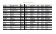
The colors for the Wendy’s Wonderful Kids brand reflect its personality. Heavy use of simple black<br />
and white represents the clarity of our vision and the honesty of our perspective. The logo’s<br />
characteristic red adds pop<br />
and provides vivid contrast.<br />
<strong>For</strong> those with advanced graphics training, we have supplied secondary colors. These colors should<br />
be used sparingly — only for accents such as borders and backgrounds.<br />
Core logo<br />
colors<br />
Secondary colors<br />
<strong>For</strong> personal communications, memos, letters, and the like, use the Arial font. A single font gives the<br />
brand consistency, while multiple styles and weights used in various combinations keep the look<br />
from becoming monotonous.<br />
Arial<br />
abcdefghijklmnopqrstuvwxyz<br />
abcdefghijklmnopqrstuvwxyz<br />
0123456789