Math TEKS Algebra 1 - Texas Comprehensive Center
Math TEKS Algebra 1 - Texas Comprehensive Center
Math TEKS Algebra 1 - Texas Comprehensive Center

You also want an ePaper? Increase the reach of your titles
YUMPU automatically turns print PDFs into web optimized ePapers that Google loves.
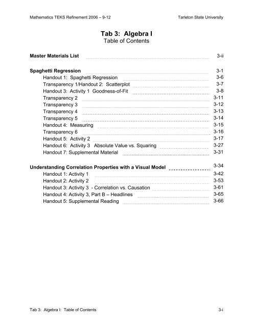
<strong>Math</strong>ematics <strong>TEKS</strong> Refinement 2006 – 9-12 Tarleton State University<br />
Tab 3: <strong>Algebra</strong> I<br />
Table of Contents<br />
Master Materials List 3-ii<br />
Spaghetti Regression 3-1<br />
Handout 1: Spaghetti Regression 3-6<br />
Transparency 1/Handout 2: Scatterplot 3-7<br />
Handout 3: Activity 1 Goodness-of-Fit 3-8<br />
Transparency 2 3-11<br />
Transparency 3 3-12<br />
Transparency 4 3-13<br />
Transparency 5 3-14<br />
Handout 4: Measuring 3-15<br />
Transparency 6 3-16<br />
Handout 5: Activity 2 3-17<br />
Handout 6: Activity 3 Absolute Value vs. Squaring 3-27<br />
Handout 7: Supplemental Material 3-31<br />
Understanding Correlation Properties with a Visual Model 3-34<br />
Handout 1: Activity 1 3-42<br />
Handout 2: Activity 2 3-53<br />
Handout 3: Activity 3 - Correlation vs. Causation 3-61<br />
Handout 4: Activity 3, Part B – Headlines 3-65<br />
Handout 5: Supplemental Reading 3-66<br />
Tab 3: <strong>Algebra</strong> I: Table of Contents 3-i
<strong>Math</strong>ematics <strong>TEKS</strong> Refinement 2006 – 9-12 Tarleton State University<br />
Tab 3: <strong>Algebra</strong> I<br />
Master Materials List<br />
Graphing calculator<br />
Spaghetti or linguine<br />
Tape<br />
Colored markers<br />
Straightedge<br />
Computer with internet access and Java 1.4<br />
Yard stick<br />
Spaghetti Regression: Transparencies and handouts<br />
Correlation: Transparencies and handouts<br />
The following materials are not in the notebook. They can be accessed on the MTR<br />
website until the 9-12 MTR CDs are available.<br />
Java Applet (http://mathteks2006.net/applets)<br />
PowerPoint presentation: Correlation vs. Causation<br />
(http://mathteks2006.net/documents/correlation.ppt)<br />
Tab 3: <strong>Algebra</strong> I: Master Materials List 3-ii
<strong>Math</strong>ematics <strong>TEKS</strong> Refinement 2006 – 9-12 Tarleton State University<br />
Activity: Spaghetti Regression<br />
Overview: Participants will investigate the concept of the “goodness-of-fit” and its<br />
significance in determining the regression line or best-fit line for the data.<br />
<strong>TEKS</strong>: This activity supports teacher content knowledge underlying the following<br />
<strong>TEKS</strong>.<br />
(A.2) Foundations of functions. The student uses the properties and<br />
attributes of functions.<br />
The student is expected to:<br />
(D) collect and organize data, make and interpret scatterplots (including<br />
recognizing positive, negative, or no correlation for data approximating<br />
linear situations), and model, predict, and make decisions and critical<br />
judgments in problem situations.<br />
Background:<br />
Fitting the graph of an equation to a data set is covered in all mathematics courses from<br />
<strong>Algebra</strong> I to Calculus and beyond. This module explores the concept in-depth, providing<br />
the participants with an understanding beyond that in ordinary secondary texts. The<br />
idea is to provide the background knowledge needed to understand the process of<br />
modeling.<br />
To enrich the study of functions, the <strong>TEKS</strong> call for the inclusion of problem situations<br />
which illustrate how mathematics can model aspects of the world. In real life, functions<br />
arise from data gathered through observations or experiments. This data rarely falls<br />
neatly into a straight line or along a curve. There is variability in real data and it is up to<br />
the student to find the function that best 'fits' the data. Regression, in its many facets, is<br />
probably the most widely used statistical methodology in existence. It is the basis of<br />
almost all modeling.<br />
This activity supports teacher knowledge underlying <strong>TEKS</strong> A.2.D, wherein students<br />
create scatterplots to develop an understanding of the relationships of bivariate data.<br />
This includes studying correlations and creating models from which they will predict and<br />
make critical judgments. As always, it is beneficial for students to generate their own<br />
data. This gives them ownership of the data and gives them insight into the process of<br />
collecting reliable data. Teachers should naturally encourage the students to discuss<br />
important concepts such as goodness-of-fit. Using the graphing calculator facilitates this<br />
understanding. Students will be curious about how the linear functions are created, and<br />
teachers should help students develop this understanding.<br />
Spaghetti Regression 3-1
<strong>Math</strong>ematics <strong>TEKS</strong> Refinement 2006 – 9-12 Tarleton State University<br />
Knuth and Hartmann in Technology-Supported <strong>Math</strong>ematics Learning Environments<br />
discuss the common approach to this topic:<br />
A common instructional practice is to have students plot the data on a<br />
coordinate plane, and then ask them to use a piece of spaghetti to<br />
represent the line that they will “fit” to the data. Students are typically<br />
instructed to position the spaghetti noodle so that it appears to be as<br />
close as possible to each point—visually determining the “best” fit. At<br />
this point students might determine the equation for their line and then<br />
use that equation in making predictions about additional points.<br />
Alternatively, the objective for the lesson might be to determine a line of<br />
best fit analytically, usually by using the statistical capabilities of a<br />
graphing calculator, and then to use the resulting equation in a similar<br />
fashion (i.e., to make predictions). In the former situation, the line that<br />
students identified as their line of best fit has not been determined<br />
mathematically and may or may not be the best fit in reality. In the latter<br />
example, the line has been determined mathematically, but students<br />
may not have an understanding of “what the calculator did” in<br />
determining the equation for the line or why the line is called a least<br />
squares line of best fit (the most commonly used line of best fit).<br />
Moreover, teachers often may not attempt to explain the underlying<br />
ideas, since the focus of the lesson may be on the use of the equation<br />
for the line. In either situation, ideas underlying the least squares line of<br />
best fit are not beyond the grasp of students and should be a topic of<br />
discussion.<br />
Participants will investigate the concept of the “goodness-of-fit” and its<br />
significance in determining the regression line or best-fit-line for the data.<br />
Development sequence:<br />
Activity 1 What is meant by “best”?<br />
What are non-analytical methods used by students to determine fit?<br />
Develop an analytical measure for fit.<br />
Discuss various measures, including residuals.<br />
Activity 2<br />
Activity 3<br />
Appendix<br />
Develop the least squares regression method via absolute value<br />
regression.<br />
Explore the effects of squaring the residuals and contrast it with using<br />
the absolute value of the residuals.<br />
Deriving the regression formula via algebra and then thru<br />
calculus.<br />
Historical notes.<br />
Materials: Graphing calculator<br />
Spaghetti Regression 3-2
<strong>Math</strong>ematics <strong>TEKS</strong> Refinement 2006 – 9-12 Tarleton State University<br />
Spaghetti or linguine<br />
Tape<br />
Colored markers<br />
Straightedge<br />
Computer with internet access (Activity 3)<br />
Transparencies: 1-6 (pages 3-7, 3-11 – 3-14, 3-16)<br />
Handout 1 (page 3-6)<br />
Handout 2 (page 3-7)<br />
Handout 3 (pages 3-8 – 3-10)<br />
Handout 4 (page 3-15)<br />
Handout 5 (pages 3-17 – 3-21)<br />
Handout 6 (pages 3-27 – 3-28<br />
Handout 7 (pages 3-31 – 3-33)<br />
Grouping: 4-5 per group<br />
Time: 1½ -2 hours<br />
Lesson:<br />
Procedures Notes<br />
Activity 1<br />
Have participants read and discuss Handout<br />
1, Spaghetti Regression:<br />
Overview/Learning<br />
Objectives/Background, (page 3-6).<br />
Give each participant 3-5 pieces of<br />
spaghetti, the Transparency 1/Handout 2,<br />
Scatterplot (page 3-7) and Handout 3,<br />
Activity 1: Goodness of Fit, (page 3-8 ).<br />
Have the participants examine the plot and<br />
visually determine a line of best-fit (or trend<br />
line) using a piece of spaghetti. They then<br />
tape the spaghetti line onto their graph.<br />
Ask: Who has the best line in your group?<br />
How can we determine this?<br />
Ask: What is meant by best?<br />
Ask: What is meant by a close fit?<br />
See, How Do You Find the Line of Best-<br />
Fit? (page 3-10), to discuss methods<br />
students use for placing trend lines. (Do not<br />
discuss how to measure yet; see below )<br />
Discuss the importance of modeling and<br />
student discussions of concepts such as<br />
goodness-of-fit (see the Trainer Notes<br />
Background discussion above.)<br />
This should be done individually so that<br />
there is variation in the choice of lines within<br />
each group.<br />
This page discusses the general idea behind<br />
linear regression. To determine a line of<br />
best fit you must have an agreed upon<br />
measure of “goodness”. If that measure is<br />
“closeness of the points to the line”, the best<br />
line is then the line with the least total<br />
distance of points to the line. There are<br />
many methods for measuring “closeness.”<br />
The most common is the method of least<br />
Spaghetti Regression 3-3
<strong>Math</strong>ematics <strong>TEKS</strong> Refinement 2006 – 9-12 Tarleton State University<br />
Procedures Notes<br />
discuss how to measure yet; see below.) squares.<br />
Have the participants use a second piece of<br />
spaghetti to measure the distance from each<br />
point to the line and break off that length.<br />
Each member of a group must measure the<br />
same way. Thus, each group must decide<br />
their method for measuring before they<br />
begin.<br />
Groups may measure vertically, horizontally,<br />
perpendicularly, etc.<br />
Have the participants line up their spaghetti<br />
distances to determine who in their group<br />
has the closest fit. Then, they replace the<br />
segments and tape them to their scatterplot.<br />
Have each group present their method and<br />
results. A good way to accomplish this is to<br />
have the “winner” from each table come up<br />
to the front. They can then be grouped by<br />
their method of measurement. Have each<br />
share, discuss, compare, and contrast.<br />
Distribute Handout 4, Measuring, (page 3-<br />
15) to discuss three ways (vertically,<br />
horizontally, perpendicularly) to measure the<br />
space between a point and the line. Discuss<br />
the meaning of a residual and why it is used<br />
in evaluating the accuracy of a model.<br />
Activity 2<br />
Intuitively, we think of a close fit as a good<br />
fit. We look for a line with little space<br />
between the line and the points it is<br />
supposed to fit. We would say that the best<br />
fitting line is the one that has the least<br />
space between itself and the data points<br />
which represent actual measurements.<br />
Encourage diversity in measuring methods<br />
among the groups to add depth to the<br />
following discussions.<br />
This will determine the total error (i.e., total<br />
distance from their line to the data).<br />
Discuss the fact that since the groups used<br />
different methods of measuring, we cannot<br />
determine best-of-fit for the entire class.<br />
Discuss accuracy of measurement. Did they<br />
measure from the edge of each point or the<br />
middle, etc.?<br />
Why measure vertically? The sole purpose<br />
in making a regression line is to use it to<br />
predict the output for a given input. The<br />
vertical distances (residuals) represent how<br />
far off the predictions are from the data we<br />
actually measured.<br />
Spaghetti Regression 3-4
<strong>Math</strong>ematics <strong>TEKS</strong> Refinement 2006 – 9-12 Tarleton State University<br />
Procedures Notes<br />
Distribute Handout 5, Activity 2, (pages 3-<br />
17 – 3-21).<br />
Tell the participants we will now determine<br />
who has the best trend line in the class.<br />
Tell participants to look for “FYI:” in the<br />
activity for calculator help.<br />
Have participants stop when they finish #5<br />
and use overhead 2 to cultivate a class<br />
discussion of the questions in #5 before<br />
proceeding. It is important that participants<br />
understand why the residuals must be<br />
absolute valued or squared before summing.<br />
Transparency 6 reproduces the figure on<br />
page 3-19.<br />
Activity 3<br />
Distribute Handout 6, Activity 3, (pages 3-<br />
27 – 3-28).<br />
Participants will need a computer with Java<br />
version 1.4.<br />
Have participants open the applet<br />
Regression and work through handout.<br />
www.mathteks2006.net/applets<br />
Supplemental Material<br />
Ask participants to read the Handout 7,<br />
Supplemental Material, (pages 3-31 – 3-<br />
33).<br />
In Activity 1 the groups used different<br />
measures of goodness-of-fit; thus the best<br />
trend line of the class could not be<br />
determined.<br />
The participants will need a Graphing<br />
Calculator.<br />
Encourage the calculator-capable<br />
participants to help out within their groups.<br />
In this activity, an interactive java applet is<br />
used to investigate several data sets and<br />
contrast geometrically and numerically the<br />
effect of using the square of the residuals<br />
vs. the absolute value of the residuals.<br />
Encourage the participants to test their own<br />
conjectures and share/discuss with group.<br />
The Supplemental Material discusses two<br />
ways to minimize the sum of the squared<br />
residuals which leads to the formula that the<br />
calculator uses to find the least squares<br />
regression line.<br />
Historical notes are included about who<br />
originally developed least squares<br />
regression and where the term regression<br />
comes from.<br />
Spaghetti Regression 3-5
<strong>Math</strong>ematics <strong>TEKS</strong> Refinement 2006 – 9-12 Tarleton State University<br />
Overview<br />
Spaghetti Regression<br />
Participants will investigate the concept of the “goodness-of-fit” and its significance in<br />
determining the regression line or best-fit line for the data.<br />
Learning Objectives<br />
This activity supports Teacher Content Knowledge needed for A2D: The student<br />
is expected to collect and organize data, make and interpret scatterplots<br />
(including recognizing positive, negative, or no correlation for data approximating<br />
linear situations), and model, predict, and make decisions and critical judgments<br />
in problem situations.<br />
Background<br />
Fitting the graph of an equation to a data set is covered in all mathematics<br />
courses from <strong>Algebra</strong> I to Calculus and beyond. The objective of this module is<br />
to explore the concept in-depth to provide understanding beyond that in ordinary<br />
secondary texts.<br />
To enrich the study of functions, the <strong>TEKS</strong> call for the inclusion of problem<br />
situations which illustrate how mathematics can model aspects of the world. In<br />
real life, functions arise from data gathered through observations or experiments.<br />
This data rarely falls neatly into a straight line or along a curve. There is<br />
variability in real data and it is up to the student to find the function that best 'fits'<br />
the data. Regression, in its many facets, is probably the most widely use<br />
statistical methodology in existence. It is the basis of almost all modeling.<br />
This activity supports teacher knowledge underlying <strong>TEKS</strong> A.2.D, wherein<br />
students create scatterplots to develop an understanding of the relationships of<br />
bivariate data; this includes studying correlations and creating models from which<br />
they will predict and make critical judgments. As always, it is beneficial for<br />
students to generate their own data. This gives them ownership of the data and<br />
gives them insight into the process of collecting reliable data. Teachers should<br />
naturally encourage the students to discuss important concepts such as<br />
goodness-of fit. Using the graphing calculator facilitates this understanding.<br />
Students will be curious about how the linear functions are created, and teachers<br />
should help students develop this understanding.<br />
Handout 1<br />
Spaghetti Regression 3-6
<strong>Math</strong>ematics <strong>TEKS</strong> Refinement 2006 – 9-12 Tarleton State University<br />
Scatterplot<br />
Transparency 1/Handout 2<br />
Spaghetti Regression 3-7
<strong>Math</strong>ematics <strong>TEKS</strong> Refinement 2006 – 9-12 Tarleton State University<br />
Activity 1 Goodness-of-Fit<br />
Objective: To Investigate the concept of goodness of fit and develop an<br />
understanding of residuals in determining a line of best-fit.<br />
1. Examine the plot provided and visually determine a line of best-fit (or trend line)<br />
using a piece of spaghetti. Tape your spaghetti line onto your graph.<br />
2. Now let us investigate the “goodness” of the fit. Use a second piece of spaghetti to<br />
measure the distance from the first point to the line. Break off this piece to represent<br />
that distance. Each person at the table must measure in the same way, so discuss<br />
the method you will use before starting. Repeat this for each point.<br />
3. Line up your spaghetti distances to determine who in your group has the closest fit.<br />
Determine the total error; i.e., total distance from your line to the data. Then replace<br />
the segments and tape them to your scatterplot.<br />
Total error = _______<br />
Handout 3<br />
Spaghetti Regression 3-8
<strong>Math</strong>ematics <strong>TEKS</strong> Refinement 2006 – 9-12 Tarleton State University<br />
Activity 1 Goodness-of-Fit – Possible Solutions<br />
Objective: To Investigate the concept of goodness of fit and develop an<br />
understanding of residuals in determining a line of best-fit<br />
1. Examine the plot provided and visually determine a line of best-fit (or trend line)<br />
using a piece of spaghetti. Tape your spaghetti line onto your graph.<br />
Trainer notes: Use the page titled How Do You Find the Line of Best-Fit? to discuss<br />
methods students use for placing trend lines. This page discusses the general idea<br />
behind linear regression. To determine a line-of best fit, you must have an agreed upon<br />
measure of “goodness.” If that measure is closeness of the points to the line, the best<br />
line is then the line with the least total distance. There are many methods for measuring<br />
“closeness.” The most common is the method of least squares.<br />
2. Now let us investigate the “goodness” of the fit. Use a second piece of spaghetti to<br />
measure the distance from the first point to the line. Break off this piece to represent<br />
that distance. Each person at the table must measure in the same way, so discuss<br />
the method you will use before starting. Repeat this for each point.<br />
Encourage at least one group to use the shortest distance from the point to the line (i.e.,<br />
the perpendicular distance.) Have each group present their method and results. A good<br />
way to accomplish this is to have the “winner” from each table come up to the front.<br />
They can then be grouped by their method of measurement. Have each share, discuss,<br />
compare, and contrast.<br />
Discuss the fact that since that the groups used different methods of measuring, we<br />
cannot determine best-of-fit for the entire class.<br />
Discuss the accuracy of their measurements. Did they measure from the edge of each<br />
point or the middle, etc.?<br />
3. Line up your spaghetti distances to determine who in your group has the closest fit.<br />
Determine the total error. (i.e., total distance from your line to the data.) Then,<br />
replace the segments and tape them to your scatterplot.<br />
Total error = _______<br />
Use the page titled Measuring to discuss three ways to measure the space between a<br />
point and the line. Discuss the meaning of a residual and why it is used in evaluating the<br />
accuracy of a model.<br />
Spaghetti Regression 3-9
<strong>Math</strong>ematics <strong>TEKS</strong> Refinement 2006 – 9-12 Tarleton State University<br />
How Do You Find the Line of Best Fit? – Possible Solutions<br />
So you’ve observed some data. You have a set of data points (x,y). You've plotted<br />
them, and they seem to be pretty much linear. How do you find the line that best fits<br />
those points? "That’s simple," your students say. "Put them into a TI-83 and look at the<br />
answer." Okay, but let us ask a deeper question: How does the calculator find the<br />
answer?<br />
What is meant by Best?<br />
First, we have to agree on what we mean by the "best fit" of a line to a set of points.<br />
Why do we say that the line on the left fits the points better than the line on the right?<br />
And can we say that some other line might fit them better still?<br />
Transparency 2 (page 3-11)<br />
Look at the following students’ responses to the task: draw a line of best fit for the data.<br />
What reasoning might they have given for their choice of lines?<br />
Passes through the most points, equal number of points above and below, passes through the<br />
end points, etc. [Transparencies 3-5 (pages 3-12 – 3-14)]<br />
Usually we think of a close fit as a good fit. But, what do we mean<br />
by close?<br />
How close are these points?<br />
Spaghetti Regression 3-10
<strong>Math</strong>ematics <strong>TEKS</strong> Refinement 2006 – 9-12 Tarleton State University<br />
Discuss criteria that might be used to assess the “closeness” of these points? How many<br />
different ways might it be done?<br />
Transparency 2<br />
Spaghetti Regression 3-11
<strong>Math</strong>ematics <strong>TEKS</strong> Refinement 2006 – 9-12 Tarleton State University<br />
Transparency 3<br />
Spaghetti Regression 3-12
<strong>Math</strong>ematics <strong>TEKS</strong> Refinement 2006 – 9-12 Tarleton State University<br />
Transparency 4<br />
Spaghetti Regression 3-13
<strong>Math</strong>ematics <strong>TEKS</strong> Refinement 2006 – 9-12 Tarleton State University<br />
Transparency 5<br />
Spaghetti Regression 3-14
<strong>Math</strong>ematics <strong>TEKS</strong> Refinement 2006 – 9-12 Tarleton State University<br />
Measuring<br />
There are at least three ways to measure the space between a point and the line:<br />
vertically in the y direction, horizontally in the x direction, and the shortest distance from<br />
a point to the line (on a perpendicular to the line.)<br />
In regression, we usually choose to measure the space vertically. These distances<br />
are known as residuals.<br />
• Why would you want to measure this way? What do the residuals represent in relation<br />
to our function? Consider the purpose of the line and the following diagram.<br />
The purpose of regression is to find a function that can model a data set. The function is<br />
then used to predict the y values (or outputs, f(x) ) for any given input x. So, the vertical<br />
distance represents how far off the prediction is from the actual data point (i.e., the<br />
“error” in each prediction.) Residuals are calculated by subtracting the model’s<br />
predicted values, f(xi), from the observed values, yi.<br />
Residual = yi −<br />
f ( xi<br />
)<br />
Handout 4<br />
Spaghetti Regression 3-15
<strong>Math</strong>ematics <strong>TEKS</strong> Refinement 2006 – 9-12 Tarleton State University<br />
Transparency 6<br />
Spaghetti Regression 3-16
<strong>Math</strong>ematics <strong>TEKS</strong> Refinement 2006 – 9-12 Tarleton State University<br />
Activity 2<br />
Objective: Investigate various methods of regression.<br />
Whose model makes the best predictions? Let us compare everyone’s lines using<br />
the residuals.<br />
Before we begin, we need to know the equation for your spaghetti function,<br />
f(x) = mx + b. Assume the lower left corner of the graph is (0,0).<br />
f(x) = __________________<br />
1. Enter your function at Y1= in the calculator.<br />
2. Enter the actual data into L1 and L2. Put the x-values in L1 and the y-values in L2.<br />
Make certain that the x’s are typed in correspondence to the y’s.<br />
x 2 5 6 10 12 15 16 20 20<br />
y 14 19 9 21 7 21 18 10 22<br />
3. Place the predicted values, f(xi), created by your function, in L3. To do this, place<br />
your cursor on L3 and enter your function, using L1 as the inputs of the function.<br />
(See below.)<br />
FYI: Y1 can be found under [vars] → [Y-vars] → [1:function] → 1:Y1<br />
Handout 5-1<br />
Spaghetti Regression 3-17
<strong>Math</strong>ematics <strong>TEKS</strong> Refinement 2006 – 9-12 Tarleton State University<br />
4. Compute the residuals (the distances between the predicted values, f(xi) , and actual<br />
y values) and place them in L4. This can be done by entering L4 = L2-L3.<br />
5. On your home screen compute Sum(L4). Record your group’s functions and the<br />
corresponding sums.<br />
FYI: Sum can be found under [2 nd ][stat] → [math] → 5:sum<br />
Function Sum of the residual errors<br />
• Examine your values in L4. What is the meaning of a negative residual in terms of the<br />
graph and in terms of the function’s predictions? What is the meaning of a positive or<br />
negative total for the functions in #5?<br />
Handout 5-2<br />
Spaghetti Regression 3-18
<strong>Math</strong>ematics <strong>TEKS</strong> Refinement 2006 – 9-12 Tarleton State University<br />
Examine the following student’s work.<br />
• In L4 what is the meaning of 39.23? What is the corresponding value in your<br />
table? Describe its meaning.<br />
• What is the meaning of a low total residual error? Is it a good measure of fit?<br />
Why or why not?<br />
Handout 5-3<br />
Spaghetti Regression 3-19
<strong>Math</strong>ematics <strong>TEKS</strong> Refinement 2006 – 9-12 Tarleton State University<br />
There are two possible ways to fix the above problem. One way is to take the absolute<br />
value of the residual; the other is to square the residual. Taking the absolute value of<br />
the residuals is synonymous with using our spaghetti segments to measure the vertical<br />
error.<br />
6. Find Sum(abs(L4)). Record your group’s functions and the corresponding sums.<br />
FYI: abs can be found under [2 nd ][0]<br />
Function Sum of the residual error<br />
• Compare with those in the class to determine who now has the lowest total<br />
error.<br />
Note: The calculator’s regression method uses the squared residuals when measuring<br />
the goodness-of-fit of a regression line.<br />
Let us compare our lines of best-fit, using the squared residuals.<br />
7. Find the total of the squared residuals by Sum((L4) 2 ) . This is often referred to as<br />
the Sum of the Squared Errors, noted SSE.<br />
Function SSE<br />
Handout 5-4<br />
Spaghetti Regression 3-20
<strong>Math</strong>ematics <strong>TEKS</strong> Refinement 2006 – 9-12 Tarleton State University<br />
• Compare with those in the class to determine who has the lowest sum of the squared<br />
errors. Did the best line in the group change? Why or why not?<br />
Let us compare our lines against the calculator’s regression line.<br />
8. Use your calculator to compute the linear regression function, f(x) = mx + b.<br />
f(x) = ___________________<br />
9. Enter the function into Y1 and place the function’s predicted values f(xi) in L3, i.e., L3 =<br />
Y1(L1).<br />
10. Quickly, compute the sum of squared errors by using SUM((L2- L3) 2 ).<br />
SSE = ________<br />
• How do the functions in the class compare to this one?<br />
11. Create a scatterplot and graph your group’s functions and the calculator’s regression<br />
function. Examine visually the goodness of fit of each in regard to their SSE.<br />
At least two methods exist for evaluating goodness of fit: taking the absolute value of<br />
the residuals and squaring the residuals. Although taking the absolute value seems<br />
most intuitive, relying on squaring does several things. The most desirable one is that it<br />
simplifies the mathematics needed to guarantee the “best” line. (See the appendix.)<br />
In Activity 3, you can investigate how squaring the residuals when measuring our<br />
goodness-of-fit affects the choice of the regression line.<br />
Understanding what you are looking for is always the toughest part of any problem, so<br />
the hard part is done. You now know how to measure “goodness” of fit. We can also<br />
say exactly what the calculator means by the line of best-fit. If we compute the residuals<br />
(i.e., the error in the y direction), square each one, and add up the squares, we say the<br />
line of best-fit is the line for which that sum is the least. Since it is a sum of squares,<br />
the method is called the Method of Least Squares! This is the most commonly used<br />
method but, as we have seen, it isn’t the only way!<br />
Handout 5-5<br />
Spaghetti Regression 3-21
<strong>Math</strong>ematics <strong>TEKS</strong> Refinement 2006 – 9-12 Tarleton State University<br />
Activity 2 - Possible solutions<br />
Objective: Investigate various methods of regression.<br />
Whose model makes the best predictions? Let us compare everyone’s lines using<br />
the residuals.<br />
Before we begin, we need to know the equation for your spaghetti function,<br />
f(x) = mx + b. Assume the lower left corner of the graph is (0,0).<br />
f(x) = __1/3 x + 9________________<br />
1. Enter your function at Y1= in the calculator.<br />
2. Enter the actual data into L1 and L2. Put the x-values in L1 and the y-values in L2. Make<br />
certain that the x’s are typed in correspondence to the y’s.<br />
x 2 5 6 10 12 15 16 20 20<br />
y 14 19 9 21 7 21 18 10 22<br />
3. Place the predicted values, f(xi), created by your function, in L3. To do this, place your<br />
cursor on L3 and enter your function, using L1 as the inputs of the function. (See below.)<br />
FYI: Y1 can be found under [vars] → [Y-vars] → [1:function] → 1:Y1<br />
Spaghetti Regression 3-22
<strong>Math</strong>ematics <strong>TEKS</strong> Refinement 2006 – 9-12 Tarleton State University<br />
4. Compute the residuals (the distances between the predicted values, f(xi) , and actual y<br />
values) and place them in L4. This can be done by entering L4 = L2-L3.<br />
5. On your home screen compute Sum(L4). Record your group’s functions and the<br />
corresponding sums.<br />
FYI: Sum can be found under [2 nd ][stat] → [math] → 5:sum<br />
Function Sum of the residual errors<br />
Y= 1/3 x + 9 24.66<br />
Y= ¼ x + 11 15.5<br />
Y= 5/4 x 8.5<br />
Y= 2x + 3 -98<br />
• Examine your values in L4. What is the meaning of a negative residual in terms of the graph<br />
and in terms of the function’s predictions? What is the meaning of a positive or negative total<br />
for the functions in #5?<br />
In the graph, a negative residual in L4 means the actual point is below the line. In<br />
terms of the function’s predictions a negative residual means the function over predicted value.<br />
A positive sum of the residuals means you have more total under predictions than over<br />
predictions and vise versa for a negative sum of the residuals.<br />
Spaghetti Regression 3-23
<strong>Math</strong>ematics <strong>TEKS</strong> Refinement 2006 – 9-12 Tarleton State University<br />
Examine the following student’s work.<br />
• In L4 what is the meaning of 39.23? What is the corresponding value in your table?<br />
Describe its meaning.<br />
It means this person’s function under predicted the value by 39.32.<br />
• What is the meaning of a low total residual error? Is it a good measure of fit? Why or<br />
why not?<br />
This is not a good measure of fit because large under predictions could be cancelled by<br />
large over predictions hence making the sum small, as in the above example.<br />
Spaghetti Regression 3-24
<strong>Math</strong>ematics <strong>TEKS</strong> Refinement 2006 – 9-12 Tarleton State University<br />
There are two possible ways to fix the above problem. One way is to take the absolute value of<br />
the residual; the other is to square the residual. Taking the absolute value of the residuals is<br />
synonymous with using our spaghetti segments to measure the vertical error.<br />
6. Find Sum(abs(L4)). Record your group’s functions and the corresponding sums.<br />
FYI: abs can be found under [2 nd ][0]<br />
Function Sum of the residual error<br />
Y= 1/3 x + 9 52<br />
Y= ¼ x + 11 48.5<br />
Y= 5/4 x 64.5<br />
Y= 2x + 3 124<br />
• Compare with those in the class to determine who now has the lowest total error.<br />
Note: The calculator’s regression method uses the squared residuals when measuring the<br />
goodness-of-fit of a regression line.<br />
Let us compare our lines of best-fit, using the squared residuals.<br />
7. Find the total of the squared residuals by Sum((L4) 2 ) . This is often referred to as the Sum<br />
of the Squared Errors, noted SSE.<br />
Function SSE<br />
Y= 1/3 x + 9 338<br />
Y= ¼ x + 11 289.375<br />
Y= 5/4 x 676.375<br />
Y= 2x + 3 2488<br />
Spaghetti Regression 3-25
<strong>Math</strong>ematics <strong>TEKS</strong> Refinement 2006 – 9-12 Tarleton State University<br />
• Compare with those in the class to determine who has the lowest sum of the squared<br />
errors. Did the best line in the group change? Why or why not?<br />
The best line could change. In regression using the absolute value and using the square<br />
may not agree, because it changes how you define what the best line is.<br />
Let us compare our lines against the calculator’s regression line.<br />
8. Use your calculator to compute the linear regression function, f(x) = mx + b.<br />
f(x) = _.156 x + 13.83__________________<br />
9. Enter the function into Y1 and place the function’s predicted values f(xi) in L3, i.e., L3 =<br />
Y1(L1).<br />
10. Quickly, compute the sum of squared errors by using SUM((L2- L3) 2 ).<br />
SSE = _259.67_______<br />
• How do the functions in the class compare to this one?<br />
The calculator linear regression function should have a lower SEE than the classes<br />
functions.<br />
11. Create a scatterplot and graph your group’s functions and the calculator’s regression<br />
function. Examine visually the goodness of fit of each in regard to their SSE.<br />
At least two methods exist for evaluating goodness of fit: taking the absolute value of<br />
the residuals and squaring the residuals. Although taking the absolute value seems<br />
most intuitive, relying on squaring does several things. The most desirable one is that it<br />
simplifies the mathematics needed to guarantee the “best” line. (See the appendix.)<br />
In Activity 3, you can investigate how squaring the residuals when measuring our<br />
goodness-of-fit affects the choice of the regression line.<br />
Understanding what you are looking for is always the toughest part of any problem, so<br />
the hard part is done. You now know how to measure “goodness” of fit. We can also<br />
say exactly what the calculator means by the line of best-fit. If we compute the residuals<br />
(i.e., the error in the y direction), square each one, and add up the squares, we say the<br />
line of best-fit is the line for which that sum is the least. Since it is a sum of squares,<br />
the method is called the Method of Least Squares! This is the most commonly used<br />
method but, as we have seen, it isn’t the only way!<br />
Spaghetti Regression 3-26
<strong>Math</strong>ematics <strong>TEKS</strong> Refinement 2006 – 9-12 Tarleton State University<br />
Activity 3 Absolute Value vs. Squaring<br />
OBJECTIVE: It is important to understand the effect squaring has on the residuals and<br />
the placement of a regression line. In this activity, we will use an interactive java applet<br />
to investigate several data sets and contrast geometrically and numerically the effect of<br />
using the square of the residuals vs. the absolute value of the residuals.<br />
1. Place three points forming a triangle on the graph. Select “plot line” and place a<br />
trend line on the graph.<br />
2. Select “Draw residuals.” Using the handle points, adjust your line to visually<br />
minimize the length of the residuals.<br />
Select “Show Trend Line Equation.” ____________________<br />
3. Select “Draw (residuals) 2 .” Using the handle points, adjust your line to visually<br />
minimize the area of the squares.<br />
Equation of the line: ____________________<br />
4. Now select “Sum of the residuals” and adjust your line to numerically minimize the<br />
|residuals|. Record the equation and total: ___________________<br />
5. Now select “Sum of the (residuals) 2 ” and adjust your line to numerically minimize the<br />
(residuals) 2 . Record the equation and total:_________________<br />
6. Create a situation where the sum of the squares is less than the sum of the absolute<br />
value.<br />
7. Create a data set in which the least absolute value and least squares methods agree<br />
on the line of best fit.<br />
8. Place the following ordered pairs (4, 1), (4, 4), (-4, 0), and (-4, -3) in the table. Find<br />
the line of best fit for each method.<br />
• Compare and contrast these two methods.<br />
Handout 6-1<br />
Spaghetti Regression 3-27
<strong>Math</strong>ematics <strong>TEKS</strong> Refinement 2006 – 9-12 Tarleton State University<br />
• How does squaring the residuals affect how individual data points contribute to the<br />
total error? Does squaring increase or decrease the effect of an individual residual on<br />
the total error?<br />
• What is the effect of an outlier point on each of the possible trend lines for each<br />
method?<br />
Further investigation<br />
Another method for finding regression lines is Chebyshev’s Best-Fit Line Method, also<br />
known as the MinMax Method, which finds the line with the minimum maximum<br />
residual. Chebyshev’s evaluates each line based on its largest residual and takes the<br />
line with the smallest (largest residual ) as the regression line.<br />
• Use Chebyshev’s method in the previous graphs to determine a line of best fit. How<br />
does it compare to the least absolute value and least squares methods? How it is<br />
affected by outliers?<br />
Handout 6-2<br />
Spaghetti Regression 3-28
<strong>Math</strong>ematics <strong>TEKS</strong> Refinement 2006 – 9-12 Tarleton State University<br />
Activity 3 Absolute Value vs. Squaring – Selected Answers<br />
OBJECTIVE: It is important to understand the effect squaring has on the residuals and<br />
the placement of a regression line. In this activity, we will use an interactive java applet<br />
to investigate several data sets and contrast geometrically and numerically the effect of<br />
using the square of the residuals vs. the absolute value of the residuals.<br />
1. Place three points forming a triangle on the graph. Select “plot line” and place a<br />
trend line on the graph.<br />
2. Select “Draw residuals.” Using the handle points, adjust your line to visually<br />
minimize the length of the residuals.<br />
Select “Show Trend Line Equation.” ____________________<br />
3. Select “Draw (residuals) 2 .” Using the handle points, adjust your line to visually<br />
minimize the area of the squares.<br />
Equation of the line: ____________________<br />
4. Now select “Sum of the |residuals|” and adjust your line to numerically minimize the<br />
|residuals|. Record the equation and total: ___________________<br />
5. Now select “Sum of the (residuals) 2 ” and adjust your line to numerically minimize the<br />
(residuals) 2 . Record the equation and total:_________________<br />
6. Create a situation where the sum of the squares is less than the sum of the absolute<br />
values. Participants should notice the effect squaring has on each residual. Place<br />
the points close to the line so that the residuals are less than 1.<br />
7. Create a data set in which the least absolute value and least squares methods agree<br />
on the line of best fit. Various possible answers<br />
8. Place the following ordered pairs (4, 1), (4, 4), (-4, 0), and (-4, -3) in the table. Find<br />
the line of best fit for each method. Note:The absolute value line is not unique.<br />
• Compare and contrast these two methods.<br />
Various answers: Note, both methods are valid. However, the absolute value method<br />
does not always give a unique regression line.<br />
Spaghetti Regression 3-29
<strong>Math</strong>ematics <strong>TEKS</strong> Refinement 2006 – 9-12 Tarleton State University<br />
• How does squaring the residuals affect how individual data points contribute to the<br />
total error? Does squaring increase or decrease the effect of an individual residual on<br />
the total error? If the residual is less than one, squaring decreases it’s effect on the<br />
total squared residual. If the residual is greater than one, squaring increases it’s effect<br />
on the total squared residual. Thus, the squaring method rewards small errors and<br />
penalizes large residual errors. This penalizing and rewarding effect of the least<br />
squares method is often described as desirable by statisticians. The absolute value<br />
methods however treats all residuals the same (with equal contempt).<br />
• What is the effect of an outlier point on each of the possible trend lines for each<br />
method? Since squaring will give disproportion weight to the outlier when compared to<br />
the absolute value method it will have a greater effect on the sum errors of the least<br />
squares regression line.<br />
Further investigation<br />
Another method for finding regression lines is Chebyshev’s Best-Fit Line Method, also known<br />
as the MinMax Method, which finds the line with the minimum maximum residual.<br />
Chebyshev’s evaluates each line based on its largest residual and takes the line with<br />
the smallest (largest residual ) as the regression line.<br />
• Use Chebyshev’s method in the previous graphs to determine a line of best fit. How<br />
does it compare to the least absolute value and least squares methods? How it is<br />
affected by outliers?<br />
Spaghetti Regression 3-30
<strong>Math</strong>ematics <strong>TEKS</strong> Refinement 2006 – 9-12 Tarleton State University<br />
Supplemental Material<br />
Two ways to minimize the sum of the squared residuals<br />
The key to solving this or any problem is understanding exactly for what you are<br />
looking. Our model, or line of “best fit”, f ( x)<br />
= mx+<br />
b , will be one that minimizes the<br />
sum of the squares of the vertical distances between the actual points and the predicted<br />
2<br />
ones, i.e., the residuals = yi − f ( xi<br />
) . It can be written L = ∑ ( y − f ( x)<br />
) or<br />
∑<br />
2<br />
L = ( y − ( mx + b ) ) .<br />
∑<br />
2<br />
What kind of equation is L = ( y − ( mx + b ) ) ? That’s right, quadratic. And we<br />
actually know enough about quadratics from <strong>Algebra</strong> II to solve this problem. But, one<br />
of the key words in the above paragraph is minimize, which should also make you think<br />
Calculus! This gives us an easy alternative approach.<br />
Let us examine this quadratic more closely.<br />
∑<br />
L = ( y − ( mx + b )<br />
=∑<br />
2<br />
)<br />
2 2<br />
2<br />
( m x + 2bmx<br />
+ b − 2myx<br />
− 2by<br />
+ y<br />
It may look daunting, but remember, m and b are the only unknowns here. x and y are<br />
just numbers supplied by each of the actual points in our scatterplot.<br />
2 2<br />
2<br />
Expanding L farther, L = m ∑ x + bm∑<br />
x + nb − 2m∑<br />
xy − 2b∑<br />
y + ∑<br />
2 y<br />
(You might want to double check all this! Why let someone else have all the fun?)<br />
Remember that the summations are just constants! So now we have a choice to use<br />
calculus to find its minimum or use <strong>Algebra</strong> II to find its vertex.<br />
Let’ try the Calculus!<br />
In calculus, the minimum occurs here where the derivative is equal to zero. Since we<br />
have two variables, m and b, we will want to take the derivative of each variable<br />
separately. (These are called partial derivatives.)<br />
∂L<br />
= 2m<br />
∂m<br />
2<br />
∑x+ 2b∑x−2∑<br />
xy =<br />
0<br />
Handout 7-1<br />
Spaghetti Regression 3-31<br />
2<br />
)<br />
2
<strong>Math</strong>ematics <strong>TEKS</strong> Refinement 2006 – 9-12 Tarleton State University<br />
∂L<br />
= 2m y<br />
∂b<br />
∑x+ 2nb<br />
− 2∑<br />
=<br />
0<br />
All that’s left is to solve this system of equations by elimination or substitution. Take<br />
your pick.<br />
Using substitution, b in the second equation looks easiest to solve for. So, we get<br />
∑ y − m∑<br />
x<br />
b = . Substituting for b into the first equation and simplifying, we get<br />
n<br />
n∑xy<br />
+ ∑ x∑y<br />
m =<br />
.<br />
2<br />
2<br />
n x − x)<br />
∑<br />
(∑<br />
And that’s it. Your calculator or computer just sums the x’s, the y’s, the xy’s, etc. and<br />
out pops the slope and y-intercept of your regression equation. It is not hard, but<br />
certainly tedious when done by hand.<br />
(You may wonder how we know it is a minimum and not a maximum. The second<br />
derivative is 2; a positive second derivative means it must be a minimum.)<br />
Let us try it with <strong>Algebra</strong>!<br />
Here we go. Remember that we want to find the minimum of<br />
L = m<br />
2<br />
2<br />
2<br />
∑ x + bm ∑ x + nb − 2m<br />
∑ xy − 2b∑<br />
y + ∑<br />
2 y<br />
and that all of those summations are just constants. Thus, L is a quadratic with respect<br />
to m or b. This can be seen easily by rearranging.<br />
2<br />
L(m) = ( ∑ x ) m2 2 2<br />
+ ( 2b<br />
∑ x − 2∑<br />
xy)<br />
m − ( 2b<br />
∑ y + ∑ y + nb )<br />
L(b)= n b2 2 2<br />
2<br />
+ ( 2m<br />
∑ x − 2∑<br />
y)<br />
b + ( m<br />
∑ x − 2m∑<br />
xy −∑<br />
y )<br />
Handout 7-2<br />
Spaghetti Regression 3-32<br />
2
<strong>Math</strong>ematics <strong>TEKS</strong> Refinement 2006 – 9-12 Tarleton State University<br />
Do they open up or down? The leading coefficients, ∑ 2<br />
x and n, are both positive, so<br />
the answer is up.<br />
From <strong>Algebra</strong> II, we know the vertex of Ax 2 − B<br />
+ Bx + C occurs at .<br />
2A<br />
So m =<br />
b =<br />
− ( 2b∑<br />
x − 2<br />
2<br />
2 x<br />
∑<br />
− ( 2m∑<br />
x − 2∑<br />
y)<br />
2n<br />
∑<br />
xy)<br />
=<br />
=<br />
∑ xy − b<br />
∑<br />
x<br />
∑ y − m∑<br />
x<br />
.<br />
n<br />
Handout 7-3<br />
Spaghetti Regression 3-33<br />
2<br />
∑<br />
x<br />
, and<br />
∑ ∑ ∑<br />
∑ (∑<br />
n xy + x y<br />
Substituting one into the other, we get m =<br />
and<br />
2<br />
2<br />
n x − x)<br />
∑<br />
∑<br />
∑<br />
∑ ∑<br />
(∑<br />
2<br />
y x − x xy<br />
b = . This is exactly the same result as before.<br />
2<br />
2<br />
n x + x)<br />
Some Historical Notes<br />
Who invented the method of least squares? It is not clear. Often credit is given to<br />
Karl Friedrich Gauss (1777–1855), who was first published on this subject in 1809. But<br />
the Frenchman Adrien Marie Legendre (1752–1833) published a clear example of the<br />
method four years earlier. Legendre was in charge of setting up the new metric system<br />
of measurement, and the meter was to be one ten-millionth of the distance from the<br />
North Pole through Paris to the Equator. Surveyors had measured portions of the arc<br />
but to get the best measurement for the whole arc, Legendre developed the method of<br />
least squares. He would probably use GPS today, but he was still amazingly accurate.<br />
Where does the term "regression” come from? The term was first used by Sir<br />
Francis Galton (1822-1911) in his hereditary studies. He wanted to predict the heights<br />
of sons from their father’s heights. He learned that a tall father tended to have sons<br />
shorter than himself, and a short father tended to have sons taller than himself. The<br />
heights of sons thus regressed towards the mean height of the population over several<br />
generations. The term "regression” is now used for many types of prediction problems,<br />
and does not merely apply to regression towards the mean.
<strong>Math</strong>ematics <strong>TEKS</strong> Refinement 2006 – 9-12 Tarleton State University<br />
Activity: Understanding Correlation Properties with a Visual Model<br />
Overview: This activity encourages participants to visually explore the meaning of<br />
correlation and to recognize correlation patterns.<br />
.<br />
<strong>TEKS</strong>: This activity supports teacher content knowledge underlying the<br />
following <strong>TEKS</strong>:<br />
§111.32. <strong>Algebra</strong> I<br />
(a) Basic understandings.<br />
(5) Tools for algebraic thinking. Techniques for working with functions<br />
and equations are essential in understanding underlying<br />
relationships. Students use a variety of representations (concrete,<br />
pictorial, numerical, symbolic, graphical, and verbal), tools, and<br />
technology, (including, but not limited to, calculators with graphing<br />
capabilities, data collection devices, and computers) to model<br />
mathematical situations to solve meaningful problems.<br />
(A.2) Foundations for functions. The student uses the properties and<br />
attributes of functions.<br />
The student is expected to:<br />
(D) collect and organize data, make and interpret scatter plots<br />
(including recognizing positive, negative, or no correlation for data<br />
approximating linear situations), and model, predict, and make<br />
decisions and critical judgments in problem situations.<br />
Vocabulary: correlation, regression, Pearson Product moment correlation, causation<br />
Procedure: Participants use a computer to investigate correlation values and to<br />
practice estimating correlation values for scatterplots.<br />
After completing the activity, participants should have a visual feel for<br />
numerical correlation values, and should also be able to relate numerical<br />
values of correlation to contextual situations. Participants are also<br />
encouraged to investigate and understand the relationship between<br />
correlation and causation.<br />
Materials: Computer with internet access and Java 1.4<br />
PowerPoint slides: Correlation vs. Causation<br />
Handout 1 (pages 3-42 – 3-46)<br />
Handout 2 (pages 3-53 – 3-55)<br />
Handout 3 (pages 3-61 – 3-64)<br />
Handout 4 (page 3-65)<br />
Handout 5 (pages 3-66 – 3-67)<br />
Yard stick<br />
Photocopy of a forearm.<br />
Understanding Correlation Properties with a Visual Model 3-34
<strong>Math</strong>ematics <strong>TEKS</strong> Refinement 2006 – 9-12 Tarleton State University<br />
Grouping: Individually or pairs<br />
Time: 2 - 2½ hours<br />
Lesson:<br />
Procedures Notes<br />
Activity 1 CSI Correlation<br />
Part A:<br />
Participants use a computer to<br />
investigate how the modeling process is<br />
used to generate new knowledge.<br />
Distribute Handouts 1 and 2, Activities 1<br />
and 2, (pages 3-42 – 3-46 and pages 3-<br />
53 – 3-55).<br />
Read the crime scene scenario.<br />
Participants will collect data from 8<br />
people using a yard stick.<br />
Participants will use a computer to<br />
investigate correlation values. Using the<br />
applet Correlation.<br />
www.mathteks2006.net/applets<br />
Hand out the photo copy of the<br />
assailants forearm. The participants will<br />
then extrapolate the assailants height.<br />
Part B: A Closer Look:<br />
Participants use a computer to<br />
investigate correlation values. Have<br />
participants open the applet Correlation.<br />
www.mathteks2006.net/applets<br />
Changes in the data set are investigated.<br />
Outliers, changes in scale, and the<br />
geocenter of a set of data are discussed.<br />
The forearm should be measured from<br />
the elbow to the wrist.<br />
Participants should discuss measuring<br />
techniques and degree of accuracy.<br />
You will need a photocopy of the<br />
assailants forearm to distribute to each<br />
group. If possible use someone who is a<br />
bit out of the normal range. For<br />
example, the tallest or shortest<br />
participant. This will cause the<br />
participants to extrapolate instead of<br />
interpolate.<br />
After completing Activity 1, participants<br />
should have a visual feel for numerical<br />
correlation values and should also be<br />
able to relate numerical values of<br />
correlation to contextual situations.<br />
Understanding Correlation Properties with a Visual Model 3-35
<strong>Math</strong>ematics <strong>TEKS</strong> Refinement 2006 – 9-12 Tarleton State University<br />
Procedures Notes<br />
Activity 2<br />
Part A:<br />
The goal of this activity is to gain an<br />
intuitive understanding of r. Using the<br />
web applet Correlation, scatterplots are<br />
easily constructed. By clicking and<br />
dragging points, participants can change<br />
the data sets and investigate the effect<br />
on the correlation.<br />
Part B: The r Game<br />
Have participants play a game with<br />
several classmates to develop deeper<br />
understanding of correlations, leverage<br />
points, and geocenters. Participants use<br />
the web applet Correlation,<br />
http://mathteks006.net/applets, to create<br />
scatterplots with a specific correlation.<br />
(See Part B handout for further<br />
directions.)<br />
The participants should play several<br />
times until they have a good intuition of<br />
how each point’s relationship with the<br />
others affects the correlation.<br />
Activity 3 Correlation vs. Causation<br />
This activity explores the relationship<br />
between correlation and causation.<br />
Part A:<br />
Give out Handout 3, Activity 3 - Part A,<br />
(pages 3-61 – 3-64) or use the Power<br />
Point provided and lead a class<br />
discussion of correlation and causation.<br />
The dynamic nature of the applet allows<br />
you to see how the correlation changes<br />
when a data point is added or moved.<br />
Without technology, such intuition would<br />
take years to develop.<br />
When interpreting the correlation<br />
coefficient, you should always look at the<br />
scatterplot first to see if the relationship<br />
is linear. If it is, you may calculate the<br />
correlation coefficient. Always<br />
remember that a visual analysis of data<br />
is quite valuable in addition to a<br />
numerical analysis.<br />
Understanding Correlation Properties with a Visual Model 3-36
<strong>Math</strong>ematics <strong>TEKS</strong> Refinement 2006 – 9-12 Tarleton State University<br />
Procedures Notes<br />
Correlation vs.<br />
Causation<br />
In a Gallup poll, surveyors asked, “Do you<br />
believe correlation implies causation?’”<br />
64% of American’s answered “Yes” .<br />
38% replied “No”.<br />
The other 8% were undecided.<br />
Ice-cream sales are strongly<br />
correlated with crime rates.<br />
Therefore, ice-cream causes<br />
crime.<br />
There is a humorous article discussing<br />
this poll in the appendix.<br />
If correlation implies causation, this<br />
would be a fabulous finding! To reduce<br />
or eliminate crime, all we would have to<br />
do is stop selling ice cream. Even<br />
though the two variables are strongly<br />
correlated, assuming that one causes<br />
the other would be erroneous. What are<br />
some possible explanations for the<br />
strong correlation between the two?<br />
One possibility might be that high<br />
temperatures increase crime rates<br />
(presumably by making people irritable)<br />
as well as ice-cream sales.<br />
Understanding Correlation Properties with a Visual Model 3-37
<strong>Math</strong>ematics <strong>TEKS</strong> Refinement 2006 – 9-12 Tarleton State University<br />
Procedures Notes<br />
The Simpsons<br />
(Season 7, "Much Apu About Nothing")<br />
Homer:Not a bear in sight. The "Bear<br />
Patrol" is working like a charm!<br />
Lisa: That's specious reasoning, Dad.<br />
Homer:[uncomprehendingly] Thanks,<br />
honey.<br />
Lisa: By your logic, I could claim that<br />
this rock keeps tigers away.<br />
Homer:Hmm. How does it work?<br />
Lisa: It doesn't work; it's just a<br />
stupid rock!<br />
Homer:Uh-huh.<br />
Lisa: But I don't see any tigers<br />
around, do you?<br />
Homer:(pause) Lisa, I want to buy your<br />
rock.<br />
Without proper prope r interpretation,<br />
inte rpre tation,<br />
causation should not be<br />
assumed, or even implied.<br />
Cons ider the following res earc earch h<br />
undertaken by the Univers ity of <strong>Texas</strong><br />
Health S cience <strong>Center</strong> at S an Antonio<br />
appearing to s how a link between<br />
cconsumption ons umption of diet diet s oda and weight<br />
gain.<br />
The The ss tudy tudy of of more more than than 600 600 normal--weight<br />
normal weight<br />
people people found, found, eight eight years years later, later, that that they they<br />
were were 65 65 percent percent more more likely likely to to be be<br />
overweight overweight if if they they drank drank one one diet diet ss oda oda a a<br />
day day than than if if they they drank drank none. none. And And if if they they<br />
drank drank two two or or more more diet diet ss odas odas a a day, day, they they<br />
were were even even more more likely likely to to become become<br />
overweight overweight or or obes obese. e.<br />
An entertaining demonstration of this<br />
fallacy once appeared in an episode of<br />
The Simpsons (Season 7, "Much Apu<br />
About Nothing"). The city had just spent<br />
millions of dollars creating a highly<br />
sophisticated "Bear Patrol" in response<br />
to the sighting of a single bear the week<br />
before.<br />
Our students and the general public<br />
often take such relationships as causal.<br />
By no means does this state that diet<br />
soda causes obesity - but there is a<br />
strange pattern at play here.<br />
A relationship other than causal might<br />
exist between the two variables. It is<br />
possible that there is some other<br />
variable or factor that is causing the<br />
outcome. This is sometimes referred to<br />
as the "third variable" or "missing<br />
variable" problem.<br />
• What are some other possible<br />
plausible alternative explanations<br />
to our diet soda/obesity research<br />
example?<br />
Understanding Correlation Properties with a Visual Model 3-38
<strong>Math</strong>ematics <strong>TEKS</strong> Refinement 2006 – 9-12 Tarleton State University<br />
Procedures Notes<br />
A re lationship othe r than causal<br />
m ight e xist be twe e n the two<br />
variables. It's possible that the re<br />
is some other variable or factor<br />
that is causing th e outcom e . This<br />
is some tim e s re fe rre d to as the<br />
"third va ria b le " or "m issin g<br />
variab le " proble m .<br />
Ice cream sales and the number of shark<br />
attacks on swimmers are correlated.<br />
Skirt lengths and stock prices are highly<br />
correlated (as stock prices go up, skirt<br />
lengths get shorter).<br />
The number of cavities in elementary<br />
school children and vocabulary size are<br />
strongly correlated.<br />
The re are two re lationships<br />
which can be mistaken for<br />
causation:<br />
1. Common re sponse<br />
2. Confounding<br />
We must be very careful in interpreting<br />
correlation coefficients. Just because<br />
two variables are highly correlated does<br />
not mean that one causes the other. In<br />
statistical terms, we simply say that<br />
correlation does not imply causation.<br />
There are many good examples of<br />
correlation which are nonsensical when<br />
interpreted in terms of causation.<br />
Understanding Correlation Properties with a Visual Model 3-39
<strong>Math</strong>ematics <strong>TEKS</strong> Refinement 2006 – 9-12 Tarleton State University<br />
Procedures Notes<br />
→Z → X &Y<br />
1 . Common Re sponse :<br />
Both Xand Yre spond to change s in<br />
some unobse rve d variable , Z. All<br />
three of our previous examples are<br />
examples of common response.<br />
2. Confounding<br />
The effect of Xon Yis indistin guishab le<br />
from the effects of other explanatory<br />
variable s on Y. When studying medical<br />
tre atm e nts, the “place bo e ffe ct” is an<br />
example of confounding.<br />
When can we imply<br />
causation?<br />
Controlled experiments<br />
must be performed.<br />
Unless data have been gathered by experimental<br />
means and confounding variables have been<br />
eliminated, correlation never implies causation.<br />
The placebo effect is the phenomenon<br />
that a patient's symptoms can be<br />
alleviated by an otherwise ineffective<br />
treatment, since the individual expects or<br />
believes that it will work.<br />
For example, if we are studying the<br />
effects of Tylenol on reducing pain, and<br />
we give a group of pain-sufferers Tylenol<br />
and record how much their pain is<br />
reduced, the effect of Tylenol is<br />
confounded with the effect of giving them<br />
any pill. Many people will report a<br />
reduction in pain by simply being given a<br />
sugar pill with no medication.<br />
Experimental research attempts to<br />
understand and predict causal<br />
relationships. Since correlations can be<br />
created by an antecedent, Z, which<br />
causes both X and Y, or by confounding<br />
variables, controlled experiments are<br />
performed to remove these possibilities.<br />
Still the great Scottish philosopher David<br />
Hume has argued that we can only<br />
perceive correlation, and causality can<br />
never truly be known or proven.<br />
Understanding Correlation Properties with a Visual Model 3-40
<strong>Math</strong>ematics <strong>TEKS</strong> Refinement 2006 – 9-12 Tarleton State University<br />
Procedures Notes<br />
Part B: Headlines<br />
Distribute Handout 4, Part B, (page 3-<br />
65). Participants brainstorm common<br />
causes of confounding variables for<br />
various headlines and related<br />
correlations.<br />
Within your group, brainstorm common<br />
causes or confounding variables. Write<br />
your ideas below and be prepared to<br />
share.<br />
Handout 5, Supplemental Reading,<br />
(pages 3-66 – 3-67).<br />
This is a humorous article discussing the<br />
correlation, causation debate.<br />
Power point slides of the headlines are<br />
included to help in a summary<br />
discussion of this activity.<br />
Understanding Correlation Properties with a Visual Model 3-41
<strong>Math</strong>ematics <strong>TEKS</strong> Refinement 2006 – 9-12 Tarleton State University<br />
ACTIVITY 1<br />
This module opens with an explanation of the way that paired measurements can be<br />
plotted in two-dimensional space. Next, positive and negative relationships are<br />
discussed and participants are asked to predict values using a regression equation. It<br />
concludes with a discussion of outliers.<br />
PART A<br />
Consider the following.<br />
At approximately 6:45 a.m., Tuesday morning, Principal Espinoza saw something<br />
strange as he opened the backdoor to B. Wyatt High School. As he entered the<br />
hallway, he immediately discovered the broken glass from the classroom door. It was a<br />
9 th grade <strong>Math</strong> classroom. The computers were missing, the desks were overturned,<br />
and the prized school banner was torn from the wall. The perpetrators were long gone,<br />
but they had left something behind. Next to the desk, where Mrs. Joe’s computer once<br />
sat, was the imprint of a forearm on the board. When the police arrived, they<br />
immediately began to gather forensic evidence. Mr. Espinosa, knowing your love of CSI<br />
and Numb3rs, asks you to help gather data to help identify the bandits.<br />
Bones of the arm can reveal interesting facts about an individual. But can they reveal a<br />
person's height? Forensic anthropologists team up with law enforcers to help solve<br />
crimes. Let us combine math with forensics to see how.<br />
Collect data for 8 people.<br />
Person Forearm<br />
Length<br />
(inches)<br />
Height<br />
(inches)<br />
Handout 1-1<br />
Understanding Correlation Properties with a Visual Model 3-42
<strong>Math</strong>ematics <strong>TEKS</strong> Refinement 2006 – 9-12 Tarleton State University<br />
1. From the table, describe any relationships you see between the variables forearm<br />
length and height.<br />
Making a scatter plot can provide a useful summary of a set of bivariate data (two<br />
variables). It gives a good visual picture of the relationship between the two variables<br />
and aids in the interpretation of the correlation coefficient and regression model. The<br />
scatterplot should always be drawn before working out a linear correlation coefficient or<br />
fitting a regression line.<br />
A positive association is indicated on a scatterplot by an upward trend (positive<br />
slope), where larger x-values correspond to larger y-values and smaller x-values<br />
correspond to smaller y-values. A negative association would be indicated by the<br />
opposite effect (negative slope) where the higher x-values would correspond to lower yvalues.<br />
Or, there might not be any notable linear association.<br />
2. We will use the web applet Correlation for further investigation in the following<br />
exercises. Enter the forearm length and height data into the table and examine the<br />
scatterplot.<br />
In 1896, Karl Pearson gave the formula for calculating the correlation coefficient known<br />
as r. (To see it, select show equation for r.) He argued that it was the best indicator of<br />
linear relationships. It derives its name from linear, meaning “straight line,” and corelation<br />
meaning to "go together." The drudgery of computing the correlation coefficient<br />
by hand is quite ominous. However, today’s calculators can easily compute r. It is often<br />
referred to as the Pearson Product Moment Correlation Coefficient.<br />
We can generally categorize the strength of correlation as follows:<br />
• Strong |r| > 0.8<br />
• Moderate: 0.5< |r |
<strong>Math</strong>ematics <strong>TEKS</strong> Refinement 2006 – 9-12 Tarleton State University<br />
If variables are strongly correlated, we often use one to predict the other. A gross<br />
example from forensic science is using the size and larva stage of maggots to predict<br />
time of death. Linear regression is the method used to create these mathematical<br />
prediction models. Given X, we can predict Y. If the correlation is high enough, record<br />
the function for the regression line.<br />
3. Using the information you collected, try predicting the height of our assailant for Mr.<br />
Espinosa. A copy of the police imprint from our assailant is attached.<br />
● What would increase your confidence in this prediction?<br />
In real life, mathematics always begins with a question. What do you want to know?<br />
This is followed by data collection. If it is bivariate data, scatterplots are drawn to give<br />
the “big picture.” If the relationship looks linear, the correlation coefficient is calculated<br />
to quantify the relationship. If the r value is reasonable, a linear function can be found<br />
that is used to predict what has not been observed; in our case, the height of the<br />
assailant.<br />
Handout 1-3<br />
Understanding Correlation Properties with a Visual Model 3-44
<strong>Math</strong>ematics <strong>TEKS</strong> Refinement 2006 – 9-12 Tarleton State University<br />
PART B – A Closer Look<br />
Now let us look more closely at how we measure the strength of associations between<br />
data sets. The correlation coefficient can range from -1 to 1. ( ± 1 being a perfect linear<br />
correlation between the two variables.) If the variables are completely independent, the<br />
correlation is 0. However, the converse is not true since the correlation coefficient<br />
detects only linear dependencies between two variables.<br />
Let us investigate changes in our data set.<br />
1. Click and drag one point of your scatterplot until the correlation is 0.3. Record the<br />
coordinates.<br />
● Is the placement of this point unique?<br />
● What does the new point represent in terms of the context?<br />
An outlier is an observation that lies an abnormal distance from other values in a<br />
sample. In a sense, this definition leaves it up to you, the analyst, to decide what will be<br />
considered abnormal. Before abnormal observations can be singled out, it is necessary<br />
to characterize normal observations. If the data point is in error, it should be corrected if<br />
possible. If there is no reason to believe that the outlying point is in error, it should not<br />
be deleted without careful consideration.<br />
● Would you consider your point an outlier? Why?<br />
2. Suppose a “mistake” was made. All the forearm sizes were reported in centimeters<br />
(1 in. = 2.54 cm.), and all the heights were recorded in inches. A student tells you<br />
that the correlation will be too low saying that increasing the forearm data by a factor<br />
greater than 1 will spread the points in a graph. Do you agree with the student?<br />
How would you explore this issue?<br />
Handout 1-4<br />
Understanding Correlation Properties with a Visual Model 3-45
<strong>Math</strong>ematics <strong>TEKS</strong> Refinement 2006 – 9-12 Tarleton State University<br />
● What do you suppose would happen to our correlation value if we changed to<br />
different height scale?<br />
3. Delete the outlying point from your table. Now, add two additional points to make a<br />
correlation of 0.99. Discuss the placement of your points.<br />
The geocenter, also called the center of mass or centroid is the “average” point of the<br />
data. If we have the points (x1,y1), (x2,y2) (x3,y3), and (x4,y4) then the coordinates of<br />
the geocenter would be ⎛ x 1+ x2<br />
+ x3<br />
+ x4<br />
y1<br />
+ y2<br />
+ y3<br />
+ y4<br />
⎞.<br />
The further a point is from the<br />
⎜<br />
⎝<br />
4<br />
,<br />
geocenter of the data the more “leverage” it has. (Note: The regression line always<br />
passes through this point.)<br />
4<br />
Students often have a naïve sense of correlation. We should look to extend their<br />
understandings. Dynamic applications such as Geometers Sketch Pad and web<br />
applets open up new avenues for exploration and deeper understandings. By allowing<br />
students to explore and test their own conjectures, they take ownership of their<br />
mathematical understandings.<br />
Handout 1-5<br />
Understanding Correlation Properties with a Visual Model 3-46<br />
⎟<br />
⎠
<strong>Math</strong>ematics <strong>TEKS</strong> Refinement 2006 – 9-12 Tarleton State University<br />
ACTIVITY 1 - Selected Answers<br />
This module opens with an explanation of the way that paired measurements can be<br />
plotted in two-dimensional space. Next, positive and negative relationships are<br />
discussed and participants are asked to predict values using a regression equation. It<br />
concludes with a discussion of outliers.<br />
PART A<br />
Consider the following.<br />
At approximately 6:45 a.m., Tuesday morning, Principal Espinoza saw something<br />
strange as he opened the backdoor to B. Wyatt High School. As he entered the<br />
hallway, he immediately discovered the broken glass from the classroom door. It was a<br />
9 th grade <strong>Math</strong> classroom. The computers were missing, the desks were overturned,<br />
and the prized school banner was torn from the wall. The perpetrators were long gone,<br />
but they had left something behind. Next to the desk, where Mrs. Joe’s computer once<br />
sat, was the imprint of a forearm on the board. When the police arrived, they<br />
immediately began to gather forensic evidence. Mr. Espinosa, knowing your love of CSI<br />
and Numb3rs, asks you to gather data to help identify the bandits.<br />
Bones of the arm can reveal interesting facts about an individual. But can they reveal a<br />
person's height? Forensic anthropologists team up with law enforcers to help solve<br />
crimes. Let us combine math with forensics to see how.<br />
Collect data for 8 people. (The number can vary, use at least 7.)<br />
Person Forearm<br />
Length<br />
(inches)<br />
Height<br />
(inches)<br />
10.5 63<br />
10 66<br />
11.5 72<br />
10.25 62<br />
10.5 66<br />
11.5 71<br />
12.5 76<br />
Understanding Correlation Properties with a Visual Model 3-47
<strong>Math</strong>ematics <strong>TEKS</strong> Refinement 2006 – 9-12 Tarleton State University<br />
1. From the table, describe any relationships you see between the variables forearm<br />
length and height.<br />
As forearm length increases, the height increases.<br />
Making a scatter plot can provide a useful summary of a set of bivariate data (two<br />
variables). It gives a good visual picture of the relationship between the two variables<br />
and aids in the interpretation of the correlation coefficient and regression model. The<br />
scatterplot should always be drawn before working out a linear correlation coefficient or<br />
fitting a regression line.<br />
A positive association is indicated on a scatterplot by an upward trend (positive slope)<br />
where larger x-values correspond to larger y-values and smaller x-values correspond to<br />
smaller y-values. A negative association would be indicated by the opposite effect<br />
(negative slope), where the higher x-values would have lower y-values. Or, there might<br />
not be any notable linear association.<br />
2. We will use the web applet Correlation for further investigation in the following<br />
exercises. Enter the forearm length and height data into the table and examine the<br />
scatterplot.<br />
Understanding Correlation Properties with a Visual Model 3-48
<strong>Math</strong>ematics <strong>TEKS</strong> Refinement 2006 – 9-12 Tarleton State University<br />
In 1896, Karl Pearson gave the formula for calculating correlation coefficients known as<br />
r. (To see it, select show equation for r.) He argued that it was the best indicator of<br />
linear relationships. It derives its name from linear, meaning “straight line,” and corelation<br />
meaning to "go together." The drudgery of computing them by hand is quite<br />
ominous. However, today’s calculators can easily compute them. It is often referred to<br />
as the Pearson Product Moment Correlation.<br />
We can generally categorize the strength of correlation as follows:<br />
• Strong: |r| > 0.8<br />
• Moderate: 0.5< |r |
<strong>Math</strong>ematics <strong>TEKS</strong> Refinement 2006 – 9-12 Tarleton State University<br />
their forearm? These questions of reliability are very important in applying the<br />
ideas of this activity to data from any real life experiment.<br />
In real life, mathematics always begins with a question. What do you want to know?<br />
This is followed by data collection. If it is bivariate data, scatterplots are drawn to give<br />
the “big picture.” If the relationship looks linear, the correlation coefficient is calculated<br />
to quantify the relationship. If the r value is reasonable, a linear function can be found<br />
that is used to predict what has not been observed, in our case, the height of the<br />
assailant.<br />
PART B – A Closer Look -Selected Answers<br />
Now let us look more closely at how we measure the strength of association between<br />
data sets. The correlation coefficient can range from -1 to 1. ( ± 1 being a perfect linear<br />
correlation between the two variables.) If the variables are completely independent, the<br />
correlation is 0. However, the converse is not true since the correlation coefficient<br />
detects only linear dependencies between two variables.<br />
.<br />
Let us investigate changes in our data set.<br />
1. Click and drag one point of your scatterplot until the correlation is 0.3. Record the<br />
coordinates.<br />
2.<br />
Ex.(8.07, 72.6) Answers may vary<br />
Understanding Correlation Properties with a Visual Model 3-50
<strong>Math</strong>ematics <strong>TEKS</strong> Refinement 2006 – 9-12 Tarleton State University<br />
● Is the placement of this point unique?<br />
No, it is not. Encourage participants to find several.<br />
Further Questions: How many places can the point be placed? 3, 4, infinite?<br />
● What does the new point represent in terms of the context?<br />
Answers may vary. The example point (8.07, 72.6) represents a person that is<br />
approximately 6 feet and ½ inches tall with 8 inch forearms.<br />
An outlier is an observation that lies an abnormal distance from other values in a<br />
sample. In a sense, this definition leaves it up to you, the analyst, to decide what will be<br />
considered abnormal. Before abnormal observations can be singled out, it is necessary<br />
to characterize normal observations. If the data point is in error, it should be corrected if<br />
possible. If there is no reason to believe that the outlying point is in error, it should not<br />
be deleted without careful consideration.<br />
● Would you consider your point an outlier? Why?<br />
Answers may vary. Yes. The point represents an abnormal situation. He is 6 feet<br />
tall and has the arms of a child or possibly an amputee.<br />
2. Suppose a “mistake” was made. All the forearm sizes were reported in centimeters<br />
(1 in. = 2.54 cm.) and all the heights were recorded in inches. A student tells you that<br />
the correlation will be too low saying that increasing the forearm data by a factor<br />
greater than 1 will spread the points in a graph. Do you agree with the student?<br />
How would you explore this issue?<br />
Encourage participants to try it. This question should encourage a healthy<br />
discussion of important misconceptions. How does the visual spread of the data<br />
affect the correlation? What if both height and forearm are recorded in<br />
centimeters? How would this dilation affect the correlation? This confronts the<br />
students’ belief that if we spread the data, the correlation should diminish.<br />
However, changes in scale do not affect correlations.<br />
● What do you suppose would happen to our correlation value if we changed to a<br />
different height scale?<br />
It should not affect the correlation. Changes in scale do not affect correlations.<br />
3. Delete the outlying point from your table. Now, add two additional points to make a<br />
correlation of 0.99. Discuss the placement of your points.<br />
Understanding Correlation Properties with a Visual Model 3-51
<strong>Math</strong>ematics <strong>TEKS</strong> Refinement 2006 – 9-12 Tarleton State University<br />
The geocenter, also called the center of mass or centroid is the “average” point of the<br />
data. If we have the points (x1,y1), (x2,y2) (x3,y3), and (x4,y4) then the coordinates of<br />
the geocenter would be<br />
. The further a point is from the geocenter<br />
⎛ x 1+ x2<br />
+ x3<br />
+ x4<br />
y1<br />
+ y2<br />
+ y3<br />
+ y4<br />
⎞<br />
⎜<br />
,<br />
⎟<br />
⎝ 4<br />
4 ⎠<br />
of the data the more “leverage” it has. (Note: The regression line always passes<br />
through this point.)<br />
Students often have a naïve sense of correlation. We should look to extend their<br />
understandings. Dynamic applications such as Geometers Sketch Pad and web<br />
applets open up new avenues for exploration and deeper understandings. By allowing<br />
students to explore and test their own conjectures, they take ownership of their<br />
mathematical understandings.<br />
Understanding Correlation Properties with a Visual Model 3-52
<strong>Math</strong>ematics <strong>TEKS</strong> Refinement 2006 – 9-12 Tarleton State University<br />
ACTIVITY 2<br />
H.G Wells once said,”Statistical thinking will one day be as necessary as the<br />
ability to read and write.”<br />
The goal of this activity is to gain an intuitive understanding of r. Using the web applet<br />
Correlation, scatterplots can easily be constructed. The dynamic nature of the applet<br />
allows you to see how the correlation changes when a data point is added or moved.<br />
PART A<br />
1. Clear your table and place two points on the graph. Note the correlation.<br />
● Would any two points have the same value? Explain.<br />
A student remarks that “when r is undefined, it means there is no linear model for the<br />
data.” Do you agree? How would you explore/explain this?<br />
2. Make a lower left to upper right pattern of 10 points with a correlation of 0.7.<br />
3. Make a vertical stack of 9 data points on the left side of the window. Add a 10 th point<br />
somewhere to the right and drag it until the correlation again reaches 0.7. Is its<br />
placement unique?<br />
4. Make another scatter plot with 10 data points in a curved pattern that starts at the<br />
lower left, rises to the right, then falls again at the far right. Adjust the points until<br />
you have a smooth curve with a correlation close to 0.7.<br />
● Does any other curved pattern have this same correlation?<br />
● What can you conclude about the numerical value of a correlation?<br />
Handout 2-1<br />
Understanding Correlation Properties with a Visual Model 3-53
<strong>Math</strong>ematics <strong>TEKS</strong> Refinement 2006 – 9-12 Tarleton State University<br />
Juan and Kaylee have collected data for a class experiment. They correctly found an rvalue<br />
of .15. Juan claims that no function will model the data. But, Kaylee says that the<br />
r-value is wrong because she has found a good one. Is this possible? How would you<br />
help these students?<br />
5. Make a data plot with a correlation of 0 by placing 8 to 10 points on the graph.<br />
6. Enter 4 points in the table to make a perfect rectangle. Note the correlation value.<br />
7. Create several other data sets with a horizontal or vertical line of symmetry and note<br />
the correlation value.<br />
Let us take a closer look at the numerical value of r by investigating the equation that<br />
produces this quantity. n is the number of points.<br />
8. Select “Show equation for r” and examine the formula to determine why and when<br />
the correlation is undefined. (Hint: use two points)<br />
So far, we have developed some intuitions about r. Its formal definition is quite<br />
complex. However, r 2 is much simpler. So we mention it here. r 2 is the fraction of total<br />
variation in the y variable that can be explained by the regression equation. The rest of<br />
the variation is due to randomness or some other factors. For example, if the correlation<br />
coefficient is 0.7 then r 2 = 0.49 meaning that 49% of the variation in the y-variable can be<br />
explained by the regression equation. The other 51% is due to some other factors. How<br />
does this affect your understanding of how the strength of correlations are categorized<br />
in part A of activity 1? Consider some other “strong,” “moderate,” and “weak” r-values.<br />
Handout 2-2<br />
Understanding Correlation Properties with a Visual Model 3-54
<strong>Math</strong>ematics <strong>TEKS</strong> Refinement 2006 – 9-12 Tarleton State University<br />
PART B – The r Game<br />
One basic rule when interpreting the correlation coefficient is to “First look at the<br />
scatterplot to see if the relationship between variables is linear.” If it is, you may<br />
calculate the correlation coefficient. Always remember that a visual analysis of data is<br />
quite valuable in addition to a numerical analysis.<br />
To understand r, it is important to understand how individual points affect the value of<br />
correlations. The relationship of outliers, leverage points and non-leverage points to the<br />
geocenter of a set of data are explored in this simple exercise.<br />
Use the web applet Correlation at http://mathteks006.net/applets to practice creating<br />
scatterplots with a specific correlation.<br />
1. Challenge your classmates to place seven points on the graph that have a correlation<br />
of 0.7.<br />
2. You are not allowed to delete or drag points once they are placed on the graph.<br />
3. Price is Right Rules – The closest r-value without going over wins!<br />
Play several times varying the number of points and r-value.<br />
Handout 2-3<br />
Understanding Correlation Properties with a Visual Model 3-55
<strong>Math</strong>ematics <strong>TEKS</strong> Refinement 2006 – 9-12 Tarleton State University<br />
ACTIVITY 2 -Selected Answers<br />
H.G Wells once said, ”Statistical thinking will one day be as necessary as the<br />
ability to read and write.”<br />
The goal of this activity is to gain an intuitive understanding of r. Using the web applet<br />
Correlation, scatterplots can easily be constructed. The dynamic nature of the applet<br />
allows you to see how the correlation changes when a data point is added or moved.<br />
PART A<br />
1. Clear your table and place two points on the graph. Note the correlation.<br />
● Would any two points have the same value? Explain.<br />
No, depending on the placement of the points, it may be 1, -1, or undefined.<br />
A student remarks that “when r is undefined, it means there is no linear model for the<br />
data.” Do you agree? How would you explore/explain this?<br />
No, consider the points (1, 4) and (3,4) modeled by y= 4. There is no correlation<br />
for these points since when the x-values increase, the y-values neither increase<br />
or decrease. The correlation is not zero since the variables are not independent<br />
of one another.<br />
Understanding Correlation Properties with a Visual Model 3-56
<strong>Math</strong>ematics <strong>TEKS</strong> Refinement 2006 – 9-12 Tarleton State University<br />
2. Make a lower left to upper right pattern of 10 points with a correlation of 0.7.<br />
3. Make a vertical stack of 9 data points on the left side of the window. Add a 10 th point<br />
somewhere to the right and drag it until the correlation again reaches 0.7. Is its<br />
placement unique? No<br />
Understanding Correlation Properties with a Visual Model 3-57
<strong>Math</strong>ematics <strong>TEKS</strong> Refinement 2006 – 9-12 Tarleton State University<br />
4. Make another scatter plot with 10 data points in a curved pattern that starts at the<br />
lower left, rises to the right, then falls again at the far right. Adjust the points until<br />
you have a smooth curve with a correlation close to 0.7.<br />
● Does any other curved pattern have this same correlation?<br />
● What can you conclude about the numerical value of a correlation?<br />
Juan and Kaylee have collected data for a class experiment. They correctly found an rvalue<br />
of .15. Juan claims that no function will model the data well. But, Kaylee says that<br />
the r-value is wrong because she has found a good model. Is this possible? How<br />
would you help these students?<br />
It is possible. Since correlation measures only a linear relationship, to have r<br />
close to or equal to zero does not mean that there is no relationship between X<br />
and Y! For example, a relationship might be quadratic.<br />
Understanding Correlation Properties with a Visual Model 3-58
<strong>Math</strong>ematics <strong>TEKS</strong> Refinement 2006 – 9-12 Tarleton State University<br />
5. Make a data plot with a correlation of 0 by placing 8 to 10 points on the graph.<br />
6. Enter 4 points in the table to make a perfect rectangle. Note the correlation value.<br />
Understanding Correlation Properties with a Visual Model 3-59
<strong>Math</strong>ematics <strong>TEKS</strong> Refinement 2006 – 9-12 Tarleton State University<br />
7. Create several other data sets with a horizontal or vertical line of symmetry and note<br />
the correlation value.<br />
Let us take a closer look at the numerical value of r by investigating the equation that<br />
produces this quantity. n is the number of points.<br />
8. Select “Show equation for r” and examine the formula to determine why and when<br />
the correlation is undefined and zero. (Hint: use two points)<br />
So far, we have developed some intuitions about r. Its formal definition is quite<br />
complex. However, r 2 is much simpler, so we mention it here. r 2 is the fraction of total<br />
variation in the y variable that can be explained by the regression equation. The rest of<br />
the variation is due to randomness or other factors. For example, if the correlation<br />
coefficient is 0.7 then r 2 = 0.49 meaning that 49% of the variation in the y-variable can be<br />
explained by the regression equation. The other 51% is due to other factors. How does<br />
this affect your understanding of how the strength of correlations are categorized in part<br />
A of activity 1? Consider some other “strong,” “moderate,” and “weak” r-values.<br />
Understanding Correlation Properties with a Visual Model 3-60
<strong>Math</strong>ematics <strong>TEKS</strong> Refinement 2006 – 9-12 Tarleton State University<br />
ACTIVITY 3 - Correlation vs. Causation<br />
Objective<br />
To explore the relationship between correlation and causation.<br />
PART A<br />
In a Gallup poll, surveyors asked, “Do you believe correlation implies causation?” 64%<br />
of American’s answered “Yes” while only 38% replied “No”. The other 8% were<br />
undecided.<br />
Consider the following:<br />
Ice-cream sales are strongly correlated with crime rates.<br />
Therefore, ice-cream causes crime.<br />
If correlation implies causation, this would be a fabulous finding! To reduce or eliminate<br />
crime, all we would have to do is stop selling ice cream. Even though the two variables<br />
are strongly correlated, assuming that one causes the other would be erroneous. What<br />
are some possible explanations for the strong correlation between the two? One<br />
possibility might be that high temperatures increase crime rates (presumably by making<br />
people irritable) as well as ice-cream sales.<br />
An entertaining demonstration of this fallacy once appeared in an episode of The<br />
Simpsons (Season 7, "Much Apu About Nothing"). The city had just spent millions of<br />
dollars creating a highly sophisticated "Bear Patrol" in response to the sighting of a<br />
single bear the week before.<br />
Handout 3-1<br />
Understanding Correlation Properties with a Visual Model 3-61
<strong>Math</strong>ematics <strong>TEKS</strong> Refinement 2006 – 9-12 Tarleton State University<br />
Homer: Not a bear in sight. The "Bear Patrol" is working like a charm!<br />
Lisa: That's specious reasoning, Dad.<br />
Homer: [uncomprehendingly] Thanks, honey.<br />
Lisa: By your logic, I could claim that this rock keeps tigers away.<br />
Homer: Hmm. How does it work?<br />
Lisa: It doesn't work; it's just a stupid rock!<br />
Homer: Uh-huh.<br />
Lisa: But I don't see any tigers around, do you?<br />
Homer: (pause) Lisa, I want to buy your rock.<br />
Correlations are often reported inferring causation in newspaper articles, magazines,<br />
and television news. But, without proper interpretation, causation should not be implied<br />
or assumed.<br />
Consider the following research undertaken by the University of <strong>Texas</strong> Health Science<br />
<strong>Center</strong> at San Antonio, appearing to show a link between consumption of diet soda and<br />
weight gain.<br />
The study of more than 600 normal-weight people found, eight years later, that they were 65<br />
percent more likely to be overweight if they drank one diet soda a day than if they drank none.<br />
And if they drank two or more diet sodas a day, they were even more likely to become<br />
overweight or obese.<br />
Our students and the general public often take such relationships as causal. By no<br />
means does this state that diet soda causes obesity - but there is a strange pattern at<br />
play here.<br />
A relationship other than causal might exist between the two variables. It is possible that<br />
there is some other variable or factor that is causing the outcome. This is sometimes<br />
referred to as the "third variable" or "missing variable" problem.<br />
• What are some other possible plausible alternative explanations to our diet<br />
soda/obesity research example?<br />
We must be very careful in interpreting correlation coefficients. Just because two<br />
variables are highly correlated does not mean that one causes the other. In statistical<br />
terms, we simply say that correlation does not imply causation. There are many<br />
Handout 3-2<br />
Understanding Correlation Properties with a Visual Model 3-62
<strong>Math</strong>ematics <strong>TEKS</strong> Refinement 2006 – 9-12 Tarleton State University<br />
good examples of correlation which are nonsensical when interpreted in terms of<br />
causation.<br />
For example, each of the following are strongly correlated:<br />
• Ice cream sales and the number of shark attacks on swimmers.<br />
• Skirt lengths and stock prices (as stock prices go up, skirt lengths get shorter).<br />
• The number of cavities in elementary school children and vocabulary size.<br />
• Peanut butter sales and the economy.<br />
Two relationships which can be mistaken for causation are:<br />
1. Common response: Both X and Y respond to changes in some unobserved variable,<br />
Z. All three of our examples above are examples of common response.<br />
2. Confounding variables: The effect of X on Y is hopelessly mixed up with the effects<br />
of other variables on Y.<br />
When studying medical treatments, the placebo effect is an example of confounding.<br />
The placebo effect is the phenomenon that a patient's symptoms can be alleviated by<br />
an otherwise ineffective treatment, since the individual expects or believes that it will<br />
work.<br />
For example, if we are studying the effects of Tylenol on reducing pain, and we give a<br />
group of pain-sufferers Tylenol and record how much their pain is reduced, the effect of<br />
Tylenol is confounded with giving them any pill. Many people will report a reduction in<br />
pain by simply being given a sugar pill with no medication.<br />
False causes can be ruled out using the scientific method. This is done through a<br />
designed experiment.<br />
In practice, three conditions must be met in order to conclude that X causes Y, directly<br />
or indirectly:<br />
1) X must precede Y<br />
2) Y must not occur when X does not occur<br />
3) Y must occur whenever X occurs<br />
Handout 3-3<br />
Understanding Correlation Properties with a Visual Model 3-63
<strong>Math</strong>ematics <strong>TEKS</strong> Refinement 2006 – 9-12 Tarleton State University<br />
Experimental research attempts to understand and predict causal relationships (X → Y).<br />
Since correlations can be created by an antecedent, Z, which causes both X and Y<br />
(Z → X & Y), or by confounding variables, controlled experiments are performed to<br />
remove these possibilities. Unless data has been gathered by experimental means and<br />
confounding variables have been eliminated, one can not infer causation.<br />
Still the great Scottish philosopher David Hume has argued that we can only perceive<br />
correlation, and causality can never truly be known or proven.<br />
Handout 3-4<br />
Understanding Correlation Properties with a Visual Model 3-64
<strong>Math</strong>ematics <strong>TEKS</strong> Refinement 2006 – 9-12 Tarleton State University<br />
PART B - Headlines<br />
Consider the following headlines and their matching correlations from various sources.<br />
Accepted uncritically, each might be used to "prove" one’s point of view in an article.<br />
Within your group, brainstorm common causes or confounding variables. Write your<br />
ideas below and be prepared to share.<br />
Correlated variables Causation factors<br />
1. Kids’ TV Habits Tied to Lower IQ Scores<br />
IQ scores and hours of TV time (r = -0.54)<br />
2. Eating Pizza ‘Cuts Cancer Risk’<br />
Pizza consumption and cancer rate (r = -0.59)<br />
3. Gun bill introduced to ward off crime<br />
Gun ownership and crime (r = 0.71)<br />
4. Reading Fights Cavities<br />
Number of cavities in elementary school children and their<br />
vocabulary size (r = 0.67)<br />
5. Graffiti Linked to Obesity in City Dwellers<br />
BMI and amount of graffiti and litter (r =0.45)<br />
6. Stop Global Warming: Become a Pirate<br />
Average global temperature and number of pirates ( r = -0.93)<br />
Handout 4<br />
Understanding Correlation Properties with a Visual Model 3-65
<strong>Math</strong>ematics <strong>TEKS</strong> Refinement 2006 – 9-12 Tarleton State University<br />
Supplemental Reading<br />
NEW POLL SHOWS CORRELATION IS CAUSATION<br />
WASHINGTON (AP) The results of a new survey conducted by pollsters<br />
suggest that, contrary to common scientific wisdom, correlation does in fact imply causation.<br />
The highly reputable source, Gallup Polls, Inc., surveyed 1009 Americans during the month of<br />
October and asked them, "Do you believe correlation implies causation?" An overwhelming<br />
64% of American's answered "YES", while only 38% replied "NO". Another 8% were<br />
undecided. This result threatens to shake the foundations of both the scientific and mainstream<br />
community.<br />
"It is really a mandate from the people." commented one pundit who wished to remain<br />
anonymous. "It says that The American People are sick and tired of the scientific mumbo-jumbo<br />
that they keep trying to shove down our throats, and want some clear rules about what to<br />
believe. Now that correlation implies causation, not only is everything easier to understand, it<br />
also shows that even Science must answer to the will of John and Jane Q. Public."<br />
Others are excited because this new, important result actually gives insight into why the result<br />
occurred in the first place. "If you look at the numbers over the past two decades, you can see<br />
that Americans have been placing less and less faith in the old maxim 'Correlation is not<br />
Causation' as time progresses." explained pollster and pop media icon Sarah Purcell. "Now,<br />
with the results of the latest poll, we are able to determine that people's lack of belief in<br />
correlation not being causal has caused correlation to now become causal. It is a real advance<br />
in the field of meta-epistemology."<br />
This major philosophical advance is, surprisingly, looked on with skepticism amongst the<br />
theological community. Rabbi Marvin Pachino feels that the new finding will not affect the plight<br />
of theists around the world. "You see, those who hold a deep religious belief have a thing called<br />
faith, and with faith all things are possible. We still fervently believe, albeit contrary to strong<br />
evidence, that correlation does not imply causation. Our steadfast and determined faith has<br />
guided us through thousands of years of trials and tribulations, and so we will weather this storm<br />
and survive, as we have survived before."<br />
Joining the theologists in their skepticism are the philosophers. "It's really the chicken and the<br />
egg problem. Back when we had to worry about causation, we could debate which came first.<br />
Now that correlation IS causation, I'm pretty much out of work." philosopher-king Jesse "The<br />
Mind" Ventura told reporters. "I've spent the last fifteen years in a heated philosophical debate<br />
about epistemics, and then all of the sudden Gallup comes along and says, "Average household<br />
consumption of peanut butter is up, people prefer red to blue, and...by the way, CORRELATION<br />
IS CAUSATION. Do you know what this means? This means that good looks actually make<br />
you smarter! This means that Katie Couric makes the sun come up in the morning! This means<br />
that Bill Gates was right and the Y2K bug is Gregory's fault." Ventura was referring to Pope<br />
Gregory XIII, the 16 th century pontiff who introduced the "Gregorian Calendar" we use today,<br />
and who we now know is to blame for the year 2000.<br />
The scientific community is deeply divided on this matter. "It sure makes my job a lot easier."<br />
confided neuroscientist Thad Polk. "Those who criticize my work always point out that, although<br />
highly correlated, cerebral blood flow is not 'thought'. Now that we know correlation IS causal, I<br />
can solve that pesky mind-body problem and conclude that thinking is merely the dynamic<br />
movement of blood within cerebral tissue. This is going to make getting tenure a piece of cake!"<br />
Handout 5-1<br />
Understanding Correlation Properties with a Visual Model 3-66
<strong>Math</strong>ematics <strong>TEKS</strong> Refinement 2006 – 9-12 Tarleton State University<br />
Anti-correlationist Travis Seymour is more cynical. "What about all the previous correlational<br />
results? Do they get grandfathered in? Like, the old stock market/hemline Pearson's rho is<br />
about 0.85. Does this mean dress lengths actually dictated the stock market, even though they<br />
did it at a time when correlation did not imply causation? And what about negative and<br />
marginally significant correlations? These questions must be answered before the scientific<br />
community will accept the results of the poll wholeheartedly. More research is definitely<br />
needed."<br />
Whether one welcomes the news or sheds a tear at the loss of the ages-old maxim that hoped<br />
to eternally separate the highly correlated from the causal, one must admit that the new logic is<br />
here and it's here to stay. Here to stay, of course, until next October, when Gallup, Inc. plans<br />
on administering the poll again. But chances are, once Americans begin seeing the<br />
entrepeneurial and market opportunities associated with this major philosophical advance, there<br />
will be no returning to the darker age when causal relationships were much more difficult to<br />
detect.<br />
http://www.obereed.net/hh/correlation.html<br />
Handout 5-2<br />
Understanding Correlation Properties with a Visual Model 3-67