pdf 1 - exhibitions international
pdf 1 - exhibitions international
pdf 1 - exhibitions international

You also want an ePaper? Increase the reach of your titles
YUMPU automatically turns print PDFs into web optimized ePapers that Google loves.
Contents<br />
Introduction<br />
The invention and spread<br />
of printing<br />
1471 Nicolas Jenson<br />
1480 Gheraert Leeu<br />
1482 Erhard Ratdolt<br />
1483 Bonino de Boninis<br />
1485 Jacob Bellaert<br />
1493 Nuremberg Chronicle<br />
1495 Johannes & Gregorius de Gregoriis<br />
1499 Hypnerotomachia Poliphili<br />
The sixteenth century<br />
1503 Wolfgang Hopyl & Henri Estienne I<br />
1505 Aldus Manutius<br />
1509 Luca Pacioli<br />
1509 Henri Estienne I<br />
1514 Complutensian Polyglot<br />
1516 Johann Froben<br />
1519 Theuerdank<br />
1521 Vitruvius<br />
1524 Ludovico degli Arrighi<br />
1525 Albrecht Dürer<br />
1529 Geoffroy Tory<br />
1532 Marco Fabio Calvo<br />
1538<br />
Decoration and illustration<br />
Hans Holbein the Younger<br />
1538 Robert Estienne<br />
1543 Andreas Vesalius<br />
1545 Simon de Colines<br />
1546 Jacques Kerver<br />
1550 Michael Isingrin<br />
1551 Michel de Vascosan<br />
1558 Jean de Tournes<br />
1558 Robert Granjon<br />
1565 Christoffel Plantin<br />
1569 Plantin Polyglot<br />
1572 Henri Estienne II<br />
1577 Giovan Francesco Cresci<br />
The Dutch Golden Age<br />
1595 Willem Barentsz<br />
1605 Jan van den Velde<br />
1615 Vincenzo Scamozzi<br />
1627 Paulus Aertsz van Ravesteyn<br />
1628 The Elzeviers<br />
1664 Joan Blaeu<br />
1683 Joseph Moxon<br />
The eighteenth century<br />
1700 Cornelis de Bruijn<br />
1705 Charles Plumier & Imprimerie Royale<br />
1719 Maria Sibylla Merian<br />
1723 Martin-Dominique Fertel<br />
1729 Mark Catesby<br />
1733 George Bickham<br />
1750 Giovanni Battista Piranesi<br />
1751 Encyclopedia of Diderot & d’Alembert<br />
1757 John Baskerville<br />
1764 Pierre-Simon Fournier<br />
1766 Johannes Enschedé<br />
1771 Louis-René Luce<br />
1772 Joaquín Ibarra<br />
1784 François-Ambroise Didot<br />
1793 Giambattista Bodoni<br />
1797 Thomas Bewick<br />
1802 Redouté & Didot le Jeune<br />
1809 Imprimerie Impériale<br />
Nineteenth-century<br />
graphic techniques<br />
1818 Alois Senefelder<br />
1822 William Savage<br />
1828 Vincent Figgins<br />
1834 Jean Midolle<br />
1840 John Gould<br />
1842 Gottlieb Haase Söhne<br />
1844 Chiswick Press<br />
1858 John Sliegh & Birket Foster<br />
1860 Victorian gift book<br />
1882 Julius Klinkhardt<br />
1887 Eadweard Muybridge<br />
1890 James McNeill Whistler<br />
1894 Gerrit Dijsselhof<br />
Private presses and traditional<br />
book typography<br />
1895 William Morris<br />
1895 Théo van Rysselberghe<br />
1897 Lucien & Esther Pissarro<br />
1904 Theodore Low De Vinne<br />
1905 Count Harry Kessler & Emery Walker<br />
1905 Rudolf von Larisch<br />
1906 Doves Press<br />
1908 Henry van de Velde<br />
1909 Peter Behrens<br />
1912 American Type Founders Company<br />
Avant-garde and<br />
New Typography<br />
1919 Francesco Cangiullo<br />
1919 Fernand Léger<br />
1923 Bruce Rogers<br />
1923 El Lissitzky<br />
1923 Rudolf Koch<br />
1924 Francis Thibaudeau<br />
1925 Theo van Doesburg & Käte Steinitz<br />
1926 Karel Teige<br />
1927 H. N. Werkman<br />
1928 W. A. Dwiggins<br />
1929 Wiener Werkstätte<br />
1929 Count Harry Kessler &<br />
Edward Gordon Craig<br />
1929 A. M. Cassandre<br />
1929 John Heartfield<br />
1929 Jan Tschichold<br />
1931 Eric Gill<br />
1931 Piet Zwart<br />
1937 Jan van Krimpen<br />
1948 Pierre Faucheux<br />
Modernism and<br />
Swiss typography<br />
1948 Richard Paul Lohse<br />
1949 Jan Tschichold<br />
1953 Herbert Bayer<br />
1954 Willem Sandberg<br />
1956 Marie Neurath<br />
1956 Robert Massin<br />
1956 Lester Beall<br />
1957 Paul Rand<br />
1958 Karl Gerstner<br />
1958 Max Huber & Giovanni Pintori<br />
1963 Willy Fleckhaus<br />
1964 Rémy Peignot & Adrian Frutiger<br />
1966 Wim Crouwel<br />
1967 Quentin Fiore<br />
1968 Christian Chruxin<br />
1970 Wolf Vostell<br />
1971 Katy Hepburn<br />
1977 Massimo Vignelli<br />
1981 Helmut Brade<br />
Postmodernism<br />
1988 Irma Boom<br />
1992 Paula Scher<br />
1995 Bruce Mau<br />
1997 Rudy VanderLans & Zuzana Licko<br />
2000 Derek Birdsall<br />
2001 Stefan Sagmeister<br />
2008 Joost Grootens<br />
2010 Irma Boom<br />
Postscript<br />
About the authors<br />
Further reading<br />
Index<br />
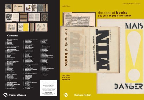
This sales blad contains uncorrected proofs<br />
of sample pages in miniature. The full<br />
specification for the book itself is:<br />
Trimmed page size: 31.8 x 22.9 cm<br />
Casebound and jacketed<br />
464 pages with over 672 colour illustrations<br />
ISBN 978-0-500-51591-4 £42.00<br />
(price subject to change without notice)<br />
Thames & Hudson<br />
181A High Holborn, London WC1V 7QX<br />
www.thamesandhudson.com<br />
Edited by<br />
Mathieu Lommen<br />
the book of books<br />
500 years<br />
of graphic<br />
innovation<br />
the book of books<br />
500 years of graphic innovation<br />
Edited by Mathieu Lommen
1895 William Morris Dante Gabriel Rossetti, Hand and soul. Hammersmith: Kelmscott Press; Chicago: Way and Williams,<br />
Towards the end of 1889,<br />
William Morris started<br />
1895. 56 pp. 15 cm. Designer & illustrator: William Morris. Printer: Kelmscott Press, Hammersmith (London).<br />
designing the Golden type<br />
(1891), which he initially<br />
called ‘Jenson-Morris.’<br />
‘I began printing books,‘ wrote William<br />
Nicolas Jenson’s roman from<br />
Morris in 1896, ‘with the hope of produc-<br />
1470 served as an example;<br />
ing some which would have a definite<br />
Emery Walker, a friend who<br />
claim to beauty, while at the same time<br />
lived near Morris in Ham-<br />
they should be easy to read and should<br />
mersmith, had furnished<br />
not dazzle the eye, or trouble the intellect<br />
photographic enlargements<br />
of the reader by eccentricity of form in<br />
of historic types. Edward<br />
the letters.’ By founding a private press,<br />
Prince (1846–1923) cut the<br />
the Englishman Morris (1834–96) gave<br />
his interest in books a new turn. Before<br />
that, in the eighteen seventies, he had<br />
punches.<br />
276 calligraphed and illuminated books by<br />
hand. Also, he abhorred the cheap paper,<br />
the thin typefaces, and the abominable<br />
layout of contemporary books.<br />
When Morris, in his fifties, started the<br />
Kelmscott Press (1891–98), he was already<br />
a successful man. He was well-known as a<br />
writer, as an Arts-and-Crafts artist, and as<br />
a socialist. His firm, Morris & Co., produced<br />
stained glass, furniture, wallpaper<br />
and fabrics, and boasted more than a<br />
hundred employees. For his private press,<br />
Morris designed heavy types, using photographic<br />
enlargements of historic types.<br />
The production of his books was done<br />
according to traditional methods: a hand<br />
press was used to print on handmade<br />
paper or parchment. Woodcuts were<br />
used for the decorations. The expensive<br />
Kelmscott editions were in great demand<br />
with book collectors and librarians.<br />
Hand and soul is an early text by the<br />
painter and poet Dante Gabriel Rossetti,<br />
who was an old friend of Morris. The ornamental<br />
borders had already been used<br />
for another book. Hand and soul is the<br />
only Kelmscott publication that also appeared<br />
in an American edition. Kelmscott<br />
Press had many admirers and followers<br />
outside of England, mostly in the United<br />
States. ml<br />
277<br />
344<br />
the book of books<br />
1929 Jan Tschichold Franz Roh & Jan Tschichold, Foto-Auge: 76 Fotos der Zeit; Oeil et photo: 76 photographies de notre<br />
temps; Photo-eye: 76 photoes of the period. Stuttgart: Dr. Fritz Wedekind & Co., 1929. 18 pp. 30 cm. Designer: Jan Tschichold.<br />
Photographer (cover): El Lissitzky. Printer: Heinrich Fink, Stuttgart. With the folds on the fore-edge.<br />
When Jan Tschichold (1902–74) designed<br />
Foto-Auge, he had already made his<br />
name, even though he was still in his<br />
twenties. To some extent, this was due<br />
to his publications, in particular to his<br />
manual Die neue Typographie, which had<br />
appeared the year before. After visiting<br />
a Bauhaus exhibition in Weimar, in<br />
1923, Tschichold’s work was increasingly<br />
influenced by Modernism.<br />
In 1928, he was a selection committee<br />
member for ‘Film und Foto’ (Fifo). This<br />
travelling <strong>international</strong> exhibition, which<br />
opened in Stuttgart in 1929, focussed on<br />
several areas of photography, among<br />
them advertising. Tschichold’s friends<br />
El Lissitzky and Piet Zwart took care of<br />
selections for the Russian and Dutch sections<br />
respectively. The groundbreaking<br />
exhibition was accompanied by a modest<br />
catalogue. The photo book Foto-Auge,<br />
which Tschichold helped put together,<br />
was a spin-off from this exhibition. It contains<br />
work by László Moholy-Nagy, Zwart,<br />
Tschichold, and others. Lissitzky’s selfportrait<br />
on the front cover, ‘The constructor’<br />
(1924), has since become iconic.<br />
Tschichold advocated the use of<br />
standard paper sizes (din) for reasons of<br />
efficiency. Die neue Typographie appeared<br />
in A5 size, Foto-Auge in A4. Foto-<br />
Auge is an example of New Typography<br />
in other aspects as well: the asymmetric<br />
layout, the exclusive use of lower case<br />
type, and the book, while refined, is not a<br />
luxury edition. A Japanese binding – the<br />
fold at the fore-edge – was used to give<br />
the book some bulk (it numbers only<br />
94 pages). To this end, the leaves were<br />
stapled through the back margins. ml<br />
the book of books<br />
William Morris<br />
Jan Tschichold<br />
345<br />
396<br />
442<br />
1966 Wim Crouwel Remco Campert, De letter ... n; verbeeld door Wim Crouwel (Total Design). Amsterdam: Den Ouden,<br />
1966. 26 pp. 15x21 cm. Designer: Wim Crouwel (Total Design). Printer: Den Ouden, Amsterdam. With the folds on the fore-edge.<br />
This publication is a linguistic and graphic<br />
game with the letter n. The designer Wim<br />
Crouwel (1928–) illustrates a short text<br />
by the Dutch poet and author Remco<br />
Campert. The booklet, printed letterpress,<br />
was a New Year’s publication by an<br />
Amsterdam printing office. A few years<br />
before it appeared, Crouwel and others<br />
had founded Total Design (td), a multidisciplinary<br />
bureau. Influenced by the Swiss<br />
style of typography, td worked according<br />
to a rational design method. Situated in<br />
Amsterdam, the bureau received large<br />
and complicated commissions, including<br />
house styles for governments, businesses<br />
and museums. td became so influential<br />
in The Netherlands that the seventies<br />
brought a reaction against its dominant<br />
‘functional’ style. The criticism, from both<br />
the design world and the media, was<br />
directed primarily against Crouwel: he<br />
was the public face of the bureau.<br />
Even though many regarded his work<br />
as rational at the time, he still found<br />
opportunities for experiment, especially<br />
the book of books<br />
the book of books<br />
in a publication like this, printed in a<br />
small edition. In these years Crouwel was<br />
also working on a typeface for the new<br />
cathode ray tube (crt) typesetters. His<br />
research resulted in his New Alphabet<br />
(1967), which broke with all conventions<br />
of legibility. Hardly used — technical<br />
advances quickly overtook the concept<br />
— the alphabet and its printed specimen<br />
have since attained a cult status.<br />
De letter ... n is partly set in the sans<br />
serif Helvetica, sometimes called ‘the<br />
faceless typeface’. td preferred to work<br />
with sans serif types. Helvetica is based<br />
on types from circa 1900, but gives a<br />
more mechanical, neutral impression.<br />
In his preference for ‘neutral’ design<br />
and machine aesthetic, Crouwel shows<br />
himself to be a true modernist. ml<br />
Helvetica (1957) was developed<br />
by Eduard Hoffmann<br />
(1892–1980), director of<br />
Haas’sche Schriftgiesserei<br />
near Basel, in collaboration<br />
with the designer Max<br />
Miedinger (1910–80). In<br />
fact, it is a completely redrawn<br />
version of Akzidenz-<br />
Grotesk. From 1961 it was<br />
also available from Stempel<br />
and Linotype, and was<br />
expanded into a family with<br />
many variations in weight<br />
and width.<br />
Wim Crouwel<br />
Stefan Sagmeister<br />
397<br />
443

![01 -[BE/INT-2] 2 KOL +UITGEV+ - exhibitions international](https://img.yumpu.com/19621858/1/184x260/01-be-int-2-2-kol-uitgev-exhibitions-international.jpg?quality=85)