Urban Animals - Art Gallery of Alberta
Urban Animals - Art Gallery of Alberta
Urban Animals - Art Gallery of Alberta

You also want an ePaper? Increase the reach of your titles
YUMPU automatically turns print PDFs into web optimized ePapers that Google loves.
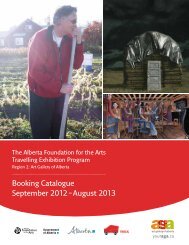
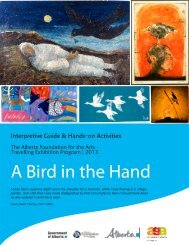
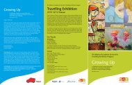
The <strong>Alberta</strong> Foundation for the <strong>Art</strong>s Travelling Exhibition Program<br />
Elements and Principles <strong>of</strong> Design Tour<br />
COLOUR: Colour comes from light that is reflected <strong>of</strong>f objects. Colour has three main<br />
characteristics: Hue, or its name (red, blue, etc.) Value: (how light or dark the colour is)<br />
and Intensity (how bright or dull the colour is)<br />
See: The City Moose, 2012 by Jason Carter<br />
What are primary colours? Do you see any? Point to them in the drawing. What<br />
secondary colours do you see?<br />
Colour is made <strong>of</strong> primary colours, red, blue and yellow. Secondary colours<br />
are created from primary colours and include green, orange and purple. We see all primaries,<br />
red, yellow, blue and secondaries orange and green.<br />
Where is your eye directed to first? Why? Are there any colours that stand out more than<br />
others?<br />
Our attention is directed to the intense warm colour <strong>of</strong> the orange tower in the centre <strong>of</strong> the<br />
painting and then across the picture plane to each <strong>of</strong> the other orange towers. These towers are<br />
the most vivid in the work and, by being placed next to large areas <strong>of</strong> the complementary colour<br />
blue, are made to stand out. The red and yellow buildings also stand out because they are also<br />
warm colours and placed next to the complement <strong>of</strong> red which is green.<br />
What are complementary colours? How have they been used to draw attention?<br />
Complementary colours are those across from each other on the colour wheel and are<br />
placed next to each other to create the most contrast. The orange and other warm colours <strong>of</strong><br />
the buildings (red, yellow) stand out against the cool colours (blue and green) and so direct<br />
the viewer’s eye. Contrasting colours are used to create a strong sense <strong>of</strong> deep space and<br />
emphasis in the work.<br />
AFA Travelling Exhibition Program, Edmonton, AB Ph: 780.428.3830 Fax: 780.421.0479<br />
youraga.ca