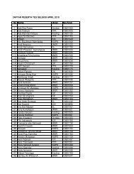
EVALUATION OF HYPERTENSION POSTER ON THE VISITORS OF ...
EVALUATION OF HYPERTENSION POSTER ON THE VISITORS OF ...
EVALUATION OF HYPERTENSION POSTER ON THE VISITORS OF ...

Create successful ePaper yourself
Turn your PDF publications into a flip-book with our unique Google optimized e-Paper software.
<strong>EVALUATI<strong>ON</strong></strong> <strong>OF</strong> <strong>HYPERTENSI<strong>ON</strong></strong> <strong>POSTER</strong> <strong>ON</strong><br />
<strong>THE</strong> <strong>VISITORS</strong> <strong>OF</strong> TALAGA HEALTH CENTER<br />
IN MAJALENGKA DISTRICT<br />
Thesis Summary<br />
Health Behavior and Promotion<br />
Public Health Study program<br />
Faculty of Medicine<br />
Presented by:<br />
ICCA STELLA AMALIA<br />
09/293328/PKU/10861<br />
POSTGRADUATE SCHOOL <strong>OF</strong> PUBLIC HEALTH SCIENCES<br />
FACULTY <strong>OF</strong> MEDICINE<br />
UNIVERSITAS GADJAH MADA<br />
YOGYAKARTA<br />
2011
<strong>EVALUATI<strong>ON</strong></strong> <strong>OF</strong> <strong>HYPERTENSI<strong>ON</strong></strong> <strong>POSTER</strong> <strong>ON</strong><br />
<strong>THE</strong> <strong>VISITORS</strong> <strong>OF</strong> TALAGA HEALTH CENTER<br />
IN MAJALENGKA DISTRICT<br />
Icca Stella Amalia 1 , Kristiani 2 , Rendra Widyatama 3<br />
ABSTRACT<br />
Background: The results of a preliminary study showed morbidity rates<br />
on hypertension in Talaga Health Center that became the top 10 diseases<br />
with a prevalence of 6.07% in 2009. However, efforts of health promotion<br />
over the issue have not been done. One medium that can be used for<br />
health promotion is a poster. Posters specific and in accordance with<br />
hypertension have not been present. Given the aforementioned facts,<br />
posters need to be designed as appropriate, in this case hypertension,<br />
and then be evaluated.<br />
Objective: Assessing the interest and understanding of Talaga Health<br />
Center visitors on the hypertension poster in aspects of design, message<br />
content and place of installation.<br />
Methods: This was a descriptive study with qualitative methods using a<br />
design of phenomenology. Subjects in this study were the visitors of<br />
Talaga Health Center. The other informants were the officer of health<br />
promotion, Head of the Health Center and Head of Health Promotion in<br />
Majalengka District. The data were collected through document review,<br />
focus group discussions (FGD), in-depth interviews and observation.<br />
Results: The visitors’ interest to the poster on hypertension was due to<br />
the use of bright colors, with combination of green, yellow and red colours,<br />
readable font size with a simple font, clear images and in accordance with<br />
daily life, simple layout, simple delivery, and the strategic installation. The<br />
visitors’ understanding could be seen from the way they knew the purpose<br />
and benefits of the message. The visitors easily understood the message<br />
because there were images, simple words and sentences, the use of<br />
everyday language, the use of color and installation position that was easy<br />
to read. The place of installation was expected to be propagated in the<br />
waiting room, in the treatment room and in every village.<br />
Conclusion: Overall, most visitors were interested in and understood the<br />
hypertension poster. The hypertension poster in Sundanese version was<br />
acceptable as a medium for health promotion by Talaga Health Center<br />
visitors who had an interest in the design and content of the message in<br />
the hypertension poster.<br />
Keywords: evaluation, hypertension poster, health center visitors<br />
1. Jatipamor Village, Talaga sub District, Majalengka District<br />
2. Magister, Health Service Management and Policy, Faculty of Medicine,<br />
Gadjah Mada University<br />
3.<br />
Faculty of Letters, Ahmad Dahlan University, Yogyakarta
2<br />
INTRODUCTI<strong>ON</strong><br />
Indonesia as a developing country still has a wide range of health<br />
problems, one of which is hypertension. (1) The prevalence of hypertension<br />
in Indonesia has reached 31.7% of the total adult population, amounting to<br />
6.8% of the proportion of death causes in all age groups in Indonesia. (2)<br />
The 2007 Basic Health Research (Riskesdas) in Majalengka showed the<br />
proportion of hypertension as non-communicable diseases occupied the<br />
third position by 10.6%, after joint disease and stroke with 24.6% and<br />
11%, respectively. (3)<br />
At the Talaga health center, hypertension becomes the top ten<br />
diseases with a prevalence of 6.07%. Although not placing on the first<br />
position, hypertension has not received attention. (4) Hypertension needs to<br />
get attention because if it is not controlled, it can be a risk factor for the<br />
emergence of other more serious diseases such as stroke, heart failure<br />
and kidney failure. One way that can be done is with the campaign to<br />
prevent hypertension. Health promotion can be carried out by the use of<br />
media. (5) The media widely used in Talaga health center is posters. From<br />
some existing posters, there are no specific posters about hypertension.<br />
A poster is a medium that combines images of visual elements<br />
such as lines, images and words to attract attention and communicate a<br />
message briefly. (6) A poster has advantages in attracting people with a<br />
special interest, because a poster can deliver or present the subject of a<br />
problem. (7) A study on the effectiveness of posters on knowledge and<br />
attitudes of a family about high-risk pregnancy and danger signs of<br />
pregnancy showed that the use of posters was less effective in increasing<br />
knowledge. (8) From some of the results of previous studies, it was note<br />
that there were differences about the effectiveness of poster; thus, to be<br />
able to assess the effectiveness of poster needed evaluation of the poster<br />
media.
2<br />
Trials and evaluation concerning the use of posters in Talaga<br />
health center were never conducted. In fact, trial and evaluation of media<br />
is very important. Media evaluation is done by looking at the provided<br />
media whether they have been appropriate and can achieve the goal or<br />
not, whether the distribution of media is on target or not, whether they are<br />
relevant or not, whether the content deliveres a message or information<br />
which is easily understandable and appropriate or not, and whether the<br />
placement or installation of the media is appropriate or not. (9) One of the<br />
learning points gained in a process of using posters to be effective must<br />
carried out evaluation of the media. (7) Some of the factors underpinning<br />
successful media communication are, among others, that the media can<br />
increase interest and understanding of the audience. (1) Based on these<br />
explanations, the problem formulation of this study is: "How are the<br />
interest and understanding of the health center’s visitor on the poster<br />
concerning hypertension?". Based on the formulation of the problem, the<br />
objective of this study is to evaluate the posters on hypertension to the<br />
visitors of Talaga health center by studying visitors’ interest and<br />
understanding on hypertension in the aspect of poster design, message<br />
content and place of installation.<br />
MATERIALS AND METHODS<br />
This study was a descriptive study with qualitative methods using a<br />
design of phenomenology. The study was conducted at the Talaga health<br />
center with consideration based on the results of preliminary studies that<br />
found no specific posters about hypertension and had never conducted an<br />
evaluation of posters. Another reason was because the Talaga health<br />
center was the health center with most visitors in comparison to other<br />
health centers in Majalengka District. (3)<br />
Selection of informants was done purposively based on the purpose<br />
in which the subject was as the unit of analysis considered in accordance<br />
with the requirement. (10) Core informants in this study were Talaga Health
3<br />
Center visitors and key informants were the Head of Health Promotion of<br />
Majalengka District, Head of health center and staff of health promotion in<br />
Talaga Health Center.<br />
Data was collected through in-depth interviews to 11 visitors, focus<br />
group discussions (FGD) to 14 individuals consisting of two visitor groups.<br />
The first group of visitors was as many as seven people who did not suffer<br />
from hypertension and the second group was seven people visitors who<br />
suffered or had once suffered hypertension. Observations were carried out<br />
to find a situation where posters on hypertension and posters visitor<br />
interacted.<br />
RESULT AND DISCUSSI<strong>ON</strong><br />
1. Visitors’ interest<br />
Visitors’ interest to the poster on hypertension could be seen<br />
from several aspects:<br />
a. Design<br />
Interest in hypertension poster of the design elements were<br />
grouped again in a few things, namely:<br />
1) Color<br />
Based on the survey results, it was revealed that poster in<br />
Sundanese version received more attention and was read by<br />
the visitors. The visitors were interested in the poster on<br />
hypertension because of its bright, contrast and varied colors.<br />
Bright colors attracted the eye, so that the visitors took a look<br />
at and read the poster on hypertension.<br />
The results were consistent with previous study that showed<br />
that the most preferred selection of basic colors in a medium<br />
was white, green or red. (10) Another study reinforced the<br />
results of this study where the preferred and interesting color<br />
was the neutral colors such as green. (11) A poster should be<br />
eye-catching in order to make people stop and read it. (12)
4<br />
In terms of color, the visitors felt that not too contrasting<br />
and striking colors helped in reading. Background colors and<br />
contrast font made the visitors read the poster easily. Letters<br />
and background color were made contrast so that the poster<br />
was easy to read and emphasis that required special<br />
emphasis could be delivered. (6)<br />
The use of color in a graphic design has several functions,<br />
namely to attract attention, generate psychological effects,<br />
develop associations, build retention and create a fun<br />
atmosphere. (13)<br />
The combination of contrasting color into a<br />
single unit in a poster will help facilitate the delivery of a<br />
message. Conversely, if the blending colors do not contrast, it<br />
will make difficulty in the one’s sight. The colors should be<br />
complementary and the use of too many colors can weaken<br />
the communication. (13)<br />
2) Font size<br />
Based on the results of in-depth interviews and group<br />
discussions, the visitors felt that the font size was quite easy to<br />
see. The visitor’s opinion to the font size in the poster is shown<br />
on the statement as follows:<br />
“the font size must be large because it is good..... if it is<br />
big, it is visible to the health center’s visitors” (IW6).<br />
The largest font size on the hypertension poster was 13 mm<br />
and the smallest 6 mm. To facilitate the legibility of the font<br />
size should not be smaller than 18 points or 5mm. (13)<br />
The font used Microsoft Sans Serif and was written capital.<br />
The use of letters in the hypertension poster was not too<br />
complicated and high artistic that could make it difficult to<br />
read. Another study supported the results of this study,<br />
suggesting that the use of font that was not unbending and<br />
cumbersome assisted in enabling people to read. (11)<br />
To
5<br />
facilitate the legibility should use clear and simple font, such<br />
as Microsoft Sans Serif. (14)<br />
The use of color on the font affected the ease of visitors<br />
to read the contents of the message in the hypertension<br />
poster. Writing letters with color variations could also provide<br />
attraction. (11) Contrast font color with the background of the<br />
poster’s overall colors helped to facilitate legibility. (6)<br />
3) The compactability between image and writing<br />
Based on the results of the study, the presence of the<br />
image became the main attraction. The image most often said<br />
to attract the attention of the visitors was the image that there<br />
was an element of regionalism (the Cepot). The visitors felt<br />
that the drawings and writings fit as in the following statement:<br />
“it refelcts compactability between image and writing,<br />
like vegetable image having to be drawn like real<br />
vegetables” (IW2).<br />
The use of regionalism in the form of puppet characters<br />
in the Pasundan picture intentionally was for providing<br />
something different. Other images were considered interesting<br />
because they fit the visitors’ daily life such as vegetables and<br />
fruit images, images of people blowing the flute and pictures of<br />
people who were exercising. The use of pictures should attract<br />
the attention of the target; this can be done by using images<br />
that are familiar with the life goals. (15)<br />
The study was<br />
supported by the previous research, namely making posters<br />
with visuals that corresponded to the social and political<br />
characteristics successfully foster the participation of Chinese<br />
ethnic group in dealing with malaria. (16)<br />
The use of original image (photo) attracted the attention<br />
of visitors, helped simplify and remember the messages<br />
conveyed in the poster. This was consistent with the previous
6<br />
study that the use of posters was less effective because the<br />
message was difficult to remember and the cause was the<br />
illustrated image did not use an original image that was<br />
considered less attractive. (8) Photo serves to increase<br />
motivation and interest, develop language skills, and help<br />
interpret and remember the content of messages regarding<br />
the photos. (15) In addition to attracting attention, the picture<br />
can help explain things so much easier to understand, clarify<br />
the parts that are important and condense a long<br />
description. (6)<br />
4) Layout<br />
These results indicated that the layout of the posters<br />
was judged fairly simple and easy to remember. Selection of a<br />
key element of either letters or illustrations could be done so<br />
that the reader could quickly grasp the message. (17) In this<br />
hypertension poster, elements that were highlighted were from<br />
the image into supporting and reinforcing the message<br />
conveyed.<br />
In the poster with the version of the Indonesian<br />
language, images that attracted the attention were the pictures<br />
of vegetables and fruits. Laying out the image on the first<br />
sequence could be said to attract attention. Sundanese<br />
language version was added a poster image that had an<br />
element of regionalism, the puppet (cepot). Figure of Cepot<br />
was placed in the top left corner, and based on survey results<br />
this revealed that the cepot image became the first thing that<br />
attracted the attention of the visitors. Other images were<br />
sorted by condition and approximate cause of hypertension<br />
from the greatest to the smallest roles.<br />
The layout of the colors was also a visitor's attention.<br />
Placement of base color into the background with the overall
7<br />
content of the message was judged contrast and helped easy<br />
to read. Writing letters with color variations could give<br />
attraction. (11) Font color contrast with the background of the<br />
poster’s overall colors helped to facilitate legibility. (6)<br />
Placement of font size was also one interesting thing. The title<br />
used a larger font than the subtitles and the contents of the<br />
message. This became important because with the proper<br />
placement of the letters in each part of the message this<br />
allowed the reader to view the message.<br />
b. Message contents<br />
The content of the message is a matter which will be<br />
delivered by communicators to express intention. (18) Results from<br />
in-depth interviews and FGD showed that the visitors felt the<br />
contents of the message was appealing for the content was<br />
information about hypertension, such as the following statement:<br />
“interesting about hypertension, so know the result of eating<br />
less nutritious foods leading to hypertension, smoking can<br />
cause hypertention too. High blood could be a stroke, heart<br />
disease, kidney failure. So we're not going to eat but at<br />
home, lack of exercise, smoking, excessive salt intake so<br />
scared, we have fear” (IW2)<br />
Words and sentences that made up the message also<br />
received close attention. The words in the hypertension poster<br />
were assessed memorable because they were words in the daily<br />
conversation. Phrases used were considered simple, not<br />
convoluted and straight to the point of the matter. The visitors’<br />
interest in words and sentences can be seen in Figure 1.
8<br />
Clear<br />
wording<br />
Daily<br />
words<br />
Interest in<br />
words and<br />
sentences<br />
Simple<br />
sentences<br />
Use of<br />
Sundanese<br />
Figure 1. The visitirs’ interest in the use of words and sentences<br />
in the poster<br />
The technique of message delivery in the hypertension<br />
poster became one of the subject in in-depth interviews as well<br />
as FGD. The opinion of the visitors related to the way of the<br />
message delivery can be seen from the following statement:<br />
“simple .. simple .. [messaging] because not many words that<br />
are not clear so just direct to the core problem”<br />
(IW2)<br />
Messages that cause certain feelings in the reader can get<br />
someone interested and apply the message. The previous study<br />
successfully conveyed a message with visuals that made people<br />
excited to use seatbelts. (19) The election of theme was said to be<br />
in accordance with public health conditions in Majalengka which<br />
were still considered high in terms of hypertension rates by one<br />
key informant. The suitability of themes and issues of concern<br />
was very important so that the poster was made readable,<br />
understandable and memorable. (20)<br />
c. Location of installation<br />
Based on the observations, it was known that the visitors<br />
who came mostly just passed through the location without seeing<br />
a poster. Some visitors were around the location, but did not pay<br />
attention to the existence of a poster; anyone noticed the poster<br />
but did not read; but there were those who also took a look at<br />
and read the poster.
9<br />
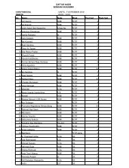
Assessment of the visitors to the location of posters can<br />
be seen from the results of in-depth interviews and FGD.<br />
Opinions about the location of installation can be seen from<br />
Table 1.<br />
Location<br />
In Talaga Health center<br />
Table 1. Location of poster installation<br />
Informant’s opinion<br />
- In outpatient waiting room<br />
- In front of inpatient room<br />
Outside Talaga Health Center<br />
- In balai desa (village hall)<br />
- In post office<br />
- In other health centers<br />
Based on this research, it was known that the visitors<br />
could see the poster in the place of installation because the place<br />
was quite spacious. In addition to the size of the posters, the<br />
existence of the posters became the main attraction when the<br />
visitors were around the place of installation. The visitors were<br />
interested in reading the hypertension poster, because the poster<br />
was judged appropriate with the position of the visitors’ eyes, so<br />
that it was not difficult to read.<br />
Location of the posters can be in public places where<br />
people often congregate as well as in government offices. (21) The<br />
results of the previous study showed that the placement of<br />
posters in strategic places could foster a desire to use the<br />
stairs. (22) Another study had shown that a person would be in the<br />
waiting room in a long time making it possible to be able to<br />
convey health messages. (23) The position or location of the poster<br />
must easily be accessible by the senses of sight, so it can attract<br />
people's attention. (24)<br />
2. Visitors’ understanding<br />
The visitors’ understanding of the messages was from the<br />
knowledge of informants against the benefits and intent of the
10<br />
message content and there were efforts to implement message<br />
content. Informants argued that the contents of the message were<br />
an invitation to a healthy life. Some things that were understood<br />
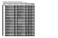
and not understood can be seen in Table 2.<br />
Table 2. Things which were understood and poorly understood by<br />
the visitors from the hypertension poster<br />
Understood<br />
- Eating vegetables and<br />
fruits makes healthy<br />
body<br />
- Cigarrette can cause<br />
hypertention<br />
- Over salt consumption<br />
causes hypertention<br />
- Hypertention can lead<br />
to blindness, stroke,<br />
and heart failure<br />
- Alcohol causes<br />
hypertention<br />
Poorly understood<br />
- Figure of proccessed meat<br />
- Figure of a person with<br />
stressful face<br />
- The cause of hypertention<br />
which was only lifestyle or<br />
gebetic factors<br />
- Words in Sundanese “cara<br />
tuang nu kirang lereus”<br />
- Word ‘stroke’ in an<br />
Indonesian languange<br />
poster<br />
Understanding of the message content was associated with<br />
the manner of delivery, comprehensiveness and use of picture.<br />
Most informants felt the message in the hypertension poster was<br />
quite simple. The words and sentences were judged simple and<br />
uncomplicated. The contents of the message were easy to<br />
understand and be understood because they were directly on the<br />
core issues. Another statement came from interviews with key<br />
informants that the poster was judged good because the<br />
information about hypertension was said to be beneficial to society.<br />
Completeness of the message was considered to adequately<br />
represent the necessary information about hypertension. Too many<br />
messages were perceived to be difficult to remember and<br />
understand because the reading time was limited. These results<br />
were supported by a statement of a key informant who argued that
11<br />
in print media such as posters; too many words would make it<br />
difficult to understand.<br />
The visitors said that to understand and remember the<br />
message was because of the pictures. In addition to drawing<br />
attention, it might also help explain things so much easier to<br />
understand, clarify the parts that are important and condense a<br />
long description. (6) In a previous study, it was known that one<br />
cause of the message difficult to remember was because of the<br />
use of illustrative images that were not using the original image. (8)<br />
Photo serves to increase motivation and interest, develop<br />
language skills, and help interpret and remember the content of<br />
messages regarding the photos. (15)<br />
The visitors understood and appreciated the message<br />
because of the use of Sundanese. In a previous study, it was<br />
demonstrated the role of a culture and language in relation to<br />
patient safety. (25) Vernacular language or dialect is said to be a<br />
version of language with specific and easily recognizable traits<br />
socially or regionally that have sentence construction, vocabulary,<br />
and pronunciation with a unique and distinctive pattern. (26)<br />
Language has an important role in the communication and helps in<br />
understanding a thing.<br />
Everyone will have different capacities to receive a message.<br />
In the ELM theory, it is described that message or information will<br />
be accepted depending on the motivation of every person and his<br />
ability to be able to process and interpret the message. (27) High<br />
ability will make visitors feel the given message becomes a thought<br />
and a focus on the quality of the message, leading to many<br />
opinions. Visitors’ low motivation and ability will see the message as<br />
a whole without seeing something important, so it does not appear<br />
to be more in-depth opinion.
12<br />
C<strong>ON</strong>CLUSI<strong>ON</strong> AND RECOMMENDATI<strong>ON</strong><br />
The informants were interested in the poster’s colors which were<br />
bright, with combination of green, yellow and red colours, readable font<br />
size with a simple font, clear images, and close to their daily lives, with<br />
simple layout. Judging from the message content, the informants were<br />
interested because the theme of hypertension was presented with simple<br />
use of words, sentences and everyday language. Strategic location, a<br />
place that was adequate and the position of posters that could be seen by<br />
the sense of sight made the poster more interesting to be read by the<br />
visitors.<br />
The messages could be understood because the text was<br />
supported with clear images, the use of Sundanese language, and the use<br />
of words and short sentences with no other meanings. The simple<br />
contents of the message could be understood by the visitors better.<br />
Overall, most visitors were interested in and understand the hypertension<br />
poster. The hypertension poster in Sundanese version was acceptable as<br />
a medium for health promotion by Talaga Health Center visitors who had<br />
an interest in the design and content of the message in the hypertension<br />
poster.<br />
Health Center and Health Office as the institution that produces or<br />
distributes the media should be able to create their own posters<br />
appropriate to the situation and condition of Majalengka District, using the<br />
Sundanese language, and may consider aspects of local culture. In<br />
addition, the posters should been evaluated in order to find and produce<br />
media in accordance with community expectations.
13<br />
REFERENCES<br />
1. Departemen Kesehatan RI. (2004). Pusat Promosi Kesehatan,<br />
Pengembangan Media Promosi Kesehatan, Jakarta.<br />
2. Pusat Data dan Informasi Persi. (2010). Cakrawala : Hanya 0,4%<br />
Penderita Hipertensi Berobat. Available from :<br />
http://www.pdpersi.co.id/?show=detailnews&kode=5453&tbl=cakrawal<br />
a (Accessed 17 September 2010).<br />
3. Dinas Kesehatan Kabupaten Majalengka. (2009). Profil Kesehatan<br />
Kabupaten Majalengka Tahun 2009. Majalengka.<br />
4. UPTD Puskesmas DTP Talaga. (2009). Profil kesehatan<br />
kecamatan Talaga Tahun 2009.<br />
5. Simons-Morton B.G., Greene W.H, Gottlieb, N.H.(1995). Introductin to<br />
Health Education Dan Health Promotion. Illinois: Waveldan Press<br />
6. Anitah, S. (2009). Media pembelajaran. Surakarta: Yuma Presindo.<br />
7. Lawson, G. (2005). The Poster Presentation: An Exercise In Effective<br />
Communication. Journal Of Vascular Nursing Vol.xxiii No.4.<br />
8. Wijayanti. (2001). Efektivitas Poster terhadap Pengetahuan dan Sikap<br />
Keluarga tentang Kehamilan Risiko Tinggi dan Tanda Bahaya<br />
Kehamilan di Kecamatan Pituruh Purworejo. Tesis, Program<br />
Pascasarjana Universitas Gadjah Mada, Yogyakarta.<br />
9. Ewles, L dan Simnett, I. (1994). Promosi Kesehatan: Petunjuk praktis.<br />
Terjemahan edisi kedua. Yogyakarta: Gadjah Mada University Press.<br />
10. Suiraoka, I.P. (2003). Perancangan Media Promosi Kesehatan GAKY<br />
pada Anak SD di Daerah Endemik di Provinsi Bali. Tesis, Program<br />
Pascasarjana Universitas Gadjah Mada, Yogyakarta.<br />
11. Aryani, D. (2009). Buku Cerita Bergambar sebagai Media Promosi<br />
Kesehatan untuk Prevalensi Dini Kekerasan Seksual pada Siswa SD<br />
di Kota Yogyakarta. Tesis, Program Pascasarjana Universitas Gadjah<br />
Mada, Yogyakarta<br />
12. Huddle, P.A (2000). How to Present A Paper or Poster.<br />
Journal of Chemical Education. Vol.77 No.9 September.<br />
13. Murray, R., Thow, M., Strachan, R. (1998). Visual Literacy: Designing<br />
and Presenting a Poster. Physiotherapy, July 1998, Vol 84, no 7.<br />
14. Matthews, D.L. (1990).The sientific Poster: Guidelines for Effective<br />
Visual communication. Technical Communication, Third Quarter 1990<br />
15. Arsyad, A. (2010). Media Pembelajaran. Jakarta: Rajawali Pers.<br />
16. Bu, L. dan Fee, E. (2010). Communicating with Pictures: The Vision of<br />
Chinese Anti-Malaria Posters. American Journal of Public Health, Vol<br />
100, No 3.<br />
17. Supriyono, R. (2010). Desain Komunikasi Visual Teori dan Aplikasi.<br />
Yogyakarta : Andi<br />
18. Direktur Kesehatan komunitas, Direktorat Jenderal Bina kesehatan<br />
Masyarakat 2002. Data Dasar Puskesmas Tahun 2002. Jakarta.
19. Akbas, O., Guvena, R., Cebecia, G., Bertleka, S.B., Aldemira, G.<br />
(2010). A study on the effects of seat belt posters on drivers. Procedia<br />
Social and Behavior Sciences 2 (2010) 1002-1007.<br />
20. Miller, J.E. (2006). Preparing and Presenting Effective<br />
Research Posters. Health Research dan Educational Trust.<br />
21. Departemen Kesehatan RI. (2004). Pusat Promosi Kesehatan,<br />
Pengembangan Media Promosi Kesehatan, Jakarta.<br />
22. Iversen, M.K., Handeli, M.N., Jensen, E.N., Frederiksen, P., Heitmann,<br />
B.L. (2007). Effect of health-promoting posters placed on the platform<br />
of two train stations in Copenhagen, Denmark, on the choice between<br />
taking the stairs or the escalators: a secondary publication.<br />
International Journal of Obesity (2007) 31, 950–955.<br />
23. Sajadian, A dan Montazeri, A. Do women read poster displays on<br />
breast cancer in waiting rooms?. Journal of Public Health Vol. 26, No.<br />
4, pp. 355–358.<br />
24. Dewi, L. (2007). Media grafis. Universitas Pendidikan Indonesia<br />
Available from :<br />
http://file.upi.edu/Direktori/A%20%20FIP/JUR.%20KURIKULUM%20D<br />
N%20TEK.%20PENDIDIKAN/197706132001122%20%20LAKSMI%2<br />
0DEWI/MEDIA%20GRAFIS/MEDIA%20GRAFISHSL%20MHSISSWA/<br />
poster/<strong>POSTER</strong>%20fix.pdf (Accessed 12 Mei 2010).<br />
25. Megan., Johnstone, J., Kanitsaki, O. (2006). Culture, language, and<br />
patient safety: making the link. International Journal for Quality in<br />
Health Care 2006; Volume 18, Number 5.<br />
26. Hartley, J. (2010). Communication, Cultural, dan Media Studies:<br />
Konsep Kunci. Yogyakarta: Jalasutra.<br />
14