Resene Newsletter issue 1 2013
Resene Newsletter issue 1 2013
Resene Newsletter issue 1 2013

You also want an ePaper? Increase the reach of your titles
YUMPU automatically turns print PDFs into web optimized ePapers that Google loves.
1/13<br />
In Australia, PO Box 924, Beenleigh, Qld 4207<br />
Call 1800 738 383, visit www.resene.com.au<br />
or email advice@resene.com.au<br />
In New Zealand, PO Box 38242, Lower Hutt 5045<br />
Call 0800 RESENE (737 363), visit www.resene.co.nz<br />
or email advice@resene.co.nz<br />
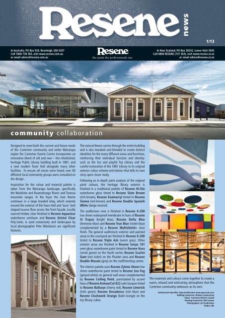
community collaboration<br />
Designed to meet both the current and future needs<br />
of the Carterton community and wider Wairarapa<br />
region the Carterton Events Centre incorporates an<br />
innovative blend of old and new – the refurbished,<br />
heritage Public Library building built in 1881, and<br />
a new modern Town Hall alongside many other<br />
facilities. To ensure all voices were heard, over 80<br />
different local community groups were consulted on<br />
the design.<br />
Inspiration for the colour and material palette is<br />
taken from the Wairarapa landscape, specifically<br />
the Waiohine and Ruamahunga Rivers and Tararua<br />
mountain ranges. In the foyer the river theme<br />
continues in a large braided inlay, which extends<br />
around the exterior of the Town Hall and ‘tuna’ (eel)<br />
shaped louvres flow across the front façade. Locally<br />
sourced timber, clear finished in <strong>Resene</strong> Aquaclear<br />
waterborne urethane and <strong>Resene</strong> Qristal Clear<br />
Poly-Satin, is used extensively and landscapes by<br />
local photographer Pete Nikolaison are significant<br />
features.<br />
The natural theme carries through the entire building<br />
and is also tweaked and blended to create distinct<br />
identities for the many different areas and functions,<br />
reinforcing their individual function and identity:<br />
such as the fun and playful Toy Library and the<br />
careful restoration of the 1881 Library to its original<br />
exterior colour scheme and interior that tells its own<br />
story upon closer study.<br />
Following an in depth paint analysis of the original<br />
paint colours, the heritage library exterior is<br />
finished in a traditional palette of <strong>Resene</strong> Hi-Glo<br />
waterborne gloss tinted to <strong>Resene</strong> Slate Brown<br />
(rich brown), <strong>Resene</strong> Enamacryl tinted to <strong>Resene</strong><br />
Sienna (red brown) and <strong>Resene</strong> Double Spanish<br />
White (beige neutral).<br />
The auditorium river is finished in <strong>Resene</strong> X-200<br />
low sheen waterproof membrane in hues of <strong>Resene</strong><br />
St Tropaz (bright blue), <strong>Resene</strong> Delta Blue<br />
(feminine blue) and <strong>Resene</strong> True Blue (violet blue)<br />
complemented by a <strong>Resene</strong> Multishield+ clear<br />
finish. The general auditorium exterior and painted<br />
areas in the courtyard are finished in <strong>Resene</strong> X-200<br />
tinted to <strong>Resene</strong> Triple Ash (warm grey). Other<br />
exterior areas are finished in <strong>Resene</strong> Sonyx 101<br />
semi-gloss waterborne paint tinted to <strong>Resene</strong> Koru<br />
(verde green) on the Youth centre, <strong>Resene</strong> Scarlet<br />
Gum (red violet) on the Plunket area and <strong>Resene</strong><br />
Double Masala (grey) on the staff/meeting centre.<br />
The interior palette uses <strong>Resene</strong> Zylone Sheen low<br />
sheen waterborne paint tinted to <strong>Resene</strong> Sea Fog<br />
(greyed white) on general wall areas complemented<br />
by <strong>Resene</strong> Ceiling Paint, punctuated by accent<br />
hues of <strong>Resene</strong> ArmourCat 822 satin lacquer tinted<br />
to <strong>Resene</strong> Bullseye (cherry red), <strong>Resene</strong> Limerick<br />
(Irish green), <strong>Resene</strong> Decadence (rich blue) and<br />
<strong>Resene</strong> Clockwork Orange (bold orange) on the<br />
toy library cubes.<br />
The materials and colours come together to create a<br />
warm, relaxed and welcoming atmosphere that the<br />
Carterton community embraces as its own.<br />
Architectural Specifier: Opus Architecture www.opusarch.co.nz<br />
Building Contractor: Holmes Construction<br />
Client: Carterton District Council<br />
Painting Contractor: Phil Carmen<br />
Photographer: Jet Productions<br />
Timber: JNL
stacked<br />
with colour<br />
Beca’s Auckland office fitout brings staff previously<br />
working out of three separate buildings into one<br />
building, occupying over 14,000 square metres of<br />
refurbished office space on eight floors, bringing<br />
new life to a 1980s building formerly occupied by<br />
both Beca and Auckland Regional Council. The large<br />
floor plates are set across two octagonal towers,<br />
with a connecting space that expands and contracts<br />
in size floor-by-floor.<br />
The extensive fitout offered an opportunity to<br />
holistically enhance Beca’s business through their<br />
ways of working and presents a fresh, professional<br />
image. Workstations and furnishings to suit various<br />
workstyles are arranged around a circulation, service,<br />
and utility core in each tower, offering distinct zones<br />
through the plan for focussed and teamwork-based<br />
working, transitioning into ‘studio’ spaces - open<br />
areas to encourage large and smallscale casual<br />
collaboration.<br />
These studio areas are minimally enclosed; in some<br />
cases by rotating screens with whiteboards to<br />
one side and pinboard to the other, encouraging<br />
functional use of the spaces that can be adapted<br />
to suit. The middle section of each floor features<br />
a central hub space adjacent to the lift core,<br />
consisting of transparent meeting rooms as well as a<br />
kitchenette, forming the social and interactive heart<br />
of the floor.<br />
Lift lobbies on all floors are painted with the same<br />
<strong>Resene</strong> Half Tuna (steel grey) colour, applied using<br />
<strong>Resene</strong> ArmourCat spray<br />
lacquer, providing a cohesive<br />
vertical element through the<br />
building. In contrast to the<br />
dark, moody colours of the<br />
lift lobby, the central space<br />
is an open vibrant focal<br />
point of the floors. A striking<br />
black cruciform-shaped<br />
kitchenette is surrounded<br />
with a variety of colourful<br />
furniture types and styles to<br />
create a bright and lively,<br />
inviting working hub. Each<br />
floor is given an identity<br />
through individual colour<br />
themes in this central space,<br />
using strong colours on walls<br />
creating a bold contrast to the dark kitchen and<br />
lobby area.<br />
Tag colours also extend to the carpet tiles in these<br />
central areas, and are carried through in analogous<br />
colours in textiles and finishes for furniture, custompainted<br />
and upholstered lampshades, and tabletop<br />
surfaces, as well as glazing film patterns and signage.<br />
The colours were selected for their visual impact, as<br />
well as compatibility with complementary fabrics<br />
and finishes. Colours include: <strong>Resene</strong> Troubadour<br />
(rich mauve), <strong>Resene</strong> Happy Hour (acid green),<br />
<strong>Resene</strong> Daredevil (fluoro orange), <strong>Resene</strong><br />
Curious Blue (sky blue), <strong>Resene</strong> Jalapeno (spicy<br />
red), <strong>Resene</strong> Hip Hop (violet blue) and <strong>Resene</strong><br />
La Palma (emerald green), primarily applied using<br />
<strong>Resene</strong> ArmourCat spray lacquer to walls.<br />
The intensity of the colour application spills out<br />
into the collaborative studio areas of the office,<br />
through suspended acoustic panels painted in the<br />
feature colours, and also into the carpet accents,<br />
differentiating these collaborative work zones from<br />
workstation areas. The tag colours of the various<br />
floors are even visible from the exterior of the<br />
building at night, providing the passer-by a glimpse<br />
into the vibrant life within.<br />
The main workspaces are primarily monochromatic<br />
in white with contrasting black joinery items.<br />
A custom white colour was created for the project by<br />
<strong>Resene</strong>, applied in a <strong>Resene</strong> ClinicalCote finish on<br />
walls and <strong>Resene</strong> Lustacryl semi-gloss waterborne<br />
enamel on trims and joinery. <strong>Resene</strong> ClinicalCote<br />
is a low odour, washable waterborne paint finish<br />
formulated with anti-microbial silver for use on<br />
broadwall. It is designed to withstand alcohol and<br />
glycol containing cleaners to keep it looking its best.<br />
<strong>Resene</strong> Set Black was used to paint existing<br />
perimeter trunking throughout the building black,<br />
offering an economical means to refinish several<br />
kilometres of trunking length. Exposed ply sheet<br />
edges are finished in <strong>Resene</strong> Aquaclear waterborne<br />
clear urethane.<br />
Even the basement carparking, a typically drab area,<br />
was enlivened with some of these same tag colours<br />
– <strong>Resene</strong> Half Stack (sandy grey), <strong>Resene</strong> La<br />
Palma, <strong>Resene</strong> Curious Blue, <strong>Resene</strong> Sherwood<br />
Green (nature green) and <strong>Resene</strong> Jalapeno –<br />
applied to nonslip coatings to highlight circulation<br />
routes, parking and loading zones.<br />
The attention to colour throughout won this fitout<br />
the <strong>Resene</strong> Total Colour Commercial Interior<br />
Office Award 2012.<br />
Architectural Specifier: Studio Pacific Architecture<br />
www.studiopacific.co.nz<br />
Building Contractor: Aspec Construction Ltd www.aspec.co.nz<br />
Building Owner: Kiwi Income Property Trust www.kipt.co.nz<br />
Client and Engineers: Beca www.beca.com<br />
Painting Contractor: TBS Fleming www.tbsgroup.co.nz<br />
Photographer: Patrick Reynolds www.patrickreynolds.co.nz
fit for<br />
royalty<br />
Adnan Mutlu has worked in hospitality for over<br />
20 years having graduated from a fine School of<br />
Food and Hospitality in Stuttgart. With a string<br />
of experience both international and local and<br />
restaurants to his name, his latest venture, the<br />
refurbishment and rebranding of the old Joy Bong<br />
restaurant has been an endeavour with a very clear<br />
intent.<br />
Joy Bong was a successful Thai restaurant and bar,<br />
part of a multi-cultural tapestry of restaurants, bars<br />
and cafes, sewn along Auckland’s Karangahape<br />
Road. With ‘Monarchy’, Adnan had a vision of<br />
elegance and sophistication without losing the<br />
customary Thai flavours and friendly demeanour.<br />
The new name ‘Monarchy’ was selected in reverent<br />
reference to the King of Thailand, so the intent was<br />
to imbue the interior of the old Joy Bong with regal<br />
elegance while playing on the Eastern philosophical<br />
idea of defining balance between opposites.<br />
In pursuing this ambition, tones of rich red were<br />
chosen for the painted walls, papered ceilings and<br />
upholstery for the bench seat and ottomans for<br />
texture and luxury. Geometric wallpaper panels in<br />
the walls carry the eye to the ceiling between timber<br />
beams.<br />
New large steel lighting tray ‘chandeliers’ have<br />
more than 30 candles enclosing small lights on each<br />
fitting. They create continuity between the spaces<br />
and add either grandeur or intimacy, depending on<br />
the level of light reflecting up onto the wallpapered<br />
ceiling. The wallpaper and gold leaf scotia add the<br />
shimmer of velvet, repeated on upholstered stools<br />
and bench seats. Regal claw high-back seats are<br />
juxtaposed with a casual velvet ottoman, while the<br />
sophisticated candle lights are offset by the fun hisand-hers<br />
seats.<br />
The new leather booth seats start as enclosed circles<br />
and unroll like red carpet. Deep red and mandarin<br />
velvet upholstery is supported by tones of <strong>Resene</strong><br />
Pohutukawa (spicy rich red) painted walls, which<br />
draw you down toward the open fire and bar. The<br />
timber lantern structure of the overhead bar wine<br />
racks adds another layer of fretwork similar to the<br />
screens and louvres connected to the world outside.<br />
Seating and dining walls are finished in <strong>Resene</strong><br />
Bianca (cream off-white), bar walls in <strong>Resene</strong><br />
Vanquish (reserved red), the bar ceiling in <strong>Resene</strong><br />
Nero (blue black) and there is an added touch<br />
of luxury with <strong>Resene</strong> Gold metallic finish on<br />
the scotia. The sumptuous colour selection won<br />
Monarchy a <strong>Resene</strong> Total Colour Commercial<br />
Interior Public + Retail Maestro Award.<br />
An old stone room with a trapdoor is transformed<br />
from a damp and dingy hollow to a visual and<br />
functional feature. The trapdoor has been replaced<br />
with a tight spiral stair and a new glass floor panel,<br />
creating a view from the restaurant above. This is an<br />
invitation only area where racks full of wine and soft<br />
light create a tempting, cavelike image for patrons;<br />
an extra treat to accompany their dining experience.<br />
Architectural Specifier: Malcolm Taylor, Xsite Architects<br />
www.xsite.net.nz<br />
Building Contractor: Complete Construction Ltd<br />
www.completeconstruction.co.nz<br />
Client: Adnan Mutlu<br />
Painting Contractor: North-South Painters & Decorators<br />
www.north-south.co.nz<br />
Photographer: Simon Devitt www.simondevitt.com<br />
waterfront<br />
welcome<br />
Picton with its population of only 4000 is remote from<br />
city pressures. But it needed a waterfront to provide<br />
a focus and heart for the town – a place that would<br />
also help it host the hundreds of thousands of ferry<br />
passengers that pass through the town every year.<br />
Design of the landscape elements and furniture<br />
throughout the Town Square and Promenade draw<br />
from the project concepts of ‘looking out and coming<br />
ashore’. Furniture elements accented with colour are<br />
located along the lines of movement to and from the<br />
heart of the square.<br />
The perforated side panels to the seats and poles are<br />
painted in either vibrant <strong>Resene</strong> Uracryl 403 tinted<br />
to <strong>Resene</strong> Supernova (bold yellow) providing a<br />
strong accent and animation to different views<br />
across the site, or <strong>Resene</strong> Blast Grey 1 (charcoal<br />
metallic) finish to provide a visually recessive, calm<br />
complement to the base furniture colour of <strong>Resene</strong><br />
Pure Pewter metallic finish. The coatings combine<br />
both a contrast and complement of finished<br />
texture – the flatter textured metallic with the gloss<br />
enhances the duality of the colour selection.<br />
The design of the light poles painted in <strong>Resene</strong><br />
Pure Pewter metallic eases the tall structures<br />
into the currently open site. Straight single poles<br />
combine with clusters of bending poles, arranged<br />
at key locations to evoke the masts of the adjacent<br />
boats around the marina. As with the seating, cut<br />
panels finished in <strong>Resene</strong> Blast Grey 1 or <strong>Resene</strong><br />
Supernova are located on each pole to respond to<br />
the particular views.<br />
The use of the <strong>Resene</strong> Pure Pewter for the<br />
furniture structures and in particular on the circular<br />
section poles makes the most of the light reflective<br />
qualities of the paint, softening the visual presence<br />
while complementing the weathered finish of the<br />
timber, stone and concrete used within the wider<br />
project. <strong>Resene</strong> Supernova is reminiscent of the<br />
yellow used on Picton’s branded furniture, logo and<br />
represented in the planting of the project.<br />
As well as adding to the aesthetic appeal, the<br />
<strong>Resene</strong> Uracryl 403 also provides excellent antigraffiti<br />
durability on the large areas of painted steel,<br />
helping to keep the project looking good for the<br />
stream of visitors passing through.<br />
Architectural Specifier: Boffa Miskell www.boffamiskell.co.nz<br />
Building Contractor: Heb Construction www.heb.co.nz<br />
Client: Marlborough District Council
on display<br />
Baptist Community Centre (BCS) are constructing over<br />
200 independent living units and a community centre<br />
as part of ‘The Gracewood Community’ development in<br />
Kellyville.<br />
The brief involved designing a display marketing<br />
apartment within an existing house on the Kellyville<br />
site. The aim of the apartment was to showcase the<br />
upcoming development to prospective residents and<br />
create a welcoming and colourful apartment with a<br />
contemporary feel.<br />
<strong>Resene</strong> Half Sisal (soft beige) is the general paint colour<br />
throughout and provides a neutral base to enhance the<br />
brighter colours utilised in decorative finishes and soft<br />
furnishings. Darker neutral tones in a custom colour<br />
match and <strong>Resene</strong> Cougar (warm taupe) were used in<br />
the lounge and bedroom respectively as feature colours.<br />
<strong>Resene</strong> Chalky, a warm sunshine yellow, was selected<br />
for the foyer, kitchen and marketing suite to create a<br />
welcoming feel for prospective buyers entering the<br />
display home.<br />
Splashes of colour can be seen in the furniture, soft<br />
furnishings, artwork and decorative items throughout<br />
in midnight blues and grassy greens, while the kitchen<br />
and bathroom finishes are in neutral hues. A thick wool<br />
residential carpet was specified to create a feeling of<br />
warmth.<br />
The end result is a beautifully furnished display<br />
apartment that will help prospective buyers visualise<br />
their future homes, and will greatly assist BCS in<br />
marketing and selling the Independent Living Units.<br />
Architectural Specifier: McFadyen Architects<br />
Building Contractor: Zadro Constructions www.zadro.com.au<br />
Colour Selection: Gilmore Interior Design www.gilmoreid.com.au<br />
Photographer: Geoff Ambler geoffambler.photoshelter.com<br />
made for memories<br />
This Cambridge garden area was in need of an<br />
inviting landscape to connect and stimulate the<br />
senses of residents living with dementia. The<br />
solution is a vibrant, engaging sensory garden for a<br />
12m x 8m internal courtyard overlooked by a lounge<br />
and bedrooms.<br />
The courtyard is primarily a stimulating yet relaxing<br />
area for the newly developed Memory Enhancement<br />
Unit (MEU). Resthaven is keen to move away from<br />
the traditional institutional models of care preferring<br />
instead areas that will trigger old memories and<br />
feelings, adding value to the resident’s life.<br />
The MEU sensory garden stimulates all the senses;<br />
• Hearing; birds are encouraged into the garden<br />
by the tree, berries and feeder.<br />
• Touch; tactile plants that invite touch, such as<br />
lambs ears and grasses.<br />
• Sight; goldfish in the pond provide an<br />
everchanging, eye-catching element. And as<br />
an added benefit, feeding the goldfish is also<br />
relaxing and a norm for those who have had<br />
pets at home.<br />
• Taste; seasonal produce, such as strawberries.<br />
• Smell; aromatic gardenia, citrus, lavender and<br />
rosemary.<br />
Concrete horse troughs were used for the raised<br />
planters and pond ensuring they are at easily<br />
accessible heights for the residents. A loop path<br />
provides a ‘way finding’ link through<br />
the gardens and pond. Artificial turf<br />
was used in place of grass due to the<br />
difficulty of accessing the courtyard<br />
with a lawnmower.<br />
The walls are finished in <strong>Resene</strong> X-200<br />
waterproofing membrane tinted to<br />
<strong>Resene</strong> Pavlova (strong neutral cream)<br />
over a Rockcote Integra system. The<br />
troughs were painted in five different<br />
colours – <strong>Resene</strong> Wicked (deep indigo), <strong>Resene</strong><br />
Hero (knocked back orange), <strong>Resene</strong> Pohutukawa<br />
(spicy rich red), <strong>Resene</strong> Spinnaker (maritime blue)<br />
and <strong>Resene</strong> Spirulina (natural green) – that relate<br />
to the plants, water and other elements in<br />
the surrounds. These colours also brighten<br />
the courtyard through all seasons. <strong>Resene</strong><br />
Lumbersider low sheen waterborne paint<br />
was specified for these for its ease of<br />
application and coverage over the concrete<br />
and its durability in an outdoor situation.<br />
Residents may participate in gardening or<br />
seating is provided for those who just wish to<br />
sit quietly. Shade is provided by an overhead<br />
shade cloth and an adjacent veranda area<br />
allows for appreciation of the garden in all<br />
weather.<br />
Architectural Specifier:<br />
Glen Brownlee, Environs Ltd www.environs.co.nz<br />
Building Contractor: Livingstone Building Ltd<br />
www.livingstonebuilding.co.nz<br />
Colour Selection: Sheryn Brownlee, Environs Ltd<br />
Landscape Design: Environs Ltd<br />
Landscape Contractor: Form Landscaping<br />
Painting Contractor: Kevin Wanless, Form Landscaping<br />
www.formlandscaping.co.nz<br />
Photographer: Tania Samuels, Intec Design
historically charming<br />
after<br />
before<br />
Highden Manor Estate has considerable architectural<br />
significance because it combines the design skills of<br />
two prominent New Zealand architects, Frederick<br />
de Jersey Clere in the original house and Charles<br />
Tilleard Natusch with the additions he designed<br />
to complement the original design. Highden<br />
captures the essence of their work and showcases<br />
fashionable styles of architecture and Tudor design<br />
of the time and is a Historic Place Category 1<br />
building recognising its historical importance.<br />
It was built in 1896 in Awahuri, Manawatu for the<br />
Honorable Walter Woods Johnston, a Member of<br />
Parliament for the Manawatu, on an area of land<br />
that stretched over a thousand acres. The vast section<br />
was later divided, with the smaller homestead block<br />
home to the manor house, farm buildings and the<br />
stand of native bush, retaining the name Highden.<br />
Over the years, Highden has been home to<br />
everything from a working farm to a family home,<br />
the first permanent Novitiate in Oceania to a<br />
school of alternative learning methods. Today, fully<br />
restored to its original grandeur, the Manor has<br />
opened its doors for visitors to enjoy, combining<br />
hotel accommodation with a venue for business and<br />
social events and weddings.<br />
With an expansive exterior that needs ongoing<br />
protection against the elements, <strong>Resene</strong> Sonyx<br />
101 semi-gloss waterborne paint was chosen as an<br />
easy to clean surface that would also be sympathetic<br />
to the age of the substrate. This is complemented by<br />
trims and joinery in the contrasting gloss finish of<br />
<strong>Resene</strong> Enamacryl waterborne enamel. The fresh<br />
exterior paint system extends to the roofing area,<br />
which has been finished in durable <strong>Resene</strong> Summit<br />
Roof satin waterborne paint.<br />
This stunning building hadn’t been painted for<br />
at least 20 years, so the painting project required<br />
extensive stripping and scaffolding to reach the full<br />
building height of 10 metres.<br />
The owners selected many different colours to ‘dress<br />
her up’ and these were electronically rendered<br />
using the <strong>Resene</strong> RenderRite visualisation service<br />
to check and confirm placement prior to the start<br />
of painting. The colour palette includes <strong>Resene</strong><br />
Jurassic (dusky green), <strong>Resene</strong> Vanquish (reserved<br />
red), <strong>Resene</strong> Bittersweet (mustard beige) and<br />
<strong>Resene</strong> Botticelli (icy blue), <strong>Resene</strong> Astra (rich<br />
cream), <strong>Resene</strong> Orchid White (oriental cream),<br />
<strong>Resene</strong> Napa (stoney beige neutral) and <strong>Resene</strong><br />
Judge Grey (mid brown). After a laborious six<br />
months the Highden Manor Estate was transformed.<br />
Situated on 36 acres of manicured gardens and<br />
native forest, and resplendent in its fresh paintwork,<br />
the historic Highden Manor House invites you to<br />
experience the serenity and privacy of a world of<br />
civilised grace and old English charm.<br />
Painting Contractor: Martin Beveridge Ltd www.martinbeveridge.co.nz<br />
<strong>Resene</strong>: BJ Searancke, Manawatu Trade Sales Representative<br />
www.highdenmanor.co.nz<br />
tick tock<br />
The Feilding Clock Tower once stood on the Post Office until that building<br />
had to be demolished following damage caused by a strong earthquake<br />
in 1942. Placed into storage, decades later it was finally restored and<br />
given a new home in the centre of Feilding’s CBD in late 1999.<br />
Having withstood the elements for a decade, it was well due for a<br />
refurbishment. The previously painted plaster is now finished in <strong>Resene</strong><br />
AquaShield mineral effect finish, selected both for its dead flat finish,<br />
which would aesthetically suit the clock tower and enhance its features,<br />
and to take advantage of <strong>Resene</strong> AquaShield’s self-cleaning abilities.<br />
<strong>Resene</strong> AquaShield is a high mineral content super-hydrophobic, water<br />
repellent coating for application on most porous building materials<br />
to impart watershedding properties. It combines the water repellent<br />
properties of silicones with a special surface microstructure considerably<br />
reducing the contact area for water and dirt; dirt particles adhere<br />
loosely and are more easily carried away by raindrops, leaving a dry and<br />
attractive facade. It’s ideal for highly stressed weather-exposed facades.<br />
The clock tower stands proudly in its fresh coating of paint, ready for the<br />
next decade of visitor photos and admiration.<br />
Painting Contractor: Programmed Property Services<br />
<strong>Resene</strong>: BJ Searancke, Manawatu Trade Sales Representative
gloss, low sheen<br />
or something in<br />
between<br />
The way a paint colour looks can be affected by how<br />
much there is of the colour, what other colours are<br />
in the space, the lighting and of course the gloss or<br />
sheen level.<br />
Colours tinted into high gloss paints appear cleaner<br />
and more intense than colours tinted into flat paints.<br />
Conversely colours appear muddied and darker in<br />
a flat finish than in a glossier finish. When you’re<br />
specifying colours it can be hard to envisage the<br />
effect of gloss on the colour choice.<br />
To make it easier for you to demonstrate this to your<br />
clients, <strong>Resene</strong> has created The Specifier - Gloss<br />
levels fandeck. This handy fandeck shows a<br />
selection of popular <strong>Resene</strong> colours in gloss,<br />
semi-gloss, satin, low sheen and flat so you<br />
can see at a glance the effect gloss level<br />
has on a colour. It also includes handy<br />
gloss clear and gloss flat indicators that<br />
you can place over the colours you are<br />
planning to use to see how they may be<br />
affected by a change in gloss level.<br />
The <strong>Resene</strong> The Specifier - Gloss levels<br />
fandeck is available free to <strong>Resene</strong> specifiers and<br />
professional decorators from <strong>Resene</strong> representatives<br />
or alternatively request a free copy by emailing us<br />
at update@resene.co.nz with your business name<br />
and postal address.<br />
win a colourful award<br />
<strong>2013</strong><br />
Show your true colours and receive the<br />
recognition you deserve – enter the <strong>Resene</strong><br />
Total Colour Awards <strong>2013</strong>! The <strong>Resene</strong> Total<br />
Colour Awards recognise outstanding use of<br />
colour. We want to celebrate the best of the<br />
best.<br />
And to make it easier to enter this year<br />
you can enter your images and information<br />
electronically or send them in on a disk if<br />
you prefer - whichever suits you. No colour<br />
board is needed.<br />
Categories include: Residential – Interior,<br />
Residential – Exterior, Commercial – Exterior,<br />
Commercial – Interior Public/Retail, Commercial<br />
– Interior Office, Landscape, Education,<br />
Heritage, Neutrals, Product/Display, Rising Star<br />
– Student, Lifetime Achievement. Commercial<br />
includes commercial, corporate rebranding,<br />
industrial, government sector.<br />
A wide range of entries each year are<br />
showcased on the <strong>Resene</strong> website in the<br />
<strong>Resene</strong> Total Colour Awards gallery and are<br />
included in <strong>Resene</strong> media throughout the year.<br />
For the colourful winners, each category winner<br />
will win NZ$1000 and a coveted <strong>Resene</strong> Total<br />
Colour Award sculpture and the overall<br />
Nightingale winner will win NZ$2500 and an<br />
exclusive <strong>Resene</strong> Total Colour - Nightingale<br />
Award sculpture.<br />
Entries are now open. See the <strong>Resene</strong><br />
website www.resene.com/colourawards or<br />
email colourawards@resene.co.nz for an<br />
entry form. Entries close 21 June <strong>2013</strong>.<br />
fabric samples ready and waiting<br />
Keen to specify <strong>Resene</strong> fabrics but need a sample to show<br />
clients? <strong>Resene</strong> A4 fabric samples are available for ordering<br />
from the <strong>Resene</strong> Drawdowns service. Simply add to your<br />
Drawdowns fax or online order and they can be sent with<br />
your order via fastpost (NZ only).<br />
If you’re specifying a lot of fabric, <strong>Resene</strong> can supply a set<br />
of samples for you to use – email update@resene.co.nz<br />
with your details and the sorts of fabrics you are interested<br />
in and <strong>Resene</strong> can send you a set or subset depending on<br />
what suits the projects you are working on.<br />
All <strong>Resene</strong> curtains come with recommended <strong>Resene</strong><br />
colour co-ordinates to give your clients quick and easy<br />
colour scheme ideas. Plus the fabrics can be made into<br />
co-ordinating cushions to complete the look.<br />
View the <strong>Resene</strong> Curtain Fabric range and co-ordinates<br />
in the online curtain gallery www.resene.co.nz/curtains.<br />
For a taste of the <strong>Resene</strong> Cushion collection, see the<br />
online cushion gallery www.resene.co.nz/cushions.htm.<br />
Cushions can be made in other <strong>Resene</strong> fabrics on request.<br />
group growth<br />
Adding to the range of finishes<br />
available from the <strong>Resene</strong><br />
Group, <strong>Resene</strong> has acquired<br />
Plaster Systems Ltd, increasing <strong>Resene</strong>’s<br />
presence in the construction products area.<br />
Plaster Systems will fit seamlessly into the<br />
current operation, which currently runs under<br />
the Rockcote <strong>Resene</strong> brand and will bring<br />
along additional manufacturing capability,<br />
an excellent product range, experienced staff<br />
and a very wide and efficiently run network<br />
of contractors.<br />
colours built<br />
for design<br />
<strong>Resene</strong> has added to its range of electronic colour design files and<br />
now has tailor-made files for Revit as well as ase files that can be<br />
used for PhotoShop, Illustrator and InDesign. These electronic files join<br />
an extensive collection of colour files that work with the most<br />
common architectural software.<br />
Files are available from the <strong>Resene</strong> website for AutoCAD, ArchiCAD,<br />
PhotoShop, Revit, SketchUp, Vectorworks, Spirit, 3D Kitchen, Chief<br />
Architect, Design2Cam, Softplan or you can download colour jpegs<br />
or access RGB values. See www.resene.com/electroniccolour.<br />
And if you’re working on a project that has Light Reflectance Value<br />
(LRV) restrictions check out the LRV values on <strong>Resene</strong> colour charts,<br />
the <strong>Resene</strong> online library (www.resene.com/colour) or the LRV<br />
value list at (www.resene.com/lrv). Ideal for those working with<br />
LRV restrictions due to glare or substrate limitations.<br />
Electronic<br />
Colours
full circle<br />
<strong>Resene</strong> PaintWise, which takes back<br />
unwanted paint and paint packaging,<br />
is the only paint stewardship<br />
programme accreditated by the<br />
Ministry for the Environment. To date,<br />
the programme has diverted over 1<br />
million packs away from landfill. Large<br />
volumes of 100% recycled waterbased<br />
paints are provided free to cover graffiti<br />
all over the country.<br />
The waterbased paint that is not needed for<br />
covering graffiti is used in other applications, such<br />
as PaintCrete. PaintCrete is a combination of<br />
paint blended into concrete reducing the use of<br />
virgin raw materials while still providing durable<br />
concrete performance.<br />
The addition of randomly mixed, waterborne acrylic<br />
and latex paint to concrete, at the prescribed dose<br />
rates allows the cement content to be reduced,<br />
lowering both the carbon footprint and the<br />
embodied energy of the concrete. It makes a very<br />
user-friendly concrete that is easier to place and<br />
finish and most importantly it does not noticeably<br />
affect the final colour. A curious fact, true the world<br />
over, is that the random mix of leftover paint (from<br />
a large enough market) typically results in a light,<br />
concrete grey colour.<br />
A recent project using PaintCrete was the new<br />
Silverdale The Warehouse. Truckloads of PaintCrete<br />
were poured by the concrete team, facilitated by 3R,<br />
effectively replacing standard concrete with the new<br />
PaintCrete blend.<br />
PaintCrete is available in selected areas – if you’d<br />
like to use it in a project you’re<br />
planning, email update@resene.<br />
co.nz and <strong>Resene</strong> and 3R can connect<br />
you to the best option for local supply.<br />
For more on PaintCrete, visit<br />
www.resene.co.nz/pdf/Paintcrete.pdf.<br />
<strong>Resene</strong><br />
PaintCrete<br />
matching paint<br />
colours to RGB<br />
or CMYK<br />
switch onto colour<br />
Match your light switches to the wall with Vynco<br />
coloured switchplates backpainted with <strong>Resene</strong><br />
Imperite in your choice of <strong>Resene</strong> colour.<br />
Designed, engineered and tested to NZ/Australian<br />
standards, they fit to any standard flush box and<br />
are retrofittable in most houses. An additional film<br />
is moulded into the cover plate, which increases<br />
resistance against scratches and chemicals. Cover<br />
plates can be ordered to match your <strong>Resene</strong> wall<br />
colours or your <strong>Resene</strong> splashback colours for an<br />
integrated or complementary look throughout your<br />
project.<br />
Attention to detail is one of the key things that sets<br />
one project apart from another… so banish those<br />
white light switches and opt for colour coordinated<br />
ones instead.<br />
Available in a wide range of switchplate<br />
configurations from electricians and leading<br />
electrical retailers.<br />
See www.vynco-fusion.co.nz for details.<br />
ohbaby.co.nz<br />
resene advertorial 127<br />
upstairs downstairs<br />
Dolls house features add<br />
decorative flair to a bookcase<br />
Make over an old set of shelves and<br />
create a fresh and original bookcase<br />
that’s as pretty as a dolls house, with<br />
a little help from your <strong>Resene</strong> ColorShop.<br />
Patterned wa lpaper and a eyepopping<br />
pink became the dominant<br />
feature of our new-look shelves. This is<br />
a great way to use up leftover wallpaper<br />
or paint. If you have enough, you could<br />
paper over a couple of storage boxes to<br />
match. We also added a floral touch to<br />
the room with a flower wa l decal from<br />
<strong>Resene</strong>’s Homestickers range.<br />
Step one: Sand shelves on a l sides and<br />
edges using various grades of sandpaper.<br />
Step two: Give them two coats of <strong>Resene</strong><br />
Enamacryl gloss waterborne paint in white.<br />
Step three: Measure the back wa l of the<br />
top and bottom shelves and pre-cut two<br />
sections of wa lpaper to fit. We used green<br />
from the <strong>Resene</strong> Schoner Wohner range.<br />
Step four: Apply wa lpaper paste, starting<br />
in the centre and spreading the paste<br />
out to the edges. Spread in the same<br />
direction when attaching it to the back<br />
of the bookcase.<br />
Step five: Tape off the back of the middle<br />
shelf and give it a couple of coats of<br />
<strong>Resene</strong> Enamacryl semi-gloss waterborne<br />
paint in <strong>Resene</strong> borde lo. Do the same to<br />
the base, leaving everything else white.<br />
Step six: Make a roof from two rectangles<br />
and a triangle of plywood. Attach with<br />
wood glue.<br />
Visit your local <strong>Resene</strong> ColorShop,<br />
ph: 0800 RESENE (737 363) or go to:<br />
www.resene.co.nz<br />
<strong>Resene</strong> Wallpaper, Schoner Whonen<br />
Book two, Green RRP$76.95 per roll<br />
<strong>Resene</strong> White<br />
<strong>Resene</strong> Bordello<br />
tip:<br />
Open windows<br />
when you’re painting<br />
inside as the air<br />
movement helps<br />
the paint dry.<br />
Got an RGB colour or CMYK and trying to match<br />
it up with a <strong>Resene</strong> paint colour? The quickest<br />
and easiest option is to use <strong>Resene</strong> Find-A-<br />
Colour, www.resene.com/findacolour.<br />
Simply type in your RGB or CMYK values and<br />
<strong>Resene</strong> Find-A-Colour will find you the nearest<br />
<strong>Resene</strong> colours. You can then click on the colours<br />
to find out more about them or download a jpeg.<br />
Paint colours don’t always match up precisely,<br />
but this is the quickest way to see what colour<br />
options are closest.<br />
Clients generally tell us they prefer that<br />
standard colours are selected where possible as<br />
it makes it easier for them to access<br />
colour samples and tinted paint in the<br />
years to come. If you prefer a custom<br />
colour match, <strong>Resene</strong> can arrange that<br />
for you.<br />
golden vote<br />
<strong>Resene</strong><br />
Find-A-Colour<br />
<strong>Resene</strong> was voted the Best Kids<br />
2012<br />
Décor following a nationwide<br />
vote involving over thousands<br />
of votes cast in the recent OHBaby<br />
Awards to find the best children’s<br />
products and services. For creative<br />
children’s room decorating ideas see the <strong>Resene</strong><br />
website www.resene.com/kids/ohbaby.htm.<br />
STYLIST: SHERYL BURSON
art that<br />
makes you APPy<br />
Take your favourite <strong>Resene</strong> paint colour, and add to it<br />
an app purpose-developed by master ceramicist Bob<br />
Steiner. With the newly minted Wall Art APP, you can<br />
see the <strong>Resene</strong> colour on the wall, and add pieces from<br />
Bob’s collection.<br />
You can create your own interpretation of<br />
Wall Art and arrange the pieces from Bob<br />
Steiner’s collection to suit your design. Bob’s<br />
Wall Art App<br />
new app is free to try for yourself online at<br />
www.steinerceramics.com/bob-steiner-wall-art.<br />
matchmaker –<br />
switches to match<br />
your wallpaper<br />
Glaringly white light switches can ruin the look of your<br />
beautiful new wallpaper feature wall, but Personalised<br />
Switch Covers has teamed up with <strong>Resene</strong> to help<br />
solve this problem – it’s a decorating first with wallpaper<br />
matched switch covers.<br />
The removable adhesive vinyl switch covers are<br />
available as a general pattern, matching or contrasting<br />
colour options and a matched pattern to your favourite<br />
<strong>Resene</strong> wallpapers starting with the Habitat and<br />
Walltrends II collections. Not just a sticker, the two-step<br />
manufacturing process of the switch cover<br />
takes this innovative design concept to a<br />
new level; no more boring light switches.<br />
View a sample at selected <strong>Resene</strong><br />
ColorShops (NZ) or order online from<br />
www.personalisedswitchcovers.com/resene.<br />
Personalised<br />
Switch Covers<br />
multicolour marilyn<br />
Reproducing a giant version of Andy Warhol’s most famous image of a celebrity is no mean feat.<br />
Measuring four by four metres, <strong>Resene</strong>’s version was made up of 3,944 <strong>Resene</strong> Testpots in four<br />
specially chosen colours – <strong>Resene</strong> Princess, <strong>Resene</strong> Smitten, <strong>Resene</strong> Shooting Star and <strong>Resene</strong><br />
All Black.<br />
Taking about three weeks to make, the design team started with a small version of the image and first<br />
worked out how to pixellate the image on a much larger scale. Each testpot was then painted and<br />
glued to the canvas, and when that didn’t work they were screwed on. Made in sections, the eight<br />
pieces were then assembled onsite and attached to the side of two shipping containers big enough<br />
to support it for Artweek.<br />
inbox inspiration<br />
Whether you or your clients are looking for<br />
inspiration or you’d like to promote your most<br />
recent colourful project, the Habitat of the Week<br />
email newsletter and website is designed to do<br />
both.<br />
The Habitat of the Week email newsletter<br />
showcases one home inside and/or out<br />
decorated in <strong>Resene</strong> paints and colours every<br />
second Thursday and on the alternate Thursday<br />
it features inspirational decorating ideas. But it<br />
isn’t just about the <strong>Resene</strong> colours. The email<br />
newsletter includes details on the home including<br />
the designer, architect, colour consultant etc.<br />
who worked on the project, information on<br />
colours and accessories used and more. All<br />
content is also showcased on the Habitat of the<br />
Week website, www.habitatoftheweek.com,<br />
so it’s a handy one stop shop for clients to get an<br />
idea of what they do or don’t like to help narrow<br />
down their preferences when you’re working on<br />
their project.<br />
You and your clients can sign up for Habitat of the<br />
Week free online at www.habitatoftheweek.<br />
com and enjoy fresh weekly inspiration to your<br />
inbox or visit the Habitat of the Week website<br />
www.habitatoftheweek.com.<br />
And if you have a colourful project you’d like to be<br />
featured, simply email information and photos to<br />
editor@habitatoftheweek.co.nz.<br />
Submissions are open to Australia,<br />
New Zealand and the Pacific Islands<br />
for projects using <strong>Resene</strong> paints<br />
and colours.<br />
Habitat of the<br />
Week<br />
Incorrect mailing: If you are receiving multiple mailings or you would like us to change your mailing details, please call:<br />
In Australia phone 1800 738 383, in New Zealand phone 0800 RESENE (737 363) or email update@resene.co.nz.<br />
<strong>Resene</strong> News is published by the <strong>Resene</strong> Marketing Department. Every effort has been made to ensure accuracy in this publication, but <strong>Resene</strong> accepts no liability for any errors of fact or opinion<br />
expressed herein. Some products or services may not be offered in your area or country. Please check with your local <strong>Resene</strong> ColorShop for availability. Most products can be ordered in though lead times<br />
and minimum order quantities may apply. <strong>Resene</strong> News is printed on environmentally responsible paper which complies with the requirements of environmental management systems EMAS and ISO14001, using vegetable-based inks. Please recycle.