Resene Total Colour Awards 2010 winners
Resene Total Colour Awards 2010 winners
Resene Total Colour Awards 2010 winners

You also want an ePaper? Increase the reach of your titles
YUMPU automatically turns print PDFs into web optimized ePapers that Google loves.
<strong>Colour</strong>s Used: <strong>Resene</strong> Half Truffle,<br />
<strong>Resene</strong> Merino, <strong>Resene</strong> Tiri<br />
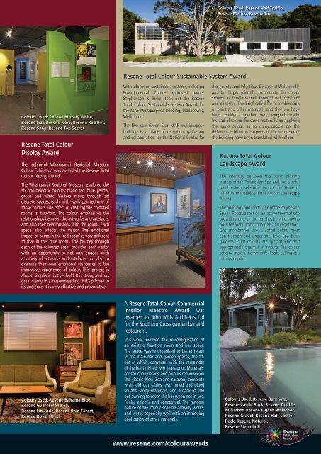
<strong>Resene</strong> <strong>Total</strong> <strong>Colour</strong> Sustainable System Award<br />
<strong>Colour</strong>s Used: <strong>Resene</strong> Buttery White,<br />
<strong>Resene</strong> Fizz, <strong>Resene</strong> Nero, <strong>Resene</strong> Red Hot,<br />
<strong>Resene</strong> Snap, <strong>Resene</strong> Top Secret<br />
<strong>Resene</strong> <strong>Total</strong> <strong>Colour</strong><br />
Display Award<br />
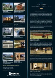
The colourful Whanganui Regional Museum<br />
<strong>Colour</strong> Exhibition was awarded the <strong>Resene</strong> <strong>Total</strong><br />
<strong>Colour</strong> Display Award.<br />
The Whanganui Regional Museum explored the<br />
six photoelectric colours; black, red, blue, yellow,<br />
green and white. Visitors move through six<br />
discrete spaces, each with walls painted one of<br />
those colours. The effect of creating the coloured<br />
rooms is two-fold. The colour emphasises the<br />
relationships between the artworks and artefacts,<br />
and also their relationships with the colour. Each<br />
space also affects the visitor. The emotional<br />
impact of being in the ‘red room’ is very different<br />
to that in the ‘blue room’. The journey through<br />
each of the coloured areas provides each visitor<br />
with an opportunity to not only engage with<br />
a variety of artworks and artefacts, but also to<br />
examine their own emotional responses to the<br />
immersive experience of colour. This project is<br />
almost simplistic, but yet bold. It is strong and has<br />
great clarity. In a museum setting that’s pitched to<br />
its audience, it is very effective and provocative.<br />
With a focus on sustainable systems, including<br />
Environmental Choice approved paints,<br />
Stephenson & Turner took out the <strong>Resene</strong><br />
<strong>Total</strong> <strong>Colour</strong> Sustainable System Award for<br />
the MAF Multipurpose Building, Wallaceville,<br />
Wellington.<br />
The five star Green Star MAF multipurpose<br />
building is a place of reception, gathering<br />
and collaboration for the National Centre for<br />
Biosecurity and Infectious Disease at Wallaceville<br />
and the larger scientific community. The colour<br />
scheme is timeless, well thought out, coherent<br />
and cohesive. The brief called for a combination<br />
of paint and other materials and the two have<br />
been melded together very sympathetically.<br />
Instead of taking the same material and applying<br />
the same colour, as so many people do, the<br />
different architectural aspects of the two sides of<br />
the building have been translated with colour.<br />
<strong>Resene</strong> <strong>Total</strong> <strong>Colour</strong><br />
Landscape Award<br />
The interplay between the warm alluring<br />
waters of the Polynesian Spa and the careful<br />
paint colour selection, won Chris Stone of<br />
Rotorua the <strong>Resene</strong> <strong>Total</strong> <strong>Colour</strong> Landscape<br />
Award.<br />
The buildings and landscape of the Polynesian<br />
Spa in Rotorua rest on an active thermal site<br />
providing one of the harshest environments<br />
possible for building materials and vegetation.<br />
Gas membranes are situated below most<br />
construction and under the Lake Spa bush<br />
gardens. Paint colours are sympathetic and<br />
appropriately thermal in nature. The colour<br />
scheme makes the water feel soft, calling you<br />
into its depths.<br />
<strong>Colour</strong>s Used: <strong>Resene</strong> Bahama Blue,<br />
<strong>Resene</strong> Guardsman Red,<br />
<strong>Resene</strong> Limeade, <strong>Resene</strong> Rain Forest,<br />
<strong>Resene</strong> Royal Heath<br />
A <strong>Resene</strong> <strong>Total</strong> <strong>Colour</strong> Commercial<br />
Interior Maestro Award was<br />
awarded to John Mills Architects Ltd<br />
for the Southern Cross garden bar and<br />
restaurant.<br />
This work involved the re-configuration of<br />
an existing function room and bar space.<br />
The space was re-organised to better relate<br />
to the main bar and garden spaces, the fitout<br />
of which, converses with the remainder<br />
of the bar finished two years prior. Materials,<br />
construction details, and colours reminisce on<br />
the classic New Zealand caravan, complete<br />
with fold out tables, two toned and piped<br />
squabs, stripy materials, and a back lit fold<br />
out awning to cover the bar when not in use.<br />
Funky, eclectic and conceptual. The random<br />
nature of the colour scheme actually works,<br />
and works especially well with an intriguing<br />
application of other materials.<br />
<strong>Colour</strong>s Used: <strong>Resene</strong> Burnham,<br />
<strong>Resene</strong> Castle Rock, <strong>Resene</strong> Double<br />
Nullarbor, <strong>Resene</strong> Eighth Nullarbor,<br />
<strong>Resene</strong> Gravel, <strong>Resene</strong> Half Castle<br />
Rock, <strong>Resene</strong> Natural,<br />
<strong>Resene</strong> Stromboli<br />
1<br />
www.resene.com/colourawards