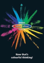
Resene Total Colour Awards 2010 winners
Resene Total Colour Awards 2010 winners
Resene Total Colour Awards 2010 winners

You also want an ePaper? Increase the reach of your titles
YUMPU automatically turns print PDFs into web optimized ePapers that Google loves.
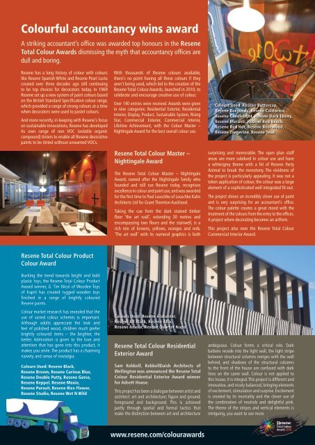
<strong>Colour</strong>ful accountancy wins award<br />
A striking accountant’s office was awarded top honours in the <strong>Resene</strong><br />
<strong>Total</strong> <strong>Colour</strong> <strong>Awards</strong> dismissing the myth that accountancy offices are<br />
dull and boring.<br />
<strong>Resene</strong> has a long history of colour with colours<br />
like <strong>Resene</strong> Spanish White and <strong>Resene</strong> Pearl Lusta<br />
created over three decades ago still continuing<br />
to be top choices for decorators today. In 1969<br />
<strong>Resene</strong> set up a new system of paint colours based<br />
on the British Standard Specification colour range,<br />
which provided a range of strong colours at a time<br />
when decorators were used to pastel colours.<br />
And more recently, in keeping with <strong>Resene</strong>’s focus<br />
on sustainable innovations, <strong>Resene</strong> has developed<br />
its own range of non VOC (volatile organic<br />
compound) tinters to enable all <strong>Resene</strong> decorative<br />
paints to be tinted without unwanted VOCs.<br />
With thousands of <strong>Resene</strong> colours available,<br />
there’s no point having all these colours if they<br />
aren’t being used, which led to the creation of the<br />
<strong>Resene</strong> <strong>Total</strong> <strong>Colour</strong> <strong>Awards</strong>, launched in <strong>2010</strong>, to<br />
celebrate and encourage creative use of colour.<br />
Over 140 entries were received. <strong>Awards</strong> were given<br />
in nine categories: Residential Exterior, Residential<br />
Interior, Display, Product, Sustainable System, Rising<br />
Star, Commercial Exterior, Commercial Interior,<br />
Lifetime Achievement, with the <strong>Colour</strong> Master –<br />
Nightingale Award for the best overall colour use.<br />
<strong>Resene</strong> <strong>Total</strong> <strong>Colour</strong> Master –<br />
Nightingale Award<br />
The <strong>Resene</strong> <strong>Total</strong> <strong>Colour</strong> Master – Nightingale<br />
Award, named after the Nightingale family who<br />
founded and still run <strong>Resene</strong> today, recognises<br />
excellence in colour and paint use, and was awarded<br />
for the first time to Paul Leuschke of Leuschke Kahn<br />
Architects Ltd for Grant Thornton Auckland.<br />
Taking the cue from the dark stained timber<br />
floor ‘the art wall’, extending 30 metres and<br />
encompassing two floors and the stairwell, is a<br />
rich mix of browns, yellows, oranges and reds.<br />
‘The art wall’ with its numeral graphics is both<br />
<strong>Colour</strong>s Used: <strong>Resene</strong> Buttercup,<br />
<strong>Resene</strong> Burgundy, <strong>Resene</strong> California,<br />
<strong>Resene</strong> Candlelight, <strong>Resene</strong> Dark Ebony,<br />
<strong>Resene</strong> Meranti, <strong>Resene</strong> Red Beech,<br />
<strong>Resene</strong> Red Hot, <strong>Resene</strong> Rosewood,<br />
<strong>Resene</strong> Tangerine, <strong>Resene</strong> Teak<br />
surprising and memorable. The open plan staff<br />
areas are more subdued in colour use and have<br />
a white/grey theme with a hit of <strong>Resene</strong> Party<br />
Animal to break the monotony. The vividness of<br />
the project is particularly appealing. It was not a<br />
token application of colour; the colour was a large<br />
element of a sophisticated well integrated fit-out.<br />
The project shows an incredibly clever use of paint<br />
and is very surprising for an accountant’s office.<br />
The colour palette creates a great mood with the<br />
treatment of the colours from the entry to the offices.<br />
A project where decorating becomes an artform.<br />
This project also won the <strong>Resene</strong> <strong>Total</strong> <strong>Colour</strong><br />
Commercial Interior Award.<br />
<strong>Resene</strong> <strong>Total</strong> <strong>Colour</strong> Product<br />
<strong>Colour</strong> Award<br />
Bucking the trend towards bright and bold<br />
plastic toys, the <strong>Resene</strong> <strong>Total</strong> <strong>Colour</strong> Product<br />
Award winner, G. Tim Nicol of Wooden Toys<br />
of Kapiti has created rugged wooden toys<br />
finished in a range of brightly coloured<br />
<strong>Resene</strong> paints.<br />
<strong>Colour</strong> market research has revealed that the<br />
use of varied colour schemes is important.<br />
Although adults appreciate the look and<br />
feel of polished wood, children much prefer<br />
brightly coloured items – the brighter, the<br />
better. Admiration is given to the love and<br />
attention that has gone into this product, it<br />
makes you smile. The product has a charming<br />
naivety and sense of nostalgia.<br />
<strong>Colour</strong>s Used: <strong>Resene</strong> Black,<br />
<strong>Resene</strong> Broom, <strong>Resene</strong> Curious Blue,<br />
<strong>Resene</strong> Double Putty, <strong>Resene</strong> Gorse,<br />
<strong>Resene</strong> Keppel, <strong>Resene</strong> Moxie,<br />
<strong>Resene</strong> Pursuit, <strong>Resene</strong> Rice Flower,<br />
<strong>Resene</strong> Studio, <strong>Resene</strong> Wet N Wild<br />
<strong>Colour</strong>s Used: <strong>Resene</strong> Alabaster,<br />
<strong>Resene</strong> All Black, <strong>Resene</strong> Alto,<br />
<strong>Resene</strong> Amour, <strong>Resene</strong> Quarter Napa<br />
<strong>Resene</strong> <strong>Total</strong> <strong>Colour</strong> Residential<br />
Exterior Award<br />
Sam Kebbell, KebbellDaish Architects of<br />
Wellington was announced the <strong>Resene</strong> <strong>Total</strong><br />
<strong>Colour</strong> Residential Exterior Award winner<br />
for Adsett House.<br />
This project has been a dialogue between artist and<br />
architect: art and architecture; figure and ground;<br />
foreground and background. This is achieved<br />
partly through spatial and formal tactics that<br />
make the distinction between art and architecture<br />
ambiguous. <strong>Colour</strong> forms a critical role. Dark<br />
battens recede into the light wall, the light stripe<br />
between structural columns merges with the wall<br />
behind, and shadows of the structural columns<br />
to the front of the house are confused with dark<br />
lines on the same wall. <strong>Colour</strong> is not applied to<br />
this house, it is integral.This project is different and<br />
innovative, and nicely balanced, bringing elements<br />
of excitement, stimulation and surprise. Excitement<br />
is created by its neutrality and the clever use of<br />
the combination of neutrals and delightful pink.<br />
The theme of the stripes and vertical elements is<br />
intriguing, you want to see more.<br />
2<br />
www.resene.com/colourawards
A <strong>Resene</strong> <strong>Total</strong> <strong>Colour</strong> Residential<br />
Exterior Maestro Award recognising<br />
excellence of colour use was awarded<br />
to Darryl Church, Darryl Church<br />
Architecture Ltd of Rotorua for the<br />
Buchanan Residence Alterations.<br />
The Buchanan Residence integrates old with<br />
new with ease. A clever patchwork of colours<br />
you would see in nature near the entry subtly<br />
leads you inside while also being reflective of<br />
the surrounding landscape. The external colour<br />
scheme was required to deliver on many levels.<br />
It needed to be respectful of the surrounding lake<br />
setting and landscape when viewed from the lake.<br />
Up close, it was to offer a rich diversity of colour<br />
<strong>Colour</strong>s Used: <strong>Resene</strong> Inside Back,<br />
<strong>Resene</strong> Maxwell Smart, <strong>Resene</strong><br />
Panzano, <strong>Resene</strong> Spirulina,<br />
<strong>Resene</strong> Bone White<br />
and texture and, unlike most properties, it also needed to be presentable when viewed from above as<br />
the driveway descends on the house above the roof-line. The client’s dislike of blue led to green and<br />
brown cues taken from the surrounding lake-scape for the feature cladding near the entry.<br />
Special Judges Mention for Bold<br />
<strong>Colour</strong> Use<br />
Rachel Ovens’ enthusiastic use of paint on<br />
curtains in her Dunedin Dining Room Revamp<br />
project was rewarded with a special judges’<br />
mention for bold colour use. Combining<br />
<strong>Resene</strong> Daredevil walls and taking paint<br />
off the wall and using <strong>Resene</strong> Arapawa to<br />
upcycle a reversed thermal drape made<br />
this a brave dining room revamp that most<br />
wouldn’t attempt. An interesting use of paint,<br />
innovative, exciting, demonstrating what<br />
can be achieved if you leave your decorating<br />
inhibitions at the door.<br />
<strong>Colour</strong>s Used: <strong>Resene</strong> Arapawa,<br />
<strong>Resene</strong> Daredevil<br />
<strong>Colour</strong>s Used: <strong>Resene</strong> Alabaster, <strong>Resene</strong> Blanc, <strong>Resene</strong> Crowshead, Double<br />
Drought, <strong>Resene</strong> Double Malta, <strong>Resene</strong> Drought, <strong>Resene</strong> Half Drought,<br />
<strong>Resene</strong> Kwila, <strong>Resene</strong> Pitch Black, <strong>Resene</strong> Soapstone, <strong>Resene</strong> Tsunami<br />
<strong>Resene</strong> <strong>Total</strong> <strong>Colour</strong> Residential<br />
Interior Award<br />
Tushka Glintmeyer, Space Architecture Studio<br />
won the <strong>Resene</strong> <strong>Total</strong> <strong>Colour</strong> Residential Interior<br />
Award for the Kawau residence in Kapiti.<br />
The layout and light colour scheme encourage<br />
a relaxed lifestyle while exploiting an excellent<br />
quality of natural light and views to Kapiti Island.<br />
<strong>Resene</strong> <strong>Total</strong> <strong>Colour</strong> Lifetime<br />
Achievement Award<br />
The <strong>Resene</strong> <strong>Total</strong> <strong>Colour</strong> Lifetime Achievement<br />
Award recognising a person in the architecture and<br />
design industry who<br />
has shown dedication<br />
to innovative and<br />
excellent colour use<br />
in their work, was<br />
awarded to Paris<br />
Magdalinos, formerly<br />
of Napier. Paris<br />
Magdalinos arrived<br />
in New Zealand as a<br />
young refugee and left<br />
school when he was<br />
14. Through his own<br />
drive and talent he<br />
The home is a relaxed family home and it adheres<br />
to wholesome principles – efficient orientation<br />
and planning, use of natural light and ventilation,<br />
and appropriate material and colour selection.<br />
The colour palette used in this project is highly<br />
competent with a good use and balance of colour,<br />
not everything has to be surprising. As a nation<br />
we use a lot of neutrals in our houses as they are<br />
easy to live with, and this project demonstrates<br />
how neutrals can be combined successfully with<br />
elements of interest and strength.<br />
became one of New Zealand’s leading architects,<br />
colourful and flamboyant in both his personality<br />
and his architecture, running a Napier-based<br />
practice undertaking significant projects all over<br />
this country and abroad.<br />
Epitomised by strong images, forms, colours and<br />
shapes, his practice fervently believes in John<br />
Ruskin’s words that “all architecture proposes an<br />
effect on the human mind, not merely a service<br />
to the human frame”. Using colour both to<br />
articulate forms and inject an essential humanity<br />
and personality to the architecture, the use of<br />
the colour became a key signature. At times the<br />
resulting colour schemes created interesting<br />
challenges for the local <strong>Resene</strong> ColorShops and<br />
painting contractors – but through Paris’s vision,<br />
the attention to hue, chromacity and value, created<br />
something memorable. His vision continues to live<br />
on in the architectural firm he founded.<br />
The <strong>Resene</strong> <strong>Total</strong> <strong>Colour</strong> Residential<br />
Interior Maestro Award was won by<br />
Hayley Whitehead, N & Co Architecture<br />
for the Strathmore Residence project in<br />
Wellington.<br />
Renovations for this kitchen came straight<br />
from the influences of Piet Mondrian’s<br />
renowned block-colour artworks. In keeping<br />
with the Art Deco style of the original house,<br />
this kitchen has blended effortlessly with<br />
the existing detailing and client’s vibrant<br />
Deco furnishings. The simple linear shapes<br />
and staggered block-colour arrangements<br />
were the perfect canvas for painting bold<br />
and stylish <strong>Resene</strong> colours. In collaboration<br />
with the client, the final colours and their<br />
arrangement were key decisions aided by 3D<br />
CAD images and <strong>Resene</strong> colour swatches and<br />
testpots. A unique, clever palette of colours,<br />
mixed and matched with care for an original<br />
styled effect.<br />
<strong>Colour</strong>s Used: <strong>Resene</strong> Blue Night,<br />
<strong>Resene</strong> Celeste, <strong>Resene</strong> Jalapeno,<br />
<strong>Resene</strong> Moon Glow, <strong>Resene</strong> Pattens<br />
Blue, <strong>Resene</strong> Soapstone<br />
3<br />
View more entries online in the <strong>Resene</strong> <strong>Total</strong> Colou
<strong>Colour</strong>s Used: (Kakariki) <strong>Resene</strong> Black White, <strong>Resene</strong> Kombi, <strong>Resene</strong> Limed Oak,<br />
<strong>Resene</strong> Limerick (Kotare) <strong>Resene</strong> Calypso, <strong>Resene</strong> Endeavour, <strong>Resene</strong> Smokey Ash<br />
(Kokowai) <strong>Resene</strong> Bullseye, <strong>Resene</strong> Crowshead, <strong>Resene</strong> Pulse<br />
<strong>Resene</strong> <strong>Total</strong> <strong>Colour</strong> Rising Star<br />
Student Award<br />
Renee Holtom of Auckland won the <strong>Resene</strong> <strong>Total</strong><br />
<strong>Colour</strong> Rising Star Award with the Aotearoa<br />
Housing project, a student design proposal for an<br />
affordable housing option.<br />
It is aimed towards providing a higher quality<br />
and standard of living for Maori. It is envisaged<br />
<strong>Colour</strong>s Used: <strong>Resene</strong> Alabaster,<br />
<strong>Resene</strong> Crowshead, <strong>Resene</strong> Guru,<br />
<strong>Resene</strong> Norwester, <strong>Resene</strong> Raven,<br />
<strong>Resene</strong> Rhapsody, <strong>Resene</strong> Topspin<br />
that this will be built in transportable units that<br />
can be built and then transported or shipped to<br />
the site. This design is a three bedroom residence<br />
comprising of two separate pavilions that are<br />
connected by a boardwalk style decking. This<br />
allows the owner to separate living and bedroom<br />
areas. Three colour schemes are proposed that<br />
will be available to give people choice and the<br />
opportunity to personalise their home. The vibrant<br />
use of colour gives the residents a clean, fresh<br />
environment.<br />
<strong>Resene</strong> <strong>Total</strong> <strong>Colour</strong> Commercial<br />
Exterior Award<br />
A collaboration between Paul Kerr-Hislop of Art +<br />
Architecture and Gus Watt of Watt Architects was<br />
awarded the <strong>Resene</strong> <strong>Total</strong> <strong>Colour</strong> Commercial<br />
Exterior Award for striking colour use on the<br />
Quattro Maison Apartments in Wellington.<br />
A tight budget stripped the original scheme<br />
of roof gardens, trees and vines but this was<br />
countered by an adventurous colour scheme<br />
which successfully distinguishes the building<br />
and assists in emphasising the ‘four buildings’.<br />
It’s a bold use of colour on a highly visible site,<br />
which renders a building which might otherwise<br />
be rather ordinary, memorable, and lifts a rather<br />
drab streetscape. The balanced colour intensities<br />
define the best line of the rectangular forms while<br />
personalising and identifying the nature of the<br />
structure. The bold exterior colour scheme followed<br />
through to the interior in colour has provided the<br />
perfect solution with a tight budget.<br />
<strong>Colour</strong>s Used: <strong>Resene</strong> Alabaster,<br />
<strong>Resene</strong> Grey Friars, <strong>Resene</strong> Groovy,<br />
<strong>Resene</strong> Natural<br />
Xsite Architects were awarded a<br />
<strong>Resene</strong> <strong>Total</strong> <strong>Colour</strong> Commercial<br />
Interior Maestro Award for the Hynds<br />
Group Headquarters renovation.<br />
Natural materials such as clear finished<br />
and stained rough sawn ply enable the<br />
materials to be detailed with little fuss. They<br />
create a contrast to the glass reinforced<br />
concrete elements and resonate with the<br />
Hynds Group business philosophy of honest,<br />
straightforward, no-nonsense “what you see<br />
is what you get” service and solutions. The<br />
project demonstrates a very accomplished<br />
application of colour with the use of wood<br />
creating a nice mood. They used colour to<br />
telling effect.<br />
<strong>Colour</strong>s Used: <strong>Resene</strong> Mondo,<br />
<strong>Resene</strong> Triple Perfect Taupe, custom<br />
colours Cashmere Primary Pale Earth,<br />
Cashmere Primary Off Yellow<br />
The Bunkhouse Goat Island by Cheshire<br />
Architects combines wood stains with<br />
bold hues winning a <strong>Resene</strong> <strong>Total</strong> <strong>Colour</strong><br />
Commercial Exterior Maestro Award.<br />
Cheap Pinus Radiata boards – stained with<br />
<strong>Resene</strong> Woodsman Natural are exposed to both<br />
the interior and exterior. The soft-stained effect<br />
will promote a graceful period of slow, controlled<br />
aging as the building settles into its site. Behind the<br />
cavity, the Shadowclad ply-lining is stained a quiet<br />
<strong>Resene</strong> Woodsman Smokey Ash to tie it carefully<br />
to the block base. This quiet, soft base-palette is<br />
counter pointed by vivid colour that awakens the<br />
world within the timber box. While on one level it<br />
may be odd to follow an avian-inspired scheme<br />
in the grounds of a marine reserve, on another it<br />
seems wholly appropriate to offer warm and vivid<br />
hues to those who regularly dwell in deep blue.<br />
This project is tasteful, very cleverly put together;<br />
lively without being obvious.<br />
<strong>Colour</strong>s Used: <strong>Resene</strong> Natural,<br />
<strong>Resene</strong> Smokey Ash<br />
The clever positioning of the palette of<br />
neutral hues on the Cashmere Primary<br />
School Epicentre won Tania Gorton Design<br />
a <strong>Resene</strong> <strong>Total</strong> <strong>Colour</strong> Commercial<br />
Exterior Maestro Award.<br />
The design lent itself to creating enhanced<br />
visual appeal, especially on the West and<br />
South sides. A checkerboard effect with<br />
negative detailing was created, allowing the<br />
front of the building to be determined. This<br />
was repeated on the West side in a simpler<br />
version. To add flow the checkerboard<br />
effect was repeated inside the building<br />
providing continuity. The colour enhances<br />
the architecture; a superb application of a<br />
predominately neutral palette.<br />
r <strong>Awards</strong> Gallery – www.resene.com/awardsgallery<br />
4
<strong>Colour</strong>s Used: <strong>Resene</strong> Half Truffle,<br />
<strong>Resene</strong> Merino, <strong>Resene</strong> Tiri<br />
<strong>Resene</strong> <strong>Total</strong> <strong>Colour</strong> Sustainable System Award<br />
<strong>Colour</strong>s Used: <strong>Resene</strong> Buttery White,<br />
<strong>Resene</strong> Fizz, <strong>Resene</strong> Nero, <strong>Resene</strong> Red Hot,<br />
<strong>Resene</strong> Snap, <strong>Resene</strong> Top Secret<br />
<strong>Resene</strong> <strong>Total</strong> <strong>Colour</strong><br />
Display Award<br />
The colourful Whanganui Regional Museum<br />
<strong>Colour</strong> Exhibition was awarded the <strong>Resene</strong> <strong>Total</strong><br />
<strong>Colour</strong> Display Award.<br />
The Whanganui Regional Museum explored the<br />
six photoelectric colours; black, red, blue, yellow,<br />
green and white. Visitors move through six<br />
discrete spaces, each with walls painted one of<br />
those colours. The effect of creating the coloured<br />
rooms is two-fold. The colour emphasises the<br />
relationships between the artworks and artefacts,<br />
and also their relationships with the colour. Each<br />
space also affects the visitor. The emotional<br />
impact of being in the ‘red room’ is very different<br />
to that in the ‘blue room’. The journey through<br />
each of the coloured areas provides each visitor<br />
with an opportunity to not only engage with<br />
a variety of artworks and artefacts, but also to<br />
examine their own emotional responses to the<br />
immersive experience of colour. This project is<br />
almost simplistic, but yet bold. It is strong and has<br />
great clarity. In a museum setting that’s pitched to<br />
its audience, it is very effective and provocative.<br />
With a focus on sustainable systems, including<br />
Environmental Choice approved paints,<br />
Stephenson & Turner took out the <strong>Resene</strong><br />
<strong>Total</strong> <strong>Colour</strong> Sustainable System Award for<br />
the MAF Multipurpose Building, Wallaceville,<br />
Wellington.<br />
The five star Green Star MAF multipurpose<br />
building is a place of reception, gathering<br />
and collaboration for the National Centre for<br />
Biosecurity and Infectious Disease at Wallaceville<br />
and the larger scientific community. The colour<br />
scheme is timeless, well thought out, coherent<br />
and cohesive. The brief called for a combination<br />
of paint and other materials and the two have<br />
been melded together very sympathetically.<br />
Instead of taking the same material and applying<br />
the same colour, as so many people do, the<br />
different architectural aspects of the two sides of<br />
the building have been translated with colour.<br />
<strong>Resene</strong> <strong>Total</strong> <strong>Colour</strong><br />
Landscape Award<br />
The interplay between the warm alluring<br />
waters of the Polynesian Spa and the careful<br />
paint colour selection, won Chris Stone of<br />
Rotorua the <strong>Resene</strong> <strong>Total</strong> <strong>Colour</strong> Landscape<br />
Award.<br />
The buildings and landscape of the Polynesian<br />
Spa in Rotorua rest on an active thermal site<br />
providing one of the harshest environments<br />
possible for building materials and vegetation.<br />
Gas membranes are situated below most<br />
construction and under the Lake Spa bush<br />
gardens. Paint colours are sympathetic and<br />
appropriately thermal in nature. The colour<br />
scheme makes the water feel soft, calling you<br />
into its depths.<br />
<strong>Colour</strong>s Used: <strong>Resene</strong> Bahama Blue,<br />
<strong>Resene</strong> Guardsman Red,<br />
<strong>Resene</strong> Limeade, <strong>Resene</strong> Rain Forest,<br />
<strong>Resene</strong> Royal Heath<br />
A <strong>Resene</strong> <strong>Total</strong> <strong>Colour</strong> Commercial<br />
Interior Maestro Award was<br />
awarded to John Mills Architects Ltd<br />
for the Southern Cross garden bar and<br />
restaurant.<br />
This work involved the re-configuration of<br />
an existing function room and bar space.<br />
The space was re-organised to better relate<br />
to the main bar and garden spaces, the fitout<br />
of which, converses with the remainder<br />
of the bar finished two years prior. Materials,<br />
construction details, and colours reminisce on<br />
the classic New Zealand caravan, complete<br />
with fold out tables, two toned and piped<br />
squabs, stripy materials, and a back lit fold<br />
out awning to cover the bar when not in use.<br />
Funky, eclectic and conceptual. The random<br />
nature of the colour scheme actually works,<br />
and works especially well with an intriguing<br />
application of other materials.<br />
<strong>Colour</strong>s Used: <strong>Resene</strong> Burnham,<br />
<strong>Resene</strong> Castle Rock, <strong>Resene</strong> Double<br />
Nullarbor, <strong>Resene</strong> Eighth Nullarbor,<br />
<strong>Resene</strong> Gravel, <strong>Resene</strong> Half Castle<br />
Rock, <strong>Resene</strong> Natural,<br />
<strong>Resene</strong> Stromboli<br />
1<br />
www.resene.com/colourawards