Download Room Brochure - National Gallery of Australia
Download Room Brochure - National Gallery of Australia
Download Room Brochure - National Gallery of Australia

Create successful ePaper yourself
Turn your PDF publications into a flip-book with our unique Google optimized e-Paper software.
1967–1978
1967–1978<br />
Beauty is now underfoot wherever we take the trouble to look.<br />
John Cage, avant-garde composer, 1961 1<br />
Robert Rauschenberg has had an extensive impact<br />
on late twentieth-century visual culture. His work has<br />
been <strong>of</strong> central influence in many <strong>of</strong> the significant<br />
developments <strong>of</strong> post-war American art and has provided<br />
countless blueprints for artistic innovation by younger<br />
generations. Rauschenberg’s radical approach to his artistic<br />
practice was always sensational, with the artist producing<br />
works so experimental that they eluded definition and<br />
categorisation. The <strong>National</strong> <strong>Gallery</strong> <strong>of</strong> <strong>Australia</strong> holds<br />
an important collection <strong>of</strong> Rauschenberg’s works. These<br />
works exemplify the artist’s striking transition in subject<br />
matter and material during the late 1960s and throughout<br />
the 1970s – a shift from the imagery <strong>of</strong> American<br />
popular culture to a focus on the handmade and unique<br />
combinations <strong>of</strong> natural and found materials. Many <strong>of</strong> the<br />
works exhibited in Robert Rauschenberg: 1967–1978 reveal<br />
the artist’s overarching aim to ‘drag ordinary materials<br />
into the art world for a direct confrontation’. 2 It has been<br />
Rauschenberg’s perpetual mix <strong>of</strong> art with life that has<br />
ensured that his work appears as innovative today as it was<br />
forty years ago.<br />
The legendary Bauhaus figure, Josef Albers, was<br />
the head <strong>of</strong> fine art at Black Mountain College, North<br />
Carolina, when Rauschenberg enrolled in 1948. Under<br />
the supervision <strong>of</strong> the strict disciplinarian, Rauschenberg<br />
learnt about the essential qualities, or unique spirit, within<br />
all kinds <strong>of</strong> materials. Rauschenberg said <strong>of</strong> their studentteacher<br />
relationship, that Albers was ‘a beautiful teacher<br />
and an impossible person. He didn’t teach you how to<br />
“do art”. The focus was on the development <strong>of</strong> your own<br />
personal sense <strong>of</strong> looking. Years later … I’m still learning<br />
from what he taught me. What he taught me had to do<br />
with the whole visual world’. 3<br />
It was also at Black Mountain College that<br />
Rauschenberg came into contact with several other key<br />
art world figures who had a vital and long-lasting impact<br />
upon his thinking and artistic pursuits. The artists Ben<br />
Shahn, Robert Motherwell, Willem de Kooning, Jack<br />
Tworkov, Franz Kline and Aaron Sisskind were all teaching<br />
at Black Mountain. However, the most significant influence<br />
on the young artist was the celebrated avant-garde<br />
composer John Cage. Rauschenberg and Cage developed<br />
a relationship <strong>of</strong> reciprocal inspiration – a connection that<br />
provided both the artist and the composer with the daring<br />
that was required in the creation <strong>of</strong> their most innovative<br />
works.<br />
In contrast to the environment <strong>of</strong> Black Mountain<br />
College, the New York avant-garde art scene in 1949<br />
was dominated by Abstract Expressionism. The artistic<br />
giants Willem de Kooning and Jackson Pollock had<br />
established themselves as the most innovative <strong>of</strong> the<br />
Abstract Expressionists. Discussions focused on the inner<br />
emotional state <strong>of</strong> the individual artist as expressed in<br />
highly charged painted gestures. The more free-thinking<br />
Rauschenberg, however, worked outside these confines,<br />
adopting a methodology that sought to reunite art with<br />
everyday life, an ideology that was in complete opposition<br />
to the central tenets <strong>of</strong> Abstract Expressionism. Early in his<br />
career, Rauschenberg created controversy within the New<br />
York art scene with a series <strong>of</strong> ‘artistic pranks’, including<br />
his infamous erasure <strong>of</strong> a Willem de Kooning drawing. This<br />
rebellious act <strong>of</strong> destroying an established artists’ work<br />
gained him instant notoriety and secured Rauschenberg<br />
the position <strong>of</strong> New York’s enfant terrible.<br />
Despite his ‘prankster’ reputation, Rauschenberg<br />
was highly self-disciplined and determined to challenge<br />
himself. In 1951, Rauschenberg completed a series <strong>of</strong> white<br />
paintings, which were in contrast, followed by a series <strong>of</strong><br />
black paintings. By limiting himself to a monochromatic<br />
palette, Rauschenberg performed an artistic exorcism,<br />
rendering the restrictions imposed by media, style and<br />
convention obsolete so that there were no psychological<br />
boundaries to what he could do from that point onwards.<br />
Only after such self-imposed regulation was Rauschenberg<br />
prepared for what he was to attempt next. In a radical<br />
transgression <strong>of</strong> artistic conventions, Rauschenberg<br />
began to fuse vertical, wall-mounted painterly works with<br />
horizontal, floor-based sculptural elements, usually in the<br />
form <strong>of</strong> found objects. His fusion <strong>of</strong> the two-dimensional<br />
picture plane and the three-dimensional object is now <strong>of</strong><br />
legendary status. It was the invention <strong>of</strong> a new ‘species’ <strong>of</strong><br />
art, which Rauschenberg termed ‘Combines’.<br />
Rauschenberg developed his own unique style by<br />
combining gestural mark-making with its antithesis –<br />
mechanically reproduced imagery. It was this remarkable<br />
clash <strong>of</strong> visual elements in Rauschenberg’s art that provided<br />
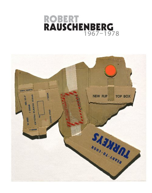
(front cover)<br />
Cardbird III<br />
from the Cardbird series 1971<br />
colour photo-lithograph,<br />
screenprint, corrugated<br />
cardboard, tape<br />
98.0 x 90.6 cm<br />
<strong>National</strong> <strong>Gallery</strong> <strong>of</strong> <strong>Australia</strong>,<br />
Canberra<br />
Purchased 1973<br />
(left)<br />
Artist Robert Rauschenberg<br />
in 1953<br />
Photo by Allan Grant,<br />
Life Magazine © Time Warner<br />
Inc/Robert Rauschenberg/<br />
VAGA, New York/DACS,<br />
London.
(left)<br />
Horsefeathers Thirteen<br />
– XV 1972<br />
from the Horsefeathers<br />
thirteen series 1972–76<br />
colour lithograph, screenprint,<br />
pochoir, collage and embossing<br />
64.8 x 52.2 cm<br />
<strong>National</strong> <strong>Gallery</strong> <strong>of</strong> <strong>Australia</strong>,<br />
Canberra<br />
Purchased 1973<br />
(right)<br />
Horsefeathers Thirteen – VIII<br />
1972 from the Horsefeathers<br />
thirteen series 1972–76<br />
colour lithograph, screenprint,<br />
pochoir, collage and<br />
embossing<br />
60.8 x 45.0 cm<br />
<strong>National</strong> <strong>Gallery</strong> <strong>of</strong> <strong>Australia</strong>,<br />
Canberra<br />
Purchased 1973<br />
a major aesthetic fracture – a departure from the heroic<br />
painterly gestures <strong>of</strong> Abstract Expressionism and a move<br />
towards the adoption <strong>of</strong> popular culture as subject matter.<br />
This radical schism, however, would not have occurred had<br />
it not been for Jasper Johns, with whom Rauschenberg<br />
had a long and intense partnership, beginning in 1954.<br />
Rauschenberg and Johns lived above one another in the<br />
same building, visiting each other every day and setting<br />
artistic challenges for each other. Rauschenberg has said <strong>of</strong><br />
his partnership with Johns that, ‘He and I were each other’s<br />
first critics … Jasper and I literally traded ideas. He would<br />
say, “I’ve got a terrific idea for you” and then I would have<br />
to find one for him’. 4 The Rauschenberg–Johns relationship<br />
was one <strong>of</strong> the great creative relationships <strong>of</strong> the twentieth<br />
century. It not only propelled them both in radically new<br />
directions, but was also a meeting <strong>of</strong> two minds that<br />
contributed to the development <strong>of</strong> the Pop Art movement.<br />
If there is an overarching methodology that provides<br />
a foundation to Rauschenberg’s work, it is the collage<br />
technique. Whilst collage was initially developed in<br />
the 1920s by Dada artists such as Kurt Schwitters,<br />
Rauschenberg catapulted collage into the sphere <strong>of</strong><br />
‘hyper collage’. 5 Rauschenberg’s work contains layered<br />
image sequences, or image sentences, where the viewer<br />
interprets the progression <strong>of</strong> images as though reading<br />
a language system. Rauschenberg’s syntax, however, is<br />
arranged in multiple, simultaneous combinations and<br />
directions. It demands a different kind <strong>of</strong> looking – a<br />
repetitive change <strong>of</strong> focus, back and forth, in an analysis<br />
<strong>of</strong> the detail <strong>of</strong> each individual component image in<br />
order to perceive the composition as a whole. While this<br />
fragmentation <strong>of</strong> the composition is akin to the multiple<br />
viewpoints <strong>of</strong> Cubism, it has been more eloquently<br />
compared by John Cage to watching ‘many television sets<br />
working simultaneously all tuned in differently …’ 6<br />
Rauschenberg’s series <strong>of</strong> dense collage works,<br />
Horsefeathers thirteen, is a striking example <strong>of</strong> the artist’s<br />
innate talent in constructing compositions <strong>of</strong> detailed<br />
sophistication. Mass media action images, such as running<br />
races, horse-riding and rowing, are mixed with more<br />
generalised subjects that blend the natural environment<br />
with the manufactured environment. Each image is<br />
poised on the precarious dynamic moment and, in this<br />
way, Rauschenberg succeeds in investing his works with<br />
a simultaneous sense <strong>of</strong> movement and suspense. There<br />
is no hierarchy <strong>of</strong> images – the path <strong>of</strong> visual exploration<br />
for each composition is <strong>of</strong> our own choosing, despite<br />
the occasional (and humorous) directional arrow. The<br />
Horsefeathers thirteen series is a visual experiment in the<br />
‘random order’ <strong>of</strong> experience. 7 By presenting us with a<br />
series <strong>of</strong> signs that encourage multiple complex readings,<br />
the artist has attempted a collaboration with the specific<br />
memories, associations and thought processes <strong>of</strong> the<br />
individual viewer.<br />
While the images and objects selected for inclusion<br />
within the artist’s compositions may not be personally<br />
symbolic, they do reveal much about the American social<br />
events and political issues <strong>of</strong> the cultural period in which<br />
they were created. The garishly coloured Reels (B + C)<br />
series appropriates film stills from the 1967 Bonnie and
Storyline I<br />
from the Reels (B + C)<br />
series 1968<br />
colour lithograph<br />
54.6 x 43.3 cm<br />
<strong>National</strong> <strong>Gallery</strong> <strong>of</strong> <strong>Australia</strong>,<br />
Canberra<br />
Purchased 1973<br />
Clyde movie, starring Faye Dunaway and Warren Beatty,<br />
and exposes Rauschenberg’s fascination with celebrity and<br />
the entertainment industry. In a similar fashion, the photocollage<br />
work Signs operates as a succinct visual summary<br />
<strong>of</strong> the cultural and political events <strong>of</strong> the 1960s, depicting<br />
the tragic musician Janis Joplin, the assassination <strong>of</strong> John<br />
F Kennedy, America’s race riots and the Vietnam War.<br />
Rauschenberg has always been an artist-activist, skilled<br />
in employing art to raise individual awareness <strong>of</strong> social,<br />
environmental and political issues.<br />
Rauschenberg’s work from the 1950s and 1960s can<br />
also be seen as a presentation <strong>of</strong> the street culture <strong>of</strong> the<br />
urban environment. During this period, Rauschenberg lived<br />
in New York and regularly walked the streets in order to<br />
collect the ‘surprises’ that the city had left for him. Many<br />
<strong>of</strong> these found objects were incorporated into his artwork,
Albino cactus (scale) 1977<br />
from the scale series 1977–81<br />
ink transfer on silk, synthetic<br />
polymer paint on composition<br />
board, mirrorised synthetic<br />
polymer film, electric light,<br />
wood, rubber tyre<br />
88.7 x 442.1 x 122.0 cm<br />
<strong>National</strong> <strong>Gallery</strong> <strong>of</strong> <strong>Australia</strong>,<br />
Canberra<br />
Purchased 1978<br />
the most famous <strong>of</strong> which is a stuffed goat (Monogram<br />
1953–59). The <strong>Gallery</strong>’s Albino cactus (scale) with its<br />
combination <strong>of</strong> two-dimensional photographic imagery<br />
and three-dimensional found objects can be considered a<br />
late ‘Combine’ work.<br />
A ‘found’ tyre in Albino cactus (scale) is incorporated<br />
into Rauschenberg’s artistic expression, but it cannot be<br />
completely detached from its life spirit. The Duchampian<br />
displacement <strong>of</strong> the found object from life, and its<br />
subsequent transference to art, creates something akin to a<br />
split personality; that is, all found objects bring with them a<br />
history and/or pre-function which the artist allows to seep<br />
into the composition. Thus, in a collaborative encounter<br />
with his material, Rauschenberg becomes a choreographer<br />
<strong>of</strong> the historical meaning and value <strong>of</strong> the found object.<br />
The images collaged along the material panel<br />
backdrop <strong>of</strong> Albino cactus (scale) have been printed via a<br />
solvent-transfer process – a technique that Rauschenberg<br />
began to experiment with in 1959. However, the look <strong>of</strong><br />
Albino cactus (scale) also recalls Rauschenberg’s many<br />
screenprinted paintings, first explored by the artist in 1962.<br />
(It was at the same time that Andy Warhol also adopted<br />
the screenprinting technique and the two artists traded<br />
ideas about the method.) The solvent-transfer process and<br />
screenprinting technique liberated Rauschenberg’s work.<br />
With both forms <strong>of</strong> printmaking, the artist discovered ways<br />
in which he could quickly and repetitively transfer his found<br />
imagery to the canvas <strong>of</strong> his paintings and Combines.<br />
Rauschenberg believed that the printmaking technique<br />
<strong>of</strong> lithography was old-fashioned and is notorious for<br />
having stated that ‘the second half <strong>of</strong> the twentieth<br />
century is no time to start writing on rocks’. Ironically,<br />
it is Rauschenberg who became a significant figure in<br />
the resurrection <strong>of</strong> American printmaking that occurred<br />
during the 1960s. He has subsequently worked with<br />
many leading print workshops to create more than 800<br />
published editions. Printmaking is a technique perfectly<br />
suited to his methodology <strong>of</strong> layering found images and<br />
one which gave him total control over the size and scale <strong>of</strong><br />
each component image. It was through printmaking that<br />
Rauschenberg was able to once again blur the distinctions<br />
between media and perfectly unite his obsessive use <strong>of</strong> the<br />
photographic image with painterly techniques.<br />
One <strong>of</strong> the most successful <strong>of</strong> Rauschenberg’s<br />
collaborations has been with the Gemini GEL print<br />
workshop – a printmaking partnership that permanently<br />
changed the terrain <strong>of</strong> American printmaking. The artist’s<br />
highly experimental approach to print processes comes to<br />
the fore in the colour lithograph and screenprint Booster,<br />
created in 1967. For Booster, Rauschenberg decided to<br />
use a life-sized X-ray portrait <strong>of</strong> himself combined with<br />
an astrological chart, magazine images <strong>of</strong> athletes, the<br />
image <strong>of</strong> a chair and the images <strong>of</strong> two power drills.<br />
Printer Kenneth Tyler was a masterful facilitator for
Booster<br />
from the Booster and seven<br />
studies series 1967<br />
colour lithograph, screenprint<br />
183.0 x 89.0 cm<br />
<strong>National</strong> <strong>Gallery</strong> <strong>of</strong> <strong>Australia</strong>,<br />
Canberra<br />
Purchased 1973
Publicon – Station IV<br />
from the Publicons<br />
series 1978<br />
enamel on wood<br />
construction, collaged<br />
laminated silk and cotton,<br />
bicycle wheel, fluorescent<br />
light fixture, perspex, enamel<br />
on polished aluminium<br />
open 132.2 x 157.6 x 32.9 cm<br />
<strong>National</strong> <strong>Gallery</strong> <strong>of</strong> <strong>Australia</strong>,<br />
Canberra<br />
Purchased 1979<br />
Rauschenberg’s ambitious project and the collaboration<br />
radically altered the aesthetic possibilities <strong>of</strong> planographic<br />
printmaking. Rauschenberg and Tyler pushed beyond what<br />
had previously been done by combining lithography and<br />
screenprinting in a new type <strong>of</strong> ‘hybrid’ print. The rules<br />
governing the size <strong>of</strong> lithographic printmaking were also<br />
ignored, and at the time <strong>of</strong> its creation Booster stood<br />
as the largest and most technically sophisticated print<br />
ever produced. Today, Booster remains one <strong>of</strong> the most<br />
significant prints <strong>of</strong> the twentieth century, a watershed that<br />
catapulted printmaking into a new era <strong>of</strong> experimentation.<br />
In 1969 Rauschenberg was invited by NASA to witness<br />
one <strong>of</strong> the most significant social events <strong>of</strong> the decade –<br />
the launch <strong>of</strong> Apollo 11, the shuttle that would place man<br />
on the moon. NASA also provided the artist with detailed<br />
scientific maps, charts and photographs <strong>of</strong> the launch,<br />
which formed the basis <strong>of</strong> the Stoned moon series – thirty<br />
lithographs printed at Gemini GEL. In the transference<br />
<strong>of</strong> the found images to the stone, Rauschenberg had<br />
the stones photosensitised, while vigorously applied<br />
lithographic crayon and tusche were used to create lines<br />
<strong>of</strong> motion. Once again, we find a mix <strong>of</strong> the mechanical<br />
and the gestural, a juxtaposition <strong>of</strong> the mechanically<br />
reproduced photographic image and the handcrafted<br />
‘television static’ appearance <strong>of</strong> Rauschenberg’s painterly<br />
and drawn additions. The Stoned moon series <strong>of</strong> prints<br />
is a celebration <strong>of</strong> man’s peaceful exploration <strong>of</strong> space<br />
as a ‘responsive, responsible collaboration between man<br />
and technology’. 8 Furthermore, the combination <strong>of</strong> art<br />
and science is something that Rauschenberg continued to<br />
pursue throughout the 60s in what he calls his ‘blowing<br />
fuses period’.<br />
Rauschenberg’s collaborations with printmakers and<br />
print workshops have <strong>of</strong>ten not resembled traditional<br />
prints at all. In his typical mix <strong>of</strong> techniques and processes,<br />
the artist has radically re-interpreted the traditional notion<br />
<strong>of</strong> what constitutes a print. Seizing upon the notion <strong>of</strong><br />
multiplicity, inherent in the printed form, Rauschenberg<br />
has frequently applied it to sculpture to create multiple<br />
sculptural works that are editioned, just as a traditional<br />
print can be editioned. His three-dimensional Publicon<br />
station multiples are seven physical expressions <strong>of</strong> the clash<br />
<strong>of</strong> art and religion and a reference to Christ’s fourteen<br />
stations <strong>of</strong> the cross. Early in his life Rauschenberg was<br />
very involved in the Church and wanted to become a<br />
preacher. His decision was reversed, however, when he<br />
was told that the Church would not tolerate dancing (an<br />
activity that Rauschenberg was particularly good at). Just<br />
like this clash <strong>of</strong> religion and culture in life, the Publicon<br />
stations represent a similar clash <strong>of</strong> visual elements in art.<br />
They are austere containers that unfold to display intricately<br />
collaged, bright fabrics and electrical components. Akin to<br />
the individual steps that make up a choreographed dance,<br />
the works are adjustable through various configurations.
As box-like containers, the Publicon stations also reveal<br />
the influence <strong>of</strong> Marcel Duchamp and Joseph Cornell.<br />
Rauschenberg closely studied the works <strong>of</strong> the two masters<br />
and repetitively referenced them in his own work.<br />
A fundamental shift in subject and material occurred<br />
in Rauschenberg’s work from the 1960s to the 1970s.<br />
In the 1960s he relied heavily upon American visual<br />
culture whereas in the 1970s Rauschenberg embraced an<br />
international perspective. The works from the 1970s also<br />
reflect his incessant experimentation with new materials.<br />
Where the 1960s were dominated by repetitive mass<br />
media imagery, the 1970s reveal a focus on natural fibres, a<br />
simplification <strong>of</strong> the artist’s materials to incorporate fabric,<br />
cardboard and other natural elements such as mud, rope<br />
and handmade paper. The catalyst for this dramatic change<br />
in both subject matter and material can be explained by<br />
a change in Rauschenberg’s physical environment – his<br />
decision to move from New York City to Captiva Island,<br />
Florida, had a pr<strong>of</strong>ound effect on the appearance <strong>of</strong> his<br />
work.<br />
With no city to <strong>of</strong>fer up its detritus, the artist turned<br />
to the things that surrounded him in his new environment<br />
and the move had yielded numerous cardboard boxes.<br />
Rauschenberg has suggested that his choice <strong>of</strong> cardboard<br />
as a new material was the result <strong>of</strong> ‘a desire … to work<br />
in a material <strong>of</strong> waste and s<strong>of</strong>tness. Something yielding<br />
with its only message a collection <strong>of</strong> lines imprinted<br />
like a friendly joke. A silent discussion <strong>of</strong> their history<br />
Cardbird II<br />
from the Cardbird series 1971<br />
colour photo-lithograph,<br />
screenprint, corrugated<br />
cardboard, tape, steel staples<br />
138.0 x 90.6 cm<br />
<strong>National</strong> <strong>Gallery</strong> <strong>of</strong> <strong>Australia</strong>,<br />
Canberra<br />
Purchased 1973
Ringer<br />
from the Hoarfrost editions<br />
series 1974<br />
lithograph and screenprint<br />
transferred to a collage<br />
<strong>of</strong> paper bag, silk taffeta,<br />
cheesecloth<br />
215.9 x 121.9 cm<br />
<strong>National</strong> <strong>Gallery</strong> <strong>of</strong> <strong>Australia</strong>,<br />
Canberra<br />
Purchased 1976<br />
exposed by their new shapes’. 9 The Cardbird series <strong>of</strong><br />
1971 is a tongue-in-cheek visual joke, a printed mimic<br />
<strong>of</strong> cardboard constructions. The labour intensive process<br />
involved in the creation <strong>of</strong> the series remains invisible to<br />
the viewer – the artist created a prototype cardboard<br />
construction which was then photographed and the image<br />
transferred to a lithographic press and printed before a<br />
final lamination onto cardboard backing. The extreme<br />
complexity <strong>of</strong> construction belies the banality <strong>of</strong> the series<br />
and, in this way, Rauschenberg references both Pop’s<br />
Brillo boxes by Andy Warhol and Minimalist boxes such<br />
as those by Donald Judd. By selecting the most mundane<br />
<strong>of</strong> materials, Rauschenberg once again succeeds in a<br />
glamorous makeover <strong>of</strong> the most ordinary <strong>of</strong> objects. This<br />
is an exploration <strong>of</strong> a new order <strong>of</strong> materials, a radical<br />
scrambling <strong>of</strong> the material hierarchy <strong>of</strong> modernism.<br />
During the 1970s, Rauschenberg’s new international<br />
focus required him to travel to several countries where he<br />
entered into significant collaborations with local artists<br />
and craftspeople. The first was in 1973 with the medieval<br />
paper mill Richard de Bas in Ambert, France. Once again,<br />
Rauschenberg imposed a disciplined stripping back <strong>of</strong> his<br />
art materials – this time it was not to do with colour but<br />
with the notion <strong>of</strong> the handmade. In particular, the artist<br />
wanted to engage with handmade paper as one <strong>of</strong> the<br />
most ancient <strong>of</strong> artistic traditions. The resulting series,<br />
Pages and fuses, is a group <strong>of</strong> paper pulp works where<br />
the Pages are formed from natural pulp and shaped into<br />
paper pieces that incorporate twine or scraps <strong>of</strong> fabric. In<br />
contrast, the Fuses are vivid pulp pieces dyed with bright<br />
pigments. It was precisely this innovative experiment with<br />
paper pulp that sparked a renewed interest in handmade<br />
paper, which inspired major paper works by artists such as<br />
Ellsworth Kelly, David Hockney and Helen Frankenthaler.<br />
Throughout his career, Rauschenberg worked with<br />
fabric in the creation <strong>of</strong> theatre costumes and stage sets.<br />
In 1974, however, his interest in the inherent properties<br />
<strong>of</strong> natural materials led him to experiment with the<br />
combination <strong>of</strong> fabric and printmaking. The Hoarfrost<br />
editions series, created at Gemini GEL, is named after<br />
the thin layer <strong>of</strong> ice that forms on cold surfaces and was<br />
inspired by Rauschenberg’s observation <strong>of</strong> printmakers<br />
using ‘large sheets <strong>of</strong> gauze … to wipe stones and presses<br />
… and hung about the room to dry … how they float in<br />
the air, veiling machinery, prints tacked to walls, furniture’. 10<br />
The imagery <strong>of</strong> the Hoarfrost editions was drawn from<br />
the Sunday Los Angeles Times and printed onto layers<br />
<strong>of</strong> silk, muslin and cheesecloth. The artist exploited the<br />
transparent layering <strong>of</strong> material in order to suspend the<br />
image within the work itself, enabling the viewer to<br />
both look at and look through the work – to see both<br />
the positive space and the negative space in conjunction<br />
with the environment behind the work. Everyday objects,<br />
such as paper bags, are in sophisticated contrast with the<br />
ghostly imprinted imagery and the folds and layers <strong>of</strong> the<br />
delicate fabric.<br />
Rauschenberg’s quest for continued international<br />
involvement took him to Ahmadabad, India, to work in<br />
a paper mill that had been established as an ashram for<br />
untouchables. Rauschenberg was immediately struck by<br />
the contrast between the rich paper mill owners and the<br />
absolute poverty <strong>of</strong> the mill workers. The artist’s specific<br />
environment once again provided him with materials and<br />
in 1975 he set about making the Bones and unions series.<br />
For the Bones, the collaborative team wove strips <strong>of</strong><br />
bamboo with handmade paper embedded with segments
Capitol<br />
from the Bones and unions<br />
series 1975<br />
rag-mud, bamboo, silk,<br />
string, glass, teakwood<br />
86.4 x 135.9 x 135.9 cm<br />
<strong>National</strong> <strong>Gallery</strong> <strong>of</strong> <strong>Australia</strong>,<br />
Canberra<br />
Purchased 1977<br />
<strong>of</strong> brightly coloured Indian saris. In the creation <strong>of</strong> the<br />
Unions, Rauschenberg sought to incorporate the mud that<br />
was used by the villagers to build their homes. He achieved<br />
this by concocting a rag-mud mixture consisting <strong>of</strong> paper<br />
pulp, fenugreek powder, ground tamarind seed, chalk<br />
powder, gum powder and copper sulphate mixed with<br />
water, all <strong>of</strong> which was then kiln fired. For Rauschenberg,<br />
the striking contrast between the sensuous colour <strong>of</strong> the<br />
saris and the aromatic and earthy aesthetic <strong>of</strong> the rag-mud<br />
encapsulated the manifest social and cultural contrasts <strong>of</strong><br />
India.<br />
The rich textile area <strong>of</strong> Ahmadabad, India, also<br />
provided Rauschenberg with the inspiration for his<br />
Jammers series <strong>of</strong> 1975–79. Apparently, Rauschenberg<br />
‘was very excited by what he saw there [in India] …<br />
rolling out bolts and bolts <strong>of</strong> sari material, each one more<br />
beautiful than last. He was feeling the texture, just amazed<br />
at the colours. A new sense <strong>of</strong> fabric came to him there’. 11<br />
Reef (Jammer) is a minimal installation <strong>of</strong> five white sheets<br />
<strong>of</strong> silk, suspended by pins and elegantly draped to flutter<br />
in the breeze. While the work’s title is a nautical reference,<br />
Reef (Jammer) recalls the ‘hyper-sensitive’ receptor surface<br />
<strong>of</strong> Rauschenberg’s series <strong>of</strong> 1951 white paintings, which<br />
were sophisticated in their simplicity and functioning as<br />
‘airports for the lights, shadows, and particles’. 12<br />
In all <strong>of</strong> his artistic pursuits, Rauschenberg has been<br />
an enthusiast for collaboration, working with numerous<br />
artists, composers, papermakers and printmakers. His joy in<br />
creating works <strong>of</strong> art within a reciprocal exchange has also<br />
extended to his materials. By looking beyond the apparent<br />
ordinariness <strong>of</strong> everyday experience, Rauschenberg<br />
celebrates the life spirit <strong>of</strong> all things, realising the unique<br />
qualities <strong>of</strong> everything from individual colours, mass media<br />
clippings, paper, fabric and mud to electric lightbulbs and<br />
old tyres. In this way, Rauschenberg has imbued his art<br />
with the visual ‘poetry <strong>of</strong> infinite possibilities’. 13<br />
Jaklyn Babington<br />
Curator, International Prints and Drawings<br />
1<br />
John Cage, ‘On Robert Rauschenberg, artist, and his work’ (first published in Metro, Milan,<br />
1961); republished in Silence, 4th edition, The M.I.T Press, Cambridge, Massachusetts and<br />
London, England, 1970, p. 98.<br />
2<br />
Walter Hopps, ‘Introduction: Rauschenberg’s art <strong>of</strong> fusion’ in Walter Hopps and Susan<br />
Davidson, Robert Rauschenberg: A retrospective, The Solomon R. Guggenheim Foundation,<br />
New York, 1997, p. 29.<br />
3<br />
Calvin Tomkins, Off the wall: the art world <strong>of</strong> our time, Doubleday & Co., New York, 1980,<br />
p. 32.<br />
4<br />
Tomkins, p. 118.<br />
5<br />
Charles F. Stuckey, ‘Rauschenberg’s everything, everywhere era’, in Walter Hopps and Susan<br />
Davidson, Robert Rauschenberg: a retrospective, The Solomon R. Guggenheim Foundation,<br />
New York, 1997, p. 34.<br />
6<br />
Cage, p. 13.<br />
7<br />
Robert Rauschenberg, ‘Random order’, Location, New York, Volume 1 Spring 1963,<br />
pp. 27–31.<br />
8<br />
Mary Lynn Kotz, Rauschenberg: art and life, Harry N. Abrams, New York, 1990, p. 178.<br />
9<br />
Robert Rauschenberg, ‘Note: Cardbirds’ in Rauschenberg:Cardbirds, promotional brochure,<br />
Gemini G.E.L, Los Angeles, 1971, n.p.<br />
10<br />
Ruth Fine, ‘Writing on rocks, rubbing on silk, layering on paper’ in Walter Hopps and Susan<br />
Davidson, Robert Rauschenberg: a retrospective, The Solomon R. Guggenheim Foundation,<br />
New York, 1997, p. 384.<br />
11<br />
Kotz, p. 206.<br />
12<br />
Cage, p. 105.<br />
13<br />
Cage, p. 103.<br />
Exhibition dates: 1 September 2007 – 27 January 2008<br />
For a full checklist <strong>of</strong> works in the exhibition,<br />
visit nga.gov.au/Rauschenberg<br />
All images are © Robert Rauschenberg<br />
Licensed by VAGA and VISCOPY, <strong>Australia</strong>, 2007<br />
(back cover)<br />
Publicon – Station I<br />
from the Publicons series<br />
enamel on wood, collaged<br />
laminated silk and cotton,<br />
gold leafed paddle, light bulb,<br />
perspex, enamel on polished<br />
aluminium<br />
open 154.8 x 146.2 x 29.0 cm<br />
<strong>National</strong> <strong>Gallery</strong> <strong>of</strong> <strong>Australia</strong><br />
Purchased 1979
This exhibition is supported by the<br />
Embassy <strong>of</strong> the United States <strong>of</strong> America