Typesetting Concrete Mathematics - TUG
Typesetting Concrete Mathematics - TUG
Typesetting Concrete Mathematics - TUG
Create successful ePaper yourself
Turn your PDF publications into a flip-book with our unique Google optimized e-Paper software.
34 <strong>TUG</strong>boat, Volume 10 (1989), No. 1<br />
Is the extra weight of <strong>Concrete</strong> Roman really<br />
necessary for compatibility with AMS Euler? Here<br />
is a small sample that uses ordinary cmrlO as the<br />
text font, so that readers can judge this question for<br />
themselves:<br />
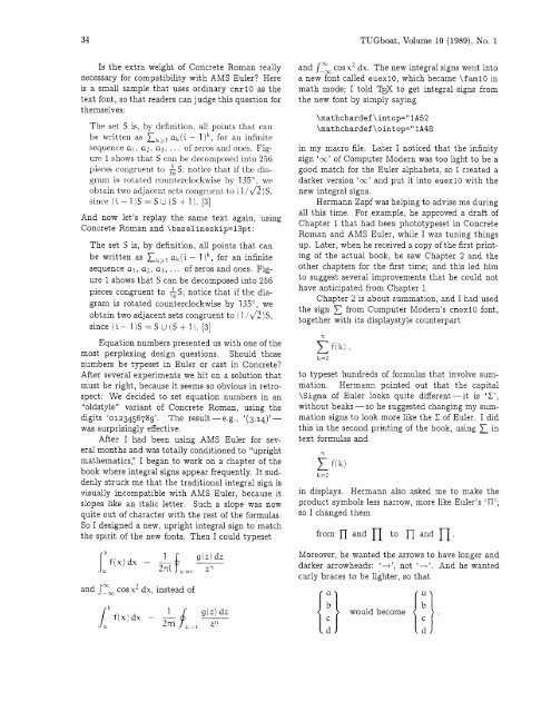
The set S is, by definition, all points that can<br />
be written as tkal ak(i - 1 lk, for an infinite<br />
sequence a1 , az, a3, . . . of zeros arid ones. Figure<br />
1 shows that S can be decomposed into 256<br />
pieces congruent to AS: notice that if the dia-<br />
gram is rotated ~ount~erclockwise by 135". we<br />
obtain two adjacent sets congruent to (1 14)s.<br />
since (i-l)S=SU(S+l). [3]<br />
And now let's replay the same text again, using<br />
<strong>Concrete</strong> Roman and \baselineskip=l3pt:<br />
The set S is, by definition, all points that can<br />
be written as tkbl ak(i - 1 )k, for an infinite<br />
sequence al, az, a3, . . . of zeros and ones. Figure<br />
1 shows that S can be decomposed into 256<br />
pieces congruent to AS; notice that if the diagram<br />
is rotated counterclockwise by 135", we<br />
obtain two adjacent sets congruent to (l/\/Z)S,<br />
since (i- 1)s =SU (S+ 1). [3]<br />
Equation numbers presented us with one of the<br />
most perplexing design questions. Should those<br />
numbers be typeset in Euler or cast in <strong>Concrete</strong>?<br />
After several experiments we hit on a solution that<br />
must be right, because it seems so obvious in retrospect:<br />
We decided to set equation numbers in an<br />
"oldstyle" variant of <strong>Concrete</strong> Roman, using the<br />
digits '0123456789'. The result - e.g., '(3.14)'-<br />
was surprisingly effective.<br />
After I had been using AMS Euler for several<br />
months and was totally conditioned to "upright<br />
mathematics:' I began to work on a chapter of the<br />
book where integral signs appear frequently. It suddenly<br />
struck me that the traditional integral sign is<br />
visually incompatible with AMS Euler, because it<br />
slopes like an italic letter. Such a slope was now<br />
quite out of character with the rest of the formulas.<br />
So I designed a new, upright integral sign to match<br />
the spirit of the new fonts. Then I could typeset<br />
and f Tm cos x2 dxI instead of<br />
'XI<br />
and JpM cos x2 dx. The new integral signs went into<br />
a new font called euexl0, which became \f am10 in<br />
math mode; I told T ' to get integral signs from<br />
the new font by simply saying<br />
in my macro file. Later I noticed that the infinity<br />
sign 'm' of Computer Modern was too light to be a<br />
good match for the Euler alphabets, so I created a<br />
darker version 'co' and put it into euexlO with the<br />
new integral signs.<br />
Hermann Zapf was helping to advise me during<br />
all this time. For example, he approved a draft of<br />
Chapter 1 that had been phototypeset in <strong>Concrete</strong><br />
Roman and AMS Euler, while I was tuning things<br />
up. Later, when he received a copy of the first printing<br />
of the actual book, he saw Chapter 2 and the<br />
other chapters for the first time; and this led him<br />
to suggest several improvements that he could not<br />
have anticipated from Chapter 1.<br />
Chapter 2 is about summation, and I had used<br />
the sign 1 from Computer Modern's cmexlo font,<br />
together with its displaystyle counterpart<br />
to typeset hundreds of formulas that involve summation.<br />
Hermann pointed out that the capital<br />
\Sigma of Euler looks quite different-it is 'L',<br />
without beaks -so he suggested changing my summation<br />
signs to look more like the L of Euler. I did<br />
this in the second priating of the book, using in<br />
text formulas and<br />
in displays. Hermann also asked me to make the<br />
product symbols less narrow, more like Euler's 'n';<br />
so I changed them<br />
from n and n to n and<br />
Moreover, he wanted the arrows to have longer and<br />
darker arrowheads: ' +', not 'i'. And he wanted<br />
curly braces to be lighter, so that


