Typesetting Concrete Mathematics - TUG
Typesetting Concrete Mathematics - TUG
Typesetting Concrete Mathematics - TUG
Create successful ePaper yourself
Turn your PDF publications into a flip-book with our unique Google optimized e-Paper software.
<strong>TUG</strong>boat, Volume 10 (1989), No. 1 3 1<br />
<strong>Typesetting</strong> <strong>Concrete</strong> <strong>Mathematics</strong><br />
Donald E. Knuth<br />
Stanford University<br />
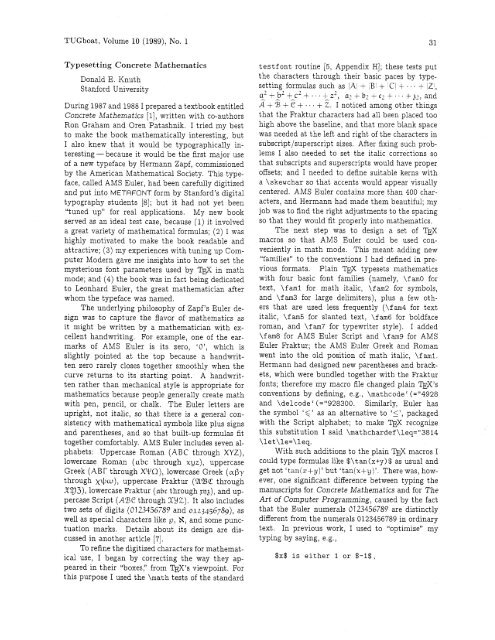
During 1987 and 1988 I prepared a textbook entitled<br />
<strong>Concrete</strong> <strong>Mathematics</strong> [I], written with co-authors<br />
Ron Graham and Oren Patashnik. I tried my best<br />
to make the book mathematically interesting, but<br />
I also knew that it would be typographically interesting-because<br />
it would be the first major use<br />
of a new typeface by Hermann Zapf, commissioned<br />
by the American Mathematical Society. This typeface,<br />
called AMS Euler, had been carefully digitized<br />
and put into METAFONT form by Stanford's digital<br />
typography students [a]; but it had not yet been<br />
"tuned up" for real applications.<br />
My new book<br />
served as an ideal test case, because (1) it involved<br />
a great variety of mathematical formulas; (2) I was<br />
highly motivated to make the book readable and<br />
attractive; (3) my experiences with tuning up Computer<br />
Modern gave me insights into how to set the<br />
mysterious font parameters used by TEX in math<br />
mode; and (4) the book was in fact being dedicated<br />
to Leonhard Euler, the great mathematician after<br />
whom the typeface was named.<br />
The underlying philosophy of Zapf's Euler design<br />
was to capture the flavor of mathematics as<br />
it might be written by a mathematician with excellent<br />
handwriting. For example, one of the earmarks<br />
of AMS Euler is its zero, 'O', which is<br />
slightly pointed at the top because a handwritten<br />
zero rarely closes together smoothly when the<br />
curve returns to its starting point. A handwritten<br />
rather than mechanical style is appropriate for<br />
mathematics because people generally create math<br />
with pen, pencil, or chalk. The Euler letters are<br />
upright, not italic, so that there is a general consistency<br />
with mathematical symbols like plus signs<br />
and parentheses, and so that built-up formulas fit<br />
together comfortably. AMS Euler includes seven alphabets:<br />
Uppercase Roman (ABC through XYZ),<br />
lowercase Roman (abc through xyz), uppercase<br />
Greek (ABr through WO), lowercase Greek (aby<br />
through x+w), uppercase kaktur (UBC through<br />
X!J3), lowercase Fraktur (abc through ~q), and uppercase<br />
Script (ABC through X2Z). It also includes<br />
two sets of digits (0123456789 and 0123456789)~ as<br />
well as special characters like p, H, and some punctuation<br />
marks. Details about its design are discussed<br />
in another article [7].<br />
To refine the digitized characters for mathematical<br />
use, I began by correcting the way they ap-<br />
peared in their "boxes," from W 'S viewpoint. For<br />
this purpose I used the \math tests of the standard<br />
testfont routine [5, Appendix HI; these tests put<br />
the characters through their basic paces by typesetting<br />
formulas such as /A + ,B1 + C + ... + Z1,<br />
a2tb2+c2t..+z2, az+br+c2+...+p,and<br />
3 + 5 + + + . . + 2. I noticed among other things<br />
that the Fraktur characters had all been placed too<br />
high above the baseline, and that more blank space<br />
was needed at the left and right of the characters in<br />
subscript/superscript sizes. After fixing such problems<br />
I also needed to set the italic corrections so<br />
that subscripts and superscripts would have proper<br />
offsets; and I needed to define suitable kerns with<br />
a \skewchar so that accents would appear visually<br />
centered. AMS Euler contains more than 400 characters,<br />
and Hermann had made them beautiful; my<br />
job was to find the right adjustments to the spacing<br />
so that they would fit properly into mathematics.<br />
The next step was to design a set of l)$<br />
macros so that AMS Euler could be used conveniently<br />
in math mode. This meant adding new<br />
"families" to the conventions I had defined in pre-<br />
vious formats. Plain 'I?@ typesets mathematics<br />
with four basic font families (namely, \f am0 for<br />
text, \fml for math italic, \fm2 for symbols,<br />
and \fm3 for large delimiters), plus a few others<br />
that are used less frequently (\fam4 for text<br />
italic, \f an5 for slanted text, \fam6 for boldface<br />
roman, and \fam7 for typewriter style). I added<br />
\fm8 for AMS Euler Script and \fa9 for AMS<br />
Euler Fraktur; the AMS Euler Greek and Roman<br />
went into the old position of math italic, \fami.<br />
Hermann had designed new parentheses and brackets,<br />
which were bundled together with the Fraktur<br />
fonts; therefore my macro file changed plain W's<br />
conventions by defining, e.g., \mathcode' (="4928<br />
and \delcodec(="928300.<br />
Similarly, Euler has<br />
the symbol '6' as an alternative to 'I1, packaged<br />
with the Script alphabet; to make TEX recognize<br />
this substitution I said \mathchardef \leq="3814<br />
\let\le=\leq.<br />
With such additions to the plain TEX macros I<br />
could type formulas like $\tan(x+y)$ as usual and<br />
get not 'tanjzfy)' but 'tan(x+y)'. There was, however,<br />
one significant difference between typing the<br />
manuscripts for <strong>Concrete</strong> <strong>Mathematics</strong> and for The<br />
Art of Computer Programming, caused by the fact<br />
that the Euler numerals 0123456789 are distinctly<br />
different from the numerals 0123456789 in ordinary<br />
text. In previous work, I used to "optimize" my<br />
typing by saying, e.g.,<br />
$x$ is either 1 or $-I$,
<strong>TUG</strong>boat, Volume 10 (1989), No. 1<br />
thereby omitting $'s around a mathematical constant<br />
unless I needed them to get a minus sign instead<br />
of a hyphen. After all, I reasoned, those extra<br />
$IS just make TEX work harder and the result looks<br />
the same; so why should I be logical? But in <strong>Concrete</strong><br />
<strong>Mathematics</strong> I needed to type<br />
$x$ is either $I$ or $-I$,<br />
to keep x from being 'either 1 or -1'. The early<br />
drafts of my manuscript had been prepared in the<br />
old way; therefore I needed to spend several hours<br />
laboriously hunting down and correcting all instances<br />
where the new convention was necessary.<br />
This experience proved to be worthwhile, because<br />
it taught me that there is a useful and meaningful<br />
distinction between text numerals and mathematical<br />
numerals. Text numerals are used in contexts<br />
like '1776' and 'Chapter 5' and '41 ways', where<br />
the numbers are essentially part of the English<br />
language; mathematical numerals, by contrast, are<br />
used in contexts like 'the greatest common divisor of<br />
12 and 18 is 6', where the numbers are part of the<br />
mathematics. (Authors of technical texts in languages<br />
like Japanese, where Arabic numerals are<br />
used in formulas but not in ordinary text, have always<br />
been well aware of this distinction; now I had<br />
a chance to learn it too.)<br />
As I was tooling up to begin using AMS Euler,<br />
my publishers were simultaneously showing the<br />
preliminary manuscript of <strong>Concrete</strong> <strong>Mathematics</strong> to<br />
a book designer, Roy Howard Brown. I had sent<br />
Roy a copy of the first Euler report [8] so that he<br />
could see examples of the typeface we planned to<br />
use for mathematics. Our original intention, based<br />
on Zapf's original plans when he began the design<br />
in 1980, was to use Computer Modern Roman for<br />
the text and AMS Euler for the mathematics. But<br />
Roy noticed that AMS Euler was somewhat darker<br />
in color than a traditional mathematical italic, so<br />
he decided that the text face should be correspondingly<br />
heavier. He sent me several samples of typefaces<br />
with more suitable weights, so that I could<br />
prepare a special font compatible with AMS Euler.<br />
(One of my basic premises when I had developed the<br />
Computer Modern meta-font was that it should be<br />
readily adaptable to new situations like this.) When<br />
I saw Roy's samples, I decided to pursue something<br />
that I'd wanted an excuse to do for several years,<br />
namely to find settings for the parameters of Computer<br />
Modern that would produce an "Egyptian"<br />
(square-serif) style.<br />
The cover designs for Computers & <strong>Typesetting</strong>,<br />
Volumes A-El show a gradual transition of<br />
the respective letter pairs Aa, Bb, Cc, Dd, and Ee<br />
from the style of standard Computer Modern Roman<br />
to an Egyptian style. I had made these cover<br />
designs just for fun, at the suggestion of Marshall<br />
Hendricks, but I had never had time to experiment<br />
with a complete text face in that style. Now I had<br />
a good reason to indulge that whim, and after a<br />
pleasant afternoon of experiments I found a combination<br />
of parameters that looked reasonably attractive,<br />
at least when I examined samples produced by<br />
our laser printer. (I magnified the fonts and viewed<br />
them from a distance, to overcome the effects of<br />
300dpi resolution.) Then I made more elaborate<br />
samples of text and printed them on Stanford's APS<br />
phototypesetter, to see if the new fonts would really<br />
pass muster. Some characters needed to be adjusted<br />
(e.g., the 'w' was too dark), but I was happy with<br />
the result and so was Roy.<br />
I decided to call the resulting font <strong>Concrete</strong><br />
Roman, because of its general solid appearance and<br />
because it was first used in the book <strong>Concrete</strong> <strong>Mathematics</strong>.<br />
(In case you haven't guessed, the text<br />
you are now reading is set in <strong>Concrete</strong> Roman.)<br />
There also zs <strong>Concrete</strong> Italzc, a companzon face<br />
that zs used for emphaszs zn the book. EVEN<br />
STRONGER EMPHASIS IS OCCASIONALLY ACHIEVED<br />
BY USING A CONCRETE ROMAN CAPS AND SMALL<br />
CAPS FONT. Anybody who has the METAFONT<br />
sources for Computer Modern can make the <strong>Concrete</strong><br />
fonts rather easily by preparing parameter files<br />
such as ccrl0 .mf, analogous to cmrl0 .mf; you just<br />
need to change certain parameter values as shown<br />
in the accompanying table.<br />
Here are samples of <strong>Concrete</strong> Roman in the 9 pt,<br />
8pt, 7pt, 6pt, and spt sizes:<br />
<strong>Mathematics</strong> books and journals do not look as<br />
beautiful as they used to. It is not that their mathematical<br />
content is unsatisfactory, rather that the<br />
old and well-developed traditions of typesetting<br />
have become too expensive. Fortunately, it now appears<br />
that mathematics itself can be used to solve<br />
this problem.<br />
A first step in the solution is to devise a method for<br />
unambiguously specifying mathematical manuscripts in<br />
such a way that they can easily be manipulated by machines.<br />
Such languages, when properly designed, can<br />
be learned quickly by authors and their typists, yet<br />
manuscripts in this form will lead directly to high quality<br />
plates for the printer with little or no human intervention.<br />
A second step in the solution makes use of classical<br />
mathematics to design the shapes of the letters and symbols<br />
themselves. It is possible to give a rigorous definition<br />
of the exact shape of the letter "a", for example, in such a<br />
way that infinitely many styles (bold, extended, sans-serif,<br />
italic, etc.) are obtained from a single definit~on by changing<br />
only a few parameters. When the same is done for the
<strong>TUG</strong>boat, Volume 10 (1989), No. 1 33<br />
other letters and symbols, we obtain a mathematical definition<br />
of type fonts, a definition that can be used on all<br />
machines both now and in the future. The main significance<br />
of this approach is that new symbols can readily be<br />
added in such a way that they are automatically consistent<br />
with the old ones.<br />
Of course ~t is necessary that the mathematically-defined letters<br />
be beautiful according to traditional notions of =sthetics<br />
Given a sequence of points in the plane, what is the most pleasing<br />
curve that connects them? This question leads to interesting<br />
mathematics, and one solution based on a novel family of spline<br />
curves has produced excellent [SIC] fonts of type in the author's<br />
preliminary experiments<br />
We may conclude that a mathematical approach to the design of<br />
alphabets does not elmunate the artists who have been domg the<br />
job for so many years, on the contrary ~t gives them an exc~ting<br />
new medium to work with [2]<br />
Heavier weight makes the type more resilient<br />
to xeroxing and easier to read in a poorly lighted li-<br />
brary, so these new typefaces may help solve some of<br />
the legibility problems we all know too well. But a<br />
typeface that is too bold can also make a book tiresome<br />
to read. To avoid this problem, Roy decided<br />
to use a \baselineskip of 13 pt with lOpt type.<br />
This gives an additional advantage for mathematical<br />
work, because it prevents formulas like a;'<br />
in the body of the text from interfering with each<br />
other; the normal 12 pt baselineskip used in most<br />
mathematics books can get uncomfortably tight. Of<br />
course, the increased space between lines also increases<br />
the number of pages by about 8%; this seems<br />
a reasonable price to pay for increased readability.<br />
Table of parameter values for <strong>Concrete</strong> fonts, using the conventions found on pages 12-31 of [6]:<br />
name cmr10 ccr10<br />
font- ident<br />
serif-fit<br />
cap-serif-fit<br />
x-height<br />
bar-height<br />
tiny<br />
fine<br />
thin-join<br />
hair<br />
stem<br />
curve<br />
ess<br />
flare<br />
cap-hair<br />
cap-stem<br />
cap-curve<br />
cap-ess<br />
bracket<br />
jut<br />
cap-jut<br />
vazr<br />
notch-cut<br />
bar, etc.*<br />
cap-notch- cut<br />
serif-drop<br />
0<br />
up ex- o<br />
other values from<br />
CMR<br />
0<br />
5<br />
155<br />
87<br />
8<br />
7<br />
7<br />
9<br />
25<br />
30<br />
27<br />
33<br />
11<br />
32<br />
37<br />
35<br />
20<br />
28<br />
37<br />
8<br />
10<br />
11<br />
10<br />
4<br />
8<br />
8<br />
CCR<br />
1<br />
3<br />
165<br />
92<br />
11<br />
6<br />
17<br />
21<br />
25<br />
27<br />
25<br />
29<br />
21<br />
27<br />
28<br />
27<br />
5<br />
30<br />
32<br />
21<br />
516<br />
21<br />
1<br />
5<br />
4<br />
3<br />
cm10<br />
ccr9<br />
CCR<br />
1<br />
2.8<br />
148.5<br />
78.3<br />
10<br />
6<br />
17<br />
20<br />
24<br />
2 6<br />
24<br />
26<br />
2 0<br />
26<br />
27<br />
24<br />
5<br />
2 7<br />
29<br />
20<br />
314<br />
20<br />
.9<br />
3.6<br />
4<br />
3<br />
cmr9<br />
CCR CCR<br />
1 1<br />
2.6 2.4<br />
132 115.5<br />
69.6 60.9<br />
9 8<br />
6 6<br />
15 13<br />
19 17<br />
22 20<br />
24 21.5<br />
22 20<br />
24 23<br />
19 17<br />
24 21.5<br />
25 22.5<br />
22 21.5<br />
4 4<br />
24 21<br />
26 23<br />
19 17<br />
213 7/12<br />
19 17<br />
.8 .7<br />
3.2 2.8<br />
3 3<br />
3 3<br />
cmr8 cmr7<br />
CCR<br />
1<br />
2.2<br />
99<br />
52.2<br />
7<br />
6<br />
12<br />
15<br />
18<br />
19<br />
17<br />
20<br />
15<br />
19<br />
20<br />
19<br />
3<br />
19<br />
20<br />
15<br />
112<br />
15<br />
.6<br />
2.4<br />
3<br />
3<br />
cmr 6<br />
ccr5 ccslc9 cctilO ccmilO cccsclO lower<br />
CCR<br />
1<br />
2<br />
82.5<br />
43.5<br />
6<br />
5<br />
11<br />
14<br />
16<br />
17<br />
12<br />
18<br />
14<br />
17<br />
18<br />
14<br />
3<br />
17<br />
18<br />
14<br />
5/12<br />
14<br />
.5<br />
2<br />
3<br />
2<br />
cmr5<br />
CCSLC<br />
0<br />
2<br />
155<br />
85<br />
9<br />
6<br />
13<br />
16<br />
2 2<br />
23<br />
2 5<br />
2 8<br />
16<br />
23<br />
24<br />
2 3<br />
5<br />
15<br />
16<br />
15<br />
314<br />
15<br />
.9<br />
3.6<br />
4<br />
3<br />
CCTI<br />
1<br />
3<br />
165<br />
92<br />
11<br />
6<br />
17<br />
21<br />
24<br />
2 6<br />
24<br />
28<br />
21<br />
26<br />
2 7<br />
26<br />
5<br />
30<br />
3 2<br />
21<br />
516<br />
21<br />
1<br />
5<br />
4<br />
3<br />
CCMI<br />
1<br />
3<br />
165<br />
92<br />
11<br />
6<br />
17<br />
2 1<br />
25<br />
2 7<br />
2 5<br />
29<br />
21<br />
2 7<br />
28<br />
2 7<br />
5<br />
30<br />
32<br />
21<br />
516<br />
2 1<br />
1<br />
5<br />
4<br />
3<br />
CCCSC<br />
1<br />
3<br />
155<br />
87<br />
11<br />
6<br />
17<br />
2 1<br />
2 5<br />
2 7<br />
25<br />
29<br />
21<br />
2 7<br />
28<br />
2 7<br />
5<br />
30<br />
32<br />
21<br />
*The measurements for bar apply also to slab, cap-bar, and cap-band. All of the <strong>Concrete</strong> fonts have<br />
dish = 0, fudge = .95, superness = 8/11, superpull = 1/15, and beak-darkness = 11/30. Parameters not<br />
mentioned here are inherited from the corresponding cm fonts, except that cccsclO has lower.fudge = .93;<br />
cctilO has the u value 20 not 18.4, and the crisp value 11 not 8; ccmilO has the crisp value 0 not 8.<br />
516<br />
2 1<br />
1<br />
5<br />
4<br />
3
34 <strong>TUG</strong>boat, Volume 10 (1989), No. 1<br />
Is the extra weight of <strong>Concrete</strong> Roman really<br />
necessary for compatibility with AMS Euler? Here<br />
is a small sample that uses ordinary cmrlO as the<br />
text font, so that readers can judge this question for<br />
themselves:<br />
The set S is, by definition, all points that can<br />
be written as tkal ak(i - 1 lk, for an infinite<br />
sequence a1 , az, a3, . . . of zeros arid ones. Figure<br />
1 shows that S can be decomposed into 256<br />
pieces congruent to AS: notice that if the dia-<br />
gram is rotated ~ount~erclockwise by 135". we<br />
obtain two adjacent sets congruent to (1 14)s.<br />
since (i-l)S=SU(S+l). [3]<br />
And now let's replay the same text again, using<br />
<strong>Concrete</strong> Roman and \baselineskip=l3pt:<br />
The set S is, by definition, all points that can<br />
be written as tkbl ak(i - 1 )k, for an infinite<br />
sequence al, az, a3, . . . of zeros and ones. Figure<br />
1 shows that S can be decomposed into 256<br />
pieces congruent to AS; notice that if the diagram<br />
is rotated counterclockwise by 135", we<br />
obtain two adjacent sets congruent to (l/\/Z)S,<br />
since (i- 1)s =SU (S+ 1). [3]<br />
Equation numbers presented us with one of the<br />
most perplexing design questions. Should those<br />
numbers be typeset in Euler or cast in <strong>Concrete</strong>?<br />
After several experiments we hit on a solution that<br />
must be right, because it seems so obvious in retrospect:<br />
We decided to set equation numbers in an<br />
"oldstyle" variant of <strong>Concrete</strong> Roman, using the<br />
digits '0123456789'. The result - e.g., '(3.14)'-<br />
was surprisingly effective.<br />
After I had been using AMS Euler for several<br />
months and was totally conditioned to "upright<br />
mathematics:' I began to work on a chapter of the<br />
book where integral signs appear frequently. It suddenly<br />
struck me that the traditional integral sign is<br />
visually incompatible with AMS Euler, because it<br />
slopes like an italic letter. Such a slope was now<br />
quite out of character with the rest of the formulas.<br />
So I designed a new, upright integral sign to match<br />
the spirit of the new fonts. Then I could typeset<br />
and f Tm cos x2 dxI instead of<br />
'XI<br />
and JpM cos x2 dx. The new integral signs went into<br />
a new font called euexl0, which became \f am10 in<br />
math mode; I told T ' to get integral signs from<br />
the new font by simply saying<br />
in my macro file. Later I noticed that the infinity<br />
sign 'm' of Computer Modern was too light to be a<br />
good match for the Euler alphabets, so I created a<br />
darker version 'co' and put it into euexlO with the<br />
new integral signs.<br />
Hermann Zapf was helping to advise me during<br />
all this time. For example, he approved a draft of<br />
Chapter 1 that had been phototypeset in <strong>Concrete</strong><br />
Roman and AMS Euler, while I was tuning things<br />
up. Later, when he received a copy of the first printing<br />
of the actual book, he saw Chapter 2 and the<br />
other chapters for the first time; and this led him<br />
to suggest several improvements that he could not<br />
have anticipated from Chapter 1.<br />
Chapter 2 is about summation, and I had used<br />
the sign 1 from Computer Modern's cmexlo font,<br />
together with its displaystyle counterpart<br />
to typeset hundreds of formulas that involve summation.<br />
Hermann pointed out that the capital<br />
\Sigma of Euler looks quite different-it is 'L',<br />
without beaks -so he suggested changing my summation<br />
signs to look more like the L of Euler. I did<br />
this in the second priating of the book, using in<br />
text formulas and<br />
in displays. Hermann also asked me to make the<br />
product symbols less narrow, more like Euler's 'n';<br />
so I changed them<br />
from n and n to n and<br />
Moreover, he wanted the arrows to have longer and<br />
darker arrowheads: ' +', not 'i'. And he wanted<br />
curly braces to be lighter, so that
<strong>TUG</strong>boat, Volume 10 (1989), No. 1 35<br />
All of these new characters were easy to design, using<br />
the conventions of Computer Modern [6], so I<br />
added them to euexlO and used them in the second<br />
printing.<br />
Readers of <strong>Concrete</strong> <strong>Mathematics</strong> will immediately<br />
notice one novel feature: There are "graffiti"<br />
printed in the margins. My co-authors and I<br />
asked students who were testing the preliminary<br />
book drafts to write informal comments that might<br />
be printed with the text, thereby giving the book<br />
a friendly-contemporary-lifelike flavor. We weren't<br />
sure how such "remarks from the peanut gallery"<br />
should be typeset, but we knew that we did want<br />
to include them; in fact, we collected almost 500<br />
marginal notes. Roy hit on the idea of putting them<br />
in the znner (gutter) margin, where they would not<br />
have too much prominence. He also sent a sample of<br />
a suitably informal typeface, on<br />
This 9pt typeface<br />
which I modeled "<strong>Concrete</strong> Ro- proved to work very<br />
man Slanted Condensed" type. nicely for marginal<br />
To typeset such graffiti, I graffiti, where-it<br />
introduced a \n macro into mv is typeset ragged<br />
m<br />
%2<br />
format file, so that it was 'picas<br />
with lOpt between<br />
possible to type simply '\g Text<br />
baselines,<br />
of a graffito. \g' on whatever<br />
line of text I wanted the marginal comment to begin.<br />
I did a bit of positioning by hand to ensure<br />
that no two comments would overlap; but my \g<br />
macro did most of the work. For example, it automatically<br />
decided whether to put graffiti into the<br />
left margin or the right margin, based on an auxiliary<br />
'grf' file that recorded the choice that would<br />
have been appropriate on the previous TEX run.<br />
My macros for <strong>Concrete</strong> <strong>Mathematics</strong> cause<br />
Tj$ to produce not only the usual dvi file and log<br />
file corresponding to the input, but also the grf file<br />
just mentioned and four other auxiliary files:<br />
The ans file contains the text of any answers to<br />
exercises that appeared in the material just typeset;<br />
such answers will be \input at an appropriate later<br />
time. (Page 422 of The wbook discusses a similar<br />
idea. The only difference between <strong>Concrete</strong> <strong>Mathematics</strong><br />
and The wbook in this regard was that I<br />
used one file per chapter in <strong>Concrete</strong> <strong>Mathematics</strong>,<br />
while The wbook was typeset from one long file.)<br />
The inx file contains raw material for preparing<br />
the index. After everything but the index was<br />
ready, I put all the inx files together, sorted them,<br />
and edited the results by hand. (See pages 423-<br />
425 of The wbook, where I describe similar index<br />
macros and explain why I don't believe in fully automatic<br />
index preparation.)<br />
There's also a ref file, which contains the symbolic<br />
names of equations, tables, and exercises that<br />
may be needed for cross references. (A ref file is<br />
analogous to an aux file in B w.)<br />
0 Finally, a bnx file records the page numbers of<br />
each bibliographic reference, so that I can include<br />
such information as a sort of index to the bibliography.<br />
That index was done automatically.<br />
I wouldn't want to deal with so many auxiliary files<br />
if I were producing a simpler book or a system for<br />
more general consumption. But for the one-shot<br />
purposes of <strong>Concrete</strong> <strong>Mathematics</strong>, this multiplefile<br />
approach was most convenient.<br />
We decided to use a nonstandard numbering<br />
system for tables, based on the way superhighway<br />
exits are numbered in some states: Table 244, for<br />
example, refers to the table on page 244. (The idea<br />
wasn't original with us, but I don't remember who<br />
suggested it.) Macros to accommodate this convention,<br />
and to update the cross-references when the<br />
page numbers change, were not difficult to devise.<br />
All of the macros I wrote for <strong>Concrete</strong> <strong>Mathematics</strong><br />
appear in an 814-line file called gkpmac. tex,<br />
which (I'm sorry to admit) includes very little documentation<br />
because it was intended only to do a<br />
single job. Macro writers may like to look at this<br />
file as a source of ideas, so I've made it publicly<br />
accessible; for example, it is gkpmac . t ex<br />
at score. stanford. edu on the Arpanet. But people<br />
who attempt to use these macros should be<br />
aware that I have not pretended to make them complete<br />
or extremely general. For example, I implemented<br />
a subset of B?]Ex's picture environment,<br />
and used it to prepare all but one of the illustrations<br />
in the book; but I didn't include everything<br />
that LAW makes available. Moreover, I didn't need<br />
boldface type in the mathematical formulas of <strong>Concrete</strong><br />
<strong>Mathematics</strong> (except for the Q on page 143<br />
of the second printing); so I didn't include macros<br />
for accessing any of the bold fonts of AMS Euler<br />
in math mode. In this respect, the book was not a<br />
perfect test, because almost half of the Euler characters<br />
are boldface and therefore still untried. Macros<br />
for bold mathematics would be easy to add, following<br />
the pattern already established in gkpmac; but<br />
I must leave such tasks to others, as I return to my<br />
long-delayed project of writing the remaining volumes<br />
of The Art of Computer Programming.
36 <strong>TUG</strong>boat, Volume 10 (1989), No. 1<br />
References<br />
to ship the character off to the Generic Format file<br />
[I] Ronald L. Graham, Donald E. Knuth, and<br />
(GF file). So, the endchar definition seemed like<br />
Oren Patashnik, <strong>Concrete</strong> <strong>Mathematics</strong>. Addisona<br />
good spot to tell METAFONT to take whatever<br />
Wesley, 1989.<br />
character image had been created and convert it<br />
to an outline, since it is called once per character,<br />
[2] Donald E. Knuth, "Mathematical typography," right before it's shipped out,<br />
Bulletin of the American Mathematical Society<br />
Here is the macro definition I used to create<br />
(new series) 1 (1979), 337-372.<br />
outline fonts with:<br />
[3] Donald E. Knuth, Seminumerical Algorithms,<br />
second edition. Addison-Wesley, 1981.<br />
[4] Donald E. Knuth, The wbook, Volume A of<br />
Computers & <strong>Typesetting</strong>. Addison-Wesley, 1984<br />
and 1986.<br />
[5] Donald E. Knuth, The METRFONT~OO~, Volume<br />
C of Computers & <strong>Typesetting</strong>. Addison-<br />
Wesley, 1986.<br />
[6] Donald E. Knuth, Computer Modern Typefaces,<br />
Volume E of Computers & <strong>Typesetting</strong>.<br />
Addison-Wesley, 1986.<br />
[7] Donald E. Knuth and Hermann Zapf, "AMS<br />
Euler - A new typeface for mathematics," Scholarly<br />
Publishing, to appear.<br />
[8] David R Siegel, The Euler Project at Stanford.<br />
Computer Science Department, Stanford University,<br />
1985.<br />
Outline fonts with METAFONT<br />
Doug Henderson<br />
Lately I've been feeling like no one else out there<br />
is having any fun with METAFONT. I sure am.<br />
Recently, I came across a small gem in the rough<br />
in the METAFONTbook and decided to polish it up<br />
some. In chapter thirteen there is an interesting<br />
exercise (13.23, page 121) which calls for the user to<br />
replace a character by its "outline". Since it was an<br />
idea that appealed to me (double dangerous bend<br />
kind of fun) I set about applying the solution in<br />
various places in the METAFONT source code to see<br />
the affects. What I finally settled on was hooking it<br />
in as a definition extension of the endchar macro. I<br />
reasoned that for each Computer Modern character<br />
METAFONT produces in a font, there exists both a<br />
beginchar statement, with which you relate things<br />
like the height, width and depth, and an endchar<br />
statement, which tells the program, among other<br />
things, to create a grid box for proof characters and<br />
me~sage~~loading the font outline macros.";<br />
boolean outlining;<br />
% only outline when told to<br />
outlining:=false;<br />
def outline =<br />
if outlining:<br />
cull currentpicture keeping (1,infinity);<br />
picture v; v:=currentpicture;<br />
cull currentpicture keeping (1,l)<br />
withweight 3;<br />
addto currentpicture also v - v<br />
shifted right -V shifted left - v<br />
shifted up - v shifted down;<br />
cull currentpicture keeping (1,4);<br />
if (pixels-per-inch >= 600) :<br />
addto currentpicture also currentpicture<br />
shifted left;<br />
addto currentpicture also currentpicture<br />
shifted up;<br />
f i<br />
showit;<br />
fi<br />
enddef ;<br />
extra-endchar:=extra-endchar & "outline";<br />
The first statement declares a boolean variable<br />
named outlining. The next line initializes<br />
outlining to be false, so we don't create outline<br />
fonts by default. The definition of outline includes<br />
the line if outlining: which tests to see whether<br />
the outlining feature is desired. If so, the macro<br />
proceeds to punch out the pixels on the inside<br />
of our character (leaving more than one pixel for<br />
the outline if using a high resolution printer or<br />
phototypesetter) and show the results, and, if not,<br />
ends the if statement with the f i statement. The<br />
last statement is interesting since it shows a nifty<br />
way to tack on new features when creating your<br />
characters. Instead of redefining the definition of<br />
the endchar macro with your special effects (in this<br />
case a character outline), just add to the definition<br />
of endchar with the extra-endchar statement.<br />
Some similar "hooks" exist for the beginchar and


