Culture, Crowding and the pleasure of Complexity; A schizophrenic presentation
Lecture by Gerard Hadders on the pleasure of seeing complexity in urban space
Lecture by Gerard Hadders on the pleasure of seeing complexity in urban space

Create successful ePaper yourself
Turn your PDF publications into a flip-book with our unique Google optimized e-Paper software.
<strong>Culture</strong>, <strong>Crowding</strong> & <strong>the</strong><br />
<strong>pleasure</strong> <strong>of</strong> <strong>Complexity</strong>.<br />
Some remarks about ‘urban<br />
graphic design’.<br />
A <strong>schizophrenic</strong> <strong>presentation</strong>.
“...Urban space is, in contrast with television or <strong>the</strong> internet<br />
where navigation takes place through ‘exclusion’,<br />
<strong>the</strong> space where we encounter <strong>the</strong> maximum <strong>of</strong> ‘static’<br />
<strong>and</strong> through which we move by ‘inclusion’; Inclusion<br />
meaning <strong>the</strong> appropriation <strong>of</strong> <strong>the</strong> visual culture <strong>of</strong> an urban<br />
space we do not necessarily underst<strong>and</strong>, probably<br />
don’t even want to underst<strong>and</strong>. Never<strong>the</strong>less this appropriation<br />
is needed dearly to be able to navigate through<br />
urban space...”
#1:<br />
Problem #1: <strong>Culture</strong>
Problem#1: <strong>Culture</strong><br />
We all have <strong>the</strong> following experience: you are waiting<br />
for a traffic light to turn green <strong>and</strong> suddenly you spot<br />
a building that you have never seen although you have<br />
passed this point at least a hundred times this year<br />
alone.<br />
And worse... <strong>the</strong> building was obviously already st<strong>and</strong>ing<br />
<strong>the</strong>re before you were even born.
Problem#1: <strong>Culture</strong><br />
This difference between seeing <strong>and</strong> looking has been<br />
described many times in science <strong>and</strong> is a thankful topic<br />
in literature <strong>and</strong> art but is generally neglected by <strong>the</strong> design<br />
community since design is very rarely concerned<br />
with looking at <strong>the</strong> ‘whole’ <strong>of</strong> a given environment as<br />
this environment is technically split up between planners,<br />
engineers, architects, industrial designers, media<br />
placement specialists, graffiti painters, greenery l<strong>and</strong>scapers,<br />
house painters, graphic designers <strong>and</strong> so forth<br />
<strong>and</strong> so forth with zoning committees as a kind <strong>of</strong> general<br />
overseers.
Problem#1: <strong>Culture</strong><br />
This difference between looking <strong>and</strong> seeing becomes<br />
spectacular if you come to think <strong>of</strong> <strong>the</strong> myriad <strong>of</strong><br />
different categories you can put potential users <strong>of</strong><br />
urban space in:<br />
running from goth teenagers all <strong>the</strong> way to immigrant<br />
pensioners.<br />
They all have a different speed <strong>and</strong> need <strong>and</strong> speech...
Problem#1: <strong>Culture</strong><br />
The psycholinguist Dan Slobin did an interesting experiment<br />
about <strong>the</strong> preconception <strong>of</strong> perception based on<br />
<strong>the</strong> linguistic structures <strong>of</strong> mo<strong>the</strong>r tongues <strong>and</strong> I quote:<br />
“...We asked English <strong>and</strong> French native speakers to<br />
write down within one minute as many way-<strong>of</strong>-motionverbs<br />
as possible. The French speakers though it a difficult<br />
task. After just a couple <strong>of</strong> verbs like ‘courir’ <strong>the</strong>y<br />
were finished writing, while <strong>the</strong> English speakers just<br />
kept on writing <strong>and</strong> writing...”
Problem#1: <strong>Culture</strong><br />
The same happens, he writes:<br />
“...in French novels where protagonists seem to materialize<br />
from place to place in a mysterious manner.<br />
French novel characters move into a field, where German<br />
characters walked, strolled, or rolled into a field...”
Problem#1: <strong>Culture</strong><br />
In short:<br />
urban space <strong>and</strong> thus its visual culture is perceived on an<br />
individualist level that is determined by age, gender,<br />
culture <strong>and</strong> speech.
Problem#2: <strong>Crowding</strong>
Problem#2: <strong>Crowding</strong><br />
A definition:<br />
“...In crowding, a target is harder to identify in <strong>the</strong> presence<br />
<strong>of</strong> nearby flankers (...) The critical spacing defines<br />
an isolation field around <strong>the</strong> target. Some objects can be<br />
recognized only when each part is isolated from <strong>the</strong> rest<br />
<strong>of</strong> <strong>the</strong> object by <strong>the</strong> critical spacing. In that case, recognition<br />
is by parts. Recognition is holistic if <strong>the</strong> observer<br />
can recognize <strong>the</strong> object even when <strong>the</strong> whole object fits<br />
within a critical spacing...”
Problem#2: <strong>Crowding</strong><br />
This is a definition from a paper called “Are faces processed<br />
like words?” published in Journal <strong>of</strong> Vision in<br />
2005 which begins its introduction with <strong>the</strong> following:<br />
“Psychophysical proposals for how people recognize<br />
objects have largely been bottom-up building on what is<br />
known about feature detection.<br />
Cognitive proposals have been top-down, reasoning<br />
from what is known about object categorization...”
Problem#2: <strong>Crowding</strong><br />
In my view, this definition describes perfectly <strong>the</strong> battlefield<br />
on which designers are to perform <strong>the</strong>ir tasks. Ever<br />
since modernism raised its polished head, functionalist<br />
designers have willingly mistaken es<strong>the</strong>tics for science.<br />
So ‘fashion’... turned ‘fact’.
Problem#2: <strong>Crowding</strong><br />
The problem with this fact is that it sits on a form <strong>of</strong><br />
visual hygiene. And since hygiene is only achieved<br />
through scrubbing <strong>and</strong> cleaning I could say that<br />
‘exclusion’ is <strong>of</strong> vital importance for modernist –<br />
functionalist – graphic design.
Problem#2: <strong>Crowding</strong><br />
I can hear you think: “why still go on about modernism?<br />
Isn’t it since decades buried under layers <strong>and</strong> layers <strong>of</strong><br />
post-modern bacteria?” Well at least for two reasons,<br />
firstly; what hasn’t changed since postmodern thinking<br />
is <strong>the</strong> economic <strong>and</strong> strategic instrumentality <strong>of</strong> marketing<br />
<strong>and</strong> communication design - this has a dynamic <strong>of</strong><br />
its own, <strong>and</strong> it’s own ‘science’,
Problem#2: <strong>Crowding</strong><br />
<strong>and</strong> secondly: however postmodern architecture might<br />
be in its design, <strong>the</strong> engineering most certainly is not<br />
<strong>and</strong> <strong>the</strong> same goes for <strong>the</strong> economic structural thinking<br />
that lies under any kind <strong>of</strong> property development.<br />
In short: necessary modernist thinking is turning into<br />
an unnecessary paradigm when developing new visual<br />
strategies.
Problem#2: <strong>Crowding</strong><br />
I think that ‘crowding’ – or ‘static’ as it used to be called<br />
in advertising – namely <strong>the</strong> loss <strong>of</strong> exclusivity when it<br />
comes to perception <strong>and</strong> reception <strong>of</strong> a sign or message<br />
is turning from a nuisance into a given. We seriously<br />
have to start thinking about an ‘inclusive’ way in approaching<br />
visual urban culture.
Problem#2: <strong>Crowding</strong><br />
The effects <strong>of</strong> <strong>Crowding</strong> through graphic design is maybe<br />
best known to you in countries like China <strong>and</strong> India<br />
where <strong>the</strong> density <strong>of</strong> activities behind a commercial facade<br />
can be seen by <strong>the</strong> amount <strong>of</strong> commercial signs on<br />
<strong>the</strong> outside, highly es<strong>the</strong>tic like on Shanghai’s Nanjing<br />
Road or more muddled <strong>and</strong> chaotic like in Delhi’s Old<br />
City District.
Problem#2: <strong>Crowding</strong><br />
It is my strong conviction that by looking at <strong>the</strong>se<br />
cities we are looking to <strong>the</strong> future <strong>of</strong> European<br />
commercial area’s when increased small scale<br />
commercialism will converge with our un-sustainable<br />
visual zoning laws <strong>and</strong> <strong>the</strong> facades <strong>of</strong> <strong>the</strong> streets will<br />
start to look like <strong>the</strong> shelves <strong>of</strong> well assorted<br />
supermarkets.
Problem#2: <strong>Crowding</strong><br />
Mind you, though; this is inherently different from <strong>the</strong><br />
dazzling visual mono culture <strong>of</strong> Las Vegas or <strong>the</strong> intended<br />
complicated facade designs from The Jerde Partnership<br />
or Tibor Kalman’s 42nd street development - where<br />
what looks complex, actually is well parceled visual information.
Conception:<br />
The <strong>pleasure</strong> <strong>of</strong> complexity.
Conception: The <strong>pleasure</strong> <strong>of</strong> complexity<br />
A quotation:<br />
“...Visual complexity <strong>and</strong> urban identity are intimately<br />
interwoven. If we see <strong>the</strong> era <strong>of</strong> modernist design as one<br />
where <strong>the</strong> surface <strong>of</strong> things was cut loose completely<br />
from <strong>the</strong> identity <strong>of</strong> its users, <strong>and</strong> related one hundred<br />
percent to <strong>the</strong> logic <strong>of</strong> its production, we can now recognize<br />
a hyper concentration on a multiplicity <strong>of</strong> consumer-identities,<br />
that makes <strong>the</strong> surface <strong>and</strong> <strong>the</strong> facade<br />
<strong>the</strong> a-priori <strong>of</strong> <strong>the</strong> design, <strong>and</strong> no longer its ‘cover-up’ or<br />
envelope...”
Conception: The <strong>pleasure</strong> <strong>of</strong> complexity<br />
Was Adolf Loos a criminal? According to <strong>the</strong> art-historian<br />
Gombrich he was merely preaching an new Anglo-<br />
Saxon style idiom to <strong>the</strong> ornament-obsessed natives <strong>of</strong><br />
Austria. And as Robert Venturi remarks in his ‘Learning<br />
from Las vegas’:<br />
“...Less may have been more, but <strong>the</strong> I-section on <strong>the</strong><br />
Mies van de Rohe’s fire resistant columns, is as complexly<br />
ornamental as <strong>the</strong> applied pilaster on <strong>the</strong> renaissance<br />
pier (...) modern ornament has seldom been symbolic<br />
<strong>of</strong> anything non-architectural since <strong>the</strong> Bauhaus<br />
vanquished Art Deco <strong>and</strong> <strong>the</strong> decorative arts...”
Conception: The <strong>pleasure</strong> <strong>of</strong> complexity<br />
Venturi already showed in <strong>the</strong> sixties that <strong>the</strong> visual exclusiveness<br />
<strong>of</strong> modernist architecture stood in <strong>the</strong> way<br />
<strong>of</strong> a comprehensive – underst<strong>and</strong>able – architecture(•). I<br />
am not an expert on <strong>the</strong> matter – I am not a <strong>the</strong>oretician<br />
– so I will subside to personal observation <strong>and</strong> experience.
Conception: The <strong>pleasure</strong> <strong>of</strong> complexity<br />
In 1991 I was asked by <strong>the</strong> Dutch PTT to create a neon<br />
fries on <strong>the</strong> basis <strong>of</strong> <strong>the</strong>ir <strong>the</strong>n newly developed corporate<br />
design. This resulted in a work called ‘The Rise<br />
And Fall Of The House-style Of The PTT’. It was a large<br />
scale graphic comic that tells <strong>the</strong> story <strong>of</strong> <strong>the</strong> death <strong>of</strong><br />
<strong>the</strong> typeface ‘univers 45’ as <strong>the</strong> sole signifier to carry <strong>the</strong><br />
identity <strong>of</strong> <strong>the</strong> former postal en telephone company as<br />
it had been since <strong>the</strong> mid-sixties. In <strong>the</strong> last ‘frame’ it is<br />
swallowed up by <strong>the</strong> neo suprematist figurations that<br />
largely made up <strong>the</strong> 2nd <strong>and</strong> 3rd level <strong>of</strong> <strong>the</strong> house-style.
Conception: The <strong>pleasure</strong> <strong>of</strong> complexity<br />
It was not my first light work so <strong>the</strong> general confusion<br />
about <strong>the</strong> work – was it a corporate house-style neon, or<br />
was it monumental art? – got me interested as it did my<br />
client at <strong>the</strong> time because it wasn’t for long before I got<br />
<strong>the</strong> next question. And it was this question that got me<br />
started.
Conception: The <strong>pleasure</strong> <strong>of</strong> complexity<br />
The brief in short was to develop: ‘a series <strong>of</strong> identical<br />
signs - for a series <strong>of</strong> identical PTT buildings - that<br />
should carry elements <strong>of</strong> <strong>the</strong> house-style but should not<br />
represent it integral’. I started with making a visual essay<br />
about architecture as sign in which I gratefully started<br />
with Venturi’s analysis from Las Vegas. This I mixed<br />
with rhetoric elements <strong>of</strong> <strong>the</strong> company <strong>and</strong> <strong>the</strong> architecture<br />
<strong>and</strong> created this proposal: a single boxletter filled<br />
with chaotic ‘carnival style’ lightbulbs. But, <strong>the</strong> way<br />
how it is in <strong>the</strong> corporate world: strategies change, <strong>and</strong><br />
so do projects.
Conception: The <strong>pleasure</strong> <strong>of</strong> complexity<br />
In <strong>the</strong> late nineties <strong>the</strong>re were two retail concepts born:<br />
<strong>the</strong> house-in-house concept <strong>and</strong> <strong>the</strong> combination megastore.<br />
They were to be taken as an example to develop<br />
a chain <strong>of</strong> business supply stores that centered around<br />
mail <strong>and</strong> logistic services supplied by what was <strong>the</strong>n<br />
called TPG-Post. These stores were to be developed market-conform:<br />
generic buildings - owned by a third party<br />
– that could also be rented to o<strong>the</strong>r clients than <strong>the</strong> PTT<br />
without significant changes in layout <strong>and</strong> finish.
Conception: The <strong>pleasure</strong> <strong>of</strong> complexity<br />
A problem with <strong>the</strong> mega-store concept was that <strong>the</strong>y<br />
forced various br<strong>and</strong>s ‘toge<strong>the</strong>r’ in one place <strong>and</strong> on one<br />
facade. And – fur<strong>the</strong>rmore – <strong>the</strong> partnership between<br />
br<strong>and</strong>s seemed to be prone to constant change.<br />
I developed a concept that was deceivably simple. The<br />
logo’s had to be represented in equal ‘weight’. Retroreflective<br />
prismatic foil applied in dots would represent<br />
<strong>the</strong> different br<strong>and</strong>s, it was cheap, easy to apply <strong>and</strong> easy<br />
to remove.
Conception: The <strong>pleasure</strong> <strong>of</strong> complexity<br />
TPG found an architect to develop <strong>the</strong> perfect ‘box’ to go<br />
with <strong>the</strong> solution <strong>and</strong> a new form <strong>of</strong> architecture-integrated<br />
signalization was born.<br />
When <strong>the</strong> matrix for <strong>the</strong> dots was developed interesting<br />
things happened: it became clear that a matrix typeface<br />
‘behaves’ differently from type-elements in a logo-type,<br />
in o<strong>the</strong>r words a logo-type is more image than text; fur<strong>the</strong>rmore<br />
a logotype could be reduced to a minimum<br />
amount <strong>of</strong> dots or <strong>the</strong> logo could be deformed severely<br />
before it lost its cognitive value. What you see, is what<br />
you remember.
Conception: The <strong>pleasure</strong> <strong>of</strong> complexity<br />
Apart from this last interesting lesson ano<strong>the</strong>r notion popped<br />
up in <strong>the</strong> following project for an affiliated client: TNT express<br />
mail. I designed a large sign for <strong>the</strong>m next to a freeway at <strong>the</strong>ir<br />
main <strong>of</strong>fice. Many people were to pass <strong>the</strong>re daily, <strong>and</strong> most<br />
likely driving very slowly. To merely enlarge a logotype to huge<br />
proportions is not interesting. It will tend to look like a print<br />
media version <strong>of</strong> <strong>the</strong> logo so o<strong>the</strong>r strategies need to be developed.<br />
To make people stay interested <strong>the</strong> design is deliberately complex.<br />
With six neon filaments that slowly switch in patterns<br />
<strong>and</strong> a prominent grid carrying <strong>the</strong> logo in plastic dots, it looks<br />
like a slow-motion version <strong>of</strong> a Las Vegas casino sign.
Conception: The <strong>pleasure</strong> <strong>of</strong> complexity<br />
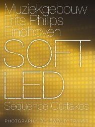
The last project I will present is <strong>the</strong> light-wall that I developed<br />
for <strong>the</strong> Dexia Tower near <strong>the</strong> Amsterdam Passenger<br />
Terminal.<br />
With developing related projects, like <strong>the</strong> WiMBY! Binnenstebuiten<br />
exhibition I had found <strong>the</strong> s.t.i.p.-matrix to<br />
be generally working for images as well. I was astounded<br />
about <strong>the</strong> small amount <strong>of</strong> actual visual information<br />
you need to piece a re<strong>presentation</strong> toge<strong>the</strong>r.
Conception: The <strong>pleasure</strong> <strong>of</strong> complexity<br />
When developing <strong>the</strong> concept for Dexia, I was first<br />
asked to merely design a kinetic light-wall, as a kind<br />
<strong>of</strong> ambient lighting. After some experiments I decided<br />
that it could be an iconographic wall. Through a mix <strong>of</strong><br />
desired possibilities <strong>and</strong> budget space we settled on a<br />
resolution <strong>of</strong> 77 x 120 pixels, each pixel divided 40 smtp<br />
led’s. (10 red, 10 blue <strong>and</strong> 20 green). The engine is <strong>the</strong><br />
– ancient – VLC format in 256 colors. The refresh rate is<br />
16 frames per second so animation is possible.
Conception: The <strong>pleasure</strong> <strong>of</strong> complexity<br />
I made some 2 hours <strong>of</strong> test movies – called A-versions.<br />
To test possibilities <strong>of</strong> <strong>the</strong> wall in conveying iconography<br />
<strong>and</strong> this is where unfortunately <strong>the</strong> story ends. The bank<br />
got into trouble through a sc<strong>and</strong>al around stock-market<br />
speculation products <strong>and</strong> <strong>the</strong> fur<strong>the</strong>r development <strong>of</strong><br />
possibilities has been halted up to now.
Conception: The <strong>pleasure</strong> <strong>of</strong> complexity<br />
The wall is actually <strong>the</strong> television reinvented. Because <strong>of</strong><br />
<strong>the</strong> rough resolution – <strong>and</strong> <strong>the</strong> fact that <strong>the</strong> led’s were<br />
spread out in stead <strong>of</strong> clustered toge<strong>the</strong>r like in traditional<br />
video-walls a interesting mix <strong>of</strong> kinetic activity<br />
from close-by with <strong>the</strong> memory driven perception <strong>of</strong> <strong>the</strong><br />
films made it for me <strong>the</strong> new stepping stone towards <strong>the</strong><br />
realization <strong>of</strong> an old Robert Venturi dream: ‘Towards<br />
Electronic Imagery On Generic Building’.<br />
I am waiting for <strong>the</strong> next economic boom to take place...
<strong>Culture</strong>, <strong>Crowding</strong> & <strong>the</strong><br />
<strong>pleasure</strong> <strong>of</strong> <strong>Complexity</strong>.<br />
Some remarks about ‘urban<br />
graphic design’.<br />
A <strong>schizophrenic</strong> <strong>presentation</strong>.