Usage Guide and usage examples. - Children's Miracle Network ...
Usage Guide and usage examples. - Children's Miracle Network ...
Usage Guide and usage examples. - Children's Miracle Network ...

You also want an ePaper? Increase the reach of your titles
YUMPU automatically turns print PDFs into web optimized ePapers that Google loves.
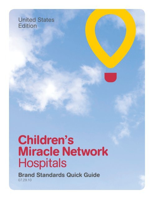
United States<br />
Edition<br />
Children’s<br />
<strong>Miracle</strong> <strong>Network</strong><br />
Hospitals<br />
Br<strong>and</strong> St<strong>and</strong>ards Quick <strong>Guide</strong><br />
07.29.10
Core Elements<br />
Our Signature<br />
The Children’s <strong>Miracle</strong> <strong>Network</strong><br />
Hospitals signature consists of three<br />
elements: the balloon icon, the<br />
Wordmark <strong>and</strong>, in certain instances,<br />
our tagline.<br />
Children’s <strong>Miracle</strong> <strong>Network</strong> Hospitals<br />
has developed an identity system to<br />
strengthen our position <strong>and</strong> organization.<br />
The consistent <strong>and</strong> proper use<br />
of our signature helps build our br<strong>and</strong><br />
<strong>and</strong> increase our name recognition.<br />
As the cornerstone of our visual<br />
identity, the look <strong>and</strong> <strong>usage</strong> of our<br />
signature must be consistent at all<br />
times. Otherwise, the br<strong>and</strong> image<br />
could be adversely affected over time.<br />
A.<br />
Balloon Icon<br />
Wordmark<br />
Tagline<br />
X<br />
B.<br />
2X<br />
2X<br />
Core Mark<br />
A. Core Mark<br />
Our identity is the visual representation of<br />
Children’s <strong>Miracle</strong> <strong>Network</strong> Hospitals <strong>and</strong>,<br />
in essence, our signature. This mark is always<br />
the preferred mark in all applications.<br />
B. Clear Space<br />
The width of the line weight of the balloon<br />
establishes “x,” illustrating the minimum clear<br />
space area to be used in most applications.<br />
C. Minimum Size<br />
In order to maintain readability, minimum sizes<br />
have been established. Do not reproduce the<br />
core version any smaller than 3/4” wide. When<br />
using the tagline, do not reproduce the core<br />
version any smaller than 1” wide.<br />
C.<br />
2X<br />
2X<br />
3/4”<br />
1”
Dynamic<br />
Signature:<br />
Vertical Separation<br />
When employing the Dynamic<br />
Signature, the Wordmark should<br />
always appear in the lower half of a<br />
given layout <strong>and</strong> the corresponding<br />
balloon icon should reside in the<br />
upper half (or slightly above).<br />
We encourage you to elevate the<br />
balloon from the Wordmark as much<br />
as possible to create the feelings of<br />
elevation, motion <strong>and</strong> tension.<br />
Horizontal Separation<br />
Horizontal orientation of the balloon<br />
may also be altered, but when<br />
doing so the balloon should always<br />
be positioned to the right of the<br />
Wordmark—never to the left.<br />
A. B.<br />
Sizing <strong>and</strong> Cropping<br />
When using the Dynamic Signature<br />
there are specifi c rules that must<br />
be followed in order to create a<br />
consistent br<strong>and</strong> character, look <strong>and</strong><br />
feel—as well as to ensure our new<br />
balloon icon is still easily recognized.<br />
A. Preferred Minimum Balloon Size<br />
The size ratio between our Wordmark <strong>and</strong> our<br />
balloon icon in this <strong>usage</strong> is the same ratio of<br />
our core mark. This is always the default <strong>and</strong><br />
preferred ratio between the two elements when<br />
employing the Dynamic Signature. The balloon<br />
should never reduced smaller than this size in<br />
relation to the Wordmark.<br />
C.<br />
B. Maximum Balloon Size<br />
Certain instances may call for the balloon to be<br />
enlarged. In these limited situations the balloon<br />
icon should never become larger than the<br />
corresponding Wordmark’s full width.<br />
The balloon icon in the Dynamic<br />
Signature can be cropped at the top<br />
<strong>and</strong> right sides to reinforce the feeling<br />
that it is in fl ight <strong>and</strong>, when used with<br />
photography, that it is an integrated<br />
element of a l<strong>and</strong>scape environment.<br />
C. Vertical Cropping<br />
The maximum crop from the top of the balloon<br />
is 1/4 the total height of the balloon.<br />
B. Horizontal Cropping<br />
The maximum crop from the right side of the<br />
balloon is 1/4 the total width of the balloon.<br />
D.<br />
1/4 ratio In use<br />
1/4 ratio In use
Color<br />
Signature<br />
Color<br />
Variations<br />
The Children’s <strong>Miracle</strong> <strong>Network</strong><br />
Hospitals logo is only used properly<br />
when reproduced in the specifi ed<br />
Pantone colors, as shown, or in solid<br />
black or white. The logo should not<br />
be reproduced in any other solid<br />
color, except when dealing with<br />
extreme printing limitations such as<br />
apparel applications.<br />
A.<br />
B.<br />
A. Signature on White Background<br />
The two-color yellow <strong>and</strong> red signature is the<br />
default <strong>and</strong> preferred version. CMNH gray <strong>and</strong><br />
black versions can be used in limited printing<br />
situations.<br />
B. Signature on Colored Backgrounds<br />
The signature can be knocked out to white<br />
against our primary <strong>and</strong> secondary color<br />
palettes in limited printing situations, <strong>and</strong>/<br />
or to achieve large, bold areas of color in the<br />
background of a layout.<br />
C.<br />
C. Signature on Photography<br />
When using our signature with photography,<br />
the two-color yellow <strong>and</strong> red signature is still<br />
the preferred version when readability can<br />
be ensured, but it is also encouraged to use<br />
a knocked-out, white version against darker<br />
backgrounds. Black can be used in black-<strong>and</strong>white<br />
or grayscale-only applications.<br />
Color Palette<br />
Color matching formulas should<br />
be optimized for each reproduction<br />
need. Always match the PANTONE®<br />
colors as closely as possible.<br />
Primary Secondary Tertiary<br />
CMNH Yellow<br />
PMS<br />
7406 C<br />
CMNH Red<br />
PMS<br />
193 C<br />
CMNH Gray<br />
PMS<br />
Cool Gray 9 C<br />
White<br />
CMNH<br />
Sky Blue<br />
CMYK<br />
49.11.0.0<br />
CMNH<br />
Medical Green<br />
CMYK<br />
87.0.38.0<br />
CMNH<br />
Light Gray<br />
CMYK<br />
2.0.0.18<br />
CMNH Black