Painting & Composition Rubric - Academy of Art University
Painting & Composition Rubric - Academy of Art University
Painting & Composition Rubric - Academy of Art University

You also want an ePaper? Increase the reach of your titles
YUMPU automatically turns print PDFs into web optimized ePapers that Google loves.
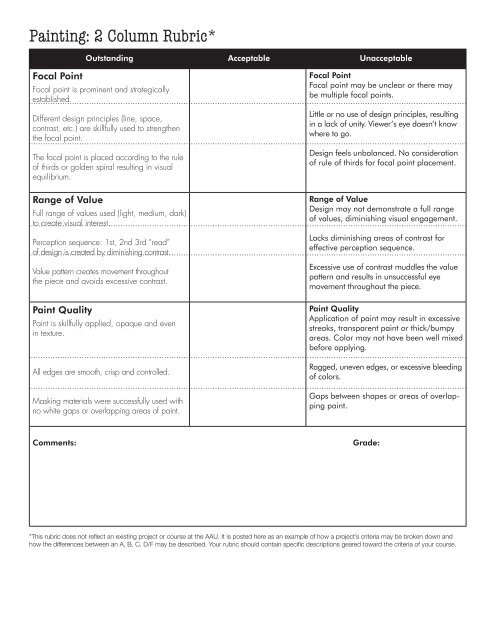
<strong>Painting</strong>: 2 Column <strong>Rubric</strong>*<br />
Outstanding Acceptable Unacceptable<br />
Focal Point<br />
Focal point is prominent and strategically<br />
established.<br />
Different design principles (line, space,<br />
contrast, etc.) are skillfully used to strengthen<br />
the focal point.<br />
The focal point is placed according to the rule<br />
<strong>of</strong> thirds or golden spiral resulting in visual<br />
equilibrium.<br />
Range <strong>of</strong> Value<br />
Full range <strong>of</strong> values used (light, medium, dark)<br />
to create visual interest.<br />
Perception sequence: 1st, 2nd 3rd “read”<br />
<strong>of</strong> design is created by diminishing contrast.<br />
Value pattern creates movement throughout<br />
the piece and avoids excessive contrast.<br />
Paint Quality<br />
Paint is skillfully applied, opaque and even<br />
in texture.<br />
All edges are smooth, crisp and controlled.<br />
Masking materials were successfully used with<br />
no white gaps or overlapping areas <strong>of</strong> paint.<br />
Focal Point<br />
Focal point may be unclear or there may<br />
be multiple focal points.<br />
Little or no use <strong>of</strong> design principles, resulting<br />
in a lack <strong>of</strong> unity. Viewer’s eye doesn’t know<br />
where to go.<br />
Design feels unbalanced. No consideration<br />
<strong>of</strong> rule <strong>of</strong> thirds for focal point placement.<br />
Range <strong>of</strong> Value<br />
Design may not demonstrate a full range<br />
<strong>of</strong> values, diminishing visual engagement.<br />
Lacks diminishing areas <strong>of</strong> contrast for<br />
effective perception sequence.<br />
Excessive use <strong>of</strong> contrast muddles the value<br />
pattern and results in unsuccessful eye<br />
movement throughout the piece.<br />
Paint Quality<br />
Application <strong>of</strong> paint may result in excessive<br />
streaks, transparent paint or thick/bumpy<br />
areas. Color may not have been well mixed<br />
before applying.<br />
Ragged, uneven edges, or excessive bleeding<br />
<strong>of</strong> colors.<br />
Gaps between shapes or areas <strong>of</strong> overlapping<br />
paint.<br />
Comments:<br />
Grade:<br />
*This rubric does not reflect an existing project or course at the AAU. It is posted here as an example <strong>of</strong> how a project’s criteria may be broken down and<br />
how the differences between an A, B, C, D/F may be described. Your rubric should contain specific descriptions geared toward the criteria <strong>of</strong> your course.
<strong>Painting</strong>: 2 Column <strong>Rubric</strong>*<br />
Outstanding Acceptable Unacceptable<br />
Focal Point<br />
Focal point is prominent and strategically<br />
established.<br />
Different design principles (line, space,<br />
contrast, etc.) are skillfully used to strengthen<br />
the focal point.<br />
The focal point is placed according to the rule<br />
<strong>of</strong> thirds or golden spiral resulting in visual<br />
equilibrium.<br />
Focal Point<br />
Focal point may be unclear or there may<br />
be multiple focal points.<br />
✓<br />
Little or no use <strong>of</strong> design principles, resulting<br />
in a lack <strong>of</strong> unity. Viewer’s eye doesn’t know<br />
where to go.<br />
✓<br />
✓<br />
Design feels unbalanced. No consideration<br />
<strong>of</strong> rule <strong>of</strong> thirds for focal point placement.<br />
Range <strong>of</strong> Value<br />
Full range <strong>of</strong> values used (light, medium, dark)<br />
to create visual interest.<br />
Perception sequence: 1st, 2nd 3rd “read”<br />
<strong>of</strong> design is created by diminishing contrast.<br />
Value pattern creates movement throughout<br />
the piece and avoids excessive contrast.<br />
Paint Quality<br />
Paint is skillfully applied, opaque and even<br />
in texture.<br />
All edges are smooth, crisp and controlled.<br />
Some range <strong>of</strong> value<br />
but inconsistant.<br />
Better, careful<br />
<strong>of</strong> streaking.<br />
OK. Work on control.<br />
Range <strong>of</strong> Value<br />
Design may not demonstrate a full range<br />
<strong>of</strong> values, diminishing visual engagement.<br />
✓<br />
Lacks diminishing areas <strong>of</strong> contrast for<br />
effective perception sequence.<br />
✓<br />
Excessive use <strong>of</strong> contrast muddles the value<br />
pattern and results in unsuccessful eye<br />
movement throughout the piece.<br />
Paint Quality<br />
Application <strong>of</strong> paint may result in excessive<br />
streaks, transparent paint or thick/bumpy<br />
areas. Color may not have been well mixed<br />
before applying.<br />
Ragged, uneven edges, or excessive bleeding<br />
<strong>of</strong> colors.<br />
Masking materials were successfully used with<br />
no white gaps or overlapping areas <strong>of</strong> paint.<br />
Comments:<br />
<br />
OK.<br />
Gaps between shapes or areas <strong>of</strong> overlapping<br />
paint.<br />
Grade:_______________<br />
Tasha: Your paint application has really improved<br />
since I last saw this; however, what is challenging about this piece is that I don’t<br />
see a clear focal point. I also see that you attempt to use a range <strong>of</strong> value, but<br />
the value patterns don’t make sense. You use high contrast in some areas where<br />
it seems inappropriate and light value in areas that seem to call for attention.<br />
I suggest that you and I meet to discuss this piece further and to try and get you<br />
on the right track. Let’s also see if there are some workshops you can attend to help<br />
you in these areas.<br />
*This rubric does not reflect an existing project or course at the AAU. It is posted here as an example <strong>of</strong> how a project’s criteria may be broken down and<br />
how the differences between an A, B, C, D/F may be described. Your rubric should contain specific descriptions geared toward the criteria <strong>of</strong> your course.<br />
D