Package 'Heatplus'
Package 'Heatplus'
Package 'Heatplus'
- No tags were found...
You also want an ePaper? Increase the reach of your titles
YUMPU automatically turns print PDFs into web optimized ePapers that Google loves.
8 doLegend<br />
doLegend<br />
A simple legend<br />
Description<br />
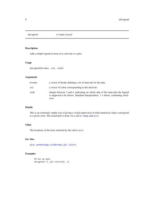
Add a simple legend in form of a color bar to a plot.<br />
Usage<br />
doLegend(breaks, col, side)<br />
Arguments<br />
breaks<br />
col<br />
side<br />
a vector of breaks defining a set of intervals for the data<br />
a vector of colors corresponding to the intervals.<br />
integer between 1 and 4, indicating on which side of the main plot the legend<br />
is supposed to be drawn. Standard interpretation: 1 = below, continuing clockwise.<br />
Details<br />
This is an extremely simple way of giving a visual impression of what numerical values correspond<br />
to a given color. The actual plot is done via a call to image and axis.<br />
Value<br />
The locations of the ticks returned by the call to axis<br />
See Also<br />
plot.annHeatmap, niceBreaks, g2r.colors<br />
Examples<br />
## Set up data<br />
doLegend(1:9, g2r.colors(8), 2)


