


5ml User's Guide

Create successful ePaper yourself
Turn your PDF publications into a flip-book with our unique Google optimized e-Paper software.
mGage Messaging Administration User’s <strong>Guide</strong><br />
<strong>5ml</strong> <strong>User's</strong> <strong>Guide</strong><br />
© 2010-2011 Velti - All rights reserved 1
<strong>5ml</strong> <strong>User's</strong> <strong>Guide</strong><br />
This material is proprietary to Velti ® . It contains trade secrets and confidential information which is solely the<br />
property of Velti ® <strong>5ml</strong>. This material shall not be used, reproduced, copied, disclosed, and transmitted, in<br />
whole or in part, without the express consent of Velti ® .<br />
© Velti ® 2011 All rights reserved.<br />
- 2 -
About This <strong>Guide</strong><br />
About This <strong>Guide</strong><br />
This guide is designed to familiarize new users with Velti ® <strong>5ml</strong>, and to serve as a reference for more experienced users.<br />
This guide is organized as follows:<br />
• Chapter 1: Introduction to <strong>5ml</strong> — introduces the product and provides an overview of its user interface.<br />
• Chapter 2: About Administering Accounts—describes how to manage brands and user accounts for your organization.<br />
• Chapter 3: <strong>5ml</strong> Tutorial — provides an overview of designing a mobile project using <strong>5ml</strong>.<br />
• Chapter 4: Organizing Projects — introduces the My Projects page and describes how to organize projects.<br />
• Chapter 5: Optimizing Projects — describes how to optimize your project using progressive loading settings that<br />
improve the mobile user experience.<br />
• Chapter 6: Importing and Managing Assets — shows how to import your creative assets and use them in multiple<br />
projects.<br />
• Chapter 7: Working in the Project Editor — describes how to use the Project Editor and the Canvas, where you edit<br />
your pages.<br />
• Chapter 8: Customizing Page Elements — describes how to customize page elements by changing their properties<br />
in the Properties pane.<br />
• Chapter 9: Using Common Widgets — shows how to use the Text, Label, and Button widgets, and other form widgets,<br />
for example, Text Input, Checkbox, and List Menu.<br />
• Chapter 10: Using Shape Widgets — shows how to use the Rectangle, Ellipsis, and Triangle widgets.<br />
• Chapter 11: Using Media Widgets — shows how to use the Image, Gallery, Audio, Video, and YouTube widgets.<br />
• Chapter 12: Using Effects and Animation Widgets — shows how to use the 360, Frameset, and Particles widgets.<br />
• Chapter 13: Using Layout and Navigation Widgets — shows how to use the Container, HBox, VBox, Scroll View,<br />
Tab Set and View Set widgets.<br />
• Chapter 14: Using Social Media Widgets — shows how to use the Google +1, Facebook Like, Tweet Button, and<br />
Twitter Follow widgets.<br />
• Chapter 15: Using Map View Widget — shows how to use the Map View widget.<br />
• Chapter 16: Using Web View, HTML, and HTML5 Widgets — shows how to use the Web View, HTML, and HTML5<br />
widgets.<br />
• Chapter 17: Enabling Native Device Functionality — describes how to enable native device functionality, for example,<br />
accelerometer, shake, device orientation, geolocation, and vibration, using events and actions.<br />
• Chapter 18: Adding Site Tracking — shows how to add the capability to track pages and page elements in order to<br />
measure site traffic and user behavior on the site.<br />
- 3 -
<strong>5ml</strong> <strong>User's</strong> <strong>Guide</strong><br />
• Chapter 19: Deploying Your Project — describes how to deploy your project by exporting its files so that you can<br />
transfer them to an external web server or by publishing the project within the <strong>5ml</strong> environment.<br />
- 4 -
Table of Contents<br />
Table of Contents<br />
About This <strong>Guide</strong> 3<br />
Table of Contents 5<br />
CHAPTER 1: Introduction to <strong>5ml</strong> 9<br />
About <strong>5ml</strong> 10<br />
How <strong>5ml</strong> Works 11<br />
First Look at <strong>5ml</strong> 12<br />
CHAPTER 2: About Administering Accounts 15<br />
About Brands 15<br />
About User Accounts 15<br />
Adding a Brand 16<br />
Editing a Brand 17<br />
Disabling a Brand 18<br />
Adding a User Account 19<br />
Editing a User Account 21<br />
Changing a User Account Password 23<br />
Disabling a User Account 26<br />
Deleting a User Account 27<br />
CHAPTER 3: <strong>5ml</strong> Tutorial 28<br />
Getting Started 29<br />
Creating a New Project 30<br />
Organizing Your Assets 32<br />
Adding a Tracing Image 37<br />
Changing the Page Background 40<br />
Adding Text to the Page 43<br />
Adding a 360-degree View 47<br />
Adding and Modifying Images 53<br />
Adding Shapes and Layout Elements 60<br />
Saving the Page 69<br />
Creating a Second Page 70<br />
Creating a Form 71<br />
Adding a Gallery with Captions 75<br />
Adding a Video 80<br />
Adding a Social Media Widget 83<br />
Adding Navigation Links and Transitions 85<br />
Previewing the Page 90<br />
CHAPTER 4: Organizing Projects 91<br />
About the My Projects Page 92<br />
Adding a New Project 94<br />
Importing a Project 97<br />
- 5 -
<strong>5ml</strong> <strong>User's</strong> <strong>Guide</strong><br />
Duplicating a Project 100<br />
Changing Project Settings 102<br />
Showing Pages in a Project 111<br />
Opening a Project 112<br />
Adding a Page to a Project 113<br />
Duplicating a Page in a Project 114<br />
Setting a Project's Home Page 116<br />
Deleting a Page From a Project 118<br />
Deleting a Project 119<br />
Previewing a Project 120<br />
Publishing a Project 123<br />
Exporting a Project 126<br />
Backing Up a Project 127<br />
Restoring a Project 129<br />
CHAPTER 5: Optimizing Projects 132<br />
About Optimizing Projects 133<br />
Optimizing at the Project Level 134<br />
Optimizing at the Page Level 138<br />
Optimizing at the View or Tab Level 141<br />
CHAPTER 6: Importing and Managing Assets 143<br />
Accessing the Library Pane 144<br />
Creating Folders 146<br />
Importing Images 149<br />
Importing Audio 151<br />
Importing Video 152<br />
Deleting Assets 153<br />
CHAPTER 7: Working in the Project Editor 154<br />
About the Project Editor 155<br />
Adding a Page in the Project Editor 157<br />
Using a Tracing Image 158<br />
Changing Page Properties 160<br />
Placing Elements on a Page 168<br />
Resizing Page Elements 171<br />
Aligning Page Elements 175<br />
Arranging and Overlapping Page Elements 181<br />
Showing and Hiding Page Elements 184<br />
Locking and Unlocking Page Elements 185<br />
Rotating Page Elements 186<br />
Copying, Pasting, and Deleting Page Elements 187<br />
Opening and Closing Pages in the Canvas 189<br />
Saving Pages 190<br />
Previewing Pages From the Canvas 191<br />
- 6 -
Table of Contents<br />
Canvas Viewing Options 192<br />
CHAPTER 8: Customizing Page Elements 194<br />
Using the Properties Pane 195<br />
Changing General Properties 197<br />
Changing Appearance Properties 198<br />
Changing Text Properties 208<br />
Changing Layout Properties 214<br />
Changing 3D Transformations Properties 216<br />
Changing Behavior Properties 223<br />
Using the Advanced Properties Pane 232<br />
CHAPTER 9: Using Common Widgets 234<br />
About Common Widgets 235<br />
Using the Text Widget 237<br />
Using the Label Widget 239<br />
Using the Button Widget 241<br />
Using the Text Input Widget 243<br />
Using the Text Area Widget 245<br />
Using the Checkbox Widget 247<br />
Using the Radio Button Widget 249<br />
Using the List Menu Widget 251<br />
Using the Password Input Widget 253<br />
CHAPTER 10: Using Shape Widgets 255<br />
About Shape Widgets 256<br />
Using the Rectangle Widget 257<br />
Using the Ellipsis Widget 258<br />
Using the Triangle Widget 259<br />
CHAPTER 11: Using Media Widgets 260<br />
About Media Widgets 261<br />
Using the Image Widget 263<br />
Using the Gallery Widget 265<br />
Using the Audio Widget 278<br />
Using the Video Widget 281<br />
Using the YouTube Widget 285<br />
CHAPTER 12: Using Effects and Animation Widgets 287<br />
About Effects and Animation Widgets 288<br />
Using the 360 Widget 289<br />
Using the Frameset Widget 297<br />
Using the Particles Widget 304<br />
CHAPTER 13: Using Layout and Navigation Widgets 310<br />
About Layout and Navigation Widgets 311<br />
Using the Container Widget 312<br />
- 7 -
<strong>5ml</strong> <strong>User's</strong> <strong>Guide</strong><br />
Using the 3D Stage Widget 314<br />
Using the HBox Widget 320<br />
Using the VBox Widget 323<br />
Using the Scroll View Widget 325<br />
Using the Tab Set Widget 327<br />
Using the View Set Widget 335<br />
CHAPTER 14: Using Social Media Widgets 345<br />
About Social Media Widgets 346<br />
Using the Google +1 Widget 348<br />
Using the Facebook Like Widget 350<br />
Using the Tweet Button Widget 352<br />
Using the Twitter Follow Widget 354<br />
CHAPTER 15: Using the Map View Widget 356<br />
About the Map View Widget 357<br />
Using the Map View Widget 358<br />
CHAPTER 16: Using Web View, HTML, and HTML5 Widgets 362<br />
About the Web View, HTML, and HTML5 Widgets 363<br />
Using the Web View Widget 364<br />
Using the HTML Widget 366<br />
Using the HTML5 Widget 369<br />
CHAPTER 17: Enabling Native Device Functionality 372<br />
Enabling Native Device Functionality for a Page 373<br />
CHAPTER 18: Adding Site Tracking 374<br />
About Tracking 375<br />
Enabling Google Analytics 376<br />
Tracking Pages 378<br />
Tracking Page Elements 379<br />
CHAPTER 19: Deploying Your Project 381<br />
Publishing a Project 382<br />
Exporting a Project 385<br />
- 8 -
CHAPTER 1: Introduction to <strong>5ml</strong><br />
CHAPTER 1: Introduction to <strong>5ml</strong><br />
This chapter introduces <strong>5ml</strong> and covers the following topics:<br />
• "About <strong>5ml</strong>" on page 10<br />
• "How <strong>5ml</strong> Works" on page 11<br />
• "First Look at <strong>5ml</strong>" on page 12<br />
- 9 -
<strong>5ml</strong> <strong>User's</strong> <strong>Guide</strong><br />
About <strong>5ml</strong><br />
<strong>5ml</strong> makes it easy for you to design and assemble high-impact, highly-interactive rich media content for smartphones,<br />
tablets, and standard web platforms. <strong>5ml</strong> automatically manages the HTML5, CSS3 and JavaScript behind your rich<br />
media content to make the creation of content as easy as point and click.<br />
<strong>5ml</strong> is a software-as-a-service (SaaS) solution you access from your browser to build rich media content such as ads and<br />
web sites, incorporating key HTML5 capabilities such as offline support, smarter mobile forms, and advanced device<br />
features. You can build content projects once to run on any HTML5-compatible device without the time and expense of<br />
coding.<br />
With <strong>5ml</strong>, you can combine images, video clips, interactive galleries, 360-degree views, social media elements,<br />
animation, transition effects, and navigation styles into a rich interactive content experience — all without using thirdparty<br />
browser plug-ins. You can enhance your user's experience with CSS3 specifications such as rounded edges and<br />
borders, text wrapping, gradients, text shadows, background enhancements, and animations. You can also take full<br />
advantage of advanced device features such as the device's camera, accelerometer, gyroscope, and location services.<br />
<strong>5ml</strong> projects can be exported to any web server or published within the <strong>5ml</strong> environment. You can get your mobile<br />
projects up and running quickly with an easy, out-of-the-box self-service solution, or have Velti run all your mobile<br />
projects with our full-service program.<br />
- 10 -
CHAPTER 1: Introduction to <strong>5ml</strong><br />
How <strong>5ml</strong> Works<br />
<strong>5ml</strong> helps advertisers, agencies, and publishers harness the full power of HTML5 to engage consumers with highly<br />
interactive rich media content -- without the need for coding.<br />
HTML5 is already transforming the mobile device landscape by making it possible to enhance mobile ads, web pages,<br />
and rich browser-based applications with new levels of functionality, advanced features, and a streamlined appearance<br />
for an optimal viewing experience. As the newest standard for mobile site design and creation, HTML5 is already<br />
supported on next-generation mobile browsers and platforms.<br />
<strong>5ml</strong>gives you a powerful visual editing canvas to edit the individual pages and share content among them. <strong>5ml</strong> manages<br />
all of your visual assets in a convenient asset library to use with multiple content projects and pages. You can drag and<br />
drop assets onto the free-form canvas and directly manipulate them with real-time viewing-- all from the comfort of your<br />
web browser.<br />
You can preview your rich media content with full interactive control in your browser, in an HTML5-compatible mobile<br />
device's browser, and in a tester app available from your device's app store or marketplace.<br />
- 11 -
<strong>5ml</strong> <strong>User's</strong> <strong>Guide</strong><br />
First Look at <strong>5ml</strong><br />
<strong>5ml</strong> is a software-as-a-service (SaaS) solution you access from your browser at http://www.fiveml.com. You can use<br />
any HTML5-compatible browser, such as Apple Safari, Google Chrome, Mozilla FireFox, or Microsoft Internet Explorer<br />
(version 10). However, some features are disabled on browsers that don't fully support HTML5; Safari and Chrome are<br />
recommended.<br />
To start using <strong>5ml</strong>, enter your account's email address and password, and click the Sign In button, as shown in Figure 1-1<br />
on page 12.<br />
Figure 1-1: Accessing <strong>5ml</strong> from your browser.<br />
The My Projects page appears in your browser's window. You use the My Projects page to:<br />
• Create a new project<br />
• Open a project<br />
• Delete a project<br />
• Preview a project<br />
• Enable tracking for a project<br />
• Add a new page to an existing project<br />
• Import or Export a project<br />
• Back up and Restore a project<br />
• Publish a project<br />
- 12 -
CHAPTER 1: Introduction to <strong>5ml</strong><br />
You learn how to create a project in "Adding a New Project" on page 94. The projects you create appear in a list<br />
underneath the Add New button. Each project can include multiple pages.<br />
Figure 1-2: Organizing your projects on the My Projects page.<br />
After clicking on a project name, you can see the project's pages to the right. Clicking the pencil icon at the bottom of a<br />
page (or double-clicking the page) opens the page in the Project Editor, as shown in Figure 1-3 on page 14.<br />
The Project Editor is comprised of the following:<br />
• The Canvas (center), in which you edit your pages<br />
• The Library pane (top left side), which contains the widgets and your project assets<br />
• The Page Outline pane (bottom left side), which shows the hierarchy of page elements<br />
• The Properties pane (right side), which shows properties you can modify for the selected element on the Canvas<br />
• The menu bar (along the top) with the New button, the Open and Save menus, and the Preview button<br />
To learn how to use the Project Editor and Canvas, see "Working in the Project Editor" on page 154.<br />
- 13 -
<strong>5ml</strong> <strong>User's</strong> <strong>Guide</strong><br />
Figure 1-3: Selecting, adding, and editing page elements and changing properties in the Project Editor.<br />
- 14 -
CHAPTER 2: About Administering Accounts<br />
CHAPTER 2: About Administering Accounts<br />
As the administrator of an organization, you can manage brands and user accounts for your organization.<br />
About Brands<br />
<strong>5ml</strong> allows you to segregate you projects by adding brands to your organization. You can then associate one or more<br />
user accounts to each of your organization's brands.<br />
Administering Brands<br />
• "Adding a Brand" on page 16<br />
• "Editing a Brand" on page 17<br />
• "Disabling a Brand" on page 18<br />
About User Accounts<br />
<strong>5ml</strong> allows you to add user accounts to your organization and brands so that you can manage who has access to your<br />
projects. When you add a user account you can assign the user account one of two types of roles.<br />
• Org Admin–The Org Admin user role can add, edit, and disable brands. This user role can also add, edit, disable,<br />
and delete a user account. In addition, it can work on projects associated with any of the organization's brands.<br />
• Author–The Author user role enables users to work on their brand's projects.<br />
Note: Which functionality a user can access depends on the type of <strong>5ml</strong> account that they have access to; regular or<br />
premium.<br />
Administering User Accounts<br />
• "Adding a User Account" on page 19<br />
• "Editing a User Account" on page 21<br />
• "Changing a User Account Password" on page 23<br />
• "Disabling a User Account" on page 26<br />
• "Deleting a User Account" on page 27<br />
- 15 -
<strong>5ml</strong> <strong>User's</strong> <strong>Guide</strong><br />
Adding a Brand<br />
You can add a brand to an organization from the Administration page. You can add one or more brands to an<br />
organization.<br />
To add a brand:<br />
1. On the Administration page, click Brands, and then Add New.<br />
Figure 2-1: Adding a new brand<br />
The Create New Brand dialog appears.<br />
2. In the Brand Name field, enter a name for the new brand, and click Create.<br />
Figure 2-2: Entering a brand name.<br />
The new brand appears in the Brands list.<br />
- 16 -
CHAPTER 2: About Administering Accounts<br />
Editing a Brand<br />
You can edit an existing brand from the Administration page.<br />
To edit a brand:<br />
1. On the Administration page, click Brands.<br />
2. In the Brands list, select the brand to edit, and click Edit.<br />
Figure 2-1: Editing a brand.<br />
The Edit Brand dialog appears.<br />
3. In the Brand Name field, edit the brand name, and click Apply.<br />
Figure 2-2: Editing the brand name.<br />
The edited brand appears in the Brands list.<br />
- 17 -
<strong>5ml</strong> <strong>User's</strong> <strong>Guide</strong><br />
Disabling a Brand<br />
You can disable a brand from the Administration page. User account's with the Author role will not be able to use a<br />
disabled brand.<br />
To disable a brand:<br />
1. On the Administration page, click Brands.<br />
2. In the Brands list, select the brand to disable, and click Disable.<br />
Figure 2-1: Disabling a brand.<br />
The brand appears disabled in the Brands list.<br />
- 18 -
CHAPTER 2: About Administering Accounts<br />
Adding a User Account<br />
You can add a user account to a brand from the Administration page.<br />
To add a user account:<br />
1. On the Administration page, click Users, and then Add New.<br />
Figure 2-1: Adding a new user<br />
The Create User dialog appears.<br />
2. In the Create User dialog, enter the information for the new user.<br />
a. In the Full Name field, enter the user's first and last name.<br />
b. In the Email field, enter the user's email address. This email address will act at the user's log in account<br />
name.<br />
c. In the Password field, enter a password for the account.<br />
d. In the Verify Password field, enter the password again.<br />
e. From the Role dropdown menu, select a user role. The user role options are Org Admin or Author.<br />
• Org Admin–Use when you want the user to access all brands for the organization and create new<br />
users for the organization.<br />
• Author–Use when you want the user to only author projects.<br />
f. The Organization field displays the name of the organization the new user will belong to.<br />
g. From the Assign To Brands list, select the checkbox for each brand that you want to give the new user<br />
access to.<br />
- 19 -
<strong>5ml</strong> <strong>User's</strong> <strong>Guide</strong><br />
Figure 2-2: Entering the user account information.<br />
3. Click Create.<br />
The new user appears in the Users list.<br />
- 20 -
CHAPTER 2: About Administering Accounts<br />
Editing a User Account<br />
You can edit user account information from the Administration page, including changing the user account password.<br />
To edit a user account:<br />
1. On the Administration page, select the user to edit, and click Edit.<br />
Figure 2-1: Editing a user account.<br />
The Edit User dialog appears.<br />
2. In the Edit User dialog, you can edit the following user account information.<br />
• Full Name<br />
• Password<br />
• Role<br />
• Assign To Brands<br />
- 21 -
<strong>5ml</strong> <strong>User's</strong> <strong>Guide</strong><br />
Figure 2-2: Entering the user account information.<br />
3. Click Apply.<br />
The updated user appears in the Users list.<br />
- 22 -
CHAPTER 2: About Administering Accounts<br />
Changing a User Account Password<br />
You can change a user account password from the Administration page.<br />
To change a user account password:<br />
1. On the Administration page, select the user to edit, and click Edit.<br />
Figure 2-1: Editing a user account.<br />
The Edit User dialog appears.<br />
- 23 -
<strong>5ml</strong> <strong>User's</strong> <strong>Guide</strong><br />
2. In the Edit User dialog, click Change Password.<br />
Figure 2-2: Clicking the Change Password link.<br />
The change password fields appear.<br />
3. In the Password field, enter a new password, and in the Verify Password field re-enter the password.<br />
- 24 -
CHAPTER 2: About Administering Accounts<br />
Figure 2-3: Entering the new password.<br />
4. Click Apply.<br />
The updated user account appears in the Users list.<br />
- 25 -
<strong>5ml</strong> <strong>User's</strong> <strong>Guide</strong><br />
Disabling a User Account<br />
You can disable a user account from the Administration page.<br />
To disable a user account:<br />
1. On the Administration page, click Users.<br />
2. In the Users list, select the user account to disable, and click Disable.<br />
Figure 2-1: Disabling a user account.<br />
The user account appears disabled in the Users list.<br />
- 26 -
CHAPTER 2: About Administering Accounts<br />
Deleting a User Account<br />
You can delete a user account from the Administration page.<br />
To delete a user account:<br />
1. On the Administration page, click Users.<br />
2. In the Users list, select the user account to delete, and click Delete.<br />
Figure 2-1: Deleting a user account.<br />
3. When the confirmation dialog appears, click Delete.<br />
The user account is deleted from the Users list.<br />
- 27 -
CHAPTER 3: <strong>5ml</strong> Tutorial<br />
CHAPTER 3: <strong>5ml</strong> Tutorial<br />
This chapter provides an overview of designing a mobile project using <strong>5ml</strong>. This chapter covers the following topics:<br />
• "Getting Started" on page 29<br />
• "Creating a New Project" on page 30<br />
• "Organizing Your Assets" on page 32<br />
• "Adding a Tracing Image" on page 37<br />
• "Changing the Page Background" on page 40<br />
• "Adding Text to the Page" on page 43<br />
• "Adding a 360-degree View" on page 47<br />
• "Adding and Modifying Images" on page 53<br />
• "Adding Shapes and Layout Elements" on page 60<br />
• "Saving the Page" on page 69<br />
• "Creating a Second Page" on page 70<br />
• "Creating a Form" on page 71<br />
• "Adding a Gallery with Captions" on page 75<br />
• "Adding a Video" on page 80<br />
• "Adding a Social Media Widget" on page 83<br />
• "Adding Navigation Links and Transitions" on page 85<br />
• "Previewing the Page" on page 90<br />
- 28 -
<strong>5ml</strong> <strong>User's</strong> <strong>Guide</strong><br />
Getting Started<br />
Web pages and advertisements need to be attractive and interesting, with rich media elements that keep customers on<br />
the page, and social media elements that encourage sharing and interaction. Web pages and ads must also have a<br />
streamlined appearance for an optimal viewing experience on mobile devices as well as on computers.<br />
With <strong>5ml</strong>, you can quickly create interactive rich media pages and ads for mobile devices and computers without the need<br />
for coding. <strong>5ml</strong> helps you harness the full power of HTML5 and manage your creative assets to produce pages and ads<br />
with stunning images, animation, layout options, navigation, and video. You can also utilize powerful mobile-specific<br />
features, such as tap-to-call and location-based services, which offer not only more convenience, but also more<br />
relevance to mobile users.<br />
This tutorial shows you how to use <strong>5ml</strong> to create a set of web pages designed for a mobile device that include video clips,<br />
an image gallery, navigation and layout elements, animated transitions, and an interactive 360-degree view. You can<br />
drag and drop assets onto the free-form canvas and directly manipulate them with real-time viewing — all from the<br />
comfort of your web browser.<br />
What You'll Learn<br />
In this tutorial you start a new project with multiple pages, and learn how to use the powerful visual editing canvas with<br />
its drag-and-drop interface to edit the individual pages and share content among them. You also learn how to manage all<br />
of your visual assets in a convenient asset library to use with multiple content projects and pages.<br />
The tutorial shows you how to use a page mockup image as a tracing image for placing elements on pages, and how to<br />
add rich media elements to pages, including text, images, video, an image gallery, and a 360-degree view. You also learn<br />
how to create text input forms, how to include navigation buttons and links, and how to preview your pages with full<br />
interactive control in your browser, in an HTML5-compatible mobile device's browser, and in a tester app available from<br />
your device's app store or marketplace.<br />
What You Need<br />
Before you begin, be sure to create an account on the <strong>5ml</strong> site and log into your account, as described in "First Look at<br />
<strong>5ml</strong>" on page 12. You can use any HTML5-compatible browser, such as Apple Safari, Google Chrome, Mozilla FireFox, or<br />
Microsoft Internet Explorer (version 10). However, some features are disabled on browsers that don't fully support<br />
HTML5; Safari and Chrome are recommended.<br />
To complete this tutorial, you need at least a few images and a video clip. You can use any images for the 360-degree<br />
view, but for best results use a set of images that show different perspectives of an object or product (such as a car). You<br />
also need a full-page image to use as a background image for a page. You can use any images as tracing images for the<br />
pages, but for best results use images that are page mockups. You may want to prepare text captions in advance for<br />
images in the image gallery.<br />
- 29 -
CHAPTER 3: <strong>5ml</strong> Tutorial<br />
Creating a New Project<br />
To create a new project, first decide the type of project and the name of the project, see "Adding a New Project" on page<br />
94.<br />
Figure 3-1: Adding a new project.<br />
The new project appears in the list of projects on the My Projects page. To show the details of the project, click the<br />
project name. You can see that the first page has been added to the project.<br />
To open the first page, double-click the page icon, or click the pencil icon in the bottom left corner of the page icon. The<br />
Project Editor appears, as shown in Figure 3-2 on page 31, with the Canvas in the center, the Widgets/Assets pane on the<br />
top left side of the Canvas, the Page Outline on the bottom left side of the Canvas, and the Properties pane on the right<br />
side of the Canvas. The ID field in the Properties pane is set to "Page 1" to identify the page.<br />
- 30 -
<strong>5ml</strong> <strong>User's</strong> <strong>Guide</strong><br />
Figure 3-2: The Project Editor screen.<br />
- 31 -
CHAPTER 3: <strong>5ml</strong> Tutorial<br />
Organizing Your Assets<br />
To create a successful mobile ad or web page, you need to use high-quality creative assets. These assets typically<br />
include graphics, icons, images, and video clips. <strong>5ml</strong> helps you organize your creative assets and use them in multiple<br />
projects and pages. You can use up to 100 MB of storage for storing assets; however, each asset file you import must be<br />
under 10 MB.<br />
To organize and import creative assets, click the Assets tab of the Library pane in the upper left corner of the Project<br />
Editor window, as shown in Figure 3-3 on page 32.<br />
Figure 3-3: Click the Assets tab of the Library pane to show the Assets pane.<br />
Before importing assets, you may want to create folders in the Assets pane first, so that you can import assets directly<br />
into the folders, thereby organizing the assets and making them easier to find.<br />
To create a folder in the Assets pane:<br />
1. Click the create folder button (the folder icon with a plus sign in its center) in the bottom left corner of the Assets<br />
pane, as shown in Figure 3-4 on page 33.<br />
The Folder Name dialog appears with a blank field for entering the folder's name.<br />
- 32 -
<strong>5ml</strong> <strong>User's</strong> <strong>Guide</strong><br />
Figure 3-4: Add a folder to the Assets pane of the Library.<br />
2. Enter the folder's name in the field, and then click the Create button (or click Cancel to cancel the operation).<br />
For example, you might name the folder "people photos", as shown in Figure 3-5 on page 33, if you are going to<br />
upload photos of people.<br />
Figure 3-5: Create the folder and give it a name.<br />
- 33 -
CHAPTER 3: <strong>5ml</strong> Tutorial<br />
3. The folder appears in the Assets pane, along with the Home icon in the upper left corner, as shown in Figure 3-6<br />
on page 34.<br />
Figure 3-6: Selecting the folder in the Assets pane.<br />
4. Repeat steps 1-3 for each folder you want to add.<br />
To import assets directly into a folder:<br />
1. Double-click the folder in the Assets pane (refer to Figure 3-6 on page 34).<br />
2. Choose Images or Videos from the drop-down menu at the top of the Assets pane (under the Assets tab) depending<br />
on which type of asset you are importing — image files or video clips.<br />
3. Click the upload assets button (the document icon with a plus sign on its right side), as shown in Figure 3-7 on page<br />
35.<br />
After clicking the upload assets button, the Select Files to Upload dialog appears, as shown in Figure 3-8 on page<br />
35.<br />
- 34 -
<strong>5ml</strong> <strong>User's</strong> <strong>Guide</strong><br />
Figure 3-7: Add asset files to the Assets pane.<br />
4. Select one or more files, and click the Open button in the bottom right corner of the dialog.<br />
The assets you select are imported directly into the folder you selected in step 1.<br />
Tip: You can import one or more files at once. To select a contiguous range of files to import, click the first file in the<br />
range, and hold down the Shift key while clicking the last file in the range. To select multiple files in a non-contiguous<br />
range, click the first file, and then hold down the Cmd key on a Mac, or the Ctrl key on a Windows PC, while clicking other<br />
files to include them in the range.<br />
Figure 3-8: Select images to import.<br />
- 35 -
CHAPTER 3: <strong>5ml</strong> Tutorial<br />
After importing image and video assets to use in your projects (including any mockup images you may have of your<br />
pages), you can start arranging the assets on your pages. (To learn more about importing and managing assets in the<br />
Assets pane, see "Importing and Managing Assets" on page 143.)<br />
- 36 -
<strong>5ml</strong> <strong>User's</strong> <strong>Guide</strong><br />
Adding a Tracing Image<br />
You may already have mockup images of one or more pages. If so, you can add them as guides for placing assets on<br />
your pages. Similar to using tracing paper to trace over an image, you can place a mockup image on the page and control<br />
its opacity, so that you can see the mockup as a tracing image behind the actual page.<br />
To assign the mockup image as a tracing image:<br />
1. Click the blank page in the Canvas to select it, or select Page in the Page Outline pane on the lower left side of the<br />
Project Editor.<br />
After selecting the page, the page properties appear in the Properties pane on the right side of the Project Editor.<br />
2. Drag the mockup image from the Assets pane to the tracing image well in the Properties pane (as shown in Figure<br />
3-9 on page 37, with a mockup image titled "Home.png").<br />
Figure 3-9: Dragging a mockup image to use as a tracing image on the page.<br />
3. Click the Tracing Image option above the tracing image well to turn it on.<br />
After clicking this option, the tracing image appears on the page.<br />
4. Drag the Opacity slider, which is beneath the tracing image well, to the left in order to decrease the tracing image<br />
opacity so that it fades out, as shown in Figure 3-10 on page 38, making the page and the elements you add to the<br />
page more visible.<br />
- 37 -
CHAPTER 3: <strong>5ml</strong> Tutorial<br />
Figure 3-10: Dragging the Opacity slider to decrease the tracing image's opacity.<br />
(For more details on using a mockup image as a tracing image, see "Using a Tracing Image" on page 158.)<br />
The tracing image shows a dark gray page with text and graphic elements. In order to set the background for the page so<br />
that it matches the dark gray background of the tracing image, start by increasing the opacity of the tracing image to see<br />
the actual background color:<br />
1. Click on the page in the Canvas (if it is not already selected).<br />
After selecting the page, the page properties appear in the Properties pane on the right side of the Project Editor.<br />
2. Drag the Opacity slider to the right in order to increase the tracking image opacity so that you can see the mockup<br />
image as a normal image, as shown in Figure 3-11 on page 39.<br />
- 38 -
<strong>5ml</strong> <strong>User's</strong> <strong>Guide</strong><br />
Figure 3-11: Increasing the opacity of the tracing image.<br />
After increasing the tracing image's opacity, it is now easier to change the background color of the page to match the<br />
background color of the mockup.<br />
- 39 -
CHAPTER 3: <strong>5ml</strong> Tutorial<br />
Changing the Page Background<br />
The mockup for the page, which is used as a tracing image, shows a dark gray page with text and graphic elements. To<br />
change the page background so that it has the same dark gray color as the mockup's background:<br />
1. Click on the page in the Canvas (if it is not already selected).<br />
After selecting the page, the page properties appear in the Properties pane on the right side of the Project Editor.<br />
2. Click on the Properties pane's Appearance tab.<br />
3. Choose Color for the Background drop-down menu, as shown in Figure 3-12 on page 40.<br />
The color picker appears in the Properties pane.<br />
Figure 3-12: Choosing Color from the Background menu.<br />
4. Click inside the HTML color code box underneath the Background drop-down menu to show the color picker.<br />
5. Click inside the color picker to pick the color.<br />
6. Drag the slider on the right side of the color picker to adjust the value of the color component to a dark gray, as<br />
shown in Figure 3-13 on page 41.<br />
- 40 -
<strong>5ml</strong> <strong>User's</strong> <strong>Guide</strong><br />
Figure 3-13: Picking a color and adjusting its value to dark gray.<br />
7. Click on the Properties pane's General tab.<br />
8. Drag the Opacity slider, which is beneath the tracing image well, to the left in order to reduce the tracing image<br />
opacity so that it fades out.<br />
You can now see the page background set to dark gray, as shown in Figure 3-14 on page 42. (For more details on<br />
changing the page properties, including the page's background and border, see "Changing Page Properties" on page<br />
160.)<br />
- 41 -
CHAPTER 3: <strong>5ml</strong> Tutorial<br />
Figure 3-14: Dragging the Opacity slider for the tracing image to the left to set it to zero in order to see the ad page<br />
background.<br />
- 42 -
<strong>5ml</strong> <strong>User's</strong> <strong>Guide</strong><br />
Adding Text to the Page<br />
Before adding elements to the page, you can increase the opacity of the tracing image for guidance. Drag the Opacity<br />
slider, beneath the tracing image well, to the right to increase its opacity.<br />
The mockup for the page shows a text headline and page title. To add this text to the ad page you can use either the Text<br />
tab or the General tab's HTML Editor. The following procedure shows how to add text using the Text tab:<br />
1. Click the Widgets tab in the Library pane to show the Widgets pane, as shown in Figure 3-15 on page 43.<br />
Figure 3-15: Selecting the Widgets pane.<br />
2. Drag the Text widget from the Widgets pane to the page over the text headline and title in the tracing image, as<br />
shown in Figure 3-16 on page 43.<br />
Figure 3-16: Dragging the Text widget to the page.<br />
- 43 -
CHAPTER 3: <strong>5ml</strong> Tutorial<br />
3. Drag the Text widget to create a Text element that covers the headline "2010 Deus."<br />
4. Drag the handles on the element's corners and edges to resize it to fit over the headline.<br />
Tip: When placing an element on the page, you can drag it freely to any position, and also use the arrow keys on your<br />
keyboard to move an element precisely in one direction, such as up, down, left, or right (for details on placing elements,<br />
see "Placing Elements on a Page" on page 168). To resize an element, drag one of the handles along the edges or at the<br />
corner of the element (for details, see "Resizing Page Elements" on page 171).<br />
5. Double-click the Text element to add text to it, and type "2010 Deus".<br />
6. Select the text in the Text element, as shown in Figure 3-17 on page 44.<br />
Figure 3-17: Selecting the text in the Text element.<br />
7. Click on the Properties pane's Text tab, and change the Text element's font family and size, and set the text to<br />
bold, as shown in Figure 3-18 on page 45, so that it matches the text in the tracing image.<br />
- 44 -
<strong>5ml</strong> <strong>User's</strong> <strong>Guide</strong><br />
Figure 3-18: Changing the Text element's font family and size, and setting it to bold.<br />
8. Click inside the HTML color code box underneath the Font Family menu (refer to Figure 3-18 on page 45).<br />
9. Select a color in the color picker, and drag the slider to white, as shown in Figure 3-19 on page 45.<br />
Figure 3-19: Setting the text color to white.<br />
- 45 -
CHAPTER 3: <strong>5ml</strong> Tutorial<br />
10. Repeat steps 2-9 for the text "Built for Speed."<br />
11. Repeat steps 2-9 for the text "385 HP @7200 rpm."<br />
(For more details on editing and changing Text element properties, see "Changing Text Properties" on page 208).<br />
- 46 -
<strong>5ml</strong> <strong>User's</strong> <strong>Guide</strong><br />
Adding a 360-degree View<br />
The mockup for the Deus project's first page also shows the image of a car, which should actually be a 360-degree view<br />
that shows the car as if it were rotating on a pedestal. You use a set of images to simulate this 360-degree view.<br />
The 360 widget creates an element that can show all the images of a 360-degree view. You can set up the 360 element to<br />
cycle through the images automatically, or to enable users to navigate through the cycle of images by swiping with a<br />
finger or dragging with a mouse.<br />
To add the 360-degree view:<br />
1. Click the Widgets tab in the Library pane to show the Widgets pane.<br />
2. Choose Effects & Animation from the drop-down menu at the top of the Widgets pane.<br />
3. Drag the 360 widget from the Widgets pane to the Canvas and position it over the car image in the tracing image,<br />
as shown in Figure 3-20 on page 47.<br />
Figure 3-20: Dragging the 360 widget to the page.<br />
4. Prepare to align the 360 element to the side of the page by clicking the Snap to Parent button to turn it on, as<br />
shown in Figure 3-21 on page 48.<br />
- 47 -
CHAPTER 3: <strong>5ml</strong> Tutorial<br />
Figure 3-21: Clicking Snap to Parent to prepare to align the 360 element to the parent (the page).<br />
5. Click the Align Left button, as shown in Figure 3-22 on page 48, to align the element to the left side of the page.<br />
(To learn more about aligning page elements, see "Aligning Page Elements" on page 175.)<br />
Figure 3-22: Clicking Align Left to align the element to the left side of the page.<br />
- 48 -
<strong>5ml</strong> <strong>User's</strong> <strong>Guide</strong><br />
6. Resize the element by dragging one of the handles on its edges or corners, as shown in Figure 3-23 on page 49.<br />
(To learn more about resizing elements on the page, see "Resizing Page Elements" on page 171.)<br />
Figure 3-23: Resizing the element by dragging a corner handle.<br />
7. To find the images for the 360-degree view, click the Assets tab at the top of the Library pane.<br />
8. Double-click the folder that contains the images (if you organized your images into folders, as described in "Organizing<br />
Your Assets" on page 32).<br />
9. Choose Images from the Assets drop-down menu to see your image assets.<br />
10. Select the first image of the 360-degree view, and drag it to the 360 element as shown in Figure 3-24 on page 50.<br />
- 49 -
CHAPTER 3: <strong>5ml</strong> Tutorial<br />
Figure 3-24: Dragging the first image of the 360-degree view to the 360 element.<br />
11. Select the second image of the 360-degree view in the Assets pane, and hold down Shift while selecting the last<br />
image in order to select the entire range (from the second image to the last), as shown in Figure 3-25 on page 50.<br />
Figure 3-25: Selecting the rest of the images at once for the 360 element.<br />
12. Drag the selected images from the Assets pane to the Photos list in the Properties pane, as shown in Figure 3-26<br />
on page 51.<br />
- 50 -
<strong>5ml</strong> <strong>User's</strong> <strong>Guide</strong><br />
Figure 3-26: Dragging the rest of the images into the Photos list for the 360 element.<br />
The images are now listed in the Photos list, as shown in Figure 3-27 on page 52. You can click the arrow buttons<br />
underneath the images in the 360 element to see each one. You can also click the add (+) or delete (-) buttons to add<br />
another image or delete an image. (You can even reorder the images in the Photos list as described in "Using the 360<br />
Widget" on page 289.)<br />
- 51 -
CHAPTER 3: <strong>5ml</strong> Tutorial<br />
Figure 3-27: Showing the next image in the 360 element.<br />
By default, the Playback drop-down menu under the Photos list is set to On Swipe. This playback mode enables the user<br />
to swipe with a finger or drag with a mouse through the 360-degree view manually. (For more details on using the 360<br />
widget, see "Using the 360 Widget" on page 289.)<br />
- 52 -
<strong>5ml</strong> <strong>User's</strong> <strong>Guide</strong><br />
Adding and Modifying Images<br />
You can drag images directly to the page and then modify them as needed to match the layout of your page mockup. <strong>5ml</strong><br />
creates an Image element for each image you drag to the page.<br />
For example, to add the "GALLERY" image:<br />
1. Click the Assets tab at the top of the Library pane.<br />
2. Double-click the folder that contains the image (if you organized your images into folders, as described in "Organizing<br />
Your Assets" on page 32).<br />
3. Select Images from the Assets drop-down menu to see your image assets.<br />
4. Drag the image from the Assets pane to the page, as shown in Figure 3-28 on page 53.<br />
Figure 3-28: Dragging the "GALLERY" image directly to the page.<br />
5. Drag the newly created Image element into position using the tracing image as a guide.<br />
6. Resize the element if necessary by dragging one of the handles along the edges or at the corner of the element.<br />
7. To add the "TEASER" image, repeat steps 4-6 (refer to Figure 3-29 on page 54).<br />
Tip: When placing an element on the page, you can drag it freely to any position, and also use the arrow keys on your<br />
keyboard to move an element precisely in one direction, such as up, down, left, or right (for details on placing elements,<br />
see "Placing Elements on a Page" on page 168 and for details on aligning elements, see "Aligning Page Elements" on page<br />
- 53 -
CHAPTER 3: <strong>5ml</strong> Tutorial<br />
175. To resize an element, drag one of the handles along the edges or at the corner of the element (for details, see<br />
"Resizing Page Elements" on page 171).<br />
Figure 3-29: Dragging the "TEASER" image to the page and moving it into position.<br />
If your image assets are ready to use, you can drag them to the page, and <strong>5ml</strong> creates the Image elements for you.<br />
However, if your image assets are not yet ready to use, you can drag an Image widget as a placeholder, and then add<br />
the image to it later.<br />
For example, to add an Image widget for the logo behind the "GALLERY" and "TEASER" images:<br />
1. Click the Widgets tab in the Library pane to show the Widgets pane.<br />
2. Choose Media from the drop-down menu at the top of the Widgets pane.<br />
3. Drag the Image widget from the Widgets pane to the page, as shown in Figure 3-30 on page 55, over the logo<br />
image in the bottom half of the tracing image.<br />
- 54 -
<strong>5ml</strong> <strong>User's</strong> <strong>Guide</strong><br />
Figure 3-30 : Dragging an Image widget to the page.<br />
Later, when the image asset is ready to use, you can drag it to the Image element to fill the element with the image, as<br />
shown in Figure 3-31 on page 56.<br />
- 55 -
CHAPTER 3: <strong>5ml</strong> Tutorial<br />
Figure 3-31: Dragging an image asset to the Image element.<br />
After adding the image to the Image element, drag the Image element into position to cover the logo in the tracing image,<br />
as shown in Figure 3-32 on page 57.<br />
- 56 -
<strong>5ml</strong> <strong>User's</strong> <strong>Guide</strong><br />
Figure 3-32: Dragging the Image element (with its image) into position.<br />
The image of the logo is in position, but it needs to appear behind the other images, and it needs to be transparent. To<br />
modify the Image element:<br />
1. Click on the Image element to select it (if it is not already selected).<br />
2. Click the Send to Back button at the top of the Canvas, as shown in Figure 3-33 on page 58.<br />
Send to Back places the Image element behind all other elements on the page. An overlapping element can<br />
appear either in front of or behind another element depending on its position in the hierarchy of elements in the<br />
Page Outline pane on the lower left side of the Project Editor. The Page Outline pane shows that the Image<br />
element is now below the other elements in the hierarchy, which means it appears behind the other elements. You<br />
can click the Move Forward, Move Backward, Bring to Front, and Send to Back buttons at the top of the Canvas (to<br />
the left of the alignment buttons) to arrange the elements in the hierarchy. (For details on arranging elements, see<br />
"Arranging and Overlapping Page Elements" on page 181<br />
- 57 -
CHAPTER 3: <strong>5ml</strong> Tutorial<br />
Figure 3-33: Clicking Send to Back to arrange the Image element to be behind all of the other elements on the page.<br />
3. Drag the Opacity slider in the Appearance tab of the Properties pane to the left in order to reduce the opacity of the<br />
element, as shown in Figure 3-34 on page 59.<br />
- 58 -
<strong>5ml</strong> <strong>User's</strong> <strong>Guide</strong><br />
Figure 3-34: Reducing the opacity of the image by dragging the Opacity slider.<br />
- 59 -
CHAPTER 3: <strong>5ml</strong> Tutorial<br />
Adding Shapes and Layout Elements<br />
<strong>5ml</strong> offers shape and layout widgets you can use to lay out sections of the page. The Rectangle widget lets you create a<br />
rectangle, which you can also use to create a horizontal or vertical line. The Container widget lets you create a<br />
rectangular area on the page that can hold other elements.<br />
To add a light gray line at the bottom of the page (as it appears in the tracing image), use the Rectangle widget:<br />
1. Click the Widgets tab at the top of the Library pane to show the Widgets pane.<br />
2. Choose Shapes in the drop-down menu to see the Rectangle widget.<br />
3. Drag the Rectangle widget from the Widgets pane to the page in the Canvas, as shown in Figure 3-35 on page 60.<br />
Figure 3-35: Dragging the Rectangle widget to the Canvas.<br />
4. Resize and position the Rectangle element by entering its size and coordinates in the Layout tab of the Properties<br />
pane, as shown in Figure 3-36 on page 61.<br />
Tip: Although you can resize the element by dragging one of the handles on the element's edges or corners, you<br />
can also enter exact pixel dimensions in the Width and Height fields next to the Size heading in the Layout tab of<br />
the Properties pane. (To learn more about resizing page elements, see "Resizing Page Elements" on page 171.)<br />
Tip: Although you can move an element into position on the page by dragging it, you can also enter the X (width)<br />
and Y (height) coordinates in pixels in the X and Y fields next to the Position heading in the Layout tab of the<br />
- 60 -
<strong>5ml</strong> <strong>User's</strong> <strong>Guide</strong><br />
Properties pane. (To learn more about positioning elements on the page, see "Placing Elements on a Page" on<br />
page 168.)<br />
Figure 3-36: Resizing and positioning the Rectangle element by entering pixel values in the Layout tab of the Properties<br />
pane.<br />
5. Choose Color for the Background drop-down menu in the Appearance tab of the Properties pane.<br />
6. Click inside the HTML color code box underneath the Background drop-down menu to show the color picker.<br />
7. Click inside the color picker to pick a color.<br />
8. Drag the slider on the right side of the color picker to adjust the value of the color component to a light gray to<br />
match the gray line in the tracing image, as shown in Figure 3-37 on page 62.<br />
- 61 -
CHAPTER 3: <strong>5ml</strong> Tutorial<br />
Figure 3-37: Changing the background color of the Rectangle element.<br />
To create a navigation bar with buttons at the bottom of the page that matches the tracing image, use a Container widget,<br />
which can hold other elements, such as images for navigation buttons. After dragging the Container widget to create the<br />
Container element, you can drag other widgets or assets into the Container element. If you need the Container element<br />
with its assets or elements on another page, you can simply copy and paste the entire Container element to the other<br />
page without having to copy each individual asset or element within the Container element.<br />
To create the navigation bar with the Container widget:<br />
1. Click the Widgets tab at the top of the Library pane to show the Widgets pane.<br />
2. Choose Layout in the drop-down menu to see the layout widgets, including the Container widget.<br />
3. Drag the Container widget from the Widgets pane to the page in the Canvas, as shown in Figure 3-38 on page 63.<br />
- 62 -
<strong>5ml</strong> <strong>User's</strong> <strong>Guide</strong><br />
Figure 3-38: Dragging the Container widget to the page to create a navigation bar.<br />
Resize and position the Container widget element by entering its size and coordinates in the Layout tab of the Properties<br />
pane, as shown in Figure 3-39 on page 63.<br />
Figure 3-39: Resizing and positioning the Container element by entering pixel values in the Layout tab of the Properties<br />
pane.<br />
- 63 -
CHAPTER 3: <strong>5ml</strong> Tutorial<br />
To add an image and a text label to the Container element:<br />
1. Click the Assets tab at the top of the Library pane.<br />
2. Double-click the folder that contains the image (if you organized your images into folders, as described in "Organizing<br />
Your Assets" on page 32).<br />
3. Select Images from the Assets drop-down menu to see your image assets.<br />
4. Drag the image from the Assets pane to the Container element, as shown in Figure 3-40 on page 64.<br />
Figure 3-40: Dragging an image into the Container element.<br />
5. Click the Widgets tab at the top of the Library pane to show the Widgets pane.<br />
6. Choose Common in the drop-down menu to see the common widgets, including the Label widget.<br />
7. Drag the Label widget from the Widgets pane to the Container element, as shown in Figure 3-41 on page 65.<br />
- 64 -
<strong>5ml</strong> <strong>User's</strong> <strong>Guide</strong><br />
Figure 3-41: Adding a Label widget to the Container element.<br />
8. In the General tab of the Properties pane, change the the Label element's Text field (refer to Figure 3-41 on page<br />
65) to the appropriate text ("Visit Deus Online").<br />
9. In the Text tab of the Properties pane, change the Label element's font family and size in the Font Family and Size<br />
drop-down menus to match the text in the tracing image.<br />
10. Click inside the HTML color code box underneath the Font Family menu to change the text color for the Label element.<br />
11. Select a color in the color picker, and drag the slider on the right side of the color picker to a shade of gray, as<br />
shown in Figure 3-42 on page 66.<br />
- 65 -
CHAPTER 3: <strong>5ml</strong> Tutorial<br />
Figure 3-42: Changing the text color of the Label element.<br />
To add the final element to the Container and change the Container element's background color to white (as it appears in<br />
the tracing image):<br />
1. Select the Container element by clicking Container in the Page Outline pane in the lower left side of the Project<br />
Editor window.<br />
Tip: To select the Container element, you can click it on the page; however, if there are too many elements in the<br />
way, it may be easier to click Container in the Page Outline pane to select the element.<br />
2. Click the Assets tab at the top of the Library pane.<br />
3. Double-click the folder that contains the image (if you organized your images into folders, as described in "Organizing<br />
Your Assets" on page 32).<br />
4. Choose Images from the Assets drop-down menu.<br />
5. Drag the image to the Container element, as shown in Figure 3-43 on page 67 (the external link icon).<br />
- 66 -
<strong>5ml</strong> <strong>User's</strong> <strong>Guide</strong><br />
Figure 3-43: Adding an image to the Container element.<br />
6. Select the Container element again (see step 1).<br />
7. Choose Color from the Background drop-down menu in the Appearance tab of the Properties pane.<br />
8. Click inside the HTML color code box underneath the Background drop-down menu to show the color picker.<br />
9. Click inside the color picker to select a color.<br />
10. Drag the slider on the right side of the color picker to adjust the value of the color component to white, as shown in<br />
Figure 3-44 on page 68.<br />
- 67 -
CHAPTER 3: <strong>5ml</strong> Tutorial<br />
Figure 3-44: Changing the background color of the Container element.<br />
- 68 -
<strong>5ml</strong> <strong>User's</strong> <strong>Guide</strong><br />
Saving the Page<br />
You must save the page in order to preserve the changes you made. To save the page, click the Save menu at the top of<br />
the Project Editor window, and choose Save, as shown in Figure 3-45 on page 69.<br />
Figure 3-45: Saving the page.<br />
Tip: To see the finished page with all of its elements, select Page in the Page Outline pane, and click the Tracing Image<br />
option in the General tab of the Properties pane to turn the option off, so that the tracing image is no longer visible. Note<br />
that the tracing image (whether on or off) is not shown on the actual page.<br />
- 69 -
CHAPTER 3: <strong>5ml</strong> Tutorial<br />
Creating a Second Page<br />
To create the next page in the Project Editor, click the New button in the top row of menus and buttons in the Project<br />
Editor window.<br />
The new page appears in the Canvas, and a new tab also appears above the Canvas with the page number. You can<br />
switch from one page to another by clicking the tab for the page above the Canvas.<br />
To assign a mockup image as a tracing image for the new page:<br />
1. Select the blank page in the Canvas by clicking on it.<br />
2. Drag the mockup image from the Assets pane to the tracing image well in the Properties pane.<br />
3. Click the Tracing Image option above the tracing image well to turn it on.<br />
4. Drag the Opacity slider next to the tracing image well to the left, as shown in Figure 3-46 on page 70, to lower the<br />
tracing image opacity.<br />
Figure 3-46: Adding a tracing image to the new page.<br />
- 70 -
<strong>5ml</strong> <strong>User's</strong> <strong>Guide</strong><br />
Creating a Form<br />
You can use many of the Common widgets to create forms that enable you to request and gather information about<br />
users. For example, you can request users to enter their email address or mobile number, which you can use later to<br />
contact them.<br />
In this example, you will create a form using Text Input, Radio Button, and Button widgets. To add other form widgets,<br />
for example, Text Area, Checkboxes, Password Input, see "Using Common Widgets" on page 234.<br />
To create a new page for the form, click the New button in the top row of menus and buttons in the Project Editor<br />
window. The new page appears in the Canvas.<br />
To create a form using Common widgets:<br />
1. Click the Widgets tab in the Library pane to show the Widgets pane.<br />
2. Choose Common from the drop-down menu at the top of the Widgets pane.<br />
3. Add text input fields:<br />
a. Drag the Text Input widget from the Widgets pane to the Canvas.<br />
b. Resize and position the Text Input element.<br />
c. In the Properties pane to the right, in the Prompt Text field, enter prompt text for the new Text Input element.<br />
For example, enter Name.<br />
d. In the Max Chars field, enter the maximum number of characters for the Name text input field. For example,<br />
enter 25.<br />
e. Drag an additional Text Input widget from the Widgets pane to the Canvas for each of the remaining text<br />
input fields that you will use in this example; Mobile, Subject, and Email. For each Text Input element enter<br />
prompt text and its maximum number of characters.<br />
Figure 3-47: Adding Text Input elements to the form<br />
- 71 -
CHAPTER 3: <strong>5ml</strong> Tutorial<br />
4. Add a Radio Button group:<br />
a. Drag the Radio Button widget from the Widgets pane to the Canvas.<br />
b. Resize and position the Radio Button element.<br />
c. In the Properties pane to the right, in the Value field, enter a value for the new Radio Button element. For<br />
example, enter 1.<br />
d. In the Text field, enter a label for the Radio Button element. For example, enter TV.<br />
e. Drag an additional two Radio Button widgets from the Widgets pane to the Canvas. For each Radio Button<br />
element, enter a unique Value and Text label. For example, 2 and Radio, and 3 and Other.<br />
Note: Within a group of Radio Button elements, each Radio Button element's Value field must contain a<br />
unique value.<br />
f. Edit the second and third Radio Button element's ID field to match the first Radio Button element's ID value.<br />
Note: To create a group of Radio Button elements, each Radio Button element's ID field must contain the<br />
exact same value.<br />
g. Now that each Radio Button element has the same ID and each has a unique Value, you can select which<br />
Radio Button element will be set as the default Radio Button element. On the Canvas select the default<br />
Radio Button element, and in the Properties pane, select the Checked check box.<br />
Figure 3-48: Adding JavaScript code to create the Custom Function sendForm<br />
5. Add a submit button and JavaScript code:<br />
In order to gather the user entered data, you need to write custom JavaScript code to capture the data from the<br />
specific fields in your form. You also need to provide a way to execute the JavaScript code. To do this you can add<br />
a Button element to the page and on the Button element's Behavior tab, you can select an event and action. For<br />
example, on clicking (onclick) the button the JavaScript code (Custom Function) executes.<br />
- 72 -
<strong>5ml</strong> <strong>User's</strong> <strong>Guide</strong><br />
a. Drag the Button widget from the Widgets pane to the Canvas.<br />
b. Resize and position the Button element.<br />
c. In the Properties pane to the right, on the General tab, in the Text field, enter a label for the submit Button<br />
element. For example, enter Sign Up Now!<br />
d. In the Properties pane to the right, click on the Behavior tab, and then click Edit Script. Copy and paste your<br />
custom JavaScript code into the Script Editor. For example, Figure 3-47 on page 71 shows example<br />
JavaScript code for the sendForm custom function.<br />
Figure 3-49: Adding JavaScript code to create the Custom Function sendForm<br />
e. Click Done.<br />
f. In the Properties pane to the right, on the Behavior tab, click the add Behavior button ( ).<br />
g. From the Event drop-down menu, select an event. For example, select onclick.<br />
h. From the Action drop-down menu, select Custom Function.<br />
i. From the Function drop-down menu, select the name of the Custom Function that you added to the Script<br />
Editor. For example, select sendForm.<br />
j. Click Add.<br />
6. Click Save.<br />
The Behavior field displays the Custom Function that submits the form's data.<br />
Figure 3-50: Associating the sendForm Custom Function with the submit Button element<br />
on page 71<br />
- 73 -
- 74 -<br />
CHAPTER 3: <strong>5ml</strong> Tutorial
<strong>5ml</strong> <strong>User's</strong> <strong>Guide</strong><br />
Adding a Gallery with Captions<br />
The Gallery widget creates an interactive gallery of images with captions for each image, and includes controls for users<br />
to navigate back and forth through the images. An interactive gallery can be entertaining as well as informative, and it<br />
provides a way to show multiple images with captions on a single page.<br />
To add the Gallery widget:<br />
1. Click the Widgets tab in the Library pane to show the Widgets pane.<br />
2. Choose Media from the drop-down menu at the top of the Widgets pane.<br />
3. Drag the Gallery widget from the Widgets pane to the Canvas.<br />
4. Resize and position the new Gallery element using the tracing image as a guide, as shown in Figure 3-51 on page<br />
75, so that the caption ("") aligns with the caption in the tracing image.<br />
Figure 3-51: Placing a Gallery widget and resizing it (using the tracing image as a guide).<br />
To add the first image to the Gallery element:<br />
1. Click the Assets tab in the Library pane.<br />
2. Double-click the folder that contains the images (if you organized your images into folders, as described in "Organizing<br />
Your Assets" on page 32).<br />
3. Choose Images from the Assets drop-down menu to see your image assets.<br />
4. Drag the first image from the Assets pane to the Gallery element, as shown in Figure 3-52 on page 76.<br />
- 75 -
CHAPTER 3: <strong>5ml</strong> Tutorial<br />
Figure 3-52: Dragging the first image into the Gallery element.<br />
The images in the Gallery element are listed in the Photos list in the General tab of the Photo Gallery Properties pane as<br />
you add them. You can add the rest of the images to the Gallery element by selecting them in the Assets pane and<br />
dragging them directly to the Photos list, as shown in Figure 3-53 on page 76.<br />
Figure 3-53: Dragging several images to the Photos list to add them at once to the Gallery element.<br />
- 76 -
<strong>5ml</strong> <strong>User's</strong> <strong>Guide</strong><br />
You can reorder the images in the Gallery element by selecting an image in the Photos list and clicking the up or down<br />
arrows at the bottom right corner of the Photos list, as shown in Figure 3-54 on page 77.<br />
Figure 3-54: Moving the selected image up in the order of images in the Gallery element.<br />
To place captions at the bottom of the Gallery element:<br />
1. Choose Bottom in the Captions drop-down menu under the Photos list in the Photo Gallery Properties pane (if it is<br />
not already selected).<br />
2. Click inside the caption area of an image in the Gallery element.<br />
The Label (caption) properties appear in the Properties pane, as shown in Figure 3-55 on page 78.<br />
- 77 -
CHAPTER 3: <strong>5ml</strong> Tutorial<br />
Figure 3-55: Selecting the caption area to show the Label properties in the Properties pane.<br />
3. Enter the caption text in the Text field in the General tab at the top of the Label properties.<br />
The caption text appears in the caption area on the page, and is also listed in the Photos section of the Photo<br />
Gallery Properties pane.<br />
4. To switch to another image and add another caption, select the full Gallery element again, and click the Show Next<br />
or Show Previous button on the right side of the gallery controls, as shown in Figure 3-56 on page 78.<br />
5. Repeat steps 2-4 to add captions to the other images in the Gallery element.<br />
Figure 3-56: Clicking the Show Next button to show the next image in the Gallery element.<br />
- 78 -
<strong>5ml</strong> <strong>User's</strong> <strong>Guide</strong><br />
You can change the size of the caption area, place captions at the bottom or top of the images, or overlay the captions<br />
over the images, as well as change the appearance, text, and layout properties for the captions. For details, see "Using<br />
the Gallery Widget" on page 265.<br />
To save the page before adding more elements or creating another page, click the Save menu at the top of the Project<br />
Editor window, and choose Save.<br />
- 79 -
CHAPTER 3: <strong>5ml</strong> Tutorial<br />
Adding a Video<br />
You can use the Video widget to place a video element on the page with controls for users to play or pause the video, and<br />
rewind, scrub through, or fast-forward through the video.<br />
To create a new page for the video, click the New button in the top row of menus and buttons in the Project Editor<br />
window. The new page appears in the Canvas. To assign a mockup image as a tracing image for the new page, see<br />
"Adding a Tracing Image" on page 37.<br />
To add the Video widget:<br />
1. Click the Widgets tab in the Library pane to show the Widgets pane.<br />
2. Choose Media from the drop-down menu at the top of the Widgets pane.<br />
3. Drag the Video widget from the Widgets pane to the Canvas.<br />
4. Resize and position the Video element using the tracing image as a guide, as shown in Figure 3-57 on page 80.<br />
Figure 3-57: Placing a Video element and resizing it (using the tracing image as a guide)<br />
To add a video to the Video widget element:<br />
1. Click the Assets tab in the Library pane.<br />
2. Double-click the folder that contains the video files (if you organized your assets into folders, as described in<br />
"Organizing Your Assets" on page 32).<br />
- 80 -
<strong>5ml</strong> <strong>User's</strong> <strong>Guide</strong><br />
3. Select Videos from the Assets drop-down menu to see your video assets.<br />
4. Drag the video file from the Assets pane, and drop it into the Video element, as shown in Figure 3-58 on page 81.<br />
Figure 3-58: Dragging a video from the Assets pane into the Video element.<br />
You can set the Preview frame of the video, which is the frame that appears before the video loads and when the video is<br />
not playing. You can also set the video controls to be visible or hidden:<br />
1. Click the video on the page to select it, or select Video in the Page Outline pane.<br />
2. Drag the Preview Frame slider in the General tab of the Video Properties pane to the right until you see the frame<br />
you want, as shown in Figure 3-59 on page 82.<br />
You can move backward and forward through all the video frames by dragging the slider left and right.<br />
3. Choose Visible or Hidden from the Controls drop-down menu.<br />
- 81 -
CHAPTER 3: <strong>5ml</strong> Tutorial<br />
Figure 3-59: Setting the Preview Frame for the video.<br />
- 82 -
<strong>5ml</strong> <strong>User's</strong> <strong>Guide</strong><br />
Adding a Social Media Widget<br />
<strong>5ml</strong> includes several Social Media widget elements you can place on a page so that the user can share the page on the<br />
Facebook and Twitter social media sites. For example, you can place on the page a Facebook "Like" button with the faces<br />
of other Facebook friends who "like" your page.<br />
To place a Facebook "Like" button:<br />
1. Click the Widgets tab in the Library pane to show the Widgets pane.<br />
2. Choose Social Media from the drop-down menu at the top of the Widgets pane.<br />
3. Drag the Facebook Like widget from the Widgets pane to the Canvas, as shown in Figure 3-60 on page 83.<br />
Figure 3-60: Placing a Facebook Like widget on the page.<br />
4. In the URL to Like field underneath the ID field in the General tab of the Properties pane (on the right side of the<br />
Project Editor), enter the URL of the page to share on Facebook.<br />
5. Click the Show Faces option to turn on the display of faces of the user's Facebook friends who have also liked this<br />
URL.<br />
The Show Faces option appears for the standard layout. You can choose a different layout style in the Layout Style<br />
drop-down menu. See "Using the Facebook Like Widget" on page 350 for details.<br />
6. Choose a color scheme for the Facebook Like widget element (either Light or Dark) in the Color Scheme dropdown<br />
menu underneath the Layout Style menu.<br />
7. Choose the font for the button and "Sign up" link in the Font drop-down menu.<br />
8. Choose the verb to use (either "Like" or "Recommend") in the Verb To Display drop-down menu.<br />
- 83 -
CHAPTER 3: <strong>5ml</strong> Tutorial<br />
To learn more about using the Social Media widgets, see "Using Social Media Widgets" on page 345.<br />
- 84 -
<strong>5ml</strong> <strong>User's</strong> <strong>Guide</strong><br />
Adding Navigation Links and Transitions<br />
To create a navigation link, you can associate an event/action with an Image element to be performed when the user<br />
taps or clicks the image. For example, you can turn the "GALLERY" icon image on Page 1 into a link to Page 2, which<br />
contains the gallery.<br />
Tip: You can associate an event/action with many types of elements; see "Changing Behavior Properties" on page 223.<br />
To use an image element as a navigation link to another page in your project:<br />
1. Click the Image element on the page, or select it in the Page Outline pane.<br />
2. Choose onclick from the Event menu on the Behavior tab of the Properties pane.<br />
3. Choose Show Page from the Action drop-down menu .<br />
4. Select the page (for example, Page 2, Page 3, etc.) from the menu that appears underneath the Action menu, as<br />
shown in Figure 3-61 on page 85<br />
Figure 3-61: Choosing Show Page as the action for an Image element, and selecting the page number in the project.<br />
5. Add a page transition effect by choosing Slide or Fade In from the Effect drop-down menu, as shown in Figure 3-62<br />
on page 86.<br />
Tip: Transition effects are available only when linking to an internal page in your project.<br />
- 85 -
CHAPTER 3: <strong>5ml</strong> Tutorial<br />
Figure 3-62: Adding a transition effect for the Show Page link.<br />
6. Change the duration of the transition by clicking the up or down arrows for the Duration control, as shown in Figure<br />
3-63 on page 87, or enter the number of seconds (you can use a decimal point to enter fractions of a second).<br />
- 86 -
<strong>5ml</strong> <strong>User's</strong> <strong>Guide</strong><br />
Figure 3-63: Changing the duration of the transition.<br />
To set the "TEASER" image as a navigation link to Page 3 in your project (which contains the teaser video clip), click the<br />
image and repeat steps 1-5, choosing Page 3 in step 3.<br />
If you choose the Slide transition, you can change the direction of the slide transition, as shown in Figure 3-64 on page 88,<br />
by choosing one of the following options from the Direction drop-down menu:<br />
• Right to Left: The image slides into view from the right side.<br />
• Left to Right: The image slides into view from the left side.<br />
• Bottom to Top: The image slides into view from the bottom.<br />
• Top to Bottom: The image slides into view from the top.<br />
- 87 -
CHAPTER 3: <strong>5ml</strong> Tutorial<br />
Figure 3-64: Setting the direction of the slide transition.<br />
If you choose the Fade-in transition, you can specify the way the fade-in transition accelerates from start to finish by<br />
choosing one of the following options from the Acceleration drop-down menu:<br />
• Ease: The image fade-in accelerates slowly and builds up to normal speed.<br />
• Ease In: The image fade-in accelerates from slower at the start to normal speed at the end.<br />
• Ease Out: The image fade-in plays at normal speed at the start and then decelerates (from faster to slower) at the<br />
end.<br />
• Ease In Out: The image fade-in accelerates from slower at the start to faster in the middle, and then decelerates<br />
(from faster to slower) at the end.<br />
• Linear: The image fade-in occurs at the same speed throughout.<br />
- 88 -
<strong>5ml</strong> <strong>User's</strong> <strong>Guide</strong><br />
Figure 3-65: Setting the acceleration of the fade-in transition.<br />
- 89 -
CHAPTER 3: <strong>5ml</strong> Tutorial<br />
Previewing the Page<br />
You can preview any page in the project from the Canvas:<br />
1. Save each modified page of the project first -- see "Saving the Page" on page 69<br />
2. Click the Preview button in the Project Editor menu bar above the Canvas.<br />
If you have a page in your project that is not yet saved, <strong>5ml</strong> displays a warning that pages contain unsaved<br />
modifications. The warning dialog asks if you want to continue with the preview, and provides the Cancel and OK<br />
buttons. Click Cancel to cancel the preview, or OK to continue with the preview (your unsaved modifications may<br />
be lost if you continue).<br />
If your pages have already been saved, or if you click OK to the warning, the Preview dialog appears, as shown in<br />
Figure 3-66 on page 90.<br />
3. Click the Preview Now button to see the page in your browser.<br />
Figure 3-66: Previewing the page.<br />
For a detailed description of previewing the project in a mobile browser or using the <strong>5ml</strong> tester app, see "Previewing a<br />
Project" on page 120<br />
- 90 -
CHAPTER 4: Organizing Projects<br />
CHAPTER 4: Organizing Projects<br />
<strong>5ml</strong> provides the My Projects page to help you organize your projects. This chapter covers the following topics:<br />
• "About the My Projects Page" on page 92<br />
• "Adding a New Project" on page 94<br />
• "Importing a Project" on page 97<br />
• "Duplicating a Project" on page 100<br />
• "Changing Project Settings" on page 102<br />
• "Showing Pages in a Project" on page 111<br />
• "Opening a Project" on page 112<br />
• "Adding a Page to a Project" on page 113<br />
• "Duplicating a Page in a Project" on page 114<br />
• "Setting a Project's Home Page" on page 116<br />
• "Deleting a Page From a Project" on page 118<br />
• "Previewing a Project" on page 120<br />
• "Publishing a Project" on page 382<br />
• "Deleting a Project" on page 119<br />
• "Backing Up a Project" on page 127<br />
• "Restoring a Project" on page 129<br />
• "Exporting a Project" on page 385<br />
- 91 -
<strong>5ml</strong> <strong>User's</strong> <strong>Guide</strong><br />
About the My Projects Page<br />
After signing in to your <strong>5ml</strong> account, the My Projects Home page appears in your browser's window (see Figure 4-1 on<br />
page 92), and to the left appears the Project Navigation panel. Your projects are listed in alphabetical order in the Project<br />
Navigation panel. Each project can hold multiple pages that constitute your mobile site or mobile ad. Above the projects<br />
list appears a search box and beneath the projects list appears the project list filter. You can find a project by searching<br />
for it by name in the search box and/or by filtering the project list by brand and/or project type, and then sorting the<br />
projects list.<br />
• To add a new project, click the Add New button. See "Adding a New Project" on page 94 to learn how to add a new<br />
project.<br />
• To import a project, and its set of files, click the Add New button. See "Importing a Project" on page 97 to learn<br />
how to import a project.<br />
• To open an existing project, see "Opening a Project" on page 112.<br />
• To find an existing project, "Finding, Filtering, and Sorting Projects" on page 1.<br />
Figure 4-1: The My Projects Home page.<br />
The Preview, Duplicate, Backup/Restore, Export, Delete, and Settings menu items appear when you click on the Project<br />
Menu ( ) icon (refer to Figure 4-1 on page 92):<br />
• Use Preview to preview your project, see "Previewing a Project" on page 120.<br />
• Use Duplicate to create a new project from a copy of an existing project, see "Duplicating a Project" on page 100.<br />
• Use Backup/Restore to perform project back ups (and save versions), and use the project backup file to restore a<br />
project or import the project into another workspace. For more information, see "Backing Up a Project" on page<br />
127 and "Restoring a Project" on page 129.<br />
- 92 -
CHAPTER 4: Organizing Projects<br />
• Use Export to export a project, see "Exporting a Project" on page 385.<br />
• Use Delete to delete a project, see "Deleting a Project" on page 119.<br />
• Use Settings to set up and customize project-level configuration options, for example, add project metadata tags,<br />
customize runtime behavior, enable a splash screen, enable project level optimizing, enable tracking, or enable<br />
offline caching of assets, see "Changing Project Settings" on page 102.<br />
- 93 -
<strong>5ml</strong> <strong>User's</strong> <strong>Guide</strong><br />
Adding a New Project<br />
When adding a project, you can create a project from scratch or import a project. You can choose whether to create a<br />
micro website or an ad unit. Each new project starts with a blank Page 1 (the starting page or home page).<br />
To add a new project:<br />
1. On the My Projects page, above the projects list, click the Add New button, as shown in Figure 4-2 on page 94.<br />
Figure 4-2: Adding a new project.<br />
The first page of the New Project Setup wizard appears, as shown in Figure 4-3 on page 94.<br />
2. Select the Create From Scratch option, and then click Continue.<br />
Figure 4-3: Selecting the Create From Scratch option.<br />
- 94 -
CHAPTER 4: Organizing Projects<br />
The second page of the New Project Setup wizard appears.<br />
3. In the Project Name field, enter a unique name for the project that best describes its purpose.<br />
Figure 4-4: Selecting the mobile website option.<br />
4. Choose whether the new project is a website or an ad project.<br />
5. Click Finish.<br />
• If the new project is an website, select the Blank Website option.<br />
• If the new project is an ad, select the Full Page Interstitial option. (Currently, <strong>5ml</strong> supports only Full Page<br />
Interstitial ads for Mobclix in-app ads.)<br />
The project appears in the list of projects on the My Projects page, and the project's first page is created.<br />
Figure 4-5: New project with the first page set as the home page.<br />
- 95 -
<strong>5ml</strong> <strong>User's</strong> <strong>Guide</strong><br />
Note: You can change the default project settings now or later. See "Changing Project Settings" on page 102.<br />
- 96 -
CHAPTER 4: Organizing Projects<br />
Importing a Project<br />
Using a backed up project file, you can import an entire project from the My Projects page and save it with a project<br />
name of your choosing. The project is imported as a compressed "pkg" file (with the ".pkg" filename extension) and then<br />
unpackaged into a project folder. For more information about creating a backup file, see "Backing Up a Project" on page<br />
127.<br />
To import a project:<br />
1. On the My Projects page, above the projects list, click the Add New button, as shown in Figure 4-6 on page 97.<br />
Figure 4-6: Adding (importing) a new project.<br />
The first page of the New Project Setup wizard appears, as shown in Figure 4-7 on page 98.<br />
2. Select the Import Project option, and then click Continue.<br />
- 97 -
<strong>5ml</strong> <strong>User's</strong> <strong>Guide</strong><br />
Figure 4-7: Importing a project.<br />
The next page of the New Project Setup wizard appears.<br />
3. Click the File to import, Browse button to locate the pkg file that contains the project's files to import, as shown in<br />
Figure 4-8 on page 98.Figure 4-6 on page 97<br />
Figure 4-8: Selecting the project file to import.<br />
4. From the Brand dropdown menu, select the brand account for which you want to import the project.<br />
5. In the Import As field, enter a unique name for the imported project that best describes its purpose.<br />
6. Click Import.<br />
- 98 -
CHAPTER 4: Organizing Projects<br />
• You might see a dialog notifying you that some asset files were not imported because they already exist in<br />
your account, as shown in Figure 4-9 on page 99. This ensures that you do not erroneously replace an<br />
asset, for example, an image, that already exists and is used in a different project.<br />
Figure 4-9 : Skipping existing asset files.<br />
• If there are no duplicate asset files, a dialog appears stating that the project has been imported<br />
successfully, as shown in Figure 4-10 on page 99.<br />
Figure 4-10: Importing all files.<br />
7. Click Finish to complete the import process.<br />
The imported project appears in the projects list.<br />
- 99 -
<strong>5ml</strong> <strong>User's</strong> <strong>Guide</strong><br />
Duplicating a Project<br />
You can duplicate an existing project from the My Projects page. Duplicating makes an exact copy of your project, which<br />
you can then freely modify.<br />
To duplicate a project:<br />
1. On the My Projects page, click on the project name.<br />
The Project Menu (<br />
) icon appears.<br />
Figure 4-1: Duplicating a project.<br />
2. Click on the Project Menu icon to open the menu, and select Duplicate.<br />
A duplicate copy of the project appears in the project list, with "Copy 1" appended to the project name.<br />
- 100 -
CHAPTER 4: Organizing Projects<br />
Figure 4-2: Duplicate copy of the project in the projects list.<br />
- 101 -
<strong>5ml</strong> <strong>User's</strong> <strong>Guide</strong><br />
Changing Project Settings<br />
After you add a new project, you can change some project-level settings. By default these settings are not enabled<br />
(except for preloading assets). You can change the default settings at the start of the project or at any time later.<br />
To open the project Settings page:<br />
1. On the My Projects page, click on the project name.<br />
The Project Menu (<br />
) icon appears.<br />
2. Click on the Project Menu icon to open the menu, and select Export.<br />
Figure 4-1: Opening the Settings page.<br />
The project's Settings page appears.<br />
3. To change the project's settings, scroll to the appropriate section and enable or disable the setting, choose setting<br />
options, or enter text, then click Apply and OK.<br />
Project-level settings include:<br />
• General: Enables you to add page metadata tags to landing pages and define the browser heading title.<br />
See "General" on page 103.<br />
• Runtime: Enables you to define how your project should behave or look at runtime. See "Runtime" on<br />
page 104.<br />
• Splash Screen: Enables you to customize what a user will see while your project loads in the browser.<br />
See "Splash screen" on page 105.<br />
- 102 -
CHAPTER 4: Organizing Projects<br />
General<br />
• Open Graph Meta Tags: Enables you to create a Facebook Open Graph Object with metadata for a<br />
project, and when a user posts the web app to Facebook, Facebook can use the metadata to generate the<br />
post summary. See "Open Graph Meta Tags" on page 107.<br />
• Optimization: Enables the preloading of assets. See "Optimizing at the Project Level" on page 134.<br />
• Analytics: Enables page and page element tracking. See "Adding Site Tracking" on page 374.<br />
• Export: Enables you to host a project in an environment external to <strong>5ml</strong>. See "Export" on page 109.<br />
• Manifest: Enables you to store project data (except audio and video files) on the mobile device's offline<br />
cache. See "Manifest" on page 109.<br />
The General section, on the project Settings page, allows you to add page metadata tags to landing pages. (This<br />
functionality does not apply to advertisement projects.) Metadata tags help search engines and users find your content.<br />
HTML meta tags are page data tags that lie between the open and close tags in the HTML code of a document.<br />
The text in these tags do not display, but are parsible and help to tell the browsers (or other web services) specific<br />
information about the page. <strong>5ml</strong> supports the and page meta tags, as well as the <br />
tag.<br />
Figure 4-1: Setting the page meta tags.<br />
- 103 -
<strong>5ml</strong> <strong>User's</strong> <strong>Guide</strong><br />
• Name (Title)–The Name field adds text to the HTML tag. (This is not officially a meta tag, but it is a<br />
required element.) It defaults to the project name. To enter a more descriptive title to your page enter it in the<br />
Name field. When viewing the landing page, the text displays in the browser header.<br />
Note: The text you enter into the Name field becomes the new project name.<br />
• Description–The Description field allows you to add a page meta tag to your project pages. You<br />
should enter a short but highly focused description of your site, as the browser presents this text (among other<br />
descriptions) to the viewer when the viewer performs a search that is relevant to your site. You want the viewer<br />
to click on your link, and having a well-written description not only tells users what is on your page, but also<br />
entices them to visit your site. Also, a well written description can help to increase your site's rankings. (If you do<br />
not enter text into this field, then the tag is not created.)<br />
• Keywords–The Keywords field allows you to add a page meta tag to your project pages. Enter relevant<br />
keywords for your site that help search engines and users find your content.<br />
Runtime<br />
The Runtime section, on the project Settings page, allows you to define how your project should behave or look at<br />
runtime. For example, you can define whether the browser should display its address bar, or you can upload an image to<br />
use as the app icon.<br />
Figure 4-2: Setting project runtime options.<br />
• Mobile Browser Settings–Use to define how the mobile browser should behave with your project. (This functionality<br />
does not apply to advertisement projects.)<br />
o<br />
Show mobile browser address bar–Select this checkbox when you want the browser to display your<br />
landing page address.<br />
- 104 -
CHAPTER 4: Organizing Projects<br />
o<br />
Allow the user to zoom in and out–Select this checkbox to allow the user to zoom in and out when<br />
viewing your pages.<br />
• Web App Settings–Use to define whether your project should run in fullscreen mode or not.<br />
o<br />
Run in fullscreen mode–Select this checkbox to run your project in fullscreen mode. (This functionality<br />
only applies to the iOS platform.)<br />
• iOS Status Bar Style–Use to define the iOS status bar style.<br />
o<br />
o<br />
o<br />
Default–Select this radio button to keep the default status bar style.<br />
Black–Select this radio button to change the iOS default status bar to a black status bar when displaying<br />
your project.<br />
Black translucent–Select this radio button to change the iOS default status bar to a black translucent<br />
status bar when displaying your project.<br />
• iOS Web App Icon–Use to upload a graphic to use as your mobile web application's icon. Upload a 144 x 144<br />
pixel graphic in the .png file format. Click inside the image well, navigate to the graphic file, and select it. The<br />
graphics file uploads and displays in the image well. (This functionality only applies to the iOS platform.)<br />
o<br />
Splash screen<br />
Mark as precomposed–Select this checkbox to ensure no image effects are applied by iOS to your icon;<br />
otherwise, your icon might be altered visually.<br />
The Splash Screen section, on the project Settings page, allows you to customize what a user will see while your project<br />
loads in the browser. Using a splash screen shows the user that your project is loading, especially if you have configured<br />
your project to preload images and assets. You can change the splash screen's background color, choose to display a<br />
progress bar or not, as well as change the progress bar's color. You can also upload a background image and position it<br />
vertically. To the right the Preview box shows a preview of what the splash screen will look like with your customized<br />
settings.<br />
- 105 -
<strong>5ml</strong> <strong>User's</strong> <strong>Guide</strong><br />
Figure 4-3: Setting splash screen options.<br />
• Colors–Use to select a background or progress bar color. Click inside the color well to open the color selector<br />
dialog. Select a color or enter a Hex value, then move the Opacity slide control to the right to increase the color<br />
opacity. Click anywhere outside the color selector dialog to close it.<br />
Figure 4-4: Selecting a background or progress bar color.<br />
• Background Image–Use to select a background image for the splash screen. The default image is the <strong>5ml</strong><br />
image. To select a custom image, from the Background Image dropdown menu, select Custom. Click inside the<br />
image well, navigate to the graphic file, and select it. The graphics file uploads and displays in the image well. Use<br />
the V Position slide control to re-position the image vertically on the splash screen.<br />
- 106 -
CHAPTER 4: Organizing Projects<br />
Figure 4-5: Selecting a background image.<br />
• Progress Bar–Use to show or hide the progress bar on the splash screen. Select the Always show checkbox to<br />
show the progress bar on the splash screen.<br />
Open Graph Meta Tags<br />
The Open Graph Meta Tags section, on the project Settings page, allows you to create a Facebook Open Graph Object for<br />
your project and add metadata that Facebook can use when a user posts your web app. (This functionality does not apply<br />
to advertisement projects.) Facebook Open Graph Objects allow you to integrate your web app into key points of<br />
distribution on Facebook, with the result that your web app becomes a part of the user’s identity and social graph. When a<br />
user chooses to share your web app with others on Facebook, for example, by clicking on a Like button on one of your<br />
pages, a post summary describing your web app appears on Facebook. Facebook uses your Open Graph Object's<br />
metadata to generate the post summary content.<br />
An Open Graph Object is simply a web page with tags containing Open Graph information in the section<br />
of the page. These tags describe the type of the object, the name of the object and other key information. For example,<br />
to create the "Stuffed Pizza" object for a recipe app, you should add tags to specify the object type as a recipe,<br />
its title as “Stuffed Pizzas” and the URL to its representative image.<br />
- 107 -
<strong>5ml</strong> <strong>User's</strong> <strong>Guide</strong><br />
Figure 4-6: Setting a project's Facebook Open Graph Object metadata.<br />
• Title–The Title field allows you to add a title to your Facebook post.<br />
• Type–Use the Type dropdown menu to select an Open Graph Object type that best describes your project. The<br />
object types are:<br />
o<br />
o<br />
o<br />
o<br />
o<br />
o<br />
o<br />
o<br />
o<br />
Article<br />
Blog<br />
Book<br />
Profile (External)<br />
Movie<br />
TV Episode<br />
TV Show<br />
Video<br />
Website<br />
• Description–The Description field allows you to add a detailed description of your project.<br />
• Image–Use to upload a graphic file for your project's Facebook post. Click inside the image well, navigate to the<br />
graphic file, and select it. The graphics file uploads and displays in the image well.<br />
- 108 -
CHAPTER 4: Organizing Projects<br />
Optimization<br />
For information about optimizing your project, see "Optimizing at the Project Level" on page 134.<br />
Analytics<br />
For information about enabling analytics for your projects, see "Adding Site Tracking" on page 374.<br />
Export<br />
You can choose to host your project on an external (to <strong>5ml</strong>) Web server, for example Mobclix Ad Exchange. If you choose<br />
to do so, then you should add the external host URL to the Host URL field, in the project Settings page, before you export<br />
the project. Including the Host URL value allows <strong>5ml</strong> to configure the project export file with all the necessary<br />
configurations for the project to work external to the <strong>5ml</strong> environment, as some functionality depends on the full URL<br />
path. For example, the Mobclix SDK and Facebook image tags.<br />
Figure 4-7: Entering an external Host URL to export the project.<br />
Manifest<br />
The Manifest section, on the project Settings page, allows you to store project data (except audio and video files) on the<br />
mobile device's offline cache. Offline caching can reduce the amount of project data to transfer as well as reduce the<br />
project loading time. Once an asset is transferred it does not need to be transferred a second time. Select the Enable<br />
offline application cache for this project checkbox to enable offline cache storage. As the mobile user interacts with the<br />
project assets load (according to your optimization choices) and display in the project. The first time a project loads and<br />
requests an asset to display it also copies the asset to the device's offline cache. The next time the project requires the<br />
asset the project retrieves it from the device's offline cache. The assets remain in the offline cache even after the user<br />
stops viewing the project, and the assets are available from the offline cache the next time the user interacts with the<br />
project.<br />
- 109 -
<strong>5ml</strong> <strong>User's</strong> <strong>Guide</strong><br />
Figure 4-8: Selecting to store project data offline on the device<br />
- 110 -
CHAPTER 4: Organizing Projects<br />
Showing Pages in a Project<br />
To show the pages in a project, click the project name, as shown in Figure 4-9 on page 111. To hide the pages of the<br />
project, click another project or click Home in the project breadcrumb.<br />
When showing the pages in a project, thumbnail images for the pages appear in a row. You can sort the thumbnails in the<br />
row by clicking the Sort By options above the row: Name, Date Modified, or Date Created.<br />
Figure 4-9: Showing the pages in a project.<br />
If the project has more page thumbnails than can fit in the row, a vertical scroll bar appears to the right. You can drag the<br />
scroll bar to see more pages in the project.<br />
- 111 -
<strong>5ml</strong> <strong>User's</strong> <strong>Guide</strong><br />
Opening a Project<br />
To open a project and edit a page, first show the pages in a project (see "Showing Pages in a Project" on page 111).<br />
To open a page in a project:<br />
1. Double-click on the page's thumbnail or click on the page's edit ( ) icon, located at the bottom left corner of the<br />
page thumbnail.<br />
Figure 4-1: Showing the pages in a project.<br />
The Project Editor appears with the Canvas in the center, the Widgets/Assets pane on the top left side, the Page<br />
Outline on the bottom left side, and the Properties pane on the right side. (To learn more about using the Project<br />
Editor and Canvas, see "Working in the Project Editor" on page 154.)<br />
Figure 4-2: Opening a page in the Project Editor<br />
- 112 -
CHAPTER 4: Organizing Projects<br />
Adding a Page to a Project<br />
You can add pages to a project only within the Project Editor, see "Adding a Page in the Project Editor" on page 157.<br />
However, you can duplicate a page on the My Projects page, see "Duplicating a Project" on page 100.<br />
- 113 -
<strong>5ml</strong> <strong>User's</strong> <strong>Guide</strong><br />
Duplicating a Page in a Project<br />
You can duplicate an existing page in a project from the My Projects page. Duplicating makes an exact copy of your page,<br />
which you can then freely modify.<br />
To duplicate a page in a project:<br />
1. On the My Projects page, click on the project name.<br />
The project pages appear to the right.<br />
2. Click on the page to duplicate.<br />
The page level icons appear at the bottom of the page thumbnail.<br />
Figure 4-1: Page level icons.<br />
3. Click the Duplicate ( ) icon.<br />
The Duplicate Page dialog appears.<br />
4. Enter a page name for the duplicate page, and click Duplicate.<br />
Figure 4-2: Entering the duplicate page's name.<br />
The new (duplicate) page appears with the existing pages.<br />
- 114 -
CHAPTER 4: Organizing Projects<br />
Figure 4-3: Duplicate page appears.<br />
- 115 -
<strong>5ml</strong> <strong>User's</strong> <strong>Guide</strong><br />
Setting a Project's Home Page<br />
When you create a new project, by default, the first page in the project is the project's home page. At runtime, the home<br />
page is the first page you see when you view your project and it is the project's entry point. To get to other pages in your<br />
project the pages need to be linked to the home page (or another page that is linked to the home page), for example,<br />
clicking on a button on the home page can open a second page. Once you create additional pages you can change the<br />
home page to any page in the project. Keep in mind that your page linking scheme starts with the home page, so you<br />
might need to rework the linking scheme from the new home page to the other pages.<br />
To set the project's home page:<br />
1. On the My Projects page, click on the project name.<br />
The project pages appear to the right.<br />
Figure 4-1: The project pages with Page 1 as the home page.<br />
2. Click on the page to be the new home page.<br />
The page level icons appear at the bottom of the page thumbnail.<br />
Figure 4-2: Page level icons.<br />
3. Click the Home ( ) icon.<br />
The page you selected becomes the new home page.<br />
- 116 -
CHAPTER 4: Organizing Projects<br />
Figure 4-3: The project pages with Page 2 as the new home page.<br />
- 117 -
<strong>5ml</strong> <strong>User's</strong> <strong>Guide</strong><br />
Deleting a Page From a Project<br />
After showing the pages of a project (see "Opening a Project" on page 112), you can delete a page from the project by<br />
clicking the delete icon (the circle icon with a line across it) in the bottom right corner of the page thumbnail, as shown in<br />
Figure 4-1 on page 118.<br />
To delete a page from a project:<br />
1. Open the project and select the page to delete.<br />
2. At the bottom right corner of the page thumbnail, click the delete ( ) icon.<br />
Figure 4-1: Deleting a page from a project.<br />
A warning dialog appears asking if you are sure that you want to delete the page.<br />
3. Click Delete in the warning dialog to delete the page (or Cancel to cancel the deletion).<br />
Warning: You cannot undo deleting a page from a project.<br />
- 118 -
CHAPTER 4: Organizing Projects<br />
Deleting a Project<br />
You can delete an entire project from the My Projects page. You cannot undo deleting a project. Deleting a project does<br />
not delete the project's assets.<br />
To delete an entire project:<br />
1. On the My Projects page, click on the project name. The Project Menu ( ) icon appears.<br />
Figure 4-1: Deleting an entire project from the My Projects page.<br />
2. Click on the Project Menu icon to open the menu, and select Delete.<br />
A warning dialog appears asking if you are sure that you want to delete the project.<br />
3. Click Delete. (Or, click Cancel to cancel the delete operation.)<br />
Warning: You cannot undo deleting a project.<br />
- 119 -
<strong>5ml</strong> <strong>User's</strong> <strong>Guide</strong><br />
Previewing a Project<br />
You can preview the project's home page (first page) from the My Projects page. If the home page offers links to other<br />
pages, you can click on the links in the preview display to see the other pages.<br />
To preview a project:<br />
1. On the My Projects page, click on the project name.<br />
The Project Menu (<br />
) icon appears.<br />
Figure 4-1: Previewing a project using the project menu.<br />
2. Click on the Project Menu icon to open the menu, and select Preview.<br />
The Preview selection dialog appears. To close the Preview dialog without previewing the project, click the "x"<br />
button in the top right corner of the Preview dialog.<br />
- 120 -
CHAPTER 4: Organizing Projects<br />
Figure 4-2: Selecting a preview option.<br />
3. Choose a preview display option:<br />
• Preview on a mobile browser: You can choose to preview on a mobile browser by entering the URL<br />
under the "Preview on a mobile browser" heading directly into your mobile browser. If you have a Quick<br />
Response (QR) barcode reader app on your mobile device, you can scan the QR barcode that appears<br />
under the "Preview on a mobile browser" heading to automatically enter the URL and preview the project<br />
in your mobile browser.<br />
• Preview as a mobile app: You can download the <strong>5ml</strong> Tester App for your mobile device (available from<br />
the App Store for iOS devices and Android Marketplace for Android devices), and then log into your <strong>5ml</strong><br />
account to use the app to preview your project.<br />
• Preview on a desktop browser: Click the Preview Now button to preview your project in your<br />
computer's browser. For best results, use a WebKit-based browser such as Apple Safari or Google<br />
Chrome.<br />
After choosing Preview on a desktop browser, the project's first page appears inside a separate browser<br />
window on your computer, which mimics how the page might look on a mobile phone.<br />
- 121 -
<strong>5ml</strong> <strong>User's</strong> <strong>Guide</strong><br />
Figure 4-3: Choosing the Preview on a desktop brower option.<br />
You can use your mouse to interact with the page. Mouse clicks are like taps on a mobile device, and<br />
dragging the mouse is similar to swiping with your finger on a mobile device.<br />
If the home page offers links to other pages, you can click on the links in the preview display to see the other<br />
pages.<br />
- 122 -
CHAPTER 4: Organizing Projects<br />
Publishing a Project<br />
You publish a project when you want to host it on <strong>5ml</strong>. (To publish your project in an environment external to <strong>5ml</strong>, see<br />
"Exporting a Project" on page 385.)<br />
To publish a project:<br />
1. On the My Projects page, click on the project name.<br />
The Project Menu (<br />
) icon appears.<br />
2. Click on the Project Menu icon to open the menu, and select Publish.<br />
Figure 4-1: Publishing a project using the project menu.<br />
The Publishing dialog appears.<br />
3. Click Publish.<br />
- 123 -
<strong>5ml</strong> <strong>User's</strong> <strong>Guide</strong><br />
Figure 4-2: Publishing the project<br />
The project publishing process starts and might take up to 15 or 20 minutes, depending on the size of your project.<br />
To check if a project is published:<br />
1. On the My Projects page, click on the project name.<br />
The Project pages appear to the right.<br />
2. Click the Check Status button located above the project pages.<br />
Figure 4-3: Checking if a project is published.<br />
• If the publishing process is not yet complete, a status message appears and requests that you try again<br />
later.<br />
- 124 -
CHAPTER 4: Organizing Projects<br />
Figure 4-4: Publishing status message; still publishing.<br />
• If the publishing process is complete, a status message appears with the last published date and time for<br />
the project, and the project's published URL appears to the right.<br />
Figure 4-5: Published project with URL.<br />
3. To capture the published project's URL, click on the URL. A browser opens, and you can copy the URL from the<br />
browser's address field.<br />
- 125 -
<strong>5ml</strong> <strong>User's</strong> <strong>Guide</strong><br />
Exporting a Project<br />
You export a project when you want to host it on an external (to <strong>5ml</strong>) Web server. You can export the entire project from<br />
the My Projects page to the folder that your browser uses to download files. The project is exported as a standalone set<br />
of files, in the form of a compressed "zip" file (with the ".zip" filename extension) that can be unzipped and then hosted on<br />
a web server. The zip file uses the project name.<br />
Note: Before exporting a project, you should consider adding the external host server's URL as some functionality<br />
depends on the full URL path. For more information, see "Export" on page 109.<br />
To export a project your user account needs to have the export feature enabled. To enable the export feature, contact<br />
your <strong>5ml</strong> representative.<br />
To export a project:<br />
1. On the My Projects page, click on the project name.<br />
The Project Menu (<br />
) icon appears.<br />
2. Click on the Project Menu icon to open the menu, and select Export.<br />
Figure 4-6: Exporting a project using the project menu.<br />
3. In the File Download dialog that appears, click Save to save the downloaded zip file, or Open to save the zip file<br />
and then open it. (Or follow your particular browser's prompts.)<br />
To learn how to host your exported project on a server, see "Deploying Your Project" on page 381.<br />
- 126 -
CHAPTER 4: Organizing Projects<br />
Backing Up a Project<br />
You can back up an entire project from the My Projects page to the folder that your browser uses to download files. You<br />
can use the backup functionality to perform project back ups (and save versions), and then use the project backup file to<br />
restore a project or import the project into another workspace. To do this, your user account needs to have the Back<br />
Up/Restore feature enabled. The project is backed up and exported as a compressed "pkg" file (with the ".pkg" filename<br />
extension). The pkg file uses the project name. To enable the Back Up/Restore feature, contact your <strong>5ml</strong> representative.<br />
Note: You cannot use a project's backup file to host the project on a web server; instead you should use the export<br />
function. For more information, see "Exporting a Project" on page 385.<br />
To back up a project:<br />
1. On the My Projects page, click on the project name.<br />
The Project Menu (<br />
) icon appears.<br />
2. Click on the Project Menu icon to open the menu, and select Backup/Restore.<br />
Figure 4-1: Backing up a project using the project menu.<br />
The Backup and Restore dialog appears.<br />
3. Select the Backup this project radio button to download the pkg file containing the project's files.<br />
- 127 -
<strong>5ml</strong> <strong>User's</strong> <strong>Guide</strong><br />
Figure 4-2: Selecting the Backup this project radio button and Include analytics checkbox.<br />
4. If you enabled your project to gather analytics, you can choose to back up the analytics component of the project.<br />
Select the Include Analytic checkbox to include the project's analytics component in the backup.<br />
5. Click Backup, and then Save to back up the project to the folder that your browser uses to download files.<br />
- 128 -
CHAPTER 4: Organizing Projects<br />
Restoring a Project<br />
You can restore a previously backed up project from the My Projects page and replace the existing project and its files<br />
(including assets). For more information about backing up projects, see "Backing Up a Project" on page 127. The project<br />
is imported as a compressed "pkg" file (with the ".pkg" filename extension) and then unpackaged into the existing project<br />
folder. The restore function, deletes all pages in the existing project and creates all pages that are included in the restore<br />
pkg file (which was previously backed up from the same project).<br />
Note: You can only restore a project with a backup taken from the same project. If you want to create a new project<br />
using the backup files, then use the import project functionality. For more information, see "Importing a Project" on page<br />
97.<br />
To restore a project:<br />
1. On the My Projects page, click on the project name.<br />
The Project Menu (<br />
) icon appears.<br />
2. Click on the Project Menu icon to open the menu, and select Backup/Restore.<br />
Figure 4-1: Restoring a project using the project menu.<br />
The Backup and Restore dialog appears.<br />
3. Select the Restore this project to a previous version radio button to upload the pkg file containing the project's<br />
files.<br />
- 129 -
<strong>5ml</strong> <strong>User's</strong> <strong>Guide</strong><br />
Figure 4-2: Selecting the Restore this project to a previous version radio button and Replace existing assets<br />
checkbox.<br />
4. Click the Browse button to locate the backup pkg file to restore, as shown in Figure 4-3 on page 130Figure 4-3 on<br />
page 130.<br />
Figure 4-3: Browsing to the project backup file to restore.<br />
The backup file to restore uploads.<br />
5. Decide whether you want to replace any existing asset files with the backed up version of the asset file. To replace<br />
all asset files when restoring, select the Replace existing assets checkbox, as shown in Figure 4-3 on page 130.<br />
6. Click the Restore button to restore the project to the backed up version.<br />
- 130 -
CHAPTER 4: Organizing Projects<br />
• If you did not select the Replace existing assets checkbox, as shown in Figure 4-3 on page 130, you might<br />
see a dialog notifying you that some asset files were not restored because they already exist in your<br />
account. This ensures that you do not erroneously replace an asset, for example, an image, that already<br />
exists and is used in a different project.<br />
Figure 4-4: Restoring all files except existing asset files.<br />
• If you did select the Replace existing assets checkbox, a dialog appears stating that the project has been<br />
imported successfully.<br />
Figure 4-5: Restoring all files.<br />
7. Click Finish to complete the restore process. The restored project appears in the projects list.<br />
- 131 -
CHAPTER 5: Optimizing Projects<br />
CHAPTER 5: Optimizing Projects<br />
<strong>5ml</strong> provides several ways to optimize your projects. This chapter covers the following topics:<br />
• "About Optimizing Projects" on page 133<br />
• "Optimizing at the Project Level" on page 134<br />
• "Optimizing at the Page Level" on page 138<br />
• "Optimizing at the View or Tab Level" on page 141<br />
- 132 -
<strong>5ml</strong> <strong>User's</strong> <strong>Guide</strong><br />
About Optimizing Projects<br />
You can optimize a project at the project, page, and view or tab level by using the progressive loading of data settings.<br />
Optimizing a project refers to managing when data is transferred to the mobile user's device. For example, a project<br />
page that contains a View Set widget, by design, does not display every piece of information at the same time. The views<br />
that are not currently active do not display. Therefore it is not necessary to transfer all project data when rendering the<br />
page's initial view. You can optimize the time it takes to load the initial page by transferring data, such as images, only<br />
when the user performs an action to display the data, for example, when the user changes a view.<br />
The optimize settings appear at the following levels:<br />
• Project level–You can set the Preload all assets or Don't preload any assets optimize settings at the project<br />
level. When you create a new project, by default, all assets, except background images, are automatically preloaded.<br />
If you want some pages not to preload assets, keep the project level setting on and turn on the page level<br />
Load on demand setting. See "Optimizing at the Project Level" on page 134.<br />
• Page level–You can set the Load on demand and Preload images settings at the page level. If the project level<br />
preload assets setting is active and you set the Load on demand setting to be active on a page, then only this page<br />
is set to load data (including images) on demand. In other words, the page level load on demand setting overrides<br />
the project level preload images setting. In addition, you can set the page level preload images setting to be<br />
active. In this case everything but the images are loaded on demand and the images are preloaded. See "Optimizing<br />
at the Page Level" on page 138.<br />
• View and tab level–Some widgets, for example, those that contain views and tabs, also include load on<br />
demand and preload images settings. When these settings are active they override the project and page level settings.<br />
For example, if the project level setting preload images is inactive and the page level setting load on<br />
demand is active (but the preload images setting is not active), then activating a view or tab level load on demand<br />
and preload images setting means only this view on this page is set to preload images. See "Optimizing at the View<br />
or Tab Level" on page 141.<br />
- 133 -
CHAPTER 5: Optimizing Projects<br />
Optimizing at the Project Level<br />
You can optimize a project at the project, page, and view or tab level by using the progressive loading of data settings.<br />
Optimizing a project refers to managing when data is transferred to the mobile user's device. This section describes how<br />
to optimize at the project level.<br />
The optimize setting at the project level is:<br />
• Preload all assets–Selecting this setting causes the project to preload all assets (with the exception of background<br />
images) before the assets are required to display on the user's mobile device. This setting improves the<br />
user's experience once the initial loading of data is complete.<br />
• Don't preload any assets–Selecting this setting causes the project to load assets only when the user performs<br />
an action, or there is a dynamic action, that requires the asset to display on the mobile device. This setting<br />
improves project's initial loading time.<br />
You can set the Preload all assets optimize setting at the project level. All images, except background images, are<br />
automatically preloaded. When you create a new project, by default this setting is turned on to preload all assets. If you<br />
want some pages in a project not to preload assets, keep the project level setting on and turn on the page level Load on<br />
demand setting.<br />
The optimize assets project level setting appears on the Settings page's Optimization section.<br />
Changing the Project Level Optimize Settings<br />
To set the project to preload all assets:<br />
• By default, when you create a new project the project level Preload all assets setting is active.<br />
To set the project to not preload any images:<br />
- 134 -
<strong>5ml</strong> <strong>User's</strong> <strong>Guide</strong><br />
1. In the Optimization section, of the project Settings page, select Don't preload any assets.<br />
Figure 5-1: Selecting the Don't preload any assets radio button to not preload assets.<br />
Optimizing Through Image Quality<br />
Another way to optimize the loading of your project is to alter the quality of the images contained in the project. The<br />
lower the image quality the faster your project loads; however, images that are reduced in size can lose sharpness and<br />
detail. For this reason, <strong>5ml</strong> provides Image Quality presets, which affect both file size and image quality. Image quality<br />
presets compress and shrink down the size of the image so that it loads quickly, but maintains a certain level of quality.<br />
<strong>5ml</strong> provides several image quality presets to choose from. You can also choose a custom setting for images that are in<br />
the JPEG format.<br />
To set the image quality:<br />
1. In the Optimization section, of the project Settings page, select an image quality preset value from the Image<br />
Quality dropdown menu.<br />
- 135 -
CHAPTER 5: Optimizing Projects<br />
Figure 5-2: Selecting a image quality preset value.<br />
The possible image quality preset values are:<br />
• Maximum–100% quality<br />
• Very High–80% quality<br />
• High–60% quality<br />
• Medium–30% quality<br />
• Low–10% quality<br />
• Custom–1-100% (only for JPEG files)<br />
2. Click Apply, and then OK.<br />
To create a custom image quality preset for JPEG files:<br />
1. In the Optimization section, of the project Settings page, select the Custom image quality preset value from the<br />
Image Quality dropdown menu.<br />
- 136 -
<strong>5ml</strong> <strong>User's</strong> <strong>Guide</strong><br />
Figure 5-3: Creating a custom image quality preset for JPEG files.<br />
2. Move the quality control slider to the left to lower the quality level or to the right to increase the quality level.<br />
- 137 -
CHAPTER 5: Optimizing Projects<br />
Optimizing at the Page Level<br />
You can optimize a project at the project, page, and view or tab level by using the progressive loading of data settings.<br />
Optimizing a project refers to managing when data is transferred to the mobile user's device. This section describes how<br />
to optimize at the page level.<br />
The optimize settings at the page level are:<br />
• Load on demand–Selecting this setting causes the project to load data, including images, only when the user<br />
performs an action, or there is a dynamic action, that requires the data to display on the mobile device. This setting<br />
improves the project's initial loading time.<br />
• Preload images–Selecting this setting causes the project to preload images (with the exception of background<br />
images) before the images are required to display on the user's mobile device. This setting improves the user's<br />
experience once the initial loading of data is complete.<br />
You can set the Load on demand and Preload images settings at the page level. If the project level Preload all images<br />
setting is active and you set the Load on demand setting to be active on a page, then only this page is set to load data on<br />
demand. By default when you select the page's Download on demand setting the page's Preload Images setting is also<br />
active. In other words, when you activate the page level load on demand setting it does not override the project level<br />
Preload Images setting. However, you can deactivate the page level Preload Images setting. In this case everything<br />
including images are loaded on demand. If a page includes a View Set or Tab Set widget and you activate the view's or<br />
tab's Download on demand and/or Preload Images settings, the view's or tab's settings override the page level settings.<br />
The Load on demand and Preload Images page level settings appear on the Properties panel's General tab.<br />
Changing the Page Level Optimize Settings<br />
To set the page to download data on demand:<br />
1. On the Page Outline panel, select the page.<br />
2. On the General tab, select Load on demand.<br />
Beneath the Load on demand checkbox, the Preload Images checkbox appears already selected.<br />
- 138 -
<strong>5ml</strong> <strong>User's</strong> <strong>Guide</strong><br />
Figure 5-4: Selecting the page level Load on demand and Preload Images settings<br />
3. If you want page level images to preload, keep the Preload Images checkbox selected, if not, deselect it.<br />
To set the page to preload images:<br />
1. By default, the project level Preload Images setting is active. Unless you want to activate the page's Download on<br />
Demand setting, you do not need to do anything to preload images at the page level.<br />
• If the Download on demand setting is not active on the page's Properties pane's, General tab, as seen in<br />
Figure 5-5 on page 140, then do nothing.<br />
- 139 -
CHAPTER 5: Optimizing Projects<br />
Figure 5-5: Load on demand setting at the page level<br />
• If the Download on demand setting is active, as seen in Figure 5-4 on page 139, then select the Preload<br />
Images checkbox beneath the Download on demand checkbox. (By default, it is already selected.)<br />
- 140 -
<strong>5ml</strong> <strong>User's</strong> <strong>Guide</strong><br />
Optimizing at the View or Tab Level<br />
You can optimize a project at the project, page, and view or tab level by using the progressive loading of data (Preload<br />
Images and Load on demand) settings. Optimizing a project refers to managing when data is transferred to the mobile<br />
user's device. This section describes how to optimize at the view or tab level.<br />
The optimize settings at the view or tab level are:<br />
• Preload images–Selecting this setting causes the project to preload images (with the exception of background<br />
images) before the images are required to display on the user's mobile device. This setting improves the user's<br />
experience once the initial loading of data is complete.<br />
• Load on demand–Selecting this setting causes the project to load data, including images, only when the user<br />
performs an action, or there is a dynamic action, that requires the data to display on the mobile device. This setting<br />
improves project loading time.<br />
The Load on demand and Preload Images view or tab level settings appear only for the View Set, Tab Set, and Gallery<br />
widgets. The Load on demand and Preload Images appear on the widget's General tab. (In the Gallery widget, these<br />
settings appear on the image View component's General tab.)<br />
When these settings are active they override the project and page level settings. For example, if the project level setting<br />
Preload Images is not active, the page level setting Load on demand is active, and the page level Preload Images setting<br />
is not active, then activating the view or tab level Load on demand and Preload Images settings means only this view or<br />
tab on this page is set to preload images.<br />
Changing the View or Tab Level Optimize Settings<br />
To set a view to download data on demand and preload images:<br />
1. Drag and drop a View Set (Tab Set or Gallery) widget onto the canvas.<br />
2. Add views to the View Set (tabs to the Tab Set or image to the Gallery) widget.<br />
3. On the Page Outline pane, select a view (or tab). (For the Gallery widget you need to select an image in the Photo<br />
list and then double-click on the image to open the image View.)<br />
4. On the General tab, select Load on demand, as seen in Figure 5-6 on page 142.<br />
Beneath the Load on demand checkbox, the Preload Images checkbox appears already selected.<br />
- 141 -
CHAPTER 5: Optimizing Projects<br />
Figure 5-6: Selecting the Load on demand checkbox<br />
5. If you want view (or tab) level images to preload, keep the Preload Images checkbox selected, if not, deselect it.<br />
- 142 -
CHAPTER 6: Importing and Managing Assets<br />
CHAPTER 6: Importing and Managing Assets<br />
<strong>5ml</strong> lets you import your creative assets and use them in multiple projects and pages. This chapter covers the following<br />
topics:<br />
• "Accessing the Library Pane" on page 144<br />
• "Creating Folders" on page 146<br />
• "Importing Images" on page 149<br />
• "Importing Video" on page 152<br />
- 143 -
<strong>5ml</strong> <strong>User's</strong> <strong>Guide</strong><br />
Accessing the Library Pane<br />
To create a successful web project, you need to use high-quality creative assets in your pages. These assets typically<br />
include graphics, icons, images, and even audio and video clips. <strong>5ml</strong> helps you organize your creative assets and use<br />
them in multiple projects and pages. You can import assets into <strong>5ml</strong> at any time while working on projects. Each<br />
registered user can use up to 100 MB of storage for storing assets.<br />
To import assets, open the Project Editor by opening a project page (for details, see "Opening a Project" on page 112). On<br />
the Library pane, click on the Assets tab in the upper left corner of the Project Editor window, as shown in Figure 6-1 on<br />
page 144.<br />
Figure 6-1: Clicking the Assets tab of the Library pane to show the Assets pane.<br />
The Assets pane of the Library is empty until you import assets. However, before importing assets, you may want to<br />
create folders in the pane first, so that you can import assets directly into the folders, thereby making the assets easier to<br />
find in the Assets pane. See "Creating Folders" on page 146.<br />
When you want to use an Image asset in a project, you can preview it first before adding it to the Canvas. To preview the<br />
Image, select the image on the Assets pane and click on the magnifier icon that appears at the top right corner of the<br />
image icon. The preview window opens to display the image.<br />
- 144 -
CHAPTER 6: Importing and Managing Assets<br />
Figure 6-2: Showing the Image preview in the Assets pane.<br />
- 145 -
<strong>5ml</strong> <strong>User's</strong> <strong>Guide</strong><br />
Creating Folders<br />
To create a folder in the Assets pane so that you can organize your assets in folders:<br />
1. Click the create folder button (the folder icon with a plus sign in its center) in the bottom left corner of the Assets<br />
pane, as shown in Figure 6-3 on page 146.<br />
The Folder Name dialog appears with a blank field for entering the folder's name.<br />
Figure 6-3: Adding a folder to the Assets pane of the Library.<br />
2. Enter the folder's name in the field, and then click the Create button (or click Cancel to cancel the operation).<br />
For example, you might name the folder "people photos", as shown in Figure 6-4 on page 147, if you are going to<br />
upload photos of people.<br />
The folder appears in the Assets pane, along with the Home icon in the upper left corner, as shown in Figure 6-5<br />
on page 147.<br />
- 146 -
CHAPTER 6: Importing and Managing Assets<br />
Figure 6-4: Naming the folder and creating it.<br />
Figure 6-5: Double-clicking the folder to open it.<br />
- 147 -
<strong>5ml</strong> <strong>User's</strong> <strong>Guide</strong><br />
3. Double-click the folder to open it.<br />
The folder name appears next to the Home icon, as shown in Figure 6-6 on page 148, to show that the folder is<br />
open. After opening the folder, you can click the upload assets button (the document icon with a plus sign on its left<br />
side) to add asset files to the folder.<br />
After opening a folder, you can click the Home icon in the Assets pane to return to the top view of folders.<br />
Figure 6-6: Opening a folder in the Assets pane.<br />
- 148 -
CHAPTER 6: Importing and Managing Assets<br />
Importing Images<br />
To import image assets:<br />
1. Choose Images from the drop-down menu at the top of the Assets pane (under the Assets tab).<br />
2. Click the upload assets button (the document icon with a plus sign), as shown in Figure 6-7 on page 149.<br />
Tip: If you have already opened a folder (see "Creating Folders" on page 146), the assets you select are imported<br />
directly into the folder.<br />
After clicking the upload assets button, the Select Files to Upload dialog appears, as shown in Figure 6-8 on page<br />
150.<br />
Figure 6-7: Upload asset files to the Assets pane.<br />
- 149 -
<strong>5ml</strong> <strong>User's</strong> <strong>Guide</strong><br />
Figure 6-8: Select images to upload.<br />
3. Select one or more files, and click the Open button in the bottom right corner of the dialog.<br />
Tip: You can import one or more files at once. To select a contiguous range of files to import, click the first file in the<br />
range, and hold down the Shift key while clicking the last file in the range (as shown in Figure 6-8 on page 150). To select<br />
multiple files that are not contiguous in a range, click the first file, and then hold down the Cmd key on a Mac, or the Ctrl<br />
key on a Windows PC, while clicking each subsequent file. When you are finished selecting files, click the Open button in<br />
the bottom right corner of the dialog<br />
- 150 -
CHAPTER 6: Importing and Managing Assets<br />
Importing Audio<br />
To import audio assets, follow these steps:<br />
1. Choose Audio from the drop-down menu at the top of the Assets pane (under the Assets tab).<br />
2. Click the upload assets button (the document icon with a plus sign on its left side), as shown in Figure 6-9 on page<br />
151.<br />
Figure 6-9: Import audio into the Assets pane.<br />
After clicking the upload assets button, the Select Files to Upload dialog appears.<br />
3. Select one or more files, and click the Open button in the bottom right corner of the dialog.<br />
Tip: If you have already opened a folder (see "Creating Folders" on page 146), the assets you selected are uploaded<br />
directly into the folder.<br />
Tip: To select a contiguous range of files to upload, click the first file in the range, and hold down the Shift key while<br />
clicking the last file in the range. To select multiple files that are not contiguous in a range, click the first file, and then hold<br />
down the Cmd key on a Mac, or the Ctrl key on a Windows PC, while clicking each subsequent file. When you are finished<br />
selecting files, click the Open button in the bottom right corner of the dialog.<br />
- 151 -
<strong>5ml</strong> <strong>User's</strong> <strong>Guide</strong><br />
Importing Video<br />
To import video assets, follow these steps:<br />
1. Choose Videos from the drop-down menu at the top of the Assets pane (under the Assets tab).<br />
2. Click the upload assets button (the document icon with a plus sign on its left side), as shown in Figure 6-10 on page<br />
152.<br />
Figure 6-10: Upload videos into the Assets pane.<br />
After clicking the upload assets button, the Select Files to Upload dialog appears.<br />
3. Select one or more files, and click the Open button in the bottom right corner of the dialog.<br />
Tip: If you have already opened a folder (see "Creating Folders" on page 146), the assets you select are uploaded<br />
directly into the folder.<br />
Tip: To select a contiguous range of files to upload, click the first file in the range, and hold down the Shift key<br />
while clicking the last file in the range. To select multiple files that are not contiguous in a range, click the first file,<br />
and then hold down the Cmd key on a Mac, or the Ctrl key on a Windows PC, while clicking each subsequent file.<br />
When you are finished selecting files, click the Open button in the bottom right corner of the dialog.<br />
- 152 -
CHAPTER 6: Importing and Managing Assets<br />
Deleting Assets<br />
To delete one or more assets or folders containing assets:<br />
1. Select one or more assets (images or videos), or one or more folders, in the Assets pane.<br />
To select more than one asset or folder in a contiguous range, click the first asset or folder, and then hold down<br />
the Shift key while clicking the last asset or folder in the range. To select assets or folders that are not contiguous<br />
in a range, click the first asset or folder, and then hold down the Cmd key on a Mac, or the Ctrl key on a Windows<br />
PC, while clicking each subsequent asset or folder.<br />
2. Click the delete file button (the document icon with a minus sign), as shown in Figure 6-11 on page 153.<br />
A warning dialog appears asking if you are sure you want to delete the selected items.<br />
3. Click Delete in the warning dialog (or Cancel to cancel the delete operation).<br />
Warning: You can't undo the deletion of assets.<br />
Figure 6-11: Deleting assets from the Assets pane.<br />
- 153 -
CHAPTER 7: Working in the Project Editor<br />
CHAPTER 7: Working in the Project Editor<br />
The Project Editor includes the Canvas where you edit your pages, and the Library, Page Outline, and Properties panes.<br />
This chapter covers the following topics:<br />
• "About the Project Editor" on page 155<br />
• "Adding a Page in the Project Editor" on page 157<br />
• "Using a Tracing Image" on page 158<br />
• "Changing Page Properties" on page 160<br />
• "Placing Elements on a Page" on page 168<br />
• "Resizing Page Elements" on page 171<br />
• "Aligning Page Elements" on page 175<br />
• "Arranging and Overlapping Page Elements" on page 181<br />
• "Copying, Pasting, and Deleting Page Elements" on page 187<br />
• "Opening and Closing Pages in the Canvas" on page 189<br />
• "Saving Pages" on page 190<br />
• "Previewing Pages From the Canvas" on page 191<br />
• "Canvas Viewing Options" on page 192<br />
- 154 -
<strong>5ml</strong> <strong>User's</strong> <strong>Guide</strong><br />
About the Project Editor<br />
The Project Editor is comprised of the following:<br />
• The menu bar (along the top) with the New button, the Open and Save menus, and the Preview button<br />
• The Library pane (top left side), which contains the widgets for placing on the Canvas, and your project assets<br />
• The Page Outline pane (bottom left side), which shows the hierarchy of page elements<br />
• The Canvas (center), in which you edit your pages (also includes the Canvas top and bottom toolbars)<br />
• The Properties pane (right side), which shows properties you can modify for the selected element on the Canvas<br />
Figure 7-1: Choosing Undo in the Project Editor to undo the last action performed on the Canvas.<br />
Menu Bar<br />
The menu bar (along the top) includes the New (page) button, the Open and Save (page) menus, and the Preview<br />
(project) button.<br />
Library Pane<br />
The Library pane (which includes the Widgets and Assets panes) appears in the top left side of the Project Editor window,<br />
providing widgets and assets that you can place on the pages in the Canvas.<br />
- 155 -
CHAPTER 7: Working in the Project Editor<br />
Page Outline Pane<br />
The Page Outline pane appears in the bottom left side and shows the hierarchy of elements on the page, which indicates<br />
elements that are in front of other elements. To open the Page Outline hierarchy, click the disclosure triangle next to Page<br />
in the Page Outline pane. When you select an element on the page, the element is also selected in the hierarchy of<br />
elements in the Page Outline pane. You can also click an element in the Page Outline pane in order to select it on the page<br />
in the Canvas. The Page Outline pane includes a show/hide element icon which allows you to show or hide an element on<br />
the canvas. In addition, the Page Outline pane includes lock/unlock element icons which allows you to lock an element to<br />
its current position on the canvas.<br />
Canvas<br />
After you open a project (for details, see "Opening a Project" on page 112), the Canvas appears in the center of the<br />
Project Editor window, as shown in Figure 7-1 on page 155. The Canvas shows the page, and provides top and bottom<br />
toolbars for aligning, resizing, rotating, and arranging elements on the page; for copying or cutting and pasting elements;<br />
for deleting elements; and for undoing actions in the Canvas. As you work in the Canvas, you can Undo any action by<br />
clicking the Undo button in the top left corner of the Canvas. You can also add a mockup of the page as a tracing image to<br />
use as a guide for placing the elements on the page. For more information, see "Using a Tracing Image" on page 158.<br />
Properties Pane<br />
The Properties pane, which appears on the right side, enables you to change the properties of the selected element on<br />
the page. For example, if you select a text element on the page, the Properties pane lets you change the text element's<br />
properties (for details, see "Changing Text Properties" on page 208).<br />
- 156 -
<strong>5ml</strong> <strong>User's</strong> <strong>Guide</strong><br />
Adding a Page in the Project Editor<br />
You can no longer add pages to a project on the My Projects page; you can add pages only within the Project Editor.<br />
However, you can duplicate a page on the My Projects page, see "Duplicating a Project" on page 100.<br />
Note: If you want the new page to be the project's home page, see "Setting a Project's Home Page" on page 116.<br />
To add a new page to the project:<br />
1. First open the project by showing the project's pages and opening a project page, see "Opening a Project" on page<br />
112.<br />
2. Click New... in the Project Editor menu bar above the Canvas.<br />
A new page appears in the Canvas as part of the project, as shown in Figure 7-2 on page 157. A page tab (such as<br />
"Page 2") appears above the Canvas for each open page. You can click the page tab to switch from one page to<br />
another.<br />
Figure 7-2: Adding a new page to the project.<br />
- 157 -
CHAPTER 7: Working in the Project Editor<br />
Using a Tracing Image<br />
A tracing image is a mockup of the page that appears as a guide for placing the page elements. The concept is similar to<br />
using tracing paper to trace over an image. You can control the opacity of the tracing image so that you can see the page<br />
elements you are arranging more clearly, or see the tracing image more clearly.<br />
To use a tracing image with your page, you need to first import a mockup image for your page into the Assets pane (for<br />
details, see "Importing Images" on page 149).<br />
To assign the tracing image to the page:<br />
1. Click the page in the Canvas, or select Page in the Page Outline pane on the lower left side of the Project Editor<br />
next to the Canvas.<br />
After selecting the page, the page properties appear in the Properties pane on the right side of the Project Editor<br />
next to the Canvas.<br />
2. Drag the mockup image in the Assets pane to the tracing image well in the Properties pane, as shown in Figure 7-3<br />
on page 158.<br />
Figure 7-3: Dragging a mockup image to use as a tracing image on the page.<br />
3. Click the Tracing Image option above the tracing image well to turn it on.<br />
4. Drag the Opacity slider, which is beneath the tracing image well, in order to increase or reduce the opacity of the<br />
tracing image.<br />
- 158 -
<strong>5ml</strong> <strong>User's</strong> <strong>Guide</strong><br />
Dragging the slider to the left reduces the opacity of the tracing image, increasing its transparency so that you can<br />
see the page elements better. Dragging the slider to the right increases the opacity of the tracing image, so that<br />
you see the tracing image better.<br />
Figure 7-4: Dragging the Opacity slider to set the tracing image's opacity.<br />
- 159 -
CHAPTER 7: Working in the Project Editor<br />
Changing Page Properties<br />
You can change the page's background, border, and opacity in the Appearance tab of the Properties pane, and add<br />
padding to the inner edges of the page in the Layout section of the Properties pane. You can also add a tracing image to<br />
the General tab of the Properties pane to use as a guide for placing elements (for details, see "Using a Tracing Image" on<br />
page 158). In addition, on the General tab you can set the page level optimize settings, see "Optimizing at the Page Level"<br />
on page 138.<br />
To change the page properties, click the page in the Canvas, or select Page in the Page Outline pane. After selecting the<br />
page, the page properties appear in the Properties pane on the right side of the Project Editor next to the Canvas, as<br />
shown in Figure 7-5 on page 160.<br />
Figure 7-5: Selecting the page in the Page Outline pane.<br />
Changing the Page Background<br />
To change the page background, on the Properties panel's Appearance tab, choose Color, Linear Gradient, Image Fill, or<br />
None for the Background drop-down menu. Choosing None specifies no background color, gradient, or image (for<br />
example, if you already selected a color, gradient, or image, select None to delete it).<br />
To add color to the page background:<br />
- 160 -
<strong>5ml</strong> <strong>User's</strong> <strong>Guide</strong><br />
1. Select Color in the Background drop-down menu.<br />
The HTML color code box appears underneath the Background drop-down menu, showing the HTML code for<br />
white (#FFFFFF), as shown in Figure 7-6 on page 161. You can enter the color's HTML code in the box, or<br />
continue with these steps to pick the color.<br />
Figure 7-6: Choosing color for the page background.<br />
2. Click inside the HTML color code box.<br />
The color picker appears in the Properties pane, as shown in Figure 7-7 on page 162.<br />
- 161 -
CHAPTER 7: Working in the Project Editor<br />
Figure 7-7: Selecting a color in the color picker.<br />
3. Click inside the color picker to pick a color.<br />
4. Drag the slider on the right side of the color picker to adjust the value of the color component (from saturated to<br />
black), as shown in Figure 7-8 on page 163.<br />
- 162 -
<strong>5ml</strong> <strong>User's</strong> <strong>Guide</strong><br />
Figure 7-8: Adjusting the value of the color component.<br />
To set a linear gradient of color for the page background:<br />
1. Select Linear Gradient in the Background drop-down menu.<br />
A gradient line appears underneath the Background menu, as shown in Figure 7-9 on page 163.<br />
Figure 7-9: Selecting a linear gradient of color for the page background.<br />
- 163 -
CHAPTER 7: Working in the Project Editor<br />
2. Click the HTML color code box at the left end of the gradient line to show the color picker.<br />
3. Click inside the color picker to pick the starting color for the gradient, as shown in Figure 7-10 on page 164.<br />
4. Drag the slider on the right side of the color picker to adjust the color component value (from saturated to black).<br />
Figure 7-10: Picking the starting color for a linear gradient background for the page.<br />
5. Click the HTML color code box at the right end of the gradient line to show the color picker.<br />
6. Click inside the color picker to pick the ending color for the gradient.<br />
7. Drag the slider on the right side of the color picker to adjust the color component value (from saturated to black).<br />
8. Click one of the two gradient buttons underneath the gradient line to set the gradient to flow from top to bottom, as<br />
shown in Figure 7-11 on page 165, or from side to side.<br />
To experiment with the gradient, you can click the button to the right of the two gradient buttons to switch the starting and<br />
ending colors of the gradient.<br />
- 164 -
<strong>5ml</strong> <strong>User's</strong> <strong>Guide</strong><br />
Figure 7-11: Setting the linear gradient to flow from top to bottom.<br />
To set an image as the page background (filling the background):<br />
1. Select Image Fill in the Background drop-down menu.<br />
An image well appears under the menu.<br />
2. Drag an image from the Assets pane to the image well.<br />
3. Use the Original Size drop-down menu to specify whether the image should remain in its original size, or be<br />
stretched or scaled (resized up) to fit the background, as shown in Figure 7-12 on page 166.<br />
- 165 -
CHAPTER 7: Working in the Project Editor<br />
Figure 7-12: Adding an image fill to the page background, and setting the image fill size.<br />
Adding a Page Border<br />
To add a border around the page:<br />
1. Choose a line type, such as Line (Simple Mode), in the Border drop-down menu.<br />
2. Choose a line style, such as a solid line, a line of dashes, or a frame (as shown in Figure 7-13 on page 167).<br />
3. Specify the line size and roundness (for rounded corners).<br />
4. Specify the border's color by clicking the HTML color box underneath the Border menu to show the color picker,<br />
and then picking a color.<br />
- 166 -
<strong>5ml</strong> <strong>User's</strong> <strong>Guide</strong><br />
Figure 7-13: Adding a border to the page, and setting the style for the line or frame style for the border.<br />
Changing the Page Opacity<br />
To set the opacity for the entire page, including existing elements on the page, drag the Opacity slider underneath the<br />
Border menu in the Appearance tab of the Properties pane.<br />
Dragging the Opacity slider to the left reduces the opacity of the page and its elements (fading the entire page), while<br />
sliding to the right increases the opacity. Drag the slider all the way to the right (if it is not already set to the far right) to<br />
use normal opacity.<br />
Adding Page Padding<br />
You can add padding to the inner edges of the page to create space between the edge of the page and page elements. To<br />
add padding, enter the number of pixels in the Top, Bottom, Left, and Right fields in the Layout tab of the Properties pane.<br />
- 167 -
CHAPTER 7: Working in the Project Editor<br />
Placing Elements on a Page<br />
To place elements such as images, graphics, text, buttons, and video clips on the page, drag them from the Library pane<br />
to the Canvas. You can then resize and arrange these elements to fit your page design.<br />
For example, if you drag a Text widget from the Widgets pane to the Canvas, as shown in Figure 7-1 on page 168, you<br />
can place the element it creates anywhere on the page, and then edit the Text element by double-clicking it. You can also<br />
select the text in the Text element and change its font, size, and other properties. (For more details on editing and<br />
changing text properties, see "Changing Text Properties" on page 208).<br />
Figure 7-1: Placing a Text widget element on the page in the Canvas.<br />
You can drag image and video assets directly from the Assets pane of the Library, as shown in Figure 7-2 on page 169. If<br />
your assets are not yet ready to use, you can drag Image and Video widgets to use as placeholders, and when your<br />
assets are ready to use, drag the assets from the Assets pane into the Source field on the widget element's Properties<br />
pane, as shown in Figure 7-3 on page 169.<br />
- 168 -
<strong>5ml</strong> <strong>User's</strong> <strong>Guide</strong><br />
Figure 7-2: Placing an image asset on a page in the Canvas.<br />
Figure 7-3: Dragging an image from the Assets pane to place inside an Image widget element.<br />
- 169 -
CHAPTER 7: Working in the Project Editor<br />
Placing Elements Freely or Using Arrow Keys<br />
When placing an element on the page, you can drag it freely to any position. Once placed on the canvas, you can also use<br />
the arrow keys on your keyboard to move an element precisely (one pixel at a time) in one direction, such as up, down,<br />
left, or right. Using two keys at a time, you can even move the element diagonally.<br />
Placing Elements Using Page Coordinates<br />
To place an element using precise page coordinates, select the element and use the Layout tab of the Properties pane on<br />
the right side of the Canvas, as shown in Figure 7-4 on page 170.<br />
For example, you can click inside the X and Y Position fields to enter coordinates in pixels for the top left corner of the<br />
element. You can also use the keywords "center", "left", and "right" for the X Position field (for example, "center" centers<br />
the element horizontally on the page), and "top", "middle", or "bottom" with the Y Position field. You can also specify a<br />
percentage (such as "60%" in the Y Position field to place an element starting at exactly 60% of the distance from the top<br />
of the page).<br />
Figure 7-4: Placing an element using precise page coordinates in the Layout tab of the Properties pane.<br />
- 170 -
<strong>5ml</strong> <strong>User's</strong> <strong>Guide</strong><br />
Resizing Page Elements<br />
To resize an element on a page in the Canvas, drag one of the handles along the edges of the element. Dragging a side<br />
handle stretches the element horizontally, while dragging a top or bottom handle stretches it vertically; dragging a corner<br />
handle stretches the element both horizontally and vertically, as shown in Figure 7-5 on page 171.<br />
When you resize a Text, Label, or Button element, the size of the text in the element doesn't change — only the element<br />
itself changes. (For details on resizing the text, see "Changing Text Properties" on page 208.)<br />
Figure 7-5: Resizing an Image element on a page in the Canvas.<br />
When resizing Image elements and other elements by dragging the handles along the edges of the element, the<br />
dimensions of the element (in pixels) appear in a pop-up box. When you resize an image or video, the image or video<br />
picture inside the element also changes size.<br />
You can resize an element to be the same size as another element. Select two elements and click the following tabs at the<br />
top of the Canvas:<br />
• Same Width, as shown in Figure 7-6 on page 172, changes the thinner selected element to have the same width as<br />
the wider selected element.<br />
• Same Height, as shown in Figure 7-7 on page 172, changes the shorter selected element to have the same height<br />
as the taller selected element.<br />
• Same Width & Height, as shown in Figure 7-8 on page 173, changes the smaller selected element to be the same<br />
size as the larger selected element.<br />
- 171 -
CHAPTER 7: Working in the Project Editor<br />
Figure 7-6: Resizing an element to match the width of another element.<br />
Figure 7-7: Resizing an element to match the height of another element.<br />
- 172 -
<strong>5ml</strong> <strong>User's</strong> <strong>Guide</strong><br />
Figure 7-8: Resizing an element to be the same size as another element.<br />
To resize an element to specific dimensions, or to constrain the proportions of the element while resizing, select the<br />
element and use the Layout tab of the Properties panel on the right side of the Canvas, as shown in Figure 7-9 on page<br />
174. You can click inside the Width and Height fields to enter sizes for the width and height in pixels. You can also turn on<br />
the Constrain Proportions option in order to freely resize the element in the same aspect ratio.<br />
- 173 -
CHAPTER 7: Working in the Project Editor<br />
Figure 7-9: Specifying an exact size for the element and turning on the Constrain Proportions option.<br />
- 174 -
<strong>5ml</strong> <strong>User's</strong> <strong>Guide</strong><br />
Aligning Page Elements<br />
There are a number of methods to position and align page elements on the Canvas. You can drag page elements on to the<br />
Canvas and freely move and arrange the elements. You can use the keyboard arrow keys to freely move and arrange<br />
elements on the Canvas. You can use the alignment buttons along the top of the Canvas to precisely align a page element<br />
to another page element or to the parent element. The parent element is either the page itself (the parent to all elements<br />
on the page), or a page element that holds other page elements (such as a Container or Tab Set widget). Additionally,<br />
you can use page or element snap-to grid lines.<br />
Placing Elements Freely or Using Arrow Keys<br />
When placing an element on the page, you can drag it freely to any position. Once placed on the Canvas, you can also use<br />
the arrow keys on your keyboard to move an element precisely (one pixel at a time) in one direction, such as up, down,<br />
left, or right. Using two keys at a time, you can even move the element diagonally.<br />
Aligning Elements Using the Alignment Buttons<br />
The six alignment buttons (Align Left, Align Center, Align Right, Align Top, Align Middle, and Align Bottom) are located at<br />
the center-right of the Canvas Toolbar, and are followed by the Snap to Parent on/off button. If you click the Snap to<br />
Parent button to turn it on (the button is highlighted when turned on), the alignment buttons align the selected element or<br />
elements to the parent. If the Snap to Parent button is turned off (not highlighted), you must select two page elements to<br />
align them to each other.<br />
For example, if the Snap to Parent button is turned off, you can select two elements on the page (click the first element,<br />
and then Shift-click the second element), and align them by clicking the alignment buttons:<br />
• Align Left to align the rightmost element to the leftmost element along the leftmost element's left side, as shown in<br />
Figure 7-10 on page 175.<br />
Figure 7-10: Aligning two page elements vertically along the left side.<br />
- 175 -
CHAPTER 7: Working in the Project Editor<br />
• Align Center to center the elements vertically.<br />
• Align Right to align the leftmost element to the rightmost element along the rightmost element's right side, as<br />
shown in Figure 7-11 on page 176.<br />
Figure 7-11: Aligning two page elements vertically along the right side.<br />
• Align Top, as shown inFigure 7-12 on page 176, to align the lower element to the top of the higher element.<br />
Figure 7-12: Aligning the top of one page element to the top of another element.<br />
• Align Bottom, as shown in Figure 7-13 on page 177, to align the higher element to the bottom of the lower<br />
element.<br />
- 176 -
<strong>5ml</strong> <strong>User's</strong> <strong>Guide</strong><br />
Figure 7-13: Aligning the bottom of one page element to the bottom of another page element.<br />
• Align Middle, as shown in Figure 7-14 on page 177, to align the middle of the elements horizontally.<br />
Figure 7-14: Aligning the middle of the page elements horizontally.<br />
If you click the Snap to Parent button to turn it on, the alignment buttons align the selected element or elements to the<br />
parent. The parent is either the page itself (the parent to all elements on the page), or a page element that holds other<br />
page elements (such as a Container or Tab Set widget).<br />
For example, if you click Snap to Parent to turn it on (as shown in Figure 7-15 on page 178, and then click a single element<br />
on the page, you can click Align Left (as shown in Figure 7-16 on page 178) to align the element to the left side of the page<br />
- 177 -
CHAPTER 7: Working in the Project Editor<br />
(the page is the parent of the element). You can quickly center an element horizontally on the page by clicking Snap to<br />
Parent to turn it on, and then clicking Align Center.<br />
Figure 7-15: Clicking Snap to Parent to turn it on (the page itself is the parent of the two rectangle elements).<br />
Figure 7-16: Clicking Align Left to align the image to the left side of the parent (the page), with Snap to Parent turned<br />
on.<br />
- 178 -
<strong>5ml</strong> <strong>User's</strong> <strong>Guide</strong><br />
Aligning Elements Using Page and Element Snap-to Grid Lines<br />
When placing elements on a page you can use the snap-to grid lines to align elements. Snap-to works in two ways; snapto<br />
align with a page grid line or snap-to align with another element.<br />
The snap-to page grid lines are located at the vertical center and horizontal center of the page, as well as at each (top,<br />
bottom, right, or left ) edge of the page, as shown in Figure 7-17 on page 179. The element's outline has six snap-to<br />
points. This lets you align the element's top, bottom, right, or left edge with a page grid line or align its vertical center or<br />
horizontal center to a page grid line. For example, you can align a Button element's bottom edge with the page's<br />
horizontal center snap-to grid line, and align its vertical center points with the page's vertical center line snap-to grid line,<br />
as shown in Figure 7-17 on page 179. Or, you can align a button element's top and left edges with the page's top and left<br />
snap-to grid lines, also shown in Figure 7-17 on page 179.<br />
Figure 7-17: Snap-to page grid lines.<br />
The snap-to element grid lines are located at the vertical center and horizontal center of the element, as well as at each<br />
(top, bottom, right, or left ) edge of the element, as shown in Figure 7-18 on page 180. (When an element is the same size<br />
as the element it is being aligned too, for example, two Button elements with the default size, elements are aligned using<br />
the left and top element grid lines.) The element's outline has six snap-to handles. This lets you align a second element to<br />
the first element's top, bottom, right, or left edge using the first element's snap-to grid lines. For example, you can align a<br />
button element's top edge with another element's top snap-to grid line, as shown in Figure 7-18 on page 180.<br />
- 179 -
CHAPTER 7: Working in the Project Editor<br />
Figure 7-18: Snap-to element edge grid lines.<br />
You can also align the second element's vertical center or horizontal center to the first element's vertical center or<br />
horizontal center grid line. For example, you can align a button element's horizontal center line with another element's<br />
horizontal snap-to grid line, as shown in Figure 7-19 on page 180.<br />
Figure 7-19: Snap-to element center grid lines.<br />
- 180 -
<strong>5ml</strong> <strong>User's</strong> <strong>Guide</strong><br />
Arranging and Overlapping Page Elements<br />
Page elements can appear in front of or behind other elements on the page. You can overlap one element over another<br />
by selecting the element and dragging it over the other element. The overlapping element appears either in front of or<br />
behind the other element depending on its position in the hierarchy of elements in the Page Outline pane on the lower left<br />
side of the Project Editor next to the Canvas.<br />
You can arrange the elements so that one covers the other, or vice-versa. To select a page element that is hard to select<br />
on the Canvas because it is behind another element, click on the element's name in the Page Outline pane. After selecting<br />
one or more elements, you can click the following buttons at the top of the Canvas (to the left of the alignment buttons) to<br />
arrange the elements in the hierarchy:<br />
• Move Forward, as shown in Figure 7-20 on page 181, moves the selected element forward, in front of another element.<br />
In the Page Outline pane, the element moves up one level in the hierarchy.<br />
• Move Backward, as shown in Figure 7-21 on page 182, moves the selected element backward, in back of another<br />
element. In the Page Outline pane, the element moves down one level in the hierarchy.<br />
• Bring to Front, as shown in Figure 7-22 on page 182, moves the selected element in front of all other elements. In<br />
the Page Outline pane, the element moves to the top of the hierarchy under Page.<br />
• Send to Back, as shown in Figure 7-23 on page 183, moves the selected element in back of all other elements. In<br />
the Page Outline pane, the element moves to the bottom of the hierarchy.<br />
You can also use the Arrange buttons to change the order of tabs and views in the Tab Set and View Set elements (for<br />
details, see "Using the Tab Set Widget" on page 327 and "Using the View Set Widget" on page 335).<br />
Figure 7-20: Moving an overlapping element forward, in front of another element.<br />
- 181 -
CHAPTER 7: Working in the Project Editor<br />
Figure 7-21: Moving an overlapping element backward, behind another element.<br />
Figure 7-22: Moving an element in front of all other elements.<br />
- 182 -
<strong>5ml</strong> <strong>User's</strong> <strong>Guide</strong><br />
Figure 7-23: Moving an element behind all other elements.<br />
- 183 -
CHAPTER 7: Working in the Project Editor<br />
Showing and Hiding Page Elements<br />
The Page Outline pane includes a show/hide element icon which allows you to show or hide an element on the canvas.<br />
Some elements are parent elements, for example, the Container element. In the case of a parent element, you can show<br />
or hide at the parent level or at the child element level. For example, Figure 7-1 on page 184 shows the Container<br />
element, the parent element, and hides one of its Image elements, a child element. (The red rectangle as shown<br />
indicates where the hidden Image element would display if it was not hidden; it does not appear on the Canvas.) When a<br />
parent element is hidden so are all of its child elements.<br />
Figure 7-1: Hiding an Image element on the Canvas.<br />
To hide a page element:<br />
1. Select the page element either on the Canvas on in the Page Outline pane.<br />
2. Click on the show/hide ( ) icon located in the Page Outline's left column.<br />
The show/hide icon no longer appears and the element is hidden on the Canvas.<br />
To show a page element:<br />
1. On the Page Outline, click in the show/hide column to the left of the element.<br />
The show/hide (<br />
) icon appears and the element displays on the Canvas.<br />
- 184 -
<strong>5ml</strong> <strong>User's</strong> <strong>Guide</strong><br />
Locking and Unlocking Page Elements<br />
The Page Outline pane includes a lock/unlock element icon which allows you to lock an element to its current position on<br />
the canvas. Some elements are parent elements, for example, the Container element. In the case of a parent element,<br />
you can lock or unlock at the parent level or at the child element level. For example, Figure 7-1 on page 185 shows the<br />
Container element unlocked, the parent element, and two Image elements, one locked and the other unlocked. Both<br />
Image elements are child elements of the Container element. The first Image element, being unlocked can be manually<br />
moved to another position on the page as shown Figure 7-1 on page 185. The second Image element being locked cannot<br />
be moved. When a parent element is locked so are all of its child elements.<br />
Figure 7-1: Moving an unlocked Image element on the Canvas.<br />
To lock a page element:<br />
1. Select the page element either on the Canvas on in the Page Outline pane.<br />
2. Click on the lock/unlock ( ) icon located in the Page Outline's middle column.<br />
The lock/unlock icon no longer appears and the element is locked on the Canvas and cannot be manually moved<br />
on the Canvas.<br />
To unlock a page element:<br />
1. On the Page Outline, click in the lock/unlock column to the left of the element.<br />
The lock/unlock (<br />
) icon appears and the element is unlocked on the Canvas and can be manually moved.<br />
- 185 -
CHAPTER 7: Working in the Project Editor<br />
Rotating Page Elements<br />
To rotate an element on the Canvas, click the Rotate button (with the circular arrow icon<br />
toolbar, beneath the Canvas.<br />
) located on the bottom<br />
Figure 7-2: Rotate button on bottom toolbar.<br />
When you select the element to rotate, its handles change from blue to white. Place the cursor over a handle to display<br />
the rotate cursor, then holding down the mouse button, move the element in either a clockwise or counter-clockwise<br />
direction, as shown in Figure 7-3 on page 186.<br />
Figure 7-3: Rotating a Button element on the canvas.<br />
You can rotate the element to a precise angle of rotation using the Rotation field on the Properties pane's Layout tab. In<br />
the Rotation field, enter the exact rotation degree value, as shown in Figure 7-3 on page 186.<br />
- 186 -
<strong>5ml</strong> <strong>User's</strong> <strong>Guide</strong><br />
Copying, Pasting, and Deleting Page Elements<br />
To copy an element from one place to another on the page, or from one page to another page, select the element, and<br />
then click the Copy button on the left side of the row of buttons above the Canvas, as shown in Figure 7-4 on page 187.<br />
Figure 7-4: Copying the selected element.<br />
The Copy operation makes a copy of the element, leaving the original element on the page. To remove the original<br />
element while moving it to another location or another page, click the Cut button next to the Copy button (refer to Figure<br />
7-4 on page 187.<br />
To paste the copied or cut element on the same page, click the Paste button next to the Copy button, as shown in Figure<br />
7-5 on page 188.<br />
To paste the copied or cut element on another page, switch to another page and then click the Paste button. (For details<br />
on adding another page to the Canvas and switching pages in the Canvas, see "Adding a Page in the Project Editor" on<br />
page 157).<br />
To delete an element from the page, select the element and then click the Delete button next to the Paste button at the<br />
top of the Canvas, as shown in Figure 7-6 on page 188.<br />
- 187 -
CHAPTER 7: Working in the Project Editor<br />
Figure 7-5: Pasting the copied (or cut) element on the page.<br />
Figure 7-6: Deleting an element on the page.<br />
- 188 -
<strong>5ml</strong> <strong>User's</strong> <strong>Guide</strong><br />
Opening and Closing Pages in the Canvas<br />
To open another page in your project, choose the page (such as Page 2, or Page 3, etc.) from the Open menu in the<br />
Project Editor menu bar above the Canvas, as shown in Figure 7-7 on page 189.<br />
You must have already created the page, either on the My Projects page (see "Adding a Page to a Project" on page 113)<br />
or in the Canvas (see "Adding a Page in the Project Editor" on page 157). A blue dot next to a page in the Open menu<br />
indicates that the page is already open in the Canvas. Tabs for the page appear above the Canvas — click the tab for the<br />
page to jump to that page.<br />
Figure 7-7: Opening another page in the Canvas.<br />
To close a page, click the "x" button on the right side of the page tab (refer to Figure 7-7 on page 189).<br />
- 189 -
CHAPTER 7: Working in the Project Editor<br />
Saving Pages<br />
You use a browser to access <strong>5ml</strong>. Browser access to Internet resources can suddenly fail for any number of reasons<br />
(including a lost Internet connection), so you should save your work in a project as often as possible.<br />
To save the page currently open, choose Save from the Save menu in the Project Editor menu bar above the Canvas, as<br />
shown in Figure 7-8 on page 190. Choose Save All from the Save menu to save all of the pages in the project at once.<br />
Figure 7-8: Saving the page in the ad project.<br />
- 190 -
<strong>5ml</strong> <strong>User's</strong> <strong>Guide</strong><br />
Previewing Pages From the Canvas<br />
You can preview the entire project while working in the Project Editor. Click the Preview button in the Project Editor menu<br />
bar above the Canvas. For a detailed description of previewing the project, see "Previewing a Project" on page 120<br />
- 191 -
CHAPTER 7: Working in the Project Editor<br />
Canvas Viewing Options<br />
You can zoom into the page in the Canvas to see it in more detail by dragging the zoom slider in the lower right corner of<br />
the Canvas. Dragging the zoom slider to the right zooms into the page to see more detail, and dragging to the left zooms<br />
out of the page to see more of the page.<br />
You can increase or decrease the width of the Canvas by dragging the right edge of the Canvas, as shown in Figure 7-9<br />
on page 192. You can also increase or decrease the width of the Library and Page Outline panes by dragging the left edge<br />
of the Canvas.<br />
Figure 7-9: Dragging the right edge of the Canvas to make it wider.<br />
If you started your project with a variable-sized page (see "Adding a New Project" on page 94), you can see how the<br />
page will appear on different-sized devices or different screen orientations (portrait or landscape) by changing the<br />
Canvas page size in the drop-down menu on the lower left side of the Canvas, as shown in Figure 7-10 on page 193.<br />
- 192 -
<strong>5ml</strong> <strong>User's</strong> <strong>Guide</strong><br />
Figure 7-10: Changing the Canvas page size to show a variable-sized page at different sizes and orientations.<br />
- 193 -
CHAPTER 8: Customizing Page Elements<br />
CHAPTER 8: Customizing Page Elements<br />
<strong>5ml</strong> lets you place a variety of elements on a page to build the content of the page. As you place elements, you can also<br />
customize them by changing their properties in the Properties pane. This chapter covers the following topics:<br />
• "Using the Properties Pane" on page 195<br />
• "Changing General Properties" on page 197<br />
• "Changing Appearance Properties" on page 198<br />
• "Changing Text Properties" on page 208<br />
• "Changing Layout Properties" on page 214<br />
• "Changing Behavior Properties" on page 223<br />
- 194 -
<strong>5ml</strong> <strong>User's</strong> <strong>Guide</strong><br />
Using the Properties Pane<br />
<strong>5ml</strong> lets you place a variety of elements on a page to build the content of the page. As you place elements, you can also<br />
customize them by changing their properties, such as the element's appearance, position on the page, size, and text (if<br />
the element includes text), in the Properties pane. You can also customize some elements to associate it with an<br />
event/action behavior to perform when the user taps or clicks the element, such as navigating to another page or<br />
executing a custom script.<br />
After placing an element on the page (for details, see "Placing Elements on a Page" on page 168), you can select the<br />
element on the page or in the Page Outline pane and change its properties in the Properties pane on the right side of the<br />
Project Editor.<br />
The Properties pane, shown in Figure 8-1 on page 195, includes the following tabs:<br />
Figure 8-1: The Properties pane.<br />
• The General tab lets you define the element's optional object ID attribute, which you can use with custom HTML5<br />
markup, CSS3 style sheets, and JavaScript scripts to refer to the element object. Most elements also offer a<br />
unique set of General properties that you can change — for details, refer to each widget's description. If a page element<br />
supports tracking, the Track in analytics check box appears on the element's General tab.<br />
- 195 -
CHAPTER 8: Customizing Page Elements<br />
• The Appearance tab lets you set the element's background, border, and opacity, and also add a reflection or<br />
shadow to the element.<br />
• The Text tab appears only for elements that include text. It lets you change the font family and size of the text, the<br />
text color, the text alignment within the element, and other text formatting settings.<br />
• The Layout tab lets you set the size of the element, its position on the page, and for some elements, the amount of<br />
padding within the element. You can also constrain the proportions of the element when freely resizing it on the<br />
Canvas.<br />
• The 3D Transformations tab lets you transform any widget into a 3D version of that widget.<br />
• The Behavior tab lets you associate a page or page element with an event/action behavior.<br />
- 196 -
<strong>5ml</strong> <strong>User's</strong> <strong>Guide</strong><br />
Changing General Properties<br />
The General tab of the Properties pane lets you define an element's object ID (identifier), which can be used with HTML5<br />
markup, CSS3 style sheets, and JavaScript scripts to refer to the specific element.<br />
Most elements created from widgets also offer a unique set of General properties that you can change — for details, refer<br />
to each widget's description.<br />
To change an element's General properties, select the element on the page or in the Page Outline pane. The Properties<br />
pane for the element appears on the right side of the Project Editor, and the General tab is at the top of the Properties<br />
pane, as shown in Figure 8-2 on page 197.<br />
Figure 8-2: Choosing Stretch in the Fill Mode menu and Middle in the Vertical Align menu for the Image element.<br />
Object ID<br />
You can enter the element's object ID attribute in the ID field in the General tab of the Properties pane. While it is not<br />
necessary to enter an object ID, the ID can be used with HTML5 markup, CSS3 style sheets, and JavaScript scripts to<br />
refer to this specific element. The ID can be a word or any sequence of alphanumeric characters — such as "gallery_<br />
button1" shown in Figure 8-2 on page 197.<br />
Track in analytics<br />
If a page element supports tracking, the Track in analytics check box appears on the element's General tab. The Track in<br />
analytics check box only appears if you have enabled tracking at the project level. For more information, see "Adding Site<br />
Tracking" on page 374.<br />
- 197 -
CHAPTER 8: Customizing Page Elements<br />
Changing Appearance Properties<br />
The Appearance tab of the Properties pane (shown in Figure 8-3 on page 198) lets you set an element's background,<br />
border, and opacity, as well as add a reflection or shadow to the element.<br />
Figure 8-3: The Appearance tab of the Properties pane.<br />
Changing the Background<br />
To change the element's background, choose Color, Linear Gradient, Image Fill, or None in the Background drop-down<br />
menu. Choosing None specifies no background color, gradient, or image (for example, if you already selected a color,<br />
gradient, or image, select None to delete it).<br />
Color<br />
To set the background to a solid color:<br />
1. Choose Color from the Background drop-down menu.<br />
The HTML color code box appears underneath the Background drop-down menu, showing the HTML code for<br />
white (#FFFFFF), as shown in Figure 8-3 on page 198. You can enter the color's HTML code in the box, or<br />
continue with these steps to pick the color..<br />
2. Click inside the HTML color code box.<br />
The color picker appears in the Properties pane, as shown in Figure 8-4 on page 199.<br />
- 198 -
<strong>5ml</strong> <strong>User's</strong> <strong>Guide</strong><br />
Figure 8-4: Selecting a color in the color picker and adjusting the value of the color component.<br />
3. Click inside the color picker to pick a color component.<br />
4. Drag the slider on the right side of the color picker to adjust the color component value (from saturated to black).<br />
Linear Gradient<br />
To set the background to a linear gradient of colors:<br />
1. Choose Linear Gradient from the Background drop-down menu.<br />
A gradient line appears underneath the Background menu, as shown in Figure 8-5 on page 200.<br />
2. Double-click the HTML color code box at the left end of the gradient line to show the color picker.<br />
- 199 -
CHAPTER 8: Customizing Page Elements<br />
Figure 8-5: Selecting a linear gradient of color in the Background menu.<br />
3. Click inside the color picker to pick a color component for the starting color of the gradient, as shown in Figure 8-6<br />
on page 201.<br />
4. Drag the slider on the right side of the color picker to adjust the value of the color component (from saturated to<br />
black).<br />
- 200 -
<strong>5ml</strong> <strong>User's</strong> <strong>Guide</strong><br />
Figure 8-6: Choosing the starting color and adjusting the color value for the linear gradient.<br />
5. Double-click the HTML color code box at the right end of the gradient line to show the color picker.<br />
6. Click inside the color picker to pick the ending color for the gradient.<br />
7. Drag the slider on the right side of the color picker to adjust the color component value (from saturated to black).<br />
8. Click one of the four gradient buttons underneath the gradient line to set the gradient to flow from top to bottom,<br />
as shown in Figure 8-7 on page 202, from left to right, from top left corner to bottom right corner, or from bottom<br />
left corner to top right corner.<br />
- 201 -
CHAPTER 8: Customizing Page Elements<br />
Figure 8-7: Setting the linear gradient to flow from top to bottom.<br />
To experiment with the gradient, you can click the button to the right of the gradient buttons to switch the starting and<br />
ending colors of the gradient.<br />
To add more colors to the gradient line in between the start and end colors:<br />
1. Click on the gradient line to add a HTML color code box.<br />
2. Double-click on the HTML color code box to show the color picker.<br />
3. Click inside the color picker to pick the color for the gradient.<br />
4. Drag the slider on the right side of the color picker to adjust the color component value (from saturated to black).<br />
The gradient line now has three colors that graduate into each other, as shown in Figure 8-7 on page 202.<br />
5. Drag the HTML color code box to the left or right to adjust the midpoint of the new gradient color.<br />
Note: To remove the additional colors from the gradient line, click the trash can icon located underneath the<br />
gradient line to the right.<br />
- 202 -
<strong>5ml</strong> <strong>User's</strong> <strong>Guide</strong><br />
Figure 8-8: Adding more colors to the gradient line.<br />
Image Fill<br />
To set the background to an image, follow these steps:<br />
1. Choose Image Fill from the Background drop-down menu.<br />
The image well appears underneath the Background drop-down menu, as shown in Figure 8-9 on page 204.<br />
2. Drag an image from the Assets pane to the image well.<br />
3. Choose Original Size, Stretch, or Scale to Fit from the drop-down menu to the right of the image well.<br />
• Original Size: The image retains its original size.<br />
• Stretch: The image is stretched horizontally and/or vertically to fit the background.<br />
• Scale to Fit: The image is scaled up or down to fit the entire image in the background.<br />
- 203 -
CHAPTER 8: Customizing Page Elements<br />
Figure 8-9: Adding an image fill to the background, and setting the image fill size to Scale to fit in order to fit all of the<br />
image into the background.<br />
None<br />
Choose None from the Background drop-down menu to specify no background color, gradient, or image (for example, if<br />
you already selected a color, gradient, or image, select None to delete it).<br />
Adding a Border<br />
To add a border around an element:<br />
1. Choose a border type, such as Line (Simple Mode), in the Border drop-down menu.<br />
2. To change the line style (which is a single solid line by default), choose a line style from the Style drop-down<br />
menu, such as a solid line, a line of dashes, or a frame, as shown in Figure 8-10 on page 205.<br />
3. To change the line size (which is set to one pixel by default), click the up or down arrows for the Size control, or<br />
enter the size in pixels.<br />
4. To change the border roundness (which is set to zero by default, for no roundness), click the up or down arrows<br />
for the Roundness control.<br />
5. To change the border color (which is set to black by default), click in the HTML color code box underneath the Border<br />
menu to show the color picker.<br />
- 204 -
<strong>5ml</strong> <strong>User's</strong> <strong>Guide</strong><br />
6. To set the color, click inside the color picker to pick a color component, and drag the slider on the right side of the<br />
color picker to adjust the value of the color component (from saturated to black).<br />
Figure 8-10: Adding a border to an element, and setting the style for the border.<br />
Changing Opacity<br />
Normally the Opacity slider underneath the Border drop-down menu is set to full opacity (far to the right). Dragging the<br />
slider to the left reduces the opacity of the element, increasing its transparency. Dragging the slider to the right increases<br />
opacity.<br />
Adding Reflection and Shadow<br />
You can add a mirror reflection effect to an element that appears below, above, or to either side of the element. You can<br />
also add a shadow behind an element.<br />
To add a reflection effect:<br />
1. Click the Reflection option to turn it on.<br />
2. Click one of the four arrows below the Reflection option indicating whether the reflection is above, below, or to<br />
either side of the element, as shown in Figure 8-11 on page 206.<br />
3. To change the offset (the number of pixels between the element and its reflection), click the up or down arrows for<br />
- 205 -
CHAPTER 8: Customizing Page Elements<br />
the Offset control or enter the offset in pixels.<br />
(By default, the offset is set to zero, which attaches the reflection to the element with no space between them.)<br />
4. Drag the Opacity slider underneath the four arrows to the left to reduce the opacity of the reflection and make it<br />
more transparent, or to the right to increase opacity.<br />
5. To change the size of the reflection, drag the Size slider to the left to reduce the size of the reflection or to the right<br />
to increase the size of the reflection.<br />
Figure 8-11: Adding a reflection to a Text element to show below the element with an offset of zero and an opacity of<br />
0.7.<br />
To add a shadow behind an element:<br />
1. Click the Shadow option to turn it on.<br />
2. To change the shadow's color (set to black by default), click in the HTML color code box underneath the Shadow<br />
option to show the color picker.<br />
3. To set the color, click inside the color picker to pick a color component, and drag the slider on the right side of the<br />
color picker to adjust the value of the color component (from saturated to black).<br />
- 206 -
<strong>5ml</strong> <strong>User's</strong> <strong>Guide</strong><br />
4. The Offset X (horizontal axis) and Offset Y (vertical axis) values are set to 4. To change either offset value (or<br />
both), click the up or down arrows for the Offset X and/or Offset Y controls under the HTML color code bar, or<br />
enter the offset in pixels.<br />
5. The Blur option, to blur the edges of the element, is set to zero (no blurring). To blur the edges of the element,<br />
click the up or down arrows for the Blur control as shown in Figure 8-11 on page 206, or enter the number of pixels<br />
to use for blurring.<br />
Figure 8-12: Adding a shadow effect with blurred edges to a Image element.<br />
- 207 -
CHAPTER 8: Customizing Page Elements<br />
Changing Text Properties<br />
You use the Text tab of the Properties pane to change the text properties of elements that contain text, for example,<br />
Button, Label, and List Menu elements. The Text tab lets you change the selected text's font family and size, color,<br />
alignment within the element, formatting, character spacing, opacity, and add a shadow to the text.<br />
For some elements, for example, Text Input, Text Area, Password Input, Radio button, and Checkbox elements, the Text<br />
tab also lets you wrap text, change the line height, set content as ordered or unordered lists, and set content as<br />
superscript or subscript.<br />
In order to make changes to the Text tab, you must first select the text inside the element. To select the text, double-click<br />
the element and then drag across the text you want to select in order to highlight it.<br />
Changing the Font Family and Size<br />
To change the font family for the selected text, choose a font family in the left drop-down menu under the Font Family<br />
& Size heading, as shown in Figure 8-13 on page 208.<br />
Figure 8-13: Changing the font family of the selected text to Verdana.<br />
To change the font size, choose a size from the right drop-down menu under the Font Family & Size heading, as shown in<br />
Figure 8-14 on page 209. The sizes available for the selected text in Text elements are xx-small, x-small, small, medium,<br />
- 208 -
<strong>5ml</strong> <strong>User's</strong> <strong>Guide</strong><br />
large, x-large, and xx-large. For all other elements, you specify the pixel size for the text. (You can manually enter a<br />
pixel size.)<br />
Figure 8-14: Changing the text size.<br />
Changing the Text Color<br />
To change the color of the selected text:<br />
1. Click inside the HTML color code box underneath the Font Family & Size drop-down menus to show the color<br />
picker, as shown in Figure 8-15 on page 210.<br />
2. Click inside the color picker to pick a color component, and drag the slider on the right side of the color picker to<br />
adjust the value of the color component (from saturated to black).<br />
As an alternative, you can enter the color's HTML color code directly into the HTML color code box.<br />
- 209 -
CHAPTER 8: Customizing Page Elements<br />
Figure 8-15: Changing the text color.<br />
Changing the Text Formatting<br />
You can change the alignment for selected text inside an element to be left-aligned, centered, right-aligned, or justified<br />
within the element. To change the text alignment, click the Left, Center, Right, or Justified button underneath the<br />
HTML color code box in the Text tab of the Properties pane, as shown in Figure 8-16 on page 211.<br />
You can also change the text style for selected text inside an element to bold, italic, and/or underlined (for example, you<br />
can style the text to be both bold and italic, or italic and underlined, or bold and underlined). To change the text style, click<br />
the B, I, and/or U buttons under the HTML color code box (refer to Figure 8-16 on page 211). To set text to be superscript<br />
or subscript, click the superscript or subscript buttons next to the text style buttons. To make text into an ordered or<br />
unordered list, click either the bullet list or number list button.<br />
- 210 -
<strong>5ml</strong> <strong>User's</strong> <strong>Guide</strong><br />
Figure 8-16: Changing the text alignment and style.<br />
To change the line height, drag the Line Height slider to the right to increase the height, or to the left to reduce the height.<br />
Changing Opacity, Line Height, and Character Spacing<br />
You can set the text's opacity, line height, and character spacing.<br />
To increase the opacity, select the element and drag the Opacity slider to the right, as shown in Figure 8-17 on page 212.<br />
After increasing the opacity, you can reduce it by dragging the slider to the left.<br />
To increase the line height, select the element and drag the Line Height slider to the right, as shown in Figure 8-17 on<br />
page 212. After increasing the line height, you can reduce it by dragging the slider to the left.<br />
To increase the character spacing, select the element and drag the Character Spacing slider to the right, as shown in<br />
Figure 8-17 on page 212. After increasing the character spacing, you can reduce it by dragging the slider to the left.<br />
- 211 -
CHAPTER 8: Customizing Page Elements<br />
Figure 8-17: Changing the opacity, line height, and character spacing.<br />
Adding Text Wrap<br />
You can add text wrapping to the Text Input, Text Area, Password Input, Radio button, and Checkbox elements. To add<br />
text wrap to an element, on the Properties pane, click Wrap Content (refer to Figure 8-18 on page 213). (To select text<br />
wraping for a Label widget, you select the Wrap text checkbox on the General tab.)<br />
Adding Text Shadow<br />
You can add a shadow to the text in an element. In addition, you can select the shadow color, change the vertical and<br />
horizontal shadow offset, and change the shadow's blur effect.<br />
To add a shadow to the text in an element:<br />
1. Click the Text Shadow option to turn it on (refer to Figure 8-18 on page 213).<br />
2. To change the shadow's color (set to black by default), click in the HTML color code box underneath the Text<br />
Shadow option to show the color picker.<br />
3. To set the shadow's color, click inside the color picker to pick a color component, and drag the slider on the right<br />
side of the color picker to adjust the value of the color component (from saturated to black).<br />
4. To change the Offset X (horizontal axis) and/or Offset Y (vertical axis) values for the shadow (which are set to 1<br />
by default), click the up or down arrows for the Offset X and/or Offset Y controls under the HTML color code box,<br />
or enter the offset in pixels.<br />
5. To blur the edges of the element, click the up or down arrows for the Blur control, or enter the number of pixels to<br />
use for blurring (set to zero by default for no blurring).<br />
- 212 -
<strong>5ml</strong> <strong>User's</strong> <strong>Guide</strong><br />
Figure 8-18:Adding text shadow and text wrap<br />
- 213 -
CHAPTER 8: Customizing Page Elements<br />
Changing Layout Properties<br />
The Layout tab of the Properties pane lets you set the size of the selected element and its position on the page. In<br />
addition, for elements that contain text or other elements, you can set the amount of padding to the inner edges of the<br />
element to create space between the edge of the element and whatever the element contains. You can also constrain the<br />
proportions of the element when freely resizing it on the Canvas.<br />
Changing the Element Size<br />
To change the size of the selected element on the page, click inside the Width and Height fields next to the Size heading<br />
and enter sizes for the width and height in pixels, as shown in Figure 8-19 on page 214.<br />
Figure 8-19: Changing the element's size on the page.<br />
You can also freely resize the element by dragging its edges (for details, see "Resizing Page Elements" on page 171). In<br />
order to freely resize the element without changing the element's aspect ratio, turn on the Constrain Proportions option in<br />
the Layout tab. (By default the Image, Video, and You Tube widgets have the Constrain Proportions checkbox preselected.)<br />
- 214 -
<strong>5ml</strong> <strong>User's</strong> <strong>Guide</strong><br />
Changing the Element Position<br />
In addition to placing an element freely on the page (for details, see "Placing Elements on a Page" on page 168), you can<br />
position the element using precise page coordinates. Click inside the X and Y Position fields to enter pixel coordinates<br />
using the top left corner of the element as the zero point of origin — for example, entering 20 pixels for the X position<br />
places the element exactly 20 pixels to the right of the left edge of the page; entering 50 pixels for the Y position places<br />
the element exactly 50 pixels down from the top of the page.<br />
You can also use the keywords "center", "left", and "right" for the X Position field (for example, "center" centers the<br />
element horizontally on the page), and "top", "middle", or "bottom" with the Y Position field. You can also specify a<br />
percentage (such as "60%" in the Y Position field to place an element starting at exactly 60% of the distance from the top<br />
of the page).<br />
Changing the Element Padding<br />
You can also add padding to Text, Label, Button, Image, and Container widget elements. Padding creates space around<br />
the inside edges within the element. To add padding, enter the number of pixels in the Top, Bottom, Left, and Right fields<br />
next to the Padding heading.<br />
Changing the Element Rotation<br />
To rotate an element on the Canvas, you can click the Rotate button (with the circular arrow icon ) located on the<br />
bottom toolbar, beneath the Canvas. Alternatively, you can rotate the element to a precise angle of rotation using the<br />
Rotation field on the Properties pane's Layout tab. In the Rotation field, enter the exact rotation degree value.<br />
- 215 -
CHAPTER 8: Customizing Page Elements<br />
Changing 3D Transformations Properties<br />
The 3D Transformations tab of the Properties pane lets you edit a widget's 3D properties. For a widget to have 3D<br />
properties you must place it within the 3D Stage widget. You can place one or more of the <strong>5ml</strong>widgets within a 3D Stage<br />
widget.<br />
Note: Due to limited CSS 3D support in some browsers, the 3D Transformation properties are available only in Safari<br />
and Chrome browsers.<br />
Changing an Element's Origin Properties<br />
You can change the position of the element's perspective vanishing point by changing the perspective Origin values.<br />
Changing the X perspective Origin value moves the vanishing point along the X axis. A negative value moves it to the left<br />
and a positive number moves it to the right. Changing the Y perspective Origin value moves the vanishing point along the<br />
Y axis. A negative value moves it down and a positive number moves it to the up.<br />
The perspective Origin properties for all elements within a 3D Stage element are based on the 3D Stage's Perspective and<br />
Perspective Origin values. For example, an element within the 3D Stage element uses the 3D Stage's Perspective Origin<br />
value as its starting point for evaluating its own perspective origin. If you keep the element at it default value, 50%, then<br />
it will share the same vanishing point as the 3D Stage element, as shown with rectangle A in Figure 8-1 on page 216.<br />
Figure 8-1: Placing two Rectangle elements within a 3D Stage element.<br />
If you change the element's Origin value, then you will offset its vanishing point from the 3D Stage element's vanishing<br />
point, as shown with rectangle B in Figure 8-2 on page 217.<br />
- 216 -
<strong>5ml</strong> <strong>User's</strong> <strong>Guide</strong><br />
Figure 8-2: Changing Rectangle B's Origin X and Y values to offset its vanishing point.<br />
To change the perspective Origin for the selected element on the page, open the 3D Transformations tab and pull the<br />
Origin (X or Y) slider to the right or left as shown in Figure 8-3 on page 218. You can also enter a percentage value. The<br />
default value is 50%, which represents the 3D Stage element's Perspective Origin value. You can change it to any value<br />
between zero and 100%.<br />
- 217 -
CHAPTER 8: Customizing Page Elements<br />
Figure 8-3: Changing a Button element's Origin properties.<br />
Changing an Element's Offset<br />
You can offset (in pixels) an element from its original position on the X (horizontal) axis, the Y (vertical) axis, and/or the Z<br />
(depth) axis. To change the Offset X (horizontal axis), Offset Y (vertical axis), and/or Offset Z values (which are set to 0<br />
by default), move the slider controls right or left, as shown in Figure 8-5 on page 219, or enter the offset values in pixels.<br />
Enter the values in pixels between -500 and 500.<br />
- 218 -
<strong>5ml</strong> <strong>User's</strong> <strong>Guide</strong><br />
Figure 8-4: Placing two Rectangle elements within a 3D Stage element.<br />
Figure 8-5: Changing the Second Rectangle Element's X Offset to 50px<br />
Changing an Element's Rotation Properties<br />
You can rotate an element (in degrees) around its X (horizontal) axis, Y (vertical) axis, and/or Z (depth) axis. To change<br />
the Rotate X (horizontal axis), Rotate Y (vertical axis), and/or Rotate Z values (which are set to 0 by default), move the<br />
slider controls right or left, or enter the values in degrees between -360 and 360.<br />
Change the X Rotate value to rotate the element around the X axis. A positive value rotates the element backward<br />
(clockwise) and a negative value rotates the element forward (anti-clockwise), as shown in Figure 8-6 on page 220.<br />
- 219 -
CHAPTER 8: Customizing Page Elements<br />
Figure 8-6: Rotating the Element Around the X axis.<br />
Change the Y Rotate value to rotate the element around the Y axis. A positive value rotates the element's left side<br />
forward and right side backward (clockwise) and a negative value rotates the element's right side forward and left side<br />
backward (anti-clockwise), as shown in Figure 8-7 on page 220.<br />
Figure 8-7: Rotating the Element Around the Y Axis.<br />
Change the Z Rotate value to rotate the element around the Z axis. A positive value rotates the element clockwise around<br />
the Z axis and a negative value rotates the element anti-clockwise around the Z axis, as shown in Figure 8-8 on page 221.<br />
- 220 -
<strong>5ml</strong> <strong>User's</strong> <strong>Guide</strong><br />
Figure 8-8: Rotating the Element Around the Z Axis.<br />
Changing an Element's Skew Properties<br />
You can skew an element (in degrees) on its X (horizontal) axis and Y (vertical) axis. To change the Skew X (horizontal<br />
axis) and/or Skew Y (vertical axis) values (which are set to 0 by default), move the slider controls right or left, or enter<br />
the values in degrees between -90 and 90.<br />
Change the X Skew value to skew the element on its X axis. A positive value skews the element to the left and a negative<br />
value skews the element to the right, as shown in Figure 8-9 on page 221.<br />
Figure 8-9: Skewing the Element Around the X Axis and Y Axis.<br />
- 221 -
CHAPTER 8: Customizing Page Elements<br />
Displaying an Element's Backface<br />
You can choose to either display or hide the back face (rear side) of an element. If you display the back face and rotate<br />
the element to face backward, you can see the image or text in reverse. If you hide the back face and rotate the element<br />
to face backward you see only blank space, as shown in Figure 8-10 on page 222.<br />
Figure 8-10: Hiding an Element's Backface<br />
- 222 -
<strong>5ml</strong> <strong>User's</strong> <strong>Guide</strong><br />
Changing Behavior Properties<br />
The Behavior tab on the Properties pane lets you associate an element (or page) with an event and an action to perform<br />
when that event is triggered, for example, when the user taps or clicks the element, such as navigating to another page<br />
or executing a custom script. For details about supported events and actions, see "About Events" on page 224 and "About<br />
Actions" on page 226. The events and actions that appear in the drop-down lists depend on the widget type and whether<br />
the SDK is enabled for the project.<br />
Note: To use a Custom Function action, you must enter the function into the Script Editor before selecting the Event and<br />
Action. (Some custom functions might require you to enable the SDK functionality. For more information, see "Enabling<br />
Native Device Functionality" on page 372.)<br />
To change an element's Behavior properties:<br />
1. Open a project page, and on the Page Outline, select the page or a page element.<br />
The Properties pane for the page or element appears on the right side of the Project Editor, and the Behavior tab is<br />
at the top right of the Properties pane, as shown in Figure 8-1 on page 223.<br />
2. On the Properties pane select the Behavior tab.<br />
Figure 8-1: Associating a Button element with an event and action on the Behavior tab<br />
3. Click the add behavior ( ) button.<br />
4. From the Event drop-down menu, choose an event. For example, choose onclick.<br />
5. From the Action drop-down menu, choose an action. For example, choose Show Page, and then choose the page<br />
to open. In this example you can also choose how to transition the page change. For example, for Effect choose<br />
Fade in, for Acceleration choose Ease, and for Duration enter 2.<br />
6. Click Apply. The new behavior displays in the Behavior list.<br />
- 223 -
CHAPTER 8: Customizing Page Elements<br />
About Events<br />
The Behavior tab on the Properties pane lets you associate an element (or page) with an event, and an action to perform.<br />
When the user generates the event, for example, taps or clicks the element, the action executes, for example, navigates<br />
to another page or executes a custom script (including calling an external web service). <strong>5ml</strong> supports the events shown in<br />
Table 8-2: on page 224. The events and actions that appear in the drop-down lists depend on the widget type and<br />
whether the SDK is enabled for the project. Some events are dependent on native device functionality and require you to<br />
enable the ad exchange/ad network SDK; for more details, see "Enabling Native Device Functionality" on page 372.<br />
Table 8-2: Supported Events<br />
Event<br />
Description<br />
Use with this<br />
element<br />
Use with<br />
this action<br />
SDK<br />
required<br />
onadcontract<br />
Occurs before the advertisement contracts back to its<br />
original size.<br />
All<br />
Mostly Custom<br />
Function<br />
Yes<br />
onafteradresize Occurs after the advertisement finishes resizing. All Mostly Custom<br />
Function<br />
Yes<br />
onchange<br />
Occurs when the current state of the media changes; by<br />
play, pause, or stop actions.<br />
Video, Audio<br />
Mostly Custom<br />
Function<br />
No<br />
onclick<br />
oncontextmenu<br />
Occurs when the user clicks on an element. (Supported<br />
by devices with a touch screen display.)<br />
Occurs after the user clicks the right mouse button.<br />
(Applicable only for devices equipped with a two button<br />
mouse.)<br />
All All No<br />
All All No<br />
ondblclick Occurs when the user double-clicks on an element. All All No<br />
ondevicemotion<br />
Occurs when the user rotates or moves the device and<br />
provides the projection of the current gravity vector on<br />
the X, Y and Z axis. (Applicable only for devices equipped<br />
with accelerometer.)<br />
All<br />
Mostly Custom<br />
Function<br />
Yes or No -<br />
if viewed on<br />
the iPhone<br />
or iPad<br />
mobile<br />
browser.<br />
ondeviceorientationchange<br />
Occurs when the user rotates the device on z axis and<br />
provides the new orientation: Up, Right, Down or Left.<br />
(Applicable only for devices equipped with accelerometer.)<br />
All<br />
Mostly Custom<br />
Function<br />
Yes<br />
ondevicerotate<br />
Occurs when the user rotates the device and provides the<br />
device’s rotation angle for the X, Y, and Z axis. (Applicable<br />
only for devices equipped with accelerometer.)<br />
All<br />
Mostly Custom<br />
Function<br />
Yes or No -<br />
if viewed on<br />
the iPhone<br />
or iPad<br />
mobile<br />
browser.<br />
ondeviceshake<br />
Occurs when the user shakes the device. (Applicable only<br />
for devices equipped with accelerometer.)<br />
All All Yes<br />
- 224 -
<strong>5ml</strong> <strong>User's</strong> <strong>Guide</strong><br />
Event<br />
Description<br />
Use with this<br />
element<br />
Use with<br />
this action<br />
SDK<br />
required<br />
ondocumentload Occurs when the external page loads. Facebook Like Button,<br />
Tweet Button,<br />
YouTube, IFrame<br />
Mostly Custom<br />
Function<br />
No<br />
ondrop<br />
Fires on a target element when the user releases the<br />
mouse button during a drag-and-drop operation.<br />
All<br />
Mostly Custom<br />
Function<br />
No<br />
onenter Occurs before a view becomes the current view. Page, View , Tab Mostly Custom<br />
Function<br />
No<br />
onheadingchange<br />
Occurs when the device’s heading is changed. (Applicable<br />
only for devices equipped with magnetometer.)<br />
All<br />
Mostly Custom<br />
Function<br />
Yes<br />
onkeydown<br />
Occurs on the focused element when the user presses a<br />
key down, and occurs periodically until the user releases<br />
the key.<br />
All<br />
Mostly Custom<br />
Function<br />
No<br />
onkeypress<br />
Occurs on the focused element when the user presses a<br />
key down, and occurs periodically until the user releases<br />
the key.<br />
All<br />
Mostly Custom<br />
Function<br />
No<br />
onkeyup<br />
Occurs on the focused element when the user releases a<br />
key.<br />
All<br />
Mostly Custom<br />
Function<br />
No<br />
onleave<br />
Occurs on the current view before it is replaced by<br />
another view and becomes hidden.<br />
Page, View, Tab<br />
Mostly Custom<br />
Function<br />
No<br />
onload Occurs immediately after an element loads and is parsed. All Mostly Custom<br />
Function<br />
No<br />
onlocationchange<br />
Occurs when the device’s location (latitude, longitude)<br />
changes. (Provides higher accuracy if the device is<br />
equipped with GPS.)<br />
All<br />
Mostly Custom<br />
Function<br />
No<br />
onmousedown<br />
Occurs when the user presses a mouse button over an<br />
element.<br />
All All No<br />
onmousemove<br />
Occurs when the user moves the mouse over an element.<br />
(Supported by devices with a touch screen display.)<br />
All<br />
Mostly Custom<br />
Function<br />
No<br />
onmouseout<br />
Occurs when the user moves the mouse pointer out of an<br />
element.<br />
All All No<br />
onmouseover<br />
Occurs when the user moves the mouse pointer into an<br />
element.<br />
All<br />
Mostly Custom<br />
Function<br />
No<br />
onmouseup<br />
Occurs when the user releases the mouse button on an<br />
element. (Supported by devices with a touch screen display.)<br />
All All No<br />
onresize Occurs when the size of an element changes. All Mostly Custom<br />
Function<br />
No<br />
onswipe<br />
Occurs after the user swipes an element using the mouse.<br />
(Supported by devices with a touch screen display.)<br />
All<br />
Mostly Custom<br />
Function<br />
No<br />
- 225 -
CHAPTER 8: Customizing Page Elements<br />
Event<br />
Description<br />
Use with this<br />
element<br />
Use with<br />
this action<br />
SDK<br />
required<br />
onuiorientationchange<br />
Occurs when the device’s user interface orientation<br />
changes. (Applicable only for devices equipped with accelerometer.)<br />
All<br />
Mostly Custom<br />
Function<br />
No<br />
onunload<br />
Occurs before an element is destroyed. (By calling its<br />
destroy() method.)<br />
All<br />
Mostly Custom<br />
Function<br />
No<br />
onviewchange Occurs when the current view changes. Gallery, 360, View-<br />
Set, TabSet<br />
Mostly Custom<br />
Function<br />
No<br />
About Actions<br />
When you add an event to a page or an element, you must select an action to perform when the user triggers the event.<br />
For example, when the user taps or clicks on a button (the onclick event), the browser displays a different page (the<br />
Show Page action). <strong>5ml</strong> supports the actions shown in Table 8-3: on page 226. The events and actions that appear in the<br />
drop-down lists depend on the widget type and whether the SDK is enabled for the project. Some actions are dependent<br />
on native device functionality and require you enable the ad exchange/ad network SDK; for more details, see "Enabling<br />
Native Device Functionality" on page 372.<br />
Table 8-3:Supported Actions<br />
Action Description Element/SDK Required<br />
Contract to original size<br />
Custom Function<br />
Expand to full screen<br />
Hide<br />
Move<br />
Open External Page<br />
Contracts a previously expanded page element to its original size.<br />
User defined.<br />
Expands the page element to full screen size.<br />
Hides a page element. Use in combination with the Show action.<br />
Moves a page element to the defined page coordinates.<br />
Opens a Web page external to the project, but hosted by a <strong>5ml</strong> project.<br />
Pause Media Pauses the media that is currently playing. Audio, Video<br />
Play Media Starts playing the selected media. Audio, Video<br />
Send E-mail<br />
Opens a new email message window with the defined email address in<br />
the To field.<br />
- 226 -
<strong>5ml</strong> <strong>User's</strong> <strong>Guide</strong><br />
Action Description Element/SDK Required<br />
Set Text<br />
Share on Facebook<br />
Show<br />
Replaces the text that appears on a text-based element with new text<br />
that is defined along with this action. (For the Text Input, Text Area,<br />
and Password Input elements this action replaces the text in the<br />
Prompt Text field. For the Button and Label elements this action<br />
replaces the text in the Text field. For the Text element this action<br />
replaces all the text entered into the HTML Editor.<br />
Opens a browser window with the Facebook Share this link page and<br />
the defined link to share.<br />
Shows a hidden page element. Use in combination with the Hide<br />
action.<br />
Text, Label, Text Area, Text Input,<br />
Button, and Password Input.<br />
Show Current Location Causes the current location to display on the Map View element. Map View<br />
Show Next View Shows the next view in a View Set element. View Set<br />
Show Page<br />
Shows the selected page, with selected transition effect and time.<br />
Show Previous View Shows the previous view in a View Set element. View Set<br />
Show View Shows the defined view. View Set<br />
Stop Media Stops playing the selected media. Audio, Video<br />
Take a photo Takes a photo with the mobile device. SDK integration<br />
Turn Flashlight Off Turns the mobile device's flashlight off. SDK integration<br />
Turn Flashlight On Turns the mobile device's flashlight on. SDK integration<br />
Twitter Post<br />
Opens a browser window with the Twitter What's Happening page and<br />
the defined Tweet Text and the account to follow.<br />
Vibrate Device Vibrates the mobile device. SDK<br />
Using the <strong>5ml</strong> Proxy API<br />
This section describes the <strong>5ml</strong> Proxy API and provides example implementations. Using the <strong>5ml</strong> Proxy API, the <strong>5ml</strong><br />
developer can access any kind of remote web service, through a GET or POST HTTP request. Because some public web<br />
services do not allow AJAX calls from third-party sites to access the web service, <strong>5ml</strong> uses a proxy to access the web<br />
service. When you export a project, <strong>5ml</strong> provides a proxy.php script in the project package, which you can use to handle<br />
the proxy request, provided the web server hosting the project supports PHP.<br />
You can write custom code to obtain data from a <strong>5ml</strong> widget's attributes to pass to the web service using the <strong>5ml</strong> Proxy<br />
API. Similarly you can write custom code to obtain data from a web service and insert it into a <strong>5ml</strong> widget's attributes. For<br />
example, the mobile device user enters the zip code value "94111" into a entry form and clicks on a button to retrieve a<br />
list of local concerts from a web service. The user clicks on a button to retrieve the price for a ticket. The web service<br />
sends the price, for example, "$20," and the price is passed to a button widget's caption attribute. The user sees the<br />
button rendered with the "$20" value.<br />
- 227 -
CHAPTER 8: Customizing Page Elements<br />
The Behavior tab on the Properties pane lets you associate an element (or page) with an event and an action to perform<br />
when the user taps or clicks the element. An action can execute a Custom Function that calls the <strong>5ml</strong> Proxy API. The API<br />
in turn can invoke a remote web service, hosted on another server. Use the Behavior tab's Script Editor to implement the<br />
custom code and <strong>5ml</strong> Proxy API. Then associate the custom code with a <strong>5ml</strong> widget (for example, a Button widget) by<br />
setting up an Event/Action sequence, using the Custom Function-Action and selecting the custom function from the<br />
Function drop down menu. For more information about setting up Events and Actions, see "Changing Behavior<br />
Properties" on page 223.<br />
<strong>5ml</strong> Proxy API Reference<br />
fiveml.proxy.sendRequest = function(url, httpMethod /*, data, oncomplete, headers*/);<br />
Parameters<br />
• url (required)—The remote web service URL that you want to invoke.<br />
• httpMethod (required)—The HTTP method to invoke the remote web service (GET or POST).<br />
• data (required for POST requests)—The data parameter can be of any type, depending on the web service you<br />
wish to invoke. If you want to invoke a web service using a GET HTTP request and you want to pass parameters<br />
as a query string, then pass a JavaScript object and the <strong>5ml</strong> Proxy API will manage the encoding.<br />
• oncomplete (optional)—A callback function to invoke after the remote service sends the response. It accepts one<br />
parameter, which is the XHR instance.<br />
• headers (required for POST)—A JavaScript object that contains headers that you want to set when invoking the<br />
remote web service. For POST HTTP requests, you should at least set the Content-Type header, as the API uses it<br />
to determine how to encode the POST data.<br />
The headers parameter can take the following three static variables:<br />
fiveml.proxy.TYPE_JSON = 'application/json';<br />
fiveml.proxy.TYPE_XML = 'text/xml';<br />
fiveml.proxy.TYPE_FORM_POST = 'application/x-www-form-urlencoded';<br />
<strong>5ml</strong> Proxy API Examples<br />
Sending a Simple GET HTTP Request<br />
function simpleGet() {<br />
fiveml.proxy.sendRequest('http://wsf.cdyne.com/WeatherWS/Weather.asmx/<br />
GetCityForecastByZIP','GET', null, function(req){alert(req.responseText);<br />
});<br />
Sending a GET HTTP Request with Query String Parameters<br />
function get() {<br />
- 228 -
<strong>5ml</strong> <strong>User's</strong> <strong>Guide</strong><br />
var data = {<br />
'zip' : '23454',<br />
'country' : 'UK'<br />
};<br />
fiveml.proxy.sendRequest('http://wsf.cdyne.com/WeatherWS/Weather.asmx/<br />
GetCityForecastByZIP','GET', data, function(req){alert(req.responseText);<br />
});<br />
Sending a POST HTTP Request to a Web Service Expecting JSON Data<br />
function jsonPost() {<br />
var data = {<br />
"clientId" : "corning_gorilla",<br />
"msgId" : '1',<br />
"msisdns" : [ "+11234343434" ],<br />
"params" : {<br />
"name" : "test"<br />
}<br />
}<br />
var headers = {<br />
'Content-Type' : fiveml.proxy.TYPE_JSON,<br />
'Accept' : 'application/json',<br />
'User-Agent' : 'Firefox'<br />
}<br />
fiveml.proxy.sendRequest("http://some.remoteservice.net/api/json", 'POST', data,<br />
function(req){alert(req.responseText);<br />
}, headers);<br />
}<br />
- 229 -
CHAPTER 8: Customizing Page Elements<br />
Sending a POST HTTP Request to a Web Service Expecting Simple HTTP FORM POST Data<br />
Note: Do not pass complex structures for the data parameter, when using the FORM POST Content-Type.<br />
function httpPost() {<br />
var data = {<br />
"clientId" : "corning_gorilla",<br />
"msgId" : '1'<br />
}<br />
var headers = {<br />
'Content-Type' : fiveml.proxy.TYPE_FORM_POST<br />
}<br />
fiveml.proxy.sendRequest("http://some.remoteservice.net/api/post", 'POST', data,<br />
function(req){alert(req.responseText);<br />
}, headers);<br />
}<br />
Sending a POST HTTP Request to a Web Service Expecting XML Data<br />
function xmlPost() {<br />
var data = '';<br />
var headers = {<br />
'Content-Type' : fiveml.proxy.TYPE_XML<br />
}<br />
fiveml.proxy.sendRequest("http://some.remoteservice.net/api/xml", 'POST', data,<br />
function(req){alert(req.responseText);<br />
}, headers);<br />
}<br />
Exporting Projects that Include <strong>5ml</strong> Proxy API Calls<br />
You do not need to perform any other configuration after you export the project for the proxy requests to work. The<br />
proxy.php is included in the exported package only if the proxy is used by the custom code in the Script Editor.<br />
- 230 -
<strong>5ml</strong> <strong>User's</strong> <strong>Guide</strong><br />
- 231 -
CHAPTER 8: Customizing Page Elements<br />
Using the Advanced Properties Pane<br />
<strong>5ml</strong> lets you set advanced properties for page elements. To set advanced properties:<br />
1. Click the element on the page, or click the element in the Page Outline pane.<br />
The Properties pane for the element appears on the right side of the Project Editor.<br />
2. Click the Advanced Properties button at the top of the Properties pane, as shown in Figure 8-1 on page 232.<br />
The Advanced Properties pane replaces the Properties pane on the right side of the Project Editor, as shown in<br />
Figure 8-2 on page 233.<br />
3. Select the property you want to change.<br />
A drop-down menu with choices, a selection button, a color picker, or text entry field appears for the property.<br />
4. Choose an option from the drop-down menu, click the selection button, click inside the color picker, or enter the<br />
new value in the text entry field for the property.<br />
Figure 8-1: Choosing Advanced Properties for the selected Image element.<br />
- 232 -
<strong>5ml</strong> <strong>User's</strong> <strong>Guide</strong><br />
Figure 8-2: Using the drop-down menu for the image-valign property in the Advanced Properties pane to change the<br />
property's setting.<br />
- 233 -
CHAPTER 9: Using Common Widgets<br />
CHAPTER 9: Using Common Widgets<br />
The Common widgets provide basic building blocks for creating the elements of a page, including forms. This chapter<br />
covers the following topics:<br />
• "About Common Widgets" on page 235<br />
• "Using the Text Widget" on page 237<br />
• "Using the Label Widget" on page 239<br />
• "Using the Button Widget" on page 241<br />
• "Using the Text Area Widget" on page 245<br />
• "Using the Text Input Widget" on page 243<br />
• "Using the Radio Button Widget" on page 249<br />
• "Using the Checkbox Widget" on page 247<br />
• "Using the List Menu Widget" on page 251<br />
• "Using the Password Input Widget" on page 253<br />
- 234 -
<strong>5ml</strong> <strong>User's</strong> <strong>Guide</strong><br />
About Common Widgets<br />
<strong>5ml</strong> includes several Common widgets to create page elements, including forms, in your project:<br />
• Text widget: Creates a simple text element. You can change its appearance, including the text font family and<br />
size, text formatting within the element, and the element's layout on the page. It also provides a HTML editor so<br />
you can include more advanced content, for example, a link.<br />
• Label widget: Creates an interactive text element. You can assign an action to the label element to be performed<br />
when the user taps the element. You can also change the element's appearance, including the text font family and<br />
size, text formatting within the element, character spacing, and the element's layout on the page.<br />
• Button widget: Creates an interactive button with a border and text. You can assign an action to the button element<br />
to be performed when the user taps the button. You can also change the element's appearance, including the<br />
text font family and size, text formatting within the element, and the element's layout on the page.<br />
• Text Input widget: Creates a simple text entry form field. You can change the element's appearance, including the<br />
text font family and size, text formatting within the element, character spacing, and its layout on the page. You can<br />
also add prompt text and define the maximum number of characters that can be entered into the form field.<br />
• Text Area widget: Creates a text entry form field similar to the Text Input widget, but with a larger entry field that<br />
does not have a limit on the maximum number of characters you can enter. You can change the element's appearance,<br />
including the text font family and size, text formatting within the element, character spacing, and the element's<br />
layout on the page. You can also add prompt text.<br />
• Checkbox widget: Creates an interactive checkbox element to represent a selection choice. You can assign an<br />
action to the element to be performed when the user selects the element and submits the form. You can also<br />
change the element's appearance, including the text font family and size, text formatting within the element, character<br />
spacing, and the element's layout on the page.<br />
• Radio Button widget: Creates an interactive radio button element to represent a selection choice. Once you place<br />
two or more Radio Button widgets on a page and associate them together, you can select one Radio Button element<br />
to be the default selection. You can change the element's appearance, including the text font family and size,<br />
text formatting within the element, character spacing, and the element's layout on the page. You can also label the<br />
radio button and assign it a value.<br />
• List Menu widget: Creates an interactive drop-down list menu element to represent a list of choices to choose<br />
from. You can define the menu selections and assign one selection to be the default selection. You can also assign<br />
an action to the element to be performed when the user selects the element and submits the form. You can change<br />
the element's appearance, including the text font family and size, text formatting within the element, character<br />
spacing, and the element's layout on the page.<br />
• Password Input widget: Creates a password entry field. You can change the element's appearance, including the<br />
text font family and size, text formatting within the element, character spacing, and its layout on the page. You can<br />
also add prompt text and define the maximum number of characters that can be entered into the form field.<br />
Click the Widgets tab at the top of the Library pane to show the Widgets pane. You can then select Common in the dropdown<br />
menu under the Widgets tab, as shown in Figure 9-1 on page 236, to see the Button, Label, Text, Text Input, Text<br />
- 235 -
CHAPTER 9: Using Common Widgets<br />
Area, Checkbox, Radio Button, List Menu, and Password Input widgets (or select All in the pop-up menu to see all<br />
widgets).<br />
Figure 9-1: Selecting the Common widgets.<br />
To create an element on the page from a widget, drag the widget from the Widgets pane to the Canvas. You can then<br />
resize, align, and arrange the element to fit your page design (for details, see "Working in the Project Editor" on page<br />
154). You can also customize the element by changing the element's properties in the Properties pane — for details, see<br />
"Customizing Page Elements" on page 194.<br />
- 236 -
<strong>5ml</strong> <strong>User's</strong> <strong>Guide</strong><br />
Using the Text Widget<br />
The Text widget lets you add a Text element to a page. You may want to use it to add a headline or body text to the page.<br />
You can change the element's appearance, the font and formatting of text within the element, and the element's layout<br />
and position on the page.<br />
To place a Text element on a page, drag the Text widget from the Common section of the Widgets pane to the Canvas.<br />
You can then resize, align, and arrange the element to fit your page design (for details, see "Working in the Project<br />
Editor" on page 154).<br />
To customize the Text element, select the element on the page or in the Page Outline pane, as shown in Figure 9-2 on<br />
page 237. To enter the text for the Text element, double-click the element on the page and edit the text in the element.<br />
Alternatively, to enter more sophisticated content, in the Properties pane, on the General tab, click the Open HTML Editor<br />
button and enter HTML code.<br />
Figure 9-2: Entering text for the Text element or opening the HTML editor.<br />
You can customize the element by changing properties in the Properties pane, which appears on the right side of the<br />
Project Editor after you select the Text element:<br />
• The General tab lets you define the Text element's optional ID. You can also open the HTML Editor and enter<br />
HTML code to create more sophisticated content than just double-clicking on the Text widget and entering text<br />
there. For details, see "Changing General Properties" on page 197.<br />
- 237 -
CHAPTER 9: Using Common Widgets<br />
• The Appearance tab lets you set the element's background, border, and opacity, and add a reflection and shadow<br />
to the element. See "Changing Appearance Properties" on page 198<br />
• The Text tab lets you change the font family and size of the text, the text color, text alignment within the element,<br />
and text formatting. See "Changing Text Properties" on page 208<br />
• The Layout tab lets you set the size of the element, its position on the page, and the amount of padding within the<br />
element. You can also constrain the proportions of the element so that the aspect ratio stays the same when freely<br />
resizing it on the Canvas. For details, see "Changing Layout Properties" on page 214.<br />
• The Behavior tab lets you associate the Text element with an event and an action to be performed. See "Changing<br />
Behavior Properties" on page 223 for details.<br />
- 238 -
<strong>5ml</strong> <strong>User's</strong> <strong>Guide</strong><br />
Using the Label Widget<br />
The Label widget lets you add a Label element with text to a page and associate an action to be performed when the user<br />
taps or clicks the element. You may want to use it to add a rectangle with text as a link to another page or to a web page.<br />
You can change the element's appearance, the text font family and size, text formatting within the element, and the<br />
element's layout on the page. In addition, you can change the text character spacing, add a shadow to the text, and wrap<br />
the Label text.<br />
To place a Label element on a page, drag the widget from the Common section of the Widgets pane to the Canvas. You<br />
can then resize, align, and arrange the element to fit your page design (for details, see "Working in the Project Editor" on<br />
page 154).<br />
To customize the Label element, select the element on the page or in the Page Outline pane, as shown in Figure 9-3 on<br />
page 239. The Properties pane for the element appears on the right side of the Canvas.<br />
To enter the text for the Label element, enter the text in the Text field in the General tab at the top of the Properties pane,<br />
or double-click the element on the page and edit the text in the element.<br />
Figure 9-3: Entering text for the Label element.<br />
You can customize the element by changing properties in the Properties pane:<br />
• The General tab lets you define the Label element's optional ID and name, and set up the text wrap option. For<br />
details, see "Changing General Properties" on page 197.<br />
- 239 -
CHAPTER 9: Using Common Widgets<br />
• The Appearance tab lets you set the element's background, border, and opacity, and add a reflection and shadow<br />
to the element. For details, see "Changing Appearance Properties" on page 198.<br />
• The Text tab lets you change the font family and size of the text, the text color, text alignment within the element,<br />
text opacity, character spacing, and text formatting. It also lets you add a shadow to the text itself, and select text<br />
wrapping. See "Changing Text Properties" on page 208 for details.<br />
• The Layout tab lets you set the size of the element, its position on the page, and the amount of padding within the<br />
element. You can also constrain the proportions of the element so that the aspect ratio stays the same when freely<br />
resizing it on the Canvas. For details, see "Changing Layout Properties" on page 214.<br />
• The Behavior tab lets you associate the Label element with an event and an action to be performed. See "Changing<br />
Behavior Properties" on page 223 for details.<br />
- 240 -
<strong>5ml</strong> <strong>User's</strong> <strong>Guide</strong><br />
Using the Button Widget<br />
The Button widget lets you add a Button element to a page and associate an action to be performed when the user taps or<br />
clicks the button. You can change the element's appearance, the text font family and size, text formatting within the<br />
element, and the element's layout on the page. In addition, you can change the text character spacing, and add a shadow<br />
to the text in the element.<br />
To place a Button element on a page, drag the Button widget from the Common section of the Widgets pane to the<br />
Canvas. You can then resize, align, and arrange the element to fit your page design (for details, see "Working in the<br />
Project Editor" on page 154).<br />
To customize the Button element, select the element on the page or in the Page Outline pane, as shown in Figure 9-4 on<br />
page 241. The Properties pane for the element appears on the right side of the Project Editor.<br />
To enter the text for the Button element, enter the text in the Text field in the General tab at the top of the Properties<br />
pane, or double-click the element on the page and edit the text in the element.<br />
Figure 9-4: Entering text for the Button element.<br />
You can customize the element by changing properties in the Properties pane:<br />
• The General tab lets you define the Button element's label and optional ID. For details, see "Changing General<br />
Properties" on page 197.<br />
• The Appearance tab lets you set the element's background, border, and opacity, and add a reflection and shadow<br />
to the element. For details, see "Changing Appearance Properties" on page 198.<br />
- 241 -
CHAPTER 9: Using Common Widgets<br />
• The Text tab lets you change the font family and size of the text, the text color, text alignment within the element,<br />
text opacity, character spacing, and text formatting, and lets you add a shadow to the text itself. See "Changing<br />
Text Properties" on page 208 for details.<br />
• The Layout tab lets you set the size of the element, its position on the page, and the amount of padding within the<br />
element. You can also constrain the proportions of the element so that the aspect ratio stays the same when freely<br />
resizing it on the Canvas. For details, see "Changing Layout Properties" on page 214.<br />
• The Behavior tab lets you associate the Button element with an event and an action to be performed. See "Changing<br />
Behavior Properties" on page 223 for details.<br />
- 242 -
<strong>5ml</strong> <strong>User's</strong> <strong>Guide</strong><br />
Using the Text Input Widget<br />
The Text Input widget lets you add a simple text entry field to a page or form. You can change the element's appearance,<br />
including the text font family and size, text formatting within the element, character spacing, and its layout on the page.<br />
You can also add prompt text to inform the user of the type of content to be entered. In addition you can define the<br />
maximum number of characters that can be entered into the text field.<br />
To place a Text Input element on a page, drag the Text Input widget from the Common section of the Widgets pane to the<br />
Canvas. You can then resize, align, and arrange the element to fit your page design (for details, see "Working in the<br />
Project Editor" on page 154).<br />
To customize the Text Input element, select the element on the page or in the Page Outline pane, as shown in Figure 9-5<br />
on page 243. The Properties pane for the element appears on the right side of the Project Editor.<br />
To enter the Name for the Text Input element, enter the name in the Name field in the General tab at the top of the<br />
Properties pane, and to inform the user of the type of content to enter into the field, in the Prompt Text field, enter prompt<br />
text; for example, enter Address. To set a limit for the maximum number of characters to enter, in the Max Chars field,<br />
enter the maximum number of characters.<br />
Figure 9-5: Entering Name and Prompt Text for the Text Input element.<br />
You can customize the element by changing properties in the Properties pane:<br />
• The General tab lets you define the element's name, optional ID, and prompt text. You can also limit the maximum<br />
number of characters allowed to be entered into the field. For details, see "Changing General Properties" on page<br />
197.<br />
- 243 -
CHAPTER 9: Using Common Widgets<br />
• The Appearance tab lets you set the element's background, border, and opacity, and add a reflection and shadow<br />
to the element. For details, see "Changing Appearance Properties" on page 198.<br />
• The Text tab lets you change the font family and size of the text, the text color, text alignment within the element,<br />
text opacity, character spacing, and text formatting. It also lets you add a shadow to the text itself and select text<br />
wrapping. See "Changing Text Properties" on page 208 for details.<br />
• The Layout tab lets you set the size of the element, its position on the page, and the amount of padding within the<br />
element. You can also constrain the proportions of the element so that the aspect ratio stays the same when freely<br />
resizing it on the Canvas. For details, see "Changing Layout Properties" on page 214.<br />
- 244 -
<strong>5ml</strong> <strong>User's</strong> <strong>Guide</strong><br />
Using the Text Area Widget<br />
The Text Area widget lets you add a text entry field, to a page or form, similar to the Text Input widget, but with a larger<br />
entry field that does not have a limit on the maximum number of characters you can enter. You can change the element's<br />
appearance, including the text font family and size, text formatting within the element, character spacing, and the<br />
element's layout on the page. You can also add prompt text to inform the user of the type of content to be entered. There<br />
is no maximum number of characters limit for the text field.<br />
To place a Text Area element on a page, drag the Text Area widget from the Common section of the Widgets pane to the<br />
Canvas. You can then resize, align, and arrange the element to fit your page design (for details, see "Working in the<br />
Project Editor" on page 154).<br />
To customize the Text Area element, select the element on the page or in the Page Outline pane, as shown in Figure 9-6<br />
on page 245. The Properties pane for the element appears on the right side of the Project Editor.<br />
To enter the Name for the Text Area element, enter the name in the Name field in the General tab at the top of the<br />
Properties pane, and to inform the user of the type of content to enter into the field, in the Prompt Text field, enter prompt<br />
text; for example, enter Description.<br />
Figure 9-6: Entering text for the Text Area element.<br />
You can customize the element by changing properties in the Properties pane:<br />
• The General tab lets you define the element's name, optional ID, and prompt text. For details, see "Changing General<br />
Properties" on page 197.<br />
- 245 -
CHAPTER 9: Using Common Widgets<br />
• The Appearance tab lets you set the element's background, border, and opacity, and add a reflection and shadow<br />
to the element. For details, see "Changing Appearance Properties" on page 198.<br />
• The Text tab lets you change the font family and size of the text, the text color, text alignment within the element,<br />
text opacity, character spacing, and text formatting. It also lets you add a shadow to the text itself and select text<br />
wrapping. See "Changing Text Properties" on page 208 for details.<br />
• The Layout tab lets you set the size of the element, its position on the page, and the amount of padding within the<br />
element. You can also constrain the proportions of the element so that the aspect ratio stays the same when freely<br />
resizing it on the Canvas. For details, see "Changing Layout Properties" on page 214.<br />
- 246 -
<strong>5ml</strong> <strong>User's</strong> <strong>Guide</strong><br />
Using the Checkbox Widget<br />
The Checkbox widget lets you add an interactive checkbox element to a page or form to represent a selection choice. You<br />
can assign an action to the element to be performed when the user selects the element and submits the form. You can<br />
also change the element's appearance, including the text font family and size, text formatting within the element,<br />
character spacing, and the element's layout on the page.<br />
To place a Checkbox element on a page, drag the Checkbox widget from the Common section of the Widgets pane to the<br />
Canvas. You can then resize, align, and arrange the element to fit your page design (for details, see "Working in the<br />
Project Editor" on page 154).<br />
To customize the Checkbox element, select the element on the page or in the Page Outline pane, as shown in Figure 9-7<br />
on page 247. The Properties pane for the element appears on the right side of the Project Editor.<br />
To give the Checkbox element an informational label to represent the selection choice, enter the label in the Text field in<br />
the General tab at the top of the Properties pane. If you want the checkbox to be selected by default when the user views<br />
the form, then under the Text field, select the Checked checkbox.<br />
Figure 9-7: Entering text for the Checkbox element's label and selecting the default state as Checked.<br />
You can customize the element by changing properties in the Properties pane:<br />
• The General tab lets you define the element's name, optional ID, label text, and default selection state. For details,<br />
see "Changing General Properties" on page 197.<br />
• The Appearance tab lets you set the element's background, border, and opacity, and add a reflection and shadow<br />
to the element. For details, see "Changing Appearance Properties" on page 198.<br />
- 247 -
CHAPTER 9: Using Common Widgets<br />
• The Text tab lets you change the font family and size of the text, the text color, text alignment within the element,<br />
text opacity, character spacing, and text formatting. It also lets you add a shadow to the text itself and select text<br />
wrapping. See "Changing Text Properties" on page 208 for details.<br />
• The Layout tab lets you set the size of the element, its position on the page, and the amount of padding within the<br />
element. You can also constrain the proportions of the element so that the aspect ratio stays the same when freely<br />
resizing it on the Canvas. For details, see "Changing Layout Properties" on page 214.<br />
• The Behavior tab lets you associate the Checkbox element with an event and an action to be performed. See<br />
"Changing Behavior Properties" on page 223 for details.<br />
- 248 -
<strong>5ml</strong> <strong>User's</strong> <strong>Guide</strong><br />
Using the Radio Button Widget<br />
The Radio Button widget lets you add an interactive radio button element to a page or form to represent one option from<br />
a group of possible options. To use a Radio Button element you must group it with at least one other Radio Button<br />
element. You can change the element's appearance, including the text font family and size, text formatting within the<br />
element, character spacing, and the element's layout on the page.<br />
To place a Radio Button element on a page, drag the Radio Button widget from the Common section of the Widgets pane<br />
to the Canvas. You can then resize, align, and arrange the element to fit your page design (for details, see "Working in<br />
the Project Editor" on page 154).<br />
To customize the Radio Button element, select the element on the page or in the Page Outline pane, as shown in Figure 9-<br />
8 on page 249. The Properties pane for the element appears on the right side of the Project Editor.<br />
To give the Radio Button element an informational label to represent the selection choice, enter the label in the Text field<br />
in the General tab at the top of the Properties pane. To assign a value to the Radio Button element, enter the value in the<br />
Value field.<br />
To associate the Radio Button element with another Radio Button element and create a logical group of radio buttons,<br />
drag another Radio Button widget to the Canvas and replace the ID of the new element with the same ID of the first Radio<br />
Button element. (For a group of Radio Button elements to be associated with each other they must all have the same ID,<br />
but different values.) To choose which Radio Button element is selected by default when the user views the form or page,<br />
on the Canvas select the default Radio Button element and then under the Text field, select the Checked checkbox.<br />
Figure 9-8: Grouping Radio Button elements: Entering a name, value, and label. Replacing the second radio button's ID<br />
to match the first. Selecting the first radio button as the default option.<br />
You can customize the element by changing properties in the Properties pane:<br />
• The General tab lets you define the element's name, ID, label text, value, and default selection state. For details,<br />
see "Changing General Properties" on page 197.<br />
• The Appearance tab lets you set the element's background, border, and opacity, and add a reflection and shadow<br />
to the element. For details, see "Changing Appearance Properties" on page 198.<br />
- 249 -
CHAPTER 9: Using Common Widgets<br />
• The Text tab lets you change the font family and size of the text, the text color, text alignment within the element,<br />
text opacity, character spacing, and text formatting, and lets you add a shadow to the text itself. See "Changing<br />
Text Properties" on page 208 for details.<br />
• The Layout tab lets you set the size of the element, its position on the page, and the amount of padding within the<br />
element. You can also constrain the proportions of the element so that the aspect ratio stays the same when freely<br />
resizing it on the Canvas. For details, see "Changing Layout Properties" on page 214.<br />
- 250 -
<strong>5ml</strong> <strong>User's</strong> <strong>Guide</strong><br />
Using the List Menu Widget<br />
The List Menu widget lets you add a List Menu element to a form or page and associate an action to be performed when<br />
the user selects a menu option. You can change the element's appearance, the text font family and size, text formatting<br />
within the element, and the element's layout on the page. In addition, you can change the text character spacing, and add<br />
a shadow to the text in the element.<br />
To place a List Menu element on a page, drag the List Menu widget from the Common tab of the Widgets pane to the<br />
Canvas. You can then resize, align, and arrange the element to fit your page design (for details, see "Working in the<br />
Project Editor" on page 154).<br />
To customize the List Menu element, select the element on the page or in the Page Outline pane, as shown in Figure 9-9<br />
on page 251. The Properties pane for the element appears on the right side of the Project Editor.<br />
To enter a name for the List Menu element, enter the name in the Name field in the General tab at the top of the<br />
Properties pane.<br />
To add the various List Menu options, in the General tab, under the Options section, click the add icon ( ). In the Text<br />
field enter the label for the List Menu element's first option, and then in the Value field enter a unique value that this option<br />
represents. To add more List Menu options click the add icon again. To choose which List Menu option will display as the<br />
default when the user views the form or page, click on the option's far right column and select the check box that<br />
appears. A blue check mark displays to show the default value.<br />
Figure 9-9: Entering a Name, defining menu Options, and selecting a default for the List Menu element.<br />
You can customize the element by changing properties in the Properties pane:<br />
- 251 -
CHAPTER 9: Using Common Widgets<br />
• The General tab lets you define the element's name, optional ID, menu options, and default selection state. For<br />
details, see "Changing General Properties" on page 197.<br />
• The Appearance tab lets you set the element's background, border, and opacity, and add a shadow to the element.<br />
For details, see "Changing Appearance Properties" on page 198.<br />
• The Text tab lets you change the font family and size of the text, the text color, text alignment within the element,<br />
text opacity, character spacing, and text formatting, and lets you add a shadow to the text itself. See "Changing<br />
Text Properties" on page 208 for details.<br />
• The Layout tab lets you set the size of the element, its position on the page, and the amount of padding within the<br />
element. You can also constrain the proportions of the element so that the aspect ratio stays the same when freely<br />
resizing it on the Canvas. For details, see "Changing Layout Properties" on page 214.<br />
• The Behavior tab lets you associate the List Menu element with an event and an action to be performed. See<br />
"Changing Behavior Properties" on page 223 for details.<br />
- 252 -
<strong>5ml</strong> <strong>User's</strong> <strong>Guide</strong><br />
Using the Password Input Widget<br />
The Password Input widget lets you add a password entry field to a form or page. The actual password characters do not<br />
display when a user enters them. You can change the element's appearance, including the text font family and size, text<br />
formatting within the element, character spacing, and its layout on the page. You can also add prompt text to inform the<br />
user of the type of content to be entered. In addition you can define the maximum number of characters that can be<br />
entered into the password field.<br />
To place a Password Input element on a page, drag the Password Input widget from the Common tab of the Widgets<br />
pane to the Canvas. You can then resize, align, and arrange the element to fit your page design (for details, see "Working<br />
in the Project Editor" on page 154).<br />
To customize the Password Input element, select the element on the page or in the Page Outline pane, as shown in Figure<br />
9-10 on page 253. The Properties pane for the element appears on the right side of the Project Editor.<br />
To inform the user of the type of content to enter into the field, in the Prompt Text field on the General tab, enter prompt<br />
text; for example, Enter Password. To set a limit for the maximum number of characters to enter, in the Max Chars field,<br />
enter the maximum number of characters.<br />
Figure 9-10: Entering Prompt Text and Max Chars for the Password Input element.<br />
You can customize the element by changing properties in the Properties pane:<br />
• The General tab lets you define the element's optional ID and prompt text. You can also limit the maximum<br />
number of characters allowed to be entered into the field. For details, see "Changing General Properties" on page<br />
197.<br />
- 253 -
CHAPTER 9: Using Common Widgets<br />
• The Appearance tab lets you set the element's background, border, and opacity, and add a reflection and shadow<br />
to the element. For details, see "Changing Appearance Properties" on page 198.<br />
• The Text tab lets you change the font family and size of the text, the text color, text alignment within the element,<br />
text opacity, character spacing, and text formatting, and lets you add a shadow to the text itself. See "Changing<br />
Text Properties" on page 208 for details.<br />
• The Layout tab lets you set the size of the element, its position on the page, and the amount of padding within the<br />
element. You can also constrain the proportions of the element so that the aspect ratio stays the same when freely<br />
resizing it on the Canvas. For details, see "Changing Layout Properties" on page 214.<br />
- 254 -
CHAPTER 10: Using Shape Widgets<br />
CHAPTER 10: Using Shape Widgets<br />
The Shape widgets provide basic building blocks for creating the elements of a page. This chapter covers the following<br />
topics:<br />
• "About Shape Widgets" on page 256<br />
• "Using the Rectangle Widget" on page 257<br />
• "Using the Ellipsis Widget" on page 258<br />
• "Using the Triangle Widget" on page 259<br />
- 255 -
<strong>5ml</strong> <strong>User's</strong> <strong>Guide</strong><br />
About Shape Widgets<br />
<strong>5ml</strong> includes several Shape widgets to create page elements in your project:<br />
• Rectangle widget: Creates a rectangle. You can change the element's appearance and its layout on the page.<br />
• Ellipsis widget: Creates an elliptical shape such as a circle or oval. You can change the element's appearance and<br />
its layout on the page.<br />
• Triangle widget: Creates a triangle. You can change the element's appearance and its layout on the page.<br />
Click the Widgets tab at the top of the Library pane to show the Widgets pane. You can then select Shapes in the dropdown<br />
menu to see the Rectangle, Ellipsis, and Triangle widgets (or select All in the pop-up menu to see all widgets).<br />
Figure 10-1: Selecting the Shapes widgets.<br />
To create an element on the page from a widget, drag the widget from the Widgets pane to the Canvas. You can then<br />
resize, align, and arrange the element to fit your page design (for details, see "Working in the Project Editor" on page<br />
154). You can also customize the element by changing the element's properties in the Properties pane — for details, see<br />
"Customizing Page Elements" on page 194.<br />
- 256 -
CHAPTER 10: Using Shape Widgets<br />
Using the Rectangle Widget<br />
The Rectangle Widget lets you add a Rectangle element to a page. You may want to use it to define a rectangular section<br />
of the page and then fill the rectangle with color, a linear gradient, or an image. You can change the element's<br />
appearance and its layout on the page.<br />
To place a Rectangle element on a page, drag the Rectangle widget from the Shapes section of the Widgets pane to the<br />
Canvas. You can then resize, align, and arrange the element to fit your page design (for details, see "Working in the<br />
Project Editor" on page 154).<br />
To customize the Rectangle element, select the element on the page or in the Page Outline pane, as shown in Figure 10-2<br />
on page 257. The Properties pane for the element appears on the right side of the Project Editor with the following tabs:<br />
• The General tab lets you define the element's optional ID. For details, see "Changing General Properties" on page<br />
197.<br />
• The Appearance tab lets you set the element's background, border, and opacity, and add a reflection and shadow<br />
to the element. For details, see "Changing Appearance Properties" on page 198.<br />
• The Layout tab lets you set the size of the element and its position on the page. You can also constrain the proportions<br />
of the element so that the aspect ratio stays the same when freely resizing it on the Canvas. For details,<br />
see "Changing Layout Properties" on page 214.<br />
• The Behavior tab lets you associate the Rectangle element with an event and an action to be performed. See<br />
"Changing Behavior Properties" on page 223 for details.<br />
Figure 10-2: Selecting the Rectangle element on the page to change its properties.<br />
- 257 -
<strong>5ml</strong> <strong>User's</strong> <strong>Guide</strong><br />
Using the Ellipsis Widget<br />
The Ellipsis Widget lets you add a circle or oval Ellipsis element to a page. You may want to use it to define a circular or<br />
oval section of the page and then fill the shape with color, a linear gradient, or an image. You can change the element's<br />
appearance and its layout on the page.<br />
To place an Ellipsis element on a page, drag the Ellipsis widget from the Shapes section of the Widgets pane to the<br />
Canvas. You can then resize, align, and arrange the element to fit your page design (for details, see "Working in the<br />
Project Editor" on page 154).<br />
To customize the Ellipsis element, select the element on the page or in the Page Outline pane, as shown in Figure 10-3 on<br />
page 258. The Properties pane for the element appears on the right side of the Project Editor with the following tabs:<br />
• The General tab lets you define the element's optional ID.For details, see "Changing General Properties" on page<br />
197.<br />
• The Appearance tab lets you set the element's background, border, and opacity, and add a reflection and shadow<br />
to the element. For details, see "Changing Appearance Properties" on page 198.<br />
• The Layout tab lets you set the size of the element and its position on the page. You can also constrain the proportions<br />
of the element so that the aspect ratio stays the same when freely resizing it on the Canvas — turn on this<br />
option to resize a circle shape and maintain the shape as a circle. For details, see "Changing Layout Properties" on<br />
page 214.<br />
• The Behavior tab lets you associate the Ellipsis element with an event and an action to be performed. See "Changing<br />
Behavior Properties" on page 223 for details.<br />
Figure 10-3: Selecting the Ellipsis element on the page to change its properties,<br />
- 258 -
CHAPTER 10: Using Shape Widgets<br />
Using the Triangle Widget<br />
The Triangle Widget lets you add a Triangle element to a page. You may want to use it to define a triangular section of<br />
the page and then fill the triangle with color, a linear gradient, or an image. You can change the element's appearance<br />
and its layout on the page.<br />
To place a Triangle element on a page, drag the Triangle widget from the Shapes section of the Widgets pane to the<br />
Canvas. You can then resize, align, and arrange the element to fit your page design (for details, see "Working in the<br />
Project Editor" on page 154).<br />
To customize the Triangle element, select the element on the page or in the Page Outline pane, as shown in Figure 10-4<br />
on page 259. The Properties pane for the element appears on the right side of the Project Editor with the following tabs:<br />
• The General tab lets you define the element's optional ID.For details, see "Changing General Properties" on page<br />
197.<br />
• The Appearance tab lets you set the element's background color and opacity, and add a reflection and shadow to<br />
the element. For details, see "Changing Appearance Properties" on page 198.<br />
• The Layout tab lets you set the size of the element and its position on the page. You can also constrain the proportions<br />
of the element so that the aspect ratio stays the same when freely resizing it on the Canvas. For details,<br />
see "Changing Layout Properties" on page 214.<br />
• The Behavior tab lets you associate the Triangle element with an event and an action to be performed. See<br />
"Changing Behavior Properties" on page 223 for details.<br />
Figure 10-4: Selecting the Triangle element on the page to change its properties.<br />
- 259 -
CHAPTER 11: Using Media Widgets<br />
CHAPTER 11: Using Media Widgets<br />
The media widgets enable you to add media elements to a page, including images, audio, video clips, and links to video<br />
clips on YouTube. This chapter covers the following topics:<br />
• "About Media Widgets" on page 261<br />
• "Using the Image Widget" on page 263<br />
• "Using the Gallery Widget" on page 265<br />
• "Using the Audio Widget" on page 278<br />
• "Using the Video Widget" on page 281<br />
• "Using the YouTube Widget" on page 285<br />
- 260 -
<strong>5ml</strong> <strong>User's</strong> <strong>Guide</strong><br />
About Media Widgets<br />
<strong>5ml</strong> includes several Media widgets to create page elements in your project:<br />
• Image widget: Creates an interactive image element. You can drag an image from the Assets pane to create an<br />
image element. If you need a placeholder for an image asset that's not ready, you can drag an Image widget from<br />
the Widgets pane and then drag an image from the Assets pane later to fill the element. You can assign an action<br />
to the element to be performed when the user taps or clicks the image. You can also change the element's appearance<br />
and layout on the page.<br />
• Gallery widget: Creates an interactive gallery of images with controls for users to navigate back and forth through<br />
the images. You drag multiple images from the Assets pane to fill the Gallery element. You can also change the element's<br />
appearance and layout on the page.<br />
• Audio widget: Creates an interactive audio element that plays automatically or offers controls for users to play,<br />
pause, and turn off the sound. You can drag audio content from the Assets pane to create an audio element. If you<br />
need a placeholder for a audio asset that's not ready to use, you can drag an Audio widget from the Widgets pane<br />
and then drag an audio file from the Assets pane later to fill the element. You can also change the element's<br />
appearance and layout on the page.<br />
• Video widget: Creates an interactive video element that plays automatically or offers controls for users to play,<br />
fast-forward, rewind, pause, and freely scrub through the video. You can drag a video from the Assets pane to<br />
create a video element. If you need a placeholder for a video asset that's not ready to use, you can drag a Video<br />
widget from the Widgets pane and then drag a video from the Assets pane later to fill the element. You can also<br />
change the element's appearance and layout on the page.<br />
• YouTube widget: Creates an interactive element for a YouTube video with controls for users to expand the video<br />
to full screen, adjust the video's sound, and play, pause, and freely scrub through the video. You can also change<br />
the element's appearance and layout on the page.<br />
Click the Widgets tab at the top of the Library pane to show the Widgets pane in the Library. You can then select Media in<br />
the drop-down menu under the Widgets tab, as shown in Figure 11-1 on page 262, to see the Image, Gallery, Audio,<br />
Video, and YouTube widgets (or select All in the drop-down menu to see all widgets).<br />
- 261 -
CHAPTER 11: Using Media Widgets<br />
Figure 11-1: Selecting the Media widgets in the Widgets pane of the Library.<br />
To create an element on the page from a widget, drag the widget from the Widgets pane to the Canvas. You can then<br />
resize, align, and arrange the element to fit your page design (for details, see "Working in the Project Editor" on page<br />
154). You can also change the element's properties in the Properties pane — for details, see "Customizing Page<br />
Elements" on page 194<br />
- 262 -
<strong>5ml</strong> <strong>User's</strong> <strong>Guide</strong><br />
Using the Image Widget<br />
The Image widget lets you create an Image element on a page and associate an action to be performed when the user<br />
taps or clicks the image. You can set the image to be embedded as well as downloadable. You can also associate the<br />
Image element with an event and an action to be performed when the user interacts with the Image element. You can<br />
resize, align, and arrange the element on the page to fit your page design (for details, see "Working in the Project Editor"<br />
on page 154).<br />
To place an Image element on a page, select Images in the Assets pane drop-down menu, and drag an image from the<br />
Assets pane, as shown in Figure 11-2 on page 263.<br />
Figure 11-2: Placing an image asset on a page in the Canvas.<br />
You can also drag an Image widget from the Media section of the Widgets pane, and later drag an image from the Assets<br />
pane to fill the element, as shown in Figure 11-3 on page 264. To fill the Image element, select the element and drag the<br />
image asset to the Source field on the Properties pane's General tab. Use this method if your image asset is not ready for<br />
placement on the page or if you want to replace an existing image.<br />
- 263 -
CHAPTER 11: Using Media Widgets<br />
Figure 11-3: Dragging an image from the Assets pane to the Image widget's Source field to place it inside an Image<br />
element already on the page.<br />
To reduce the time to load an image, you can embed the image into the page's HTML file (in base64 format). To embed<br />
an image, select the Image element, open the Properties pane's advanced view, and select the image-embed checkbox.<br />
To set the image to be downloadable (for example, to download a wallpaper image), select the Image element and then<br />
select the Downloadable checkbox on the Properties pane's General tab. The mobile user can tap on the image and save<br />
it to their mobile device.<br />
To change the Image element's properties, select the element on the page or in the Page Outline pane. The Properties<br />
pane for the element appears on the right side of the Project Editor with the following tabs:<br />
• The General tab lets you define the Image element's action and optional ID. For details, see "Changing General<br />
Properties" on page 197.<br />
• The Appearance tab lets you set the element's border, opacity, and add a reflection and shadow to the element.<br />
For details, see "Changing Appearance Properties" on page 198.<br />
• The Layout tab lets you set the size of the element and its position on the page. You can also constrain the proportions<br />
of the element so that the aspect ratio stays the same when freely resizing it on the Canvas. For details,<br />
see "Changing Layout Properties" on page 214.<br />
• The Behavior tab lets you associate the Image element with an event and an action to be performed. See "Changing<br />
Behavior Properties" on page 223 for details.<br />
- 264 -
<strong>5ml</strong> <strong>User's</strong> <strong>Guide</strong><br />
Using the Gallery Widget<br />
The Gallery widget lets you create a page element for an interactive gallery of images with captions for each image, and<br />
includes controls for users to navigate back and forth through the images. An interactive gallery can be entertaining as<br />
well as informative, and it provides a way to show multiple images with captions on a single page.<br />
You place the widget on the page to create the Gallery element, and then fill the element with multiple images by<br />
dragging the images from the Assets pane.<br />
To place the Gallery widget on a page, drag the widget from the Media section of the Widgets pane to the Canvas, as<br />
shown in Figure 11-4 on page 265.<br />
Figure 11-4: Placing a Gallery widget on a page (using a tracing image as a guide).<br />
You can resize, align, and arrange the element to fit your page design, as shown in Figure 11-5 on page 266 (for details,<br />
see "Working in the Project Editor" on page 154).<br />
- 265 -
CHAPTER 11: Using Media Widgets<br />
Figure 11-5: Resizing the Gallery element.<br />
To change the Gallery element's properties, select the element on the page or in the Page Outline pane. The Properties<br />
pane for the Gallery element appears on the right side of the Project Editor (refer to Figure 11-5 on page 266).<br />
Note: To select the Gallery widget on the canvas single-click on the Gallery widget. To select an image, double-click the<br />
Gallery widget; the last active image opens.<br />
To add the first image to the Gallery element:<br />
1. Click the Assets tab in the Library pane, and choose Images from the Assets drop-down menu to see your image<br />
assets.<br />
2. Drag the first image from the Assets pane to the Gallery element, as shown in Figure 11-6 on page 267.<br />
- 266 -
<strong>5ml</strong> <strong>User's</strong> <strong>Guide</strong><br />
Figure 11-6: Dragging the first image into the Gallery element.<br />
To add the next image to the Gallery element, you can click the Add View (+) button in the Gallery element's controller,<br />
as shown in Figure 11-7 on page 267. You can then drag the next image from the Assets pane, as shown in Figure 11-8 on<br />
page 268.<br />
Figure 11-7: Clicking the Add View button to add the next image to the Gallery element.<br />
- 267 -
CHAPTER 11: Using Media Widgets<br />
Figure 11-8: Dragging the next image into the Gallery element.<br />
The images in the Gallery element are listed in the Photos list in the General tab of the Photo Gallery Properties pane as<br />
you add them.<br />
You can also add one or more images to the Gallery element by selecting them in the Assets pane and dragging them<br />
directly to the Photos list, as shown in Figure 11-9 on page 269. You can then reorder the images in the Gallery by<br />
selecting an image in the Photos list and clicking the up or down arrows at the bottom right corner of the Photos list, as<br />
shown in Figure 11-10 on page 269.<br />
- 268 -
<strong>5ml</strong> <strong>User's</strong> <strong>Guide</strong><br />
Figure 11-9: Dragging several images to the Photos list to add them at once to the Gallery element.<br />
Figure 11-10: Moving an image up in the order of images in the Gallery element.<br />
- 269 -
CHAPTER 11: Using Media Widgets<br />
Each Gallery image includes a View and a Label (caption) component, each with its own Properties pane. To change an<br />
image's View or Label properties, select the image in the Photos list or use the Show Next button to navigate to the<br />
image, as shown in Figure 11-11 on page 270. Double-click on the image to select the image View and display the View<br />
Properties pane. Click on the Label (caption) component below the image View to select the Label component and display<br />
the Label Properties pane.<br />
Figure 11-11: Using the Show Next button to navigate to the next image.<br />
To change the image View Properties:<br />
1. Select the image in the Photos list or use the Show Next button to navigate to the image.<br />
2. Double-click on the image to select the image View.<br />
The image View Properties pane opens.<br />
- 270 -
<strong>5ml</strong> <strong>User's</strong> <strong>Guide</strong><br />
Figure 11-12: Selecting a Gallery widget's image View and Properties pane<br />
3. From the Transition drop-down menu, you can select to Slide or Fade In the image when the user or an event<br />
changes the Gallery view.<br />
• Select the Slide in transition.<br />
Figure 11-13: Selecting the Slide transition.<br />
Then select a Slide in Direction, Acceleration, and Duration option.<br />
• Select the Fade In transition.<br />
- 271 -
CHAPTER 11: Using Media Widgets<br />
Figure 11-14: Selecting the Fade In transition<br />
Then select a Fade In Acceleration and Duration option.<br />
4. You can select the Load on demand and Preload Images checkboxes to determine when to load the images to the<br />
user's device. For more information about Loading on demand and Preloading Images, see "Optimizing at the<br />
View or Tab Level" on page 141.<br />
To add a caption to a Gallery image:<br />
1. Select the image in the Photos list or use the Show Next button to navigate to the image.<br />
2. Double-click on the image to select the image View.<br />
3. Beneath the image, click inside the caption area to select the Label component.<br />
The Label (caption) properties appear in the Properties pane, as shown in Figure 11-15 on page 273.<br />
- 272 -
<strong>5ml</strong> <strong>User's</strong> <strong>Guide</strong><br />
Figure 11-15: Selecting a Gallery widget's image Label and Properties pane.<br />
4. Enter the caption text in the Text field in the General tab.<br />
The caption text appears in the caption area on the page, and is also listed in the Photos section of the Photo<br />
Gallery Properties pane.<br />
5. The Wrap Text checkbox is selected by default. If you enter a large amount of text, it will wrap to the size of Label<br />
(caption) component.<br />
Setting up caption placement:<br />
You can place captions at the bottom or top of the images, or overlay the captions over the images. You can also change<br />
the size of the caption area.<br />
To set the placement of captions in the Gallery element, choose one of the following options in the Captions drop-down<br />
menu under the Photos list in the Photo Gallery Properties pane, as shown in Figure 11-16 on page 274:<br />
• Bottom: Captions are placed below each image.<br />
• Bottom (Overlay): Captions are placed at the bottom of each image overlaying the image.<br />
• Top: Captions are placed above each image.<br />
• Top (Overlay): Captions are placed at the top of each image overlaying the image.<br />
• No Captions: Captions do not appear in the Gallery element.<br />
- 273 -
CHAPTER 11: Using Media Widgets<br />
Figure 11-16: Choosing to place captions at the bottom of each image overlaying the image.<br />
With Bottom (Overlay) or Top (Overlay) choices, a drop-down menu appears below the Captions menu, as shown in<br />
Figure 11-17 on page 275, for choosing Always Show to always show the overlaid caption, or On Tap to show the overlaid<br />
caption only when the user taps or clicks the image.<br />
- 274 -
<strong>5ml</strong> <strong>User's</strong> <strong>Guide</strong><br />
Figure 11-17: Choosing to show the overlaid caption only when the user taps or clicks the image.<br />
To resize the caption area, drag the Caption Size slider at the bottom of the General tab of the Photo Gallery properties,<br />
as shown in Figure 11-18 on page 276. The caption size is a percentage of the total size of the Gallery element.<br />
- 275 -
CHAPTER 11: Using Media Widgets<br />
Figure 11-18: Resizing the caption area with the Caption Size slider.<br />
You can also customize the Gallery element itself by selecting the Gallery element on the page or in the Page Outline pane<br />
and changing its properties in the Properties pane:<br />
• The General tab of the Gallery widget Properties pane lets you define the element's optional ID. It lets you select<br />
where to locate the gallery image's caption, whether to show a caption, and what size the caption should be. In<br />
addition you can select whether to enable tracking for to the Gallery widget. For details, see "Changing General<br />
Properties" on page 197.<br />
• The Appearance tab lets you set the element's border and opacity, and add a reflection and shadow to the element.<br />
For details, see "Changing Appearance Properties" on page 198.<br />
• The Layout tab lets you set the size of the element and its position on the page. You can also constrain the proportions<br />
of the element so that the aspect ratio stays the same when freely resizing it on the Canvas. For details,<br />
see "Changing Layout Properties" on page 214.<br />
• The Behavior tab lets you associate the Gallery element with an event and an action to be performed. See "Changing<br />
Behavior Properties" on page 223 for details.<br />
You can customize the images by changing the View properties:<br />
- 276 -
<strong>5ml</strong> <strong>User's</strong> <strong>Guide</strong><br />
• The General tab of the View Properties pane lets you define the View's optional ID. You can set up image transitions<br />
such as Slide and Fade In, and you can customize the transitions by choosing the Slide Direction and the<br />
Slide or Fade In Acceleration and Duration options. In additon you can enable View tracking options; you can track<br />
the image as a View or as a Page. You can also choose Load on Demand and Preload Images options.<br />
• The Appearance tab of the View Properties pane lets you set the View background, border, and opacity. For<br />
details, see "Changing Appearance Properties" on page 198.<br />
• The Layout tab lets you set the degree of rotation to set the caption area. For details, see "Changing Layout Properties"<br />
on page 214.<br />
• The Behavior tab lets you associate the View component with an event and an action to be performed. See "Changing<br />
Behavior Properties" on page 223 for details.<br />
You can customize the captions by changing the Label properties:<br />
• The General tab lets you enter text for the Label (caption) component. The Wrap Text option is automatically<br />
selected so that long caption text lines wrap around to the next line; however, if you don’t want the text lines to<br />
wrap, you can turn this option off by clicking it.<br />
• The Appearance tab of the Label Properties pane lets you set the caption’s background, border, and opacity, and<br />
add a reflection to the element. For details, see "Changing Appearance Properties" on page 198.<br />
• The Text tab lets you change the font family and size of the text, the text color, text alignment within the caption,<br />
text opacity, character spacing, and text formatting, and lets you add a shadow to the text itself. In addition, you<br />
can set the line height by dragging the Line Height slider — dragging to the right increases the line height, while<br />
dragging to the left reduces the line height. The line height is measured in percentages of the font size, in which<br />
100% is equal to the font size. See "Changing Text Properties" on page 208 for details.<br />
• The Layout tab lets you set the degree of rotation to set the caption area. For details, see "Changing Layout Properties"<br />
on page 214.<br />
- 277 -
CHAPTER 11: Using Media Widgets<br />
Using the Audio Widget<br />
The Audio widget lets you create an Audio element on a page that offers controls for users to play or pause the audio<br />
content, as well as turn the sound on or off. You can also resize, align, and arrange the element to fit your page design<br />
(for details, see "Working in the Project Editor" on page 154).<br />
To place an Audio element on a page, click the Assets tab, select Audio in the Assets pane drop-down menu, and navigate<br />
to the audio file you want to place on the Canvas. Drag and drop the audio file from the Assets pane onto the Canvas, as<br />
shown in Figure 11-19 on page 278.<br />
Figure 11-19: Placing an audio asset on a page in the Canvas.<br />
You can also drag an Audio widget from the Media section of the Widgets pane, and later drag an audio file from the<br />
Assets pane to use with the Audio element, as shown in Figure 11-20 on page 279. Use this method if your audio asset is<br />
not ready for placement on the page.<br />
- 278 -
<strong>5ml</strong> <strong>User's</strong> <strong>Guide</strong><br />
Figure 11-20 : Dragging an audio file from the Assets pane to the Audio widget's Source field to place it inside an Audio<br />
element already on the page.<br />
To change the Audio element's properties, select the element on the page or in the Page Outline pane. The Properties<br />
pane for the element appears on the right side of the Project Editor.<br />
You can customize the Audio element by changing properties in the Properties pane:<br />
• The General tab lets you define the Audio element's optional ID. You can set the audio player controls to be visible<br />
or hidden by choosing Visible or Hidden from the Controls drop-down menu. The user can then tap or click the<br />
audio to see the controls. Using the controls the user can play, pause, and turn the sound on or off. In the Options<br />
section, you can set the audio content to play automatically or only when the user clicks on the play control. You<br />
can also set the audio content to play in a loop and you can choose whether to preload the audio content.<br />
(Preloading the audio reduces the response time when the user clicks to play the audio; however, it increases the<br />
initial page load time.) For details, see "Changing General Properties" on page 197<br />
If you enable the tracking feature for the project, then you see additional options on the General tab. You can<br />
choose to track when the user starts the audio (either auto or manual play), pauses the audio (manual pause), and<br />
when the audio ends (either auto or manual stop). In the Label and Category fields you can enter custom values to<br />
create report tags to sort and aggregate the events in tracking reports.<br />
- 279 -
CHAPTER 11: Using Media Widgets<br />
Figure 11-21 : Tracking the audio element and selecting tracking options; track media start, media pause, and<br />
media end.<br />
• The Appearance tab lets you set the element's border and opacity, and add a reflection and shadow to the element.<br />
For details, see "Changing Appearance Properties" on page 198.<br />
• The Layout tab lets you set the size of the element and its position on the page, as well as add padding. You can<br />
also constrain the proportions of the element so that the aspect ratio stays the same when freely resizing it on the<br />
Canvas. For details, see "Changing Layout Properties" on page 214.<br />
- 280 -
<strong>5ml</strong> <strong>User's</strong> <strong>Guide</strong><br />
Using the Video Widget<br />
The Video widget lets you create a Video element on the page that offers controls for users to play or pause the video,<br />
and rewind, scrub through, or fast-forward through the video. You can also resize, align, and arrange the element to fit<br />
your page design (for details, see "Working in the Project Editor" on page 154).<br />
To place a Video element on a page, select Videos in the Assets pane drop-down menu, and drag a video from the Assets<br />
pane, as shown in Figure 11-22 on page 281.<br />
Figure 11-22: Placing a video asset on a page in the Canvas.<br />
You can also drag a Video widget from the Media section of the Widgets pane, and later drag a video file from the Assets<br />
pane to use with the Video element, as shown in Figure 11-23 on page 282. Use this method if your video asset is not<br />
ready for placement on the page.<br />
- 281 -
CHAPTER 11: Using Media Widgets<br />
Figure 11-23 : Placing a Video widget from the Widgets pane on the page before dragging a video file from the Assets<br />
pane to place inside a Video widget already on the page.<br />
In addition, you can use a HTTP URL to a remote web server to point to the video file, as shown in Figure 11-24 on page<br />
282. Use this method if your video is hosted elsewhere. To add the video source URL, drag a Video widget onto the<br />
canvas, and click the Advanced Properties button at the top of the Properties pane. In the media-source field, enter (or<br />
copy and paste) the URL value for the video's source.<br />
Figure 11-24 : Using a URL, in the Advanced Properties' media-source field, to point to the video file's location.<br />
- 282 -
<strong>5ml</strong> <strong>User's</strong> <strong>Guide</strong><br />
To change the Video element's properties, select the element on the page or in the Page Outline pane. The Properties<br />
pane for the element appears on the right side of the Project Editor.<br />
In the General tab of the Properties pane you can set the Preview frame of the video, which is the frame that appears<br />
when the video is not playing. To set the Preview frame, drag the Preview Frame slider in the General tab of the Video<br />
Properties pane to the right until you see the frame you want, as shown in Figure 11-25 on page 283. You can move<br />
backward and forward through all the video frames by dragging the slider left and right.<br />
You can also set the video player controls to be visible or hidden by choosing Visible or Hidden from the Controls dropdown<br />
menu in the General tab of the Video Properties. The user can then tap or click the video to see the controls.<br />
Figure 11-25: Setting the Preview Frame for the video.<br />
Alternatively, instead of using a frame from the video as a preview, you can display a poster image for the video using a<br />
HTTP URL to a remote web server, as shown in Figure 11-24 on page 282. It appears before the video starts. To add the<br />
poster source URL, drag a Video widget onto the canvas, and click the Advanced Properties button at the top of the<br />
Properties pane. In the poster field, enter (or copy and paste) the URL value for the poster's source. The poster source<br />
can be either local or remote. (Currently to use a local asset, you need to drag and drop the image onto the canvas and<br />
then copy the Image widget's Advanced Properties image property value and paste it into the Video widget's Advanced<br />
Properties poster property field.) To hide the poster image, in the Advanced Properties pane, select the hide-poster<br />
checkbox.<br />
You can customize the Video element by changing properties in the Properties pane:<br />
• The General tab lets you define the Video element's optional ID. You can set the video player controls to be visible<br />
or hidden by choosing Visible or Hidden from the Controls drop-down menu. The user can then tap or click the<br />
video to see the controls. Using the controls the user can play, pause, and turn the sound on or off.<br />
- 283 -
CHAPTER 11: Using Media Widgets<br />
In the Options section, you can set the video content to play automatically or only when the user clicks on the play<br />
control. You can also set the video content to play in a loop and you can choose whether to preload the video<br />
content. (Preloading the video reduces the response time when the user clicks to play the video; however, it<br />
increases the initial page load time.) For details, see "Changing General Properties" on page 197<br />
If you enable the tracking feature for the project, then you see additional options on the General tab. You can<br />
choose to track when the user starts the video, pauses the video, and when the video ends (either auto or manual<br />
stop). In the Label and Category fields you can enter custom values to create report tags to sort and aggregate the<br />
events in tracking reports.<br />
Figure 11-26: Tracking the video element and selecting tracking options; track media start, media pause, and<br />
media end.<br />
• The Appearance tab lets you set the element's border and opacity, and add a reflection and shadow to the element.<br />
For details, see "Changing Appearance Properties" on page 198.<br />
• The Layout tab lets you set the size of the element and its position on the page. You can also constrain the proportions<br />
of the element so that the aspect ratio stays the same when freely resizing it on the Canvas. For details,<br />
see "Changing Layout Properties" on page 214.<br />
- 284 -
<strong>5ml</strong> <strong>User's</strong> <strong>Guide</strong><br />
Using the YouTube Widget<br />
The YouTube widget places a YouTube video clip on a page with controls for users to play or pause the video, scrub<br />
through the video, adjust the sound, play the video full-screen, and jump to the YouTube page where the video resides.<br />
To place the YouTube element on a page, drag the widget from the Media section of the Widgets pane to the Canvas, as<br />
shown in Figure 11-27 on page 285. You can then resize, align, and arrange the element to fit your page design (for<br />
details, see "Working in the Project Editor" on page 154).<br />
Figure 11-27: Placing a YouTube widget on a page in the Canvas.<br />
To change the YouTube element's properties, select the element on the page or in the Page Outline pane. The Properties<br />
pane for the element appears on the right side of the Project Editor.<br />
To assign a YouTube video clip to the element, enter the YouTube video ID (not the entire URL for the YouTube video,<br />
just the ID portion at the end of the URL) in the Video ID field in the General tab at the top of the YouTube Properties<br />
pane, as shown in Figure 11-28 on page 286.<br />
- 285 -
CHAPTER 11: Using Media Widgets<br />
Figure 11-28: Changing the YouTube Video ID to point to a different YouTube video clip.<br />
You can customize the Video element by changing its properties in the Properties pane:<br />
• The General tab lets you define the YouTube element's optional ID. For details, see "Changing General Properties"<br />
on page 197<br />
• The Appearance tab lets you set the element's background, border, and opacity, and add a reflection and shadow<br />
to the element. For details, see "Changing Appearance Properties" on page 198.<br />
• The Layout tab lets you set the size of the element and its position on the page. You can also constrain the proportions<br />
of the element so that the aspect ratio stays the same when freely resizing it on the Canvas. For details,<br />
see "Changing Layout Properties" on page 214.<br />
- 286 -
CHAPTER 12: Using Effects and Animation Widgets<br />
CHAPTER 12: Using Effects and Animation Widgets<br />
The Effects and Animation widgets let you add special effects to a page, including a 360-degree view and animation. This<br />
chapter covers the following topics:<br />
• "About Effects and Animation Widgets" on page 288<br />
• "Using the 360 Widget" on page 289<br />
• "Using the Frameset Widget" on page 297<br />
• "Using the Particles Widget" on page 304<br />
- 287 -
<strong>5ml</strong> <strong>User's</strong> <strong>Guide</strong><br />
About Effects and Animation Widgets<br />
<strong>5ml</strong> includes several Effects and Animation widgets to create page elements in your project:<br />
• 360 widget: Creates an interactive gallery of images designed to show a 360-degree view, with controls for users<br />
to navigate back and forth through the images. You drag multiple images from the Assets pane to fill the 360 element.<br />
You can also change the element's appearance and layout on the page.<br />
• Particles widget: Creates an animation of particles, such as falling leaves, rain, snow, confetti, stars, Xmas-style<br />
snowflakes, or custom particles. You can control the size of the particles, the speed of the animation, the<br />
animation's rotation about the X, Y, and Z axes, and the acceleration of the animation.<br />
• Frameset widget: Creates an interactive slideshow of images that you can set to play automatically, to play when<br />
the mouse hovers over the element, or to navigate manually by swiping through the images. You drag multiple<br />
images from the Assets pane to fill the Frameset element. You can also change the element's appearance and layout<br />
on the page.<br />
Click the Widgets tab at the top of the Library pane to show the Widgets pane. You can then select Effects & Animation in<br />
the drop-down menu under the Widgets tab, as shown in Figure 12-1 on page 288, to see the 360, Particles, and<br />
Frameset widgets (or select All in the drop-down menu to see all widgets).<br />
Figure 12-1: Selecting the Effects & Animation widgets in the Widgets pane of the Library.<br />
- 288 -
CHAPTER 12: Using Effects and Animation Widgets<br />
Using the 360 Widget<br />
The 360 widget lets you create a page element for an interactive gallery of images that you can set to play automatically,<br />
to play when the mouse hovers over the element, or to be navigated manually by swiping through the images. You drag<br />
multiple images from the Assets pane to fill the 360 element. You can also change the element's appearance and layout<br />
on the page.<br />
To place the widget on a page and create a 360 element, drag the widget from the Effects & Animation section of the<br />
Widgets pane to the Canvas, as shown in Figure 12-2 on page 289. You can then resize, align, and arrange the element to<br />
fit your page design (for details, see "Working in the Project Editor" on page 154). You can also associate the 360 element<br />
with an event and an action to be performed when the user interacts with the 360 element.<br />
Figure 12-2: Placing a 360 widget on the page.<br />
To add the first image to the 360 element:<br />
1. Click the Assets tab in the Library pane, and choose Images from the Assets drop-down menu.<br />
2. Drag the image from the Assets pane, and drop it into the element, as shown in Figure 12-3 on page 290.<br />
- 289 -
<strong>5ml</strong> <strong>User's</strong> <strong>Guide</strong><br />
Figure 12-3: Dragging the first image into the 360 element.<br />
To add the next image to the 360 element, click the Add View (+) button in the 360 element's controller, as shown in<br />
Figure 12-4 on page 291. You can then drag the next image from the Assets pane into the 360 element, as shown in<br />
Figure 12-5 on page 291.<br />
- 290 -
CHAPTER 12: Using Effects and Animation Widgets<br />
Figure 12-4: Clicking the Add View button to add the next image to the 360 element.<br />
Figure 12-5: Dragging the next image into the 360 element.<br />
- 291 -
<strong>5ml</strong> <strong>User's</strong> <strong>Guide</strong><br />
The images in the 360 element are listed in the Photos list in the General tab of the 360 Properties pane as you add them.<br />
Tip: You can add a selection of images quickly to the 360 element by selecting them in the Assets pane and dragging<br />
them directly to the Photos list, as shown in Figure 12-6 on page 292.<br />
You can reorder the images in the 360 widget element by selecting an image in the Photos list and clicking the up or down<br />
arrows at the bottom right corner of the Photos list, as shown in .<br />
Figure 12-6: Dragging several images to the Photos list to add them at once to the 360 element.<br />
- 292 -
CHAPTER 12: Using Effects and Animation Widgets<br />
Figure 12-7: Moving an image up in the order of images in the 360 element.<br />
You can also set the 360 element to enable swiping through the images manually, or playing the images automatically as<br />
a slideshow, by choosing Manual or Automatic from the Playback drop-down menu in the General tab of the Frameset<br />
Properties pane, as shown in Figure 12-8 on page 294.<br />
- 293 -
<strong>5ml</strong> <strong>User's</strong> <strong>Guide</strong><br />
Figure 12-8: Setting the Frameset element to On Swipe to show the images by manual swiping.<br />
The choices for the Playback menu are:<br />
• On Swipe: The 360 element displays the first image, and the user can swipe (or click and drag with a mouse) to<br />
navigate back and forth through all the images.<br />
• On Hover: The 360 element starts playing the images as a slideshow whenever the user hovers the mouse over<br />
the element.<br />
• Automatic: The 360 element starts playing the slideshow immediately after the page loads.<br />
• None: Removes any playback modes.<br />
After choosing Automatic, you can choose Duration in the drop-down menu underneath the Playback menu to set the<br />
slideshow's duration in milliseconds, as shown in Figure 12-9 on page 295, or choose Frames Per Second in the menu to<br />
set the number of frames per second for playing the slideshow, as shown in Figure 12-10 on page 296. You can also click<br />
the Loop option to continually repeat the slideshow.<br />
- 294 -
CHAPTER 12: Using Effects and Animation Widgets<br />
Figure 12-9: Setting the Playback menu to Automatic, choosing Duration, and setting the duration in milliseconds.<br />
- 295 -
<strong>5ml</strong> <strong>User's</strong> <strong>Guide</strong><br />
Figure 12-10: Setting the Playback menu to Automatic, choosing Frames Per Second, and setting the number of frames<br />
per second.<br />
The 360 Properties pane also includes the following tabs:<br />
• The General tab lets you define the 360 element's optional ID and the image playback mode. For details, see<br />
"Changing General Properties" on page 197.<br />
• The Appearance tab lets you set the element's border and opacity. For details, see "Changing Appearance Properties"<br />
on page 198.<br />
• The Layout tab lets you set the size of the element and its position on the page. You can also constrain the proportions<br />
of the element so that the aspect ratio stays the same when freely resizing it on the Canvas. For details,<br />
see "Changing Layout Properties" on page 214.<br />
• The Behavior tab lets you associate the 360 element with an event and an action to be performed. See "Changing<br />
Behavior Properties" on page 223 for details.<br />
- 296 -
CHAPTER 12: Using Effects and Animation Widgets<br />
Using the Frameset Widget<br />
The Frameset widget lets you create a page element for an interactive slideshow of images that you can set to play<br />
automatically, to play when the mouse hovers over the element, or to be navigated manually by swiping through the<br />
images. You drag multiple images from the Assets pane to fill the Frameset element. You can also change the element's<br />
appearance and layout on the page.<br />
To place the widget on a page and create a Frameset element, drag the widget from the Effects & Animation section of<br />
the Widgets pane to the Canvas, as shown in Figure 12-11 on page 297. You can then resize, align, and arrange the<br />
element to fit your page design (for details, see "Working in the Project Editor" on page 154). You can also associate the<br />
Frameset element with an event and an action to be performed when the user interacts with the Frameset element.<br />
Figure 12-11: Placing a Frameset widget on the page.<br />
To add the first image to the Frameset element:<br />
1. Click the Assets tab in the Library pane, and choose Images from the Assets drop-down menu.<br />
2. Drag the image from the Assets pane, and drop it into the element, as shown in Figure 12-12 on page 298.<br />
- 297 -
<strong>5ml</strong> <strong>User's</strong> <strong>Guide</strong><br />
Figure 12-12: Dragging the first image into the Frameset element.<br />
To add the next image to the Frameset element, click the Add View (+) button in the Frameset element's controller, as<br />
shown in Figure 12-13 on page 298. You can then drag the next image from the Assets pane to the Frameset element, as<br />
shown in Figure 12-14 on page 299.<br />
Figure 12-13: Clicking the Add View button to add the next image to the Frameset element.<br />
- 298 -
CHAPTER 12: Using Effects and Animation Widgets<br />
Figure 12-14: Dragging the next image into the Frameset element.<br />
The images in the Frameset element are listed in the Photos list in the General tab of the Frameset Properties pane as you<br />
add them. You can also add one or more images to the Frameset element by selecting them in the Assets pane and<br />
dragging them directly to the Photos list, as shown in Figure 12-15 on page 300.<br />
You can reorder the images in the Frameset element by selecting an image in the Photos list and clicking the up or down<br />
arrows at the bottom right corner of the Photos list, as shown in Figure 12-16 on page 300.<br />
- 299 -
<strong>5ml</strong> <strong>User's</strong> <strong>Guide</strong><br />
Figure 12-15: Dragging several images to the Photos list to add them at once to the Frameset element.<br />
Figure 12-16: Moving an image up in the order of images in the Frameset element.<br />
- 300 -
CHAPTER 12: Using Effects and Animation Widgets<br />
You can also set the Frameset element to enable swiping through the images manually, or playing the images<br />
automatically as a slideshow, by choosing Manual or Automatic from the Playback drop-down menu in the General tab of<br />
the Frameset Properties pane, as shown in Figure 12-17 on page 301.<br />
Figure 12-17: Setting the Frameset element to On Swipe to show the images by manual swiping.<br />
The choices for the Playback menu are:<br />
• On Swipe: The Frameset element displays the first image, and the user can swipe (or click and drag with a mouse)<br />
to navigate back and forth through all the images.<br />
• On Hover: The Frameset element starts playing the images as a slideshow whenever the user hovers the mouse<br />
over the element.<br />
• Automatic: The Frameset element starts playing the slideshow immediately after the page loads.<br />
• None: Removes any playback modes.<br />
After choosing Automatic, you can choose Duration in the drop-down menu underneath the Playback menu to set the<br />
slideshow's duration in milliseconds, as shown in Figure 12-18 on page 302, or choose Frames Per Second in the menu to<br />
- 301 -
<strong>5ml</strong> <strong>User's</strong> <strong>Guide</strong><br />
set the number of frames per second for playing the slideshow, as shown in Figure 12-19 on page 303. You can also click<br />
the Loop option to continually repeat the slideshow.<br />
Figure 12-18: Setting the Playback menu to Automatic, choosing Duration, and setting the duration in milliseconds.<br />
- 302 -
CHAPTER 12: Using Effects and Animation Widgets<br />
Figure 12-19: Setting the Playback menu to Automatic, choosing Frames Per Second, and setting the number of frames<br />
per second.<br />
You can also customize the Frameset element in the Properties pane:<br />
• The General tab lets you define the Frameset element's optional ID. For details, see "Changing General Properties"<br />
on page 197.<br />
• The Appearance tab lets you set the element's border and opacity. For details, see "Changing Appearance Properties"<br />
on page 198.<br />
• The Layout tab lets you set the size of the element and its position on the page. You can also constrain the proportions<br />
of the element so that the aspect ratio stays the same when freely resizing it on the Canvas. For details,<br />
see "Changing Layout Properties" on page 214.<br />
• The Behavior tab lets you associate the Frameset element with an event and an action to be performed. See<br />
"Changing Behavior Properties" on page 223 for details.<br />
- 303 -
<strong>5ml</strong> <strong>User's</strong> <strong>Guide</strong><br />
Using the Particles Widget<br />
The Particles widget lets you create a page element for animated particles. The Particles widget includes presets for<br />
falling leaves, rain, snow, confetti, stars, xmas-related particles, and you can create animation with custom particles. You<br />
can control the size of the particles, the speed of the animation, the animation's rotation about the X, Y, and Z axes, and<br />
the acceleration of the animation.<br />
To place the widget on a page and create a Particles element, drag the widget from the Effects & Animation section of the<br />
Widgets pane to the Canvas, as shown in Figure 12-20 on page 304. You can then resize, align, and arrange the element<br />
to fit your page design (for details, see "Working in the Project Editor" on page 154).<br />
Figure 12-20: Placing a Particles widget on a page (on top of an Image element).<br />
You can change the type of animated particle in the Particles element by choosing the type in the Type drop-down menu<br />
in the General tab of the Particles Properties pane, as shown in Figure 12-21 on page 305.<br />
- 304 -
CHAPTER 12: Using Effects and Animation Widgets<br />
Figure 12-21: Changing the type of animated particle in the Particles widget element to Snow.<br />
You can use your own custom particles by uploading the particle image(s) into the Assets library. For information about<br />
how to upload an image, see "Importing Images" on page 149. On the Particles Properties pane's General Tab, from the<br />
Type drop-down menu, choose Custom. Under the Type drop-down menu an image well appears. Drag and drop the<br />
custom particle image(s) from the Assets library into the image well, as shown in Figure 12-22 on page 306. (You can add<br />
one or more particle images. To remove an image, select the image and click on the bin icon.) When implementing<br />
custom particles you need to consider the image size and the image density (number of images). Also, consider how<br />
rendering the image size and density affects the mobile user experience and how the particles will render on a variety of<br />
mobile devices. For more information, contact your Velti representative.<br />
- 305 -
<strong>5ml</strong> <strong>User's</strong> <strong>Guide</strong><br />
Figure 12-22: Using a Custom particle image.<br />
After selecting a type of particle, you can set the amount of particles in the Population slider by dragging to the right (for a<br />
large animation with many particles) or to the left (for a small animation with less particles), as shown in Figure 12-23 on<br />
page 307.<br />
You can also set the speed of the animation by dragging the Speed slider to the left (slow) or the right (fast). To change<br />
the direction of the animated particles, you can set the particles to rotate around the X, Y, and/or Z axes by clicking to<br />
turn on the X Axis, Y Axis, and/or Z Axis under the Rotation subheading, as shown in Figure 12-24 on page 308.<br />
- 306 -
CHAPTER 12: Using Effects and Animation Widgets<br />
Figure 12-23: Setting the Population of animated particles to Large (for more particles in the animation).<br />
You can also specify the way the animation accelerates from start to finish by choosing one of the following for the<br />
Acceleration drop-down menu:<br />
• Ease: The animation accelerates slowly and builds up to normal speed as it plays.<br />
• Ease In: The animation accelerates from slower at the start to normal speed at the end.<br />
• Ease Out: The animation plays at normal speed at the start and then decelerates (from faster to slower) at the<br />
end.<br />
• Ease In Out: The animation accelerates from slower at the start to faster in the middle, and then decelerates (from<br />
- 307 -
<strong>5ml</strong> <strong>User's</strong> <strong>Guide</strong><br />
faster to slower) at the end.<br />
• Linear: The animation plays at the same speed throughout.<br />
Figure 12-24: Changing the Acceleration and direction of the animated particles to rotate around both the Y and Z axes.<br />
You can also customize the Particles element in the Properties pane:<br />
• The General tab lets you define the Particles element's optional ID. For details, see "Changing General Properties"<br />
on page 197.<br />
- 308 -
CHAPTER 12: Using Effects and Animation Widgets<br />
• The Appearance tab lets you set the element's background, border, and opacity. For details, see "Changing<br />
Appearance Properties" on page 198.<br />
• The Layout tab lets you set the size of the element and its position on the page. You can also constrain the proportions<br />
of the element so that the aspect ratio stays the same when freely resizing it on the Canvas. For details,<br />
see "Changing Layout Properties" on page 214.<br />
- 309 -
CHAPTER 13: Using Layout and Navigation Widgets<br />
CHAPTER 13: Using Layout and Navigation Widgets<br />
The Layout widgets let you group other widget-created elements together for layout on the page, and the Navigation<br />
widgets provide a way to navigate collections of elements. This chapter covers the following topics:<br />
• "About Layout and Navigation Widgets" on page 311<br />
• "Using the Container Widget" on page 312<br />
• "Using the 3D Stage Widget" on page 314<br />
• "Using the HBox Widget" on page 320<br />
• "Using the VBox Widget" on page 323<br />
• "Using the Scroll View Widget" on page 325<br />
• "Using the Tab Set Widget" on page 327<br />
• "Using the View Set Widget" on page 335<br />
- 310 -
<strong>5ml</strong> <strong>User's</strong> <strong>Guide</strong><br />
About Layout and Navigation Widgets<br />
<strong>5ml</strong> includes the following Layout and Navigation widgets you can use in your project:<br />
• Container widget: Creates a rectangular element for page layout that can hold other page elements.<br />
• HBox and VBox widgets: Create horizontal and vertical boxes for laying out page elements that automatically position<br />
the page elements within them.<br />
• Scroll View widget: Creates a rectangular window that provides additional viewing space in which you can view<br />
other page elements. The Scroll View widget provides a compact method for displaying elements that take up a lot<br />
of space, whether due to the size of the element or the number of the elements. In this way you can fit more elements<br />
or larger elements inside the Scroll View element than would otherwise fit into the space the Scroll View element<br />
takes up on the Canvas. The Scroll View element provides scroll bars that allow the user to scroll vertically<br />
and horizontally to view all the other elements within the window.<br />
• Tab Set widget: Creates a page element that holds sets of other elements and shows them one at a time. Users<br />
can navigate to each set by tapping tabs along the top of the Tab Set element -- similar to the way users click tabs<br />
at the top of a web page to see different "pages" of content.<br />
• View Set widget: Creates a page element that holds sets of other elements and shows each set one at a time.<br />
Users can navigate to the other sets by tapping dots along the bottom of the View Set element -- similar to the way<br />
users tap dots at the bottom of a mobile device's home screen to see different screens of content.<br />
The Layout and Navigation widgets let your group other page elements together, either as a collection of elements that<br />
are all visible on the page (such as in a Container, HBox, or VBox), or as sets of elements that users can navigate to by<br />
tabs (in a Tab Set) or dots (in a View Set).<br />
Click the Widgets tab at the top of the Library pane to show the Widgets pane in the Library. As shown in Figure 13-1 on<br />
page 311, you can then select Layout in the drop-down menu under the Widgets tab to see the Layout widgets, and select<br />
Navigation in the drop-down menu to see the Navigation widgets (or select All in the drop-down menu to see all widgets).<br />
Figure 13-1: Choosing Layout and Navigation widgets.<br />
- 311 -
CHAPTER 13: Using Layout and Navigation Widgets<br />
Using the Container Widget<br />
The Container widget creates a rectangular area on the page that can hold other page elements, such as Label, Button,<br />
Text, Image, and Video elements. Container elements are useful for holding other elements so that you can copy and<br />
paste the entire Container element on another page without having to copy the individual elements. You can change the<br />
appearance of the Container element separately from the other elements and from the page itself.<br />
To place the widget on a page and create a Container element, drag the widget from the Layout section of the Widgets<br />
pane to the Canvas, as shown in Figure 13-1 on page 312. You can then resize, align, and arrange the element to fit your<br />
page design (for details, see "Working in the Project Editor" on page 154). You can also associate the Container element<br />
with an event and an action to be performed when the user interacts with the Container element.<br />
Figure 13-1: Placing a Container widget on the page (using a tracing image as a guide).<br />
After placing the Container element on the page, you can drag widgets from the Widgets pane, or assets from the Assets<br />
pane, into the Container element, as shown in Figure 13-2 on page 313. Each element or asset you add to the Container<br />
element appears as a child to the parent Container element in the Page Outline pane on the lower left side of the Project<br />
Editor.<br />
- 312 -
<strong>5ml</strong> <strong>User's</strong> <strong>Guide</strong><br />
Figure 13-2: Placing a Label widget inside the Container element.<br />
To change the Container element's properties, click the element on the page, or click Container in the Page Outline pane.<br />
The Properties pane for the Container element appears on the right side of the Project Editor with the following tabs:<br />
• The General tab lets you define the element's optional ID. For details, see "Changing General Properties" on page<br />
197.<br />
• The Appearance tab lets you set the element's background, border, and opacity, and add a reflection and shadow<br />
to the element. These settings are applied to the entire Container element; to change the appearance settings for<br />
each element within the Container element, select each element first. For details, see "Changing Appearance Properties"<br />
on page 198.<br />
• The Layout tab lets you set the size of the entire Container element and its position on the page, and the amount of<br />
padding within the element. You can also constrain the proportions of the element so that the aspect ratio stays<br />
the same when freely resizing it on the Canvas. For details, see "Changing Layout Properties" on page 214.<br />
• The Behavior tab lets you associate the Container element with an event and an action to be performed. See<br />
"Changing Behavior Properties" on page 223 for details.<br />
- 313 -
CHAPTER 13: Using Layout and Navigation Widgets<br />
Using the 3D Stage Widget<br />
The 3D Stage widget creates a container area on the page that can hold other page elements, such as Label, Button,<br />
Text, Image, and Video elements. Using this widget you can transform two dimensional elements into three dimensional<br />
elements by dragging them into the 3D Stage element. The 3D Stage element provides "the appearance" that some parts<br />
of an element are near the viewer as they appear larger and some parts of an element are further from the viewer as<br />
they appear smaller.<br />
The 3D Stage widget's 3D Transform tab allows you to set Perspective and Perspective Origin properties collectively to all<br />
the elements that are included within the widget. In addition, for each element within the 3D Stage element, you can set<br />
its individual 3D properties, including setting different perspective point of origin, offset, rotation, and skew properties.<br />
You can change the appearance of the 3D Stage element separately from the other elements and from the page itself.<br />
You can also associate the 3D Stage element with an event and an action to be performed when the user interacts with<br />
the 3D Stage element.<br />
To place the widget on a page and create a 3D Stage element, drag the widget from the Layout section of the Widgets<br />
pane to the Canvas, as shown in Figure 13-1 on page 314. You can then resize, align, and arrange the element to fit your<br />
page design (for details, see "Working in the Project Editor" on page 154).<br />
Figure 13-1: Placing a 3D Stage widget on the page.<br />
Set the 3D Stage element's Perspective and Perspective Origin values, as shown in Figure 13-2 on page 315.<br />
- 314 -
<strong>5ml</strong> <strong>User's</strong> <strong>Guide</strong><br />
Figure 13-2: Setting the 3D Transformations properties.<br />
After placing the 3D Stage element on the page, you can drag widgets from the Widgets pane, or assets from the Assets<br />
pane, into the 3D Stage element, as shown in Figure 13-3 on page 315. (Select the 3D Stage element before dragging the<br />
widget into it.) Each element or asset you add to the 3D Stage element appears as a child to the parent 3D Stage element<br />
in the Page Outline pane on the lower left side of the Project Editor.<br />
Figure 13-3: Placing a Button widget inside the 3D Stage element.<br />
- 315 -
CHAPTER 13: Using Layout and Navigation Widgets<br />
After placing a widget inside a 3D Stage element, you can select the widget's 3D Transformations tab, on the Properties<br />
pane, and set the 3D properties for that individual element. Figure 13-4 on page 316 shows the 3D Transformations tab<br />
for a Button element. For more information about the 3D Transformations tab, see "Changing 3D Transformations<br />
Properties" on page 216.<br />
Figure 13-4: Setting a Button element's 3D Transformations properties.<br />
Perspective Property<br />
Use the 3D Stage widget's Perspective property to align all the elements within the 3D Stage element to the same<br />
perspective. In this way each element shares the same 3D space.<br />
The Perspective's value determines the intensity of the 3D effect. Think of it as a distance from the viewer to the object.<br />
The greater the value, the further the distance, the less intense the visual effect. For example, the default 800px<br />
perspective value yields a subtle 3D effect, as if you are viewing an object from far away. A 100px perspective value<br />
produces a more intense 3D effect, as if you are viewing a massive object.<br />
You can change the perspective by moving the Perspective slider control to the right or the left. To intensify the 3D effect<br />
(the object looks closer), move the Perspective slider control to the left. To reduce the intensity of the 3D effect (the<br />
object looks far away), move the Perspective slider control to the right.<br />
- 316 -
<strong>5ml</strong> <strong>User's</strong> <strong>Guide</strong><br />
Figure 13-5: Decreasing the Perspective Value to 20px to Intensify the 3D Effect.<br />
Perspective Origin Properties<br />
By default, the vanishing point for a 3D Stage element is positioned at the center of the element. The vanishing point is<br />
represented by a Perspective Origin X axis (horizontal axis) value of 50% and a Perspective Origin Y axis (vertical axis)<br />
vaule of 50%. The 50% Perspective Origin X and Perspective Origin Y values represent the midway points for the X and Y<br />
axises. (Think of an imaginary X and Y axis; a 50% value for X and a 50% value for Y is equivalent to the (0,0) value.<br />
The X and Y Perspective Origin values have a range from 0% to 100%.You can change the position of the vanishing point<br />
by changing the Perspective Origin values. Changing the X Perspective Origin moves the vanishing point along the X axis.<br />
A value 50 moves it to the right. Changing the Y Prespective Origin moves the<br />
vanishing point along the Y axis. A value 50 moves it to the up.<br />
The 3D Transformations properties for all elements within a 3D Stage element are based on the 3D Stage's Perspective<br />
and Perspective Origin values. For example, an element within the 3D Stage element uses the 3D Stage's Perspective<br />
Origin value as its starting point for evaluating its own perspective origin. If you keep the element at it default value,<br />
50%, then it will share the same vanishing point as the 3D Stage element, as shown with rectangle A in Figure 13-6 on<br />
page 318.<br />
- 317 -
CHAPTER 13: Using Layout and Navigation Widgets<br />
Figure 13-6: Placing two Rectangle elements within a 3D Stage element.<br />
If you change the element's Origin value, then you will offset its vanishing point from the 3D Stage element's vanishing<br />
point, as shown with rectangle B in Figure 13-7 on page 318.<br />
Figure 13-7:Changing Rectangle B's Origin X and Y values to offset its vanishing point.<br />
To change the 3D Stage element's properties, click the element on the page, or click 3D Stage in the Page Outline pane.<br />
The Properties pane for the 3D Stage element appears on the right side of the Project Editor with the following tabs:<br />
• The General tab lets you define the element's optional ID. For details, see "Changing General Properties" on page<br />
197.<br />
• The Appearance tab lets you set the element's border and opacity, and add a reflection and shadow to the element.<br />
These settings are applied to the entire Container element; to change the appearance settings for each<br />
- 318 -
<strong>5ml</strong> <strong>User's</strong> <strong>Guide</strong><br />
element within the Container element, select each element first. For details, see "Changing Appearance Properties"<br />
on page 198.<br />
• The Layout tab lets you set the size of the entire Container element and its position on the page. You can also constrain<br />
the proportions of the element so that the aspect ratio stays the same when freely resizing it on the Canvas.<br />
For details, see "Changing Layout Properties" on page 214.<br />
• The 3D Transformations tab lets you set the Perspective and Perspective Origin properties. For details, see<br />
"Changing 3D Transformations Properties" on page 216.<br />
• The Behavior tab lets you associate the Container element with an event and an action to be performed. See<br />
"Changing Behavior Properties" on page 223 for details.<br />
- 319 -
CHAPTER 13: Using Layout and Navigation Widgets<br />
Using the HBox Widget<br />
The HBox widget lets you create a horizontal box for laying out page elements. Each asset or widget you drag into the<br />
HBox is automatically placed horizontally in a row, to the right of the previous one. As you add more page elements, the<br />
HBox grows wider.<br />
You can set an offset (in pixels) between the elements inside the HBox, and change the appearance of the HBox<br />
separately from the other elements and from the page itself.<br />
To place the widget on a page and create an HBox element, drag the widget from the Layout tab of the Widgets pane to<br />
the Canvas, as shown in Figure 13-8 on page 320. You can then resize, align, and arrange the element to fit your page<br />
design (for details, see "Working in the Project Editor" on page 154). You can also associate the HBox element with an<br />
event and an action to be performed when the user interacts with the HBox element.<br />
Figure 13-8: Placing an HBox widget on a page.<br />
After placing the HBox widget on the page, you can drag other widgets from the Widgets pane, or assets from the Assets<br />
pane, into the HBox element, as shown in Figure 13-9 on page 321.<br />
- 320 -
<strong>5ml</strong> <strong>User's</strong> <strong>Guide</strong><br />
Figure 13-9: Dragging Button widgets to the HBox element (with Spacing set to five pixels).<br />
Each element you add to the HBox element appears to the right of the previous element, and also appears as a child to<br />
the parent HBox element in the Page Outline pane on the lower left side of the Project Editor. You can change the order of<br />
the elements by clicking Bring Forward, Send Backwards, and so on (for details on arranging elements, see "Arranging<br />
and Overlapping Page Elements" on page 181).<br />
To change the HBox element's properties, click the element on the page, or click HBox in the Page Outline pane. The<br />
Properties pane for the HBox element appears on the right side of the Project Editor (refer to Figure 13-9 on page 321).<br />
To set the spacing in pixels between elements in the HBox, drag the Spacing slider in the General tab of the Properties<br />
pane — drag to the right to increase spacing, or to the left to reduce spacing. To align the elements vertically within the<br />
HBox element, choose Top, Middle, or Bottom in the Vertical Align drop-down menu.<br />
You can also customize the HBox element by changing properties in the Properties pane:<br />
• The General tab lets you define the element's optional ID.For details, see "Changing General Properties" on page<br />
197.<br />
• The Appearance tab lets you set the HBox element's background, border, and opacity, and add a reflection and<br />
shadow to the element. You can also set the roundness of the border's line style with the Roundness control.<br />
These settings are applied to the entire HBox element; to change the appearance settings for each widget element<br />
within the HBox element, select each element first. For details, see "Changing Appearance Properties" on page<br />
198.<br />
- 321 -
CHAPTER 13: Using Layout and Navigation Widgets<br />
• The Layout tab lets you set the size of the entire HBox element and its position on the page, and the amount of padding<br />
within the element. You can also constrain the proportions of the element so that the aspect ratio stays the<br />
same when freely resizing it on the Canvas. For details, see "Changing Layout Properties" on page 214.<br />
• The Behavior tab lets you associate the HBox element with an event and an action to be performed. See "Changing<br />
Behavior Properties" on page 223 for details.<br />
- 322 -
<strong>5ml</strong> <strong>User's</strong> <strong>Guide</strong><br />
Using the VBox Widget<br />
The VBox widget lets you create a vertical box for laying out page elements. Each asset or widget you drag into the VBox<br />
is automatically placed vertically in a column, below the previous one. As you add more elements, the VBox grows taller.<br />
You can set an offset (in pixels) between the elements inside the VBox, and change the appearance of the VBox<br />
separately from the other elements and from the page itself.<br />
To place the widget on a page and create a VBox element, drag the widget from the Layout tab of the Widgets pane to the<br />
Canvas, as shown in Figure 13-10 on page 323. You can then resize, align, and arrange the element to fit your page<br />
design (for details, see "Working in the Project Editor" on page 154).<br />
Figure 13-10: Placing a VBox widget on a page.<br />
After placing the VBox widget on the page, you can drag other widgets from the Widgets pane, or assets from the Assets<br />
pane, into the VBox element, as shown in Figure 13-11 on page 324.<br />
- 323 -
CHAPTER 13: Using Layout and Navigation Widgets<br />
Figure 13-11: Dragging Button widgets to the VBox element (with Spacing set to five pixels).<br />
Each element you add to the VBox appears below the previous element, and also appears as a child to the parent VBox<br />
element in the Page Outline pane on the lower left side of the Project Editor.<br />
To change the VBox element's properties, click the element on the page, or click VBox in the Page Outline pane. The<br />
Properties pane for the VBox element appears on the right side of the Project Editor (refer to Figure 13-11 on page 324).<br />
To set the spacing in pixels between elements in the VBox, drag the Spacing slider in the General tab of the Properties<br />
pane — drag to the right to increase spacing, or to the left to reduce spacing. To align the elements horizontally within the<br />
VBox element, choose Right, Middle, or Left in the Horizontal Align drop-down menu.<br />
You can also customize the VBox element by changing properties in the Properties pane:<br />
• The General tab lets you define the element's optional ID.For details, see "Changing General Properties" on page<br />
197.<br />
• The Appearance tab lets you set the VBox element's background, border, and opacity, and add a reflection and<br />
shadow to the element. You can also set the roundness of the border's line style with the Roundness control.<br />
These settings are applied to the entire VBox element; to change the appearance settings for each element within<br />
the VBox element, select each element first. For details, see "Changing Appearance Properties" on page 198.<br />
• The Layout tab lets you set the size of the entire VBox element and its position on the page, and the amount of padding<br />
within the element. You can also constrain the proportions of the element so that the aspect ratio stays the<br />
same when freely resizing it on the Canvas. For details, see "Changing Layout Properties" on page 214.<br />
- 324 -
<strong>5ml</strong> <strong>User's</strong> <strong>Guide</strong><br />
Using the Scroll View Widget<br />
The Scroll View widget creates a rectangular window on the page that can hold other page elements, such as Label,<br />
Button, Text, and Image elements. Scroll View elements are useful for displaying other elements that take up a lot of<br />
space, whether due to the size of the element or the number of the elements. It provides additional viewing space as you<br />
can fit more elements or larger elements inside the Scroll View element than would otherwise fit into the space the Scroll<br />
View element takes up on the Canvas. The Scroll View element provides scroll bars that allow the user to scroll vertically<br />
and horizontally to view the other elements within the window. For example, in Figure 13-1 on page 325 you cannot fully<br />
see the two image elements that are contained within the Scroll View element; however, when the mobile user views the<br />
page, they will also see scroll bars that allow them to scroll horizontally and vertically to view all the elements within the<br />
Scroll View window. You can change the appearance of the Scroll View element separately from the other elements and<br />
from the page itself.<br />
To place the widget on a page and create a Scroll View element, drag the widget from the Layout section of the Widgets<br />
pane to the Canvas. You can then resize, align, and arrange the element to fit your page design (for details, see "Working<br />
in the Project Editor" on page 154). You can also associate the Scroll View element with an event and an action to be<br />
performed when the user interacts with the Scroll View element.<br />
After placing the Scroll View element on the page, you can drag widgets from the Widgets pane, or assets from the Assets<br />
pane, into the Scroll View element, as shown in Figure 13-1 on page 325. Each element or asset you add to the Scroll<br />
View element appears as a child to the parent Scroll View element in the Page Outline pane on the lower left side of the<br />
Project Editor.<br />
Figure 13-1: Placing an image inside the Scroll View element<br />
- 325 -
CHAPTER 13: Using Layout and Navigation Widgets<br />
To change the Scroll View element's properties, click the element on the page, or click Scroll View in the Page Outline<br />
pane. The Properties pane for the Scroll View element appears on the right side of the Project Editor with the following<br />
tabs:<br />
• The General tab lets you define the element's optional ID and choose to display scroll bars, and the scroll bar type<br />
(vertical, horizontal, or both). For details, see "Changing General Properties" on page 197.<br />
• The Appearance tab lets you set the element's background, border, and opacity, and add a shadow to the element.<br />
These settings are applied to the entire Scroll View element; to change the appearance settings for each element<br />
within the Scroll View element, select each element first. For details, see "Changing Appearance Properties"<br />
on page 198.<br />
• The Layout tab lets you set the size of the entire Scroll View element and its position on the page, and the amount<br />
of padding within the element. You can also constrain the proportions of the element so that the aspect ratio stays<br />
the same when freely resizing it on the Canvas. For details, see "Changing Layout Properties" on page 214.<br />
• The Behavior tab lets you associate the Scroll View element with an event and an action to be performed. See<br />
"Changing Behavior Properties" on page 223 for details.<br />
- 326 -
<strong>5ml</strong> <strong>User's</strong> <strong>Guide</strong><br />
Using the Tab Set Widget<br />
The Tab Set widget lets you create a page element that holds sets of other elements and shows them one at a time. Users<br />
can navigate to each set by tapping or clicking tabs along the top of the Tab Set element — similar to the way users click<br />
tabs at the top of a web page to see different "pages" of content.<br />
The Tab Set widget is a good choice when you need to provide sets of elements on a single page, with each set defined by<br />
a tab title. The tab titles should be short and fit on one row across the page. The elements in each set, or tab "page," can<br />
be any other page elements. Because Tab Sets can contain many tabs and therefore a lot of data (including images), this<br />
widget lets you choose Load on demand and Preload Images options at the tab level. For more information, see<br />
"Optimizing at the View or Tab Level" on page 141.<br />
To place the widget on a page and create a Tab Set element, drag the widget from the Navigation section of the Widgets<br />
pane to the Canvas. You can then resize, align, and arrange the element, as shown in Figure 13-2 on page 327, to fit your<br />
page design (for details, see "Working in the Project Editor" on page 154). You can also associate the Tab Set element<br />
with an event and an action to be performed when the user interacts with the Tab Set element.<br />
Figure 13-2: Placing a Tab Set widget into position on a page.<br />
To change the Tab Set element's properties, click the element on the page, or click Tab Set in the Page Outline pane on<br />
the lower left side of the Project Editor. The Properties pane for the Tab Set element appears on the right side of the<br />
Project Editor.<br />
After placing the Tab Set element on the page, you can add new tabs, give a title to each tab, and add assets from the<br />
Assets pane, or widgets from the Widgets pane to each tab. You can also rearrange the order of the tabs using the<br />
- 327 -
CHAPTER 13: Using Layout and Navigation Widgets<br />
Arrange buttons on the Project Editor's top toolbar (for details, see "Arranging and Overlapping Page Elements" on page<br />
181).<br />
Note: To select the Tab Set widget on the canvas single-click on the Tab Set widget. To select a Tab, double-click the<br />
Tab Set widget; the last active Tab opens. The active Tab is highlighted.<br />
To add a Tab Set widget to a page:<br />
1. Select the tab title ("Tab 1") in the Page Outline pane, and then enter the text for the tab title in the Text field on the<br />
General tab of the Properties pane, as shown in Figure 13-3 on page 328.<br />
After typing the text, the text becomes the tab title at the top of the Tab Set element and in the Page Outline pane.<br />
Figure 13-3: Adding the title "Speed" to the first tab set.<br />
2. In the Page Outline, select the tab title "Speed" to select the tab, and drag one or more assets or widgets on to the<br />
Canvas.<br />
The elements appear in the Page Outline pane as child elements in relation to the "Speed" parent element, as<br />
shown in Figure 13-3 on page 328.<br />
- 328 -
<strong>5ml</strong> <strong>User's</strong> <strong>Guide</strong><br />
Figure 13-4: Adding two image assets and a Text element to the first Tab of a Tab Set element.<br />
3. Resize the elements and enter text in to the Text element, as shown in Figure 13-3 on page 328.<br />
Figure 13-5: Resizing an image.<br />
4. (Optional) Change the appearance of the tab, "Speed," by selecting the tab title in the Page Outline pane, and then<br />
changing the Background, Border, and Opacity settings in the Appearance tab of the Properties pane (for details<br />
- 329 -
CHAPTER 13: Using Layout and Navigation Widgets<br />
on changing the appearance, see "Changing Appearance Properties" on page 198).<br />
Figure 13-6: Changing the Tab's background color on the Appearance tab.<br />
These settings affect only the selected tab, not the entire Tab Set element.<br />
5. In the Page Outline, select the Tab Set and click the Add View (+) button in the Tab Set element's controller, as<br />
shown in Figure 13-5 on page 329.<br />
- 330 -
<strong>5ml</strong> <strong>User's</strong> <strong>Guide</strong><br />
Figure 13-7: Clicking the Add View button to add the next tab to the Tab Set element.<br />
The next tab appears with a blank area below it, and another tab element child appears under the Tab Set parent<br />
in the Page Outline pane.<br />
6. Select the tab title ("Tab 2") in the Page Outline pane, and then enter the text for the tab title in the Text field inside<br />
the General tab of the Properties pane, as shown in Figure 13-5 on page 329.<br />
- 331 -
CHAPTER 13: Using Layout and Navigation Widgets<br />
Figure 13-8: Entering the title "Features" for the second tab.<br />
After typing the text, the text becomes the second tab title at the top of the Tab Set element and in the<br />
Page Outline pane.<br />
7. Repeat Steps 2-4 for each new tab set.<br />
To rearrange the tab order:<br />
1. In the Page Outline, select the tab that you want to move.<br />
2. Depending on where you want to move the tab, select one of the Arrange buttons on the top toolbar (for details,<br />
see "Arranging and Overlapping Page Elements" on page 181).<br />
For example, you have three tabs named Cakes, Breads, and Buns, in that order, as show in Figure 13-9 on page<br />
333. You want to move the tab named Cakes, currently in the first tab position, to the last tab position.<br />
To move the Cakes tab to the last positon, in the Page Outline, select the Cakes tab and then click on the Send to<br />
Back button on the top toolbar, as show in Figure 13-9 on page 333.<br />
- 332 -
<strong>5ml</strong> <strong>User's</strong> <strong>Guide</strong><br />
Figure 13-9: Selecting the Cake tab and clicking Send to Back on top toobar.<br />
The Cakes tab moves to the last position, as shown in Figure 13-10 on page 333.<br />
Figure 13-10: Cakes tab moves to the last tab position.<br />
- 333 -
CHAPTER 13: Using Layout and Navigation Widgets<br />
To customize the entire Tab Set element, select the title of a tab set on the page, or select the title in the Page Outline<br />
pane, and then change properties in the Properties pane:<br />
• The General tab lets you define the entire Tab Set element's optional ID. The ID is applied to the entire Tab Set element;<br />
to change the ID for each set within the Tab Set element, select each individual set first. For details on using<br />
the ID, see "Changing General Properties" on page 197. In addition, you can choose the Tab Set transition setting<br />
and set up the tab level Load on demand and Preload Images settings.<br />
• The Appearance tab lets you set the Tab Set element's background, border, and opacity to the element. These settings<br />
are applied to the entire Tab Set element; to change the appearance settings for each set within the Tab Set<br />
element, select each individual set first. For details, see "Changing Appearance Properties" on page 198.<br />
• The Layout tab lets you set the size of the entire Tab Set element and its position on the page. You can also constrain<br />
the proportions of the element so that the aspect ratio stays the same when freely resizing it on the Canvas.<br />
For details, see "Changing Layout Properties" on page 214.<br />
• The Behavior tab lets you associate the Tab Set element with an event and an action to be performed. See "Changing<br />
Behavior Properties" on page 223 for details.<br />
- 334 -
<strong>5ml</strong> <strong>User's</strong> <strong>Guide</strong><br />
Using the View Set Widget<br />
The View Set widget lets you create a page element that holds sets of other elements and shows each set one at a time.<br />
Users can navigate to the other sets by tapping or clicking dots along the bottom of the element — similar to the way<br />
users tap dots at the bottom of a mobile device's home screen to see different screens of content.<br />
You can also set a View Set element's playback to automatic playback with transitions of different views in any direction,<br />
so that you can create automatically rotating banners or page elements.<br />
The View Set widget is a good choice when you want to provide multiple sets of elements on a single page without titles.<br />
The elements in each set can be any other page elements. Because View Sets can contain many views and therefore a lot<br />
of data (including images), this widget lets you choose Load on demand and Preload Images options at the view level. For<br />
more information, see "Optimizing at the View or Tab Level" on page 141.<br />
To place the widget on a page and create a View Set element, drag the widget from the Navigation section of the Widgets<br />
pane to the Canvas. You can then resize, align, and arrange the element, as shown in Figure 13-11 on page 335, to fit<br />
your page design (for details, see "Working in the Project Editor" on page 154). You can also associate the View Set<br />
element with an event and an action to be performed when the user interacts with the View Set element.<br />
Figure 13-11: Placing a View Set widget on a page.<br />
To change the View Set element's properties, click the element on the page, or click View Set in the Page Outline pane on<br />
the lower left side of the Project Editor. The Properties pane for the View Set element appears on the right side of the<br />
Project Editor.<br />
- 335 -
CHAPTER 13: Using Layout and Navigation Widgets<br />
After placing the View Set element on the page, you can add assets from the Assets pane, or widgets from the Widgets<br />
pane, to each set within the element. You can also rearrange the order of the views using the Arrange buttons on the<br />
Project Editor's top toolbar (for details, see "Arranging and Overlapping Page Elements" on page 181).<br />
Note: To select the View Set widget on the canvas single-click on the View Set widget. To select a View, double-click the<br />
View Set widget; the last active View opens. The active View is indicated by the highlighted dot.<br />
To add a View Set widget to a page:<br />
1. Drag one or more assets or widgets into the area above the dot in the View Set element, as shown in Figure 13-12<br />
on page 336.<br />
The elements appear in the Page Outline pane as child elements in relation to the View parent.<br />
Figure 13-12 : Adding an image asset to the first set of a View Set element.<br />
2. (Optional) Change the appearance of the view by selecting the area above the dot or selecting the child View<br />
under View Set in the Page Outline pane, and then changing the Background, Border, and Opacity settings in the<br />
Appearance tab of the View Properties pane (for details on changing the appearance, see "Changing Appearance<br />
Properties" on page 198).<br />
These settings affect only the selected view, not the entire View Set element.<br />
3. Select the View Set and click the Add View (+) button in the View Set element's controller, as shown in Figure 13-<br />
13 on page 337, to add the next set to the View Set element.<br />
- 336 -
<strong>5ml</strong> <strong>User's</strong> <strong>Guide</strong><br />
The next dot appears with a blank area above it, and another View child appears under the View Set parent in the<br />
Page Outline pane.<br />
4. Drag one or more assets or widgets to the next set, as shown in Figure 13-14 on page 338.<br />
Figure 13-13: Clicking the Add View button to add the next set to the View Set element.<br />
- 337 -
CHAPTER 13: Using Layout and Navigation Widgets<br />
Figure 13-14: Adding an image asset to the next set of a View Set element.<br />
5. (Optional) Change the appearance of the view set by selecting the area above the dot, or selecting the View child<br />
of the View Set parent in the Page Outline pane, and then changing the Background, Border, and Opacity settings<br />
in the Appearance tab of the View Properties pane (for details on changing the appearance, see "Changing<br />
Appearance Properties" on page 198).<br />
These settings affect only the selected view set, not the entire View Set element.<br />
6. Repeat Steps 3-5 for each new view set.<br />
To set the playback of the View Set element, choose one of the following from the Playback menu in the General tab of<br />
the View Set Properties pane:<br />
• Manual: Let the user tap or click the dots in the View Set element to navigate to other sets.<br />
• Automatic: Play the entire View Set element as a slideshow with transitions.<br />
• Manual & Automatic: Play the entire View Set element as a slideshow with transitions, while also enabling the user<br />
to tap or click the dots to navigate to other sets.<br />
• None: Removes any playback modes.<br />
After choosing Automatic from the Playback menu, you can drag the Delay slider to set the delay between view sets in<br />
milliseconds, or click the delay controller at the right end of the slider to set the number of milliseconds. (The Delay slider<br />
really determines how long the slide displays on screen before the next slide displays.) You can choose the type of<br />
transition for automatic playback in the Transition drop-down menu, as shown in Figure 13-15 on page 339.<br />
- 338 -
<strong>5ml</strong> <strong>User's</strong> <strong>Guide</strong><br />
Figure 13-15: Choosing a transition for automatic playback of the View Set element.<br />
If you choose a Slide transition, you can also set the direction of the transition in the Direction drop-down menu, as shown<br />
in Figure 13-16 on page 340.<br />
- 339 -
CHAPTER 13: Using Layout and Navigation Widgets<br />
Figure 13-16: Choosing a direction for the Slide transition for automatic playback of the View Set element.<br />
You can also specify the way the slide transition accelerates or decelerates, from start to finish, using the Acceleration<br />
drop-down menu, as shown in Figure 13-16 on page 340. The Acceleration options are:<br />
• Ease: The slide transition accelerates slowly and builds up to normal speed as it plays.<br />
• Ease In: The slide transition accelerates from slower at the start to normal speed at the end.<br />
• Ease Out: The slide transitions at normal speed at the start and then decelerates (from faster to slower) at the<br />
end.<br />
• Ease In Out: The slide transition accelerates from slower at the start to faster in the middle, and then decelerates<br />
(from faster to slower) at the end.<br />
• Linear: The slide transitions at the same speed throughout.<br />
- 340 -
<strong>5ml</strong> <strong>User's</strong> <strong>Guide</strong><br />
Figure 13-17: Choosing a slide transition acceleration or deceleration rate for automatic playback of the View Set<br />
element.<br />
You can specify the slide transition duration, in seconds. While the Delay option determines how long the slide displays,<br />
the Duration determines the transition time between slide displays.<br />
- 341 -
CHAPTER 13: Using Layout and Navigation Widgets<br />
Figure 13-18: Choosing a slide transition duration for automatic playback of the View Set element.<br />
To rearrange the view order:<br />
1. In the Page Outline, select the view that you want to move.<br />
2. Depending on where you want to move the view, select one of the Arrange buttons on the top toolbar (for details,<br />
see "Arranging and Overlapping Page Elements" on page 181).<br />
For example, you have three views named Cakes, Breads, and Buns, in that order, as show in Figure 13-19 on<br />
page 343Figure 13-18 on page 342. You want to move the view named Cakes, currently in the first view position,<br />
to the last view position.<br />
To move the Cakes view to the last positon, in the Page Outline, select the Cakes view and then click on the Send<br />
to Back button on the top toolbar, as show in Figure 13-19 on page 343.<br />
- 342 -
<strong>5ml</strong> <strong>User's</strong> <strong>Guide</strong><br />
Figure 13-19: Selecting the Cake view and clicking Send to Back on top toobar.<br />
The Cakes view moves to the last position, as shown in Figure 13-20 on page 343.<br />
Figure 13-20: Cakes view moves to the last view position.<br />
- 343 -
CHAPTER 13: Using Layout and Navigation Widgets<br />
You can also remove the dots from the View Set element by clicking the Show Dots option in the General tab of the<br />
Properties pane to turn it off. Turning off the Show Dots option is useful for automatic playback.<br />
To customize the entire View Set element, select the View Set element on the page, or select View Set in the Page Outline<br />
pane, and then change properties in the Properties pane:<br />
• The General tab lets you define the entire View Set element's optional ID. The ID is applied to the entire View Set<br />
element; to change the ID for each set within the View Set element, select each individual set first. For details on<br />
using the ID, see "Changing General Properties" on page 197. In addition, you can choose the View Set transition<br />
setting and set up the view level Load on demand and Preload Images settings.<br />
• The Appearance tab lets you set the View Set element's background, border, and opacity to the element. These<br />
settings are applied to the entire View Set element; to change the appearance settings for each set within the View<br />
Set element, select each individual set first. For details, see "Changing Appearance Properties" on page 198.<br />
• The Layout tab lets you set the size of the entire View Set element and its position on the page. You can also constrain<br />
the proportions of the element so that the aspect ratio stays the same when freely resizing it on the Canvas.<br />
For details, see "Changing Layout Properties" on page 214.<br />
• The Behavior tab lets you associate the View Set element with an event and an action to be performed. See<br />
"Changing Behavior Properties" on page 223 for details.<br />
- 344 -
CHAPTER 14: Using Social Media Widgets<br />
CHAPTER 14: Using Social Media Widgets<br />
The Social Media widgets enable you to add social media elements to a page, such as a Facebook "Like" button, a Twitter<br />
"Follow me" button, and so on. This chapter covers the following topics:<br />
• "About Social Media Widgets" on page 346<br />
• "Using the Google +1 Widget " on page 348<br />
• "Using the Facebook Like Widget" on page 350<br />
• "Using the Tweet Button Widget" on page 352<br />
• "Using the Twitter Follow Widget" on page 354<br />
- 345 -
<strong>5ml</strong> <strong>User's</strong> <strong>Guide</strong><br />
About Social Media Widgets<br />
<strong>5ml</strong> includes several Social Media widgets you can place on a page so that the user can share the page on the Facebook<br />
and Twitter social media sites:<br />
• Google +1 widget: Creates a Google +1 "Like" button on a page. You provide the URL of the page that the user<br />
can "+1" (and share on Google). You can choose the Google +1 element layout size; standard, small, medium, or<br />
tall. You can also choose to show the +1 counter.<br />
• Facebook Like widget: Creates a Facebook "Like" button in a standard layout that shows the faces of other Facebook<br />
friends who "like" your page, or in a layout that shows only a button with a counter of other "likes" or a box<br />
with a counter of other "likes". You provide the URL of the page that the user can "like" (and share on Facebook).<br />
You can choose a light or dark color scheme and a different font, and change the verb from "Like" to "Recommend".<br />
• Tweet Button widget: Creates a Twitter "Tweet" button with or without a counter of other tweet messages about<br />
your page, and with optional text for the tweet message to post on in the user's Twitter feed. You provide the<br />
URL that Twitter users share when they tap the Tweet button, and the usernames for two Twitter accounts that<br />
users can tap to follow.<br />
• Twitter Follow widget: Creates a "Follow Me on Twitter" button with a choice of button styles. You provide the<br />
username for the Twitter account that users follow as a result of tapping the button.<br />
Click the Widgets tab at the top of the Library pane to show the Widgets pane in the Library. You can then select Social<br />
Media in the drop-down menu under the Widgets tab, as shown in Figure 14-1 on page 346 (or select All in the drop-down<br />
menu to see all widgets).<br />
Figure 14-1 : Selecting the Social Media widgets in the Widgets pane of the Library.<br />
To place a widget on a page and create an element from it, drag the widget from the Widgets pane to the Canvas. You<br />
can then resize, align, and arrange the element to fit your ad page design (for details, see "Working in the Project Editor"<br />
- 346 -
CHAPTER 14: Using Social Media Widgets<br />
on page 154). You can also change the element's properties in the Properties pane -- for details, see "Customizing Page<br />
Elements" on page 194<br />
- 347 -
<strong>5ml</strong> <strong>User's</strong> <strong>Guide</strong><br />
Using the Google +1 Widget<br />
The Google +1 widget lets you place a Google +1 "Like" button on a page. You provide the URL of the page that the user<br />
can "+1" (and share on Google). You can choose the Google +1 element layout size; standard, small, medium, or tall.<br />
You can also choose to show the +1 counter.<br />
To place the widget on a page and create an element from it, drag the widget from the Widgets pane to the Canvas, as<br />
shown in Figure 14-2 on page 348. You can then resize, align, and arrange the element to fit your page design (for<br />
details, see "Working in the Project Editor" on page 154).<br />
Figure 14-2: Placing a Google +1 widget on a page in the Canvas.<br />
To change the Google +1 element's properties, click the element on the page or select it in the Page Outline pane. The<br />
Properties pane for the element appears on the right side of the Project Editor. You can then set the properties in the<br />
General tab of the Properties pane:<br />
1. Enter the URL in the URL To +1 field, which is underneath the ID field.<br />
2. Choose one of the following layout sizes (shown with the counter) from the Size drop-down menu underneath the<br />
URL To +1 field:<br />
Size<br />
Image<br />
Standard<br />
Small<br />
- 348 -
CHAPTER 14: Using Social Media Widgets<br />
Size<br />
Image<br />
Medium<br />
Tall<br />
3. Select the Count checkbox to display the +1 counter.<br />
You can also customize the Google +1 element by changing properties in the Properties pane:<br />
• The General tab lets you define the element's optional ID. For details, see "Changing General Properties" on page<br />
197.<br />
• The Appearance tab lets you set the element's background, border, and opacity, and add a reflection and shadow<br />
to the element. For details, see "Changing Appearance Properties" on page 198.<br />
• The Layout tab lets you set the size of the element and its position on the page. You can also constrain the proportions<br />
of the element so that the aspect ratio stays the same when freely resizing it on the Canvas. For details,<br />
see "Changing Layout Properties" on page 214.<br />
- 349 -
<strong>5ml</strong> <strong>User's</strong> <strong>Guide</strong><br />
Using the Facebook Like Widget<br />
The Facebook Like widget lets you place a Facebook "Like" button on a page. You can choose a standard layout that<br />
shows the faces of other Facebook friends who "like" the page, or a layout that shows only a button with a counter of<br />
other "likes" or a box with a counter of other "likes".<br />
You provide the URL of the page that the user can "like" (and share on Facebook). You can choose a light or dark color<br />
scheme and a different font, and change the verb from "Like" to "Recommend".<br />
To place the widget on a page and create an element from it, drag the widget from the Widgets pane to the Canvas, as<br />
shown in Figure 14-3 on page 350. You can then resize, align, and arrange the element to fit your page design (for<br />
details, see "Working in the Project Editor" on page 154).<br />
Figure 14-3: Placing a Facebook Like widget on a page in the Canvas.<br />
To change the Facebook Like element's properties, click the element on the page or select it in the Page Outline pane.<br />
The Properties pane for the element appears on the right side of the Project Editor. You can then set the properties in the<br />
General tab of the Properties pane:<br />
1. Enter the URL in the URL to Like field, which is underneath the ID field.<br />
2. Choose one of the following layout styles from the Layout Style drop-down menu underneath the URL to Like field:<br />
• Standard: The standard layout (refer to Figure 14-3 on page 350) displays the Like button, the counter<br />
(with a Facebook icon), and a "Sign up" link for non-Facebook users. You can also click the Show Faces<br />
option to turn on the display of faces of the user's Facebook friends who have also liked this URL.<br />
- 350 -
CHAPTER 14: Using Social Media Widgets<br />
• Button Count: The Button Count layout shows only the Facebook Like button and the counter.<br />
• Box Count: The Box Count layout shows the Facebook Like button and the counter in a separate box.<br />
3. Choose a color scheme for the Facebook Like widget element (either Light or Dark) in the Color Scheme dropdown<br />
menu underneath the Layout Style menu.<br />
4. Choose the font for the button and "Sign up" link in the Font drop-down menu.<br />
5. Choose the verb to use (either "Like" or "Recommend") in the Verb To Display drop-down menu.<br />
You can also customize the Facebook Like element by changing properties in the Properties pane:<br />
• The General tab lets you define the element's optional ID. For details, see "Changing General Properties" on page<br />
197.<br />
• The Appearance tab lets you set the element's background, border, and opacity, and add a reflection and shadow<br />
to the element. For details, see "Changing Appearance Properties" on page 198.<br />
• The Layout tab lets you set the size of the element and its position on the page. You can also constrain the proportions<br />
of the element so that the aspect ratio stays the same when freely resizing it on the Canvas. For details,<br />
see "Changing Layout Properties" on page 214.<br />
- 351 -
<strong>5ml</strong> <strong>User's</strong> <strong>Guide</strong><br />
Using the Tweet Button Widget<br />
The Tweet Button widget lets you place a "Tweet" button on a page, with or without a counter of other tweet messages<br />
about the page, and with optional text for the tweet message to post in the user's Twitter feed.<br />
You provide the URL of the page that Twitter users share when they tap or click the Tweet button, and the usernames for<br />
two Twitter accounts that users can tap or click to follow.<br />
To place the widget on a page and create an element from it, drag the widget from the Widgets pane to the Canvas, as<br />
shown in Figure 14-4 on page 352. You can then resize, align, and arrange the element to fit your page design (for<br />
details, see "Working in the Project Editor" on page 154).<br />
Figure 14-4: Placing a Tweet Button widget on a page in the Canvas.<br />
To change the Tweet Button element's properties, click the element on the page or select it in the Page Outline pane. The<br />
Properties pane for the Tweet Button element appears on the right side of the Project Editor. You can then set the<br />
properties in the General tab of the Properties pane:<br />
1. Enter the URL of the page in the URL to Share field, which is underneath the ID field.<br />
2. Choose one of the following display types from the Display Type drop-down menu underneath the URL to Share<br />
field:<br />
• Horizontal Count: Displays the Tweet button and counter in a horizontal layout (refer to Figure 14-4 on<br />
page 352).<br />
• Vertical Count: Displays the Tweet button and counter in a vertical layout.<br />
• No Count: Displays the Tweet button without a counter.<br />
- 352 -
CHAPTER 14: Using Social Media Widgets<br />
3. Enter the optional text for the tweet message to be posted in the user's Twitter stream.<br />
4. Enter up to two optional Twitter accounts that the user can follow.<br />
You can also customize the Tweet Button element by changing properties in the Properties pane:<br />
• The General tab lets you define the Tweet Button element's optional ID. For details, see "Changing General Properties"<br />
on page 197.<br />
• The Appearance tab lets you set the element's background, border, and opacity, and add a reflection and shadow<br />
to the element. For details, see "Changing Appearance Properties" on page 198.<br />
• The Layout tab lets you set the size of the element and its position on the page. You can also constrain the proportions<br />
of the element so that the aspect ratio stays the same when freely resizing it on the Canvas. For details,<br />
see "Changing Layout Properties" on page 214.<br />
- 353 -
<strong>5ml</strong> <strong>User's</strong> <strong>Guide</strong><br />
Using the Twitter Follow Widget<br />
The Twitter Follow widget lets you place a "Follow Me on Twitter" button on a page, with a choice of three button styles.<br />
You provide the username for the Twitter account that users follow as a result of tapping or clicking the button.<br />
To place the widget on a page and create an element from it, drag the widget from the Widgets pane to the Canvas, as<br />
shown in Figure 14-5 on page 354. You can then resize, align, and arrange the element to fit your page design (for<br />
details, see "Working in the Project Editor" on page 154).<br />
Figure 14-5: Placing a Twitter Follow widget on a page in the Canvas.<br />
To change the Twitter Follow element's properties, click the element on the page or select it in the Page Outline pane.<br />
The Properties pane for the Twitter Follow element appears on the right side of the Project Editor. You can then set the<br />
properties in the General tab of the Properties pane:<br />
1. Enter the username for the Twitter account that the user can follow into the Twitter Username field, which is underneath<br />
the ID field.<br />
2. Click one of the three button styles for the "Follow Me on Twitter" button in the Button Styles subsection underneath<br />
the Twitter Username field.<br />
You can also customize the Twitter Follow element by changing properties in the Properties pane:<br />
• The General tab lets you define the Twitter Follow element's optional ID. For details, see "Changing General Properties"<br />
on page 197.<br />
• The Appearance tab lets you set the element's background, border, and opacity, and add a reflection and shadow<br />
to the element. For details, see "Changing Appearance Properties" on page 198.<br />
- 354 -
CHAPTER 14: Using Social Media Widgets<br />
• The Layout tab lets you set the size of the element and its position on the page. You can also constrain the proportions<br />
of the element so that the aspect ratio stays the same when freely resizing it on the Canvas. For details,<br />
see "Changing Layout Properties" on page 214.<br />
- 355 -
CHAPTER 15: Using the Map View Widget<br />
CHAPTER 15: Using the Map View Widget<br />
The Map View widget lets you place an interactive map on a page. This chapter covers the following topics:<br />
• "About the Map View Widget" on page 357<br />
• "Using the Map View Widget" on page 358<br />
- 356 -
<strong>5ml</strong> <strong>User's</strong> <strong>Guide</strong><br />
About the Map View Widget<br />
<strong>5ml</strong> includes the Map View widget so you can include an interactive map (Google map) in your project:<br />
• Map View widget: Creates a map view on a page to direct viewers to one or more locations.<br />
Click the Widgets tab at the top of the Library pane to show the Widgets pane. You can then select Other in the drop-down<br />
menu under the Widgets tab, as shown in Figure 15-1 on page 357, to see the Map View widget (or select All in the dropdown<br />
menu to see all widgets).<br />
Figure 15-1: Choosing the Map View widget.<br />
- 357 -
CHAPTER 15: Using the Map View Widget<br />
Using the Map View Widget<br />
The Map View widget lets you create an interactive map (Google map) on a page. You set the map's center location and<br />
add map markers for the various locations to which you want to direct the viewer.<br />
To place a Map View element on a page, drag the widget from the Other section of the Widgets pane to the Canvas, as<br />
shown in Figure 15-2 on page 358. You can then resize, align, and arrange the element to fit your page design (for<br />
details, see "Working in the Project Editor" on page 154).<br />
Figure 15-2: Placing a Map View widget on a page.<br />
To change the Map View element's properties, click the element on the page, or click Map View in the Page Outline pane.<br />
The Properties pane for the Map View element appears on the right side of the Project Editor (refer to Figure 15-3 on<br />
page 359).<br />
To configure the map view:<br />
1. In the Map Center field on the Properties' General tab, enter a place name, location, or address to set the map's<br />
center, as shown in Figure 15-3 on page 359. (You can adjust the map view by double-clicking on the map image,<br />
and when the hand icon appears, move the map image in the direction you want. You can also center the map<br />
based on a marker, which is discussed later.)<br />
As you enter a place name, location, or address, the Map Center field's smart search displays possible locations to<br />
choose from. When the location is set the Latitude and Longitude fields automatically populate with the location's<br />
- 358 -
<strong>5ml</strong> <strong>User's</strong> <strong>Guide</strong><br />
latitude and longitude values. Alternatively, you can enter the location's latitude and longitude values directly into<br />
the fields.<br />
Figure 15-3: Adding a location to set the map's center location.<br />
2. To choose the type of map to display, from the Map Type menu, select one of the following options:<br />
• Roadmap<br />
• Hybrid<br />
• Satellite<br />
• Terrain<br />
3. To increase the map detail level move the Zoom Level slider to the right. To decrease the map detail level move<br />
the Zoom Level slider to the left.<br />
4. To display navigation controls on the map view, for example, zoom in and zoom out controls, street level view,<br />
and panning controls, select the Show Navigation Controls checkbox. (Selected by default.)<br />
5. To display a menu on the map view with map type options, for example, satellite or terrain, select the Show Map<br />
Types checkbox.<br />
6. To add a location marker to the map, click the plus icon ( ) below the Markers field, as shown in Figure 15-4 on<br />
page 360.<br />
- 359 -
CHAPTER 15: Using the Map View Widget<br />
Figure 15-4: Adding a location marker.<br />
In the Title field, enter a name for the marker, and in the Location field, enter a place name, location, or address.<br />
The marker's Latitude and Longitude fields populate automatically with the location marker's latitude and<br />
longitude values. Click Add.<br />
7. To add information about the marker, which displays on the map when the mobile user hovers over the marker,<br />
select the marker in the Markers list and select the Enable Info Window checkbox. Click Edit Content to open the<br />
HTML Editor and enter content about the maker. To see a preview of the content, click Show Window.<br />
8. To add another location marker, click the plus icon ( ) again.<br />
You can customize the Map View element by changing properties in the Properties pane:<br />
• The General tab lets you define the element's optional ID, set the map location, the type of map, the zoom level<br />
and add location markers. For details, see "Changing General Properties" on page 197.<br />
• The Appearance tab lets you set the Map View element's border and opacity, and add a reflection and shadow to<br />
the element. For details, see "Changing Appearance Properties" on page 198.<br />
• The Layout tab lets you set the size of the Map View element and its position on the page. You can also constrain<br />
the proportions of the element so that the aspect ratio stays the same when freely resizing it on the Canvas. For<br />
details, see "Changing Layout Properties" on page 214.<br />
• The Behavior tab lets you associate the Map View element with an event and an action to be performed. See<br />
"Changing Behavior Properties" on page 223 for details.<br />
- 360 -
<strong>5ml</strong> <strong>User's</strong> <strong>Guide</strong><br />
- 361 -
CHAPTER 16: Using Web View, HTML, and HTML5 Widgets<br />
CHAPTER 16: Using Web View, HTML, and HTML5<br />
Widgets<br />
The Web View widget lets you place a web page view on a page, the HTML widget lets you add HTML code to a page,<br />
and the HTML5 widget lets you place the HTML5 logo on a page with icons showing the supported features of your site.<br />
This chapter covers the following topics:<br />
• "About the Web View, HTML, and HTML5 Widgets" on page 363<br />
• "Using the Web View Widget" on page 364<br />
• "Using the HTML Widget" on page 366<br />
• "Using the HTML5 Widget" on page 369<br />
- 362 -
<strong>5ml</strong> <strong>User's</strong> <strong>Guide</strong><br />
About the Web View, HTML, and HTML5 Widgets<br />
<strong>5ml</strong> includes the following widgets to create page elements in your project:<br />
• Web View widget: Creates a view on a page that displays an existing web page.<br />
• HTML widget: Creates a HTML element that lets you add HTML code to a page.<br />
• HTML5 widget: Creates a HTML5 logo element that includes icons representing the supported features of your<br />
site.<br />
Click the Widgets tab at the top of the Library pane to show the Widgets pane. You can then select External in the dropdown<br />
menu under the Widgets tab, as shown in Figure 16-1 on page 363, to see the Web View widget, or Other in the<br />
drop-down menu to see the HTML and HTML5 widgets (or select All in the drop-down menu to see all widgets).<br />
Figure 16-1: Choosing the External and Other widgets.<br />
- 363 -
CHAPTER 16: Using Web View, HTML, and HTML5 Widgets<br />
Using the Web View Widget<br />
The Web View widget lets you create a view on a page that displays an existing web page. You enter the URL and set the<br />
scrolling option for the web page.<br />
To place a Web View element on a page, drag the widget from the External section of the Widgets pane to the Canvas, as<br />
shown in Figure 16-2 on page 364. You can then resize, align, and arrange the element to fit your page design (for<br />
details, see "Working in the Project Editor" on page 154).<br />
Figure 16-2: Placing a Web View widget on a page.<br />
After placing the Web View widget on the page, you can enter the full URL for the web page in the Source field of the<br />
General tab of the Properties pane on the right side of the Project Editor, as shown in Figure 16-3 on page 365. You can<br />
also use the Scrolling drop-down menu to choose:<br />
• Yes: Include scroll bars<br />
• No: Not include scroll bars<br />
• Auto: Include scroll bars only if the web page is not fully contained within the view.<br />
- 364 -
<strong>5ml</strong> <strong>User's</strong> <strong>Guide</strong><br />
Figure 16-3: Adding a URL for the web page to use in the Web View element (with Scrolling set to Yes).<br />
To change the Web View element's properties, click the element on the page, or click Web View in the Page Outline pane.<br />
The Properties pane for the Web View element appears on the right side of the Project Editor (refer to Figure 16-3 on<br />
page 365). You can customize the Web View element by changing properties in the Properties pane:<br />
• The General tab lets you define the element's optional ID.For details, see "Changing General Properties" on page<br />
197.<br />
• The Appearance tab lets you set the Web View element's background, border, and opacity, and add a reflection<br />
and shadow to the element. For details, see "Changing Appearance Properties" on page 198.<br />
• The Layout tab lets you set the size of the Web View element and its position on the page. You can also constrain<br />
the proportions of the element so that the aspect ratio stays the same when freely resizing it on the Canvas. For<br />
details, see "Changing Layout Properties" on page 214.<br />
- 365 -
CHAPTER 16: Using Web View, HTML, and HTML5 Widgets<br />
Using the HTML Widget<br />
The HTML widget lets you create a HTML element on a page into which you can directly enter HTML code. The<br />
HTML widget can take up the whole page or just a segment of the page.<br />
To place a HTML element on a page, drag the widget from the Other section of the Widgets pane to the Canvas, as shown<br />
in Figure 16-4 on page 366. You can then resize, align, and arrange the element to fit your page design (for details, see<br />
"Working in the Project Editor" on page 154).<br />
Figure 16-4: Placing a HTML widget on a page<br />
After placing the HTML widget on the page, you can open the HTML Editor to enter the HTML code. On the General tab of<br />
the Properties pane, on the right side of the Project Editor, as shown in Figure 16-5 on page 367, click Open HTML Editor.<br />
For details about which HTML tags are not supported by the HTML widget, see "About Unsupported HTML Tags" on page<br />
1.<br />
- 366 -
<strong>5ml</strong> <strong>User's</strong> <strong>Guide</strong><br />
Figure 16-5: Entering HTML code into the HTML element's HTML Editor<br />
Enter the HTML code, and then click Done. The HTML Editor closes and the HTML code renders on the Canvas.<br />
Figure 16-6: Viewing the HTML code on the Canvas<br />
To change the HTML element's properties, click the element on the page, or click HTML in the Page Outline pane. The<br />
Properties pane for the HTML element appears on the right side of the Project Editor (refer to Figure 16-5 on page 367).<br />
You can customize the HTML element by changing properties in the Properties pane:<br />
- 367 -
CHAPTER 16: Using Web View, HTML, and HTML5 Widgets<br />
• The General tab lets you define the element's optional ID and the Open HTML Editor button opens the HTML Editor<br />
where you can enter HTML code. For details, see "Changing General Properties" on page 197.<br />
• The Appearance tab lets you set the HTML element's background, border, and opacity, and add a reflection and<br />
shadow to the element. For details, see "Changing Appearance Properties" on page 198.<br />
• The Layout tab lets you set the size of the HTML element and its position on the page. You can also constrain the<br />
proportions of the element so that the aspect ratio stays the same when freely resizing it on the Canvas. For<br />
details, see "Changing Layout Properties" on page 214.<br />
- 368 -
<strong>5ml</strong> <strong>User's</strong> <strong>Guide</strong><br />
Using the HTML5 Widget<br />
The HTML5 widget lets you create an HTML5 logo element on a page that includes icons representing the supported<br />
features of your site. You use the HTML5 widget to highlight specific capabilities, such as offline access and storage, 3D<br />
graphics and effects, CSS3 style sheet control, and real-time connectivity.<br />
To place the HTML5 element on a page, drag the widget from the Other section of the Widgets pane to the Canvas, as<br />
shown in Figure 16-7 on page 369. You can then align and arrange the element to fit your page design (for details, see<br />
"Working in the Project Editor" on page 154).<br />
Figure 16-7: Placing an HTML5 widget on a page.<br />
After placing the HTML5 widget on the page, you can change the HTML5 element's properties by clicking the element on<br />
the page, or clicking HTML5 in the Page Outline pane. The Properties pane for the HTML5 element appears on the right<br />
side of the Project Editor, as shown in Figure 16-8 on page 370. You can choose which features of your site to highlight by<br />
selecting individual Supporting Elements in the General tab of the Properties pane:<br />
• Connectivity / Real Time: Uses Web Sockets and server-sent events to provide more efficient connectivity for<br />
real-time chats, faster games, and better communication.<br />
• CSS3 / Styling: Uses CSS3 to deliver a wide range of stylization and effects, and Web Open Font Format (WOFF)<br />
for typographic flexibility.<br />
- 369 -
CHAPTER 16: Using Web View, HTML, and HTML5 Widgets<br />
• Device Access: Uses rich, device-aware features including geolocation, access to audio/video input from microphones<br />
and cameras, local data such as contacts and events, and tilt orientation.<br />
• Graphics, 3D & Effects: Uses SVG, Canvas, WebGL, and CSS3 3D features to provide stunning visuals natively rendered<br />
in the browser.<br />
• Multimedia: Uses audio and video.<br />
• Performance & Integration: Uses techniques and technologies such as Web Workers and XMLHttpRequest 2 to<br />
make Web Apps and dynamic web content display faster.<br />
• Semantics: Provides meaning for structured data with a rich set of tags and microformats.<br />
• Offline & Storage: Uses the HTML5 app cache, local storage, indexed databases, and the File API specifications to<br />
start web apps faster and work without an Internet connection.<br />
You can also use the Orientation drop-down menu above the Supporting Elements to choose Horizontal for a horizontal<br />
orientation of the logo and icons, or Vertical for a vertical orientation.<br />
Figure 16-8: Choosing the Supporting Elements for the HTML5 element to highlight features of the site.<br />
You can customize the HTML5 element by changing its properties in the Properties pane:<br />
• The General tab lets you define the element's optional ID. For details, see "Changing General Properties" on page<br />
197.<br />
• The Appearance tab lets you set the element's background, border, and opacity, and add a reflection and shadow<br />
to the element. For details, see "Changing Appearance Properties" on page 198.<br />
- 370 -
<strong>5ml</strong> <strong>User's</strong> <strong>Guide</strong><br />
• The Layout tab lets you set the size of the element and its position on the page. You can also constrain the proportions<br />
of the element so that the aspect ratio stays the same when freely resizing it on the Canvas. For details,<br />
see "Changing Layout Properties" on page 214.<br />
- 371 -
CHAPTER 17: Enabling Native Device Functionality<br />
CHAPTER 17: Enabling Native Device Functionality<br />
<strong>5ml</strong> ad projects support native device functionality. This feature is only for ad projects that will serve as in-application<br />
advertisements via the Mobclix ad exchange. Examples of native device functionality are; accelerometer, shake, device<br />
orientation, geolocation, and vibration. Native device functionality is supported through the ad exchange/ad network SDK<br />
(Mobclix iOS SDK) and by adding custom scripting or the event/action framework to a page.<br />
This chapter covers the following topics:<br />
• "Enabling Native Device Functionality for a Page" on page 373<br />
- 372 -
<strong>5ml</strong> <strong>User's</strong> <strong>Guide</strong><br />
Enabling Native Device Functionality for a Page<br />
After you enable the project to support native device functionality, you can add native device functionality to a page.<br />
To enable native device functionality on a page:<br />
1. Open a project page, and on the Page Outline, select the page (or a page element).<br />
2. On the Properties pane select the Behavior tab.<br />
Figure 17-1: Enabling native device functionality on the Behavior tab<br />
3. Add a native device event and action. For example, from the Event drop-down menu, select the ondevicemotion<br />
event, and from the Action drop-down menu, select the Vibrate Device action.<br />
4. Click Apply. The new behavior displays in the Behavior list.<br />
For more information about adding event/action behaviors and a list of supported native device behaviors, see<br />
"Changing Behavior Properties" on page 223. For more information about the native device functionality<br />
supported by <strong>5ml</strong>, see "About Events" on page 224.<br />
Note: To view and test native device functionality you must preview the page using the Preview as Mobile App<br />
option; see "Previewing a Project" on page 120. Native device functionality does not work on browsers.<br />
- 373 -
CHAPTER 18: Adding Site Tracking<br />
CHAPTER 18: Adding Site Tracking<br />
<strong>5ml</strong> lets you add the capability to track pages and page elements in order to measure site traffic and user behavior on the<br />
site. This chapter covers the following topics:<br />
• "About Tracking" on page 375<br />
• "Enabling Google Analytics" on page 376<br />
• "Tracking Pages" on page 378<br />
• "Tracking Page Elements" on page 379<br />
- 374 -
<strong>5ml</strong> <strong>User's</strong> <strong>Guide</strong><br />
About Tracking<br />
<strong>5ml</strong> lets you add the capability to track pages and page elements in order to measure site traffic and user behavior on the<br />
site. With tracking capabilities, you can determine which pages drive the most page views on your site, and which groups<br />
of visitors did something important on your site (such as click on a link for more information, or click to purchase<br />
something).<br />
To add tracking to your project, first enable tracking for your project on the My Projects' Settings page, and enter the site<br />
profile ID. For details, see "Enabling Google Analytics" on page 376.<br />
After enabling tracking for the project, you can track each page in the project, see "Tracking Pages" on page 378, and<br />
also track individual page elements in the project, see "Tracking Page Elements" on page 379.<br />
- 375 -
CHAPTER 18: Adding Site Tracking<br />
Enabling Google Analytics<br />
<strong>5ml</strong> lets you add the capability to track performance and user behavior for each page in a project, and for individual page<br />
elements, using Google Analytics (www.google.com/analytics).<br />
Note: Before you can enable tracking for <strong>5ml</strong> projects, you need a valid Google Analytics profile.<br />
To enable a project to use Google Analytics for tracking:<br />
1. On the My Projects page, click on the project name.<br />
The Project Menu (<br />
) icon appears.<br />
Figure 18-1: Opening the project settings page.<br />
2. Click on the Project Menu icon to open the menu, and select Settings.<br />
The Settings page appears.<br />
3. Scroll down the page to the Analytics section, and select the Google Analyitcs Settings checkbox.<br />
- 376 -
<strong>5ml</strong> <strong>User's</strong> <strong>Guide</strong><br />
Figure 18-2: Selecting the Google Analytics Settings checkbox<br />
4. In the Google Analytics Settings field, enter the Google Analytics profile ID.<br />
You can find more about how to create and manage Google Analytics accounts at<br />
http://www.google.com/analytics/learn/index.html. Currently, <strong>5ml</strong> supports only page and page elementgenerated<br />
event tracking.<br />
5. Click Apply. When the confirmation diaglog appears, click OK.<br />
6. After enabling analytics for the project, you can open the project (see "Opening a Project" on page 112) and select<br />
pages and page elements to track. See "Tracking Pages" on page 378 and "Tracking Page Elements" on page 379<br />
for details.<br />
- 377 -
CHAPTER 18: Adding Site Tracking<br />
Tracking Pages<br />
After enabling tracking for the project (see "About Tracking" on page 375), you can track each page in the project, and<br />
also track individual page elements in the project, see "Tracking Page Elements" on page 379.<br />
To track an entire page:<br />
1. Open the page in the Project Editor (see "Opening a Project" on page 112).<br />
2. Select the entire page by clicking Page at the top of the Page Outline.<br />
3. On the General tab of the Properties pane, click the Track in Analytics checkbox, as shown in Figure 18-3 on page<br />
378.<br />
The tracking ID for the entire page appears in a text field below the Track in Analytics option. You can change the<br />
tracking ID by clicking in this field and entering another tracking ID.<br />
Figure 18-3: Tracking an entire page.<br />
- 378 -
<strong>5ml</strong> <strong>User's</strong> <strong>Guide</strong><br />
Tracking Page Elements<br />
To track a page element, you must first enable project tracking, see "About Tracking" on page 375, and page tracking,<br />
see "Tracking Pages" on page 378.<br />
To track any single element on the page:<br />
1. Select the page element, and then on the General tab of the Properties pane, click the Track in Analytics checkbox,<br />
as shown in Figure 18-1 on page 379.<br />
Figure 18-1: Selecting the Track in Analytics checkbox.<br />
You can control some basic attribute values for each event that Google Analytics tracks (object, action, label). A<br />
<strong>5ml</strong> user can modify:<br />
• Label–Enter text to change the string reported to Google Analytics for the event label.<br />
• Category–Enter text to change the string reported to Google Analytics for the event object.<br />
• Event Name–Enter text to change the string reported to Google Analytics for event action.<br />
For more information about Google Analytics event tracking semantics, see<br />
https://developers.google.com/analytics/devguides/collection/gajs/eventTracker<strong>Guide</strong>.<br />
2. You need to add an event and action to the page element to determine what to track; see "Changing Behavior<br />
Properties" on page 223.<br />
- 379 -
CHAPTER 18: Adding Site Tracking<br />
For example, you could use an Image element on a page to go to another page. To track when a user clicks on the<br />
image to go to that page, you select the Image element's Track in analytics checkbox and on the Behavior tab you<br />
add the onclick event and choose the Show Page action.<br />
Note: Tracking an Audio element does not require an event/action behavior. Instead, on the Audio element's<br />
General tab there are three additional check boxes that determine the behavior to track.<br />
Figure 18-2: Adding an event/action to the selected page element to track.<br />
You can enable tracking for the following page elements:<br />
• Button<br />
• Label<br />
• Photo Gallery<br />
• Image<br />
• Audio<br />
• 360<br />
• Frame Set<br />
• Container<br />
• Tab Set, and Tab<br />
• View Set<br />
- 380 -
CHAPTER 19: Deploying Your Project<br />
CHAPTER 19: Deploying Your Project<br />
<strong>5ml</strong> enables you to deploy your project in two ways. You can publish the project within the <strong>5ml</strong>-hosted environment or<br />
you can export the project and deploy it on a web server external to the <strong>5ml</strong> environment. This chapter covers the<br />
following topics:<br />
• "Publishing a Project" on page 382<br />
• "Exporting a Project" on page 385<br />
- 381 -
<strong>5ml</strong> <strong>User's</strong> <strong>Guide</strong><br />
Publishing a Project<br />
You publish a project when you want to host it on <strong>5ml</strong>. (To publish your project in an environment external to <strong>5ml</strong>, see<br />
"Exporting a Project" on page 385.)<br />
To publish a project:<br />
1. On the My Projects page, click on the project name.<br />
The Project Menu (<br />
) icon appears.<br />
2. Click on the Project Menu icon to open the menu, and select Publish.<br />
Figure 19-1: Publishing a project using the project menu.<br />
The Publishing dialog appears.<br />
3. Click Publish.<br />
- 382 -
CHAPTER 19: Deploying Your Project<br />
Figure 19-2: Publishing the project<br />
The project publishing process starts and might take up to 15 or 20 minutes, depending on the size of your project.<br />
To check if a project is published:<br />
1. On the My Projects page, click on the project name.<br />
The Project pages appear to the right.<br />
2. Click the Check Status button located above the project pages.<br />
Figure 19-3: Checking if a project is published.<br />
• If the publishing process is not yet complete, a status message appears and requests that you try again<br />
later.<br />
- 383 -
<strong>5ml</strong> <strong>User's</strong> <strong>Guide</strong><br />
Figure 19-4: Publishing status message; still publishing.<br />
• If the publishing process is complete, a status message appears with the last published date and time for<br />
the project, and the project's published URL appears to the right.<br />
Figure 19-5: Published project with URL.<br />
3. To capture the published project's URL, click on the URL. A browser opens, and you can copy the URL from the<br />
browser's address field.<br />
- 384 -
CHAPTER 19: Deploying Your Project<br />
Exporting a Project<br />
You export a project when you want to host it on an external (to <strong>5ml</strong>) Web server. You can export the entire project from<br />
the My Projects page to the folder that your browser uses to download files. The project is exported as a standalone set<br />
of files, in the form of a compressed "zip" file (with the ".zip" filename extension) that can be unzipped and then hosted on<br />
a web server. The zip file uses the project name.<br />
Note: Before exporting a project, you should consider adding the external host server's URL as some functionality<br />
depends on the full URL path. For more information, see "Export" on page 109.<br />
To export a project your user account needs to have the export feature enabled. To enable the export feature, contact<br />
your <strong>5ml</strong> representative.<br />
To export a project:<br />
1. On the My Projects page, click on the project name.<br />
The Project Menu (<br />
) icon appears.<br />
2. Click on the Project Menu icon to open the menu, and select Export.<br />
Figure 19-6: Exporting a project using the project menu.<br />
3. In the File Download dialog that appears, click Save to save the downloaded zip file, or Open to save the zip file<br />
and then open it. (Or follow your particular browser's prompts.)<br />
To learn how to host your exported project on a server, see "Deploying Your Project" on page 381.<br />
- 385 -
Velti UK<br />
4th Floor, Bastille Court<br />
2 Paris Garden<br />
London, SE1 8ND, UK<br />
Tel: + 44 (0) 20 7633 5000<br />
Fax: +44 (0) 20 7633 5001<br />
Velti Greece<br />
44 Kifissias Ave. 151 25<br />
Marousi, Athens<br />
Greece<br />
Tel: +30 210 637 8800<br />
Fax: +30 210 637 8888<br />
www.velti.com<br />
info@velti.com<br />
London | New York | San Francisco | Boston | Athens | Madrid | Sofia | Nicosia |<br />
Moscow | Dubai | New Delhi | Mumbai | Beijing |Shanghai<br />
- 386 -
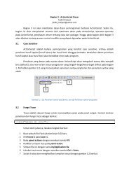

 Change language