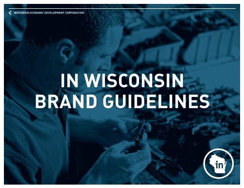
IN WISCONSIN BRAND GUIDELINES
IN WISCONSIN BRAND GUIDELINES
IN WISCONSIN BRAND GUIDELINES

Create successful ePaper yourself
Turn your PDF publications into a flip-book with our unique Google optimized e-Paper software.
WISCONS<strong>IN</strong> ECONOMIC DEVELOPMENT CORPORATION<br />
<strong>IN</strong> WISCONS<strong>IN</strong><br />
<strong>BRAND</strong> GUIDEL<strong>IN</strong>ES
TABLE OF<br />
CONTENTS<br />
3 <strong>BRAND</strong> PLATFORM / <strong>BRAND</strong> VOICE<br />
4 <strong>BRAND</strong> FONTS<br />
5 <strong>BRAND</strong> COLORS<br />
6 <strong>IN</strong>TERNAL LOGO<br />
7 <strong>BRAND</strong> LOGO SPACE<br />
8 EXTERNAL: CO-<strong>BRAND</strong><strong>IN</strong>G<br />
9 EXTERNAL: LOGO ADOPTION<br />
10 <strong>BRAND</strong> LOGO VIOLATIONS<br />
11 ACTION LOGO<br />
12 IMAGES & PHOTOGRAPHY<br />
13 GRAPHIC ELEMENTS / CO-OP MATERIALS
<strong>BRAND</strong><br />
PLATFORM<br />
Brand attributes are the characteristics that define us. They tell our customers who<br />
In Wisconsin is, what we stand for, and why this is the right place for business. It’s<br />
crucial that we understand who we are before our customers can. And we must believe<br />
it, or they never will.<br />
GROUNDBREAK<strong>IN</strong>G BUS<strong>IN</strong>ESS<br />
“Can do” is a common phrase in Wisconsin. And success is the product of effort. Driving<br />
it all is the motivation, throughout history, by its people to demonstrate an ability to<br />
“get it done”. From breaking new ground to growing new industries, the state and the<br />
products and services produced here are intertwined and inseparable. It always has<br />
been and always will be because it’s in Wisconsin’s DNA. As a team, we push ahead.<br />
As partners, we discover what’s next. And together, we possess a unique capacity<br />
to evolve and innovate—building our foundation to create the right environment for<br />
businesses to make it happen.<br />
<strong>BRAND</strong> VOICE<br />
The In Wisconsin brand is a perfect representation of the state. Its voice is bold, not<br />
boastful. Its language is professional and approachable, without becoming too stiff or too<br />
casual. In Wisconsin is authentic, conversational and smart—it uses the full weight of<br />
words without coming across as esoteric or verbose. And no one can consider it a know-it-all.<br />
From headlines to body copy, the In Wisconsin voice is straightforward—just like our people.<br />
<strong>IN</strong> WISCONS<strong>IN</strong> COLLATERAL HEADL<strong>IN</strong>E EXAMPLE:<br />
Innovation is born here from a long tradition of doing what’s right, what works and what’s<br />
next. Find the future In Wisconsin.<br />
BODY COPY EXAMPLE:<br />
Wisconsin’s commitment to education doesn’t end with high school. 100 years ago, we<br />
were the first to establish a system of vocational, technical and adult education schools,<br />
which now rank top in the nation and offer highly specialized degrees across a broad<br />
range of industries. Our technical college system and Customized Labor Training Fund<br />
serves one of every eight adults—twice the national average.<br />
3
<strong>BRAND</strong> FONTS<br />
When creating print communications for In Wisconsin use only the fonts identified here.<br />
D<strong>IN</strong> Bold Alt or D<strong>IN</strong> Bold in all caps is used at the designer’s discretion for primary messaging,<br />
headlines, subheads, headers and footers. D<strong>IN</strong> Bold is used for numbers and symbols occurring<br />
in primary messaging, headlines, subheads, headers or footers.<br />
HEADL<strong>IN</strong>ES, SUBHEADS, HEADERS & FOOTERS: D<strong>IN</strong> BOLD ALT OR D<strong>IN</strong> BOLD (ALL CAPS)<br />
ABCDEFGHIJKLMNOPQRSTUVWXYZ<br />
NUMBERS & SYMBOLS <strong>IN</strong> HEADL<strong>IN</strong>ES, SUBHEADS, HEADERS & FOOTERS: D<strong>IN</strong> BOLD<br />
1234567890?%&*<br />
D<strong>IN</strong> Regular is used for body copy and captions.<br />
BODY COPY: D<strong>IN</strong> REGULAR<br />
ABCDEFGHIJKLMNOPQRSTUVWXYZ<br />
abcdefghijklmnopqrstuvwxyz<br />
1234567890?%&*<br />
EXPORTED/EDITABLE DOCUMENTS SHOULD SUBSTITUTE ARIAL FOR D<strong>IN</strong><br />
ABCDEFGHIJKLMNOPQRSTUVWXYZ<br />
abcdefghijklmnopqrstuvwxyz<br />
1234567890?%&*<br />
BELOW SYMBOL SHOULD SUBSTITUTE ARIAL FOR D<strong>IN</strong><br />
@<br />
4
<strong>BRAND</strong> COLORS<br />
The In Wisconsin color system is comprised of two palettes. The primary color palette<br />
is Green, Dark Blue and Grey—the dominant branding colors.<br />
The secondary palette should be used as accent colors to enhance communication without<br />
distracting from the primary brand palette.<br />
PRIMARY COLORS:<br />
PMS: 5405<br />
C:84 M:58 Y:40 K:20<br />
R:52 G:89 B:111<br />
PMS: 5757<br />
C:15 M:0 Y:72 K:54<br />
R:121 G:128 B:59<br />
PMS: 423<br />
C:42 M:35 Y:35 K:7<br />
R:146 G:145 B:145<br />
SECONDARY COLORS:<br />
PMS: 551<br />
C:33 M:10 Y:9 K:0<br />
R:168 G:202 B:218<br />
PMS: Pantone Black 6<br />
C:100 M:35 Y:40 K:20<br />
R:0 G:0 B:24<br />
PMS: 202<br />
C:0 M:100 Y:61 K:43<br />
R:152 G:0 B:46<br />
PMS: 173<br />
C:0 M:69 Y:100 K:4<br />
R:232 G:109 B:31<br />
PMS: 1805<br />
C:0 M:91 Y:100 K:23<br />
R:191 G:49 B:26<br />
PMS: 143<br />
C:0 M:35 Y:85 K:0<br />
R:251 G:176 B:64<br />
PMS: 5125<br />
C:65 M:86 Y:49 K:0<br />
R:121 G:73 B:106<br />
5
<strong>IN</strong>TERNAL<br />
LOGO<br />
There are specific uses for the In Wisconsin logo. When the In Wisconsin logo and the<br />
In Wisconsin “Smile” logo appear, be sure to use the correct logo depending on the audience<br />
and for the piece being created.<br />
When In Wisconsin branding has not been established, use the “Smile” logo. If the “Smile”<br />
logo does not work with the layout, use the Horizontal Primary.<br />
“SMILE” LOGO:<br />
HORIZONTAL PRIMARY:<br />
“SMILE” LOGO / REVERSED:<br />
HORIZONTAL PRIMARY / REVERSED:<br />
The logo should always be reproduced from the original electronic file. The minimum size<br />
that the “Smile” logo can be reproduced at is 1” x 1” while the minimum size the Horizontal<br />
Primary logo can be reproduced at is 2” wide x 0.5” tall. Logos are provided in both Vector<br />
(print) and JPEG (web) file formats.<br />
6
<strong>BRAND</strong> LOGO<br />
SPACE<br />
The In Wisconsin logo needs space to differentiate itself. Keeping an adequate space around<br />
the logo equal to the height and width of the “in” maintains its power and readability. Do<br />
not place the logo on top of a busy photo where it may be hard to see – use discretion<br />
and best judgement. This rule is especially important when used with other logos or in<br />
advertising.<br />
7
EXTERNAL:<br />
CO-<strong>BRAND</strong><strong>IN</strong>G<br />
When creating extended use materials, the In Wisconsin Primary logo should be used<br />
and the guidelines for proper logo spacing should be followed. (Please refer to page 7.)<br />
When partnering the In Wisconsin Primary logo with another logo, the guidelines for<br />
the proper spacing of the logo must be adhered to.<br />
<strong>IN</strong> WISCONS<strong>IN</strong> PRIMARY:<br />
LOGO PAIR<strong>IN</strong>G:<br />
<strong>IN</strong> WISCONS<strong>IN</strong> PRIMARY / REVERSED:<br />
LOGO PAIR<strong>IN</strong>G / REVERSED:<br />
The logo should always be reproduced from the original electronic file.<br />
Logos are provided in both Vector (print) and JPEG (web) file formats.<br />
8
EXTERNAL:<br />
LOGO<br />
ADOPTION<br />
When creating a modified “Smile” or Horizontal Primary logo, the “Wisconsin Economic<br />
Development Corporation” is to be replaced with the name of the modifying EDO.<br />
D<strong>IN</strong> Regular in initial caps is to be used for the “Smile” logo, while D<strong>IN</strong> Bold Alt or<br />
D<strong>IN</strong> Bold in all caps is to be used for the Horizontal Primary logo.<br />
MODIFIED “SMILE” LOGO:<br />
MODIFIED HORIZONTAL PRIMARY LOGO:<br />
NORTHEAST<br />
Northeast<br />
MODIFIED “SMILE”<br />
LOGO / REVERSED:<br />
MODIFIED HORIZONTAL PRIMARY<br />
LOGO / REVERSED:<br />
NORTHEAST<br />
Northeast<br />
The logo should always be reproduced from the original electronic file.<br />
Logos are provided in both Vector (print) and JPEG (web) file formats.<br />
9
<strong>BRAND</strong> LOGO<br />
VIOLATIONS<br />
The In Wisconsin logo was purposely built to attract attention to the piece and to the state.<br />
Do your part to keep it that way. If you have a specific request or question regarding<br />
logo usage, please contact the Marketing Department of WEDC.<br />
<strong>IN</strong><br />
Do not change the logo color.<br />
Do not change the typeface of the logo.<br />
Do not change proportions of the logo.<br />
Do not rotate the logo.<br />
Do not change/distort the logo.<br />
Do not add embellishmements to the logo.<br />
10
ACTION LOGO<br />
When creating an Action Logo, the paired element is to be one word, all caps in D<strong>IN</strong> Bold Alt<br />
or D<strong>IN</strong> Bold font and placed within the circle of the In Wisconsin Primary logo. (Please refer<br />
to page 8.)<br />
When using the Action Logo, adhere to the guidelines for proper spacing of the logo.<br />
(Please refer to page 7.)<br />
When using the logo for target audiences outside of Wisconsin who may or may not know<br />
the shape of the state, we recommend using the Action Logo that contains WISCONS<strong>IN</strong> to<br />
avoid any confusion.<br />
EXAMPLES OF AN ACTION LOGO:<br />
PRODUCED<br />
DRIVEN<br />
ACTION LOGO VIOLATIONS:<br />
PRODUCED<br />
DR<br />
IV E N<br />
Do not change the placement<br />
of the Action Logo.<br />
Do not change the<br />
typeface of the Action Logo.<br />
Do not add additional<br />
words to the Action Logo.<br />
11
IMAGES &<br />
PHOTOGRAPHY<br />
Photography for In Wisconsin pieces should always support the In Wisconsin proof points<br />
including images that show specific industries, general business, the overall quality of life<br />
and/or demonstrate collaboration among the people. In collateral materials, use only black<br />
and white images. If a photo is not full-bleed, it must include a drop shadow and a 2-point,<br />
white border.<br />
PHOTOGRAPHY DROP SHADOW<br />
Blending Mode: Normal<br />
Opacity: 16%<br />
Position:<br />
Distance: .0196”<br />
Angle: 90°<br />
x offset: 0<br />
y offset: .0196”<br />
Options:<br />
Size: .0694”<br />
Spread: 0%<br />
Noise: 0%<br />
Check the box for “Objects<br />
knocks out shadow”<br />
<strong>IN</strong>DUSTRY SPECIFIC IMAGES:<br />
COLLABORATION IMAGES:<br />
12
GRAPHIC<br />
ELEMENTS<br />
The Hairline found on In Wisconsin materials must always be paired with the Graphic<br />
Arrow. If an Internal logo is not used, “Wisconsin Economic Development Corporation”<br />
should appear with the Graphic Arrow.<br />
WISCONS<strong>IN</strong> ECONOMIC DEVELOPMENT CORPORATION<br />
The Hairline must also have a 0.375-inch space from the top/bottom/side of the sheet.<br />
Oversized quotation marks are to be used with In Wisconsin material in which a quote is<br />
being offset for note.<br />
CO-OP<br />
MATERIALS<br />
Creation of co-op materials is permitted, assuming they follow the guidelines set forth. If<br />
you have any questions or would like WEDC to create your co-op materials, please contact<br />
the Marketing Department of WEDC.<br />
FOR MORE <strong>IN</strong>FORMATION<br />
Kelly Lietz<br />
Vice President of Marketing<br />
Kelly.lietz@wedc.org<br />
608-210-6858<br />
13