SAM PuttLab - Reports Manual - Science & Motion Golf
SAM PuttLab - Reports Manual - Science & Motion Golf
SAM PuttLab - Reports Manual - Science & Motion Golf

You also want an ePaper? Increase the reach of your titles
YUMPU automatically turns print PDFs into web optimized ePapers that Google loves.
<strong>SAM</strong> <strong>PuttLab</strong> - <strong>Reports</strong> <strong>Manual</strong><br />
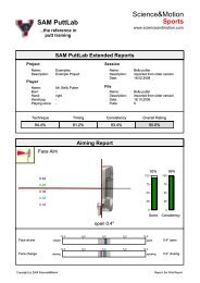
1. Graphical display of the results for the current parameter<br />
In this section of the Report view you will see graphical display of the<br />
results. This can be an image with additional results displayed (e.g. Impact<br />
Spot) or data curves (e.g. Putter Path). If results for multiple putts are<br />
displayed you will see them in different colors. The color for a single putt will<br />
be the same for all views in this report. This allows comparing of different<br />
parameters for the same putt.<br />
Some graphics only show an average value of multiple putts (Alignment,<br />
Rotation). In this case the consistency value is very important because it<br />
shows the variability in your putting. Good performance in the currently<br />
shown parameter is indicated by high ratings in Score and Consistency.<br />
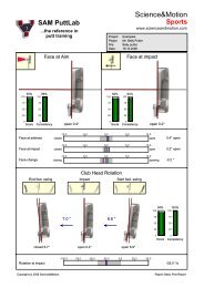
2. Detailed output of numerical result values in data graphs with a<br />
benchmark range<br />
The bar charts provide detailed information on each single putt. The<br />
numbers on top of the bars correspond to the data scale. The colored<br />
vertical stripes within the bars represent the different putts. The grey areas<br />
indicate the optimum data ranges as derived from the PGA Tour data<br />
sample.<br />
The number printed on the right side of the graph represents the average<br />
value for this parameter, but the single lines show the value of each stroke.<br />
So you can inspect in detail both the average performance and the<br />
variability of your putts. The average is the basis of calculating the<br />
corresponding Score rating.<br />
The spread of the single data values indicates the distribution for the single<br />
putts. The distribution of the data is the basis of calculating the<br />
corresponding Consistency rating. For high consistency of movement<br />
execution the stripes should be grouped very close together.<br />
The grey area inside of the bar graphs represents the benchmark range and<br />
represents about 68% of the Tour players performance. For a topperformance<br />
your stroke results should be inside of this range. The<br />
benchmark range data has been collected over the last three years from<br />
over 100 European PGA Tour Players and shows their average performance<br />
and variability.<br />
Page 7