Download Usability Testing Report - Soma Ray
Download Usability Testing Report - Soma Ray
Download Usability Testing Report - Soma Ray

Create successful ePaper yourself
Turn your PDF publications into a flip-book with our unique Google optimized e-Paper software.
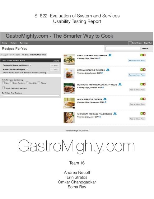
SI 622: Evaluation of System and Services<br />
<strong>Usability</strong> <strong>Testing</strong> <strong>Report</strong><br />
GastroMighty.com<br />
Team 16<br />
Andrea Neuoff<br />
Erin Stratos<br />
Omkar Chandgadkar<br />
<strong>Soma</strong> <strong>Ray</strong>
Index<br />
Executive Summary....................................................................................<br />
3<br />
Introduction................................................................................................<br />
4<br />
Methods.....................................................................................................<br />
5<br />
Findings and Recommendations.................................................................<br />
6<br />
Summary Results.....................................................................................<br />
6<br />
Key Findings & Recommendations...........................................................<br />
6<br />
1. Participants faced difficulty navigating the website..............................................<br />
6<br />
2. “Add New Recipes” page needs to be easier and faster to use...........................<br />
7<br />
3. “Edit Shopping List” is hard to find and needs to include more information..........<br />
8<br />
4. Search and Filter options need to be optimized...................................................<br />
9<br />
5. Interface design should remain minimalist but must meet user expectations.....<br />
11<br />
6. Ratings and comments should be optimized and system learning capabilities<br />
should be conveyed.............................................................................................<br />
12<br />
Discussion................................................................................................<br />
14<br />
Conclusion...............................................................................................<br />
15<br />
References...............................................................................................<br />
16<br />
Appendix A: Consent Form.......................................................................<br />
17<br />
Appendix B: <strong>Usability</strong> Tasks......................................................................<br />
18<br />
Appendix C: Post-Test Questionnaire........................................................<br />
21<br />
Appendix D: Logging Form.......................................................................<br />
22<br />
Appendix E: Additional Reference Material................................................<br />
23<br />
Appendix F: Additional Recommendations................................................<br />
24<br />
Appendix G: User Data Logs and Post-Test Questionnaire........................<br />
25<br />
<strong>Usability</strong> <strong>Testing</strong> <strong>Report</strong> 2
Executive Summary<br />
In this study, we conducted usability testing of GastroMighty in order to find areas of the website<br />
that can be improved to give users a better experience. We focused on areas that we found issues<br />
with in our previous research. Our goal was to find out if these problem areas manifest again during<br />
usability testing. We also sought to discover user preferences that can be incorporated in order to<br />
increase user base and maintain loyalty.<br />
As part of our methods, we developed five tasks for our participants to perform, fill out a post-test<br />
questionnaire, and recount their experience in debrief interview. We had three colleague reviewers<br />
for these documents and piloted our test with two participants. Using feedback from our reviewers<br />
and pilot testers, we revised our tasks and conducted testing with five potential novice users of<br />
GastroMighty. All five participants fall within the target demographic.<br />
We found that the majority of our participants were excited about the concept of GastroMighty and<br />
found the main functions of the site easy to use. A number of our participants expressed that they<br />
liked GastroMighty enough to use it for their personal requirements in future.<br />
During the usability process, we also found a number of areas where the website can be improved<br />
to better meet the needs of its users. Our main findings and recommendations are as follows:<br />
1. Participants faced difficulty navigating the website.<br />
Recommendations: Add breadcrumbs and back buttons; add “My Current Meal Plan” section to<br />
top navigation; optimize “sides” workflow<br />
2. “Add New Recipes” page needs to be findable and easier to use.<br />
Recommendations: Make page more prominent and easier to find; create more clarity for adding a<br />
recipe; and do not force users to use “Location”<br />
3. “Edit Shopping List” is hard to find and needs to include more information.<br />
Recommendations: Make page easier to find; show amounts of ingredients on shopping list; and<br />
connect ingredients to recipes.<br />
4. Search and filter options need to be optimized.<br />
Recommendations: Improve internal dictionary; ensure accurate search returns; add vegetarian<br />
filter; create advanced search option and “Recently Viewed Recipes” list.<br />
5. Interface design should remain minimalist but must meet user expectations.<br />
Recommendations: Incorporate clear visual cues for users; create more contrast between pages to<br />
help users know where they are.<br />
6. Ratings and comments should be optimized and system learning capabilities should be<br />
conveyed.<br />
Recommendations: Inform users about the machine learning capabilities of the website; create<br />
awareness about how ratings and comments work; separate rating from favoriting.<br />
<strong>Usability</strong> <strong>Testing</strong> <strong>Report</strong> 3
Introduction<br />
GastroMighty is an online service to help people efficiently and easily plan, shop, and cook their<br />
weekly meals. With over 5,000 recipes in its database, GastroMighty remembers what you like,<br />
what you don’t, what you cooked last week or last month, and uses this information to<br />
recommend new recipes. With a free account, users can quickly decide what they want to cook for<br />
the week, and customize a grocery shopping list based on the selected recipes and side dishes. At<br />
the moment, GastroMighty’s primary target audience are busy and active adults who want to cook<br />
more at home and want a tool that will help facilitate this.<br />
In this study, our team conducted usability tests with potential customers of Gastromighty to<br />
understand the problems they might face while using the website. We recruited five participants for<br />
the study who had to complete a set of tasks using desktop and mobile versions of<br />
GastroMighty.com. During the study, we tried to uncover bugs, usability issues, and any<br />
inconsistencies between users’ expectation and system deliverables. The tests gave us valuable<br />
feedback about how real users might interact with the system, what they feel about the system,<br />
and why.<br />
Our participants really liked the concept of Gastromighty and how easily they could start using it to<br />
create meal plans. They were interested in using features like shopping lists and saving personal<br />
recipes and also liked the visual appeal of the website including UI elements like photographs of<br />
recipes and the slider on the home page. Most of our recommendations address issues about<br />
navigation during and after creating a meal plan, using shopping list and add new recipe pages,<br />
and lack of awareness among users about various features.<br />
<strong>Usability</strong> <strong>Testing</strong> <strong>Report</strong> 4
Methods<br />
The goal of our usability testing was to figure out how potential users interact with the site.<br />
Specifically, we ran formative tests to find out which key usability issues of the site need to be fixed<br />
in order for GastroMighty to attract new users and ensure loyalty. For GastroMighty, this meant that<br />
we looked for places where participants deviated from the expected usage path, made mistakes<br />
entering information, had problems either finding or using specific features, and were unable to<br />
complete specific tasks key to Gastromighty.<br />
With these goals in mind, we created 5 tasks. The tasks focused on certain GastroMighty features<br />
that we suspected might have usability issues as indicated by our previous heuristic evaluation,<br />
comparative analysis, and survey results. The tasks asked the participants to create a meal plan,<br />
modify a meal plan, send the grocery list to a friend or use the grocery list on a mobile device,<br />
replace recipes because of dietary needs, enter in a new recipe, and use the rating and<br />
commenting features. After the initial draft of our tasks, we had three colleagues review the tasks<br />
and then we piloted the entire usability test with two separate individuals. The final version of our<br />
tasks that we used can be found in Appendix B.<br />
We ran five usability tests with participants from our target population. Each test was run with two<br />
team members present (a moderator and note-taker). Each usability test began with a formal<br />
introduction to the study that explained the purpose of the test, our expectations, and the rights of<br />
the participant. We then asked the participant to sign a consent agreement (See Appendix A), after<br />
which we began the test. We used TechSmith’s Camtasia software to capture all on-screen<br />
interaction activity and our participant’s facial reactions for contextual reference during team<br />
debriefing and reporting. The note-taker logged comments, observations, times, bugs, and other<br />
important behavior clues in an excel sheet designed for logging. The excel sheet was designed to<br />
auto log time and code description thus allowing the logger to focus on capturing the comments<br />
and observations (Appendix D).<br />
After completion of the tasks we asked the participant to fill out a post-test questionnaire on their<br />
experience using the site. After that, the moderator interviewed the participant about their<br />
experiences, the areas they had problems with, and some of the comments they made.<br />
When we completed our five usability tests, our team met as a whole and reviewed the data of<br />
each test together. We noted common problems and positive comments that were made by<br />
participants. We brainstormed about the causes and at a later meeting we compiled our results<br />
and came up with a set of key findings and recommendations as follows.<br />
<strong>Usability</strong> <strong>Testing</strong> <strong>Report</strong> 5
Findings and Recommendations<br />
Summary Results<br />
Our usability tests revealed that many people are excited about using a meal planning site. Our<br />
usability participants found it easy to create basic meal plan and liked that the system did not<br />
pester them with lots of questions, requests, or forms. They liked the large selection of recipes,<br />
their source information, and nutritional information. They all liked the ability to enter in their own<br />
recipes, although some had problems with the process, and the option to generate an aggregated<br />
shopping list they could use and modify. The homepage with the photo slider also received a lot of<br />
compliments. In fact, one participant used the slider to find most of their recipes due to the image<br />
and description. In general, our participants were very excited to use a system like GastroMighty,<br />
despite some of the problems they encountered. In the findings and recommendations that follow,<br />
we focus on the key areas where GastroMighty can improve the website for users in order to<br />
provide an even better experience. Most of our recommendations address issues about navigation<br />
during and after creating a meal plan, using shopping list and add new recipe pages, and lack of<br />
awareness among users about various features.<br />
Key Findings & Recommendations<br />
1. Participants faced difficulty navigating the website<br />
Most of our usability test participants commended on how clean and simple GastroMighty<br />
appeared to be. However, once they started working on the tasks, almost all participants<br />
expressed confusion navigating between different stages of the meal planning process. Adding<br />
dishes to create a meal plan was easy but once they navigated to editing grocery lists, or editing<br />
previous meal plans it became unclear where they were in the site. They especially felt lost while<br />
finishing up with a meal plan as the system does not clearly inform them of the completion while<br />
the process leads one to subsequent steps. Alerts or messages like “View Your Finished Meal<br />
Plan” are absent, thus leaving participants unsure. More than one participant had trouble<br />
navigating to their shopping lists for a previously created meal plan once they exited the list. Some<br />
of them were hesitant to browse individual recipe search results as they were not able to navigate<br />
back to the same spot in the results page.<br />
Some of our participants could not figure out how to add new recipe as the navigation is not<br />
indicative of the task. In GastroMighty’s case, to create new recipe one has to click My<br />
Recipes>Saved>Enter new Recipe. One participant commented how she would never think of<br />
creating a new recipe by navigating to ‘Saved’ as that referred to previously created/saved recipes.<br />
Some of our participants also had problems comprehending the process of adding sides to the<br />
main dishes. The sides panel is away from the recipes section thus making it difficult to establish a<br />
connection between them in the meal plan process. Our participants found that one cannot add<br />
the same side to more than one main dish in a meal plan.<br />
<strong>Usability</strong> <strong>Testing</strong> <strong>Report</strong> 6
Recommendations<br />
We recommend that GastroMighty rethink their post meal plan navigation process to match their<br />
users’ previous experiences and habits. Users would feel more at ease if they knew during every<br />
step of the process what their location was in the website and were given the ability to review their<br />
actions or go back to their most recent step. This would include adding features such as<br />
breadcrumbs, task review options such as ‘View Your Completed Meal Plan’, and back buttons.<br />
Adding meal plan and shopping list links to top navigation would go a long way in terms of usability<br />
for users.<br />
The Sides’ workflow needs to be better integrated with the main dishes during meal planning. A<br />
few of our suggestions include having an ‘add side’ icon closer to the main recipes links, allowing<br />
user to add same side to more than one main dish, preventing error if user chooses their own side<br />
and clicks on ‘I’m done’ without saving the selection, and allowing display of more than three side<br />
options in the overlay.<br />
2. “Add New Recipes” page needs to be easier and faster to use<br />
Tasks #2 and #4 (See Appendix B) asked our usability participants to edit their shopping lists and<br />
add a new recipe to the collection, respectively. Almost all participants liked the function and<br />
purpose of these pages but, in observing their use of these pages, it became clear that workflow<br />
and features on these need to be reconceptualized to match user expectations and behaviors.<br />
When we asked our participants to add a recipe to their GastroMighty account, the first trouble<br />
they encountered was figuring out where they could accomplish this task. They expected to find<br />
this function in the top navigation menu but none of the link names matched. For example, it was<br />
only after clicking on every other option that one participant found the “Add New Recipes” page.<br />
After participants arrived on “Add New Recipes”, they encountered trouble understanding the<br />
workflow of how to add a recipe. Did they need to press the “Add Step” button after entering in<br />
every ingredient? Should they enter in all the steps or just one step at a time in the “Directions” text<br />
box. Did they need to add the step numbers themselves or would the system take care of that?<br />
See Figure 1 for an example. The drop-down “Location” menu for ingredients did not make sense<br />
to our participants until they clicked on it and realized that location meant the location of the<br />
ingredient in the grocery store. Furthermore, many of our participants had a hard time figuring out<br />
which grocery aisle to choose since many of the products either fit more than one category or<br />
none.<br />
<strong>Usability</strong> <strong>Testing</strong> <strong>Report</strong> 7
Figure 1. The recipe directions one participant produced<br />
We gave our participants a short recipe for basic chocolate chip cookies and they found the<br />
process long and laborious. Many of them complained about the length of time it took to enter in<br />
the recipe and explicitly wished there were other options for adding recipes, such as ability to<br />
import photos or scans of a recipe and have the site use natural language processing to add it.<br />
Others wanted to be able to add photos of their dishes and add specific notes for each ingredient.<br />
Despite these problems, our participants liked how the site displayed their recipe input. One<br />
commented that it looked like a “real recipe.” They also liked the idea of being able to keep all of<br />
their recipes in one place.<br />
Recommendations<br />
We suggest that the “Add New Recipe” page should be easier to access and more prominent on<br />
the site. The top navigation drop-down menu, for example, could list “Add Recipe” in addition to<br />
the “Saved” option. Users wanted to reach these pages from a variety of places and by making<br />
them more accessible through the navigation header, users will be able to take advantage of<br />
features.<br />
Regarding the “Add New Recipe” page, we recommend adding dynamic clues about how this<br />
page works, especially regards to the text box where users add the recipe’s directions. For<br />
example, add text field suggestions that inform the user how to enter their directions in.<br />
We compiled a list of additional recommendations of varying degrees of importance that can be<br />
found in Appendix F: Additional Recommendations.<br />
3. “Edit Shopping List” is hard to find and needs to include more information<br />
The “Edit Shopping List” page was well received by our participants. Many of them liked that the<br />
system automatically made the list and sorted it by grocery aisle or section. One said “Oh, they<br />
separate them [the ingredients] just like my mom used to.” However, participants wished they<br />
could locate the page much easier. They expected to find shopping list option in the top navigation<br />
bar. They also had trouble with the meaning “location” and did not appreciate being forced to<br />
<strong>Usability</strong> <strong>Testing</strong> <strong>Report</strong> 8
select options in this field while adding items. Some wished that this field allowed auto suggestion<br />
enabled typing and auto population. We also learned that the location drop-down menu is missing<br />
some important categories like, health and beauty, paper products, cereal, and snack aisle.<br />
Our participants did not have trouble crossing out items on the desktop version of the site, but they<br />
wanted to be able to cross out whole sections. “Edit Shopping List” does not display amounts of<br />
the specific ingredients (although this is shown in the printed shopping list), nor does it allow users<br />
to know which ingredients relate to which recipes. The need to know which ingredient belongs to<br />
which recipe also became important when participants noticed duplicate or similar ingredients.<br />
They also need additional control over amount of ingredient required based on how much they<br />
have in their kitchen.<br />
Finally, we asked the participants, who already use a smartphone, to use the mobile version of<br />
GastroMighty and try out the shopping list feature. While many of the participants appreciated this<br />
additional functionality, they had a hard time figuring out the difference between crossing out items<br />
(showing they had bought them) and removing items from the list altogether. We also found two<br />
important bugs with respect to the mobile site. First, after participants signed into the mobile site<br />
on their mobile device, they were directed to the desktop version of the site, not the mobile<br />
version. Secondly, there was no way for participants to log out of the mobile site. This along with<br />
the “unfinished” appearance of the mobile site left our participants wanting.<br />
Recommendations<br />
We recommend adding “Edit Shopping List”, page to the top navigation bar. Users should not be<br />
required to choose a location when they add ingredients. More importantly, we recommend<br />
showing the amounts of ingredients and allowing users to be able to edit these amounts. It will also<br />
be important to connect each ingredient with the recipe it has. One way to do this would be to<br />
show recipe(s) excerpts when the mouse hovers over the ingredient for a moment. This could also<br />
be addressed by showing the recipes on this page and when the cursor hovers over or clicks on<br />
the recipe, its specific ingredients change color, become highlighted, or have some visual cue for<br />
distinction.<br />
An additional list of recommendations can be found in Appendix F: Additional Recommendations.<br />
4. Search and Filter options need to be optimized<br />
Our usability testing exercise found that both the search feature and the filter options are two areas<br />
that are highly important to users, and GastroMighty could benefit from optimizing both of them in<br />
order to better meet users’ needs. We found that, despite the fact that our tasks did not directly<br />
instruct participants to use the search feature, they turned to it often to find their desired meals. In<br />
fact, overall, participants used the search feature more often than they used the “Suggest More<br />
Recipes” option. Unfortunately, our participants ran into a number of issues when using the search<br />
feature.<br />
Some examples of search errors that participants encountered were that a search for “vegetarian”<br />
returns results that include meat, and the first result in a search for “vegetarian chili” is “vegetarian<br />
pad thai.” Our participants also found that there are spelling errors in GastroMighty’s dictionary. For<br />
instance, see Figure 2.<br />
<strong>Usability</strong> <strong>Testing</strong> <strong>Report</strong> 9
Figure 2: When users search for “meatloaf” they get a “Did you mean?” result with a misspelling<br />
Participants also expressed a desire to have more advanced search options, as well as the ability<br />
to view their most recent searches and recipes.<br />
There were a number of issues that our participants found when using the filter options. First, and<br />
most importantly, the filters do not currently allow users to select vegetarian or vegan options. One<br />
of our participants, who is a vegetarian, was highly frustrated with this and felt that the website was<br />
not a good fit for her because of this oversight. We also found that the filters do not always work as<br />
expected. For instance, filtering for dairy free options returns results that do, in fact, contain dairy.<br />
Specifically, many of these results contained butter.<br />
We also found that, in addition to wanting a filter for vegetarian recipes, participants expressed<br />
interest in wanting to filter by specific ingredients or nutritional value. There was also some<br />
confusion over what the “seasonal” filter referred to, and they wondered if this feature was<br />
somehow based on their geographic location.<br />
Recommendations<br />
The search and filter options are of central importance to users, and we recommend that<br />
GastroMighty invest in making them as usable as possible. Correcting the internal dictionary of the<br />
site, and making sure that search returns appropriate results is of utmost importance for a good<br />
experience with the website.<br />
Additionally, users would greatly benefit from additional filters, and we feel that a vegetarian filter is<br />
critical towards addressing a significant demographic’s needs. Of secondary importance is giving<br />
users the ability to filter by vegan recipes, by recipes that are under a certain calorie limit, and by<br />
recipes that have specific ingredients.<br />
We also suggest creating an advanced search option so that users can search, for example, for<br />
recipes that contain chicken but not mushrooms. We feel that Google’s advanced search option<br />
would be a good model for GastroMighty to work from. Finally, including a “Recently Viewed” area<br />
would help users remember what recipes they have already looked at, and would aid them in easily<br />
finding recipes that they want to see again.<br />
<strong>Usability</strong> <strong>Testing</strong> <strong>Report</strong> 10
5. Interface design should remain minimalist but must meet user expectations<br />
GastroMighty’s user interface experience has been paradoxical for our usability participants. On<br />
one hand, almost everyone agreed they liked GastroMighty’s modern minimalist look. On the other<br />
hand, once participants started working with the website, they encountered hindrances that were<br />
due to the interface design. In our opinion, the important examples include:<br />
• Color usage in a predominantly monochromatic theme: Blue is used in a gray palette which<br />
caught our participants’ attention thus affecting the tasks contrary to our expectations.<br />
Figure 3: recipe page<br />
In the image above, participants noticed ‘Add comment’ more than they noticed “Back” or “+ Meal<br />
Plan” which caused them to exit the page and go back to recipe listing to add it to the meal plan.<br />
Another example of confusing color usage is marking the favorited recipe in green which not only is<br />
barely distinguishable but also might be a potential problem for colorblind users (508 compliance)<br />
• In most cases, buttons and tasks related to a workflow are not placed where one expects them<br />
to be and hence makes it difficult to locate them.<br />
Figure 4: Create meal plan<br />
<strong>Usability</strong> <strong>Testing</strong> <strong>Report</strong> 11
For example, with reference to the Create meal plan image, our participants found it difficult to<br />
locate the ‘Suggest More Recipes’ button as it is not close to the recipe list. We feel this violates<br />
Gestalt’s principles of proximity (Johnson, Jeff)<br />
• Most pages look and feel similar to one another and thus add to the confusion our participants<br />
faced while navigating a task. Not only did the system not provide adequate navigational<br />
information (refer to Finding 1) but the similarity of pages design also added to lack of visual<br />
cues.<br />
• Other issues include the search box not having a clickable option, the location of the ‘Add sides’<br />
panel and location of recipe filters.<br />
Recommendations<br />
We suggest GastroMighty follow human behavioral fundamentals applicable to human computer<br />
interaction for guidelines on interface, look, and feel design. A few suggestions we have are (this is<br />
by no means an exhaustive list):<br />
• Action buttons, links, or icons related to a particular task flow should be in close proximity. For<br />
example ‘Suggest more Recipes’ should be closer to the list of recipes displayed.<br />
• Use highlight colors (in GastroMighty’s case Blue, Red, and Green) for actions one would<br />
consider as important and logical. For example, highlight ‘Add to meal plan’ rather than ‘Add<br />
comments’ in a recipe page. Also reconsider color palate to ensure adherence to 508<br />
compliance.<br />
• Ensure the sides workflow is visually better connected to adding main dishes as they form part of<br />
the main meal planning activity. Also ensure the recipe filters are better highlighted as currently<br />
they blend with the grey color theme and don’t command attention.<br />
We also suggest GastroMighty incorporate some distinct visual cues to help users keep a track of<br />
their work process on the website. For example distinguishing the look and feel of home page and<br />
create meal plan from finished meal plan and previous meal plans would go a long way in<br />
optimizing a user’s experience.<br />
6. Ratings and comments should be optimized and system learning<br />
capabilities should be conveyed.<br />
From our usability tests, we found that there was lack of awareness among the participants of how<br />
certain aspects of the system actually work. Most of these issues were about the machine learning<br />
algorithms, commenting, and rating features on the website.<br />
For example, the website does not communicate its machine learning capabilities. Liking or<br />
disliking a recipe affects what recipe suggestions the system makes for the user. However, none of<br />
our participants could infer this relationship between liking/disliking a recipe and recipe<br />
suggestions. So, they did not realize that “disliking” a recipe would block it from appearing in future<br />
meal planning suggestions. The system does not clearly communicate that when a user likes a<br />
recipe, Gastromighty uses this data to suggest similar recipes in the future and gradually learns<br />
from these inputs.<br />
We also observed that participants could not understand how the rating and commenting feature<br />
works. Most of them were unsure if the comments were only visible to them or if they were publicly<br />
<strong>Usability</strong> <strong>Testing</strong> <strong>Report</strong> 12
available. Some of them asked if their comments could be printed while printing the recipe. We<br />
believe that since there were no other comments on the recipe page during testing, the<br />
participants expected comments to work like personal notes for the recipes. One of our<br />
participants indicated that they would like to have personal notes for each recipe.<br />
During the usability tests, all participants expressed confusion about the rating feature.<br />
GastroMighty uses terms like “vote up” and “vote down” to add recipes to favorites or block them<br />
from appearing in the suggested recipes section. A user’s favourite recipes are visible to their<br />
friends. Participants expected “vote up” and “vote down” feature to work like facebook where they<br />
can see that how many people have liked this recipe. One participant also suggested that it would<br />
help if the recipes could be sorted according to these ratings.<br />
Recommendations<br />
We feel that GastroMighty could benefit from informing the users about its learning capabilities.<br />
This could be demonstrated through a short guided tour, which tells them how liking/disliking a<br />
recipe affects future recommendations. Alternatively, whenever the user rates a recipe, a<br />
notification could appear informing them that GastroMighty will remember their choice when<br />
suggesting recipes next time.<br />
We also suggest that Gastromighty should separate the rating feature from the favoriting feature in<br />
the website. Using a “star” icon to favorite a recipe and the thumbs-up/ thumbs-down icon to rate<br />
a recipe would help in reducing the confusion in the user’s mind. Additionally, marking the number<br />
of likes or dislikes for a recipe would help them understand that rating is a publicly visible feature<br />
whereas “star” icon (similar to Gmail) is for their personal use to mark a recipe as favorite.<br />
For the commenting feature, we feel that since Gastromighty does not yet have many comments<br />
on its recipe pages, information boxes like<br />
“0 users have commented on this recipe. Be the first to comment!”<br />
could provide a clear indication to the users that their comments are visible to the public. Once<br />
they have more comments, it will be more obvious to the users that their comments are public.<br />
<strong>Usability</strong> <strong>Testing</strong> <strong>Report</strong> 13
Discussion<br />
There are a few points of discussion that should be raised about our usability testing. First, our five<br />
usability participants had very similar demographic makeup; they were all women, caucasian, and<br />
American-born. It is important to note that this demographic likely falls within GastroMighty’s main<br />
target audience, however, diversity of participants in future tests would ensure that GastroMighty is<br />
meeting the needs of a greater user base. Likewise, due to geographic and time restraints, all of<br />
our participants were either friends of the research team or friends of friends. This may have<br />
introduced some level of personal bias to the feedback that could have been prevented were we<br />
able to test a different pool of users.<br />
There were two areas of the GastroMighty website that we were not able to test in-depth. First, we<br />
did not include the History page in our task list; we felt that its current functionality prevented us<br />
from devising tasks that would have a logical inclusion of history page’s functions. Despite that,<br />
some participants did still happen upon it during the test. They were glad to see that GastroMighty<br />
allows them to view past meal plans, but wanted more control over using this feature. One<br />
participant wanted to be able to move their meal plans like a widget around on the page. She also<br />
felt that the “bunched up” look of the meal plans on the History page was unappealing. As the<br />
History page is an important feature of GastroMighty, and participants responded well to the<br />
concept, we suggest GastroMighty review our previous heuristic evaluation and comparative<br />
analysis of the site in order to find ways to make this page as user-friendly as possible.<br />
The second area of GastroMighty that had limited testing was the mobile site. We felt it was<br />
important to test the website itself in order to confirm previous research and ensure that we were<br />
providing robust feedback about GastroMighty’s main product. Although we included the mobile<br />
site in one of our tasks, we did not test as in-depth as we may have if we were only focusing on<br />
this interface of the product. We also ran into some trouble during the testing of the mobile site, as<br />
the internet connectivity in our testing space was limited. Two of our participants had to use a<br />
moderator’s phone in order to complete the mobile task. Because the moderator was unable to<br />
sign out of their own account on the mobile site, they were forced to complete the task with the<br />
moderator’s account rather than the user testing account. Despite this issue, we feel that the<br />
interactions with the mobile site provided enough valuable feedback to include in this report. We<br />
strongly recommend that GastroMighty explore the usability of the mobile site further by<br />
conducting user research in the future that focuses only on mobile.<br />
<strong>Usability</strong> <strong>Testing</strong> <strong>Report</strong> 14
Conclusion<br />
In this study, our team conducted usability tests with potential customers of Gastromighty to<br />
understand the problems they might face while using the website. We recruited five participants for<br />
the study who had to complete a set of tasks using the desktop and mobile version of the<br />
GastroMighty.com. The tests gave us valuable feedback about how real users interact with the<br />
system, what they feel about the system and why. Overall, all of the participants liked the concept<br />
of Gastromighty and the problem it tries to solve. We uncovered problems relating to navigation<br />
and flow of tasks, usability issues with the shopping list and adding new recipe pages, bugs in the<br />
mobile website and other UI problems. We also observed that Gastromighty needs to make its<br />
user more aware about its learning capabilities, the effects of the rating recipes and commenting<br />
features. We recognize that this report is not exhaustive, and that further research is needed in<br />
many areas. However, the recommendations we provide, if implemented, would help GastroMighty<br />
better appeal to potential users as well as foster a sense of loyalty in those users.<br />
<strong>Usability</strong> <strong>Testing</strong> <strong>Report</strong> 15
References<br />
• Nielsen, J. (1994) Heuristic Evaluation. In J. Nielsen. & R. L. Mack (Eds.) <strong>Usability</strong> Inspection<br />
Methods. New York, NY: John Wiley & Sons.<br />
• Jeff Johnson (2010) Designing with the Mind in Mind, chp-2. Burlington, MA: Morgan Kaufmann<br />
•508compliance.Retrievedfrom http://en.wikipedia.org/wiki/<br />
Section_508_Amendment_to_the_Rehabilitation_Act_of_1973<br />
• <strong>Usability</strong> Training Center. (2012). Log <strong>Usability</strong> Tests Like a Pro. Retrieved from http://<br />
www.userfocus.co.uk/articles/datalogging.html.<br />
<strong>Usability</strong> <strong>Testing</strong> <strong>Report</strong> 16
Appendix A: Consent Form<br />
Consent Form<br />
Please read and sign this form.<br />
In this usability test:<br />
• We will record you performing the test, with both audio and video.<br />
• We will request that you fill out a post-test questionnaire and answer post-test interview<br />
questions.<br />
• Your responses will be used in data analysis.<br />
• Your personal information will not be disclosed at any point.<br />
Participation in this usability study is voluntary. All information will remain strictly confidential. The<br />
descriptions and findings gathered from this study may be used in the report(s) we provide to our<br />
client, however, at no time will your name or any other identification be used. You can withdraw<br />
your consent to the test and stop participation at any time.<br />
If you have any questions after today, please contact:<br />
• Erin: ecstrato@gmail.com / 734.834.1586<br />
• Andrea: andrea.neuhoff@gmail.com / neuhoffa@gmail.com / 503.481.6502<br />
• <strong>Soma</strong>: <strong>Soma</strong>ray@umich.edu / 678.642.4486<br />
• Omkar: omkar.chandgadkar@gmail.com / 734.804.8010<br />
I have read and understood the information on this form and have had all of my questions<br />
answered to my satisfaction.<br />
______________________________<br />
Subject's Signature<br />
_________________<br />
Date<br />
______________________________<br />
<strong>Usability</strong> Consultant<br />
_________________<br />
Date<br />
<strong>Usability</strong> <strong>Testing</strong> <strong>Report</strong> 17
Appendix B: <strong>Usability</strong> Tasks<br />
Task 1<br />
You need to plan your dinners for the upcoming week (Monday through Friday). It’s Saturday and<br />
tomorrow you’ll go grocery shopping to buy the items you need for the coming week. Plan your<br />
dinners at gastromighty.com and include at least 3 main dishes and 3 side dishes. You can choose<br />
any dishes on the site. Use the following information to sign in:<br />
Email: si622-group16@googlegroups.com<br />
Password: si622<br />
When you have finished this task, please let the moderator know.<br />
Task 2<br />
Now that you’ve created a plan for the coming week, you need to modify your grocery list because<br />
your partner is going to do the shopping. You need:<br />
• toilet paper<br />
• cereal<br />
• lunch meat<br />
• toothpaste<br />
• canned peaches<br />
Please add these items to your list so your partner remembers to get them. Also, your kitchen has<br />
a pretty extensive collection of spices and basic ingredients, such as flour, sugar, oil, and butter.<br />
Remove any pantry items you normally keep on hand and would already have.<br />
After you finished these modifications, please do one of the following:<br />
A. If you use a smartphone, please bring up your grocery shopping list on the GastroMighty mobile<br />
website: www.gastromighty.com/mobile as you would if you were in the grocery store. Please add<br />
ice cream to your shopping list and cross out the things you just added to your list.<br />
OR<br />
B. If you don’t use a smartphone, please email your grocery list to your partner, Erin, at<br />
ecstrato@gmail.com.<br />
When you have finished this task, please let the moderator know.<br />
<strong>Usability</strong> <strong>Testing</strong> <strong>Report</strong> 18
Task 3<br />
A good friend of yours is visiting next week and she is lactose intolerant. Return to your plan and<br />
change it. Remove the recipes with dairy products and replace them with dairy-free recipes.<br />
When you have finished this task, please sign out of your gastromighty.com account and let the<br />
moderator know.<br />
*If your list is already dairy free, replace the recipes that have gluten.<br />
Task 4<br />
Your great Aunt Nestlé Tollhoüse finally sent you her delicious recipe for chocolate chip cookies.<br />
Sign-in to gastromighty.com, add this recipe (see below) to GastroMighty and mark it as a favorite<br />
recipe.<br />
Prep: 15 mins<br />
Cooking: 9 mins<br />
Level: Easy<br />
Cooling: 15 mins<br />
Yields: 60<br />
Ingredients<br />
• 2 1/4 cups all-purpose flour<br />
• 1 teaspoon baking soda<br />
• 1 teaspoon salt<br />
• 1 cup (2 sticks) butter, softened<br />
• 3/4 cup granulated sugar<br />
• 3/4 cup packed brown sugar<br />
• 1 teaspoon vanilla extract<br />
• 2 large eggs<br />
• 2 cups (12-oz. pkg.) chocolate semi-sweet chips<br />
• 1 cup chopped nuts (optional)<br />
Steps:<br />
1.PREHEAT oven to 375° F.<br />
2.COMBINE all ingredients. Drop dough by rounded tablespoon onto ungreased baking sheets.<br />
3.BAKE for 9 to 11 minutes or until golden brown. Cool on baking sheets for 2 minutes; remove to<br />
wire racks to cool completely.<br />
When you have finished this task, please let the moderator know.<br />
<strong>Usability</strong> <strong>Testing</strong> <strong>Report</strong> 19
Task 5<br />
You’ve got a few extra minutes and have decided to browse the recipes on GastroMighty.com to<br />
find a dish you might like to cook in the future. Find 3 recipes that you like and 3 recipes you don’t<br />
like. Rate these recipes and leave a comment on one recipe explaining your rating. When you finish<br />
rating recipes, show your GastroMighty.com favorites list to your moderator.<br />
When you have finished this task, please let the moderator know.<br />
<strong>Usability</strong> <strong>Testing</strong> <strong>Report</strong> 20
Appendix C: Post-Test<br />
Questionnaire<br />
Name:<br />
Age:<br />
Income:<br />
Occupation:<br />
Tasks<br />
1 It was easy to use the site.<br />
Strongly<br />
Agree<br />
Agree Neutral Disagree Strong<br />
Disagree<br />
Notes<br />
2 The on-screen instructions and prompts<br />
are helpful.<br />
3 I could understand the tasks.<br />
4 I could complete the tasks with ease.<br />
5 The required steps were as I expected.<br />
6 I like the visual appeal of the site.<br />
7 I found the mobile version easy to use.<br />
8 I would use this site in the future.<br />
9 I would recommend this site to a friend or<br />
colleague.<br />
Additional Comments/notes:<br />
<strong>Usability</strong> <strong>Testing</strong> <strong>Report</strong> 21
Appendix D: Logging Form<br />
Our logging forms and behavioral codes are based on material from the <strong>Usability</strong> Training Center<br />
site (2012).<br />
Behavioral Codes<br />
Type<br />
A<br />
B<br />
C<br />
D<br />
F<br />
G<br />
H<br />
I<br />
M<br />
N<br />
P<br />
V<br />
X<br />
Definition<br />
Assist from moderator<br />
Bug<br />
Comment (general comment by participant)<br />
Duplicate usability problem (described earlier)<br />
Facial reaction (e.g. surprise)<br />
Gives up or wrongly thinks finished<br />
Help or documentation accessed<br />
Design idea (design insight by logger)<br />
Misc (general observation by logger)<br />
Negative opinion expressed by participant<br />
Positive opinion expressed by participant<br />
Video highlight - an “Ah-ha!” moment<br />
<strong>Usability</strong> problem<br />
Example Logging Sheet*:<br />
Code description Code Note Clock time Time<br />
stamp<br />
Misc (general M Starting Task 1 13:37:52 00:00.0<br />
observation by logger)<br />
Comment (general<br />
comment by<br />
participant)<br />
Comment (general<br />
comment by<br />
participant)<br />
Comment (general<br />
comment by<br />
participant)<br />
Comment (general<br />
comment by<br />
participant)<br />
C "Interesting" when popup box appears 13:38:16 00:24.4<br />
C Show seasonal recipes that sounds interesting 13:39:10 01:18.7<br />
C What does this do? Referring to the slider 13:39:17 01:25.5<br />
C Chili powder won't work - husband won't eat food 13:40:05 02:13.2<br />
*The first, fourth, and fifth columns were automatically filled in when the logger entered a behavioral<br />
code in the second column.<br />
<strong>Usability</strong> <strong>Testing</strong> <strong>Report</strong> 22
Appendix E: Additional<br />
Reference Material<br />
Jeff Johnson (2010) Designing with the Mind in Mind. Burlington-MA: Morgan Kaufmann<br />
Don Norman (2002) The Design of Everyday things. New York: Basic Books<br />
Christina Wodke(2002) Information Architecture: Blueprints for the Web. Berkeley, CA: New Riders<br />
Peter Morville and Louis Rosenfeld(2007) Information Architecture for the World Wide Web. CA:<br />
O’Reilly Media Inc.<br />
<strong>Usability</strong> <strong>Testing</strong> <strong>Report</strong> 23
Appendix F: Additional<br />
Recommendations<br />
“Add New Recipe” Page<br />
We highly recommend that GastroMighty:<br />
• Change “Location” to “Grocery Aisle” or “Grocery Section”<br />
• Add more options to the drop-down “Location” menu, like paper products, pharmacy, health and<br />
beauty, seasonal, household products, seasonal items, cereal, and snack food.<br />
• Allow users to add their own categories to the “Location” menu.<br />
• Auto-populate or offer suggestions for the “Location” of ingredients.<br />
• Provide both abbreviations and the full text for less knowledgeable users.<br />
• Allow users to mark their own recipes as favorites from within the add recipe page.<br />
• Remove “This Week’s Meal Plan” from this page. Users were confused by the appearance of this<br />
on the “My Saved Recipes” page.<br />
“Edit Shopping List” Page<br />
We suggest GastroMighty make the following changes:<br />
• Add the ability to cross out an entire section on the grocery shopping list<br />
• Add the ability to move sections and ingredients around (like users can with the ingredients on<br />
the “Add New Recipe” page). The ability to group certain items will help users adapt the system<br />
to their everyday behaviors.<br />
• Do not require users to select a location for the items they add to their list.<br />
• Add more options to the drop-down “Location” menu, like paper products, pharmacy, health and<br />
beauty, seasonal, household products, seasonal items, cereal, and snack food.<br />
• Allow users to add their own categories to the “Location” menu.<br />
• Automate the entry of “Location” so users do not need to input this information.<br />
• Allow users to log out of the mobile system.<br />
• Rework the mobile interface so the difference between crossing out and removing items is clear<br />
to users. We did not do enough usability testing on this aspect to make any specific<br />
recommendations.<br />
• When users pressed the “Cancel” button, they were taken to the homepage. Our participants<br />
thought this button (despite the reset button) would just clear all the information they had<br />
entered.<br />
• Add a pop-up warning the user what they are about to do.<br />
<strong>Usability</strong> <strong>Testing</strong> <strong>Report</strong> 24
Appendix G: User Data Logs<br />
and Post-Test Questionnaire<br />
<strong>Usability</strong> <strong>Testing</strong> <strong>Report</strong> 25