


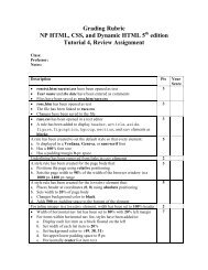
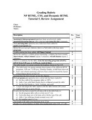
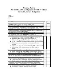
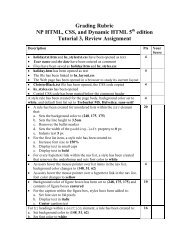
RA8 Grading Rubric - CIS
RA8 Grading Rubric - CIS
RA8 Grading Rubric - CIS

You also want an ePaper? Increase the reach of your titles
YUMPU automatically turns print PDFs into web optimized ePapers that Google loves.
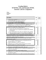
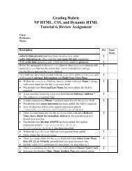
• File is saved as dfprint.css<br />
After the initial style comments, an @page rule is inserted to set the size of 3<br />
the printed page to 8.5 in by 11 in, portrait orientation, margin 0.5 in<br />
At the bottom of the file, a style rule is inserted for the article element to 2<br />
avoid page breaks within the element and add a page break after the element<br />
A style rule is added for list items in the familyLinks nav list to avoid page 3<br />
breaks within/after each item<br />
For the last list item in the familyLinks nav list, a style rule is inserted to 2<br />
avoid adding a page break<br />
In dubcek.htm, a link to dfprint.css is added, using print as media device 3<br />
• dfmobiletxt.css is opened<br />
2<br />
• your name/the date are entered as comments<br />
• File is saved as dfmobile.css<br />
• At the bottom of the file, an @media rule with a media query is 13<br />
inserted to match a screen device in portrait orientation<br />
• Within @media, a style rule is created for list items within the<br />
familyLinks nav list to<br />
a) Display list items as blocks<br />
b) Set width to 40%<br />
c) Set top/bottom margins to 5 px, left/right margins to 5%<br />
d) Float list items on the left<br />
• An @media rule is created for screen devices in landscape orientation 12<br />
• Within @media, a style rule is created for list items belonging to the<br />
parentList class to<br />
a) Display items as blocks<br />
b) Set width to 45%<br />
c) Set top/bottom margins to 5 px, left/right margins to 2%<br />
d) Float the items on the left<br />
In the @media rule for landscape orientation, a style rule is added for list 10<br />
items belonging to the childList class to<br />
a) Display items as blocks<br />
b) Set width to 16%<br />
c) Set top/bottom margins to 5 px, left/right margins to 0.2%<br />
d) Float the items on the left<br />
In dubcek.htm, in the head section of the file, a meta element is inserted to 3<br />
set the viewport of the file to match the device width<br />
A link is added to dfmobile.css, loading the style sheet only for screen 3<br />
elements that are less than or equal to 500 px in width<br />
TOTAL POSSIBLE POINTS: 100 0<br />
YOUR SCORE: ______


 Change language