

RA8 Grading Rubric - CIS
RA8 Grading Rubric - CIS
RA8 Grading Rubric - CIS

Create successful ePaper yourself
Turn your PDF publications into a flip-book with our unique Google optimized e-Paper software.
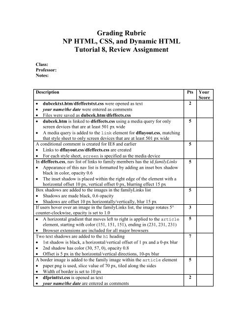
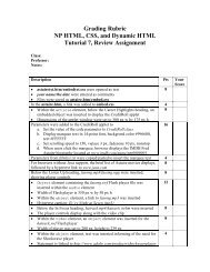
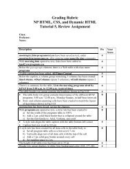
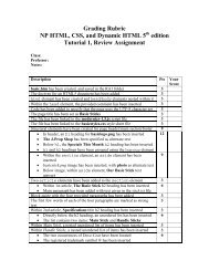
<strong>Grading</strong> <strong>Rubric</strong><br />
NP HTML, CSS, and Dynamic HTML<br />
Tutorial 8, Review Assignment<br />
Class:<br />
Professor:<br />
Notes:<br />
Description Pts Your<br />
Score<br />
• dubcektxt.htm/dfeffectstxt.css were opened as text<br />
2<br />
• your name/the date were entered as comments<br />
• Files were saved as dubcek.htm/dfeffects.css<br />
• dubcek.htm is linked to dfeffects.css using a media query for only 5<br />
screen devices that are at least 501 px wide<br />
• A media query is added to the link element for dflayout.css, matching<br />
that style sheet to only screen devices that are at least 501 px wide<br />
A conditional comment is created for IE8 and earlier<br />
5<br />
• Links to dflayout.css/dfeffects.css are created<br />
• For each style sheet, screen is specified as the media device<br />
In dfeffects.css, nav list of links to family members has the id familyLinks 5<br />
• Appearance of this nav list is formatted by adding an inset box shadow<br />
black in color, opacity 0.6<br />
• The inset shadow is placed within the right edge of the element with a<br />
horizontal offset 10 px, vertical offset 0 px, blurring effect 15 px<br />
Box shadows are added to the images in the familyLinks list<br />
5<br />
• Shadows are made black, 0.6 opacity<br />
• Shadows are offset 10 px horizontally/vertically, blur 15 px<br />
If users hover over an image in the familyLinks list, the image rotates 5° 3<br />
counter-clockwise, opacity is set to 1.0<br />
• A horizontal gradient that moves left to right is applied to the article 5<br />
element, starting with color (151, 151, 151), ending in (231, 231, 231)<br />
• Browser extensions are included for all major browsers<br />
Two text shadows are added to the h1 heading<br />
7<br />
• 1st shadow is black, a horizontal/vertical offset of 1 px and a 0-px blur<br />
• 2nd shadow has color (30, 57, 0), opacity 0.8<br />
• Offset is 5 px in the horizontal/vertical directions, 10-px blur<br />
A border image is added to the family image within the article element 5<br />
• paper.png is used, slice value of 70 px, tiled along the sides<br />
• Width of border is set to 10 px<br />
• dfprinttxt.css is opened as text<br />
2<br />
• your name/the date are entered as comments
• File is saved as dfprint.css<br />
After the initial style comments, an @page rule is inserted to set the size of 3<br />
the printed page to 8.5 in by 11 in, portrait orientation, margin 0.5 in<br />
At the bottom of the file, a style rule is inserted for the article element to 2<br />
avoid page breaks within the element and add a page break after the element<br />
A style rule is added for list items in the familyLinks nav list to avoid page 3<br />
breaks within/after each item<br />
For the last list item in the familyLinks nav list, a style rule is inserted to 2<br />
avoid adding a page break<br />
In dubcek.htm, a link to dfprint.css is added, using print as media device 3<br />
• dfmobiletxt.css is opened<br />
2<br />
• your name/the date are entered as comments<br />
• File is saved as dfmobile.css<br />
• At the bottom of the file, an @media rule with a media query is 13<br />
inserted to match a screen device in portrait orientation<br />
• Within @media, a style rule is created for list items within the<br />
familyLinks nav list to<br />
a) Display list items as blocks<br />
b) Set width to 40%<br />
c) Set top/bottom margins to 5 px, left/right margins to 5%<br />
d) Float list items on the left<br />
• An @media rule is created for screen devices in landscape orientation 12<br />
• Within @media, a style rule is created for list items belonging to the<br />
parentList class to<br />
a) Display items as blocks<br />
b) Set width to 45%<br />
c) Set top/bottom margins to 5 px, left/right margins to 2%<br />
d) Float the items on the left<br />
In the @media rule for landscape orientation, a style rule is added for list 10<br />
items belonging to the childList class to<br />
a) Display items as blocks<br />
b) Set width to 16%<br />
c) Set top/bottom margins to 5 px, left/right margins to 0.2%<br />
d) Float the items on the left<br />
In dubcek.htm, in the head section of the file, a meta element is inserted to 3<br />
set the viewport of the file to match the device width<br />
A link is added to dfmobile.css, loading the style sheet only for screen 3<br />
elements that are less than or equal to 500 px in width<br />
TOTAL POSSIBLE POINTS: 100 0<br />
YOUR SCORE: ______


 Change language