


You also want an ePaper? Increase the reach of your titles
YUMPU automatically turns print PDFs into web optimized ePapers that Google loves.
CHAPTER<br />
19<br />
<strong>Bootstrap</strong> Navbar<br />
The Navbar is a nice feature, and is one of the prominent features of <strong>Bootstrap</strong> sites. Navbars are<br />
responsive meta components that serve as navigation headers for your application or site. Navbars collapse in<br />
mobile views and become horizontal as the available viewport width increases. At its core, the navbar includes<br />
styling for site names and basic navigation.<br />
Default navbar<br />
To create a default navbar:<br />
<br />
<br />
<br />
<br />
Add classes .navbar, .navbar-default to the tag.<br />
Add role="navigation" to the above element, to help with accessibility.<br />
Add a header class .navbar-header to the element. Include an element with classnavbar-brand.<br />
This will give the text a slightly larger size.<br />
To add links to the navbar, simply add an unordered list with a classes of .nav, .navbar-nav.<br />
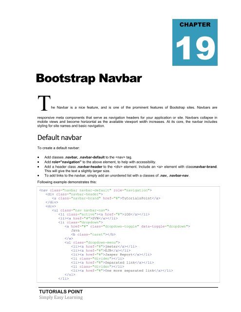
Following example demonstrates this:<br />
<br />
<br />
<strong>Tutorial</strong>sPoint<br />
<br />
<br />
<br />
iOS<br />
SVN<br />
<br />
<br />
Java<br />
<br />
<br />
<br />
jmeter<br />
EJB<br />
Jasper Report<br />
<br />
Separated link<br />
<br />
One more separated link<br />
<br />
<br />
TUTORIALS POINT<br />
Simply Easy Learning
 Change language