Effective Presentations - Northwest Center for Public Health Practice
Effective Presentations - Northwest Center for Public Health Practice
Effective Presentations - Northwest Center for Public Health Practice

You also want an ePaper? Increase the reach of your titles
YUMPU automatically turns print PDFs into web optimized ePapers that Google loves.
When you think about colors, it’s helpful to think about<br />
putting together two to three colors that will resonate<br />
throughout the presentation. Often, people choose<br />
complimentary colors on the color wheel because of the<br />
contrast they provide to each other (blue/orange is one<br />
example, and many colleges and universities employ this<br />
strategy with color schemes like purple/yellow, etc.). These<br />
two colors will be the primary colors, but can be accentuated<br />
by grays or a secondary color scheme if mandated by a<br />
chart, graph or other visualization that needs color <strong>for</strong><br />
differentiation. However, avoid using red against green to<br />
differentiate data or in<strong>for</strong>mation (in a pie chart, <strong>for</strong> example)<br />
because about 10% of men are color blind and can’t<br />
differentiate red from green.<br />
Typography<br />
If you are going to have text on your slides, be consistent<br />
about the fonts you use. This is another “rule” that people<br />
have heard over and over, but haven’t had explained to<br />
them. It’s the same principle we discussed in the slide<br />
template section. Consistent typography gives the audience<br />
visual cues about how they’re supposed to interpret<br />
in<strong>for</strong>mation. If the audience has to adjust to new typefaces,<br />
it takes time away from diving straight into the content.<br />
One font is sufficient <strong>for</strong> your slides. You can use color and<br />
text attributes, such as text size and color, to differentiate<br />
different types of content (header and body). Also, be sure<br />
to have the same font size and style <strong>for</strong> headers and content<br />
(e.g., Arial 36 point bold <strong>for</strong> headers and Arial 28 point <strong>for</strong><br />
body).<br />
Charts and Data<br />
It’s often tempting to use slides to explain the in<strong>for</strong>mation<br />
that is most technical, the most difficult to understand.<br />
Sometimes this is appropriate. Some types of in<strong>for</strong>mation<br />
are best displayed and explained visually, but make sure that<br />
you have spent the appropriate amount of time thinking<br />
about what you want people to understand. If you’re going<br />
to put up a slide and say, “I don’t expect you to be able to<br />
see or understand all of this, but the important part is…”<br />
then only include the important part. Simplify.<br />
If you put complex materials on the screen, people will try<br />
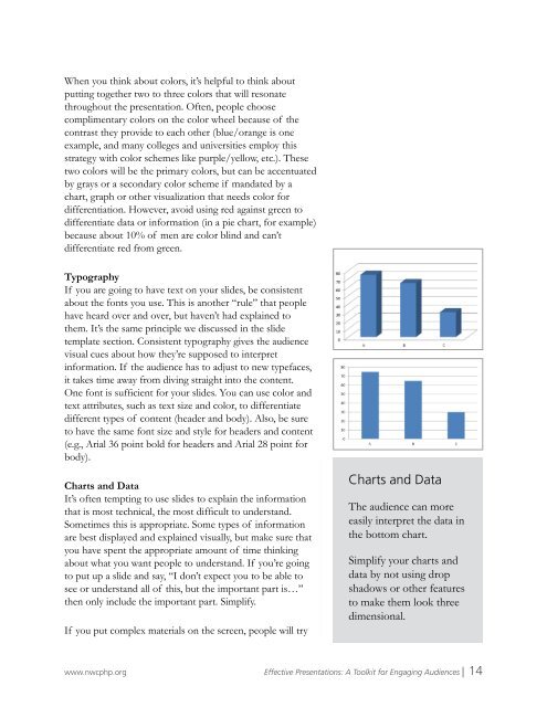
Charts and Data<br />
The audience can more<br />
easily interpret the data in<br />
the bottom chart.<br />
Simplify your charts and<br />
data by not using drop<br />
shadows or other features<br />
to make them look three<br />
dimensional.<br />
www.nwcphp.org <strong>Effective</strong> <strong>Presentations</strong>: A Toolkit <strong>for</strong> Engaging Audiences | 14