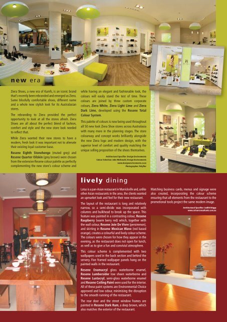
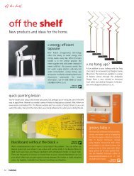
new eraZiera Shoes, a new era of Kumfs, is an iconic brandthat’s recently been rebranded and emerged as Ziera.Same blissfully comfortable shoes, different nameand a whole new stylish look for its Australasianstores.The rebranding to Ziera provided the perfectopportunity to look at all the stores afresh. ZieraShoes are all about the perfect blend of fashion,comfort and style and the new store look neededto reflect that.While Ziera wanted their new stores to have amodern, fresh look it was important not to alienatetheir existing loyal customer base.<strong>Resene</strong> Eighth Stonehenge (muted grey) and<strong>Resene</strong> Quarter Oilskin (grey brown) were chosenfrom the extensive <strong>Resene</strong> colour palette as perfectlycomplementing the new store’s colour scheme andwhile having an elegant and fashionable look, thecolours will easily stand the test of time. Thesecolours are joined by three custom corporatecolours, Ziera White, Ziera Light Lime and ZieraDark Lime, developed using the <strong>Resene</strong> TotalColour System.This palette of colours is now being used throughoutall 50 new look Ziera Shoe stores across Australasiawith many more in the planning stages. The storecolourway and concept works brilliantly alongsidethe new Ziera logo and modern design, with thesuperior level of comfort and quality matching theunique selling proposition of the shoes themselves.Architectural Specifier: Design EnvironmentsColour Selection: John McDonald, Design Environmentswww.designenvironments.co.nzPhotographer: Polyflorlively diningLotus is a pan-Asian restaurant in Marrickville and, unlikeother Asian restaurants in the area, the clients wantedan upmarket look and feel for their new restaurant.The layout of the restaurant is long and relativelynarrow, so a semi-divide was incorporated withcolumns and bulkhead to break up the space. Thisfeature was painted in a contrasting colour, <strong>Resene</strong>Raspberry (warm berry red) which, together withthe wall colour, <strong>Resene</strong> Joie De Vivre (persimmon),and skirting in <strong>Resene</strong> Mexican Wave (red basedorange), creates a colourful and lively colour scheme.The colours were chosen for how they appear in theevening, as the restaurant does not open for lunch,as well as to give a fun and convivial atmosphere.This colour scheme is complemented with twowallpapers used in the back section and behind theservery. Five framed wallpaper panels hang on thepainted walls in the restaurant.<strong>Resene</strong> Enamacryl gloss waterborne enamel,<strong>Resene</strong> Lumbersider low sheen waterborne and<strong>Resene</strong> Lustacryl, semi-gloss waterborne enameland <strong>Resene</strong> Ceiling Paint were used for the interior.All of these paint systems are Environmental Choiceapproved and low odour, minimising the disruptionto the smooth running of the restaurant.The rear door and the street window frames arepainted in <strong>Resene</strong> Dark Rum, a deep brown, whichalso matches the exterior of the restaurant.Matching business cards, menus and signage werealso created, incorporating the colour schemeensuring that all elements from the restaurant to thepromotional tools project the same modern image.Architectural Specifier: Judith Briggswww.colourconsultants.com.au
fresh flowerWhen the new owners undertook the task oftransforming Passion Café into Buttercup Café,they carefully considered all elements, includingthe floor. Situated in Kimbolton Road, Feilding,this café is a local favourite. But with all thosefeet traipsing in and out, the floor is subject tosignificant wear and tear.The dated vanished floors were high gloss andextensively yellowed as solventborne clearfinishes tend to do. Keen to make the most of thetimber flooring but in a more natural looking way,the previous coating was completely sanded offbefore the entire floor was coated with <strong>Resene</strong>Qristal ClearFloor 2K, a durable waterborneflooring finish, much lower in VOCs and odourthan traditional solventborne finishes. <strong>Resene</strong>Qristal ClearFloor 2K is a satin finish that looksnatural while imparting a hardwearing floorfinish so that it can withstand the foot traffic,dropped dishes and spilt food and beverages.Now the café is humming along the owners areenjoying the hardness of the floor and the easeof cleaning that comes with it and customersare showing their appreciation with theircompliments on how good it looks.<strong>Resene</strong>: BJ Searancke, Manawatu Trade Representativehome awayfrom homeParents of children having treatment at StarshipChildren’s Hospital have one less thing to worryabout thanks to the opening of Ronald McDonaldHouse Trust’s newest family accommodationfacility, Grafton Mews. Grafton Mews has 18 roomsincluding two transplant units, customised disabledrooms, standard rooms, laundries, living areas anda playground.The Trust provides accommodation and support forfamilies from all over the country, who have to travelwhile their children are treated at Starship Children’sHospital. It provides comfort and a safe environmentfor families during what can be a highly stressfultime. It enables them to be together and for familiesto draw strength from others who are on a similarjourney.In 2010 the Trust provided over 23,000 room nightsto families. In <strong>2011</strong> this is expected to increase toover 24,000. It costs on average $120 per night toprovide accommodation and some meals, howeverthere is no charge for referred families to stay at anyof the three facilities. Collectively the three facilitieshave 79 rooms available to referred families, thelargest room capacity in Australasia, with a further20 rooms planned.For the Grafton Mews project, only EnvironmentalChoice approved products were selected, including<strong>Resene</strong> Zylone Sheen low sheen waterborneand <strong>Resene</strong> SpaceCote Low Sheen low sheenwaterborne enamel on walls, <strong>Resene</strong> Lustacrylsemi-gloss waterborne enamel on trim and joineryand <strong>Resene</strong> Broadwall 3 in 1, which can be usedas a surfacer, sealer and finishing coat, enablingsignificant time and cost savings.The general colour palette throughout the house isneutral with <strong>Resene</strong> Quarter Tea (muted beige),<strong>Resene</strong> Quarter Napa (grey beige neutral), <strong>Resene</strong>Alabaster (blackened white), <strong>Resene</strong> WhitePointer (stark off-white), <strong>Resene</strong> Quarter PearlLusta (classic cream) complemented by soothinggreens of <strong>Resene</strong> Chill Out (pale chartreuse),<strong>Resene</strong> Sulu (summer yellow green), <strong>Resene</strong> TintOf Aqua (green off white) and <strong>Resene</strong> Anakiwa(pale blue). The project also includes bold accentcolours <strong>Resene</strong> Endeavour (clear blue), <strong>Resene</strong>Havoc (pure red), <strong>Resene</strong> Turbo (energetic yellow)and <strong>Resene</strong> Space Cadet (ultramarine blue) to addinterest without being overpowering.Worldwide there are over 300 Ronald McDonaldHouses in 30 countries. Ronald McDonald Housesstarted in Philadelphia in 1974 with a McDonaldsregional manager helping a friend whose daughterhad leukaemia. <strong>Resene</strong> has been a long standingsupporter of Ronald McDonald Houses providingmany many litres of paint free to Ronald McDonaldHouse projects around the country. It’s nice tothink that families going through a parent’s worstnightmare and the stress of having a sick child havea supportive team, environment and home to helpthem through.Architectural Specifier: Avery ArchitectsBuilding Contractor: Brookfield MultiplexPhotography: Michael Bradley; Brookfield Multiplex<strong>Resene</strong>: Rob Mountford, Central Auckland Branch Managercool caféThey say imitation is the sincerest form of flattery,but the owners of this Hood Street, Hamilton caféwould prefer to forgo the flattery and keep theirunique look strictly one of a kind.While most strive for smooth walls, this café hasinstalled Muros roughcast concrete panels, giving anauthentic rough concrete finish to pillars, beams andwalls. The Muros panels are finished in EnvironmentalChoice approved <strong>Resene</strong> Lumbersider low sheenwaterborne paint, though could have easily beenfinished in <strong>Resene</strong> SpaceCote Low Sheen if alower sheen finish had been desired.In a competitive market where cafés need to standout to attract repeat business, the uniqueness of thefinishing makes this café very memorable.www.muros.co.nz