Getting Back to Basics with Ed Arnold. - News Design Associates
Getting Back to Basics with Ed Arnold. - News Design Associates
Getting Back to Basics with Ed Arnold. - News Design Associates
- No tags were found...

You also want an ePaper? Increase the reach of your titles
YUMPU automatically turns print PDFs into web optimized ePapers that Google loves.
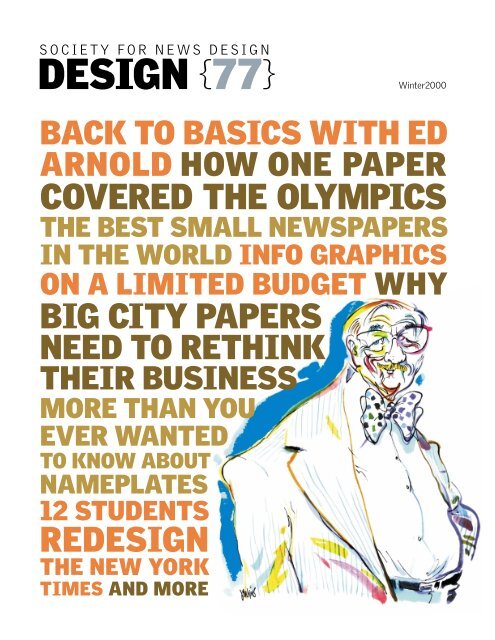
SOCIETY FOR NEWS DESIGNDESIGN {77}Winter2000BACK TO BASICS WITH EDARNOLD HOW ONE PAPERCOVERED THE OLYMPICSTHE BEST SMALL NEWSPAPERSIN THE WORLD INFO GRAPHICSON A LIMITED BUDGET WHYBIG CITY PAPERSNEED TO RETHINKTHEIR BUSINESSMORE THAN YOUEVER WANTEDTO KNOW ABOUTNAMEPLATES12 STUDENTSREDESIGNTHE NEW YORKTIMES AND MORE
TONY JENKINSCONVERSATION
CONVERSATION<strong>Getting</strong> back<strong>to</strong> basics <strong>with</strong><strong>Ed</strong><strong>Arnold</strong><strong>Ed</strong> <strong>Arnold</strong>, often described as the Father ofNorth American <strong>News</strong>paper <strong>Design</strong>, was honoredby SND at its recent Minneapolis workshop<strong>with</strong> a Lifetime Achievement Award forhis “Outstanding contributions <strong>to</strong> newspaperdesign and graphics worldwide. Through hisdecades of work as an author, teacher, lecturerand designer, he has done much <strong>to</strong> elevatethe importance of visual journalism.”<strong>Arnold</strong>, former edi<strong>to</strong>r of Linotype <strong>News</strong>, newspaper owner, professorat Syracuse University, seminar leader at the AmericanPress Institute and designer of many newspapers in a careerspanning 60 years, talks <strong>to</strong> <strong>Design</strong>’s edi<strong>to</strong>r Tony Sut<strong>to</strong>n abouthis trade, his experiences and his hopes for the future.JAMES KEGLEY
CONVERSATION“I’ve oftenwonderedwhat wouldhappenif Ty Cobbhad everbeenasked<strong>to</strong> wearan ad.He’d say,’Nuts <strong>to</strong>you, Bud,I’m not awalkingbillboard,I’m abaseballplayer’”Sut<strong>to</strong>n: You’ve been in the newspaper business for 60years; are you happy <strong>with</strong> the way newspaper designhas evolved during that time?<strong>Arnold</strong>: I want <strong>to</strong> put on record that I’m not an oldreprobate longing for a return <strong>to</strong> the good old days. I’mmore of a proud father who is disappointed that hiskids are only reaching 98 percent of their potential andwants them <strong>to</strong> reach 101 percent. My message <strong>to</strong>young designers is this: look, kids, you can do better,but the only way <strong>to</strong> achieve your potential is <strong>to</strong> go back<strong>to</strong> – and understand – the basics. That sounds boring,but it’s reality.This last month I’ve been circulating among highschools around my home in Roanoke, Virginia, seeingthe football teams getting ready for the new season.They were doing exactly the same things I rememberseeing in the ’30s when I was in high school: basicblocking, basic ball handling, basic concentration ofwhat the aim is – <strong>to</strong> get the ball across the opponents’line. If I were involved in newspaper design <strong>to</strong>day, I’dfight <strong>to</strong> get back <strong>to</strong> basics, <strong>to</strong> convince everyone fromthe publisher down <strong>to</strong> the copyboy what our job reallyis. I’d love <strong>to</strong> do it, though. It’s exciting. It’s a challenge.It’s fun. And I can’t think of any other way of earninga living <strong>with</strong>out working for it.We’re living in a better age because we have a moreamenable mindset <strong>to</strong> new ideas. <strong>Design</strong> is recognized;you aren’t bound by the very rigid limitations of hotmetal. Pages are cheap <strong>to</strong> produce, and typefaces arecheap <strong>to</strong> produce – that’s why we are getting all theseGod-awful abominations. However, I do get a feelingwe are losing some of our concentration. I think thatmaking sure that the reader reads all our copy and –more important – comprehends it has become secondaryor almost entirely ignored. Display oftenbecomes more important than the message the edi<strong>to</strong>ris trying <strong>to</strong> sell.Sut<strong>to</strong>n: In what way?<strong>Arnold</strong>: Well, for example, I was looking at the DetroitFree Press display in its booth downstairs [in the SNDconference’s registration hall]. It has a bunch of beautifulfront page posters, the kind that my kids used <strong>to</strong>put on the wall when they were teenagers. Well, youget one of these pages, and you’re looking at it from 14inches, and it’s like standing in front of a circus poster,but it’s almost impossible <strong>to</strong> read. The front-pageimages on our newspapers are becoming so big thatthey don’t attract the reader, they attract the looker.And they often don’t work because the broadsheetpage is folded so you only see half of it in the newsrack. We are over-designing, and we are over-coloring,so that the reader is confronted by a three-ring circus.Who do I watch? The bareback riders, the weightlifteror the jugglers? I no longer see page patterns that leadmy eye through the page and tell me where <strong>to</strong> go. I callthese patterns the Gutenberg Principle. When I pickup a piece of printed paper, I go immediately <strong>to</strong> the <strong>to</strong>pleft-hand corner and when I get <strong>to</strong> the bot<strong>to</strong>m right I’mdone and I turn the page. That’s it! I’m also unhappy<strong>with</strong> putting ads on the front page. It reminds me of thedrivers in NASCAR and other au<strong>to</strong> races who arewalking billboards. Every square inch of the uniformis an ad.I’ve often wondered what would happen if Ty Cobbhad ever been asked <strong>to</strong> wear an ad. He’d say, “Nuts <strong>to</strong>you, Bud, I’m not a walking billboard, I’m a baseballplayer.”Sut<strong>to</strong>n: But surely advertising has always been an integralpart of newspapers?<strong>Arnold</strong>: Just before we got in<strong>to</strong> World War II, RalphIngersoll started a beautiful newspaper called PM. Ithad no ads, just journalism. Then the paper got somany complaints from readers that they started treatingads as news – ‘The big news <strong>to</strong>day is that Macy's isdoing this, Saks 5th Avenue is doing that,’ and so on.Then Ingersoll finally said, “This is advertising, let’sget some money for it.” Unfortunately, newsprintrationing came in, and Ingersoll didn’t have any previous-usebase point, so PM went under, which was ashame because it was a very handsome newspaper.But I believe advertising must be subordinate <strong>to</strong> newsand if you have <strong>to</strong> have it on page one, God forbid, putit down at the foot of the page, not at the <strong>to</strong>p. The higheron the page, the more importance it assumes, andI’d be damned if I’d let any ad be more important thanthe news.I redid the Bos<strong>to</strong>n Globe in the mid ’60s. At the timeadvertising filled a bit more than a quarter of the pageand I kept telling John Taylor, the publisher, “Getthose ads off, for Pete’s sake.” Well, he finally agreedand the ads disappeared as the contracts expired untilthere was only one left – about eight-inches deep bytwo columns wide. It was a beer ad that was predominantlya beautiful picture of Massachusetts, so it didn’tmar the page design at all. The day that ad disappeared,ABC announced that the Globe was the newNo. 1 paper in Bos<strong>to</strong>n. As soon as I heard this, I got onthe phone and said, “See, John, if you had taken myadvice earlier you’d have been No. 1 years ago.”There’s something a little tawdry about ads on pageone, but I’m sure we’re going <strong>to</strong> have <strong>to</strong> live <strong>with</strong> thembecause the trend is growing all the time.”Sut<strong>to</strong>n: Yes, the corporate bean counters aren’t going<strong>to</strong> back down on that one. Talking about bean counters,what do you think about the movement of North Americannewspapers <strong>to</strong> the narrow 50-inch web?<strong>Arnold</strong>: It’s stupid, incredibly stupid. What we are selling,basically, are square inches of printed material.We have a press that will print a certain width everytime it goes clunk. And we’re making it so it gives usless. But it costs just as much in electricity <strong>to</strong> run thepress, it costs just as much for the real estate the pressoccupies and everything else. It’s like taking a five-<strong>to</strong>ntruck and drawing a yellow line down one side and sayingthis is going <strong>to</strong> remain unused. Economically, I
CONVERSATIONJAMES KEGLEYAmerican Press Institute direc<strong>to</strong>r William Winter presents <strong>Arnold</strong> <strong>with</strong> API’s Lifetime Achievement award.can’t figure it out. And I think it is a shame, ethically,because we are supposedly selling a full-page ad andit has been so wide for umpteen years and, all of a sudden,the pages come out narrower, but the advertisingrate doesn’t come down. As a matter of fact, the ad rateusually goes up. I just can’t understand it.We have smart people in the newspaper business,but they sure aren’t demonstrating their IQ in this situation.It’s interesting <strong>to</strong> watch the price of newsprintgo up as the web width has shrunk. The paper manufacturershave a machine that will create a web and,every five yards they make a penny profit. Then, whenthe publishers got smart and reduced the width oftheir papers, the papermakers said, “These stupidAmerican publishers want us <strong>to</strong> cut down our capacityand make narrower webs, so we’ll lose eight percen<strong>to</strong>f our income. We’ll just add eight percent <strong>to</strong> the bill,like restaurants do <strong>with</strong> the au<strong>to</strong>matic tip.” So,newsprint manufacturers didn’t drop a penny on thatdeal. They never will, because they’ve got us by theshort hair. And the publishers weren’t smart enough<strong>to</strong> realize that.Sut<strong>to</strong>n: Publishers will do anything <strong>to</strong> maximize profits,of course. That’s their job.<strong>Arnold</strong>: Well, actually it isn’t. It’s like a contrac<strong>to</strong>r whosays, “I’m going <strong>to</strong> save some money and raise theprofits by buying 25 percent less lumber, and then I’mgoing <strong>to</strong> build a two-bedroom house instead of thethree bedrooms we’re used <strong>to</strong>.” So, if I’m charging thesame money for this house versus the old house, thenI’m cheating the consumer. That’s what newspapersare doing. And this new page – almost twice as deep asit is wide – is aesthetically the worse design area youcan have. My daughter was in Syracuse last week andbrought home a copy of the Post-Standard, and I said,“What the hell is this?” I tried <strong>to</strong> read it, and it’s comingbetween my legs and I have <strong>to</strong> scroll up. It’s justhorrendous from a design point of view.It gets worse. I’ve been reading the MinneapolisStar Tribune here at the conference <strong>with</strong> its four-paragraphs<strong>to</strong>ries on the front page. Then I go <strong>to</strong> an insidepage and find a s<strong>to</strong>ry that basically consumes thewhole page, <strong>with</strong>out art. I just wonder if newspaperdesigners and edi<strong>to</strong>rs ever sit down and read their own“Son,” Ianswered,“if youstand onprerogatives,you’ll soonbe standingon thebread line”
CONVERSATION“In my localpaper, jumpheads areone word,about 42 pt.bold sansserifs,saying‘Taxes,’and thes<strong>to</strong>ry justgoes onand onand on.This is theeasy wayout.I don’t have<strong>to</strong> writeanotherheadline.I don’t have<strong>to</strong> writesubheads”papers <strong>to</strong> see how a reader reacts <strong>to</strong> the obstacles thatwe plant in their way. I drove from Roanoke <strong>to</strong> Michiganin June. Naturally, I bought every paper along theway and found some of them so hard <strong>to</strong> read it seemedthat edi<strong>to</strong>rs were deliberately placing obstacles forreaders. Often our efforts seem <strong>to</strong> be intended solely<strong>to</strong> attract lookers, but not <strong>to</strong> serve readers. When wewere at API’s 2020 thing I said <strong>to</strong> the group, “We’re abunch of great architects, but we’re lousy carpenters.I can see this great mansion there, a thing <strong>to</strong> bring joyin<strong>to</strong> your heart. But the doors don’t lock very nicely,the windows stick, and when I come in<strong>to</strong> my kitchen Ican’t open my fridge.” You still have <strong>to</strong> have a saw, ahammer and a bunch of nails <strong>to</strong> build something.Those are the basics and we’ve got <strong>to</strong> drum these in<strong>to</strong>our kids <strong>to</strong> start <strong>with</strong>.Sut<strong>to</strong>n: Tell us more about those basics?<strong>Arnold</strong>: Well, one of them is getting the line length correct,another is the Gutenberg Principle: things startat the <strong>to</strong>p left corner of the page, and the eye wants <strong>to</strong>go down and <strong>to</strong> the right because that’s the exit. Itdoesn’t want <strong>to</strong> go backward, and whenever we try <strong>to</strong>make the reader go backward that’s an irritation. Wefail <strong>to</strong> recognize that the reading eye and the readingprocess are very delicate instruments and consequentlyare affected by very minute fac<strong>to</strong>rs. That’ssomething we have <strong>to</strong> continually be aware of.Another thing we have <strong>to</strong> remember is that thesetypographic errors are like the old Chinese water <strong>to</strong>rture:they’re accumulative. I wake up in the morningand look at my clock. That’s my first typographicencounter of the day. Then I read the back of my cornflakesbox, and I see a billion signs all over the place asI drive <strong>to</strong> the office. I get <strong>to</strong> my workplace, and there’sa pile of stuff on my desk, a kaleidoscope of differenttypestyles. By the time I get <strong>to</strong> my newspaper, I’veaccumulated a bunch of straws, and finally there’s thisone piddling thing on page one and it’s the final strawthat breaks this camel’s back. The connections aresometimes hard <strong>to</strong> realize, but we’ve got <strong>to</strong> make thembecause that’s the world we’re living in.We’ve also got <strong>to</strong> be aware of some of the earlyresearch in<strong>to</strong> typefaces. I don’t think any sane personwould argue that roman is not the best body type. Tha<strong>to</strong>ught <strong>to</strong> be a given. We also know that, when used inmass, sans serifs and italics have low readability. Wealso know that condensed letters have low readability.But we ignore those truths … I have a typeface on mycomputer – Arial, I believe it’s called – and even in socallednormal setting, when I get an ‘r’ and an ‘n’<strong>to</strong>gether it comes up as ‘m’ every time. Now, when I’mreading, I don’t read letter by letter; I read words, andall of a sudden I hit a word I don’t understand becauseit’s got that damn ‘m’ in it. Then, when I look closely, Isee it’s not an ‘m’, but that damn ‘r’ and ‘n’ cozying up.Every one of those little interruptions is another strawthat helps <strong>to</strong> break this camel’s back.Today we have a fad for using condensed sans serifs;we have <strong>to</strong> condense type just <strong>to</strong> get words <strong>to</strong> fitin<strong>to</strong> five-pica columns. They’re irritating and the wordbreaks often make them almost impossible <strong>to</strong> read.Another thing that we seem <strong>to</strong> have completely overlookedis that headlines in all caps are less legible thanlower case. I sat in on a session this morning, and thespeaker had done a paper in Leicester, England, andcome up <strong>with</strong> all caps headlines in a narrow face <strong>with</strong>no leading so the characters practically <strong>to</strong>uched theline below. The designer probably thought it lookedgood, but it sure isn’t good <strong>to</strong> read.Fortunately, we haven’t got round <strong>to</strong> using all capsin text. There was a time when William RandolphHearst was still The Chief, when the teletype wouldring lustily in his newsrooms, and one of his edi<strong>to</strong>rialswould appear <strong>with</strong> orders that it must run on page oneand it MUST – thank heavens – BE SET IN ALL CAPS,so that the peasants couldn’t read it anyway.We have, on the advertising side, the idea that allcaps adds strength and attention <strong>to</strong> everything. Otherthan <strong>to</strong> the word SALE, they don’t.People forget the basics, and that’s sad, because itmeans that at some place in their education their men<strong>to</strong>rhas failed miserably. As an ex-journalism teacher,I see my failures and those of my colleagues <strong>to</strong>o often.Sut<strong>to</strong>n: A lot of these mistakes are made becausedesigners are not trained as edi<strong>to</strong>rs. The work they dois often very pretty, but not functional. Why haven’tAmerican newspapers got past this obstacle?<strong>Arnold</strong>: This again goes back <strong>to</strong> journalism schools. Inthe old days, they didn’t produce designers, so whathappened? The edi<strong>to</strong>r who wanted a designer went <strong>to</strong>an art school and often got in<strong>to</strong> trouble. I had an experiencein New Orleans, where I had earlier redesignedboth of the papers, the Times Picayune and I think theother was called The State. Several years later, I got acall from the managing edi<strong>to</strong>r who had hired a youngdesigner and asked me <strong>to</strong> take a look at the work. Well,I was reluctant; I’m not going there <strong>to</strong> second guesssomeone else – but we were very good friends, sowhen he offered <strong>to</strong> take me for some good shrimp Iagreed.I went <strong>to</strong> New Orleans, and this kid was in theprocess of designing a new body face. This was like aguy being hired <strong>to</strong> run a bakery who goes out andplants the wheat field. I kept quiet on that, but when Iasked him <strong>to</strong> explain his basic game plan, he said, “Ienvision the page as a bunch of areas that I shiftaround until it suits my eye, and then I put stuff it it.”I replied, “Well, that’s fine, but what do you do if youget a s<strong>to</strong>ry that won’t fit in<strong>to</strong> one of these areas?”“Then,” he said, “I stand on my prerogative andmove it <strong>to</strong> an inside page.”“Son,” I answered, “if you stand on prerogatives,you’ll soon be standing on the bread line.”Now we often see designers who are not journalists.If they’re not controlled, many of them will createmoveable art galleries. You can’t blame them because
CONVERSATIONthey often don’t have any idea of news judgment.Sut<strong>to</strong>n: What would you do <strong>to</strong> change that attitude?<strong>Arnold</strong>: I believe the sender of the message has a responsibility<strong>to</strong> his audience. We have an attitude that ifthe reader doesn’t understand a s<strong>to</strong>ry, it’s his fault,and it will be resolved if he concentrates on it. That’srubbish. The responsibility is always on the part of thesender, never the receiver. We have <strong>to</strong> say, “I’m not adesigner, I’m a newspaperman, and I’m using this particular<strong>to</strong>ol <strong>to</strong> communicate <strong>with</strong> my readers.” It’s justlike a reporter sitting down and saying <strong>to</strong> himself,“How do I start this s<strong>to</strong>ry? Do I say, ‘The city councillast night approved a new sewer …’ or do I start out<strong>with</strong> ‘John Smith has lived here 90 years and the sewerhas always been stinking …’” Our decisions alwayshave <strong>to</strong> be based on news, and when we become journalistswe are, whether or not we want <strong>to</strong> be, dedicated<strong>to</strong> transmitting the truth, the real honest-<strong>to</strong>-Godtruth and not the virtual truth.This is why I would love <strong>to</strong> see a journalism schooldeliberately set out <strong>to</strong> train journalists – all of the skills– and that’s all. I get kind of tired of hearing aboutSyracuse, which used <strong>to</strong> be a school of journalism, butnow it’s a school of mass communication in contemporarysociety or something like that. The titles ofthese schools are getting longer, and poor old journalismis down in the bot<strong>to</strong>m corner. It’s interesting,though, how many people like <strong>to</strong> think of themselvesas communica<strong>to</strong>rs. The year before I went <strong>to</strong> Syracusein 1960, Newhouse had made a very sizeable donationthat built a beautiful building. It had a conference onhow it should be spent, at which communica<strong>to</strong>rs cameout of the woodwork. Someone from the school offorestry said, “We’re communica<strong>to</strong>rs; we’re the guyswho plant the trees that make the newsprint.” And allthe vultures gathered. Same doggone thing when Iwent <strong>to</strong> Virginia Commonwealth University; everybody’sa communica<strong>to</strong>r and wants a suite in the newbuilding. At Michigan State, my alma mater, audiologists,people who work <strong>with</strong> the deaf, call themselvescommunica<strong>to</strong>rs, and they’re part of the school. So wehad journalism, then we added advertising and audiologyand all these other forms of communication allunder one tent. I don’t get that stuff at all. What bothersme is that journalism is now near the bot<strong>to</strong>m of thefood chain. That’s wrong; journalism schools have got<strong>to</strong> teach journalism.Sut<strong>to</strong>n: That’s an interesting point. In Europe the subedi<strong>to</strong>rs usually do the tasks of editing and page layout,and some of them are very, very talented in both skills;but in North America there’s almost a church and stateseparation, which regularly results in splashy overdesign of feature fronts followed by deathly dull insidepages.<strong>Arnold</strong>: Yes, you can have the best writing in the world,but you still have <strong>to</strong> get people <strong>to</strong> read it, and this againis where you have <strong>to</strong> go back <strong>to</strong> the basics. When I wasthe only picture edi<strong>to</strong>r in upstate Michigan – and laterwhen I was barns<strong>to</strong>rming on the lecture circuit – aquestion that constantly came up was, “Where doesthe picture edi<strong>to</strong>r or pho<strong>to</strong> edi<strong>to</strong>r or art direc<strong>to</strong>r sit?”Out by the darkroom, he had as much contact <strong>with</strong> thenewsroom as the guy in circulation on the next floor.This was a very, very intense debate, and it was lessthan trivial, because it was not really about where theguy’s desk went, but it was about his place in the network.I think we’ve come a long way in integrating thedepartments, but we must still be careful so it’s no<strong>to</strong>verdone. There was a very great newspaper in Pennsylvania,and the young publisher came in via aninheritance. He was very interested in design andinsisted that the art direc<strong>to</strong>r sit in on the daily newsconference. Pretty soon, the tail began wagging theCARSTEN GREGERSENLeft:<strong>Ed</strong> <strong>Arnold</strong> tellsa s<strong>to</strong>ry afterbeing presented<strong>with</strong> SND’sLifetimeAchievementAward.Below: <strong>Arnold</strong>chats <strong>with</strong>Gordon Preece,art direc<strong>to</strong>r ofCanada’sWinnipeg FreePress, Preece’swife, Deborah,right, anddaughter,Lindsay, left.CARSTEN GREGERSEN
CONVERSATIONEmphasizing the basics: <strong>Ed</strong> <strong>Arnold</strong> in action at one of the many seminars he conducted for API.quite stealable but are these future newspaper projectsworthwhile at a deeper level? Is there any real benefit<strong>to</strong> the industry?<strong>Arnold</strong>: I don’t think there is any solid value becauseyou’re preaching <strong>to</strong> the choir. And you really want <strong>to</strong>preach <strong>to</strong> the pas<strong>to</strong>r – the publisher. Somebody saidthat <strong>to</strong> me at API at one time: “This is fine telling usbut why don’t you tell it <strong>to</strong> the publishers?” So MontyCurtis, the executive direc<strong>to</strong>r, gets us a gig as a twomanpanel at a meeting of a bunch of publishers at thetime when Hubert Humphrey was campaigning forPresident. We had just gone on stage, and were waiting<strong>to</strong> be introduced when there was a flurry at theentrance. Humphrey had arrived. He was supposed <strong>to</strong>talk the day before but never made it; he was alwaysrunning 36 hours late. Now he had time <strong>to</strong> extend shortgreetings <strong>to</strong> these publishers, so he climbed on<strong>to</strong> thestage and started talking. He talked and talked and hisfive minutes stretched <strong>to</strong> 45. Monty and I were anchoredthere, so couldn’t walk off. But, finally, the chairmancame up and thanked him, and Hubert left. Thenthe chairman said, “Well, we’re just about in time forthe next session,” so I never did get <strong>to</strong> pass my greatmessage <strong>to</strong> the publishers. I thought this must havebeen a message from above.Sut<strong>to</strong>n: Still on the subject of the future, I’m sure youhave some comments about the design of websites.<strong>Arnold</strong>: The typography on the Web is abominable. Itis such a kaleidoscope that you don’t know where <strong>to</strong>go. And designers use <strong>to</strong>o much condensed sans whichis hard <strong>to</strong> read. Last week, for example, I had <strong>to</strong> lookup something in the Encarta dictionary, and I broughtthis thing up on my screen, and I literally couldn’t readit. I couldn’t get through it because the word spacingis absolutely minimal, and the leading is less than minimal.Now this ought <strong>to</strong> be fine typography becausebooks have always had a tradition of fine type, but thiscomes out stinking. My daughter Bethany writes a dailycolumn for the country’s biggest Christian website,and I check her page <strong>to</strong> see if she’s spelling properly,but the typography is lousy. I read it because it’s myduty, it’s a point of pride, but I sure don’t enjoy thephysical experience.Like you, I’m a professional reader; we can sit downand read a poor typography in a newspaper. It doesn’tbother me, I can read it fine, but your typical readeralmost moves his lips when he reads. We’ve got <strong>to</strong> acceptthe fact that most of our readers are not very goodat reading and give them every bit of help that we can.One of the things we can do is <strong>to</strong> raise newspaper bodytype by another point.While we’re on the subject of body type, one of thegreat battles in the 1950s was raising the size <strong>to</strong> 9 pt.after 8 pt. had been the standard for 50 years. The troublewas that Associated Press was sending everythingline for line on the Teletype at 12 picas. When the publishersasked for 9 at 12, AP wouldn’t play ball, so we“We’ve got<strong>to</strong> acceptthe factthat mos<strong>to</strong>f ourreadersare notvery goodat readingand givethem everybit ofhelp thatwe can”
CONVERSATION“Then wesee theseinfernalnarrowcolumnsthat havebecomeso popular<strong>with</strong>designers …Readingthat is likewalkingdown astaircase<strong>with</strong>regularsteps,but thenhitting ashorter oneandbumpingdown <strong>to</strong>the bot<strong>to</strong>m.It’sirritatingand it’sdoggonenearpainful”had a fight. Then the San Jose <strong>News</strong> had a bigger fightbecause they wanted <strong>to</strong> reduce the column width <strong>to</strong> 11picas. AP said, “No soap.” Well, Pete Southam, whohad just retired as head honcho at Southam newspapersin Canada, was interested in typography so heinvited me <strong>to</strong> Ottawa and asked what we could doabout the problem. I said, “Pete you’re president ofCanadian Press, surely you’ve got some clout.” Heasked me for the answer. I <strong>to</strong>ld him the solution was assimple as changing the margin release on a typewriter.It was that easy, no matter what CP or AP said. So Peteused his clout and Canadian Press went <strong>to</strong> 11 picacolumns. Then the people down here said, “If thoseCanadians can do it, why the hell can’t we?” and, veryreluctantly, AP changed its transmission <strong>to</strong> 9 at 11. Itwas like moving the pyramids five yards <strong>to</strong> the south.Sut<strong>to</strong>n: We spoke earlier about the need <strong>to</strong> turn lookersin<strong>to</strong> readers, but wouldn’t you agree that we alsohave <strong>to</strong> take care that we don’t oversimplify everything<strong>to</strong> the point of irrelevance?<strong>Arnold</strong>: That’s the distinction that we have <strong>to</strong> reiterateconstantly, that there are viewers and there are readers.And they are not identical functions or identicalroles. It sounds so tiresome <strong>to</strong> keep repeating this, butyou’ve got <strong>to</strong> get back <strong>to</strong> the basics again. People are<strong>to</strong>tally ignorant of the his<strong>to</strong>ry of our craft, which is anhonorable one. The printer is the schoolteacher of theworld, but we don’t learn or understand our own his<strong>to</strong>rybecause no one teaches us. There are alwaysbright spots, like when I was working <strong>with</strong> La Pressein Montreal. The publisher at the time was an elderlyFrench version of Conrad Black, and she was sitting ina lot of meetings. During one, we were trying <strong>to</strong> comeup <strong>with</strong> a new headline type. French words are longerthan English, and I was trying <strong>to</strong> get a legible typefacethat would enable the heads <strong>to</strong> fit properly. I asked thepublisher why her paper hadn’t developed headlineselike American papers, who’d say something like “Ikegoes <strong>to</strong> NATO,” whereas La Presse would say, “Monsieurle President Eisenhower …” Well, madamealmost fainted, so I dropped that ball very quickly. Later,one of my hosts <strong>to</strong>ok me outside her office wherethere was a plaque from the French Academy honoringmadam for her valiant efforts <strong>to</strong> preserve the purityof the French language. There’s a lesson there.Sut<strong>to</strong>n: You’ve redesigned many newspapers in yourtime. Talk about some of your experiences and those ofthe other newspaper design pioneers.<strong>Arnold</strong>: There was a guy, Deacon Farrar, who had beenthe No. 1 newspaper designer for years. When he went<strong>to</strong> redo The Detroit <strong>News</strong> in the late ’40s,he got a suiteat the Hotel Cadillac, then the city’s best hotel. He hadno contact <strong>with</strong> the staff of the paper and only spoke <strong>to</strong>the publisher immediately after he talked <strong>to</strong> God. Hewas in Detroit for weeks, pasting up pages in his suite,but he alienated the staff <strong>with</strong> his memos so much that<strong>with</strong>in two months the only trace of Farrar’s footstepswas a funny little sideless box he had designed; everythingelse moved back <strong>to</strong> what it was before.Well, I saw this from the outside, and it taught mea lesson: get the staff involved fast because they’re justas smart as you are, probably a little smarter. So oneof the things that I always did was ask that somebodywould come up <strong>with</strong> a headline schedule and get themworking on anything else they could possibly do. Myidea was get in there, get the job done and get the hellout as soon as I’d done the job properly.I had a colleague at Virginia Commonwealth Universitywho worked for two years on a redesign of astate newspaper. Two years on one job? Well, a lot ofthis is management, which likes <strong>to</strong> procrastinate. So,I’d go in <strong>to</strong> whoever had <strong>to</strong> make the decisions and say,“Look here, we’ve got <strong>to</strong> get this all set now becauseI’m catching a plane in a couple of hours, and we can’tdo anything until you sign off.” And it would work.There are many ways <strong>to</strong> move publishers. I redesignedThe Toron<strong>to</strong> Star when Beland Honderichwas the publisher. He was a conservative man who didn’tbelieve in doing things that hadn’t been donebefore. We completed the redesign, complete <strong>with</strong>stylebook and a new nameplate – which, incidentally,they still use after all these decades. Everything wasall set, but he couldn’t bring himself <strong>to</strong> push the but<strong>to</strong>n.Then the word came out that The Globe and Mailwas building a new plant, and they would be comingup <strong>with</strong> a new design. That was that, Beland pushedthe but<strong>to</strong>n, and bam, bam, bam, there we were.But it’s always a good idea <strong>to</strong> make sure everythingis set up in advance. When Gannett bought a littleweekly in Titusville, Florida, <strong>to</strong> convert in<strong>to</strong> a dailycalled Today, it had staff on duty for at least a month,putting out a paper every day up <strong>to</strong> the point of droppingit off at the carrier spots. Then somebody wouldcome right up behind, picking them up fast. The firstday the paper came out they were hit by a hurricane.The staff did a terrific job because they had got plentyof training in putting the paper out every day.On the other hand, I was at another paper on LongIsland that had committed <strong>to</strong> a start-up date. I wasthere a week before the launch date, and the new, reconditioned,press was still not running. This was thelast days of the newspaper wars, and only half thepapers – a Sunday edition – got out. It was a <strong>to</strong>tal messbecause they just wouldn’t take another week <strong>to</strong> getthe job running properly.Then we had the extreme on the other side when ElMundo started in San Juan, Puer<strong>to</strong> Rico. It had a fullstaff in operation for a year and put out a paper up <strong>to</strong>platemaking every day. And that was <strong>to</strong>o long becausethey lost a lot of good people who got bored and said,“What the hell is this?” But when they did start theyhad a veteran staff. And it wasn’t <strong>to</strong>tally Mickey Mousebecause there was another morning newspaper in thesame shop, so they were also working for El Vocero,which had kept <strong>to</strong> the same design I had given them 22years earlier.
CONVERSATION<strong>Ed</strong> <strong>Arnold</strong> gets a standing ovation as he goes <strong>to</strong> collect his Lifetime Achievement Award at the Minneapolis workshop.Sut<strong>to</strong>n: A good design should last longer than a coupleof years, shouldn’t it?<strong>Arnold</strong>: A colleague put out a book that was very successful.I met him later and asked what he was doing.He <strong>to</strong>ld me he was writing his second book and washaving <strong>to</strong> make so many changes that it bothered him.“Brother,” I replied, “if your first book had been sound,you would have had principles that didn’t have <strong>to</strong> bechanged.” And I have stuck <strong>to</strong> that philosophy constantly.This sounds like bragging, I’m sure, but oncein a while, I go back <strong>to</strong> one of my books and read it andknow I would make no apologies at all if I put it outagain <strong>with</strong> all the words the way they are, just changingthe illustrations. The basic principles don’t changebecause the eye and the brain don’t change. The sameprinciples apply <strong>to</strong> newspapers – if the design is solid,it should survive.Sut<strong>to</strong>n: I believe you were the guy responsible for theinnovative switch from eight columns <strong>to</strong> six columns inNorth American newspapers in the 1960s? How didthat come about?<strong>Arnold</strong>: Way back in Ben Franklin’s day, his old chumGiambattista Bodoni, and the other master printers ofEurope came up <strong>with</strong> the idea of an optimum linelength that was one-and-a-half times the lower casealphabet length. When you translated that in<strong>to</strong> thetype we were using it came <strong>to</strong> 14 picas. When I transformedthe Louisville Courier Journal and TheLouisville Times <strong>with</strong> Norm Isaac in 1964, we came up<strong>with</strong> a six-column format because that gave us 14 picacolumns. Some papers had used six columns for theirfront pages before then, but these were the first ones<strong>to</strong> use the same format right through. But, back <strong>to</strong>Bodoni and Franklin. They also said that the minimumline length should 25 percent less than the optimum,while the maximum line length is 50 percent more, soit all comes out basically <strong>to</strong> character counts of 32, 42and 64 characters. But, <strong>to</strong>day, especially in Canada, Isee pages where the cutlines run clear across thesheet.Sut<strong>to</strong>n: Surely that’s acceptable if it only makes one ortwo lines.<strong>Arnold</strong>: If it is only one line then it’s <strong>to</strong>lerable, but it’sthat terrible jump back <strong>to</strong> the start of the next line thatcauses trouble. Then we see these infernal narrowcolumns that have become so popular <strong>with</strong> designers.I was doing a critique of a publication that shall benameless – even <strong>with</strong> you, because I know this is goingin<strong>to</strong> the designers’ equivalent of the CongressionalRecord. It was using many columns of about five picaswide, which usually means one word per line and a lo<strong>to</strong>f the time that word has <strong>to</strong> be hyphenated. Readingthat is like walking down a staircase <strong>with</strong> regularsteps, but then hitting a shorter one and bumpingCARSTEN GREGERSEN“Everyau<strong>to</strong>mobileis going<strong>to</strong> havefour wheels,and it’sgoing <strong>to</strong>have anengine andwindshieldbecausethat’s thefunction ofthe beast.<strong>News</strong>papers,becausethey allshare thesamefunction,are going<strong>to</strong> basicallybe thesame”
CONVERSATIONGurus gather: Roger Black, <strong>Ed</strong> <strong>Arnold</strong> and Mario Garcia.“The jobof apreacheris <strong>to</strong>discoverthe basicprinciplesand thenarticulatethem.Findingthoseprinciplesoftentakes morework thanpeopleare willing<strong>to</strong> devote”down <strong>to</strong> the bot<strong>to</strong>m. It’s irritating and it’s doggonenear painful. The result is that what was, at the time ofthe Courier-Journal, the optimum line of 14 picas,<strong>to</strong>day becomes a maximum. The established formulafor the shortest line doesn’t even allow for one unhyphenatedword. I don’t think that the people who areinflicting this on the reader give a hoot in hades aboutthe his<strong>to</strong>rical formula for readability.Sut<strong>to</strong>n: We may disagree about cutlines, but we certainlyagree that a sense of his<strong>to</strong>ry is important.<strong>Arnold</strong>: I write a column for a print and graphics magazinein Washing<strong>to</strong>n D.C., and I’m always telling myreaders that they should be aware of their legacy andbe proud of it. I think a newspaper designer should befamiliar <strong>with</strong> Bodoni, <strong>with</strong> John Allen, the old Linotype<strong>News</strong> edi<strong>to</strong>r, and maybe W.A. Dwiggins, who designedthe Caledonian and Metro typefaces, and so on. Anyonewho is unfamiliar <strong>with</strong> them is as incomplete as adoc<strong>to</strong>r who doesn’t know what Lister did or what JonasSalk did. We’ve got <strong>to</strong> realize we’re members of theoldest mechanical craft in the world, apart from carpentry.Damn it, we ought <strong>to</strong> be proud of our craft, andwe should consider that we have a body of literature;we’re not sleight-of-hand guys going along by whimsyand the fad of the moment.I think the Society for <strong>News</strong> <strong>Design</strong> is doing a goodjob in this progression. I spoke <strong>to</strong> a little girl fromSouth America this morning, and if it hadn’t been forSND she would have been a clerk. SND has given us acachet, which is good – but we need <strong>to</strong> do a lot of workbuilding on that.Sut<strong>to</strong>n: How do you react <strong>to</strong> the criticism that SNDhas contributed <strong>to</strong> a sameness in newspapers becausepeople steal things from the annual rather than doJAMES KEGLEYtheir own original thinking?<strong>Arnold</strong>: Well, there was a time when I was barns<strong>to</strong>rmingaround the country. Inevitably someone would say,“You’re coming up <strong>with</strong> a stereotype and every newspaperis going <strong>to</strong> look like an <strong>Ed</strong> <strong>Arnold</strong> newspaper. ”Heck, no! But, when you think about it, every newspaperis going <strong>to</strong> look like a newspaper. Every au<strong>to</strong>mobileis going <strong>to</strong> have four wheels, and it’s going <strong>to</strong> have anengine and a windshield because that’s the function ofthe beast. And newspapers, because they all share thesame function, are going <strong>to</strong> basically be the same. Whatbugs me, though, are teachers who don’t have a message.When I was very young and inexperienced, therewas a trainer called Howard Taylor who worked <strong>with</strong>Copley <strong>News</strong>papers in California. He had a dog andpony show that he <strong>to</strong>ok round the country. It consistedof projecting pages on<strong>to</strong> a screen, and he’d say, “Now,here’s a great page, isn’t it?” Yup. yup. He’d say, “Uphere, we’ve got a picture of a three-legged elephant.Great picture, isn’t it?” Yup, yup. “Over here we’ve gota nice headline; kind of a pun. Pretty nice, isn’t it?” Yup,yup. “Over here, we’ve got a picture of a 107-year-oldwoman playing golf. Great picture?” Yup, yup.So, a few days later, I’m back at my weekly paper. Idon’t have a picture of a three-legged elephant, ourpuns are so bad that no one understands them, andwe’ve got no 107-year-old golfers. So what have Ilearned? Not a single thing, because Taylor never saidthe basic principle of design is <strong>to</strong> get readers’ attention<strong>to</strong> the prime corner. When I was given a nationalforum by Linotype, I really <strong>to</strong>ok it as a responsibility<strong>to</strong> develop a formula, one that is still very sound. Thejob of a teacher is <strong>to</strong> discover the basic principles andthen articulate them. Finding those principles oftentakes more work than people are willing <strong>to</strong> devote.Anyone who thinks he can wing it by just standing upand talking is deceiving himself and probably boringthe audience.Sut<strong>to</strong>n: We’d better s<strong>to</strong>p now before we start <strong>to</strong> boreour audience. One last question: what does it feel like<strong>to</strong> be a living legend?<strong>Arnold</strong>: Unbelievable!◆Tony Sut<strong>to</strong>n is president of <strong>News</strong> <strong>Design</strong><strong>Associates</strong> Inc., edi<strong>to</strong>rial and publicationdesign consultants, 10469 Sixth Line,RR#3, George<strong>to</strong>wn, Ontario L7G 4S6,Canada (Tel: 905-702-8600; e-mail:<strong>to</strong>nysut<strong>to</strong>n@newsdesign.net). He is theauthor of Creative <strong>News</strong>paper <strong>Design</strong>,Creative Magazine & <strong>News</strong>letter <strong>Design</strong>and 99 Ways To Improve Your <strong>News</strong>paper.NDA’s website is www.newsdesign.net