TONY SUTTON - News Design Associates
TONY SUTTON - News Design Associates
TONY SUTTON - News Design Associates
Create successful ePaper yourself
Turn your PDF publications into a flip-book with our unique Google optimized e-Paper software.
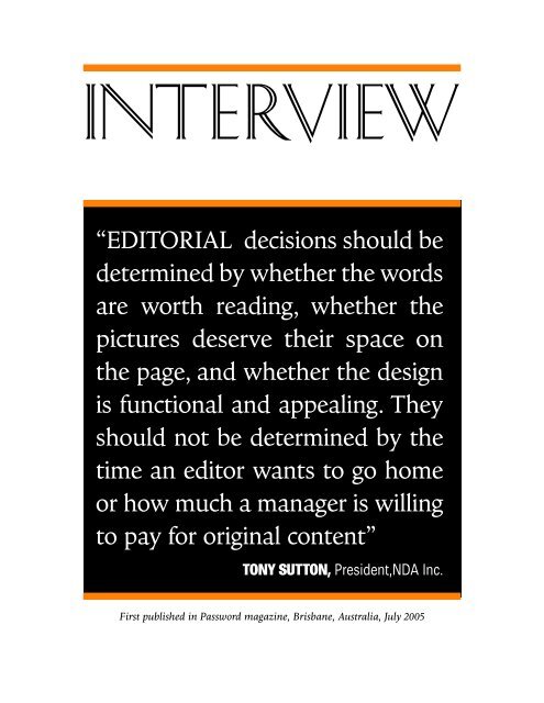
INTERVIEW<br />
“EDITORIAL decisions should be<br />
determined by whether the words<br />
are worth reading, whether the<br />
pictures deserve their space on<br />
the page, and whether the design<br />
is functional and appealing. They<br />
should not be determined by the<br />
time an editor wants to go home<br />
or how much a manager is willing<br />
to pay for original content”<br />
<strong>TONY</strong> <strong>SUTTON</strong>, President,NDA Inc.<br />
First published in Password magazine, Brisbane, Australia, July 2005
<strong>TONY</strong> <strong>SUTTON</strong><br />
TALKING SHOP<br />
WITH A<br />
DISCERNING<br />
DESIGNER<br />
This interview<br />
originally<br />
appeared in<br />
Password,<br />
a magazine<br />
produced by the<br />
Australian<br />
Provincial<br />
<strong>News</strong>paper<br />
(APN) group<br />
in Brisbane,<br />
Australia,<br />
July 2005<br />
Redesigning regional daily newspapers to meet the<br />
expectations of increasingly fickle readership markets<br />
demands close consultation with readers, some serious<br />
soul-searching on existing content’s effectiveness,<br />
seemingly endless bench testing – and much more.<br />
Tapping into the knowledge of an internationally<br />
respected design consultant such as Tony Sutton, as<br />
the Australian Provincial <strong>News</strong>papers (APN) group is<br />
currently doing, makes the process more enjoyable and<br />
less instinctive for all involved. Greg Swain recently<br />
caught up with the globetrotting Tony Sutton for his<br />
thoughts on the processes and philosophies behind a<br />
successful redesign and relaunch of a daily newspaper<br />
PASSWORD: Tony, thanks for your time. Could we start with<br />
some profiling of Tony Sutton and of how <strong>News</strong> <strong>Design</strong><br />
<strong>Associates</strong> Inc (NDA) came about?<br />
<strong>TONY</strong>: My career began as a teenage failure. I was a schoolboy<br />
soccer prodigy and had planned to play for England, marry a film<br />
star and retire at 30; but, at 17, I was told I wasn’t good enough to<br />
be a full time professional. So, as an alternative to getting a real<br />
job, I joined the staff of my local weekly, the Horncastle <strong>News</strong>,<br />
PAGE 2
Lincolnshire, where journalism helped uncover my real talents:<br />
drinking beer and whining about my bosses. A few years later, my<br />
wife Jools tired of small town life and decided it was time to see<br />
the world, so we moved up to Tyneside, where I subbed on an<br />
evening paper and became chief sub at the Sunday Sun at<br />
Newcastle upon Tyne, before heading further north to the Daily<br />
Express in Glasgow a few months before the owners closed the<br />
Scottish operation and gave me my first redundancy cheque.<br />
Fancying a change from life on daily newspapers, I moved to<br />
Fleet Street as assistant London editor of the East and West<br />
African editions of Drum, the famous South African picture magazine.<br />
A year later, in 1975, I got a call from proprietor Jim Bailey –<br />
to call him eccentric is a wild misrepresentation – saying he needed<br />
me for a year in Johannesburg: “Come next week and don’t<br />
worry about the work permit; we’ll fix it when you get here”, to<br />
sort out a couple of his women’s magazines, wonderfully titled<br />
Love and True Love (Love died but True Love endured some rough<br />
patches and is now the biggest woman’s mag in South Africa). I<br />
didn’t really fancy editing women’s mags, but Jools still wanted to<br />
see the world, so we packed up the kids and away we went.<br />
The year almost over, Bailey persuaded me to stay by making<br />
me executive editor of the South African edition of Drum, a couple<br />
of months before the Soweto riots of 1976 and their tumul-<br />
PAGE 3<br />
<strong>TONY</strong> <strong>SUTTON</strong><br />
“<strong>News</strong>paper<br />
publishers,<br />
editors and<br />
designers<br />
spend too<br />
much time<br />
selfconsciously<br />
trying to<br />
replicate<br />
other media”
<strong>TONY</strong> <strong>SUTTON</strong><br />
“Good<br />
design<br />
should be<br />
simple and<br />
easy to<br />
implement,<br />
especially in<br />
smaller<br />
papers that<br />
do not have<br />
their own<br />
design and<br />
graphics<br />
department”<br />
tuous aftermath. The following years, four with Drum, the rest as<br />
a consultant, were the most exciting of my life: editing, designing,<br />
and developing publications for black readers was never easy<br />
under a government that was quick to crush any form of protest.<br />
Seven publications for which I worked or consulting were banned<br />
during the next 13 years of my extended stay in the country.<br />
We packed up our kids and dog and moved to Canada at the<br />
beginning of 1990 when I was invited to redesign the national<br />
daily Globe and Mail in Toronto. “Canada is as dull as hell,” said<br />
the Globe’s then managing editor, “but you can walk safely down<br />
the streets at night”. That attitude permeated the newspaper and<br />
made my 20 months as design director the most boring of my<br />
career, so I jumped at the chance to move a couple of miles down<br />
the road to Thomson <strong>News</strong>papers’ head office as head of design<br />
for the company’s North American operation. Especially as I got<br />
to fly around the continent at company expense.<br />
My contracts with the Globe and Thomson allowed me to operate<br />
<strong>News</strong> <strong>Design</strong> <strong>Associates</strong>, which I built in my spare time into<br />
one of North America’s main design agencies, specializing in alternative<br />
weeklies, magazines and non-mainstream newspapers. I<br />
moved full time to the company in the mid-90s and the dropping<br />
of a non-compete agreement allowed me to shift focus to mainstream<br />
newspapers. During this period, I also spent five years as<br />
part time editor of <strong>Design</strong>, the magazine of the US-based Society<br />
for <strong>News</strong> <strong>Design</strong>, during which time, I also published my own<br />
journalism tabloids, RaggedRight and Nine On Ten (pdf files of<br />
Nine On Ten are at www.newsdesign.net).<br />
PASSWORD: Looking around your website (http://www.newsdesign.net),<br />
NDA has certainly undertaken some significant<br />
redesign projects around the globe. What sets NDA apart from<br />
other newspaper design consultants?<br />
<strong>TONY</strong>: I think we’re successful because my background is as an<br />
editor, NOT as an artist. This means that I understand, from<br />
experience, the problems and pressures of content as much as<br />
those of layout and projection. I also believe good design and<br />
great content go hand in hand, that news should never, ever, be<br />
subservient to layout, and that great writing always beats great<br />
design. Good design should be simple and easy to implement,<br />
especially in smaller papers that do not have their own design<br />
PAGE 4
and graphics department. In addition, we do good work at a reasonable<br />
price, give great aftersales service and, as a result, get lots<br />
of repeat business.<br />
PASSWORD: What is the process of consultation with a newspaper<br />
for a redesign?<br />
<strong>TONY</strong>: Clients have different needs, but I prefer working with<br />
editors and managers who know what they’d like to achieve from<br />
a redesign. Usually – not always with success – I ask project leaders<br />
to give me a 2,000-word summary of what they’re seeking<br />
before I start so we begin by aiming for the same goals. But most<br />
prefer to wait until I’ve done a first draft so they can figure out<br />
what they like and dislike and take it from there. Most jobs take<br />
two or three runs before we get things right, a process that is<br />
accompanied by lots of head scratching, some heartache and<br />
merciless revision – occasionally helped by a few beers; the hangover<br />
is part of the process.<br />
Looking back, my favourite clients are Andrew Jaspan, the brilliant<br />
editor with whom I worked on the launch of Glasgow’s<br />
Sunday Herald in 2000, and Stephen Haw, a senior editor at<br />
Johannesburg’s Sunday Times – the biggest paper in Africa – with<br />
whom I have worked on a number of redesign and new-launch<br />
projects over the past four or five years, the latest being a new<br />
PAGE 5<br />
<strong>TONY</strong> <strong>SUTTON</strong><br />
“The front<br />
page should<br />
be for the<br />
projection<br />
of the main<br />
NEWS of the<br />
day – so the<br />
strongest<br />
visual signal<br />
ought NOT<br />
to be for<br />
Honest Joe’s<br />
Gently Used<br />
Cars”
<strong>TONY</strong> <strong>SUTTON</strong><br />
“The editing<br />
test for<br />
pictures<br />
should be<br />
the same as<br />
that which,<br />
I hope, we<br />
follow with<br />
text: Is it<br />
worth the<br />
space?”<br />
soccer tabloid and a relaunch of the Daily Dispatch at East London<br />
in the Eastern Cape. What makes them special is wonderful<br />
editorial vision, instinctive feel for content and design and an<br />
overwhelming desire for their papers to be the best in the market.<br />
I’m also proud to have worked with publisher Mairtin O<br />
Muilleoir on the launch, earlier this year, of Daily Ireland, a Sinn<br />
Fein-supporting tabloid based in Belfast, Northern Ireland, that<br />
was launched at the beginning of this year in the face of fierce<br />
political opposition and threats of violence. It’s good to see a<br />
newspaper launched for reasons other than merely to serve<br />
advertisers, and O Muilleoir’s vision for a peaceful and united<br />
Ireland, just like the earlier fight for the ending of apartheid in<br />
South Africa, is one that deserves support.<br />
PASSWORD: Australia’s regional newspapers fortunately do<br />
not have to suffer the same gut wrenches as other newsgroups<br />
over the pros and cons of going “compact”. What are your<br />
thoughts on optimum space usage in tabloid formats?<br />
<strong>TONY</strong>: The questions I ask of my daily paper are: Am I getting<br />
useful information?; am I conscious of good quality content?; is<br />
the paper worthwhile for me as a reader?; or am I merely being<br />
fed snippets of information by someone whose real motive is selling<br />
me things I don’t want or need? Unfortunately, many papers<br />
are better at selling advertising than delivering quality news.<br />
Format is not really an issue if the product is compelling and I<br />
could make as strong a case for broadsheet as for tabloid.<br />
But tabloids are different from broadsheets, and in many ways<br />
they’re much harder to produce – too many long stories make<br />
them look overbearingly dull and gray and unreadable, so there’s<br />
a need to edit everything tighter and make sure there are plenty<br />
of short stories to balance the longer reads.<br />
Good picture editing is also a key to the process of effective<br />
tabloid design – it’s amazing how many ‘bad’ pictures become<br />
brilliant with a bit of thought and effort at the editing stage. And<br />
the challenge of competing with massive ads in full colour can be<br />
problematic (the solution is, of course, don’t try to compete; save<br />
the editorial energy for pages where you have the space to be creative).<br />
PASSWORD: What are the latest surveys showing about the<br />
PAGE 6
time an average reader can afford for the local daily newspaper?<br />
<strong>TONY</strong>: I don’t know. Surveys usually contain a few pearls of<br />
information, but common sense and good instincts are more<br />
important. There is a direct connection between readership and<br />
the quality of the content and I don’t need a survey to tell me this<br />
– I have a wife who points out the shortcomings of our local daily<br />
over breakfast every morning. If the content of a newspaper (or<br />
magazine or book or film) is worthwhile, I will spend time with it;<br />
if not . . . well, we all know the answer to that. When I was running<br />
Drum magazine in South Africa, I judged each issue as much<br />
on the amount of stuff I’d thrown out on deadline as by what<br />
made it into the magazine. I agonized before – and after – publication<br />
and continually tried to do better.<br />
One of the biggest problems I’ve found in my travels is that editors<br />
tend not to read their own papers. And, if they can’t be bothered,<br />
why should they expect their readers to care?<br />
The process of editing was neatly articulated by Ralph<br />
Ingersoll, who helped launch Life and Fortune magazines in the<br />
USA in the thirties: “An editor may pass for print only what pleases<br />
him. It is his own taste he must discover. If he then finds that<br />
people share his taste and like or enjoy or approve of what his<br />
taste has chosen, then he is a successful editor. If they don’t, then<br />
he had better choose another trade, for no man can base his<br />
PAGE 7<br />
<strong>TONY</strong> <strong>SUTTON</strong><br />
“O Muilleoir’s<br />
vision for<br />
a peaceful<br />
and united<br />
Ireland,<br />
just like<br />
the earlier<br />
fight for the<br />
ending of<br />
apartheid in<br />
South Africa,<br />
is one that<br />
deserves<br />
support”
<strong>TONY</strong> <strong>SUTTON</strong><br />
“Many<br />
papers<br />
are better<br />
at selling<br />
advertising<br />
than<br />
delivering<br />
quality<br />
news”<br />
choice on what he imagines or reasons other people MIGHT<br />
like.” Having said that, Ingersoll went on to launch his own daily<br />
newspaper – PM – in New York City. It failed. He became an<br />
author.<br />
PASSWORD: Both readers, and the journalists creating our<br />
daily newspapers suffer from information availability overload.<br />
Our newspaper editors are constantly striving to find the right<br />
balance of story counts per page. Is there a general rule, trend or<br />
philosophy for modern day tabloid design in this area?<br />
<strong>TONY</strong>: It’s all a question of balance – and awareness. There’s<br />
nothing wrong with running a full-page feature with no photographs<br />
or art, providing it’s the RIGHT full-page feature. But<br />
you’d want to make sure that you didn’t have six – or even two<br />
– of those in a row. Equally, six pages full of short, inconsequential,<br />
stories aren’t really going to satisfy the reader, either. The criteria<br />
should be the quality of the content. Always. No matter how<br />
big or small the market. Each edition of the newspaper should<br />
have a full range of stories, ranging from big, important and wellwritten<br />
page leads down to tightly edited fillers. Everything<br />
should be worth its place in the pages.<br />
The small stories are just as important as the larger one-pagers.<br />
But there is no magic formula to getting the mix right . . . TS Eliot<br />
said the only method in such matters is to be very intelligent. And<br />
very dedicated. In newspapers, it’s about developing and maintaining<br />
rhythm and keeping the interest of curious but fickle readers<br />
as long as possible. If someone can make something interesting<br />
to me that I’m not particularly interested in, I’ll read it. For<br />
example, when I was riding home from Toronto on the train one<br />
evening, I suddenly discovered I was halfway through a 3,000word<br />
story about ballet? Why am I reading this? I asked myself.<br />
The answer: The picture was wonderful, the headline and intro<br />
informative and fun, and the first par was intriguing. From there,<br />
the narrative kept me reading.<br />
PASSWORD: APN newspapers cater to a wide range of age<br />
demographics. And they share a lot of common interest pages<br />
with sister newspapers. If not from a design perspective, then<br />
from typography directions how feasible/advisable is a one size<br />
fits all approach?<br />
PAGE 8
<strong>TONY</strong>: It’s not really about design or typography or format – it’s<br />
about the editor. Given the same space, one editor will fill it with<br />
wonderful stories, great heads and superb pictures, while another<br />
will produce bland pages. I know which editor I’d want to run<br />
the paper I read.<br />
My gut feeling is that one size doesn’t fit all – that sounds too<br />
much like an accountant’s wet dream. It may seem sensible when<br />
outlined on a spreadsheet, but common content is often bland<br />
and generic and tends to degrade every product it touches.<br />
Editorial decisions should be determined by whether the words<br />
are worth reading, whether the picture is worth its space on the<br />
page, and whether the design is functional and appealing. They<br />
should not be determined by the time an editor wants to go<br />
home or the price a manager is willing to pay for original content.<br />
PASSWORD: What newspaper typefaces head up your<br />
favourites list for body copy and headlines, and why?<br />
<strong>TONY</strong>: We develop, with associate Nick Shinn, one of the world’s<br />
leading typeface designers, most of the typefaces we use for our<br />
redesigns. This gives customers access to unique faces, which are<br />
also adaptable to their needs – we created new condensed versions<br />
of the headline face Nicholas for use in the Toowoomba<br />
Chronicle, for example. Worldwide, another of Shinn’s fonts, was<br />
PAGE 9<br />
<strong>TONY</strong> <strong>SUTTON</strong><br />
“It’s<br />
amazing<br />
how many<br />
‘bad’<br />
pictures<br />
become<br />
brilliant<br />
with a bit<br />
of thought<br />
and effort<br />
at the<br />
editing<br />
stage”
<strong>TONY</strong> <strong>SUTTON</strong><br />
“If everything<br />
is fighting<br />
and<br />
screaming<br />
for attention,<br />
we all lose.<br />
Instead,<br />
we should<br />
place colour<br />
intelligently,<br />
in the RIGHT<br />
places”<br />
designed specially for newspapers, combining a large x-height,<br />
slightly condensed character forms and tight setting to maximize<br />
readability when printed in narrow newspaper columns. This versatile<br />
font has grown over six years from a single weight produced<br />
for the tabloid Worldwoman (read about the development of the<br />
font on newsdesign.net), to a wide range of typestyles ranging<br />
from text settings to ultra condensed headlines. Other non-Shinn<br />
fonts I have used recently for text are Utopia and Clarion and, for<br />
heads, Griffith Gothic, Meta and Miller.<br />
PASSWORD: From what you have seen of APN products, what<br />
are your general impressions on the design front?<br />
<strong>TONY</strong>: The design generally mirrors the content, most of which<br />
is adequate, without being outstanding. I’d prefer to see a more<br />
adventurous display of good solid stories that have a real significance<br />
to our readers – that, after all, is why we’re journalists;<br />
we’re all failed soccer players who want to change the world,<br />
aren’t we? But it would be good to see more front pages that are<br />
determined by the shape of the news rather than designed strictly<br />
according to inflexible design formats, which look good but<br />
hardly change from day to day. We should surprise the readers –<br />
and ourselves – a bit more.<br />
PASSWORD: What influence are internet site designers having<br />
on newspaper design philosophies and newspaper reader expectations,<br />
if any?<br />
<strong>TONY</strong>: Probably more than they should. <strong>News</strong>paper publishers,<br />
editors and designers spend too much time self-consciously trying<br />
to replicate other media (remember USA Today’s sales boxes<br />
that imitated TV sets?) when they should be developing unique<br />
ways of persuading readers to spend more time with their product.<br />
There are no quick fixes waiting to be stolen from other<br />
media – excellence is the result of hard work, loads of mistakes<br />
and intense thought.<br />
PASSWORD: Do humungous size front-page images suit conservative<br />
readership markets? If so, how often per week should<br />
the big picture attention grabber be used on a daily product?<br />
<strong>TONY</strong>: Good pictures, projected well, always sell, no matter<br />
what the audience or how often they are used. But they should<br />
PAGE 10
e worth the size. The editing test for pictures should be the same<br />
as that which, I hope, we follow with text: Is it worth the space?<br />
Readers respond to what we give them – if we make a habit of<br />
blowing up dull pictures, they’ll think (quite correctly) that we’re<br />
of no consequence; if we make them too small, they won’t notice<br />
them. At the end of the day, though, it’s about valuing available<br />
space; if I don’t, how can I expect anyone else to.<br />
PASSWORD: APN has a lot of free weekly newspapers, most of<br />
which are produced out of the same office of the local regional<br />
daily. And often by the same editorial designers. Should there be<br />
a different design approach taken for free weeklies rather than to<br />
just mimic the flagship product?<br />
<strong>TONY</strong>: Yes, if only because the newspaper is a DIFFERENT title,<br />
aimed at a DIFFERENT target market. I, as an editor, don’t want<br />
my flagship paid-for title to look too much like the freebie (why<br />
would readers pay for it if they can get something similar for<br />
nothing?); I want it to look different and read BETTER – people<br />
are paying for it and they deserve more. That doesn’t mean the<br />
typographic changes have to be massive, but there should at least<br />
be different headline fonts (sans if the main paper is serif, for<br />
example), a different style for page headers and so on.<br />
PAGE 11<br />
<strong>TONY</strong> <strong>SUTTON</strong><br />
“it would be<br />
good to see<br />
more front<br />
pages<br />
that are<br />
determined<br />
by the shape<br />
of the news<br />
rather than<br />
designed<br />
strictly<br />
according<br />
to inflexible<br />
formats”
<strong>TONY</strong> <strong>SUTTON</strong><br />
“My gut<br />
feeling is<br />
that one<br />
size doesn’t<br />
fit all – that<br />
sounds too<br />
much like an<br />
accountant’s<br />
wet dream”<br />
PASSWORD: What are the optimum sizes for ads on the primary<br />
news pages to allow quality design to do its job?<br />
<strong>TONY</strong>: On the front page the ads should be no more than 5 to 7<br />
cms deep. I’d expect any newspaper group with a Readers First<br />
programme to exclude the multi-coloured abominations I saw at<br />
the foot of some of the front pages during my recent trip to<br />
Australia. The front page should be for the projection of the main<br />
NEWS of the day – so the strongest visual signal ought NOT to<br />
be for Honest Joe’s Gently Used Cars or Bill the Butcher’s Midweek<br />
Specials. That’s not to say there isn’t a place for ads on the<br />
front page, but let’s make sure they don’t swamp the news –<br />
which is, I believe, what readers buy the paper for, even if news<br />
doesn’t, as my pals in advertising keep telling me, pay the bills!<br />
PASSWORD: More is best seems to be the general approach<br />
towards colour usage in news pages. And that’s bound to<br />
increase with more sophisticated presses. What are you thoughts<br />
on editorial design to accommodate this, particularly in view of<br />
eye competition with colourful and busy advertisements?<br />
<strong>TONY</strong>: More isn’t best. I meet too many people who want to use<br />
masses of colour to compete with advertising or because their<br />
press CAN print colour on every page. That’s a recipe for chaos<br />
and confusion: If everything is fighting and screaming for attention,<br />
we all lose. We should place colour intelligently, in the<br />
RIGHT places: great photographs, pointers to important information<br />
and as a guide to help readers through the paper.<br />
PASSWORD: What are the right and the wrong ways to introduce<br />
readers to a major design overhaul?<br />
<strong>TONY</strong>: It’s amazing how often we claim to serve our readers but<br />
never bother to ask their opinions. Let readers know when the<br />
change is taking place and explain what we’ve done in the<br />
relaunch issue. I’m in favour of reader groups, but we should<br />
never allow them to hijack the process – we’re supposed to be the<br />
experts, so we should use their responses and ideas as a resource,<br />
not as a gospel that must be slavishly followed!<br />
PASSWORD: Thanks for sharing your thoughts.<br />
<strong>TONY</strong>: It’s a pleasure.<br />
PAGE 12
Read more<br />
interviews<br />
and essays on<br />
journalism at<br />
newsdesign.net<br />
(Click here to enter web site)


