Video Vortex Reader II: moving images beyond YouTube
Video Vortex Reader II: moving images beyond YouTube
Video Vortex Reader II: moving images beyond YouTube

You also want an ePaper? Increase the reach of your titles
YUMPU automatically turns print PDFs into web optimized ePapers that Google loves.
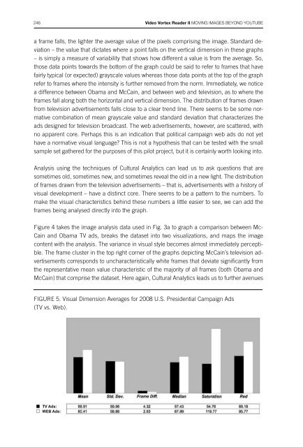
246 <strong>Video</strong> <strong>Vortex</strong> <strong>Reader</strong> <strong>II</strong> Moving Images Beyond Youtubetechnological approaches247a frame falls, the lighter the average value of the pixels comprising the image. Standard deviation– the value that dictates where a point falls on the vertical dimension in these graphs– is simply a measure of variability that shows how different a value is from the average. So,those data points towards the bottom of the graph could be said to refer to frames that havefairly typical (or expected) grayscale values whereas those data points at the top of the graphrefer to frames where the intensity is further removed from the norm. Immediately, we noticea difference between Obama and McCain, and between web and television, as to where theframes fall along both the horizontal and vertical dimension. The distribution of frames drawnfrom television advertisements falls close to a clear trend line. There seems to be some normativecombination of mean grayscale value and standard deviation that characterizes theads designed for television broadcast. The web advertisements, however, are scattered, withno apparent core. Perhaps this is an indication that political campaign web ads do not yethave a normative visual language? This is not a hypothesis that can be tested with the smallsample set gathered for the purposes of this pilot project, but it is certainly worth looking into.Analysis using the techniques of Cultural Analytics can lead us to ask questions that aresometimes old, sometimes new, and sometimes reveal the old in a new light. The distributionof frames drawn from the television advertisements – that is, advertisements with a history ofvisual development – have a distinct core. There seems to be a pattern to the numbers. Tomake the visual characteristics behind these numbers a little easier to see, we can add theframes being analysed directly into the graph.Figure 4 takes the image analysis data used in Fig. 3a to graph a comparison between Mc-Cain and Obama TV ads, breaks the dataset into two visualizations, and maps the imagecontent with the analysis. The variance in visual style becomes almost immediately perceptible.The frame cluster in the top right corner of the graphs depicting McCain’s television advertisementscorresponds to uncharacteristically white frames that deviate significantly fromthe representative mean value characteristic of the majority of all frames (both Obama andMcCain) that comprise the dataset. Here again, Cultural Analytics leads us to further avenuesfor exploration. What other visual dimensions, besides mean grayscale value and standarddeviation, might contribute to the strong core we observe in the television-based campaignadvertisements? Brightness? Color? Saturation? And what exactly is unique about this outlyingsubset of frames that fall at the extreme edges of this core?What Cultural Analytics Tells Us About the 2008 U.S. Presidential Campaign AdsNotice that the patterns that continue to emerge from the visualizations are related. If wecompare patterns across a larger number of visual characteristics and condense our imageanalysis to sample-wide averages (Fig. 5 – 6), keeping in mind the comparatively detailedexplorations discussed thus far, we can observe general trends in the visual form of the campaignadvertisements across multiple dimensions of measurement:1) While all campaign ads in the sample set were posted and distributed on the web, thoseads designed for television broadcast are visually different than ads designed for webbroadcast across a number of visual dimensions.If the internet was indeed a revolutionary force in the 2008 U.S. presidential elections, thenwe might expect to see this reflected in the visual design of campaign advertising and communication.As the numbers reveal, we do. For all but one of the six visual characteristicsrepresented in Figure 5, there is a measurable difference between television and web advertisements.However, the implications and parameters of the patterns that emerge from thedata may deviate from our expectations about how the developing medium of online videoshould look and function. The pattern revealed – that web-based advertisements possessa quieter and more conservative visual language that those designed for television – is nota trend we would expect from the 2008 U.S. presidential campaign’s innovative use of anonline <strong>moving</strong>-image medium.2) Comparing the television advertisements for both candidates leads to a similarly counterintuitiveobservation: McCain’s TV ads are more visually aggressive and radical in visuallanguage than Obama’s.FIGURE 5. Visual Dimension Averages for 2008 U.S. Presidential Campaign Ads(TV vs. Web).FIGURE 6. Visual Dimension Averages for 2008 U.S. Presidential Campaign TV Ads(Obama vs. McCain).