Pylab Plotting data Formatting lines Controlling figure windows
Pylab Plotting data Formatting lines Controlling figure windows
Pylab Plotting data Formatting lines Controlling figure windows
- No tags were found...
You also want an ePaper? Increase the reach of your titles
YUMPU automatically turns print PDFs into web optimized ePapers that Google loves.
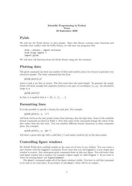
Scientific Programming in PythonNotes30 September 2009<strong>Pylab</strong>We will use the <strong>Pylab</strong> library to plot graphs. Since this library contains some functions andvariables that conflict with the SciPy library, we will start our programs withfrom __future__ import divisionfrom scipy import *import pylabWe will then call functions from the <strong>Pylab</strong> library using the dot notation.<strong>Plotting</strong> <strong>data</strong>The plot command can draw any number of <strong>lines</strong> and markers onto a set of axes to generate veryattractive graphs. The basic command has the formpylab.plot(x,y)where x and y are lists or arrays. The lists must have the same length. To generate the graph,<strong>Pylab</strong> will draw straight line segments between every pair of coordinates, (x i , y i ). An alternativeusage is orpylab.plot(y)In this, it is implicit that x = [0, 1, 2, ...].<strong>Formatting</strong> <strong>lines</strong>It is also possible to specify a format for each plot. For examplepylab.plot(x, y, ’o’)will draw circles at the <strong>data</strong> points rather than drawing a line through them. Some of the availableformat commands are listed in Table 1. Note that some of the commands change the colour of theplot rather than the line style. You can combine different format characters to draw compositeplots. For example,pylab.plot(x, y, ’gs-’)will draw a green plot (g) with a solid line (-) and square symbols (s) on the <strong>data</strong> points.<strong>Controlling</strong> <strong>figure</strong> <strong>windows</strong>By default <strong>Pylab</strong> plots multiple graphs on the same set of axes in one window. You can create anew window with the <strong>figure</strong>() command. Every time that you call <strong>figure</strong>(), a new empty plotwindow is created. Any subsequent plot commands draw on this new <strong>figure</strong>. You will notice thateach <strong>figure</strong> window has a number, for example a <strong>figure</strong> might be called Figure 1. If you want toselect an existing <strong>figure</strong>, use <strong>figure</strong>(number).The show() command makes all of the <strong>figure</strong> <strong>windows</strong> visible. You have to call this commandto be able to see your plots. If you forget to call show(), there will be no output.1
- solid line -- dashed line-. dash-dot line : dotted line. points , pixelso circle symbols ^ triangle up symbolsv triangle down symbols < triangle left symbols> triangle right symbols s square symbols+ plus symbols x cross symbolsD diamond symbolsb blue g greenr red c cyanm magenta y yellowk black w whiteTable 1: Some of the available format characters for changing the line style, <strong>data</strong> point symbolsand colours.Example The following commands create two <strong>figure</strong>s, plot x 2 and x 4 on the first <strong>figure</strong> and plotx 3 on the second <strong>figure</strong>.from __future__ import divisionfrom scipy import *import pylabx = linspace(0, 1, 100)pylab.<strong>figure</strong>(1)# Create the first <strong>figure</strong>pylab.plot(x, x**2) # Plot on Figure 1pylab.<strong>figure</strong>(2)# Create the second <strong>figure</strong>pylab.plot(x, x**3) # Plot on Figure 2pylab.<strong>figure</strong>(1) # Return to Figure 1pylab.plot(x, x**4) # Plot on Figure 1pylab.show()Changing the axesThe axis command is used to change the ranges of the x and y axes. Callingpylab.axis([xmin, xmax, ymin, ymax])sets the ranges. Calling axis() without any parameters returns the current x and y ranges. Youcan also use the functions xlim and ylim to set the range of only one of the axes.By default <strong>Pylab</strong> scales the axes so that all of the <strong>data</strong> fits on the plot window. This meansthat the x and y might have different length scales. This behaviour can be changed with thefollowing commands.• axis(’equal’) sets the x and y axes to have the same scale. This will make a circle lookcircular.• axis(’scaled’) also makes a circle look circular, but does it by changing the dimensionsof the plot window (and not the axes).2
• axis(’tight’) changes the axes so that the <strong>data</strong> fits exactly into the plot. This means thatthe ranges of the x and y axes will be the same as the ranges of the x and y coordinates ofthe <strong>data</strong>.• axis(’auto’) selects the default behaviour.Finally, you can use axis(’off’) to remove the axes and axis labels completely.Adding textYou can add text labels to your plot, to the axes and to the graphs on the plot.• title(’...’) adds a title to the plot.• xlabel(’...’) adds text to the x axis.• ylabel(’...’) adds text to the y axis.The legend() command creates a legend with a text description for each of the <strong>lines</strong> on your plot.If you have 3 <strong>lines</strong>, you can usepylab.legend(’Text for line 1’, ’Line 2’, ’And line 3’)to create the legend. <strong>Pylab</strong> chooses a good location for the legend on the plot. If you don’t likethe placement you can use, for example,pylab.legend(’Text for line 1’, ’Line 2’, ’And line 3’, loc=’upper left’)to position the legend yourself. The available locations are’best’’upper right’’upper left’’lower left’’lower right’’center left’’center right’’lower center’’upper center’’center’The ’best’ option is the default that lets <strong>Pylab</strong> choose the location.Other types of plotsRather than using the linear axes of plot(), you can also use log scaled axes.• loglog makes both the x and y axes log scaled.• semilogx makes the x axis log scaled and the y axis linear.• semilogy makes the y axis log scaled and the x axis linear.The parameters for these three commands are the same as for the plot command.3


