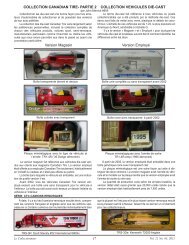
FOR SALE - Canadian Tire Coupon Collectors Club
FOR SALE - Canadian Tire Coupon Collectors Club
FOR SALE - Canadian Tire Coupon Collectors Club

Create successful ePaper yourself
Turn your PDF publications into a flip-book with our unique Google optimized e-Paper software.
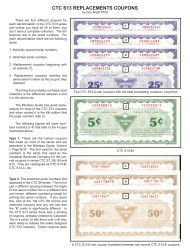
THE TARTAN-TYPE BORDERS ON THE FRONT OF THESANDY MCTIRE COUPONS: STANDARD, VARIANT, AND ANOMALOUSby Don Roebuck #848The Standard BordersBy and large, each denomination in the Sandy Mc<strong>Tire</strong>issue has a different dominant colour in the tartan-type borderon the front of the coupon.These colours are:5¢ Green.10¢ Blue. (Actually, there are three major colours --blue, green, and purple -- in the border on thisdenomination, but if you make the colours blurtogether -- for example, by wearing the wrongglasses -- you get an overall impression ofblue.)20¢ Red.30¢ Yellow.40¢ Pink. (At least, that is what the Bilodeau Guidecalls it.)How the Standard Borders were PrintedThe borders were printed by the four-colour process. Thecolours used in this process are:Magenta, also called process red. This is a slightly purplishred, and it is the colour in the standard border onthe 40¢ denomination (which the Bilodeau Guidecalls pink).Cyan,also called process blue. This is a slightly greenishblue, and it is the blue in the 3 mm squares(at the intersection of the red and white lines) inthe standard border on the 10¢ denomination.Yellow. This is the colour in the border on the 30¢denomination.Black.All other colours are produced by combining these four indifferent proportions, by using different sizes of halftone dots.In particular,Equal proportions of magenta and yellow give red. Thisis the dominant colour in the standard border on the 20¢denomination.Equal proportions of yellow and cyan give green. This isthe dominant colour in the border on the 5¢ denomination.And equal proportions of cyan and magenta give whatprinters have traditionally called blue, but which is reallypurple. This is the purple in the 3 mm squares (at the intersectionof the two white lines) in the standard border on the 10¢denomination.Now let us take a more analytical look at each denomination.For the border on the 5¢ denomination, three colours ofink were used: cyan, yellow, and black. The cyan was usedwhere the border is green, and the yellow was used where theborder is green or yellow. (Note that the border is also greenunder the black, as you can see by examining a coupon onwhich the black is out of registration.)For the standard border on the 10¢ denomination, all fourcolours of ink were used: magenta, cyan, yellow, and black.The magenta was used where the border is red or purple, theyellow was used where the border is red or green, and thecyan was used where the border is purple, green, or blue.For the border on the 20¢ denomination, three colours ofink were used: magenta, yellow, and black. The magenta wasused where the border is red, and the yellow was used wherethe border is red or yellow. (Note that the border is also redunder the black.)For the border on the 30¢ denomination, only two coloursof ink were used: yellow and black. If you compare the 30¢border with the 20¢ border, you will see that these two colourswere used on the 30¢ border exactly where they were usedon the 20¢ border. Or, to put it another way, the 30¢ borderis the same as the 20¢ border, except that no magenta wasused. So one might say that the 30¢ border was printed fromtwo of the three 20¢ plates.The standard border on the 40¢ denomination is similar,but with an extra twist. Only two colours of ink were used:magenta and black. If you compare the 40¢ border with the 5¢border, you will see that these two colours were used on the40¢ border exactly where cyan and black, respectively, wereused on the 5¢ border. Or, to put it another way, the 40¢ borderis the same as the 5¢ border, except that no yellow wasused, and the cyan was replaced by magenta. So one mightsay that the 40¢ border was printed from two of the three 5¢plates, but one of these two plates was used with a differentcolour of ink.I began this article by saying “by and large”. There aretwo kinds of exceptions to what I have said so far: variantsand anomalies.Variant Borders1. Red-Orange 20¢ BorderThere is -- inevitably -- a certain amount of random variationin printed colours. In my collection, the most noticeablevariation of this type is on one of my MP1B-20F 20¢ couponsand one of my PS2B-20-1 20¢ coupons, where the dominantcolour is between red and orange.2. Blue-Purple 10¢ BorderA much more striking departure from the standard colorationcan be seen on the MP1C-10E 10¢ coupons, where,for some reason, a pure blue ink was used instead of thegreenish cyan. As a result, the border on this coupon givesan overall impression that is between blue and purple.I have two sub-variants of this coupon: one where theblue is darker, and the overall impression is closer to blue,and one where the blue is lighter, and the overall impressionis closer to purple.Anomalous BordersThe borders on two of the 40¢ coupons are outrightexceptions to the general rule, and they also have seriousproblems from the point of view of design, so I am inclined tothink that they were mistakes.1. MP2C-40D2According to the Bilodeau Guide, the border on thiscoupon is yellow, but there are really two major colours onthis coupon, yellow and “pink”, and the overall impression isorange.The Collector CTCCC 8 CTCCCVol. 19, No. 1, 2009