

Raph Levien - TUG
Raph Levien - TUG
Raph Levien - TUG

Create successful ePaper yourself
Turn your PDF publications into a flip-book with our unique Google optimized e-Paper software.
<strong>Raph</strong> <strong>Levien</strong><br />
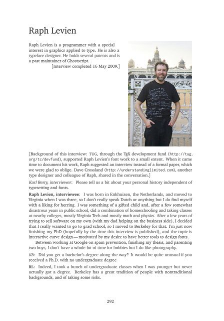
<strong>Raph</strong> <strong>Levien</strong> is a programmer with a special<br />
interest in graphics applied to type. He is also a<br />
typeface designer. He holds several patents and is<br />
a past maintainer of Ghostscript.<br />
[Interview completed 16 May 2009.]<br />
[Background of this interview: <strong>TUG</strong>, through the TEX development fund (http://tug.<br />
org/tc/devfund), supported <strong>Raph</strong> <strong>Levien</strong>’s font work to a small extent. When it came<br />
time to document his work, <strong>Raph</strong> suggested an interview instead of a formal paper, which<br />
we were glad to oblige. Dave Crossland (http://understandinglimited.com), another<br />
type designer and colleague of <strong>Raph</strong>, shared in the conversation.]<br />
Karl Berry, interviewer: Please tell us a bit about your personal history independent of<br />
typesetting and fonts.<br />
<strong>Raph</strong> <strong>Levien</strong>, interviewee: I was born in Enkhuizen, the Netherlands, and moved to<br />
Virginia when I was three, so I don’t really speak Dutch or anything but I do find myself<br />
with a liking for herring. I was something of a gifted child and, after a few somewhat<br />
disastrous years in public school, did a combination of homeschooling and taking classes<br />
at nearby colleges, mostly Virginia Tech and mostly math and physics. After a few years of<br />
trying to sell software on my own (with my dad helping on the business side), I decided<br />
that I really wanted to go to grad school, so I moved to Berkeley for that. I’m just now<br />
finishing my PhD (hopefully by the time this interview is published), and the topic is<br />
interactive curve design — motivated by my desire to have better tools to design fonts.<br />
Between working at Google on spam prevention, finishing my thesis, and parenting<br />
two boys, I don’t have a whole lot of time for hobbies but I do like photography.<br />
KB: Did you get a bachelor’s degree along the way? It would be quite unusual if you<br />
received a Ph.D. with no undergraduate degree<br />
RL: Indeed, I took a bunch of undergraduate classes when I was younger but never<br />
actually got a degree. Berkeley has a great tradition of people with nontraditional<br />
backgrounds, and of taking some risks.<br />
292
<strong>Raph</strong> <strong>Levien</strong> 293<br />
KB: I know you from the world of typography and fonts. How and when did you first get<br />
introduced to typesetting and font design?<br />
RL: Among other things, my father made a number of books (he’s especially well known<br />
for his miniature editions) and was very interested in fonts and typography. One of my<br />
earliest memories of books is an old Phil’s Fonts catalog (an old New York phototypesetting<br />
vendor who I think mostly served the advertising market), which had a big letter on each<br />
page. So I sometimes say I learned the alphabet that way — A is for Aachen, B is for<br />
Baskerville, C is for Caslon.<br />
In the mid-’80s, I wrote a batch typesetting system called Byso Print. It was in some<br />
ways fairly ambitious — among other things, it had autokerning based on the shapes of<br />
the individual glyphs. In other ways (especially compared to TEX) it was fairly crude.<br />
It did scaling of fonts by starting from a 256-pixel per em bitmap and scaling that. So,<br />
you can imagine, it looked pretty rough at large sizes. It also piggybacked on top of<br />
WordPerfect to do the hyphenation and justification.<br />
My first serious attempt at a scalable font was a techno design called Zaltbommel (for<br />
a sample of this, and a bit more of my early history, see http://typophile.com/node/<br />
54857).<br />
Ever since really diving into TEX, I’ve been fascinated and impressed with how advanced<br />
it was for its day. It’s a shame its usability problems kept it from ever going<br />
mainstream, but it’s good to see that it’s carved out a solid niche for itself, and that there’s<br />
still interesting development. Metafont in particular was way ahead of its time. I’ve<br />
only come to appreciate how good its interpolating spline algorithm is after going deep<br />
into the theory behind them for my own thesis. A good way of understanding it is as an<br />
approximation to the Euler spiral spline, basically as close as you can get to that using a<br />
cubic Bezier as the primitive segment. I think if it had been easier to use, it might have<br />
become popular. As it is, you have to be a hardcore computer scientist to understand<br />
Metafont programs — I’m even a little intimidated by them.<br />
Metafont’s use of cubic Beziers is very efficient, but I figured we have orders of<br />
magnitude more CPU power than then. What would the absolute best curve look like, if<br />
you had unlimited computing power? It turns out to be a trickier problem than I first<br />
thought, but I’ve come a long way to answering it in my thesis. Some of the optimizationbased<br />
approaches, like Henry Moreton’s Minimum Energy Curve and Minimum Variation<br />
Curve, took many seconds to solve a curve, but I’ve figured out some numerical techniques<br />
(strongly influenced by what John Hobby did for the curves in Metafont and MetaPost)<br />
that get you to interactive speeds without any problem. And, of course, the fact that you’re<br />
drawing letters on the screen instead of writing a program makes the design process<br />
easier too.<br />
I did a lot of tracing existing metal fonts using my curves. That was a good way to put<br />
my curves through their paces, but before long I started itching to do my own original<br />
design. I saw there was a niche to do a better monospaced font than what was already<br />
out there in the free world, and went for it.<br />
Dave Crossland, interviewer: Metafont was one of the first graphic-program languages,<br />
and the way it is used has not changed much since the 1970s when it was invented. The<br />
success of Logo with children suggests that such languages need not be so intimidating,<br />
and perhaps different approaches to the way Metafont programs are written could help.<br />
Recently this set of languages has become an active area, with Processing, DrawBot, Node-<br />
Box, ShoeBot and others; perhaps the most advanced is Field, with its tight integration of<br />
a text editor to the graphic output of the code in that editor. There’s a good video of this
294 <strong>Raph</strong> <strong>Levien</strong><br />
at http://vimeo.com/3034647. Do you have any suggestions for the way that Metafont<br />
could be made less intimidating?<br />
RL: I’m not sure Metafont itself has much more life in it, sadly. While it was amazing<br />
technology for the time, its output can’t be easily converted to standard font formats.<br />
That’s pretty much a dealbreaker. (I know of various efforts, including rasterizing at high<br />
resolution and converting that to vectors, but that’s not really acceptable for professional<br />
font design).<br />
I think you could easily do Metafont-like things though, and the tools you listed are<br />
extremely promising. I think one of the most important things is to make it interactive<br />
rather than batch mode. In the ’70s, batch mode made sense, but these days, if there’s a<br />
coordinate, you really need to be able to click on the point and drag it.<br />
I think one of the most exciting developments today is JavaScript in the browser, using<br />
either SVG or Canvas to do the drawing. Just in the past year or so, you have really good,<br />
fast JavaScript implementations, and a solid 2D rendering engine beneath. A couple years<br />
ago, it would be nearly impossible to get interactive performance. Today, by developing<br />
for the Open Web platform, you can make tools accessible to a lot of people, and having<br />
JavaScript right there means you could combine programmability with interactive graphics<br />
in interesting ways. I think John Resig’s processing.js is a huge step in that direction.<br />
KB: I’m intrigued by your passing mention of autokerning. Is autokerning implemented<br />
in any program today? I have never come across it. I’ve tried to write programs along<br />
those lines from time to time, for kerning and interletter spacing in general, but never<br />
succeeded.<br />
RL: Yes, there are a few interesting autokerning systems out there. The first one that<br />
was really any good was the Kernus system by the Ikarus people. I think a version of that<br />
shipped with PageMaker 5 in the early ’90s. Adobe then shipped a more refined version<br />
in InDesign, which is used by lots of people.<br />
One of the more interesting things going on now in that space is iKern, by Igino<br />
Marino. I don’t know too much about how the algorithm works, but I have tried it out<br />
on my Century Catalogue. The results are quite good, even better than InDesign in my<br />
opinion. Last I checked, he’s not interested in releasing the tool itself as open source, but<br />
there are free font designers who are interested in using it. The quality of spacing is one<br />
of the huge determiners of quality between an amateurish font and a truly excellent one.<br />
DC: Marino is apparently not interested in releasing it at all — he operates it as ‘software<br />
as a postal service’ where you email him a font and he emails it back with better spacing.<br />
RL: Yeah. I hope that works out for him, but it pretty much limits the scope for his ideas<br />
to have broad impact.<br />
KB: I’d like to hear a little more about these new curves. In reading your blog (http:<br />
//www.advogato.org/person/raph/diary.html), I see that they’re called Euler spirals or<br />
Cornu spirals. Can you say a bit about the difference a designer would see working with<br />
these spirals instead of Beziers? And would it make a visible difference to the ultimate<br />
reader?<br />
RL: Well, Euler got there a hundred and thirty years before Cornu, so I think he deserves<br />
the credit for it. Actually, James Bernoulli first wrote down the equation for the curve in<br />
1694, so it goes a long way back, but he didn’t actually plot it and it’s not clear he had a<br />
clear picture what it looked like. Since then it’s been rediscovered any number of times<br />
in a number of different applications and, each time, given a new name. Fresnel found<br />
that their equations were useful for solving diffraction problems, so they’re also known as
<strong>Raph</strong> <strong>Levien</strong> 295<br />
the Fresnel integrals. Cornu figured out you could plot those and read the answer to the<br />
diffraction problem off the plot, so the curve got his name. It was also rediscovered a few<br />
times by railway engineers looking to make smooth transitions between straight sections<br />
of rail and curves, so the train doesn’t suddenly lurch from side to side. In that domain,<br />
it’s now most commonly called the clothoid.<br />
And, in fact, I don’t just use the Euler spirals, I use a mixture of curves (my package is<br />
called spiro, which is kind of an abbreviation for polynomial spirals). Most of Inconsolata<br />
(the monospaced font mentioned above) is drawn using G4-continuous splines, which are<br />
a very close approximation to the Minimum Variation Curve of Henry Moreton. I now<br />
think that’s overkill, and G2-continuous splines (the Euler spiral ones) are plenty, and<br />
could be done with fewer points.<br />
DC: Øyvind Kolås (http://pippin.gimp.org) mentioned to me that he came to the<br />
same conclusion — using G2 points as default and G4 points where extra smoothness is<br />
desired. And for me, FontForge allows one to switch quickly between Spiros and Beziers<br />
(although the conversion is not yet optimised); I find myself using Beziers by default, and<br />
then using Spiro splines when drawing curves that are tricky to keep smooth with Beziers,<br />
like S-bend curves — ones that double back on themselves — the vertical stroke of a ‘7’, or<br />
the tail of a two-story ‘g’.<br />
RL: Interesting. I haven’t actually tried working that way myself, and one of the things I<br />
worry about is making the interface too complex, but having more choices certainly fits<br />
into the free software aesthetic.<br />
I’ve lately redone the optimized conversion to Beziers to be quite a bit faster (it used<br />
to take over a minute for most glyphs, now 15 seconds or so, and that’s in Python). Maybe<br />
if that were recoded in C, it would be fast enough you could flip back and forth inside the<br />
drawing program and it would be fast enough not to interrupt the flow.<br />
You can draw any curve you like using either Beziers or splines like I’m using. But<br />
I’m absolutely convinced that the tool you use has a profound effect on the shapes you<br />
draw. Almost all “contemporary” looking fonts you see produced these days have shapes<br />
that are very characteristic of Bezier curves. And, if you look at their outlines, you’ll see<br />
that most often one quadrant of, say, an ‘o’ is drawn with a single cubic Bezier. So that<br />
gives you a palette. A reasonably rich one, but ultimately there are only two parameters<br />
describing a cubic Bezier that traverses exactly one quadrant of arc. You can go past it,<br />
but it takes more work, and it’s easier to get lumpy results.<br />
The curves you get using Spiro are a different palette. I think they’re more classical,<br />
more like a French curve (and, in fact, I believe the Euler spiral is at least used as<br />
inspiration for French curves). So I think ultimately Inconsolata is a different font than it<br />
would have been had I drawn it using Beziers.<br />
DC: Your Spiro package includes GTK and GTK2 prototype GUI programs for drawing<br />
with these splines, and since the release in 2007 they have been integrated into FontForge<br />
and Inkscape. Do you have any suggestions about what the free software community can<br />
do to make Spiro more popular?<br />
RL: Part of the problem is that the Spiro integration has been on development branches,<br />
and it’s fairly painful for most people to build from scratch, getting all the libraries, and<br />
so on. When you can just ‘apt-get install’ your apps that have Spiro turned on by default,<br />
I think lots more people will use those curves.<br />
The other thing that I think might make a big difference is to build a good vector<br />
drawing editor for the Open Web platform. I have a prototype of Spiro for that too, but<br />
unfortunately it’s too unfinished to actually draw in, and I don’t have much time to work
296 <strong>Raph</strong> <strong>Levien</strong><br />
on it now. It would make a great project for someone who wanted to do something<br />
awesome in that platform, and get lots of users.<br />
KB: Let’s turn to that monospaced font you’ve designed that we mentioned above, named<br />
Inconsolata. Please tell us where the name came from, and about your design ideas for<br />
the font.<br />
RL: My original idea for the name was “Unconsoled”, which was intended to be both<br />
descriptive and self-deprecating as is common for free software projects (keep in mind<br />
that one of the projects I worked on was The Gimp). One idea for the font is that I was<br />
going to optimize it entirely for very high resolution rendering, and make no concessions<br />
to adapting it to a low-res pixel grid, which is of course the space that most monospaced<br />
fonts need to work in. I was very inspired by Consolas, a beautifully executed design, but<br />
I felt I could do some things better for the print domain, free to do some subtly angled<br />
strokes that just don’t work when you’re fitting to a grid. Ironically, most people use it<br />
as a terminal font anyway. On Mac OS X and (to a lesser extent) Linux, the rendering is<br />
pretty good, but on Windows it’s fuzzy and users aren’t as happy.<br />
Hrant Papazian came up with the name “Inconsolata”, which is more or less the Italian<br />
translation. I thought it sounded classier, so I went with it.<br />
I wanted it to be a classical sans, clean like the Franklin Gothic series. I wanted to<br />
make the spacing as smooth as possible, so even though it is of course monospaced, it<br />
doesn’t necessarily look like it is. That’s one of the highest bits of praise I got — somebody<br />
saying that it had the color on the page of a proportionally spaced font. There are also<br />
quite a few glyphs with subtle curves in them, like the lowercase ‘t v w’. Some people<br />
don’t like those, but I think they make text look warmer.<br />
Since I was designing for very high resolution, I also wanted to play with an idea I got<br />
while looking at gothic fonts in Japan — the microserif, or very small spur. My idea was<br />
that it would make the font look a little sharper and crisper, and visually more interesting.<br />
In very small sizes, it’s hardly visible at all (and of course not at all on the screen), but it’s<br />
still cool knowing they’re there.<br />
KB: What’s the current status of Inconsolata (I see it’s available from http://www.levien.<br />
com/type/myfonts/inconsolata.html), and the Century Catalogue project you also mentioned,<br />
and any others you might have in the offing (post-thesis presumably)?<br />
RL: Inconsolata is pretty close to what I’d consider done. It’s shipping in a bunch of<br />
Linux distros, and there are quite a few people using it. There are a few more tweaks I<br />
want to do before calling it completely done, mostly responding to feedback I’ve gotten<br />
from users. In fact, a lot of that feedback has been in the form of people releasing their<br />
own versions with changes, which really feels to me like the free software spirit at work.<br />
I did a lot of work tracing existing metal fonts, including Century Catalogue, to wrap<br />
my mind around the way the old masters worked (scans of these, mostly from the amazing<br />
American Type Founders catalogs, are available at my web page, and the raw high-res<br />
scans are on tug.org). Now, I think I’ve gained more confidence in doing my own designs.<br />
My latest work-in-progress is Cecco, for which I now have a complete lowercase and<br />
uppercase alphabet. It’s intended to be a good working text font, and I’m pleased with the<br />
way it’s turning out. With the amount of free time I have now, it’ll take a while to finish,<br />
but that is one of the nice things about fonts — working slowly and steadily eventually<br />
gets the job done.<br />
KB: I’m glad you consider Inconsolata at least pretty close to be being done, since we’re<br />
using it for the typewriter material in this book.<br />
Fonts in general have had a torturous legal history, going back to Goudy at least (as
<strong>Raph</strong> <strong>Levien</strong> 297<br />
I’ve heard it). Please say a few words about why you chose to release Inconsolata under<br />
the SIL Open Font License.<br />
RL: It’s very important to me that Inconsolata (and other fonts in the same vein) be<br />
useful for use in free software. I looked at the available licenses, and found problems<br />
with a lot of them. A lot of the licenses people use are for software, and aren’t really<br />
appropriate for fonts. In particular, it’s important to grant the right to embed the font into<br />
documents, and software licenses tend not to be clear about that — for GPL-licensed fonts,<br />
there’s usually an explicit embedding exception. I also considered Creative Commons<br />
licenses (which are fairly popular among visual artists), but those may not be compatible<br />
with purist free software distributions.<br />
To me, the exact legal terms are only part of the reason to choose a license. They’re<br />
also important to signal intention and, to some extent, membership in a community. The<br />
OFL community tends to produce high quality fonts, like Victor Gaultney’s Gentium and<br />
the excellent work of the Greek Font Society. I felt that choosing the OFL communicated<br />
my intent to do fonts better than most of the stuff that’s out there for zero cost, but at the<br />
same time actually be useful for free software.<br />
KB: Going along with font legalities, I noticed that you hold several patents, while<br />
licensing them for use in GPL’d software but not otherwise. Have you found that holding<br />
the patents is worth the bother of getting them, and what are your general thoughts on<br />
patenting of software and algorithms?<br />
RL: Well, I’m very fortunate in this regard, because I have actually gotten some good<br />
revenues from licensing my patents over the years, both some early work I did on security<br />
(I was in fact eleven when I filed for my first patent) and more recently on halftone<br />
screening work. The screening work is used in the free Gutenprint inkjet drivers, and<br />
also commercially by several well-known companies. I think my strategy of using the free<br />
software release to bring more publicity to the work was a good one, and it would be<br />
great if the same thing happened with the curve work.<br />
But the business of patent licensing is very hit or miss. Some of my better ideas never<br />
got licensed at all, and the ones that did were largely out of luck. The way the game is<br />
rigged, the best strategy for making money from patents is to be a patent troll, but that’s<br />
never what I wanted to do — I just wanted to be able to create new technology and find a<br />
way to make some money.<br />
Generally, I think the world would be better off if software and algorithms weren’t<br />
patentable. The actual incentive to individual inventors — the main motivation you see<br />
cited — isn’t very strong, and the potential for abuse is huge. It’s also expensive and time<br />
consuming to get patents, so mostly you see big companies doing it. In general, I wouldn’t<br />
recommend bothering.<br />
KB: I also noticed you are or were one of the maintainers of Ghostscript, a crucial package<br />
in the free software world. How did that come about?<br />
RL: I was one of the maintainers until a couple years ago, when I went over to Google — I<br />
unfortunately don’t work on it any more. At the time I started on Ghostscript, around<br />
2000, I was doing various 2d graphics projects in free software, including libart and the<br />
Gnome canvas, and Artifex was looking for people to work on projects for Ghostscript,<br />
both for release as free software and for their commercial licensing business, which<br />
continues to grow at a healthy clip. I started out with implementing PDF 1.4 transparency,<br />
and, after that worked out pretty well, joined Artifex as a full time employee. Ghostscript<br />
is, as you point out, a core component of the graphics and printing infrastructure in free<br />
software, and I’m still very friendly with them and wish them the best.
298 <strong>Raph</strong> <strong>Levien</strong><br />
KB: I’ll close with a general question. As we all see every day, there are seemingly an<br />
infinitude of fonts already in existence (many for centuries), some of insurmountable<br />
beauty, others of insurmountable ugliness. You’ve talked about the technical reasons you<br />
had for creating Inconsolata, but it seems to me that very few new fonts have such a<br />
background.<br />
Why do you think fonts are still being created in such incredible proliferation? What<br />
is it that makes them such an attractive goal?<br />
RL: Good question. Mostly, designing fonts is very satisfying creative work, I guess for<br />
certain people anyway. I enjoy drawing but can’t do it very well, and I find that with fonts<br />
I can continually refine and improve the curves until it looks like what I wanted.<br />
Also, fonts (especially good ones) tend to last a pretty long time, while most software<br />
gets thrown away quickly. It’s especially satisfying to me to create something which might<br />
be more durable.<br />
KB: Thank you very much for participating in this interview, and all your excellent work.<br />
RL: My pleasure!<br />
Endnote: <strong>Raph</strong> provided several figures showing the Inconsolata development process.<br />
He writes:<br />
The left-hand image shows the prototype GTK software I used for drawing<br />
all the Inconsolata glyphs — extremely minimal, but I found the clean and<br />
beautiful antialiased rendering really helped me focus on the shapes of the<br />
letters. The right-hand image is the result of converting that to optimized<br />
Beziers:<br />
(continued)<br />
thresh=0.01 optim=6 tot segs=23
<strong>Raph</strong> <strong>Levien</strong> 299<br />
Here are the Spiro sources for most of the lowercase:<br />
Last, this is a screenshot of FontForge (http://fontforge.sf.net), which<br />
I used to put all the shapes together into a font, and produce Type 1 and<br />
OpenType font files.


