The Polar Area Diagrams of Florence Nightingale - debbiebaker
The Polar Area Diagrams of Florence Nightingale - debbiebaker
The Polar Area Diagrams of Florence Nightingale - debbiebaker

Create successful ePaper yourself
Turn your PDF publications into a flip-book with our unique Google optimized e-Paper software.
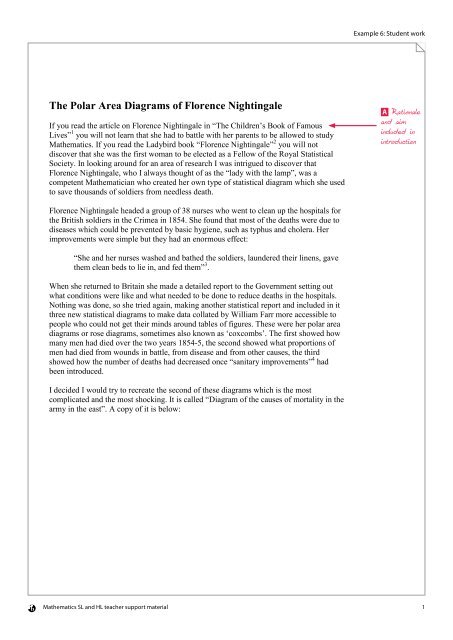
Example 6: Student work<strong>The</strong> <strong>Polar</strong> <strong>Area</strong> <strong>Diagrams</strong> <strong>of</strong> <strong>Florence</strong> <strong>Nightingale</strong>If you read the article on <strong>Florence</strong> <strong>Nightingale</strong> in “<strong>The</strong> Children’s Book <strong>of</strong> FamousLives” 1 you will not learn that she had to battle with her parents to be allowed to studyMathematics. If you read the Ladybird book “<strong>Florence</strong> <strong>Nightingale</strong>” 2 you will notdiscover that she was the first woman to be elected as a Fellow <strong>of</strong> the Royal StatisticalSociety. In looking around for an area <strong>of</strong> research I was intrigued to discover that<strong>Florence</strong> <strong>Nightingale</strong>, who I always thought <strong>of</strong> as the “lady with the lamp”, was acompetent Mathematician who created her own type <strong>of</strong> statistical diagram which she usedto save thousands <strong>of</strong> soldiers from needless death.A Rationaleand aimincluded inintroduction<strong>Florence</strong> <strong>Nightingale</strong> headed a group <strong>of</strong> 38 nurses who went to clean up the hospitals forthe British soldiers in the Crimea in 1854. She found that most <strong>of</strong> the deaths were due todiseases which could be prevented by basic hygiene, such as typhus and cholera. Herimprovements were simple but they had an enormous effect:“She and her nurses washed and bathed the soldiers, laundered their linens, gavethem clean beds to lie in, and fed them” 3 .When she returned to Britain she made a detailed report to the Government setting outwhat conditions were like and what needed to be done to reduce deaths in the hospitals.Nothing was done, so she tried again, making another statistical report and included in itthree new statistical diagrams to make data collated by William Farr more accessible topeople who could not get their minds around tables <strong>of</strong> figures. <strong>The</strong>se were her polar areadiagrams or rose diagrams, sometimes also known as ‘coxcombs’. <strong>The</strong> first showed howmany men had died over the two years 1854-5, the second showed what proportions <strong>of</strong>men had died from wounds in battle, from disease and from other causes, the thirdshowed how the number <strong>of</strong> deaths had decreased once “sanitary improvements” 4 hadbeen introduced.I decided I would try to recreate the second <strong>of</strong> these diagrams which is the mostcomplicated and the most shocking. It is called “Diagram <strong>of</strong> the causes <strong>of</strong> mortality in thearmy in the east”. A copy <strong>of</strong> it is below:Mathematics SL and HL teacher support material 1
Example 6: Student workFigure 1<strong>The</strong> basic ideas are very simple. <strong>The</strong> blue area represents deaths due to disease, the redarea represents death due to wounds in battle and the black area represents death due toother causes.I tried to find a copy <strong>of</strong> the data which this diagram represented, but I had no luck, so Idecided to make sure I understood exactly how the diagram was made and to make myown version <strong>of</strong> some data which I did have to hand. Once I tried to understand thediagram in detail I found there were some problems.<strong>The</strong> First ProblemC Studentdemonstratespersonal interestin topic.I wasn’t sure whether the black area in a shape such as this:was supposed to bethis areaor this areaD Good criticalreflection onproblems relatedto objectiveMathematics SL and HL teacher support material 2
Example 6: Student workIn other words, were the colours separate, or overlapping? <strong>The</strong> articles I read didn’t makeit clear. O’Connor says that “<strong>The</strong> area <strong>of</strong> each coloured wedge, measured from the centreas a common point, is in proportion to the statistic it represents” 5 , which makes it seemthat all colours are wedged shaped, or sectors, so the colours overlap. However, Lienhardcommented that in the November 1854 section “battle deaths take up a very small portion<strong>of</strong> each slice” 6 , which makes it sound as though the slice has three separate portions, andBrasseur says that “she also divided the areas within each <strong>of</strong> the wedges to show whichportion <strong>of</strong> the mortality data for that month could be allotted to each cause <strong>of</strong> death” 4 . Idecided to construct polar area diagrams for a set <strong>of</strong> data with the colours separate andwith the colours overlapping to see if putting theory into practice would make it clearer tome. <strong>The</strong> data I used was taken from the IB grade distribution statistics for the past 15years at my own institution. I used the numbers taking Higher Mathematics, StandardMathematics and Mathematical Studies to be represented by my three colours. I took theold Mathematical Methods course to be the same as Standard Mathematics.A Good researchdemonstratedC Createdpersonal exampleTo fit 15 sectors into the circle I needed each arc to subtend an angle <strong>of</strong> 2 π radians at151 2π2 π 2the centre. <strong>The</strong> area <strong>of</strong> each sector would then be A= × r = r where r is the2 15 15radius <strong>of</strong> the sector. Since the area needs to be proportional to the statistic, I needed to15Afind the radius, so I used r = and just used a scale which would allow me to drawπa reasonable sized diagram. To create a polar area diagram with overlapping sectors I justused this formula on each <strong>of</strong> the numbers <strong>of</strong> students taking the various options.E <strong>Area</strong> <strong>of</strong> sectorusing radians isin syllabus andis relevant toexploration.Numbers taking Mathematics year on yearNumbers (A) Radius ( r )Higher Studies Standard Higher Studies Standard1995 1 24 0 2.2 10.7 0.01996 4 15 0 4.4 8.5 0.01997 8 10 0 6.2 6.9 0.01998 6 31 0 5.4 12.2 0.01999 9 17 0 6.6 9.0 0.02000 10 20 0 6.9 9.8 0.02001 4 31 1 4.4 12.2 2.22002 5 21 2 4.9 10.0 3.12003 4 15 4 4.4 8.5 4.42004 5 29 5 4.9 11.8 4.92005 1 28 0 2.2 11.6 0.02006 3 16 2 3.8 8.7 3.12007 8 13 0 6.2 7.9 0.02008 11 29 14 7.2 11.8 8.22009 10 23 15 6.9 10.5 8.5Mathematics SL and HL teacher support material 3
Example 6: Student workI then used a geometric program (GeoGebra) to draw the sectors all with a commoncentre, each with an angle <strong>of</strong> 2 π radians, and with the radii as given in the table. I drew15the Higher sectors first with the Studies on top <strong>of</strong> these, and the Standard on top <strong>of</strong> these.This was the result:Figure 2<strong>Polar</strong> area diagram to show studentstaking Mathematics at one school(colours overlapping)Blue represents the number <strong>of</strong> students takingHigher Maths.Brown represents the number <strong>of</strong> studentstaking Mathematical Studies.Green represents the number <strong>of</strong> studentstaking Standard Maths.<strong>The</strong> colours are not solid, so where colours overlap there is a different colour. <strong>The</strong> blueoverlapping the brown makes a pink here, and the green overlapping the blue makes adarker green. In 2003 and in 2004 there were an equal number <strong>of</strong> students taking Higherand Standard so three separate colours cannot be seen on the diagram.Next I worked out the radii needed if the colours were not to overlap. For this I usedcumulative areas to work out the radii. R1=15A115( A1 + A2), R2= andππR3=15( A1 + A2 + A3).πNumbers taking Mathematics year on yearNumbers (A)RadiiHigher (A1) Studies (A2) Standard (A3) R1 R2 R31995 1 24 0 2.2 10.9 10.91996 4 15 0 4.4 9.5 9.51997 8 10 0 6.2 9.3 9.31998 6 31 0 5.4 13.3 13.31999 9 17 0 6.6 11.1 11.12000 10 20 0 6.9 12.0 12.02001 4 31 1 4.4 12.9 13.12002 5 21 2 4.9 11.1 11.62003 4 15 4 4.4 9.5 10.52004 5 29 5 4.9 12.7 13.62005 1 28 0 2.2 11.8 11.82006 3 16 2 3.8 9.5 10.02007 8 13 0 6.2 10.0 10.02008 11 29 14 7.2 13.8 16.12009 10 23 15 6.9 12.6 15.1B Good use<strong>of</strong> notationMathematics SL and HL teacher support material 4
Example 6: Student workThis gave a diagram with Higher numbers at the centre and Standard numbers at theedge, like this:Figure 3<strong>Polar</strong> area diagram to show studentstaking Mathematics at one school(colours separate)Blue represents the number <strong>of</strong> students takingHigher Maths.Brown represents the number <strong>of</strong> studentstaking Mathematical Studies.Green represents the number <strong>of</strong> studentstaking Standard Maths.This diagram is incomplete in that it has not got the dates on it, but I was interested in thebasic shape it would make rather than seeing it as a finished article to represent the data.I decided to do the same thing but with Studies in the middle and Higher at the edge tosee how different it would look.Figure 4<strong>Polar</strong> area diagram to show studentstaking Mathematics at one school(colours separate)Blue represents the number <strong>of</strong> students takingHigher Maths.Brown represents the number <strong>of</strong> studentstaking Mathematical Studies.Green represents the number <strong>of</strong> studentstaking Standard Maths.This feels very different. <strong>The</strong> blue section actually looks less significant, to my eye, beingput at the edges. This made me think <strong>of</strong> something else I had read in Brasseur’s article,“<strong>Nightingale</strong> arranged these colored areas so that the main cause <strong>of</strong> death (and the largestsections)—deaths by disease—would be at the end <strong>of</strong> the wedges and would be moreeasily noticed.” 4 I am sure that Brasseur thought that the colours were separate, and notoverlapped. However, comparing my diagrams to <strong>Nightingale</strong>’s original in Figure 1, IC Gooddemonstration <strong>of</strong>personal interestD Criticalreflection onpersonal workMathematics SL and HL teacher support material 5
Example 6: Student workbecame sure that she did mean them to be overlapped. I noticed that in the lefthand rosein figure 1 (representing the second year) there is a wedge with blue at the edge followedby a wedge with blue at the edge:Figure 5A zoom in <strong>of</strong> part <strong>of</strong> figure 1"Blue" is atyping error.This can happen in a diagram like my figure 2 <strong>of</strong> overlapping colours, but would beimpossible if the colours are separate as in figures 3 and 4. From this I deduced that thecolours on the diagram must be overlapping.<strong>The</strong> Second ProblemMy diagrams were unlike <strong>Nightingale</strong>’s ones in that the total area <strong>of</strong> the sectors in figure2 represented the total number <strong>of</strong> students taking the IB at this school over the 15 years.<strong>Nightingale</strong>’s statistics were rates <strong>of</strong> mortality. Basically they can be thought <strong>of</strong> aspercentages <strong>of</strong> soldiers who died, but, as before, when I read through the articles again, Iwas unsure what they were percentages <strong>of</strong>. Gill and Gill have table (Table 2) in theirarticle with headings “No. <strong>of</strong> soldiers admitted to the hospital” and “No. (%) <strong>of</strong> soldierswho died” 3 . This might suggest that <strong>Nightingale</strong> was working with percentages <strong>of</strong>soldiers who were admitted into hospital. Lewi is more definite and refers to the actualstatistic <strong>of</strong> one wedge <strong>of</strong> the third <strong>of</strong> <strong>Nightingale</strong>’s polar area diagrams as follows: “<strong>The</strong>mortality during the first period was 192 per 1,000 hospitalized soldiers (on a yearlybasis)” 9 . However, Brasseur refers to the statistic in a wedge <strong>of</strong> <strong>Nightingale</strong>’s firstdiagram as being “the ratio <strong>of</strong> mortality for every 1,000 soldiers per annum in the field” 4 ,in other words a percentage <strong>of</strong> the army actually on duty.I decided to create a polar area diagram to act as an analogy to the possible situations asfollows:<strong>Nightingale</strong>’s dataMy dataNumber <strong>of</strong> soldiers in the army in a month Number <strong>of</strong> students taking the IB in a yearNumber <strong>of</strong> soldiers taken to hospital Number <strong>of</strong> students taking Maths StudiesNumber <strong>of</strong> soldiers dying <strong>of</strong> wounds Number <strong>of</strong> students gaining grade 7Number <strong>of</strong> soldiers dying <strong>of</strong> disease Number <strong>of</strong> students gaining grade 6Number <strong>of</strong> soldiers dying for other reasons Number <strong>of</strong> students gaining grade 5My analogy <strong>of</strong> drawing a diagram showing the numbers <strong>of</strong> soldiers dying as a percentage<strong>of</strong> those admitted to hospital would then be the number <strong>of</strong> students gaining a grade above4 as a percentage <strong>of</strong> those taking Mathematical Studies. I decided to do this one by hand,partly to prove I could, and partly to see if it would throw any extra light on theconstruction <strong>of</strong> the diagrams.D Very goodexample <strong>of</strong>critical reflectionC Another goodpersonal exampleMathematics SL and HL teacher support material 6
Example 6: Student workI gathered the data, found the percentages and used the percentages as A in the usualformula r =15Ato find the radii needed to construct the diagram. <strong>The</strong> data is here:πNumbers gaining top three grades in Mathematical StudiesAs percentage <strong>of</strong> those takingStudiesRadius required for eachGrade 7 Grade 6 Grade 5Taking TotalStudies in year % grade 7 % grade 6 % grade 5 R7 R6 R51995 7 10 4 24 25 29.16667 41.66667 16.66667 11.80 14.10 8.921996 2 9 3 15 19 13.33333 60.00000 20.00000 7.98 16.93 9.771997 1 4 2 10 18 10.00000 40.00000 20.00000 6.91 13.82 9.771998 5 12 11 31 37 16.12903 38.70968 35.48387 8.78 13.60 13.021999 2 6 7 17 26 11.76471 35.29412 41.17647 7.49 12.98 14.022000 3 4 7 20 30 15.00000 20.00000 35.00000 8.46 9.77 12.932001 3 8 8 31 36 9.67742 25.80645 25.80645 6.80 11.10 11.102002 1 8 4 21 28 4.76190 38.09524 19.04762 4.77 13.49 9.542003 0 1 8 15 23 0.00000 6.66667 53.33333 0.00 5.64 15.962004 3 9 7 29 34 10.34483 31.03448 24.13793 7.03 12.17 10.742005 1 11 9 28 29 3.57143 39.28571 32.14286 4.13 13.70 12.392006 2 4 5 16 21 12.50000 25.00000 31.25000 7.73 10.93 12.222007 1 8 3 13 22 7.69231 61.53846 23.07692 6.06 17.14 10.502008 0 3 17 29 54 0.00000 10.34483 58.62069 0.00 7.03 16.732009 0 5 5 23 48 0.00000 21.73913 21.73913 0.00 10.19 10.19And the diagram came out like this:Figure 6<strong>Polar</strong> area diagram to showpercentages <strong>of</strong> students takingMathematical Studies who gainedgrades above 4Red represents the number <strong>of</strong> studentsgaining grade 7.Blue represents the number <strong>of</strong> studentsgaining grade 6.Green represents the number <strong>of</strong> studentsgaining grade 5.<strong>The</strong> purple areas represent coincidingnumbers <strong>of</strong> students gaining grade 5 and 6.B Studentneeds to watchconsistency <strong>of</strong>location <strong>of</strong> coloursused here.Mathematics SL and HL teacher support material 7
Example 6: Student workOne thing which I learnt from this exercise is that you have to be very careful about yourscale and think through every move before you start if you don’t want to fall <strong>of</strong>f the edge<strong>of</strong> the paper! It is a far more tense experience drawing a diagram by hand because youknow that one slip will make the whole diagram flawed. A computer slip can be correctedbefore you print out the result. My admiration for <strong>Florence</strong> <strong>Nightingale</strong>’s draftsmanshipwas heightened by doing this.<strong>The</strong> other thing which drawing by hand brought out was that, if you draw the arcs in inthe appropriate colours, the colouring <strong>of</strong> the sectors sorts itself out. You colour from thearc inwards until you come to another arc or the centre. <strong>The</strong> only problem came whentwo arcs <strong>of</strong> different colours came in exactly the same place. I got around this problem bycolouring these areas in a totally different colour and saying so at the side.C This sectionshows a lot <strong>of</strong>personal interest.At this point in my research someone suggested some more possible websites to me, andfollowing these up I found a copy <strong>of</strong> <strong>Nightingale</strong>’s second diagram which was clearenough for me to read her notes, and a copy <strong>of</strong> the original data she used. <strong>The</strong> first <strong>of</strong>these was in a letter by Henry Woodbury suggesting that <strong>Nightingale</strong> got her calculationswrong and the radii represented the statistics rather than the area. 7 <strong>The</strong> letter had acomment posted by Ian Short which led me to an article by him 8 giving the data for thesecond diagram and explaining how it was created.<strong>The</strong> very clear reproduction <strong>of</strong> <strong>Nightingale</strong>’s second diagram in Woodbury’s letter 7shows that Miss <strong>Nightingale</strong> wrote beside it: “<strong>The</strong> areas <strong>of</strong> the blue, red and blackwedges are each measured from the centre as the common vertex”. This makes it quiteclear that the colours are overlapped and so solves my first problem. She also wrote “InOctober 1854 & April 1855 the black area coincides with the red”. She coloured the first<strong>of</strong> these in red and the second in black, but just commented on it beside the diagram tomake it clear.<strong>The</strong> article by Short 8 was a joy to read, although I could only work out the mathematicalequations, which were written out in a way which is strange to me ( for example“$$ \text{<strong>Area</strong> <strong>of</strong> sector B} = \frac{\pi r_B^2}{3}=3$$” 8 ) because I already knew whatthey were (<strong>The</strong> example had a sector B in a diagram which I could see had12π2 π 2areaB = rB= rB). <strong>The</strong> two things I found exciting from this article were the2 3 3table <strong>of</strong> data which <strong>Nightingale</strong> used to create the second diagram, and an explanation <strong>of</strong>what rates <strong>of</strong> mortality she used. She described these as follows; “<strong>The</strong> ratios <strong>of</strong> deathsand admissions to Force per 1000 per annum are calculated from the monthly ratiosgiven in Dr. Smith’s Table B” 4 and I had not been able to understand the meaning <strong>of</strong> thisfrom the other articles. (Brasseur adds that “Dr. Smith was the late director-general <strong>of</strong> thearmy.” 4 ). Using Short’s article I was able to work out what it meant.I will use an example <strong>of</strong> data taken from the table in Short’s article, which is in turn takenfrom “A contribution to the sanitary history <strong>of</strong> the British army during the late war withRussia” by <strong>Florence</strong> <strong>Nightingale</strong> <strong>of</strong> 1859 8 . In February 1855 the average size <strong>of</strong> the armywas 30919. Of these 2120 died <strong>of</strong> ‘zymotic diseases’, 42 died <strong>of</strong> ‘wounds & injuries’ and361 died <strong>of</strong> ‘all other causes’. This gives a total <strong>of</strong> 2120 + 42 + 361 = 2523 deaths. 2523Mathematics SL and HL teacher support material 8
Example 6: Student workout <strong>of</strong> 30919 means that 2523 × 1000 = 81.6003 men died per 1000 men in the army in30919that month. If the size <strong>of</strong> the army had stayed at 30919, with no more men being shippedin or out, and the death rate had continued at 81.6 deaths per 1000 men per month over 12months, the number <strong>of</strong> deaths per annum would have been 81.6003× 12 = 979.2 per 1000men in the army. In other words 979.2 deaths per 1000 per annum.This understanding <strong>of</strong> the units used allowed me to finally understand why O’Connorsays <strong>of</strong> the death rate in January 1855, “if this rate had continued, and troops had not beenreplaced frequently, then disease alone would have killed the entire British army in theCrimea.” 5 <strong>The</strong> number <strong>of</strong> deaths due to disease in January 1855 was 2761 and the2761average size <strong>of</strong> the army was 32393. This gives a rate <strong>of</strong> 1000 12 1022.832393 × × =deaths from disease per 1000 per annum. Another way <strong>of</strong> looking at it is that if 2761 haddies each month from disease, 2761× 12 = 33132 would have died in 12 months, but therewere only 32393 in the army!As an aside, I noticed that O’Connor quoted the mortality rate for January 1855 as “1,023per 10,000 being from zymotic diseases” 5 . Another example that we should not trusteverything we see in print.C, D Interestingbackgroundinformation andreflectionHaving sorted this out I was ready to attempt my recreation <strong>of</strong> figure 1. I decided to dothe right hand rose only, covering April 1854 to March 1855. <strong>The</strong> following table showsthe data taken from Short’s article in blue and my calculations in black:Averagesize <strong>of</strong>army(S)Zymoticdiseases(Z)Wounds&injuries(W)Z/S*1000*12(Az)(1 d.p.)RadiusforZymtoticW/S*1000*12(Aw)(1 d.p.)RadiusforWoundsO/S*1000*12(Ao)(1 d.p.)RadiusforOtherOtherMonth(O)Apr-54 8571 1 0 5 1.4 2.3 0.0 0.0 7.0 5.2May-54 23333 12 0 9 6.2 4.9 0.0 0.0 4.6 4.2Jun-54 28333 11 0 6 4.7 4.2 0.0 0.0 2.5 3.1Jul-54 28722 359 0 23 150.0 23.9 0.0 0.0 9.6 6.1Aug-54 30246 828 1 30 328.5 35.4 0.4 1.2 11.9 6.7Sep-54 30290 788 81 70 312.2 34.5 32.1 11.1 27.7 10.3Oct-54 30643 503 132 128 197.0 27.4 51.7 14.1 50.1 13.8Nov-54 29736 844 287 106 340.6 36.1 115.8 21.0 42.8 12.8Dec-54 32779 1725 114 131 631.5 49.1 41.7 12.6 48.0 13.5Jan-55 32393 2761 83 324 1022.8 62.5 30.7 10.8 120.0 21.4Feb-55 30919 2120 42 361 822.8 56.1 16.3 7.9 140.1 23.1Mar-55 30107 1205 32 172 480.3 42.8 12.8 7.0 68.6 16.2Az is the death rate per 1000 per annum from disease, Aw is the death rate per 1000 perannum from wounds and Ao is the death rate per 1000 per annum from other causes. Forthis diagram there are 12 divisions so each sector has an angle <strong>of</strong> 2 π π= and an area <strong>of</strong>12 61 π 2 π 2r = r . So for each radius2 6 1212Ar = .πMathematics SL and HL teacher support material 9
Example 6: Student workHowever, the biggest lesson I have learnt from this research is that you can’t trust whatyou read. As I have argued in the main text, I am moderately sure that Brasseur thoughtthe colours <strong>of</strong> the second diagram did not overlap 4 , I think O’Connor got his death rateswrong for January 1855 5 , and I think Short may have transcribed the data incorrectly forSeptember 1854 8 . According to Brasseur, <strong>Florence</strong> <strong>Nightingale</strong> cross checked her dataand was systematic about addressing objections to her analysis 4 . Everyone can makemistakes, and errors can propagate if we just quote what someone else says withoutlooking for corroboration.D Reflectionon what hasbeen learnedI have been left with a desire to find out more about this tenacious woman who wouldn’tlet society mould her into a genteel wife. Also, if I ever get the chance, I would like to geta look at one <strong>of</strong> the 2000 copies <strong>of</strong> “Notes on Matters Affecting the Health, Effiency andHospital Administration <strong>of</strong> the British Army. Founded Chiefly on the Experience <strong>of</strong> theLate War” which <strong>Florence</strong> <strong>Nightingale</strong> had published in 1858, to see the actual table <strong>of</strong>data and check the numbers for September 1854.Mathematics SL and HL teacher support material 11
Example 6: Student workReferences/Bibliography1.Duthie, Eric ed. <strong>The</strong> Children’s Book <strong>of</strong> Famous Lives.Odhams Press Ltd, London 19572. Du Garde Peach, L. <strong>Florence</strong> <strong>Nightingale</strong>. Wills & Hepworth Ltd, Loughborough,19593. Gill, Christopher J. and Gill, Gillian C. <strong>Nightingale</strong> in Scutari: Her LegacyReexamined Center for Internatinal Health, Boston University School <strong>of</strong> Public Health,Boston, Massachusetts, viewed 26 th July 20094. Brasseur, Lee, <strong>Florence</strong> <strong>Nightingale</strong>’s Visual Rhetoric in the Rose <strong>Diagrams</strong>.Technical Communication Quarterly, 14(2), 161-182, Lawrence Erlbaum Associates, Inc,2005, viewed26 th July 20095. O’Connor, J.J. and Robertson, E.F., <strong>Florence</strong> <strong>Nightingale</strong>. viewed 26 th July 20096. Lienhard, John H., <strong>Nightingale</strong>’s Graph, <strong>The</strong> Engines <strong>of</strong> Our Ingenuity. 2002 viewed 26 th July 20097. Woodbury, Henry, <strong>Nightingale</strong>’s Rose. American Physical SocietyLaunches Dynamic<strong>Diagrams</strong> Redesign <strong>of</strong> Physical Review Letters, January 9, 2008, 4:05 pm, filed underInformation Design, Visual Explanation Viewed 30 th July 20098. Short, Ian, Mathematics <strong>of</strong> the Coxcombs. November 5 th , 2008 viewed 30 th July 20099. Lewi, Paul J. <strong>Florence</strong> <strong>Nightingale</strong> and <strong>Polar</strong> <strong>Area</strong> <strong>Diagrams</strong>, Speaking <strong>of</strong> Graphics.2006 < www.datascope.be/sog/SOG-Chapter5.pdf> viewed 26 th July 200910. Riddle, Larry, <strong>Polar</strong>-<strong>Area</strong> Diagram. 2006 , viewed 26 th July 200911. Small, Hugh, <strong>Florence</strong> <strong>Nightingale</strong>’s statistical diagrams. Presentation to ResearchConference organized by the <strong>Florence</strong> <strong>Nightingale</strong> Museum St. Thomas’s Hospital, 18 thMarch 1998 viewed 26 th July 2009Mathematics SL and HL teacher support material 12