- Page 1 and 2:
PROCEEDINGS Honil Gangni Yeokdae Gu
- Page 3 and 4:
C O N T E N T S Welcome Messages Lo
- Page 5 and 6:
A Week of Sharing, Learning, and Fu
- Page 7 and 8:
ACADEMIC TRACKS 7
- Page 9 and 10:
September 17, Thursday 11:00-12:15
- Page 11 and 12: September 16 (Wed) & 18 (Fri) 15:05
- Page 13 and 14: AUTOMATIC IMPROVEMENT OF POINT-OF-I
- Page 15 and 16: In the following, we will list
- Page 17 and 18: and specify their relations manuall
- Page 19 and 20: Conducting a cross-validation on th
- Page 21 and 22: 81%. For cuisine=german, the precis
- Page 23 and 24: 4.3 Tourism and Leisure Tags We ide
- Page 25 and 26: GENERATING GEOSPATIAL FOOTPRINTS FO
- Page 27 and 28: quality assessment of geocrowdsourc
- Page 29 and 30: Figure 2: The first simple case of
- Page 31 and 32: Figure 5: The footprint of walkways
- Page 33 and 34: say instead “Between 1st Street a
- Page 35 and 36: 4. DISCUSSION AND CONCLUSIONS The G
- Page 37 and 38: Performance Analysis of MongoDB Vs.
- Page 39 and 40: 2. REVIEW OF SPATIAL DATABASES Simi
- Page 41 and 42: 4.2 Point Containment Problem Like
- Page 43 and 44: If we observe the results above we
- Page 45 and 46: esolution data (RapidEye and Landsa
- Page 47 and 48: and used for calibration and coeffi
- Page 49 and 50: scatter plot of RapidEye (Global (C
- Page 51 and 52: is efficient to extrapolate depth f
- Page 53 and 54: DYNAMIC STYLING FOR THEMATIC MAPPIN
- Page 55 and 56: all) datasets on offer or applying
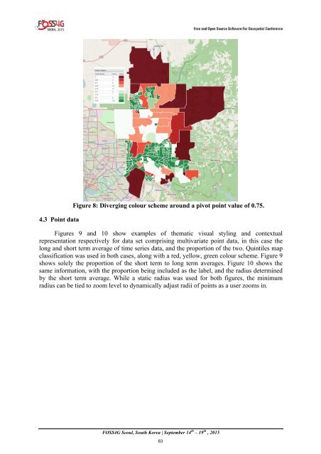
- Page 57 and 58: 3.2.1 Data inputs The styler accept
- Page 59 and 60: determine the radius (both in the x
- Page 61: Figure 5: Map classification of blo
- Page 65 and 66: 4.4 Non-spatial visualisations Figu
- Page 67 and 68: 6 ACKNOWLEDGEMENTS The Cooperative
- Page 69 and 70: educational resources (OER) and mod
- Page 71 and 72: workshops have revealed that microc
- Page 73 and 74: 300 250 200 150 100 50 0 Figure 4.
- Page 75 and 76: H 27 Male Student Maths / Geography
- Page 77 and 78: 5. CONCLUSIONS AND FUTURE WORK We h
- Page 79 and 80: DEVELOPMENT OF DATA ARCHIVING AND D
- Page 81 and 82: 2. RELATED WORK Recent developments
- Page 83 and 84: 3. Significance and Objectives With
- Page 85 and 86: Figure 3. Map Tiles Grid Selection
- Page 87 and 88: The Ceph architecture comprises of
- Page 89 and 90: Boundless, 2015. GeoExplorer — Ge
- Page 91 and 92: Object-Based Building Boundary Extr
- Page 93 and 94: 2.2. A Grid-Based Algorithm A grid-
- Page 95 and 96: 3.1 Boundary Extraction The extract
- Page 97 and 98: The Development of Web3D-based Open
- Page 99 and 100: Singh et al.(2012) have utilized op
- Page 101 and 102: Monitoring concept on operating asp
- Page 103 and 104: (a) Mining area (Left:2007, Right:2
- Page 105 and 106: geospatial information open platfor
- Page 107 and 108: open platform utilized in open-pit
- Page 109 and 110: Data Acquisition Methods Acquisitio
- Page 111 and 112: (a) Ecological Restoring Area 1 (Le
- Page 113 and 114:
possibility of development of open-
- Page 115 and 116:
2. DATA ACQUISITION 2.1 Image gathe
- Page 117 and 118:
Hugin Pix4Dmapper Pablo d'Angelo et
- Page 119 and 120:
utit may be improved using many ste
- Page 121 and 122:
Wójcicka, A., and Wróbel, Z., 201
- Page 123 and 124:
platforms, which are easy to use an
- Page 125 and 126:
SWE framework proposes the followin
- Page 127 and 128:
Steenkamp et al. (2009) state that
- Page 129 and 130:
technology and are published under
- Page 131 and 132:
Measurement value yes Measurement s
- Page 133 and 134:
4.3.1 Explore The explore view allo
- Page 135 and 136:
Figure 8. Registration of a generic
- Page 137 and 138:
participants completely agree with
- Page 139 and 140:
467 - 471. Sohraby, K., Minoli, D.,
- Page 141 and 142:
In augmented reality a live view of
- Page 143 and 144:
Figure 4. Dwellings in an informal
- Page 145 and 146:
1. Gen eral crite ria 1.1. Platform
- Page 147 and 148:
matching, 3D engine, image tracking
- Page 149 and 150:
1.4. Implemented standards OGC ARML
- Page 151 and 152:
2.3. Object events 2.4. Display rad
- Page 153 and 154:
instructional videos, and basic exa
- Page 155 and 156:
application for addressing, the pre
- Page 157 and 158:
Environments, 6(4), 355-385. Carmig
- Page 159 and 160:
1. INTRODUCTION Use of landmarks in
- Page 161 and 162:
the junctions which made with major
- Page 163 and 164:
4. IMPLEMENTATION 4.1 Technology Se
- Page 165 and 166:
Figure 3: Linear map output with si
- Page 167 and 168:
AN OPEN SOURCE WEB SERVICE FOR REGI
- Page 169 and 170:
2. IGSN OVERVIEW Figure 1 shows the
- Page 171 and 172:
types (e.g., dateType and relationT
- Page 173 and 174:
REST API(Fielding, 2000). The servi
- Page 175 and 176:
An Open Source Web Service for Regi
- Page 177 and 178:
Research Centre (ARRC) and the Nati
- Page 179 and 180:
Developing a land use database of t
- Page 181 and 182:
Figure 3. Land use input applicatio
- Page 183 and 184:
Paddy 19.4 23.7 Upland field, orcha
- Page 185 and 186:
Figure 6. Overlay point based land
- Page 187 and 188:
Integrating Open Source GIS Softwar
- Page 189 and 190:
Advanced GIS course, we recognized
- Page 191 and 192:
for undergraduates. Research take t
- Page 193 and 194:
Figure 8 The USDA Foodshed project
- Page 195 and 196:
4. Data is sent to the web pages ei
- Page 197 and 198:
Advances in Civic Co-management wit
- Page 199 and 200:
2. JAKARTA'S DISASTER RISK MANAGEME
- Page 201 and 202:
The aim of the system is to improve
- Page 203 and 204:
8. REFERENCES Baker, J. L., 2012. (
- Page 205 and 206:
EVALUATION OF AN OPEN-SOURCE COLLAB
- Page 207 and 208:
therelevant stakeholderswith differ
- Page 209 and 210:
at each stage of the exercise: · l
- Page 211 and 212:
differentmitigationmeasuresaccordin
- Page 213 and 214:
students before the exercise. 5 4 3
- Page 215 and 216:
the third stage of the exercise in
- Page 217 and 218:
doi:10.1016/j.envsoft.2003.12.019.
- Page 219 and 220:
e integrated directly in the Web-GI
- Page 221 and 222:
3. Implementation The main features
- Page 223 and 224:
Phase 1: Earthquake data Input Data
- Page 225 and 226:
Figure 4 . Magnitude 7.8 Earthquake
- Page 227 and 228:
After adding all the layer maps, th
- Page 229 and 230:
EVALUATING FLOOD HAZARD POTENTIAL I
- Page 231 and 232:
σ 0 = 10*log 10 (DN 2 ) + CF (1) W
- Page 233 and 234:
Figure 4. The geomorphological feat
- Page 235 and 236:
from water class in land cover map
- Page 237 and 238:
ANALYSIS OF SPATIAL DENSITY UTILIZI
- Page 239 and 240:
demographic data. He also states th
- Page 241 and 242:
Table 1. The combination of COUNTRY
- Page 243 and 244:
NUMBER OF SUBSCRIBERS 300,000 250,0
- Page 245 and 246:
Figure 9. The number of foreign tou
- Page 247 and 248:
Figure 16. Spatial call activity pa
- Page 249 and 250:
Recently, additional tourist inform
- Page 251 and 252:
country. It uses R-Studio, a statis
- Page 253 and 254:
Geosocial Big Data Analysis Using P
- Page 255 and 256:
AN ON-BOARD VISUAL-BASED ATTITUDE E
- Page 257 and 258:
3.1 Keypoints detection and matchin
- Page 259 and 260:
complete the process. This has been
- Page 261 and 262:
Fleet, D., & Weiss, Y. (2006). Opti
- Page 263 and 264:
technologies in Geoinformation Scie
- Page 265 and 266:
technologies becomes irrelevant in
- Page 267 and 268:
Figure 2. Server (upper block) and
- Page 269 and 270:
Name Presence Description Table 1.
- Page 271 and 272:
SampleExtraApp sampleExtraApp annot
- Page 273 and 274:
4. RESULTS Summing up, we should no
- Page 275 and 276:
Paradigms. John Wiley & Sons Inc.,
- Page 277 and 278:
FREEWAT: FREE and open source tools
- Page 279 and 280:
An Evaluation of Open Source Geogra
- Page 281 and 282:
2. DATA AND METHOD The approach ado
- Page 283 and 284:
the beginning and end of each trip
- Page 285 and 286:
Table 4 - GIS Routing Tools S/N GIS
- Page 287 and 288:
State cold store- Hungu Primary Hea
- Page 289 and 290:
Figure 3 - Comparing Discrepancy in
- Page 291 and 292:
nations based on human per capita i
- Page 293 and 294:
investigating metropolitan traffic.
- Page 295 and 296:
A Cross National Comparison on the
- Page 297 and 298:
in 1980(Saaty, 1980). It assesses t
- Page 299 and 300:
ex or current government officials
- Page 301 and 302:
Herold, S., & Sawada, M. C. (2012).
- Page 303 and 304:
frameworkwhich covers an infrastruc
- Page 305 and 306:
The architecture of the application
- Page 307 and 308:
5. CONCLUDING REMARKS Open source s
- Page 309 and 310:
cloud environment, so that end-user
- Page 311 and 312:
Figure 2 represents user interface
- Page 313 and 314:
geo-science application. Also the o
- Page 315 and 316:
PO-04 GeoDjango-Framwork-based Popu
- Page 317 and 318:
pH of 5.5 to 7.0; forest loam, rock
- Page 319 and 320:
Figure 4. Study Area (Davao Region)
- Page 321 and 322:
Figure 6. Topographic Map of Mindan
- Page 323 and 324:
Figure 8. Land Areas suitable for C
- Page 325 and 326:
It is respectfully recommended that
- Page 327 and 328:
ECDIS through introduction of Open
- Page 329 and 330:
to adopt development using open sou
- Page 331 and 332:
3. Conclusion ECDIS is navigation e
- Page 333 and 334:
PO-08 Development of an Agent Based
- Page 335 and 336:
1. INTRODUCTION 1.1 Background of t
- Page 337 and 338:
Figure 2. Workflow of the semi-auto
- Page 339 and 340:
threshold set. GRASS 7.0 is used in
- Page 341 and 342:
Figure 7. Result of the application
- Page 343 and 344:
Ming, D. M. D., Luo, J. L. J., Shen
- Page 345 and 346:
PO-10 3D Visualization of City GML
- Page 347 and 348:
As A Service (PAAS) and Infrastruct
- Page 349 and 350:
Figure 2: System Architecture and D
- Page 351 and 352:
The resulted crowd source data cont
- Page 353 and 354:
Table 1: Confusion Matrix Crowd sou
- Page 355 and 356:
PO-12 House Number Interpolation Fo
- Page 357 and 358:
(DOE) has awarded a total of 82 Gri
- Page 359 and 360:
Most solar radiation models compute
- Page 361 and 362:
2. OBJECTIVES, SCOPE, AND LIMITATIO
- Page 363 and 364:
Figure 4. BSWM Solar Sensors for Va
- Page 365 and 366:
4.2 Site Suitability Analysis Inter
- Page 367 and 368:
5. RESULTS AND DISCUSSION 5.1 Month
- Page 369 and 370:
Figure 8. Monthly Average Real-sky
- Page 371 and 372:
Figure 19. GHI for November Figure
- Page 373 and 374:
Figure 26. Non-Resource Criteria Su
- Page 375 and 376:
Kryza, M. et al. 2010. “Spatial i
- Page 377 and 378:
example coordinates agents, based o
- Page 379 and 380:
A benefit of using multiple agents
- Page 381 and 382:
A local GeoServer instance was set
- Page 383 and 384:
Figure 3. Screen captures of search
- Page 385 and 386:
In combination with ranking of resu
- Page 387 and 388:
INTRODUCTION TO A NEW GEO-REFERENCE
- Page 389 and 390:
Figure 2. ‘Click-to-go’ functio
- Page 391 and 392:
Figure 5. The conceptual structure
- Page 393 and 394:
Figure 6. Software architecture of
- Page 395 and 396:
GIS ORIENTED SERVICE OPTIMIZATION T
- Page 397 and 398:
Vehicle Routing Problem (VRP) refer
- Page 399 and 400:
So, buffer of 2 meters was created
- Page 401 and 402:
log data which was the actual dista
- Page 403 and 404:
was being served by three vehicles.
- Page 405 and 406:
Analyzing the number of customers,
- Page 407 and 408:
PO-17 A Study of the Development an
- Page 409 and 410:
MODELING OF TERMINOLOGY DATABASE IN
- Page 411 and 412:
3.2 Interpretation of the terms 4 I
- Page 413 and 414:
Figure 4 shows the result of SWOT a
- Page 415 and 416:
Add terms in the database: Super us
- Page 417 and 418:
6. REFERENCES Damdinsuren A., 2013.
- Page 419 and 420:
PO-20 Vulnerability Assessment Usin
- Page 421 and 422:
LEIGHTWEIGHT URBAN COMPUTATION INTE
- Page 423 and 424:
where events are instantly propagat
- Page 425 and 426:
not be conceived as responsive by a
- Page 427 and 428:
3.5. Remote Services Among a few
- Page 429 and 430:
4. USE CASES 4.1. Transition Worksh
- Page 431 and 432:
to display the rank of the player i
- Page 433 and 434:
PO-23 Development of Opensource-bas
- Page 435 and 436:
Author Index Aburizaiza, Ahmad O. 2