Inspire Issue 38 English.pdf - Iggesund
Inspire Issue 38 English.pdf - Iggesund
Inspire Issue 38 English.pdf - Iggesund

You also want an ePaper? Increase the reach of your titles
YUMPU automatically turns print PDFs into web optimized ePapers that Google loves.
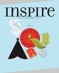
A magazine from <strong>Iggesund</strong> Paperboard <strong>Issue</strong> <strong>38</strong> • 2011
CONTENTS #<strong>38</strong><br />
4 bad habit leaves footprint<br />
The bad habit of wasting food is a matter of serious<br />
environmental consequences. Smaller packaging<br />
might be the key.<br />
6 12 months of seduction<br />
By giving its customers a calendar with 12 erotic<br />
lingerie images, Aubade becomes a partner in their<br />
seduction.<br />
8 obsessed with a brand<br />
Extreme brand loyalty makes consumers sacrifice<br />
functional value for symbolic value.<br />
13 the black box project<br />
Rustic Italian cooking is side by side with the<br />
ancient and magic art of tarot in <strong>Iggesund</strong><br />
Paperboard’s black box campaign.<br />
16 a symbol of pleasure<br />
The perfect chocolate truffle is the result of sense<br />
and sensibility – and a perfect cocoa bean.<br />
20 packaging fendi fragrance<br />
The packaging is the most important marketing<br />
element in making a perfume an object of desire.<br />
22 desired objects<br />
A package for a hunting knife, a gift pack with art<br />
cards and packaging for fine-tasting marzipan.<br />
24 design from waste<br />
When Erik Thorstensson creates new producs from<br />
industrial waste, imagination is the only limit.<br />
13<br />
avant-card<br />
Marc Benhamou gets mystical<br />
for the Black Box Project.<br />
16 8<br />
4
<strong>Inspire</strong>, a source of inspiration,<br />
provided by <strong>Iggesund</strong> Paperboard,<br />
home of Invercote and Incada.<br />
ADDRESS<br />
<strong>Iggesund</strong> Paperboard<br />
SE-825 80 <strong>Iggesund</strong>, Sweden<br />
phone: +46 650 280 00<br />
fax: +46 650 288 21<br />
www.iggesund.com<br />
PUBLISHER<br />
Carlo Einarsson<br />
(responsible under Swedish press law)<br />
EDITOR IN CHIEF<br />
Elisabeth Östlin<br />
elisabeth.ostlin@iggesund.com<br />
EDITORIAL COMMITTEE<br />
Winnie Halpin, Wout van Hoof, Astrid Korf,<br />
Véronique Lafrance, Didier Saindon,<br />
Ian Harris, Staffan Sjöberg, Elisabeth Östlin<br />
PUBLISHING AGENCY<br />
Appelberg<br />
PO Box 7344, SE-103 90 Stockholm<br />
MANAGING EDITOR AND<br />
PROJECT MANAGER<br />
Karin Strand phone:+46 8 406 54 13<br />
inspire@appelberg.com<br />
ART DIRECTOR<br />
Fredrik Andersson<br />
LAYOUT<br />
Lena Palmius<br />
EDITORS<br />
Alessia Wistén, Linas Alsenas<br />
LANGUAGE COORDINATOR<br />
Helena Åkesson<br />
PREPRESS<br />
Appelberg<br />
CONTRIBUTORS<br />
Claudia Flisi, Anne Hammarskjöld, Jocelyn<br />
Hanamirian, Anna McQueen, Eddie de<br />
Oliveira, Nancy Pick, John Scott Marchant<br />
PHOTOS<br />
Maurizio Camagna, Jonny Lindh,<br />
Martin Sundström, Axel Öberg<br />
ILLUSTRATIONS<br />
Kari Modén, Team Hawaii<br />
PRINTING<br />
Strokirk-Landströms, Lidköping<br />
Strand Grafiska, Malmö (cover)<br />
ISSN<br />
1404-2436<br />
<strong>Inspire</strong> is printed in <strong>English</strong>, Chinese,<br />
French, German and Swedish.<br />
<strong>Inspire</strong> aims to inform and entertain with<br />
stories and photos that are not restricted to the<br />
scope of <strong>Iggesund</strong>’s own business. As its name<br />
suggests, the idea is to be inspirational and<br />
not to infringe on a company or person’s image<br />
rights or intellectual property. Products that<br />
are made with Invercote, Incada and other paperboard<br />
from <strong>Iggesund</strong> are marked in the text.<br />
A DESIRED<br />
A DESIRED<br />
DEFINITELY<br />
OBJECT<br />
WITHIN THE PAPERBOARD industry<br />
development typically results<br />
from a series of small, systematic<br />
steps and incremental improvements,<br />
many of which only<br />
become noticeable over time.<br />
At <strong>Iggesund</strong> Paperboard we<br />
tend to take pride in continually<br />
developing our products without<br />
beating the drum, renaming<br />
products or making a fuss about<br />
anything. Our philosophy is that<br />
our customers will always get a<br />
better product.<br />
But when you are constantly<br />
immersed in a world of small<br />
developments, it is much more<br />
exciting to be involved in a really<br />
big step. This is the issue we are<br />
facing at <strong>Iggesund</strong> paperboard<br />
mill in Workington, where we<br />
now have to make a major change<br />
to our energy system. Our production<br />
is powered exclusively<br />
by fossil fuels, but we are investing<br />
108 million GB pounds in<br />
making a radical shift to green<br />
bio-energy.<br />
In this way, Incada will be able<br />
to provide an even better performance<br />
for its customers from an<br />
environmental perspective when<br />
all fossil emissions disappear from<br />
production. For <strong>Iggesund</strong> Paperboard,<br />
this means making use of<br />
two of the paperboard mills in the<br />
world that emit the least fossil<br />
carbon dioxide.<br />
Appropriately, we have decided<br />
that “lust and desire” will be<br />
the theme of this issue of <strong>Inspire</strong>.<br />
For all of us who work at Incada,<br />
the biomass boiler is certainly a<br />
“desired object”.<br />
You can, however, immerse<br />
yourself in other desirable objects<br />
that are not so industrial in nature,<br />
such as exclusive chocolate, highly<br />
desirable lingerie, the design of<br />
perfume packaging and the question<br />
of why people become devoted<br />
followers of certain brands.<br />
THE THEME of this issue of <strong>Inspire</strong><br />
is lust and desire, and the content is<br />
both luxurious and slightly teasing.<br />
“I started from that when creating<br />
the cover,” says <strong>Inspire</strong>’s art director,<br />
Fredrik Andersson. “The masque is<br />
timeless and sensual and conveys a<br />
secret feeling.”<br />
The cover is printed in four colour offset<br />
and two additional whites on Invercote<br />
Creato 260 g/m2 with Brushprint<br />
OLA SCHULTZ-EKLUND<br />
Managing Director,<br />
Workington mill<br />
A radical<br />
shift to<br />
green bioenergy.”<br />
Silver 47 g/m2 (12 g/m2 PE and 35 g/m2<br />
Brushfoil) and matt varnish. The masque<br />
is printed with blank UV varnish and<br />
embossed in several levels for a enhanced<br />
effect. The golden part of the masque<br />
has additional embossing. The masque<br />
appears on the reverse as well, in the form<br />
of blank UV varnish and embossing.<br />
“It’s a way to bring out the paperboard<br />
and show how the embossing effect<br />
changes with the light,” Andersson says.<br />
www.iggesund.com #<strong>38</strong> [2011] • inspire 3
InspIred Reducing waste<br />
Text Nancy Pick Illustration Kari Modén<br />
The Big FaT FooTprinT oF<br />
WasTed Food<br />
4 inspire •<br />
#<strong>38</strong> [2011]<br />
When your parents told you not to waste food,<br />
they were right in more ways than they perhaps realised.<br />
It’s not just a matter of principle, but also<br />
a matter of serious environmental consequences.<br />
Do you toss out huNKs of Camembert without<br />
thinking twice? Or leave yogurt in the bottom of the<br />
carton? Most of us are guilty of such practices.<br />
Studies show that Europeans waste huge amounts<br />
of food, and only now are they starting to think about<br />
the CO 2 consequences of bad habits and inefficient<br />
packaging.<br />
“Between 20 and 30 percent of the food we carry<br />
home is thrown away,” says Per-Stefan Gersbro,<br />
managing director of Packbridge, an international<br />
packaging-industry consulting firm located in the<br />
Swedish port city of Malmö. “We were shocked<br />
www.iggesund.com
about the actual numbers. People don’t believe them<br />
at first.”<br />
Gersbro gives talks across Europe, raising awareness<br />
about food waste and helping find solutions within the<br />
packaging industry.<br />
He tells people a surprising fact: Most foods have<br />
a far bigger carbon footprint than their packages.<br />
Cheese is a particularly dramatic example, because<br />
cows burp up huge amounts of methane, a greenhouse<br />
gas. If cheese waste could be reduced by selling<br />
smaller units, the impact would be significant. In the<br />
European Union, a 5 percent drop in cheese consumption<br />
would save the equivalent of 4 million tonnes of<br />
CO 2 every year.<br />
The increased packaging would add back only a<br />
small fraction of this savings amount. “You could<br />
easily double the amount of packaging material for<br />
cheese and still reduce the carbon load by quite a lot,”<br />
says Gersbro.<br />
As more and more people live alone, smaller packaging<br />
is key. Other solutions might include:<br />
Portion Packs. These allow consumers to use up<br />
one section of food – whether pickled herring or pâté –<br />
before opening another.<br />
Easy-EmPty Packaging. As much as 10 or 15<br />
percent of food can get left behind in the container.<br />
Solving this problem might require changing the<br />
package’s inner surface to make it more slippery.<br />
rEclosablE Packaging. In this case, Europe could<br />
follow the lead of the United States, where resealable<br />
plastic zipper-type bags are already popular.<br />
What about expiration dates? Gersbro says people<br />
need to take them with a grain of salt. Too often,<br />
consumers toss out fresh food that would remain good<br />
for days or even weeks, merely because of the date<br />
stamp. Instead, they should learn to rely more on taste<br />
and smell.<br />
Gersbro also educates people about the high cost<br />
of waste. Every year, a typical four-person European<br />
household spends 500 to 800 euros on food that<br />
doesn’t get eaten. He says, “People start to realise,<br />
‘With that much money, we could go on holiday.’”<br />
Suddenly that hunk of leftover Camembert starts to<br />
look a lot more appetising.<br />
www.iggesund.com<br />
Recycling<br />
reconsidered<br />
is recycled packaging always the best choice?<br />
“yay for recycling!” say environmentalists.<br />
Today recycling is widely considered<br />
a saintly virtue. But in reality it doesn’t<br />
always make sense to use recycled paper in<br />
packaging, says Staffan Sjöberg, <strong>Iggesund</strong><br />
Paperboard’s environmental spokesman.<br />
“What many people don’t realise is<br />
that your choice of packaging material<br />
should match your purpose,” he says.<br />
“Recycled paper is not as strong as<br />
virgin [paper], because the fibres wear<br />
down every time you use them. If you<br />
mix in recycled material, you lose stiffness.<br />
You lose performance. To compensate,<br />
you may have to increase the<br />
weight of the paper.”<br />
That increase creates environmental<br />
consequences over the entire life of the<br />
packaging. “If you have to increase the<br />
weight by 20 percent,” says Sjöberg,<br />
“then you have to produce 20 percent<br />
more, you have to transport 20 percent<br />
more, and finally you have to dispose of<br />
20 percent more in the landfill.”<br />
It all comes down to finding the right<br />
match. For shoeboxes, using recycled<br />
paperboard makes perfect sense, he<br />
says, as shoes are not very sensitive.<br />
For boxes that hold gourmet chocolate<br />
truffles, however, virgin paperboard such<br />
as Invercote is probably a better choice.<br />
“If the product is sensitive to taint<br />
and odour, then virgin is better.”<br />
Also, Invercote and other multi-layered<br />
virgin paperboards can be folded into<br />
complex shapes without cracking in<br />
the creases, and they provide an ideal<br />
surface for printing.<br />
<strong>Iggesund</strong> certainly does support recycling<br />
as part of the sustainable system of<br />
paperboard production. Virgin paperboard<br />
comes from a renewable resource –<br />
trees – that can be recycled or converted<br />
into energy.<br />
Still, paper and paperboard can only<br />
be recycled three or four times before<br />
its fibres break down too much to be<br />
practical. “What would happen if we drove<br />
only used cars, instead of new ones?”<br />
Sjöberg asks.<br />
#<strong>38</strong> [2011] • inspire 5
LESSONS<br />
IN<br />
SEDUCTION<br />
6 inspire • #<strong>38</strong> [2011]<br />
The concept is pure luxury, and the use of black-and-white<br />
photography gives sophistication to the images. Since 1998, Aubade has<br />
published an annual calendar with 12 erotic lingerie images.<br />
Text Anna McQueen Photo Aubade and iStockphoto<br />
www.iggesund.com
Avril<br />
Le suspendre au bout d'un fil.<br />
Leçon‚˚109<br />
20<br />
April 2011<br />
1 2 3 4 5 6 7 8 9 10 11 12 13 14 15 16 17 18 19 20 21 22 23 24 25 26 27<br />
28 29 30<br />
VEN SAM DIM LUN MAR MER JEU VEN SAM DIM LUN MAR MER JEU VEN SAM DIM LUN MAR MER JEU VEN SAM DIM LUN MAR MER MER JEU VEN SAM<br />
FRI SAT SUN MON TUE WED THU FRI SAT SUN MON TUE WED THU FRI SAT SUN MON TUE WED THU FRI SAT SUN MON TUE WED WED THU FRI SAT<br />
calendrier2011 v9.indd 6 14/06/10 09:<strong>38</strong><br />
Ph: Hervé LEWIS / Collection La Muse Endormie, Automne-Hiver 2010 / Fall-Winter 2010.<br />
2011 11<br />
Calendrier drier drier drie<br />
Calendar Calendar<br />
calendrier2011 v9.indd 1 14/06/10 09:37<br />
THE FRENCH HAVE ALWAYS BEEN experts in the intimate<br />
art of creating lingerie. After all, they invented<br />
the word. And none has been more successful in<br />
establishing an international reputation for being at<br />
the cutting edge of all that is sexy and desirable than<br />
the exclusive Gallic lingerie brand Aubade, which has<br />
been creating beautiful underwear since 1875.<br />
“We have always been innovators in terms of new<br />
designs to help in the art of seduction,” says Claire<br />
Masson, director of Aubade. “We were one of the � rst<br />
companies to create strapless and halter-neck bras back<br />
in 1972. We invented the � rst front-fastening bra two<br />
years later. We were pioneers of the Tanga in 1979,<br />
and in 2001 we invented the String Minimum, the<br />
world’s smallest G-string weighing just � ve grams.”<br />
But the Aubade brand is perhaps the most famous<br />
for its fabulously sexy range of black-and-white advertising<br />
photographs of beautiful lingerie-clad bodies<br />
that exude lust and desire. The campaign is called<br />
“Lessons in Seduction,” and its images contain seduction<br />
hints such as “Feign indifference,” or “Keep them<br />
hanging by a thread.”<br />
“When the � rst campaign was created in 1992, it<br />
caused quite a stir,” says Masson. “We had reports of<br />
cars crashing because the drivers’ attention had been<br />
caught – and held – by the images. Also, some bus<br />
shelters were smashed because people wanted to steal<br />
the posters.” Indeed, one young man was even arrested<br />
for vandalism and � ned, teaching him a different kind<br />
of lesson.<br />
In 1998 Aubade created a calendar that contained<br />
12 new erotic lingerie images in the same unique style<br />
Janvier<br />
N'être pas totalement blanche.<br />
as the “Lessons” campaign photos and offered it as a<br />
giveaway with the purchase of a lingerie set during the<br />
holiday season. “We saw the success of the ‘Lessons’<br />
and decided to produce a calendar so our fans could<br />
enjoy our unique imagery at home,” Masson explains.<br />
“Of course, we could have used it to generate revenue<br />
on its own, but we prefer to gift it to our customers.<br />
That way, we are partners in their seduction, as we<br />
� nd most of our female customers give the calendar to<br />
their partners.”<br />
THE CONCEPT IS PURE luxury, and the use of blackand-white<br />
photography lends a certain sophistication<br />
to the images. The models’ faces are never shown,<br />
which is further proof of the complicity Aubade<br />
wants to encourage with its customers. “By leaving<br />
off their faces, we are allowing women to imagine<br />
themselves in the photographs,” says Masson. “It also<br />
encourages their partners to imagine them in wearing<br />
the lingerie.”<br />
There is a regular trade in Aubade calendars<br />
on Internet auction sites, where they exchange<br />
hands at around 20 euros each.<br />
Aubade is a brand that trades on its<br />
traditional corsetry expertise and savoir faire<br />
using the very best fabrics and trims. “Our<br />
aim is to show women’s bodies at their<br />
best,” says Masson, “working with them to<br />
be as seductive as possible, both for themselves<br />
and for their partners, whom we<br />
believe are the happy victims of the game<br />
of seduction we play.”<br />
www.iggesund.com #<strong>38</strong> [2011] • inspire 7<br />
Leçon‚˚106<br />
January 2011<br />
1 2 3 4 5 6 7 8 9 10 11 12 13 14 15 16 17 18 19 20 21 22 23 24 25 26 27 28 29 30 31<br />
SAM DIM LUN MAR MER JEU VEN SAM DIM LUN MAR MER JEU VEN SAM DIM LUN MAR MER JEU VEN SAM DIM LUN MAR MER JEU VEN SAM DIM LUN<br />
SAT SUN MON TUE WED THU FRI SAT SUN MON TUE WED THU FRI SAT SUN MON TUE WED THU FRI SAT SUN MON TUE WED THU FRI SAT SUN MON<br />
calendrier2011 v9.indd 3 14/06/10 09:37<br />
Ph: Hervé LEWIS / Collection La Dame de Flandres, Automne-Hiver 2010 / Fall-Winter 2010.<br />
Since 1998, the Aubade<br />
calendar with its sophisticated<br />
black-and-white<br />
photograpy is a gift to<br />
the customers.
8 inspire • #<strong>38</strong> [2011]<br />
Have to<br />
Have It<br />
Certain brands have the power to elicit<br />
loyalty that borders on obsession.<br />
<strong>Inspire</strong> takes an intimate look at how<br />
products seduce us.<br />
Text Jocelyn Hanamirian Illustration Team Hawaii<br />
www.iggesund.com
Every month thousands<br />
of people from Venezuela to Saudi Arabia convene to<br />
discuss a common passion: their Harley-Davidson<br />
motorcycles. Since Harley-Davidson started its Harley<br />
Owners Group (H.O.G.) chapters in 1983, enthusiasts<br />
in dozens of countries have met at dealerships to<br />
discuss current events in the motorcycle world and to<br />
organise group rides for charity. Some of these owners<br />
have tattoos bearing the precise engine model powering<br />
their bikes. Harley owner and parts specialist Sean<br />
Sheinin explains that a fanatic can identify the distinct<br />
rumble of a Harley engine at once. The tattoo is just<br />
another way to sound off.<br />
How do some brands command such devotion<br />
from their consumers? And what, psychologically<br />
speaking, motivates consumer obsession with certain<br />
brands? While a fanatical consumer will tell you it’s<br />
all about quality, quality is just the beginning.<br />
Marketers use three metrics to measure a product’s<br />
value to consumers: functional value, hedonic value<br />
and symbolic value. While functionality is essential<br />
to any product’s success and any enjoyment delivered<br />
though consumption is a plus, what drives brand<br />
obsession is its symbolic value, the ability of a product<br />
to signal certain messages about the purchaser.<br />
Joseph Nunes, associate professor of marketing<br />
at the University of Southern California School of<br />
Business, brings up Grey Goose vodka as a brand that<br />
has successfully harnessed this value. “If you think of<br />
vodka, it is a notoriously odd category, because vodka<br />
is supposed to be this odourless, tasteless beverage,”<br />
he says. “What Grey Goose has done is come out with<br />
a campaign calling itself the best-tasting vodka in the<br />
world. It has set itself apart as top shelf, and people use<br />
that message at the bar when ordering their drinks.<br />
They use what they’re drinking as a way to define their<br />
identity.”<br />
Put in psychological terms, says Dr April Lane Benson,<br />
a New York-based psychologist who specialises<br />
www.iggesund.com #<strong>38</strong> [2011] • inspire 9
10 inspire • #<strong>38</strong> [2011]<br />
We tend to see these<br />
brands as something like<br />
people, and then the ones<br />
that we like as something<br />
we’re friends with.<br />
And once you make really<br />
good friends, it’s not that<br />
easy to let them go.”<br />
Joseph Nunes<br />
www.iggesund.com
in compulsive buying disorder, people may consume<br />
certain branded products in an attempt to “close the<br />
gap between who we see ourselves to be and how we<br />
want to be seen.” She cites clinical research that shows<br />
that people who have become shopping-obsessed are<br />
looking to fill this “self-discrepancy” gap.<br />
Benson says that when treating a shoppingobsessed<br />
patient, she tries to look at what it is they’re<br />
really shopping for. Is it the need for love and affection?<br />
The need to belong? The need for autonomy?<br />
“We look at the ways [people use] to fulfil their needs<br />
for creativity, discovery and engagement with sights,<br />
sounds and textures – all things that shopping can<br />
fulfil,” she says.<br />
At the extremes of brand loyalty, a consumer will<br />
sacrifice functional value for symbolic value, as in an<br />
iPhone purchaser’s willingness to accept certain unsatisfactory<br />
features for the cachet of buying an Apple<br />
product. This is the payoff for the company’s cultivation<br />
of associations with rebelliousness, design and<br />
creativity, setting Apple apart from more functionally<br />
oriented competitors such as IBM.<br />
It’s not just high-end brands that speak to consumers’<br />
psyches. Fred Richards, global executive creative<br />
director for consumer packaged goods and executive<br />
creative director North America for the brand<br />
consultancy Interbrand, cites Starbucks as a company<br />
that has successfully created the impression that when<br />
customers order their coffee they buy into a lifestyle –<br />
even creating a lingo particular to the chain.<br />
Richards admits to possessing an irrational brand<br />
obsession himself. “I’m a huge advocate of the Veuve<br />
Clicquot brand [of champagne]. Is it better? I don’t<br />
really know. But that doesn’t matter to me. I just enjoy<br />
being seen with the brand, and I enjoy telling stories<br />
about the brand with my friends. And I think that vernacular<br />
between consumers is extremely important to<br />
PAckAging desire<br />
Interbrand’s Fred Richards<br />
emphasises the importance of<br />
packaging in fostering consumer<br />
connection. “So many brands<br />
get that so wrong,” he says. “The<br />
package [on the] shelf should<br />
be driving the loyalty, not some<br />
sort of advertising campaign.”<br />
According to Richards, companies<br />
often misguidedly use<br />
humorous commercials that may<br />
leave viewers laughing but do not<br />
necessarily create any memory of<br />
the product being advertised.<br />
Packaging creates a concrete<br />
sensory impression and can also<br />
help create a sense of reverence<br />
for a brand. “We watch consumer<br />
behaviour in stores,” Richards<br />
says, “and even how they place<br />
Consumers want to engage<br />
with brands, now more than ever.”<br />
Fred Richards<br />
brand loyalty. It is very important that brands listen to<br />
that and play it back in response, as part of their brandbuilding<br />
mechanism. Consumers want to engage with<br />
brands, now more than ever.”<br />
One powerful strategy for connecting consumers<br />
to brands is to associate one’s brand with something<br />
that is already revered, says Tom Meyvis, associate<br />
professor of marketing at New York University’s Stern<br />
School of Business. Meyvis explains that Harley-<br />
Davidson, founded in the United States in 1903, taps<br />
into Americans’ strong feelings for their country.<br />
Creating a sense of heritage can also be effective, such<br />
as reminding consumers that they are using the same<br />
brand that their fathers or grandfathers used, and the<br />
H.O.G. chapters illustrate the power of creating a social<br />
dynamic to brands. Tools such as word-of-mouth marketing<br />
and social networking sites help brands create<br />
appealing ownership communities.<br />
Nunes points to celebrity endorsements and even<br />
highly recognisable company leaders such as Apple’s<br />
Steve Jobs as marketing strategies that strike a social<br />
chord with consumers.<br />
“We anthropomorphise brands,” Nunes says. “We<br />
tend to see these brands as something like people, and<br />
then the ones that we like as something we’re friends<br />
with. And once you make really good friends, it’s not<br />
that easy to let them go.”<br />
items in a cart. If it’s something<br />
they believe is very expensive,<br />
they don’t want it to be damaged<br />
or scraped. All of a sudden it’s<br />
given a place of prominence in<br />
the cart. It’s not really about<br />
protecting it; they want people to<br />
see they purchased it.”<br />
For luxury goods and collectible<br />
items, packaging is also<br />
essential to conveying authenticity.<br />
Marketing academic Joseph<br />
Nunes says, “I do think that when<br />
you’re trying to convey luxury,<br />
the type of packaging that you’re<br />
using speaks volumes to what’s<br />
inside the box. There’s been a<br />
huge push to improve packaging<br />
and to make it more reflective of<br />
what’s inside.”<br />
www.iggesund.com #<strong>38</strong> [2011] • inspire 11
photo istockphoto and shutterstock<br />
Around the world, music draws people<br />
together. Here is a sampling of five<br />
festivals that suggest the amazing range<br />
of music being celebrated in public.<br />
COME<br />
TOGETHER<br />
Fulong Beach<br />
TAIWAN<br />
Crashing drums, throbbing<br />
bass lines, grinding guitars,<br />
gritty vocals and powerful<br />
songs are what characterise<br />
the Hohaiyan Rock Festival,<br />
which has taken place every<br />
July since 1999 at Fulong<br />
Beach along Taiwan’s northeastern<br />
coastline. The word<br />
Hohaiyan comes from the<br />
Amis, Taiwan’s aboriginal<br />
population, and means<br />
waves and the ocean.<br />
The three-day<br />
indie rock event<br />
attracted some<br />
600,000 visitors<br />
this year. But<br />
it’s not just the<br />
music that draws<br />
the crowds; it’s<br />
the opportunity to<br />
experience Asia’s new spirit<br />
of youthful expression and<br />
unadulterated cool.<br />
JOHN SCOTT MARCHANT<br />
12 inspire •<br />
#<strong>38</strong> [2011]<br />
Essaouira<br />
MOROCCO<br />
The colorful Moroccan<br />
coastal town of Essaouira<br />
serves as the evocative<br />
backdrop for the Gnawa (or<br />
“Gnaoua”) and World Music<br />
Festival, one of Africa’s top<br />
musical gatherings. For the<br />
uninitiated, Gnawa is a musical<br />
form blending Sub-Saharan,<br />
North African and slave<br />
in� uences. Typically, the<br />
three-string lute and heavy<br />
metal castanets accompany<br />
chants that are repeated in<br />
songs that may last for hours.<br />
Masters of the<br />
genre perform at<br />
Essaouira, often<br />
in fusion concerts<br />
along with guests<br />
from the jazz and<br />
world music<br />
scene. Some<br />
400,000<br />
people attend<br />
the annual<br />
four-day<br />
event.<br />
ANNA MCQUEEN<br />
Vilnius<br />
LITHUANIA<br />
Lithuanian rock star Andrius<br />
Mamontovas really likes<br />
street music. So much so,<br />
that in 2007 he invited<br />
musicians of all stripes –<br />
professional and amateur<br />
– to hit the streets, parks<br />
and squares of Lithuania’s<br />
Luverne<br />
USA<br />
Trombone suicides sound<br />
dire, but they’re a common<br />
event every autumn in the US<br />
Midwest. Autumn is marching-band<br />
season, and<br />
“suicides” are fancy<br />
moves done with the<br />
trombone’s long brass<br />
slide – a quick turn<br />
sideways while the next<br />
in line ducks out of the<br />
way. Usually. At the<br />
Tri-State Band Festival<br />
in tiny Luverne, Minnesota,<br />
some 7,000<br />
bystanders arrive<br />
every September<br />
to watch some two<br />
dozen school bands<br />
parade down<br />
Main Street.<br />
A daylong<br />
competition follows, when<br />
the kids march into complex<br />
formations on the football<br />
� eld. Despite the occasional<br />
collision, the activity is not<br />
considered as dangerous as<br />
American football.<br />
NANCY PICK<br />
capital Vilnius for a day of<br />
raucous music-making. The<br />
idea caught � re, so now thousands<br />
of musicians ranging<br />
from traditional folk bands<br />
to avant-garde sound artists<br />
pour into the city’s public<br />
London<br />
UK<br />
Every summer since 1895,<br />
London’s stunning Royal<br />
Albert Hall has opened its<br />
doors to classical music fans<br />
of all backgrounds.<br />
The BBC Proms, as<br />
the festival is known<br />
today, offers more<br />
than 70 concerts<br />
ranging from<br />
traditional classic<br />
masterpieces to<br />
world premieres of<br />
experimental new<br />
sounds from internationalcomposers.<br />
Affordable<br />
entry prices,<br />
including supercheap<br />
standing<br />
tickets in front of<br />
the stage, ensure<br />
that the 5,000-capacity<br />
venue is always packed<br />
and that everyone has<br />
a chance to experience<br />
some of the greatest<br />
orchestras, vocalists and<br />
conductors in the world.<br />
EDDIE DE OLIVEIRA<br />
spaces every � rst Saturday in<br />
May. But Vilnius doesn’t have<br />
all the fun; the Street Musician<br />
Day festival has spread<br />
to more than 30 Lithuanian<br />
cities.<br />
LINAS ALSENAS<br />
www.iggesund.com
New York’s Marc Benhamou, the fourth designer to tackle <strong>Iggesund</strong> Paperboard’s<br />
Black Box project, channels the ancient (and magic) art of tarot.<br />
Text Jen Renzi Photo Axel Öberg<br />
<strong>Iggesund</strong>’s Invercote your design! campaign offers selected designers the<br />
opportunity to harness the possibilities of Invercote by filling a small black box<br />
with something representative of themselves and their work.<br />
THE BLACK BOX<br />
PROJECT<br />
IT’S IN<br />
THE CARDS<br />
DURING DESIGNER MARC BENHAMOU’S 15-year<br />
career as a creative director, he has observed a little<br />
something about the process of pitching concepts.<br />
“Putting a number of ideas on the table and picking<br />
one that will chart the future of the project is<br />
very similar to reading tarot cards,” he says. “The<br />
metaphorical connection between advertising and this<br />
mystical game is something I always joke about at<br />
meetings to relax clients.”<br />
So when he was invited to participate in <strong>Iggesund</strong><br />
Paperboard’s Black Box project, Benhamou<br />
immediately knew what should represent his work:<br />
the 22 cards of the tarot’s Major Arcana, representing<br />
such characters as the Hierophant, the Devil and<br />
Temperance. “A tarot deck is something I’ve wanted<br />
to envision – and to tie into my industry, beauty – for<br />
10 years, ever since I bought a beautiful set painted by<br />
Niki de Saint Phalle,” he explains. “Given <strong>Iggesund</strong>’s<br />
speciality in the luxury business, and its many<br />
cosmetics clients, it was a very nice connection.”<br />
www.iggesund.com #<strong>38</strong> [2011] • inspire 13
Each card is illustrated with a lush photograph<br />
in the style of a splashy fashion spread. The Chariot<br />
wears cleavage-baring Versace. The Fool’s tights-clad<br />
legs perch on a pair of (foolishly tall) Pierre Hardy<br />
stilettos. The Tower’s glass flaçon pours out a ribbon of<br />
white lace. And Justice, a platinum-blonde ice queen,<br />
sports Martin Margiela wraparound shades. The highconcept<br />
images were shot by beauty-world veteran<br />
Philippe Salomon in Manhattan’s Milk Studios (where<br />
the campaign was launched in May) over four days<br />
in January. “I pushed my luck,” says Benhamou.<br />
“Shooting 22 images – and 22 extraordinary hair and<br />
fashion looks – in that tight a time frame is a lot of<br />
work. Usually you can expect to complete three or four<br />
images max per day.”<br />
Casting the right talent, from the model to the<br />
makeup artist, was essential. To save time, Benhamou<br />
used a second model for hand and body close-ups<br />
and booked two adjacent stages so one shot could be<br />
prepped while another was photographed. Despite<br />
painstaking planning, setbacks occurred, including a<br />
massive snowstorm and a computer crash – right after<br />
they shot Death. “People freaked out at that, but I’m<br />
not superstitious!” Benhamou says and laughs.<br />
The latter glitch was particularly troublesome<br />
because the images were being shot digitally and<br />
edited on site. Despite his heavy reliance on digital<br />
production, though, Benhamou is reflective about its<br />
limitations. “Everything looks fantastic on a computer<br />
screen, but so many problems arise when images get<br />
translated to print,” he explains. “Luckily, the quality<br />
of production and paperboard was so high here.”<br />
The paperboard used for the cards was Invercote<br />
Duo 370 g/m² with its reverse side printed black and<br />
varnished for a mirror effect.<br />
In fact, the designer conceived his tarot deck as an<br />
opportunity to redress the ubiquity of digital overprinted<br />
imagery. “With the rise of electronic media,<br />
we’re starting to forget what a sensual experience it<br />
is to touch beautiful paper with your hands,” he says.<br />
“This kind of project can help refresh your memory.”<br />
Marc Benhamou is a Paris-born, New York City-based creative director and<br />
brand strategist specialising in beauty and fashion. He started his career<br />
at Vogue, and moved on to work in-house at luxury cosmetics companies<br />
including Estée Lauder and Lancôme. In 2009, he started his own fullservice<br />
consultancy, Creative 360º, handling everything from advertising<br />
and digital-media campaigns to product development and launches.<br />
Recently he co-launched a side venture, Correspondance, a collective of<br />
business-owners and executives specialized in fragrance and cosmetics.<br />
His long-time obsession with tarot, he explains, is about artistry rather<br />
than mysticism. “Tarot is extremely complicated, and I make no pretence<br />
whatsoever that I know anything about reading cards,” he says. “I’m<br />
primarily interested in the graphics, the symbolism and the metaphors,<br />
which are similar to those you find in surrealist paintings – a relationship<br />
between art and magic.”<br />
14 inspire • #<strong>38</strong> [2011]<br />
www.iggesund.com
Pasta in a<br />
black box<br />
In Italy, the Brunazzi family took on the<br />
black box challenge with gusto, creating<br />
a traditional pasta strainer and server<br />
complete with pasta and sauce.<br />
Text claudia Flisi Photo Maurizio camagna<br />
When <strong>Iggesund</strong> called desIgners Brunazzi &<br />
Associati of Turin, Italy, to participate in its Black Box<br />
project, the reaction by the entire Brunazzi family was<br />
enthusiastic. Company founder Giovanni Brunazzi,<br />
son Andrea, who focuses on design, and daughter<br />
Ada, a graphics-trained copywriter and a recognised<br />
photographer, agreed immediately. “We were<br />
thrilled,” recalls Ada. “What a great idea!”<br />
They decided that they wanted to do something<br />
practical, something that would be seen as useful in<br />
some way. Andrea’s design ideas often come from<br />
natural forms, revisited to make them practical as well<br />
as innovative, explains Ada, so their first thought was<br />
to develop a packaging that might be used for one of<br />
their clients – a producer of tea products and herbal<br />
infusions.<br />
The concept was a basket-like container that<br />
would hold the teas and make them visible and more<br />
appealing to the consumer. They designed packaging<br />
along these lines with folds and perforations, but<br />
weren’t convinced. “While we were trying to figure<br />
out what direction to take, Andrea said, ‘Gee, this<br />
package looks like a scolapasta (pasta strainer),’ and<br />
that got us going,” explains Ada.<br />
“You have to remember that pasta is practically part<br />
of the DNA of an Italian,” she continues. “Pasta evokes<br />
home and mama and the family table and tradition.<br />
We loved that idea and decided to run with it.”<br />
The Brunazzis chose Invercote Bio at a 400 g/m 2<br />
weight for the pasta strainer. It is made with a single<br />
sheet of paperboard with polythene on one side,<br />
creased and die cut so as to eliminate the need for glue.<br />
Its properties include strength, impermeability and<br />
flavour neutrality, which means that although the<br />
paperboard is in direct contact with the food, it does<br />
not transfer a paper smell or taste.<br />
Family influence is strong in Italy, as the lives of siblings<br />
ada and andrea Brunazzi’s confirm. They are principals in<br />
Brunazzi & Associati, founded in 1985 in Turin, Italy, by<br />
their father, Giovanni Brunazzi. The agency specialises in<br />
corporate identity, packaging, and communication.<br />
Beside her work at the agency, Ada has passion for<br />
photography. She has studied with Giuliano Cappelli<br />
and Gianni Giorgi and her photos are seen in calendars<br />
and various publications and exhibitions. She made the<br />
semi-finals for Photographer of the Year of the Natural<br />
History Museum of London twice in recent years (2008<br />
and 2009). In her free time Ada is a mountaineer, and has<br />
climbed a number of 6,000-metre peaks in various parts<br />
of the world.<br />
Andrea is the creative director at Brunazzi & Associati.<br />
In addition he lectures at various universities. Currently<br />
he is a lecturer of design at Università Cattolica of Milan<br />
and packaging at Politecnico di Torino. Since 2003 he<br />
has also been the editor-in-chief of Il Registro the official<br />
magazine of Registro Fiat Italiano. He has contributed to<br />
many graphic and architectural publications and earned<br />
awards in international and national competitions.<br />
The accompanying pasta server (molletta) is made<br />
of Invercote G Metalprint in polished silver, with a<br />
weight of 670 grams. It also consists of a single sheet<br />
of paperboard without glue; instead it is creased and<br />
die cut to achieve the desired form.<br />
The final project contains the strainer and real pasta<br />
(not paper) from an artisanal company in Turin, plus<br />
the paper molletta and a package of dehydrated sauce<br />
made by an another agency client.<br />
The Brunazzis know the contents of their black box<br />
can actually be used because they tried it out several<br />
times to make sure. The molletta is for show rather<br />
than utility, according to Ada, but the scolapasta works<br />
perfectly.<br />
www.iggesund.com #<strong>38</strong> [2011] • inspire 15
Housed in an old<br />
industrial building, the small, elegant<br />
pâtisserie and<br />
confectionery Dessert&Choklad Stockholm operates<br />
far from the city’s main shopping areas. But it’s an easy<br />
place to � � nd once you get in the vicinity. Just close<br />
your eyes and follow the alluring aroma of chocolate.<br />
Launched � � ve years ago, Dessert&Choklad Stockholm<br />
focuses on top-quality chocolates, using the<br />
highest quality of ingredients as well as excellent<br />
service and presentation. The store appears much like<br />
an exclusive jewellery shop, with items behind glass or<br />
tantalisingly displayed on small trays. Each truf� truf� e is<br />
visible, creating a veritable feast for the eyes.<br />
The company’s co-owner, Ted Johansson, is one<br />
of Sweden’s best-known and most highly acclaimed<br />
confectioners (he was a member of the Swedish<br />
National Cooking Team for six years). It was when he<br />
was working at a two-star restaurant in the UK that<br />
he had an epiphany that led to the development of<br />
Dessert&Choklad Stockholm.<br />
“In the UK I came to fully realise the importance of<br />
working with seasonal ingredients such as fresh fruit<br />
and berries,” says Johansson. “That’s how we work<br />
16 inspire • #<strong>38</strong> [2011]<br />
EXQUISITE<br />
CRAFTSMANSHIP<br />
Shiny, crisp and easy to the touch. A fitting description of a fine chocolate.<br />
For a devoted confectioner, a truffle is primarily an interplay between the habitat<br />
of the cacao bean and the season’s finest ingredients. The perfect chocolate truffle is<br />
the result of sense and sensibility, in equal measure. Which is perhaps why it has<br />
become such a timeless symbol of luxuriant pleasure.<br />
Text Anne Hammarskjöld Photo Shutterstock<br />
here. The raw produce governs what we make and sell.<br />
For example, the other day we received a couple of<br />
boxes of organic oranges from Sicily. They were all different<br />
shapes and sizes, and they weren’t that pretty.<br />
But the � avour! So right now we’re making desserts<br />
and truf� es with oranges and lemons.”<br />
This meticulous approach to raw produce naturally<br />
also includes the chocolate itself. For Johansson the<br />
terroir – habitat and local conditions – of the cacao<br />
bean is crucial in deciding whether or not it will<br />
become a Dessert&Choklad Stockholm truf� e.<br />
“We select the chocolate based on the taste, and<br />
work with several different types,” he says. “Sometimes,<br />
for example, a more acidic � avour works well<br />
as a casing for a raspberry truf� e, while a spicier kind<br />
suits a dark chocolate truf� e. The main challenge lies<br />
in striking the best balance in the combination of<br />
chocolate type and � lling. For me it’s not enough to<br />
just make truf� es. I’m interested in the whole process,<br />
from the raw bean to the point of sale.”<br />
ONE CAN TELL A FINE TRUFFLE by its shiny surface,<br />
the brittle “crack” against the teeth, and the fact that<br />
it doesn’t melt on your � ngers. That kind of quality<br />
is the result of “ tempering”, whereby the chocolate is<br />
heated to 55 degrees Celsius, gradually reduced to 26<br />
degrees and then raised again to 32 degrees. This is<br />
the ideal working temperature for making the truf� e<br />
www.iggesund.com
www.iggesund.com
When you buy a bottle of wine,<br />
you don’t ask for one with 14<br />
percent alcohol. You ask for a<br />
grape or a country. I wish we<br />
could think of chocolate in the<br />
same way.”<br />
Ted Johansson<br />
casing. The � lling is an entirely separate challenge.<br />
A truf� e � lling, or ganache, comprises cream and<br />
chocolate that is � avoured in a wide variety of ways.<br />
Creating the perfect � lling is a tough process. There<br />
has to be a certain percentage of sugar and a certain<br />
percentage of fat, and it has to be right from the<br />
start. Precision, freshness and purity are paramount.<br />
Johansson’s truf� es are characterised by what he terms<br />
“classically pure” � avours.<br />
“Concentrated � avours are classic quality for me,”<br />
he says. “I’m not interested in the bizarre. I want to<br />
offer a � avour experience you can be sure you’ll like. I<br />
leave the truf� es with blue cheese � lling to others. We<br />
want 100 percent of our customers to like the � avour<br />
they choose, and the season plays a guiding role as far<br />
as possible.”<br />
DESSERT&CHOKLAD Stockholm’s chocolate truf� es are<br />
perishable, made two or three times a week in a slow<br />
season and every day in the run-up to Christmas. The<br />
range encompasses many different elements, including<br />
cardamom, nuts, marmalades and jams, liqueurs<br />
and even the best-selling salted caramel. Johansson<br />
himself favours a South American � avour.<br />
“I wouldn’t sell anything I didn’t like,” he says.<br />
“But if I had to choose a personal favourite it would<br />
probably be the dark truf� e with cream and chocolate,<br />
partly because it needs an amazing chocolate. Ours<br />
comes from Venezuela and is slightly acidic.”<br />
For Johansson, the origin of the cacao bean is as<br />
18 inspire • #<strong>38</strong> [2011]<br />
fascinating and important as the origin of the grape<br />
would be to a connoisseur of wine. He doesn’t understand<br />
the focus in recent years on cocoa content.<br />
“When you buy a bottle of wine, you don’t ask<br />
for one with 14 percent alcohol,” Johansson explains.<br />
“You ask for a grape or a country. I wish we could<br />
think of chocolate in the same way. When you buy<br />
a bar of chocolate, look at the ingredients list. It’s<br />
a good sign if the bean is speci� ed, but what you<br />
should really look for is the term ‘single estate’, which<br />
means the bean has been grown in a speci� c location.<br />
Then the chocolate is like a vintage wine, with a different<br />
� avour from one year to the next. That experience<br />
has nothing to do with the percentage of cocoa<br />
content.”<br />
Johansson says there are a few important things<br />
to remember about keeping and enjoying chocolate<br />
truf� es at their best (apart from lying on the sofa with<br />
a box to yourself).<br />
“The most important thing is not to put truf� es in<br />
the fridge,” he says. “The coldness causes the sugar to<br />
condense and form a � lm on the chocolate. Also, don’t<br />
keep chocolate alongside spices, as it absorbs � avours<br />
very easily. The best thing is to have the box on the<br />
coffee table within easy reach so you can enjoy a couple<br />
of truf� es on special occasions.”<br />
After that, it is of course up to the individual to<br />
decide what’s a special occasion. Perhaps it’s simplest<br />
to follow Oscar Wilde’s recommendation: “The only<br />
way to get rid of temptation is to yield to it.”<br />
www.iggesund.com
Confident taste<br />
buds test<br />
the paperboard<br />
A heart-shaped box of � ne chocolates<br />
is a symbol of luxury, affection<br />
and the good things in life. It’s also a<br />
symbol of immense knowledge and<br />
meticulous analysis and preparation<br />
– in terms of both the chocolates<br />
and the box.<br />
Strict demands are placed on<br />
the Invercote paperboard used in a<br />
chocolate box. It must not absorb<br />
� avours or, worse, transfer � avours<br />
to the chocolate. This is where the<br />
sensory laboratory at <strong>Iggesund</strong><br />
Paperboard plays a key role.<br />
In addition to a host of highly<br />
advanced measurement and analysis<br />
instruments, the sensory lab<br />
relies on a sensory panel of around<br />
25 people, who test and evaluate<br />
products that are either � nished or<br />
under development. When it comes<br />
to products to be used in chocolate<br />
boxes, for example, a taste test is an<br />
important stage in the development<br />
process. The tests are blind so the<br />
panel members don’t know exactly<br />
what is being tested or why.<br />
Each taste test follows a carefully<br />
developed and evaluated process.<br />
The paperboard samples to be<br />
tested are each placed in a glass<br />
vessel. Ground chocolate is also<br />
placed in each vessel in such a way<br />
that the paperboard and chocolate<br />
do not come into direct contact, and<br />
a salt solution is used to ensure that<br />
the moisture content in the vessels<br />
is kept at a constant 75 percent.<br />
The vessels are sealed with lids,<br />
covered with foil and placed in a<br />
temperature-regulated room for 48<br />
hours. The panel members then<br />
taste each sample to determine<br />
whether the paperboard has affected<br />
the chocolate, comparing the<br />
samples with a reference chocolate<br />
that has not been in indirect contact<br />
with paperboard. A chocolate called<br />
Fazer Blå is used because its � avour<br />
quality is very consistent over time.<br />
The panel � rst tastes the reference<br />
piece, then the samples one at a<br />
time. Each tasting is assessed on a<br />
scale of 0 to 4, where 0 means “no<br />
deviation from reference” and 4<br />
means “strong deviation from reference.”<br />
The panel members taste the<br />
samples in different orders to avoid<br />
the results of one test affecting the<br />
others.<br />
<strong>Iggesund</strong>’s Laboratory for Sensory<br />
and Chemical Analyses is the<br />
only sensory lab in Sweden to be<br />
accredited by Swedac, the Swedish<br />
Board for Accreditation and Conformity<br />
Assessment.<br />
www.iggesund.com #<strong>38</strong> [2011] • inspire 19
20 inspire • #<strong>38</strong> [2011]<br />
Heaven<br />
scent<br />
In fashion, looks are everything. That truism doesn’t exclude<br />
perfume, and the packaging for the new Fan di Fendi is simply divine.<br />
<strong>Inspire</strong> takes a behind-the-scenes look at its creation.<br />
One marketing channel for<br />
the Fan di Fendi perfume is a<br />
filmed advertisment for TV.<br />
www.iggesund.com
Text Anna McQueen Photo Fendi<br />
IN AUGUST 2010, Italian fashion house Fendi launched<br />
its latest fragrance, Fan di Fendi, a fresh new fragrance<br />
with fresh new packaging that embodies the Fendi<br />
brand.<br />
“We embarked on the project at the start of 2009,”<br />
explains Sophie Fouilleron-Savino, marketing director<br />
for parent company LVMH. “Fendi had released some<br />
perfume ranges previously, but our aim here was to<br />
create a truly emblematic fragrance for the brand.<br />
“We did a lot of research into the brand’s different<br />
codes,” she recalls, “and the resulting idea was simple.<br />
We took Fendi’s most iconic accessory, the baguette<br />
bag – the � rst ever ‘it’ bag with over a million units<br />
sold – and took inspiration from the metal ‘Forever’<br />
buckle used to fasten the bag. This metal representation<br />
of the Fendi brand was our starting point, and<br />
from that we worked on the bottle to create an object<br />
that was truly aligned to the brand.”<br />
Fendi wanted to create a sophisticated fragrance that<br />
would be appealing to a wide number of consumers and<br />
would be the very embodiment the Fendi signature.<br />
As a result, Fan di Fendi releases fresh and sparkling<br />
top notes, with a � oral heart of rose and yellow jasmine.<br />
The base notes are patchouli and leather, which gives<br />
a very modern discreet animal scent. Explains Fouilleron-Savino:<br />
“The scent is what we call a fragrance de<br />
peau; it evolves in different ways depending on one’s<br />
skin. Fan di Fendi is an homage to this great Italian<br />
fashion house’s historical expertise, but at the same<br />
time, it is very feminine and very sophisticated.”<br />
Fendi’s traditional expertise is in leather goods and<br />
fur, and for many it is the epitome of exclusive fashion<br />
and design. “The Fendi brand is the ultimate in luxury<br />
goods,” says Fouilleron-Savino. “And we wanted<br />
to express that – not just through the fragrance but<br />
through the bottle and packaging too, with a level of<br />
quality that has never before been seen in a fragrance.”<br />
The Fan di Fendi bottle offers very pure lines in<br />
heavy glass and metal. The heavy iconic “Forever”<br />
buckle of two F’s sits just above the glass and is<br />
engraved like a gold bar. The bottle is topped with a<br />
lid made of solid zamak, which feels delightfully cold<br />
to the touch. It is simple and sophisticated.<br />
The carton is designed to reinforce the emblematic<br />
corporate identity, using Fendi’s signature sunshineyellow<br />
colour for a strong visual impact. The graphic<br />
concept is simple, yet the different textures offer a<br />
very high-end feel. “The packaging is critical to its<br />
overall identity of a fragrance,” says Fouilleron-Savino.<br />
“The perfume may be the heart of the product, but the<br />
bottle and the packaging are what make the dream. It<br />
must be an object of desire to succeed, and the packag-<br />
ing is probably the most important factor for that<br />
desirability.”<br />
The box was created by Paris-based packaging<br />
company Nortier Emballages, which specialises in<br />
high-end boxes for the luxury goods industry. “The<br />
biggest challenge with this project was the grain,”<br />
explains Maud Fleuret-Dieulot. “Fendi wanted the<br />
same grain on the carton that they use in all their other<br />
packaging, and we had to reproduce the exact same<br />
relief effect. We did it using Invercote, which lends<br />
itself perfectly to this technique.”<br />
ANOTHER CHALLENGE WAS in the printing of the fragrance<br />
name. “We needed the gold text to really shine<br />
out and for each character to have a smooth, rounded<br />
appearance, so we used a hot-foil stamping technique<br />
combined with embossing,” says Fleuret-Dieulot.<br />
“We also had to � nd the right varnish to suit production.<br />
We had to create the right feel whilst respecting<br />
the industrial constraints regarding the customer’s<br />
packaging line.”<br />
Explains Fouilleron-Savino: “Communication<br />
through a fragrance’s box might seem simple, but<br />
in fact it is quite tricky because the carton offers<br />
relatively limited opportunities for expression. But<br />
technological advances in the packaging world mean<br />
we can now do magni� cent things, and the palette of<br />
possibilities is very stimulating. It is essential to transcribe<br />
the richness of the fragrance into the package,<br />
and I believe we’ve achieved that here. How the box<br />
feels to the � ngertips is absolutely critical.”<br />
Fendi was created in 1925 with the launch of the<br />
company’s � rst handbag shop and fur workshop in<br />
Rome and has since been run by the women in the<br />
Fendi family, along with a little help from creative<br />
director Karl Lagerfeld. “It’s a very female-oriented<br />
brand, created and run by generations of Fendi women<br />
who unleash their unbridled creativity on each new<br />
collection,” Fouilleron-Savino says. “It sets its own<br />
trends, and this is clearly re� ected in Fan di Fendi.”<br />
THE PACKAGE<br />
Boxes for the Fan di Fendi<br />
fragrance and bath range are<br />
made with Invercote G 300 g/m2<br />
using offset printing with four<br />
colours and two varnishes on<br />
the print side, and one colour<br />
and one varnish on the reverse.<br />
A process of texturing provides<br />
the Fendi grain, and the logos<br />
are hot-foil stamped in rounded<br />
gold characters.<br />
How the box<br />
feels to the<br />
� ngertips is<br />
absolutely<br />
critical.”<br />
Sophie Fouilleron-Savino<br />
www.iggesund.com #<strong>38</strong> [2011] • inspire 21
DESIRED Objects<br />
Photo Martin Sundström<br />
CUTTING-EDGE<br />
DESIGN<br />
Product packaging<br />
Client: Brusletto & CO, Norway<br />
Creative print design: Ideloftet, Norway<br />
Technical design: Eson Pac, Sweden<br />
Printing and conversion: Eson Pac, Sweden<br />
Material: Invercote Duo 570 g/m2<br />
Technique: Offset print, hot-foil stamping<br />
in silver, spot UV varnish and embossing.<br />
22 inspire • #<strong>38</strong> [2011]<br />
Hunter Premium is an exclusive hunting knife from the � ne<br />
old knife-maker Brusletto. The beautiful hunting knife with a<br />
wooden handle obviously had to have a suitable packaging.<br />
“A premium product like this requires premium paperboard<br />
packaging, both for printability and strength,” says<br />
Eirik Faukland of Eson Pac, the company behind the conversion<br />
and printing of the packaging.<br />
The packaging comprises three sections, all made from<br />
Invercote Duo 570 g/m2.<br />
“Invercote is probably the only paperboard in the world<br />
that can meet all the quality requirements of a production<br />
like this,” says Faukland.<br />
The techniques used in production were offset print with<br />
hot-foil stamping in silver, spot UV varnish and embossing.<br />
The silver foil consists of very thin stripes, which are highly<br />
demanding both for the process and the material.<br />
ALESSIA WISTÉN<br />
www.iggesund.com
Client: Heudorf Kommunikationsberatung, Germany<br />
Designer: Heudorf Kommunikationsberatung, Germany<br />
Printing, catalogue: Gmähle Scheel Print<br />
Medien GmbH, Germany<br />
Printing, packaging: db Druckerei Bauer GmbH, Germany<br />
Material: Invercote Creato 300 g/m2<br />
Techniques: Catalogue: Offset printing,<br />
dispersion varnish. Gift pack: Offset printing,<br />
dispersion varnish, die-cutting, creasing and gluing.<br />
POCKET ART<br />
Gift pack<br />
KunstKarte D.A.CH. is a gift pack containing<br />
art cards that give the owner free admission to<br />
art museums in Germany, Austria, Liechtenstein<br />
and Switzerland. The pack also contains a<br />
240-page catalogue describing the various<br />
exhibitions. Originally KunstKarte D.A.CH. was<br />
intended as a corporate gift, but today it is also<br />
sold to the general public.<br />
The � rst KunstKarte came out in 2002. Over<br />
the years the catalogue and the cards have been<br />
adorned with various well-known works of art.<br />
This year they feature the Sistine Madonna by<br />
Raphael. Both the paperboard and the catalogue<br />
cover are printed on Invercote Creato 300 g/m2.<br />
“When the customer opens the box, it’s vital<br />
that the cover is the same colour,” says Isabella<br />
Heudorf. “That’s why we chose Invercote Creato<br />
for that as well.”<br />
Heudorf uses Invercote Creato for all its packs<br />
and folders, she says, because of its � exibility<br />
and excellent printing results.<br />
ALESSIA WISTÉN<br />
MARZIPAN WITH<br />
A HISTORY<br />
Product packaging<br />
Lübeck in Germany is renowned for its<br />
� ne-tasting marzipan. One of the best-known<br />
producers is Niederegger, founded in 1806.<br />
In Lübeck the company also has a museum and<br />
a popular café. The simple white packaging<br />
with the Niederegger logo in focus re� ects<br />
the company’s philosophy – that the marzipan<br />
should speak for itself. Incada Silk 350 g/m2<br />
was chosen because of its whiteness, which<br />
is the perfect background for the red of the<br />
company name.<br />
ALESSIA WISTÉN<br />
Client: J.G. Niederegger GmbH<br />
& Co. KG, Germany<br />
Designer: J.G. Niederegger<br />
GmbH & Co. KG, Germany<br />
Printing: Faltschachtel Hamburg,<br />
Germany<br />
Material: Incada Silk 350 g/m2<br />
Techniques: Printing, die-cutting<br />
and gluing.<br />
DESIRED Objects<br />
Photos Sanna Skerdén<br />
“Lübeck in Germany is renowned<br />
for its � ne-tasting marzipan.”<br />
Do you have any ideas for the Desired Objects pages? We’re looking for innovative packaging design and graphic products that feature material from <strong>Iggesund</strong> Paperboard.<br />
Please send in samples, along with background information to: <strong>Inspire</strong>, <strong>Iggesund</strong> Paperboard, SE-825 80 <strong>Iggesund</strong>, Sweden.<br />
www.iggesund.com #<strong>38</strong> [2011] • inspire 23
PROFILED Innovator<br />
Text Alessia Wistén Photo Jonny Lindh<br />
CREATIVE<br />
WASTE<br />
Manufacturing industry waste is<br />
transformed into exciting design<br />
products on Erik Thorstensson’s<br />
drawing table.<br />
PLASTIC FROM PERFUME packaging<br />
becomes a wallet, tennis courts become<br />
magazine holders, lampshades become<br />
clothes pegs. Erik Thorstensson and his<br />
partners Petter Danielson and Oscar<br />
Ternbom of the company Creatables use<br />
waste from the manufacturing industry<br />
to create new products. Imagination<br />
is the only limit – and imagination is<br />
something Thorstensson appears to have<br />
in bucket loads.<br />
“You have to let your ideas digest and<br />
incubate, and then the solutions suddenly<br />
appear,” he says.<br />
In most cases it’s the company behind<br />
the waste products that manufactures<br />
the Creatables product.<br />
“That’s where the main environmental<br />
bene� t is,” Thorstensson says. “A lot<br />
of the time they simply have to reset a<br />
tool, and there’s often someone at the<br />
factory who has a bit of spare time on<br />
their hands.”<br />
But Creatables isn’t out to make a lot<br />
of money. On several occasions Thorstensson<br />
and his colleagues have turned<br />
down venture capitalists wanting to<br />
invest in their company.<br />
“I do this because I’m an idealist, and<br />
it’s a hell of a lot of fun,” he says. “And<br />
maybe also because I have delusions of<br />
grandeur.”<br />
24 inspire •<br />
#<strong>38</strong> [2011]<br />
A magazine holder made<br />
from tennis court material<br />
is one of several items<br />
made by Creatables.<br />
www.iggesund.com
Student designers in<br />
France take up the<br />
Invercote challenge,<br />
spurred on by the<br />
opportunity to create<br />
a product and at the<br />
same time win a trip<br />
to <strong>Iggesund</strong>.<br />
Text Anna McQueen Photo Rolf Andersson<br />
A STRATE<br />
APPROACH TO A CORPORATE GIFT<br />
STRATE COLLEGE in suburban Paris is a highly reputed<br />
design school with some 450 students. Claire Le Sage,<br />
a teacher there for the past � ve years, recently ran a<br />
weeklong packaging workshop for third-year students<br />
in collaboration with <strong>Iggesund</strong> on the theme “The<br />
Board Creates a Surprise – Offer <strong>Iggesund</strong> Something<br />
to Offer.”<br />
“Professional partnerships are essential to students<br />
today,” Le Sage explains. “So when <strong>Iggesund</strong><br />
approached us, we were very pleased. It’s the best way<br />
for students to understand what’s at stake out there.”<br />
To de� ne the project, <strong>Iggesund</strong> Marketing Assistant<br />
Melodie Logan worked with Jean-Paul Cornillon,<br />
director of the college’s Packaging, Product & Retail<br />
department. Logan recalls, “The idea was to have students<br />
use Invercote to design a corporate giveaway for<br />
us, with the prize being a trip to <strong>Iggesund</strong>.”<br />
The workshop took place in November 2010 and<br />
involved 26 students. “It was extremely intense,”<br />
says Le Sage, “but exciting too, particularly with the<br />
motivation of the prize.”<br />
The students set out to create a product linked to<br />
the idea of giving and generosity, whilst presenting<br />
Invercote in the best possible light. They brainstormed<br />
to identify the different practices and uses<br />
they could get out of a list of themes that included<br />
travel, indulgence and leisure. From this they came up<br />
with what they felt would be the most interesting to<br />
create using the qualities of Invercote.<br />
For example, Maris Kase and Sara Khan came up<br />
with a credit card-shaped USB key that � ts into a wallet.<br />
“At � rst, you have no idea it’s a USB key, so it’s a<br />
surprise,” says Kase. “Then, inside, we created a minicatalogue<br />
of varnishes.”<br />
Stéphanie Wong created a forest-scented paper fragrance<br />
diffuser designed like a cross-section of wood.<br />
“I’m a big fan of Swedish design,” she says. “It’s very<br />
natural and pure.”<br />
The winners of the competition were Samy Burban<br />
and Quentin Rémy. They created a box with nine<br />
different compartments, each containing a tiny gift.<br />
“We love the playful nature of the box,” says Rémy.<br />
“It’s like an advent calendar, all about anticipation and<br />
surprise. Invercote is very interesting, as you can do so<br />
much with it. It’s amazingly � exible. And getting the<br />
chance to work on a real project is fantastic.”<br />
Professional<br />
partnerships<br />
are essential<br />
to students<br />
today”<br />
Claire Le Sage,<br />
Strate College<br />
www.iggesund.com #<strong>38</strong> [2011] • inspire 25
INFORMED <strong>Iggesund</strong> news<br />
INSPIRATION<br />
IN THE COLD<br />
26 inspire • #<strong>38</strong> [2011]<br />
EIGHT EUROPEAN DESIGNERS visited <strong>Iggesund</strong><br />
in February to tour the forest and the<br />
paper mill. The participants experienced a<br />
real Nordic winter, with temperatures falling<br />
to 29˚C below zero, but were supplied<br />
with thick coats and boots before the forest<br />
tour.<br />
Apart from the outdoor activities,<br />
the designers had two creative sessions.<br />
Together with the <strong>Iggesund</strong> artistin-residence<br />
Inger Drougge-Carlberg<br />
they worked on a large art piece made<br />
IGGESUND’S PARENT COMPANY Holmen<br />
has decided to invest strongly to switch the<br />
energy supply at <strong>Iggesund</strong>’s paperboard mill<br />
in Workington, UK, from fossil natural gas<br />
to biofuels. The planned biofuel plant will<br />
supply all the mill’s energy needs, both as<br />
electricity and as thermal energy.<br />
Furthermore, VindIn – a wind power company<br />
owned jointly by Holmen and other companies<br />
with large energy needs – has signed an<br />
agreement with Siemens for the construction<br />
of at least 25 wind turbines at two hilltop<br />
locations in central Sweden.<br />
Pulp art.<br />
of pulp and Niklas Fagerholm, who<br />
teaches packaging design at Mid Sweden<br />
University, led a workshop where the<br />
participants cut and folded paperboard<br />
from <strong>Iggesund</strong>.<br />
The designers were part of <strong>Iggesund</strong>’s<br />
“Designer’s Club,” an international group<br />
of packaging and graphic designers. The<br />
group was created to develop the designers’<br />
awareness of Invercote and Incada and<br />
to bring them inspiration and a different<br />
approach to paperboard.<br />
INVESTING<br />
FOSSILE<br />
FREE<br />
Photo: istockphoto<br />
IGGESUND<br />
BECOMES<br />
A BRAND<br />
LAST DECEMBER, the Swedish<br />
Court of Appeals for Patent <strong>Issue</strong>s<br />
ruled that “<strong>Iggesund</strong>” isn’t just<br />
the name of a town. It is also a<br />
brand name that belongs to <strong>Iggesund</strong><br />
Paperboard.<br />
“We are of course very<br />
pleased,” says Market Communications<br />
Director Carlo Einarsson.<br />
“Now we are one of a few Swedish<br />
companies that can use the name<br />
of a town as a brand name. The<br />
ownership issue is important from<br />
another point of view. It gives<br />
us a signi� cant freedom and<br />
strength when we communicate.”<br />
In the 19th century <strong>Iggesund</strong><br />
was registered as a brand name<br />
by <strong>Iggesund</strong>’s Bruk, but over time<br />
the issue fell into oblivion. When<br />
<strong>Iggesund</strong> Paperboard tried to reregister<br />
a couple of years ago, the<br />
request was denied; new regulations<br />
rule out the registration of<br />
a town’s name as a brand name.<br />
“In order to convince the authorities<br />
we had to dig deep into<br />
our history and � nd evidence of<br />
the very close connection that has<br />
always been between the town<br />
and the mill,” Einarsson says.<br />
“We also proved that people working<br />
professionally with paper in<br />
the international market associate<br />
the name <strong>Iggesund</strong> with paperboard<br />
and quality.<br />
“We have always regarded<br />
<strong>Iggesund</strong> as a brand name along<br />
with Invercote and Incada – not<br />
as a product but as a guarantee<br />
for service and knowledge.”<br />
Photo: istockphoto<br />
www.iggesund.com
PARIS<br />
LONDON<br />
NEW YORK<br />
HAmbuRg<br />
Think inside the box. Normally designers are called upon to think outside the box.<br />
What would happen if you asked the world’s most pre-eminent designers to do the opposite –<br />
to summon all their creative inspiration and think inside the box? We did!<br />
Visit iggesund.com/blackbox to see more …<br />
YOUR DREAMS<br />
Be prepared for the next Black Box Event coming to Hamburg in autumn 2011.<br />
Get more info online: iggesund.com/events<br />
iggesund.com
CO11015E