guidelines copy

Create successful ePaper yourself
Turn your PDF publications into a flip-book with our unique Google optimized e-Paper software.
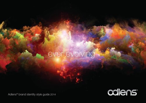
Adlens ® brand identity style guide 2014<br />
ever evolving
Adlens Brand identity style guide<br />
The new marque<br />
The bevelled edge gives the logo a 3 dimensional<br />
appearance epitomising the 3D world in which we live<br />
that becomes visible though the adlens product<br />
The form of the a and d combining<br />
shows a fluidity and continuum which<br />
supports the continuous adjustability<br />
of the products.<br />
The gloss silver effect shows a<br />
confidence in the brand as well as a<br />
practical use in reproducing the logo<br />
to give it standout.
Adlens Brand identity style guide<br />
The brand described...<br />
adjustable focus eyewear
Adlens Brand identity style guide<br />
Evolving the brand<br />
The Adlens brand identity has evolved.<br />
From the original branding created at its<br />
inception the adlens brand has moved on<br />
to embrace a more dynamic attitude.<br />
With the introduction of many new brands over recent times,<br />
the adlens logo has been challenged to work alongside<br />
these new sub brands which contain a colour range suiting<br />
the product type. New graphic elements have also been<br />
introduced to help convey the cutting edge<br />
creativity and scientific precision that defines<br />
us. This identity is designed to engage our<br />
audience with renewed life and appeal,<br />
consistently across all touch points and<br />
markets.
Adlens Brand identity style guide<br />
The adlens manifesto remains true:<br />
“<br />
We see<br />
endless possibilities<br />
for variable focus<br />
lens technology<br />
I believe<br />
we are just at the<br />
beginning of a journey<br />
that will transform people’s vision<br />
“<br />
James Chen<br />
Co-Founder, Owner and<br />
Board Member of Adlens
Adlens Brand identity style guide<br />
In 2004, James Chen,<br />
businessman and<br />
philanthropist was introduced<br />
to a new invention, Fluid-<br />
Injection lens technology.<br />
He recognised its potential to<br />
change the world of optics and<br />
the value it could bring to the<br />
developing world.<br />
In 2005 he founded Adlens,<br />
a commercial business with a<br />
social soul.<br />
The story has moved on.<br />
Continuously adjustable<br />
eyewear using the Alvarez<br />
sliding lens technology was<br />
introduced.<br />
The next generation is<br />
Variable Power Optics (VPO),<br />
the most dramatic advancement<br />
in optics in over 50 years.<br />
Adlens variable focus eyewear is now on sale around the world.
Adlens Brand identity style guide<br />
Adlens Brand identity style guide<br />
Contents
Adlens Brand identity style guide<br />
Adlens has developed an extensive toolkit<br />
of elements to consistently communicate<br />
the corporate and product brands.<br />
The Adlens corporate identity provides<br />
the foundation for a cohesive visual<br />
identity that can be recognised and<br />
understood around the world.<br />
The identity comprises the following key<br />
elements:<br />
• Our brands<br />
• Our language<br />
• Typefaces<br />
• Imagery<br />
I wear adlens<br />
adjustable focus<br />
eyewear<br />
ABCDEFGHIJKLMNOPQRSTUVWXYZ<br />
abcdefghijklmnopqrstuvwxyz<br />
ABCDEFGHIJKLMNOPQRSTUVWXYZ<br />
abcdefghijklmnopqrstuvwxyz<br />
adjustable focus<br />
eyewear
Adlens Brand identity style guide<br />
Intellectual property<br />
Registered trademarks: ®<br />
In order to protect our brands and<br />
associated logotypes we have<br />
endeavoured to obtain trademarks and<br />
registered trademarks.<br />
All logos must always appear with their<br />
relevant markings.<br />
Trademarks: TM<br />
Registered trademarks ®<br />
Adlens ®<br />
Hemisphere ®<br />
Trademarks TM<br />
Adlens Sundials TM<br />
Adlens Adjustables TM<br />
Emergensee TM<br />
Adlens SeePlus TM<br />
Adlens Interface TM<br />
Adlens John Lennon TM<br />
AdlensFocuss TM<br />
CustomFocuss TM<br />
The ‘Nested O’ symbol<br />
VPO TM<br />
Innovation is in nite.<br />
See our innovations<br />
and how we are changing<br />
the way people view the world.<br />
Visit us at VEW, booth 22095.<br />
TM<br />
Vision with a mission TM<br />
A Different Way To See The World. TM<br />
The Infinity Image<br />
TM
Adlens Brand identity style guide<br />
Protecting our intellectual property<br />
In order to protect our brand identity and<br />
intellectual property, all documentation<br />
referencing Adlens and/or Adlens brands<br />
should always be accompanied by<br />
appropriate trademarks and <strong>copy</strong>right<br />
information.<br />
The first appearence of a trademarked<br />
brand in a document must always be<br />
accompanied by its relevent markings.<br />
Copyright information must appear on<br />
every document.<br />
Trademarked brands:<br />
Adlens ®<br />
Hemisphere ®<br />
Example:<br />
Adlens Sundials TM<br />
Adlens Adjustables TM<br />
Emergensee TM<br />
Adlens SeePlus TM<br />
Adlens Interface TM<br />
Adlens John Lennon TM<br />
AdlensFocuss TM<br />
CustomFocuss TM<br />
The ‘Nested O’ symbol<br />
VPO TM<br />
Vision with a mission TM<br />
Vision with a mission TM<br />
A Different Way To See The World. TM<br />
The Infinity Image<br />
Adlens ® is the global leader in Variable Focus Eyewear. Adlens’ latest product launch is<br />
Adlens Sundials, the worlds first adjustable sunwear. With a range of -6 to +3 dioptre,<br />
Adlens Sundials are suitable for over 90% of eyeglass and contact lens wearers who do<br />
not have astigmatism.<br />
Where only a particular brand is referenced<br />
the <strong>copy</strong>right text may be abbreviated<br />
to only include the brand or brands<br />
mentioned.<br />
Copyright information:<br />
Where all brands are referenced:<br />
©Adlens Ltd 2014. ADLENSFOCUSS,<br />
VPO, ADLENS ADJUSTABLES,<br />
ADLENS SUNDIALS, EMERGENSEE,<br />
HEMISPHERE ® , A DIFFERENT WAY TO<br />
SEE THE WORLD and the ‘Nested O’<br />
symbol are trademarks of Adlens Ltd.<br />
Where only a particular brand is referenced:<br />
©Adlens Ltd 2014. ADLENS ADJUSTABLES<br />
is a trademark of Adlens Ltd.
Adlens Brand identity style guide<br />
Intellectual property notice<br />
Adlens is eager to support Distributors in<br />
promoting Adlens products.<br />
For instances where Distributors wish to create<br />
their own promotional materials Adlens asks that<br />
they seek final approval from the Marketing team<br />
to ensure that Adlens brands are communicated<br />
consistently and accurately around the world.<br />
Adlens is the owner or licensee of any intellectual property rights in<br />
the marketing material supplied to the Distributor and any use of this<br />
material must have Adlens’ specific written permission in advance of<br />
publication.<br />
Distributors are obliged to seek Adlens’ written approval for any<br />
marketing material they wish to publish, giving Adlens at least 3 days /<br />
72 hours to approve or reject it.<br />
The material provided by Adlens is supplied on the understanding that<br />
this obligation to seek approval also applies to translations of existing<br />
material, which are commissioned by the Distributor.<br />
The Distributor’s usage of the material provided by Adlens will be<br />
taken as acknowledgement of this.
Adlens Brand identity style guide<br />
Partnerships<br />
Aside from the main Adlens brand, there<br />
are partnership, product and feature brand<br />
marks to consider.<br />
Partner brands<br />
The Vision for a Nation<br />
Foundation ®<br />
Vision with a mission<br />
John Lennon<br />
The Vision for a Nation<br />
Foundation may be referred to<br />
as Vision for a Nation or VFAN<br />
in upper case.<br />
Vision with a mission is a<br />
programme and may be<br />
referred to as VWAM where<br />
appropriate.<br />
Please note: wherever the John Lennon<br />
branding is used the following <strong>copy</strong>right text<br />
must appear in the document:<br />
Eagle Eyewear, Inc. Is the exclusive creator and master<br />
eyewear licensee of The John Lennon Eyewear Collection.<br />
© Yoko Ono Lennon. Licensed exclusively by Bag One Arts.<br />
Lennon and John Lennon are Trademarks of Yoko Ono<br />
Lennon. Reproducing <strong>copy</strong>righted and trademarked materials/<br />
images is prohibited.
Adlens Brand identity style guide<br />
Text applications<br />
Other related messages such as our<br />
technologies should appear in either<br />
headings, captions or paragraph text<br />
as shown opposite.<br />
A Different<br />
Way<br />
To See<br />
The World<br />
Variable Power Optics<br />
adjustable focus eyewear<br />
Fluid-Injection<br />
Alvarez<br />
See well, do good<br />
VPO<br />
Vision with a mission<br />
The John Lennon Collection
Adlens Brand identity style guide<br />
Adlens logo 1<br />
At the heart of the corporate identity<br />
is our corporate logo. It captures<br />
the concept of infinite innovation by<br />
combining the circular elements of the ‘a’<br />
and ‘d’.<br />
The complete logo - 3D reflective<br />
MONO BLACK<br />
100K<br />
The full logo incorporates the descriptor<br />
explaining the technology together with<br />
the essence of our ethos.<br />
The logo should be used in its entirety<br />
where possible.<br />
Where the 3D reflectve logo is not reproducable (very small, screen printing, stamp printing etc.)<br />
FULL BLACK<br />
50 40 30 100<br />
then a flat version should be used.<br />
MONO BLACK<br />
100K<br />
FULL BLACK<br />
50 40 30 100<br />
black<br />
white<br />
pantone silver 877c<br />
pantone 429C grey<br />
foil block silver<br />
50% process black
Adlens Brand identity style guide<br />
Protecting the corporate logo<br />
In order to protect the logo an exclusion<br />
zone has been determined which<br />
prevents other graphic elements<br />
imposing on its space. This allows the<br />
logo to be discernible.<br />
The logo can be displayed on a<br />
background providing it does not<br />
compromise the legibility of the logo.<br />
X = 1/2<br />
height of ‘a’<br />
X<br />
Exclusion zone<br />
X<br />
X<br />
X<br />
The logo should never be stretched or<br />
squashed, skewed or distorted.<br />
4 8<br />
8
Adlens Brand identity style guide<br />
Typography<br />
Helvetica Neue LT is specified for use<br />
with brand material.<br />
It is a refined and clear typeface that<br />
provides exceptional legibility at a range<br />
of sizes and weights - a crucial feature for<br />
a vision brand.<br />
Arial typeface should be used as a<br />
substitute in all media where Helvetica<br />
Neue LT is not available.<br />
As a rule of thumb, it is best to select<br />
fonts that are at least two weights apart if<br />
using headings and body text,<br />
ie: Bold and light, Black and Medium<br />
Print fonts<br />
Helvetica Neue LT 95 Black<br />
ABCDEFGHIJKLMNOPQRSTUVWXYZ<br />
abcdefghiklmnopqrstuvwxyz<br />
1234567890<br />
Helvetica Neue LT 75 Bold<br />
ABCDEFGHIJKLMNOPQRSTUVWXYZ<br />
abcdefghiklmnopqrstuvwxyz<br />
1234567890<br />
Helvetica Neue LT 65 Medium<br />
ABCDEFGHIJKLMNOPQRSTUVWXYZ<br />
abcdefghiklmnopqrstuvwxyz<br />
1234567890<br />
Helvetica Neue LT 55 Roman<br />
ABCDEFGHIJKLMNOPQRSTUVWXYZ<br />
abcdefghiklmnopqrstuvwxyz<br />
1234567890<br />
Helvetica Neue LT 45 Light<br />
ABCDEFGHIJKLMNOPQRSTUVWXYZ<br />
abcdefghiklmnopqrstuvwxyz<br />
1234567890<br />
Helvetica Neue LT 35 Thin<br />
ABCDEFGHIJKLMNOPQRSTUVWXYZ<br />
abcdefghiklmnopqrstuvwxyz<br />
1234567890<br />
Digital fonts<br />
Arial Bold<br />
ABCDEFGHIJKLMNOPQRSTUVWXYZ<br />
abcdefghiklmnopqrstuvwxyz<br />
1234567890<br />
Arial Regular<br />
ABCDEFGHIJKLMNOPQRSTUVWXYZ<br />
abcdefghiklmnopqrstuvwxyz<br />
1234567890
Adlens Brand identity style guide<br />
Colour palette - Primary<br />
Adlens’ brand personality is conveyed<br />
through an extended colour palette.<br />
The core brand palette must always be<br />
present in design applications.<br />
Primary palette<br />
Black<br />
50%C 40% M 30%Y 100%K*<br />
Pantone black<br />
R0 G0 B0<br />
HEX #000000<br />
Dark grey<br />
70%K<br />
Pantone 430<br />
R113 G113 B112<br />
HEX #717170<br />
Uses:<br />
Pantone SOLID COATED<br />
• Screen printing<br />
• Lithographic printing<br />
CMYK colour values<br />
• Digital printing<br />
• Lithographic printing<br />
• Screen printing<br />
RGB values<br />
• Online graphics<br />
• Powerpoint presentations<br />
• Anything presented on screen<br />
HEX values<br />
• Online graphics<br />
• HTML<br />
PMS 424<br />
70%K<br />
R77 G77 B77<br />
HEX #4D4D4D<br />
* This is the recommended CMYK mix as it creates a<br />
rich neutral black and many of the the adlens toolkit<br />
items are produced with this as the background, so if<br />
you are extending backgrounds etc. this will ensure a<br />
perfect match.<br />
Any other combination of CMYK tints may result in a<br />
mismatch and create patches of varying black shades.<br />
Silver<br />
Pantone 877C (spot colour)<br />
silver foil (for block printing)<br />
This is the recommended colour for<br />
bodytext as it takes the wight out of solid<br />
black text. However care must be taken if<br />
text id being reproduced smaller than 8pt.<br />
as it may result in a slight furriness of the<br />
lettering.<br />
PMS Cyan<br />
100%C<br />
R0 G174 B239<br />
HEX #00FFFF<br />
This is the primary accent colour which<br />
can be used when a sub brand colour is<br />
not featuring. Cyan should be substituted<br />
when a sub brand is being promoted on<br />
the article -ie: Lennon Yellow, Adjustables<br />
Orange etc.
Adlens Brand identity style guide<br />
Colour palette - secondary<br />
The secondary palettes are derived from<br />
the sub brands and should be used to<br />
add clarity to the design and provide<br />
extra character, increasing impact and<br />
visual appeal.<br />
Adjustables Orange<br />
50%C 40%M 30%Y 100%K*<br />
Pantone black<br />
John lennon Yellow<br />
20%M 100%Y<br />
Pantone 116<br />
Uses:<br />
Pantone SOLID COATED<br />
• Screen printing<br />
• Lithographic printing<br />
CMYK colour values<br />
• Digital printing<br />
• Lithographic printing<br />
• Screen printing<br />
RGB values<br />
• Online graphics<br />
• Powerpoint presentations<br />
• Anything presented on screen<br />
HEX values<br />
• Online graphics<br />
• HTML<br />
Sundials Blush<br />
80%M<br />
Pantone<br />
Focuss Peacock<br />
50%C 40% M 30%Y 100%K*<br />
Pantone black<br />
SeePlus Steel<br />
10%C 3%Y 16%K*<br />
Pantone black<br />
Sundials Citrus<br />
20%C 100%Y<br />
Pantone 375<br />
Interface Blue<br />
65%C 10%M 2%Y<br />
Pantone 298
Adlens Brand identity style guide<br />
Graphic elements - the curve<br />
Extra visual appeal is created by the<br />
application of artistic detail.<br />
The dynamic curve is a graphic element<br />
that depicts adjustablity and takes the<br />
squareness out of any design.<br />
STOCK OFFERS<br />
great offers on adlens product lines<br />
great opportunities for your dealers<br />
Black frame emergensee glasses<br />
quantity 400<br />
ready to dispatch<br />
now only US$25<br />
DISCOUNT CODE : EM25 . EMAIL: STOCK@ADLENS.COM<br />
25%<br />
DISCOUNT<br />
TRADE PRICE<br />
Revolutionary fluid injection technology<br />
adjustable near to distance<br />
set and seal lenses<br />
mixed tints with clear frames<br />
quantity 800<br />
ready to dispatch<br />
now only US$60<br />
DISCOUNT CODE : JL20 . EMAIL: STOCK@ADLENS.COM<br />
20%<br />
DISCOUNT<br />
TRADE PRICE<br />
Variable Focus Eyewear mimics<br />
the eye’s natural dynamic<br />
behaviour, enabling better vision<br />
quality and control. Read more<br />
DISCOUNT CODE : HE50 . EMAIL: STOCK@ADLENS.COM<br />
The original fluid injection technology<br />
adjustable near to distance<br />
set and seal lenses<br />
optical clear lens - mixed frames<br />
quantity 1000<br />
sun lens - mixed frames/mixed tints<br />
quantity 700<br />
ready to dispatch<br />
now only US$60<br />
HALF<br />
PRICE<br />
TRADE PRICE<br />
TAKE ADVANTAGE OF THESE GREAT STOCK OFFERS BEFORE THEY GO!
Adlens Brand identity style guide<br />
Graphic elements - dynamic imagery<br />
Extra visual appeal is created by the<br />
application of artistic detail.<br />
Dynamic imagery can be used to support<br />
or demonstrate the essence of the brand<br />
and support the messaging.<br />
VPO seminar<br />
invitation<br />
Graphic elements can be used in<br />
conjunction with text to emphasis<br />
statements and headings.<br />
Innovation is in nite.<br />
See our innovations<br />
and how we are changing<br />
the way people view the world.<br />
Visit us at VEW, booth 22095.<br />
Adjustable<br />
focus eyewear<br />
a visual<br />
extravaganza
Adlens Brand identity style guide<br />
Fluid-Injection<br />
Hemisphere<br />
The John Lennon Collection
fluid injection<br />
eyewear<br />
The original fluid injection eyewear offering instant focus<br />
adjustability, set for any distnace.
Adlens Brand identity style guide<br />
Hemisphere Logo / typography / colour<br />
The Hemisphere logotype always appears<br />
in capitals, incorporating the registered<br />
trademark and should not be used without<br />
this element intact.<br />
X = 1/2 height of ‘a’<br />
X<br />
Exclusion zone<br />
X<br />
In text ‘Hemisphere’ must appear with an<br />
uppercase ‘H’.<br />
X<br />
The logo can be used on background<br />
colours or imagery providing the legibility of<br />
the logo is not impaired.<br />
The first instance of the brand referenced<br />
in a document must be followed by the<br />
registered trademark.<br />
Helvetica Neue LT is the preferred typeface<br />
for Hemisphere. For instances where<br />
Helvetica is not available Arial should be<br />
used instead.<br />
Pure cyan is the primary brand colour.<br />
Adlens corporate colours can be used to<br />
complement the primary brand colour.<br />
PMS Cyan<br />
100%C<br />
R0 G174 B239<br />
HEX #00FFFF
Adlens Brand identity style guide<br />
Hemisphere<br />
Graphic elements / photography / language<br />
Photography should represent the varying<br />
distances the glasses can be used for.<br />
Customise for your activity<br />
Where possible, arrows should be used to<br />
represent the motion of the dials.<br />
The full Adlens logo should always be used<br />
in association with this brand.<br />
Near Intermediate Distance<br />
Available in both clear and sun, Hemisphere<br />
lightweight and durable eyewear, provides instant<br />
vision and immediate dispensing at near, intermediate<br />
and far distance.<br />
Set a clear pair for reading and computer<br />
work and sun for outdoor activities.
fluid injection<br />
eyewear<br />
The first fashio fluid injection eyewear offering instant focus<br />
adjustability, set for any distance.
Adlens Brand identity style guide<br />
John lennon Logos and assets<br />
The John Lennon logo is the actual<br />
signature of John lennon himself and<br />
out license gives us the rights of usage.<br />
The logo is always accompanied by its<br />
trademark.<br />
The correct terminology for use in headings<br />
and text is ‘The John Lennon Collection’ -<br />
all beginning with capital letters.<br />
This maybe shortened to John Lennon<br />
when appropriate. The first instance of the<br />
brand name in a document must always<br />
be accompanied by its trademark. This<br />
appears after ‘Lennon’, before ‘Collection’.<br />
Primary usage<br />
100% Black<br />
50% Black<br />
Secondary usage<br />
100% White<br />
50% Black<br />
The official John Lennon<br />
Signature and John Lennon<br />
sketch, drawn by Yoko Ono,<br />
can also be used as an<br />
endorsement of the official<br />
John Lennon brand assets.
Adlens Brand identity style guide<br />
Typography / colour<br />
Due to the nature of the imagery and logo<br />
style, the Futura font has been selected to<br />
suit the John Lennon branding and should<br />
be used wherever possible on any stand<br />
alone marketing material.<br />
If the Lennon branding and imagery is<br />
being used in conjunction with other Adlens<br />
products then the main corporate typeface,<br />
Helvetica Neue LT should be used.<br />
The Lennon yellow is the same as Adlens<br />
corporate yellow.<br />
Futura Light<br />
ABCDEFGHIJKLMNOPQRSTUVWXYZ<br />
abcdefghiklmnopqrstuvwxyz<br />
1234567890<br />
Futura LT Pro<br />
FGHIJKLMNOPQRSTUVWXYZ<br />
abcdefghiklmnopqrstuvwxyz<br />
1234567890<br />
Futura Bold<br />
ABCDEFGHIJKLMNOPQRSTUVWXYZ<br />
abcdefghiklmnopqrstuvwxyz<br />
1234567890<br />
John Lennon’s iconic look would not be<br />
complete without his distinctive round<br />
shaped glasses. Inspired by his work, his<br />
life and his style, Adlens has created a<br />
new range of variable focus eyewear, The<br />
John Lennon Collection. Imagine modern<br />
technology meets legendary styling with a<br />
social conscience.<br />
WE HOPE SOMEDAY YOU’LL JOIN US.<br />
PMS 7409<br />
20%M 100%Y<br />
R255 G204 B0<br />
HEX #FFCC00<br />
PMS 2766<br />
50%C 40%M<br />
30%Y 100%K<br />
R0 G0 B0<br />
HEX #000000<br />
INSTANT<br />
EYEWEAR<br />
Only use Lennon Yellow<br />
when text appears on<br />
black or other dark<br />
backgrounds.
Adlens Brand identity style guide<br />
Graphic elements<br />
The John Lennon illustration has been<br />
produced uniquely for the Adlens brand. It<br />
can be used in either its original monotone<br />
form or used in more abstract ways such<br />
as pop art etc.<br />
The preferred treatment with this branding<br />
is to design with a black background<br />
and use the reversed out logo in<br />
conjunction with the image.<br />
INSTANT<br />
EYEWEAR<br />
John Lennon graphic based on the original photo by Iain MacMillan 1971.<br />
Eagle Eyewear, Inc. Is the exclusive creator and master eyewear licensee of<br />
The John Lennon Eyewear Collection.<br />
© Yoko Ono Lennon. Licensed exclusively by Bag One Arts. Lennon and John Lennon are<br />
Trademarks of Yoko Ono Lennon. Reproducing <strong>copy</strong>righted and trademarked materials/images<br />
is prohibited.<br />
The following <strong>copy</strong>right statement must<br />
accompany all uses of the John Lennon<br />
illustration:<br />
John Lennon graphic based on the original photo by<br />
Iain MacMillan 1971.<br />
The following <strong>copy</strong>right statement must<br />
accompany all John Lennon branded<br />
materials, including web:<br />
Eagle Eyewear, Inc. is the exclusive creator and master<br />
eyewear licensee of The John Lennon Eyewear<br />
Collection. © Yoko Ono Lennon. Licensed exclusively<br />
by Bag One Arts. Lennon and John Lennon<br />
are Trademarks of Yoko Ono Lennon. Reproducing<br />
<strong>copy</strong>righted and trademarked materials/images is<br />
prohibited.
Adlens Brand identity style guide<br />
Photography / language<br />
The association with John Lennon allows<br />
a more fashionable approach to the brand<br />
photography.<br />
The John Lennon Colleciton is always<br />
refered to as ‘Instant eyewear’.<br />
The language of the Lennon brand revolves<br />
arround the association with John Lennon’s<br />
icon style and the parrallels between his<br />
philanthropic ideologies and that of Adlens.
Adlens Brand identity style guide<br />
Alvarez technology<br />
Adjustables<br />
Sundials<br />
John Lennon<br />
Interface<br />
SeePlus
adjustable focus<br />
eyewear<br />
The original Alvarez eyewear offering instant focus adjustability for<br />
near, intermediate and distance - all at the turn of a dial.
Adlens Brand identity style guide<br />
Logo / typography / colour<br />
The logotype always appears in lowercase<br />
and must appear with the trademark.<br />
X<br />
Exclusion zone<br />
X<br />
The logo can be used on background<br />
colours or imagery providing the legibility of<br />
the logo is not impaired.<br />
In <strong>copy</strong> ‘Emergensee’ must appear with<br />
an uppercase ‘E’ with the first instance in a<br />
document accompanied by its trademark.<br />
X = 1/2 height of ‘a’<br />
X<br />
The logo reproduces in Adlens Cyan and<br />
black unless reversed out.<br />
For mono reproduction the ‘emergensee’<br />
become greyscale.<br />
Additional Adlens brand colours can be<br />
used to enhance messaging and add<br />
impact on branded materials.<br />
PMS 2766<br />
100%C 90%M<br />
R0 G8 B135<br />
HEX #000887<br />
PMS Cyan<br />
100%C<br />
R0 G174 B239<br />
HEX #00FFFF
Adlens Brand identity style guide<br />
Graphic elements / photography / language<br />
Where possible imagery of the product<br />
should always be accompanied by arrows<br />
demonstrating the rotation of the dials.<br />
Emergensee is described as<br />
‘adjustable focus eyewear’.<br />
The eyewear is functional and practical and<br />
should be represented as such, with plenty<br />
of clean space.<br />
The full Adlens logo should always be used<br />
in association with this brand.<br />
Emergensee is instantly customisable for your vision<br />
correction. Simply turn each dial to glide the overlapping<br />
lenses to create different prescriptions in seconds. They are<br />
easily adjusted for a wide range of powers from -6 to +3D,<br />
correcting over 90% of spherical prescriptions.
adjustable focus<br />
eyewear<br />
A range of eyewear offering instant focus adjustability for<br />
near, intermediate and distance - all at the turn of a dial.
Adlens Brand identity style guide<br />
Adlens Adjustables logo<br />
X<br />
Exclusion zone<br />
X<br />
Adjustables should not be used without<br />
Adlens proceeding it. This applies to all<br />
uses including logo form, headlines or body<br />
<strong>copy</strong>. Adlens Adjustables must always be<br />
written with two uppercase ‘A’s. The logo is<br />
all lowercase.<br />
The first instance of Adlens Adjustables as<br />
text in a document should be accompanied<br />
by its trademark.<br />
X = 1/2 height of ‘a’<br />
X<br />
Colour logo on white<br />
The logo should, wherever possible,<br />
appear in its colour form.<br />
The logo can appear in its monochrome<br />
form where necessary.<br />
The logo can be used on background<br />
colours or imagery providing the legibility of<br />
the logo is not impaired.<br />
Mono logo on white<br />
Helvetica is the chosen brand font.<br />
The first reference to the brand in a<br />
document must always be accompanied<br />
by it’s trademark.<br />
Mono logo on black
Adlens Brand identity style guide<br />
Adlens Adjustables Colour palette<br />
Adlens orange is the primary brand colour<br />
for Adlens Adjustables<br />
Primary palette<br />
Black<br />
50%C 40% M 30%Y 100%K*<br />
Pantone black<br />
R0 G0 B0<br />
HEX #000000<br />
Dark grey<br />
70%K<br />
Pantone 430<br />
R113 G113 B112<br />
HEX #717170<br />
PMS 424<br />
70%K<br />
R77 G77 B77<br />
HEX #4D4D4D<br />
* This is the recommended CMYK mix as it creates a<br />
rich neutral black and many of the the adlens toolkit<br />
items are produced with this as the background, so if<br />
you are extending backgrounds etc. this will ensure a<br />
perfect match.<br />
Any other combination of CMYK tints may result in a<br />
mismatch and create patches of varying black shades.<br />
Silver<br />
Pantone 877C (spot colour)<br />
silver foil (for block printing)<br />
Adjustables Orange<br />
PMS 151<br />
70%M 100%Y<br />
R243 G112 B33<br />
HEX #FF4D00
Adlens Brand identity style guide<br />
Photography<br />
Photography should reflect the simplicity of<br />
the product and the lifestyle opportunities<br />
that good eyesight can facilitate.<br />
Where possible the subject should be<br />
shown turning one of the dials, illustrating<br />
the USP.<br />
Hero photography should be accompanied<br />
by practical lifestyle imagery demonstrating<br />
the product in use. Again, where possible<br />
the subjects should be shown adjusting the<br />
glasses.
Adlens Brand identity style guide<br />
Graphic elements<br />
Alvarez Dials<br />
have been specially selected as the primary<br />
graphic elements to accompany new<br />
Alvarez products.<br />
The shapes represent the dials at either<br />
end of the temple arms and signify the<br />
technology at the heart of the product<br />
range. Cogs for Adlens Adjustables can<br />
only be used in the Adlens Adjustables<br />
orange or grey/silver.<br />
Dioptre arrows<br />
Represents the movement of the dials.<br />
Perspective arrow<br />
Represents the movement of the dials.<br />
Elsie<br />
Demonstration visuals to help with ‘try on’<br />
pairs in store and IFUs.<br />
Dioptre eye<br />
Informs the reader of the<br />
adjustable lens range<br />
-6D +3D
Adlens Brand identity style guide<br />
Language<br />
Adlens Adjustables is always referred to as<br />
‘adjustable focus eyewear’.<br />
All artwork must be accompanied by a call<br />
to action.<br />
The dioptre range of the product must<br />
always be included, along with the words<br />
Near, Intermediate and Distance, in order to<br />
communicate the power of the lenses.<br />
Artwork should reflect the lifestyle<br />
opportunities that good eyesight can<br />
facilitate. As such materials should, where<br />
possible, be accompanied with a list of<br />
tasks that could benefit from the use of the<br />
glasses.<br />
adjustable focus<br />
eyewear<br />
TRY IT NOW!<br />
Instantly adjustable for<br />
Near • Intermediate • Distance<br />
All at the turn of a dial!<br />
-6 to +3 Dioptres<br />
reading | watching TV | computer work | sports | holiday | concerts | camping<br />
theatre | sightseeing | running | first aid kit | house work | car maintenance | gaming<br />
arts and crafts | DIY | a day at the beach
Adlens Brand identity style guide<br />
Inspiration
adjustable focus<br />
sunwear<br />
All the features of the Adlerns Adjustables<br />
with the addition of tinted lenses<br />
offering UVA and UVB protection.
Adlens Brand identity style guide<br />
Sundials Logo<br />
X<br />
Exclusion zone<br />
X<br />
The Adlens element of the Sundials logo<br />
must always appear with the Sundials<br />
element and accompanied by its<br />
trademark.<br />
The Adlens Sundials logo can appear in<br />
black or white only, on black, white or a<br />
pop colour background.<br />
X = 1/2 height of ‘a’<br />
X<br />
Mono logo on white<br />
The first instance of Adlens Sundials as text<br />
in a document should be accompanied by<br />
its trademark.<br />
The exclusion zone should be<br />
observed where possible<br />
however the logo can be<br />
used on background colours<br />
or imagery providing its<br />
legibility is not impaired.<br />
Mono logo on black
Adlens Brand identity style guide<br />
Sundials colour palette<br />
Adlens Sundials brand colours utilise the<br />
pop colours of the product temple arms<br />
with an added yellow to represent the sun.<br />
Primary palette - logo colours<br />
Black<br />
50%C 40% M 30%Y 100%K*<br />
Pantone black<br />
R0 G0 B0<br />
HEX #000000<br />
Sundials Yellow<br />
PMS 7404<br />
10%M 100%Y<br />
R255 G230 B0<br />
HEX #FFDD00<br />
* This is the recommended CMYK mix as it creates a<br />
rich neutral black and many of the the adlens toolkit<br />
items are produced with this as the background, so if<br />
you are extending backgrounds etc. this will ensure a<br />
perfect match.<br />
Any other combination of CMYK tints may result in a<br />
mismatch and create patches of varying black shades.<br />
Secondary palette - product colours<br />
PMS 213<br />
80%M<br />
R255 G51 B255<br />
HEX #EF5AA0<br />
PMS 375C<br />
24%C 100%Y<br />
R194 G255 B0<br />
HEX #CDDB28<br />
PMS 286C<br />
100%C 72%M<br />
R0 G71 B255<br />
HEX #0058A8
Adlens Brand identity style guide<br />
Sundials product photography<br />
Product photography is prodcued on pur white<br />
backgrounds to enhance and display the frame<br />
colours.<br />
Each frame in each lens tint is produced:<br />
• Straight on with temple arms folded behind<br />
• Straight on with arms open<br />
• Three quarter angle with arms open
Adlens Brand identity style guide<br />
Sundials Photography<br />
Hero photography should appear on block<br />
pop colour backgrounds. Where possible<br />
the subject should be shown turning one of<br />
the dials, illustrating the USP.<br />
Hero photography should be accompanied<br />
by practical lifestyle imagery demonstrating<br />
the product in use. Again, where possible<br />
the subjects should be shown adjusting the<br />
glasses.<br />
Photography should reflect the fun and<br />
simplicity of the product and the lifestyle<br />
opportunities that instantly adjustable<br />
sunwear can facilitate.
Adlens Brand identity style guide<br />
Sundials graphic elements<br />
Dials or ‘cogs’ have been specially selected<br />
as the primary graphic elements to<br />
accompany Alvarez products.<br />
The shapes represent the dials at either<br />
end of the temple arms and signify the<br />
technology at the heart of the product<br />
range. These can be used with or without<br />
a fill.<br />
Cogs representing the Adlens Sundials<br />
brand are in a range of vibrant colours,<br />
utilising the colour pallet.<br />
Dioptre arrows<br />
Represents the movement of the dials.<br />
Elsie<br />
Demonstration visuals to help with ‘try on’<br />
pairs in store and IFUs.<br />
Dioptre eye<br />
Informs the reader of the<br />
adjustable lens range.<br />
-6D +3D
Adlens Brand identity style guide<br />
Sundials Language<br />
Where possible, Adlens Sundials artwork<br />
must always incorporate the following<br />
elements:<br />
• Product logo<br />
• ‘adjustable focus eyewear’ descriptor<br />
• Hero imagery<br />
• The dioptre range<br />
• A call to action<br />
• URL<br />
• Dials<br />
• Lifestyle imagery
adjustable focus<br />
eyewear<br />
The designer range of Alvarez featuring<br />
metallic temple arms and tinted lenses.
Adlens Brand identity style guide<br />
Adlens John Lennon Logo<br />
X<br />
Exclusion zone<br />
X<br />
The Adlens element of the John Lennon<br />
signature logo must always appear with the<br />
Lennon element and accompanied by its<br />
trademark.<br />
The Adlens John Lennon logo can appear<br />
on balck or white backgrounds but the<br />
yello signature should only be used on the<br />
black background for legibility.<br />
X = 1/2 height of ‘a’<br />
X<br />
Mono logo on white<br />
The brand should be refeered to as Adlens<br />
John lennon Collection and the The first<br />
instance as text in a document should be<br />
accompanied by its trademark -<br />
Adlens ® John lennon Collection<br />
Mono logo on black<br />
The exclusion zone should be<br />
observed where possible however the logo<br />
can be used on background colours<br />
or imagery providing its legibility is not<br />
impaired.<br />
The official John Lennon<br />
Signature and John Lennon<br />
sketch, drawn by Yoko Ono,<br />
can also be used as an<br />
endorsement of the official<br />
John Lennon brand assets.
Adlens Brand identity style guide<br />
Adlens John Lennon imagery<br />
To embrace the Alvarez John Lennon<br />
eyewear, a new John Lennon graphic has<br />
been created.<br />
This image can only be used with Alvarez<br />
technology eyewear.<br />
It is based on the original photograph by<br />
XXXXXXXXXX and should be used on all<br />
marketing material.<br />
the metallics collection<br />
adjustable focus eyewear
adjustable focus<br />
eyewear<br />
This product has been produced specifically as a<br />
low power range eyewear ideally suited for near<br />
to intermediate use such as reading and laptop<br />
operation.
Adlens Brand identity style guide<br />
Adlens SeePlus Logo<br />
X<br />
Exclusion zone<br />
X<br />
The Adlens element of the SeePlus<br />
signature logo must always appear with the<br />
SeePlus element and accompanied by its<br />
trademark.<br />
The Adlens SeePlus logo can appear on<br />
black or white backgrounds but the steel<br />
colour varies dependent on the backgound<br />
colour.<br />
X = 1/2 height of ‘a’<br />
X<br />
Logo on white<br />
The brand should be referred to as Adlens<br />
SeePlus and the first instance as text in a<br />
document should be accompanied by its<br />
trademark -<br />
Adlens ® SeePlus<br />
The exclusion zone should be<br />
observed where possible however the logo<br />
can be used on background colours<br />
or imagery providing its legibility is not<br />
impaired.<br />
SeePlus light Steel<br />
10%C 3%Y 16%K<br />
SeePlus dark Steel<br />
20%C 6%Y 32%K
Adlens Brand identity style guide<br />
Adlens SeePlus graphic elements<br />
Dials or ‘cogs’ have been specially selected<br />
as the primary graphic elements to<br />
accompany Alvarez products.<br />
The shapes represent the dials at either<br />
end of the temple arms and signify the<br />
technology at the heart of the product<br />
range. These can be used with or without<br />
a fill.<br />
Dioptre arrows<br />
Represents the movement of the dials.<br />
Elsie<br />
Demonstration visuals to help with ‘try on’<br />
pairs in store and IFUs.<br />
Dioptre eye<br />
Informs the reader of the adjustable lens<br />
range.<br />
Uage icond<br />
Informs the reader of the uses for the<br />
product - reading, writing/drawing, texting<br />
etc.<br />
+0.10D<br />
+2.75D
adjustable focus<br />
eyewear<br />
This product has been produced specifically for<br />
computer use as the lenses have been designed with<br />
a blue reduction filter which reduces screen fatigue.
Adlens Brand identity style guide<br />
Adlens Interface Logo<br />
X<br />
Exclusion zone<br />
X<br />
The Adlens element of the Interface logo<br />
must always appear with the SeePlus<br />
element and accompanied by its<br />
trademark.<br />
The Adlens SeePlus logo can appear on<br />
black or white backgrounds but the steel<br />
colour varies dependent on the backgound<br />
colour.<br />
X = 1/2 height of ‘a’<br />
X<br />
Logo on white<br />
The brand should be referred to as Adlens<br />
SeePlus and the first instance as text in a<br />
document should be accompanied by its<br />
trademark -<br />
Adlens ® SeePlus<br />
Interface Blue<br />
PMS 298<br />
64%C 10%M 1%Y<br />
The exclusion zone should be<br />
observed where possible however the logo<br />
can be used on background colours<br />
or imagery providing its legibility is not<br />
impaired.
Adlens Brand identity style guide<br />
Adlens Interface assets<br />
Dials or ‘cogs’ have been specially selected<br />
as the primary graphic elements to<br />
accompany Alvarez products.<br />
The shapes represent the dials at either<br />
end of the temple arms and signify the<br />
technology at the heart of the product<br />
range. These can be used with or without<br />
a fill.<br />
ai icon<br />
the favicon for adlens interface.<br />
Dioptre arrows<br />
Represents the movement of the dials.<br />
Elsie<br />
Demonstration visuals to help with ‘try on’<br />
pairs in store and IFUs.<br />
Dioptre eye<br />
Informs the reader of the adjustable lens<br />
range.<br />
Uage icons<br />
Informs the reader of the uses for the<br />
product - mobile, tablet, computer<br />
noir<br />
clear<br />
Alvarez Lens Technology<br />
Specifically tuned focusing power<br />
improves detail for clearer vision.<br />
Blue Light Lens Filter<br />
Filters out harsh artificial light<br />
to reduce eye strain and<br />
improve contrast.<br />
1<br />
2
Adlens Brand identity style guide<br />
Adlens Interface photography
Adlens Brand identity style guide<br />
VPO technology<br />
AdlensFocuss<br />
CustomFcuss
Adlens Brand identity style guide<br />
Logo - Adlens Focuss<br />
Focuss should never be used without<br />
Adlens proceeding it. This applies to all<br />
uses including logo form, headlines or<br />
body <strong>copy</strong>. AdlensFocuss must always be<br />
written with an uppercase ‘A’ and ‘F’ and<br />
be joined together to create one word.<br />
AdlensFocuss should never be wrapped<br />
over more than one line. AdlensFocuss<br />
should never be referred to as FOCUSS,<br />
Focuss, Focus, Adlens Focuss, Adlens<br />
Focus or AdlensFocus.<br />
The first instance of AdlensFocuss in a<br />
document should be accompanied by its<br />
trademark.<br />
The gradient on the AdlensFocuss logo will<br />
not transfer to one colour printing, in which<br />
case a vector version may be used.<br />
The logo can be black, white or silver/grey.<br />
CustomFocuss is exclusively available from<br />
LensCrafters. All branding criteria applies<br />
in the same way with ‘Adlens’ substituted<br />
for ‘Custom’.<br />
X = 1/2 height of ‘a’<br />
X<br />
Exclusion zone<br />
X<br />
X
Adlens Brand identity style guide<br />
Colour Palette<br />
AdlensFocuss uses a very simple<br />
monochrome pallet. Colours are introduced<br />
with the use of photography.<br />
The VPO blue can be used to add<br />
emphasis to headings and statements.<br />
Primary palette - logo colours<br />
Black<br />
50%C 40% M 30%Y 100%K*<br />
Pantone black<br />
R0 G0 B0<br />
HEX #000000<br />
Grey<br />
PMS 428<br />
50%K<br />
R128 G128 B128<br />
HEX #808080<br />
* This is the recommended CMYK mix as it creates a<br />
rich neutral black and many of the the adlens toolkit<br />
items are produced with this as the background, so if<br />
you are extending backgrounds etc. this will ensure a<br />
perfect match.<br />
Any other combination of CMYK tints may result in a<br />
mismatch and create patches of varying black shades.<br />
PMS 315<br />
100%C 8%M 38%K<br />
R0 G114 B161<br />
HEX #00919E<br />
Silver<br />
PMS 877c
Adlens Brand identity style guide<br />
Graphic elements - focuss<br />
This graphic device signifies the technology<br />
behind AdlensFocuss.<br />
Primarily the graphic device can be used<br />
on black or white.<br />
The graphic device can be used on<br />
backgrounds and over images providing<br />
there is no loss of clarity to the device.<br />
Care must be taken if cropping into the<br />
device. The text inside of the blue portion<br />
must either be wholly visible or cropped out<br />
completely. The device should not obstruct<br />
vital graphic elements - such as the dail<br />
inside in the AdlensFocuss temple arm, or<br />
text.<br />
Variable Power Optics<br />
Correct use of the device<br />
Variable Power Optics<br />
Variable Power Optics<br />
Incorrect use of the device<br />
Variable Power Optics<br />
Variable Power Optics<br />
Variable Power Optics
Adlens Brand identity style guide<br />
focuss photography - lifestyle<br />
Aspirational imagery has been produced<br />
as duo-tones to create a unique feel and to<br />
tie in with the blue inner circle of the VPO<br />
graphic.<br />
The duotone is produced using black and<br />
PMS 315. This then needs converting into<br />
CMYK for print or RGB for web usage.
Adlens Brand identity style guide<br />
focuss photography - product<br />
Aspirational product imagery has been<br />
produced as to create a quality and luxury<br />
feel.<br />
Importantly the images also major on the<br />
discreet dial on the inside of temple arm<br />
showing not only the practicality of the<br />
feature but also how the outward aesthetic<br />
is not compomised by the technology.
Adlens Brand identity style guide<br />
Language<br />
Unlike other Variable Focus Eyewear<br />
AdlensFocuss can only be sold as a<br />
prescription product, therefore the<br />
language of instantly adjustable eyewear is<br />
not suitable for this product.<br />
The language should reflect the benefits of<br />
Variable Power Optics over conventional<br />
progressive lenses.<br />
‘Dial with Style’ should always have a<br />
presence on any marketing item produced<br />
for AdlensFocuss. This can appear either<br />
all in capitals to make a statement line or<br />
with a capital ‘D’ and ‘S’ when used as a<br />
heading or in body <strong>copy</strong>: Dial with Style.<br />
The strapline should NEVER appear all<br />
lower case.<br />
DIAL WITH STYLE<br />
Dial with style<br />
custom made adjustable focus eyewear<br />
prescription adjustable focus eyewear<br />
Variable Power Optics (VPO) is a<br />
unique technology that mimics the<br />
eye’s natural dynamic behaviour. It is<br />
the most dramatic advancement in<br />
optics for over 50 years.<br />
AdlensFocuss is the customer’s<br />
distance prescription combined<br />
with VPO and a stylish frame. It’s<br />
a complete pair of custom made<br />
adjustable glasses, for distance, near<br />
and everything in between. All at the<br />
turn of a dial.<br />
‘Custom made adjustable focus eyewear’<br />
and should always have a presence<br />
on any marketing item produced for<br />
AdlensFocuss. This can appear either all<br />
in capitals to make a statement line or with<br />
a capital ‘C’ when used as a heading or in<br />
body <strong>copy</strong>. This should NEVER appear all<br />
lower case.<br />
4x more visible area<br />
than the best no line bifocal<br />
AT THE TURN OF A DIAL
Adlens Brand identity style guide<br />
Examples
Adlens Brand identity style guide<br />
Logo - VPO (Variable Power Optics)<br />
X<br />
Exclusion zone<br />
X<br />
The VPO and VPO Priority Club should<br />
mainly be used on either black or white<br />
backgrounds for maxuimum clarity.<br />
TM<br />
When VPO and VPO Priority Club are used<br />
in bodytext the VPO should always appear<br />
in Capitals and Priority Club should<br />
The first instance of AdlensFocuss in a<br />
document should be accompanied by its<br />
trademark.<br />
X = 1/2 height of ‘a’<br />
X<br />
TM<br />
The gradient on the AdlensFocuss logo will<br />
not transfer to one colour printing, in which<br />
case a vector version may be used.<br />
The logo can be also be reproduced in<br />
solid black, white, pantoner silver, grey or<br />
foli blocked when the tonal logo can’t be<br />
reproduced due to printing menthods.<br />
PRIORITY<br />
CLUB<br />
PRIORITY<br />
CLUB<br />
TM
Adlens Brand identity style guide<br />
Graphic elements - VPO<br />
This graphic device signifies the technology<br />
behind Variablew Power Optics.<br />
Primarily the graphic device can be used<br />
on black or white, graduating from 100%<br />
Black to 0% or 100% White to 0%.<br />
The graphic device can be used on<br />
backgrounds and over images providing<br />
there is no loss of clarity to the device.<br />
Care must be taken if cropping into the<br />
device. The text inside of the blue portion<br />
must either be wholly visible or cropped out<br />
completely. The device should not obstruct<br />
vital graphic elements - such as the dial<br />
inside in the AdlensFocuss temple arm, or<br />
text.<br />
Variable Power Optics<br />
Variable Power Optics<br />
Variable Power Optics
Adlens Brand identity style guide<br />
Examples
Adlens Brand identity style guide<br />
Multibrand marketing
Adlens Brand identity style guide<br />
Multibrand marketing<br />
By using a unified brand/subrand format and standardising the typefaces,<br />
discriptions and icons, we succeed in producing an identity that will work when<br />
promoting more than one of our product groups together. Examples would be<br />
adlens corporate brochures, exhibition stands, website etc.<br />
I wear adlens adjustable focus eyewear.<br />
Imagine being able to adjust your eyewear lenses to focus on everything from near to distance?<br />
You can now. In an Instant.<br />
With adlens instantly adjustable eywear you simply rotate the dials until you’re focussed on whatever you want<br />
to see - be it near, distant or anywhere in between. So now you can now focus on your day..
Adlens Brand identity style guide<br />
we do what others don’t,<br />
so we need to...<br />
wow!<br />
excite<br />
entice<br />
surprise<br />
educate<br />
make<br />
people<br />
desire<br />
them
Adlens Brand identity style guide<br />
Be creative<br />
with your work<br />
be considerate<br />
to the <strong>guidelines</strong><br />
If in doubt contact:<br />
Adlens Marketing Department<br />
Adlens Global Headquarters<br />
King Charles House<br />
Park End Street Oxford<br />
OX1 1JD United Kingdom<br />
Tel: +44 1865 980 400<br />
email: marketing@adlens.com<br />
©Adlens Ltd 2014.<br />
ADLENSFOCUSS, CUSTOMFOCUSS, VPO, ADLENS ADJUSTABLES, ADLENS SUNDIALS, EMERGENSEE, HEMISPHERE ® , ADLENS SEEPLUS,<br />
ADLENS INTERFACE, A DIFFERENT WAY TO SEE THE WORLD, THE INFINITY GRAPHIC and the ‘Nested O’ symbol are trademarks of Adlens Ltd.