A <strong>Kick</strong>-<strong>Ass</strong> <strong>Guide</strong> <strong>to</strong> <strong>Building</strong> <strong>an</strong> <strong>Awesome</strong> <strong>Website</strong> 6 // 25 “IF YOUR WEBSITE DOESN’T RENDER PROPERLY ON ALL DEVICES YOU WILL LOSE SALES.” Now that your website design is up-<strong>to</strong>-date <strong>an</strong>d modern, it is time <strong>to</strong> consider everyone who might use your site. Remember that a huge percentage of the people who will find your website will do so on a mobile phone, so it is import<strong>an</strong>t <strong>to</strong> make sure that your site is completely mobile-friendly. What Is Responsive Web Design? The best way <strong>to</strong> describe responsive web design is <strong>to</strong> imagine a website with a layout that ch<strong>an</strong>ges based on the size of the viewing screen. For example, a user on a computer c<strong>an</strong> see a vast amount if information all at once. On the other h<strong>an</strong>d, someone using a smartphone may only be able <strong>to</strong> see a very small amount of information at the same time, <strong>an</strong>d you have <strong>to</strong> make certain that the text, pictures, <strong>an</strong>d links are scaled down appropriately. There are four reasons why your website absolutely must be responsive in order <strong>to</strong> convert your visi<strong>to</strong>rs. #1 – Cus<strong>to</strong>mer Support Imagine that you w<strong>an</strong>t <strong>to</strong> buy a new lawnmower, so you go online from your desk<strong>to</strong>p, find a local business, <strong>an</strong>d review their offerings. You find a lawnmower you really like, <strong>an</strong>d you decide <strong>to</strong> show your spouse over dinner. Later, while you are out at a restaur<strong>an</strong>t, you pull up that site on your smartphone – but you c<strong>an</strong>not find the lawnmower because the website is not responsive <strong>to</strong> your mobile device. You may feel tempted <strong>to</strong> search <strong>an</strong>ew for a local comp<strong>an</strong>y that suits your needs. The same thing c<strong>an</strong> happen <strong>to</strong> your cus<strong>to</strong>mers if you do not think about the responsiveness of your site. #2 – One Site is Better th<strong>an</strong> M<strong>an</strong>y In the past, m<strong>an</strong>y business owners have attempted <strong>to</strong> design <strong>an</strong>d update two separate sites – one for desk<strong>to</strong>p users, <strong>an</strong>d <strong>an</strong>other for mobile users. Although this c<strong>an</strong> certainly work, it gets expensive <strong>an</strong>d frustrating over time. This is why a single responsive website is best. The site itself c<strong>an</strong> actually determine whether someone is visiting from a phone, a tablet, or a computer, <strong>an</strong>d optimize the viewing experience based on that information. What’s more, you only need <strong>to</strong> design <strong>an</strong>d maintain a single site. It is just simpler for everyone. #3 – Improve Your Search Engine R<strong>an</strong>kings If you have paid attention <strong>to</strong> website design <strong>an</strong>d conversion over the years, then you know that Google is always ch<strong>an</strong>ging the criteria by which it r<strong>an</strong>ks your site. Things like SEO <strong>an</strong>d relev<strong>an</strong>cy are incredibly import<strong>an</strong>t <strong>to</strong> Google, but starting this past April, they added <strong>an</strong>other set of criteria – mobile friendliness. With that being said, if your website is not mobile-friendly, it is having a detrimental effect on your search engine r<strong>an</strong>king. #4 – Roll with the Ch<strong>an</strong>ges Finally, a responsive website is already about as modern as it gets. This me<strong>an</strong>s that later, when huge technology providers like Apple <strong>an</strong>d Samsung release even more sophisticated devices, you will be ready. After all, the main benefit of a responsive site is its ability <strong>to</strong> scale based on the size of the screen being used <strong>to</strong> access it, <strong>an</strong>d when you already have that benefit in your corner, your site will h<strong>an</strong>dle <strong>an</strong>y size phone or tablet that a m<strong>an</strong>ufacturer c<strong>an</strong> throw at it with ease. To put it simply, when your website is as responsive as possible, it is available <strong>to</strong> more people th<strong>an</strong> ever before. The more people you c<strong>an</strong> reach, the more likely you are <strong>to</strong> convert your visi<strong>to</strong>rs in<strong>to</strong> buyers.
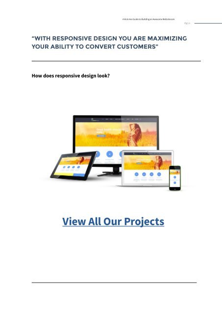
A <strong>Kick</strong>-<strong>Ass</strong> <strong>Guide</strong> <strong>to</strong> <strong>Building</strong> <strong>an</strong> <strong>Awesome</strong> <strong>Website</strong>com 7 // 25 “WITH RESPONSIVE DESIGN YOU ARE MAXIMIZING YOUR ABILITY TO CONVERT CUSTOMERS” How does responsive design look? View All Our Projects


 Change language