

Kiehl's Brand Book
Kiehl's Brand Book - Stephanie Embry, student work
Kiehl's Brand Book - Stephanie Embry, student work

You also want an ePaper? Increase the reach of your titles
YUMPU automatically turns print PDFs into web optimized ePapers that Google loves.
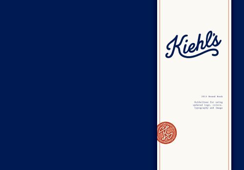
2015 <strong>Brand</strong> <strong>Book</strong><br />
Guidelines for using<br />
updated logo, colors,<br />
typography and image
Kiehl’s Since 1851, LLC<br />
Spring 2015
↖ JOHN KIEHL,<br />
FOUNDER<br />
160<br />
YEARS<br />
AGO<br />
Kiehl’s was founded as an old-world<br />
apothecary in New York’s East Villiage<br />
neighborhood. Since then,<br />
the Kiehl’s name has spent years of<br />
blood, sweat, tears and free samples<br />
to gain the accredation it has today. Though our<br />
product formulas are tried and true, we decided<br />
our branding could use a little updating. This brand<br />
book will show what steps we’re taking to move<br />
Kiehl’s forward and show pride in our heritage.
CONTENTS<br />
Our Heritage...... 5<br />
Logomark.......... 9<br />
Typography........ 15<br />
Color............. 19<br />
Collateral........ 21
OUR HERITAGE
TIMELINE<br />
1851<br />
where it all started<br />
The precursor to the original<br />
Kiehl Pharmacy, “Brunswick<br />
Apotheke,” begins to serve<br />
patrons in the East Villiage<br />
neighborhood at the<br />
intersection of Third Avenue<br />
and Thirteenth Street, known<br />
as Pear Tree Corner<br />
1894<br />
the founding father<br />
Apprentice John Kiehl<br />
purchases the brunswick<br />
apotheke; renames<br />
establishment Keihl<br />
Pharmacy<br />
1921<br />
in new hands<br />
Irving Morse, apprentice to<br />
retiring John Kiel, buys the<br />
venerable pharmacy; Russian<br />
family member Prince Karl<br />
blends “Love Oil,” the original<br />
formula for Kiehl’s Musk Oil<br />
1961<br />
skincare is for guys too<br />
Aaron Morse takes over the<br />
family business from father<br />
Irving Morse and later<br />
introduces dedicated products<br />
for men<br />
1964<br />
made with love<br />
Andy Warhol’s favorite<br />
blue astringent is launched;<br />
Calendula petals are hand<br />
inserted into every bottle of<br />
Aclendula Herbal Extract<br />
Alcohol-Free Toner, still done<br />
today<br />
1970<br />
give us a try<br />
The Morse family starts to<br />
dole out generous samples to<br />
its customers<br />
1997<br />
a helping hand<br />
Hand Care for a Cure is<br />
introduced, the first Kiehl’s<br />
product dedicated to a key<br />
philanthropic cause.<br />
2005<br />
scientifically proven<br />
Kiehl’s introduces<br />
Dermatologist Solutions, a<br />
collection to address specific<br />
skin conditions.<br />
Logomark Typography Color In Use<br />
Our Heritage<br />
6 7
LOGOMARK
SPECS<br />
x<br />
x /4<br />
give us some breathing room. The Kiehl’s logomark<br />
should be primarily shown in Kiehl’s Navy and should maintain<br />
at least .25x space around it (one-quarter of the height of the<br />
logomark)<br />
10
HOW TO USE<br />
we like to stay fashionable so we’ve come up with<br />
these guidelines for using the Kiehl’s logo. Most times the<br />
logo should be used in a dark color (navy or black) on top of<br />
a white background, but can also be used in white or cream<br />
on a dark background when appropriate.<br />
avoid a faux-pas we don’t have rules about white after<br />
labor day, but there are a few things we’d like to avoid. Don’t<br />
use the logo where it’s hard to make out, like a dark logo on<br />
a dark background or light on light. Also, Kiehl’s red should<br />
never be a background for the logo as it’s too loud and tends<br />
to vibrate.<br />
12<br />
we love new york the Kiehl’s<br />
logo always looks good in white on<br />
top of a historical photograph
TYPOGRAPHY<br />
TYPOGRAPHY
TYPEFACES<br />
BRANDON GROTESQUE<br />
Light can be used at large scales where regular<br />
or medium feel too heavy<br />
Regular can be used for supplementary body<br />
text or subheads<br />
Medium is used for names on business cards<br />
and can be used in all caps for headers or<br />
subheads<br />
BOLD LOOKS NICE IN ALL CAPS and<br />
should be used for titles and headers<br />
MERCURY G1<br />
Mercury G1 can be used as body or caption text<br />
when Prestige is inappropriate or too small.<br />
If you want to spice things up a little, there’s<br />
always Mercury italic, semibold and bold<br />
Prestige<br />
For that old-school pharmacy feel. Only use<br />
Prestige at 8pt and in Kiehl’s navy where<br />
possible. Prestige is used for customizable<br />
information, like business cards or<br />
personal letters.<br />
SINCE 1851<br />
Our Heritage Logomark Typography Color In Use<br />
we’re old We love to talk about how long we’ve been in<br />
the skincare industry. On signage, packages, or labels it’s<br />
appropriate to add “Since 1851” in <strong>Brand</strong>on Grotesque Bold,<br />
all caps.<br />
16 17
COLOR
PALETTE<br />
Kiehl’s Red should be used sparingly,<br />
primarily as an accent color. Small<br />
details, outlines, and stamps would be<br />
appropriate in red but the logo should<br />
very rarely be seen in this color.<br />
PMS: 276<br />
C=100 M=80 Y=0 K=60<br />
R=0 G=20 B=102<br />
HEX: #001466<br />
Color<br />
Kiehl’s Navy is the most common<br />
color used in our scheme. It should<br />
be used as a background color where<br />
appropriate, or used in large portions<br />
for shirts, posters, or other ephemera.<br />
The Kiehl’s logo should be most often<br />
shown in Navy, if appropriate.<br />
PMS: 1788<br />
C=0 M=85 Y=75 K=0<br />
R=240 G=78 B=69<br />
HEX: #ff2640<br />
PMS: 7527<br />
C=0 M=0 Y=5 K=2<br />
R=250 G=250 B=237<br />
HEX: #fafaed<br />
Kiehl’s Cream is most commonly used<br />
as the color of the logo when on top<br />
of Kiehl’s navy. It can also be used as a<br />
background where Kiehl’s Navy is too<br />
heavy or dark.<br />
20
IN USE
STATIONERY<br />
vintage is in. Letterheads and business cards are styled after vintage prescription<br />
cards and pharmacy documents, and primarily use Prestige, a typewriter-like font. All<br />
stationery follows our color scheme and should be printed on paper as close to Kiehl’s<br />
Cream as possible.<br />
Our Heritage Logomark Typography Color In Use<br />
it’s all yours All stationery<br />
materials can be customized for each<br />
employee or store location. Business<br />
cards will be printed empty as a<br />
template and employees will fill in<br />
their own information.<br />
24 25
EPHEMERA<br />
Our Heritage Logomark Typography Color In Use<br />
show it off Our logo looks<br />
great printed on all sorts of things,<br />
especially if it can be screen<br />
printed or letter pressed (the more<br />
authentic, the better.) All ephemera<br />
follows the same typographic and<br />
color guidelines, but over everything<br />
this is the place to experiment with<br />
colors and placement.<br />
26 27